Daily Archives: June 20, 2018
Filters
What is Masterplan?
What is it?
Masterplan is a five-year project between the years of 2016 – 2020, and intends to use photography, film and archival research to tell the story of Jersey’s economic growth and development. This would allow a visual record to Jersey’s modernization in the finance industry, and to do this is collaborating with photographers Martin Toft and Gareth Syvret within Archisle – The Jersey Contemporary Photography Program, run by Societe Jersiaise Photographic Archive. The project wishes to emphasize the importance of the finance sector compared to the post-war state, using the Photographic Archive it brings up documentaries of St Helier’s landscape, social and business histories in both the 19th and 20th century, with huge development in landscapes, infrastructure and society during times of post-war, all seen through the visual narrative of photographs.
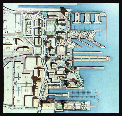
Above is the image of how the finance sector at the waterfront is meant to look after completion, Masterplan wishes to look at this development and the changes that occur throughout the process whilst identifying what makes the area unique to Jersey and its industry.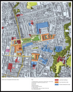 This image represents the potential changes that will occur in certain areas, whilst also showing points of historical interest to the public which may cause debate. By doing so it provides an insight into how St Helier wishes to change over time, this gives us an idea on how we want to go about photographing these areas, as the technique of contrast could be used to identify changed features.
Second Shoot in St. Helier
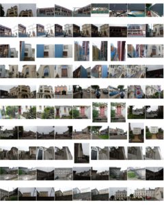
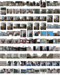
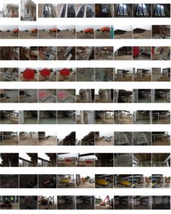
Contact Sheets
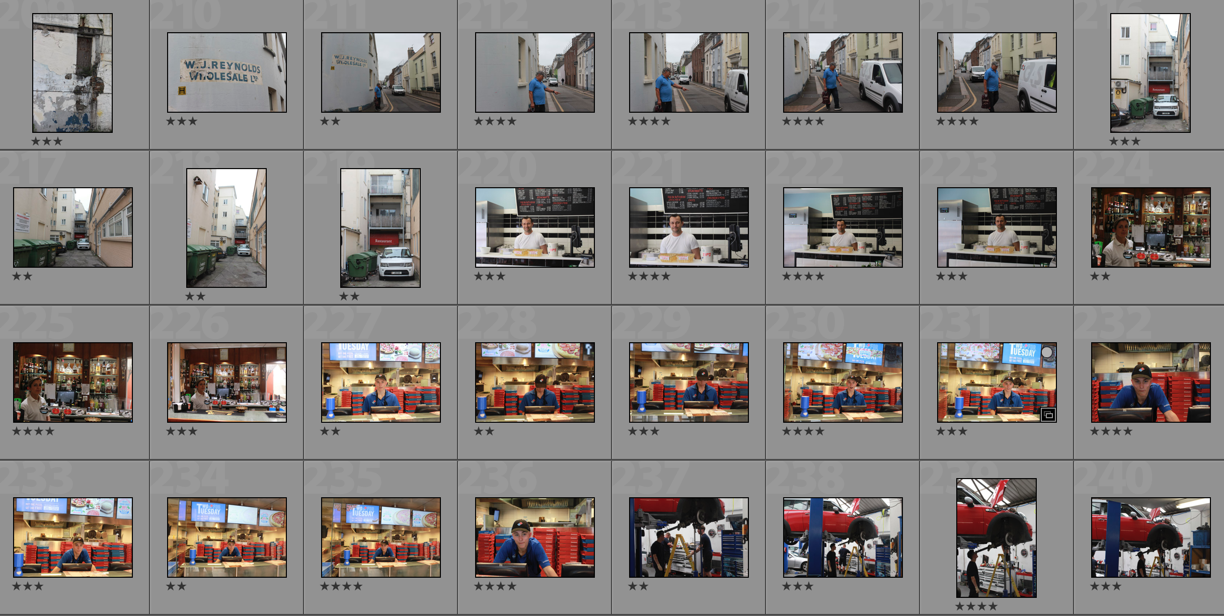
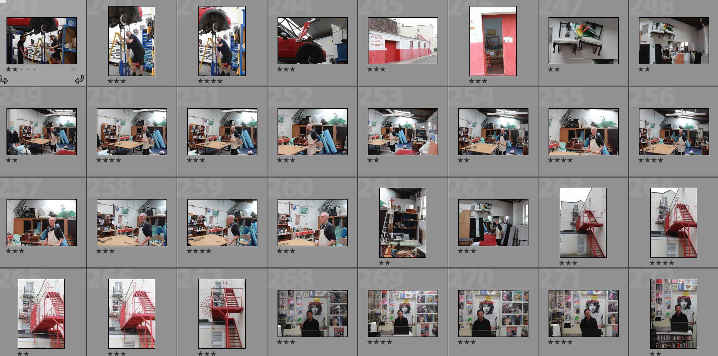
My Shortlist of Photographs
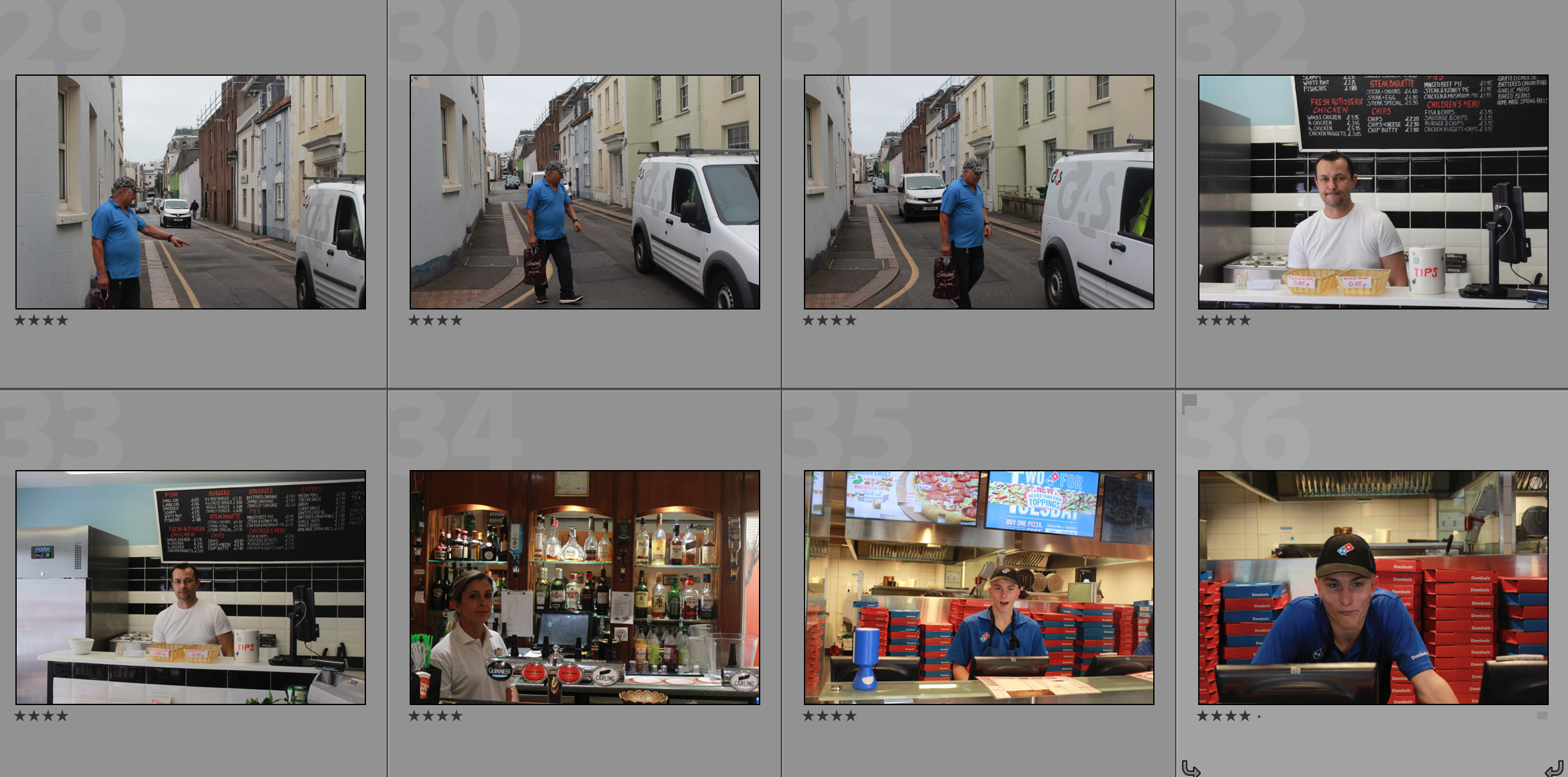
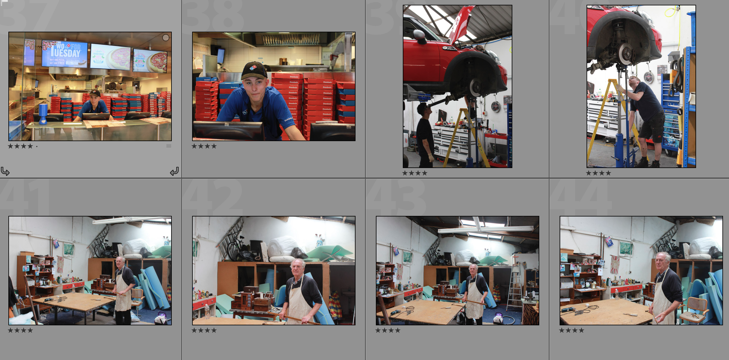

Edits of the Shortlist
St Helier Photoshoot 1
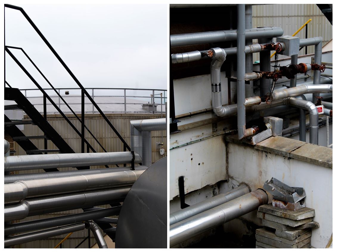
I reviewed all of my images I took on my St. Helier photoshoot and selected the top 100 images from throughout the day. When photographing these images I relaised I was drawn to the bold and abstract shapes and colours and how this contrasts with the background of some images.
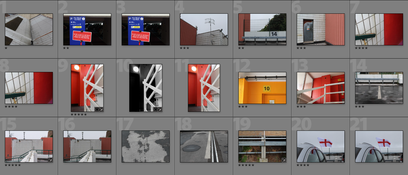
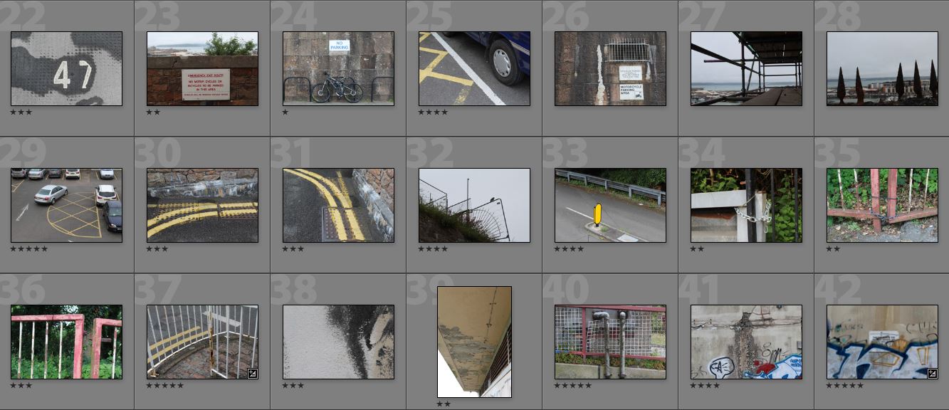
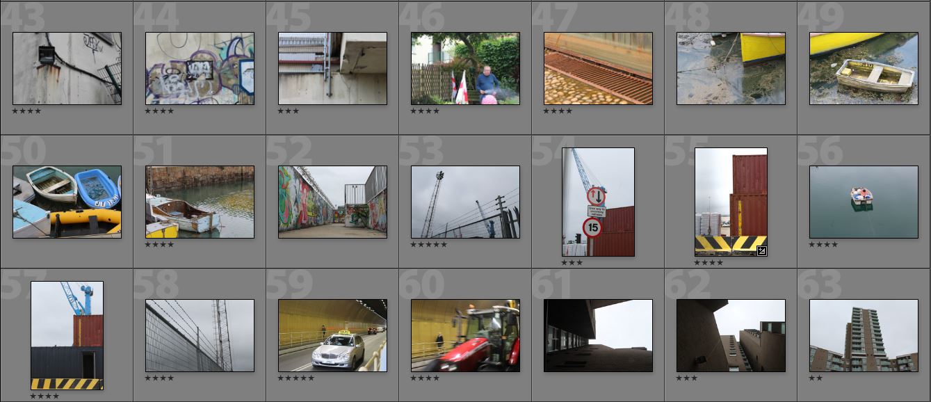
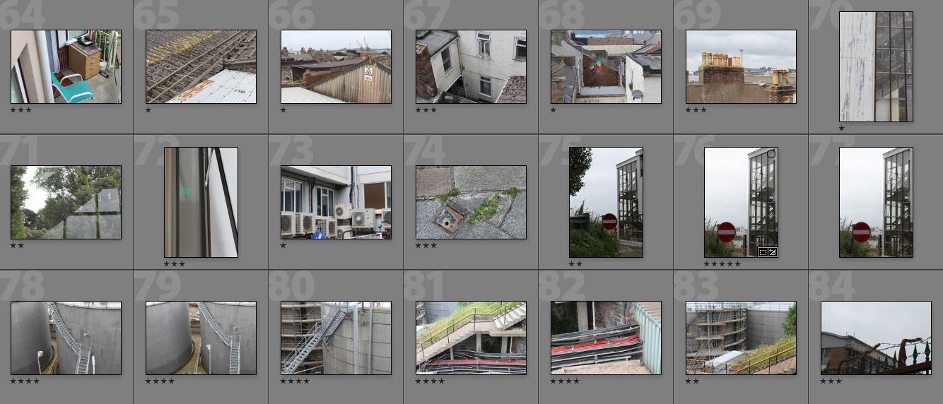
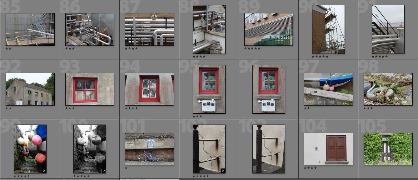
To develop these images I will pick a smaller selection and arrange them in an order together as I think the images I have collected all link together in a way. I wanted to focus on the parts of St Helier that people may not pay attention to in everyday life, similar to Luke Fowler.
Here are selection of my favourite images from the shoot:
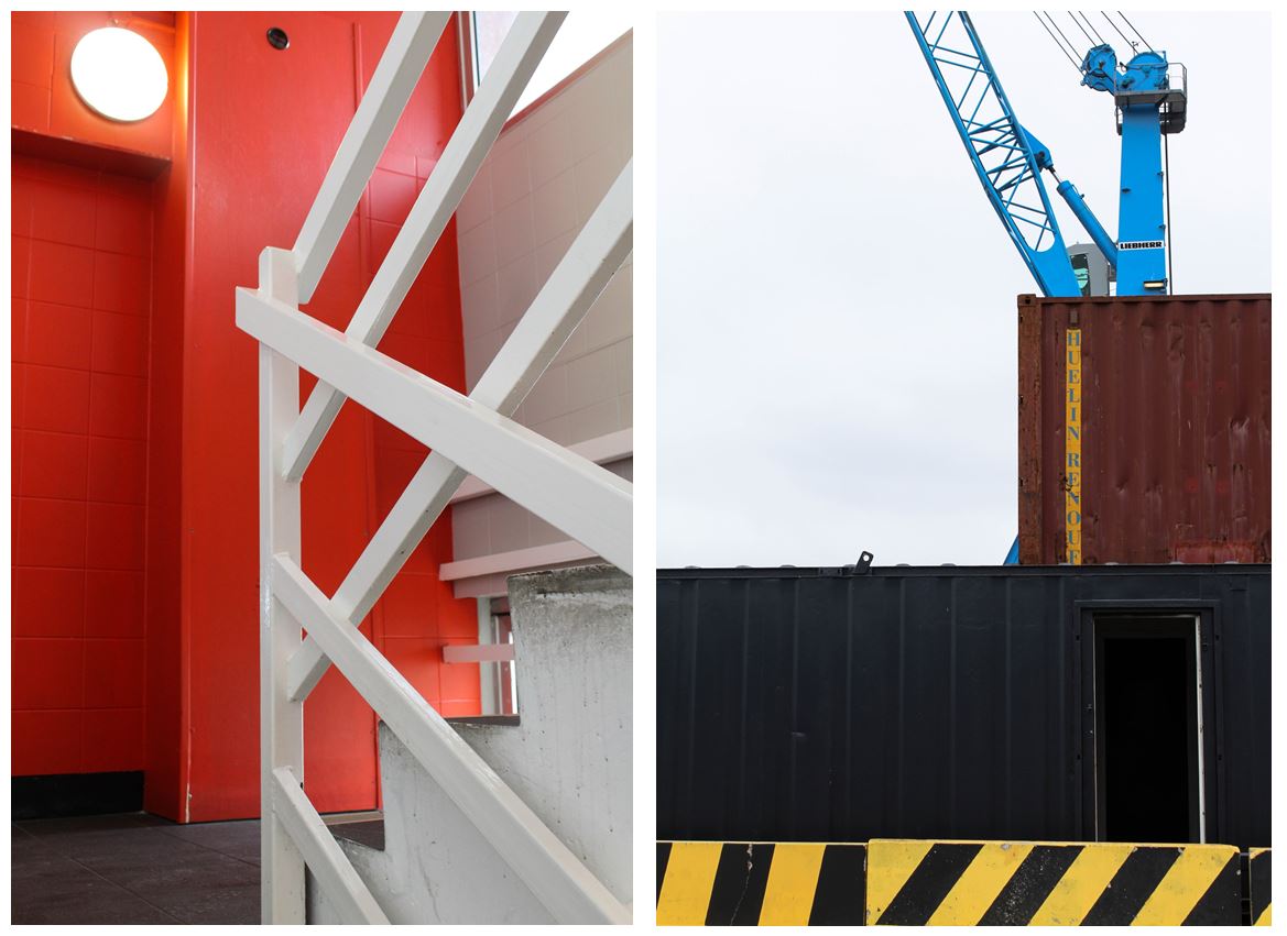
One of my favourite photo from this shoot was the image on the left.
Visual:
- I like this image due to its bold and structural lines and shapes that frame the photo. The right hand side has multiple bold white lines creating a crossed pattern to the middle of the image which is juxtaposed with the simple red wall behind and on the right if the image.
- The contrasts between the red wall behind the white railings gives the image a more abstract feel and only allowing the audience to tell what the shapes are because of the staircase in the bottom right hand side.
- The use of only three main colours in the image gives it a minimalistic appearance, focusing in the structural side.
- I also like the image of the right due to its industrial appearance with the crane and metal crates, focusing entirely on structures.
- The bold black and yellow wall along the bottom the he image contrasted with the rest of the quite dark colours in the image, making the wall more obviously a warning not to cross over.
- The composition in this image shows the structures in layers, starting from the yellow and black wall along the bottom, followed above by the entirely black crate going half way up the image. Above that is a smaller brown crate and a blue crate above. The different layers in the image create obvious divisons between each section, but the way all the shapes are together makes them look conjoined
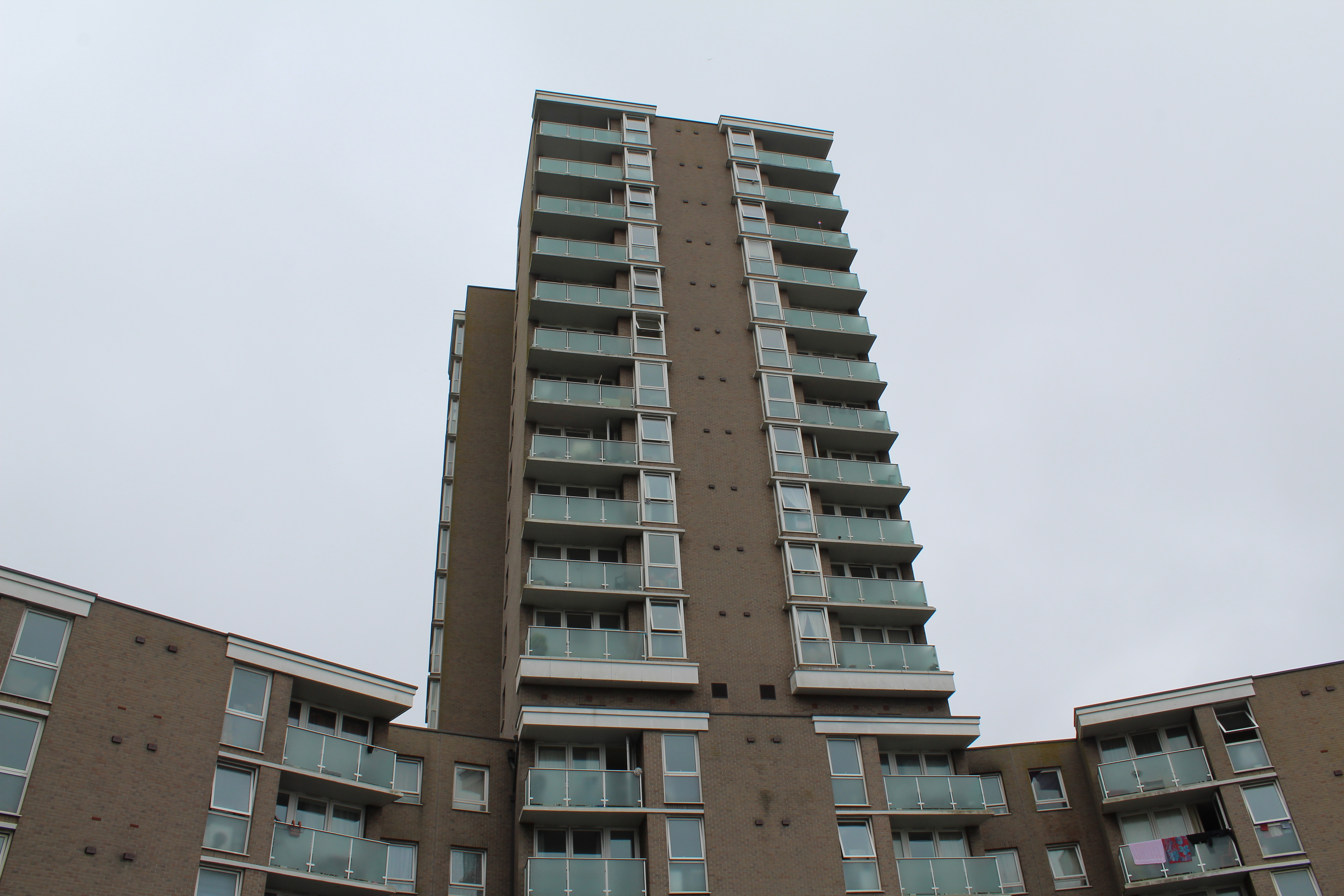
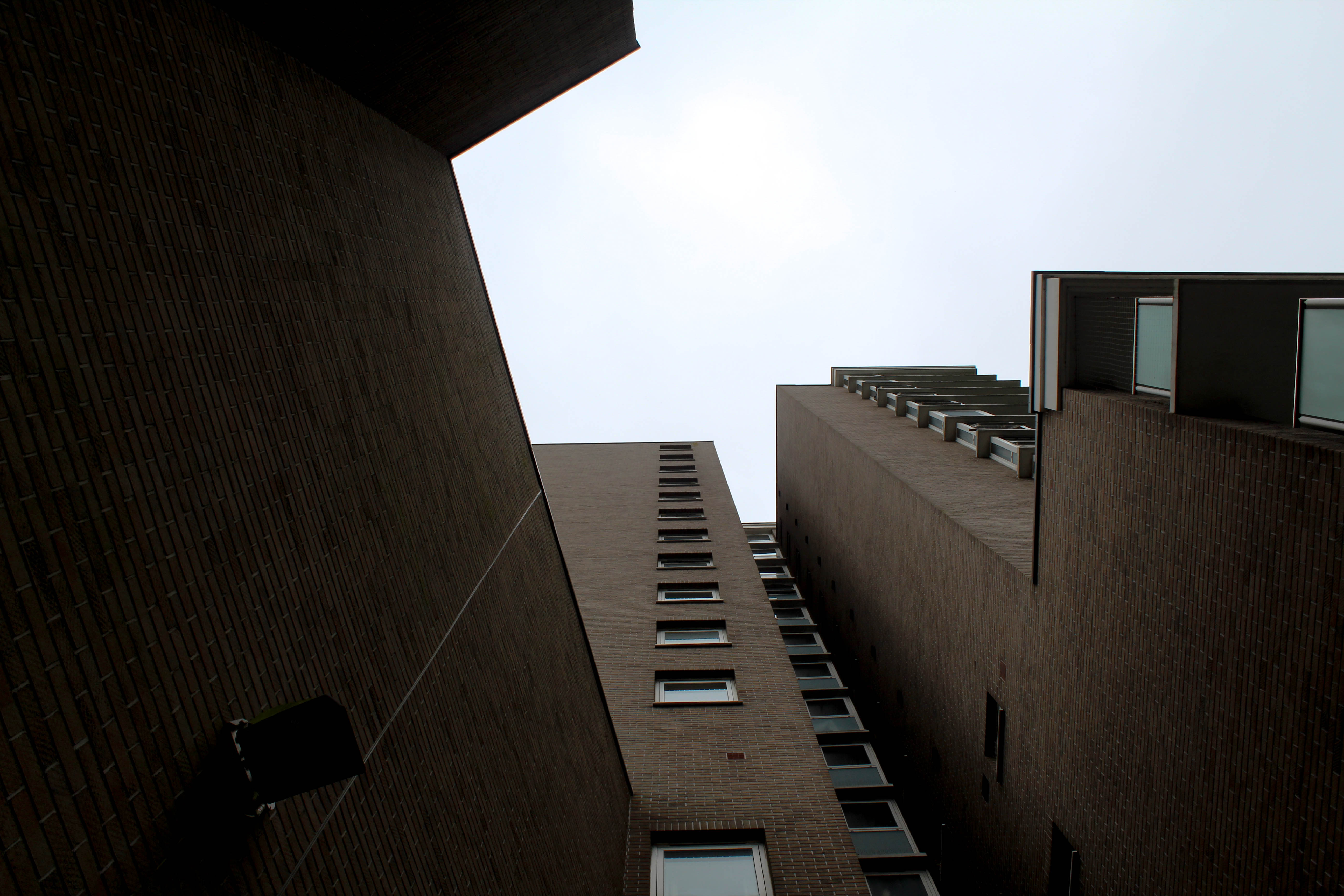
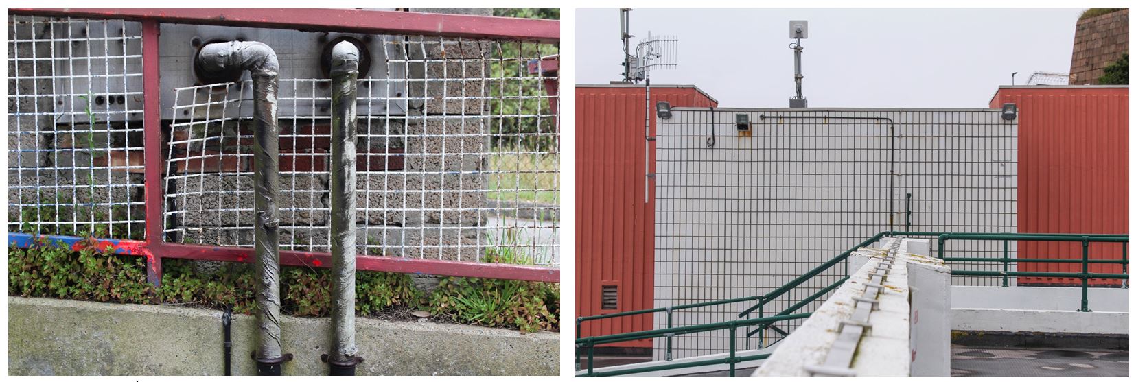
Industrial Images:
Artist Research
Nick Miners
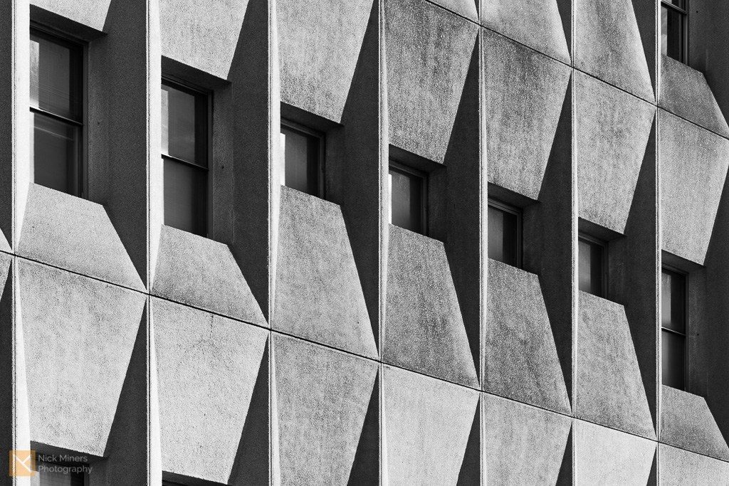
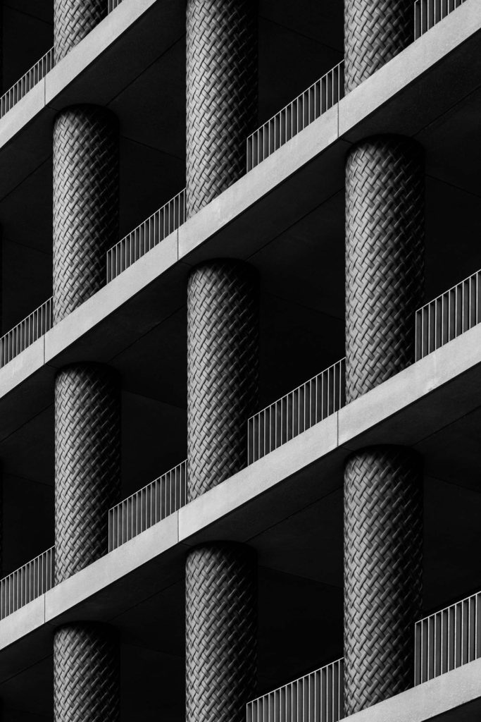
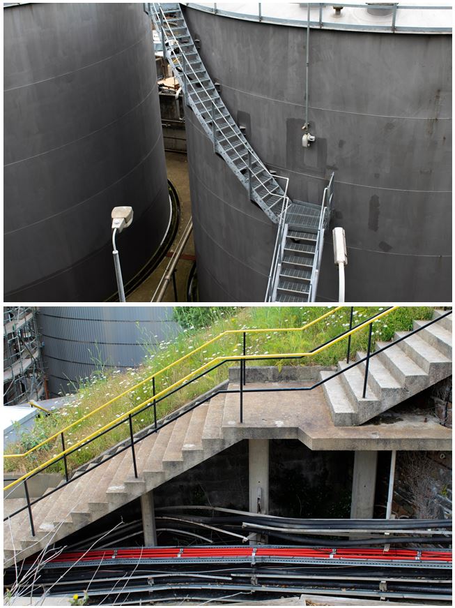
Nick Miners is an architecture and interiors photographer based between Bath and London. He is inspired about architecture and interior design and has a particular interest for brutalism and the work of Le Corbusier, Denys Lasdun and Ernő Goldfinger. He loves to to explore interesting buildings in his photography whether they are still being dusted off or have been standing for centuries. He has photographed buildings as old as the 16th Century Packwood House in Warwickshire, and as recent as 30 St Mary Axe, more commonly known as The Gherkin in London. Miners manages to capture the essence of a building in a seemingly abstract way, turning concrete monsters into beautifully abstract shapes, patterns and textures.
Artist research
Garry Winogrand
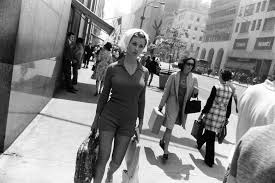
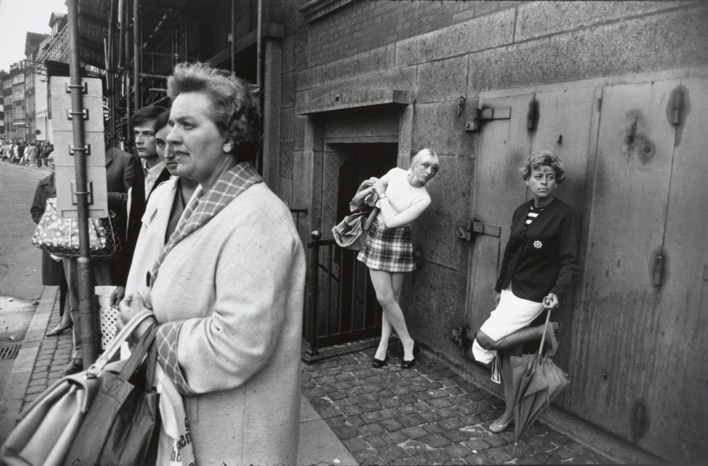
Garry Winogrand was born in 1928, he grew up in a Jewish, working-class neighbourhood of the Bronx in New York City. His parents immigrated to the United States from Hungary and Poland in the hopes of having a better life in the United States, but then the Great Depression hit the country a year after Winogrand was born. In 1949, he took a photography class at the New School, where his teacher, Alexey Brodovitch, who was the celebrated art director at Harper’s Bazaar at the time, taught him to rely on his instinct rather than classical photographic techniques when taking photos. The lessons Brodovitch gave Winogrand, such as trusting his gut rather than established conventions would greatly influence him, defining not only his photographic style, but also his attitude towards the medium. Ultimately, Winogrand’s working class immigrant background influenced his shooting style as well as his choice of subjects. This viewpoint ultimately set him apart from his colleagues, as well as the tremendous influence of photographers such as Brodovitch and Henri Cartier-Bresson. His unflinching view of American society places his lineage more in line with the photographers Walker Evans and Robert Frank. Like most photographers of his generation, Winogrand was inspired by the black and white photography of Henri Cartier-Bresson, Robert Frank, and Walker Evans. It was after seeing Evans’s book American Photographs that he really became driven in regards to his own work. Everyday he would shoot relentlessly, and with the dynamic energy of the city as his subject and inspiration, Winogrand began to create an unwavering body of work that was rich in its diversity. He took photos of women passing by, animals, parades, crowded street corners, airports, business men, political conventions, anti-war protests- any scene he found interesting, but always containing people. Rather than allowing the scenes he photographed to happen as he maintained a passive stance, as traditional street photographers had done, he intruded into his subject’s physical space. This allowed him to startle and provoke his subjects as he shot them and thus to capture their startled and strange glances. His photographs often appear haphazard, tilted, and poorly composed – what came to be called the ‘snapshot aesthetic’. However, this unique aesthetic helped emphasize his subject matter, allowing the viewer to engage with his subjects in new and unusual ways. In so doing, Winogrand influenced an entire generation of photographers and artists to push the boundaries of what photography as a medium could be and what it could expose.
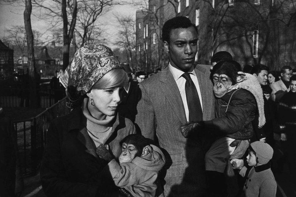
Central Park Zoo, a young interracial couple each holds a chimpanzee dressed in children’s clothes. Winogrand captures himself in this scene as well – his shadow falls over the man’s torso, reminding the viewers of just how close Winogrand got to his subjects. Taken during the height of the Civil Rights Movement, their mere public presence is very much a political statement. Interracial couples were taunted with the idea that their children would be monkey-like, casting a more serious political statement to the seeming levity of the dressed up chimpanzees. Certainly aware of this, Winogrand presents them in a moment of passing by him, and their implacable facial expressions give this image an ambiguous tone: there is no easy or singular political statement offered here. In this work, Winogrand removes the context, showing just enough of the moment that the viewer can only describe what they are seeing in the image. The racial tensions inherent in this image are in the background, and in so doing, Winogrand normalises what would have been a rare sight: an interracial couple in public, in addition to their well-dressed chimpanzees. For Winogrand, photography was about transforming the real world into a distinct image, disconnecting it from its narrative. Because he believed photography’s purpose wasn’t to tell a story, it was simply to exist, or perhaps, in this image, the right to exist.
Future of st helier
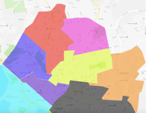
The red section is the section that I have been given, to me, this divides into two main areas; This being the old police station that has now been left empty with some interesting architecture, and the Savoy jersey which could be considered the most upscale part of this particular area and then up towards St Thomas church. The area throughout is focused mostly on old buildings and more urban and deteriorating areas typically ignored by government property developers as they do not hold a public interest within the main section of town or the finance sector, and therefor the area has been left to slowly deteriorate and slowly being abandoned by example the police station which has now moved to a more central and up to date part of town. I do believe there are many small communities within these areas to which I could take images of the people as a representative of the area itself. I also intend to explore the the architecture of the area, such as the churches and deteriorating buildings that form this area, there are also quite a few independent shops and areas of flats in this area that I intend to photograph to create a full perspective of the area with my images.
