Monthly Archives: May 2018
Filters


Final Image
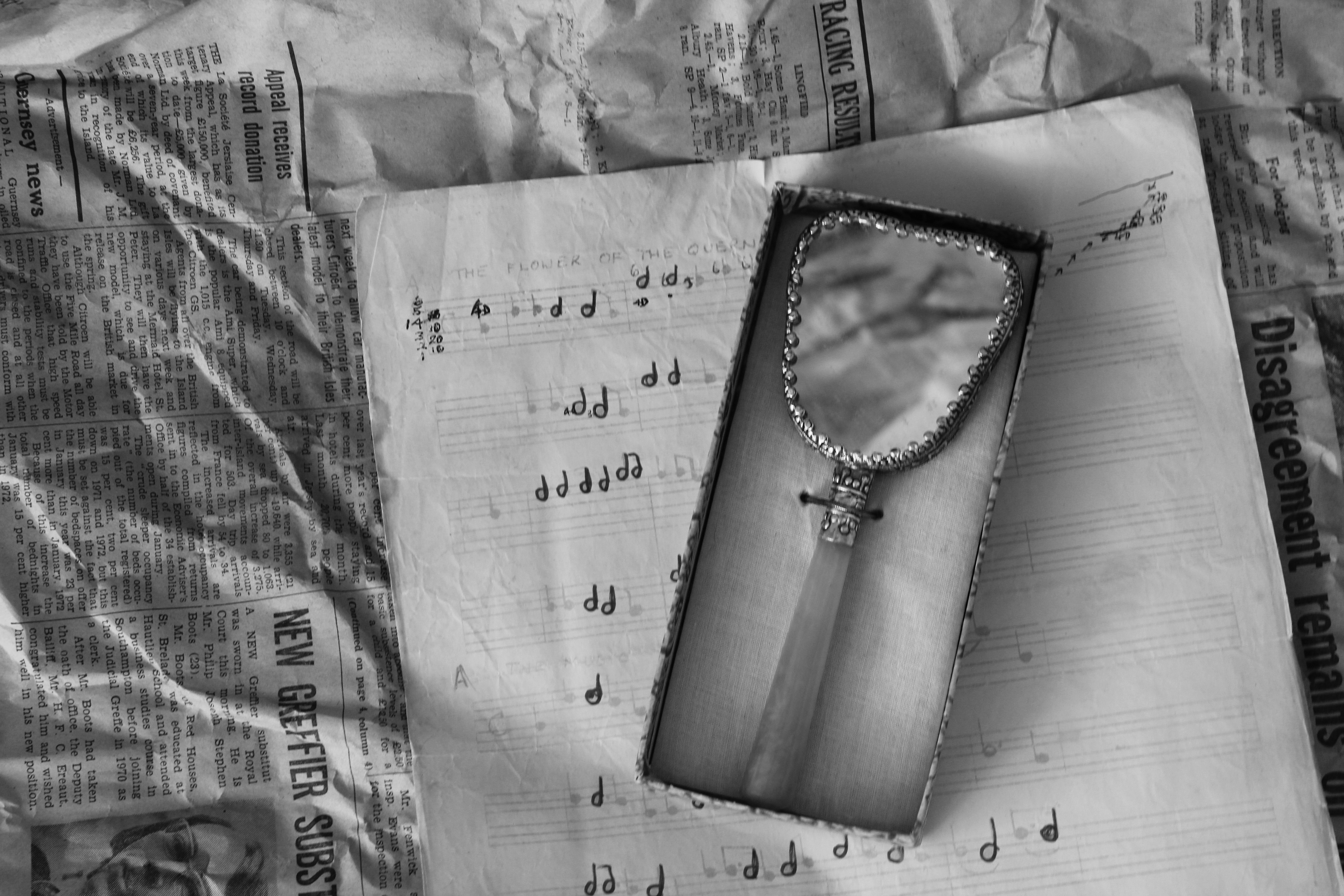
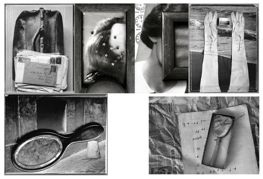
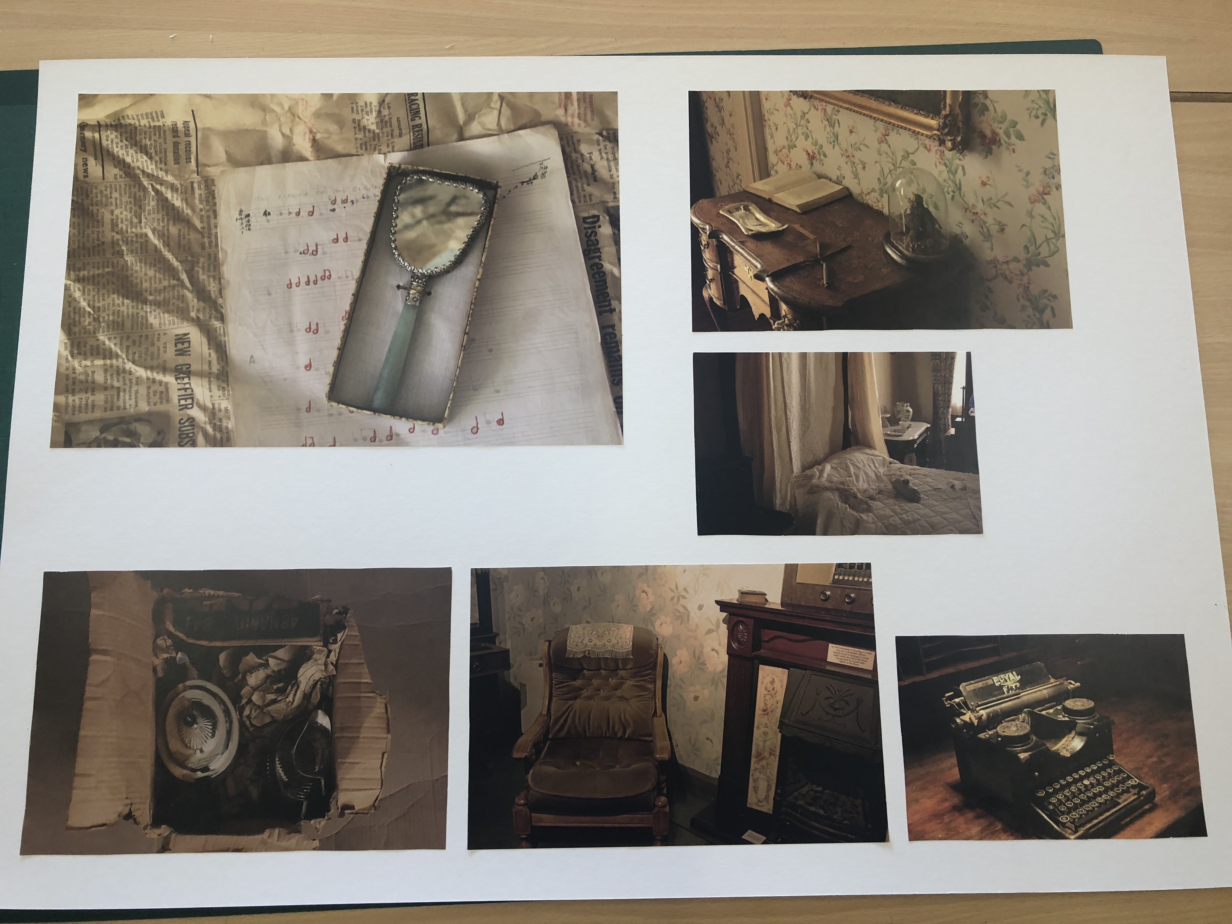
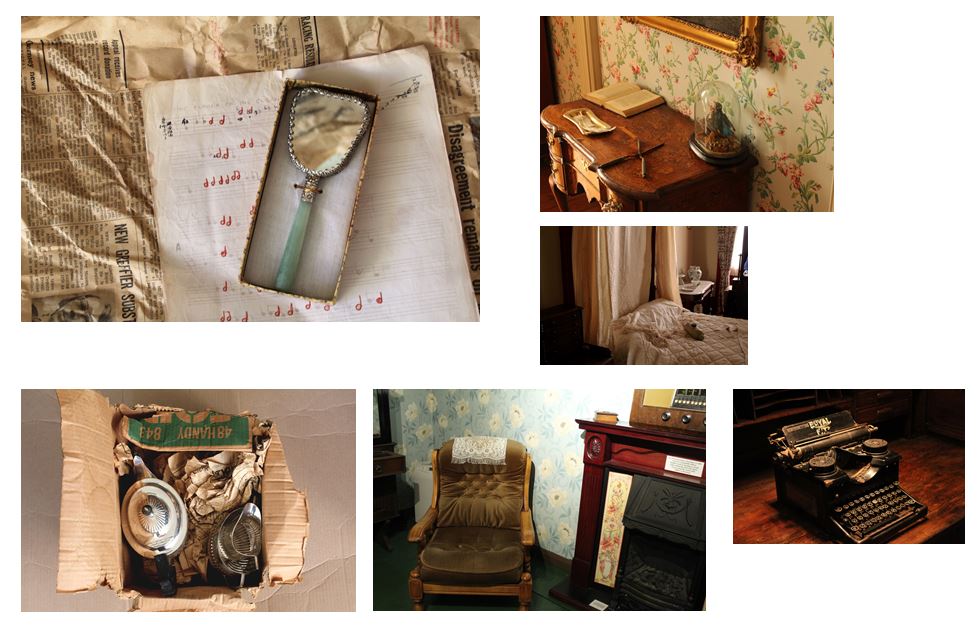
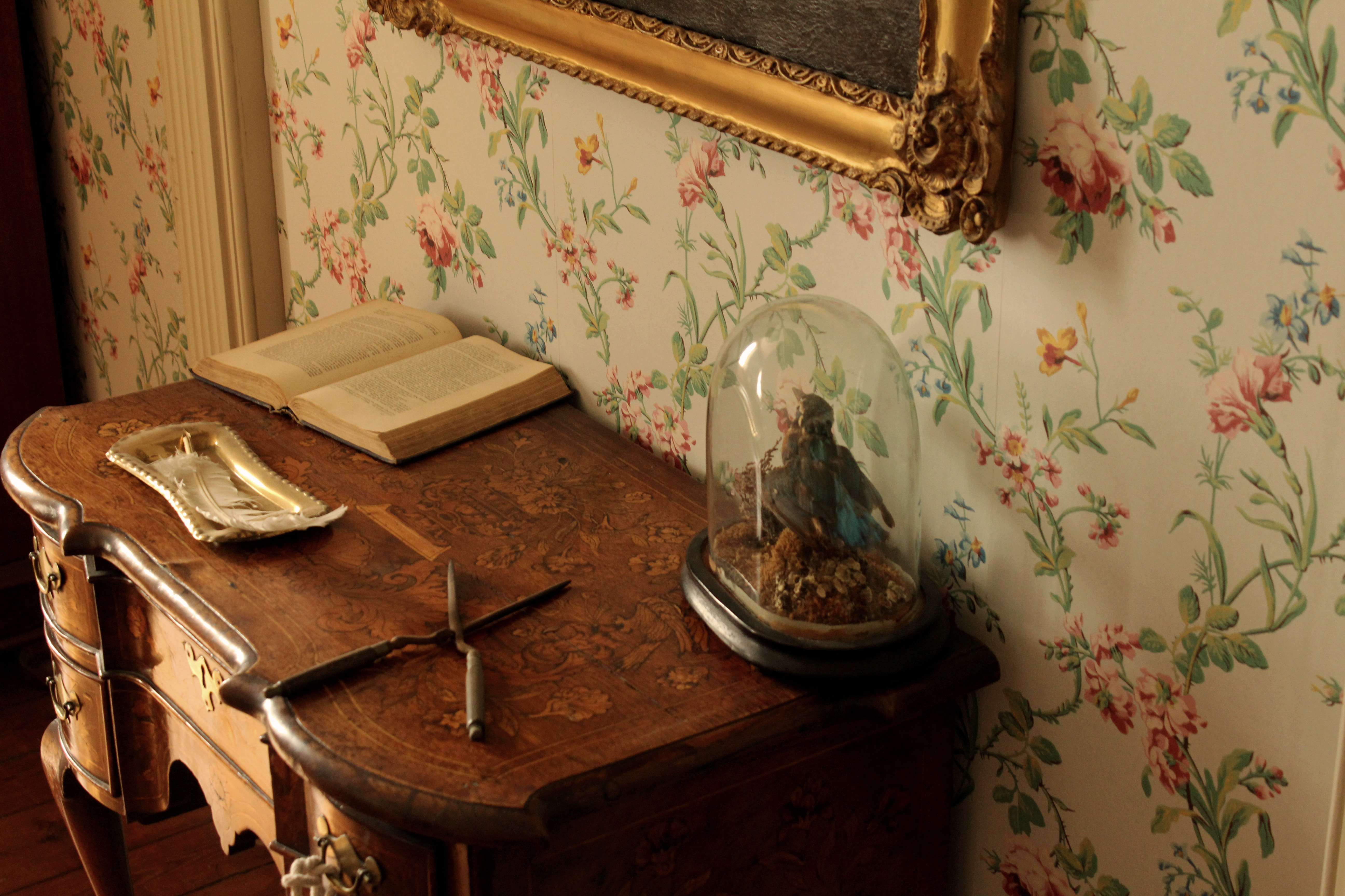
Out of my final outcomes I chose this as my final image because i think it represents all the aspects i explored in this project where i looked at how conventional objects having stories and personal connections to them. The mirror in this photo was owned by my grandma, the piano music is something which my granddad sent me in a letter when i was younger, and the newspaper background, which is seen in most of my images from the 3rd shoot, is newspaper dated back to Feburary 16th 1973 which i found in a box where my great great grandma’s silver tea set was kept. This shows how i took inspiration from Mari Mahr when photographing this image as I’ve collected objects owned by past family members and displayed them all together, representing a part of myself, like she did in her photos. I edited this image black and white to interpret Mari Mahr’s work , but also it emphasises the interesting details and textures of the objects within the image. Like the crease and folds of the newspaper which is from 1973 showing how the condition over the past 45 years has deteriorated and the crease edges of the piano music. The black and white also emphasises the shadows created from the natural light coming from the left, shown on the right side underneath the piano music. I used natural light when taking this photo to give it a more authentic, eclectic effect like most of my images did in this project and didn’t want it to look too manipulated, giving the effect that someone could still be using these objects to this day. The colour of the newspaper links to the other images as they all contain brown and yellow undertones, emphasisng the fact that what is being photographed is old. This contrasts with the off-white colour of the piano music, which also shows signs of ageing around the corners. The tones of the newspaper link into the colour of the outsides of the box containing the mirror. This makes the overall image more aesthetically pleasing as the colours and tones all complement each other and make for a more balanced image. I also reflected newspaper in the mirror so it wasn’t completely white and so it complements the newspaper background. I arranged the objects in a way so that the angles each object were placed at balanced each other out, e.g. the piano sheet music angled to the left, complemented the box with the mirror angled to right, together creating horizontal lines and different layers and aspects in the photo. I chose to take this image to show how an photo containing conventional objects can have historic links and also personal ones and that there is more to an object the what meets the eye as there’s probably a story or personal connection to it.
Project Conclusion
Overall I think i have worked consistently throughout this project, linking my images to the concept of how personal possessions and conventional objects have stories behind them. For example, in my fourth photo shoot I think the images I took represent the passage of time and absence, showing furniture and beds of people in the 1860’s, but the absence of people in the images show the history and how a conventional objects within a house can have more meaning than the purpose of what it was built for. This also links to my 3rd photo shoot where i took objects from my own family and photographed them together. I used objects such as my great great grandma’s tea set and my great uncles camera. These all link into the history side of photography and how conventional objects can also be passed down through families. This also links to my first photoshoot where I looked how the lives of people living in Jersey were affected by the occupation in 1940s,the overall concept of the images to represent daily life for islanders during and the idea that history and memories can be represented though conventional objects.
Final Outcomes
Image 1:
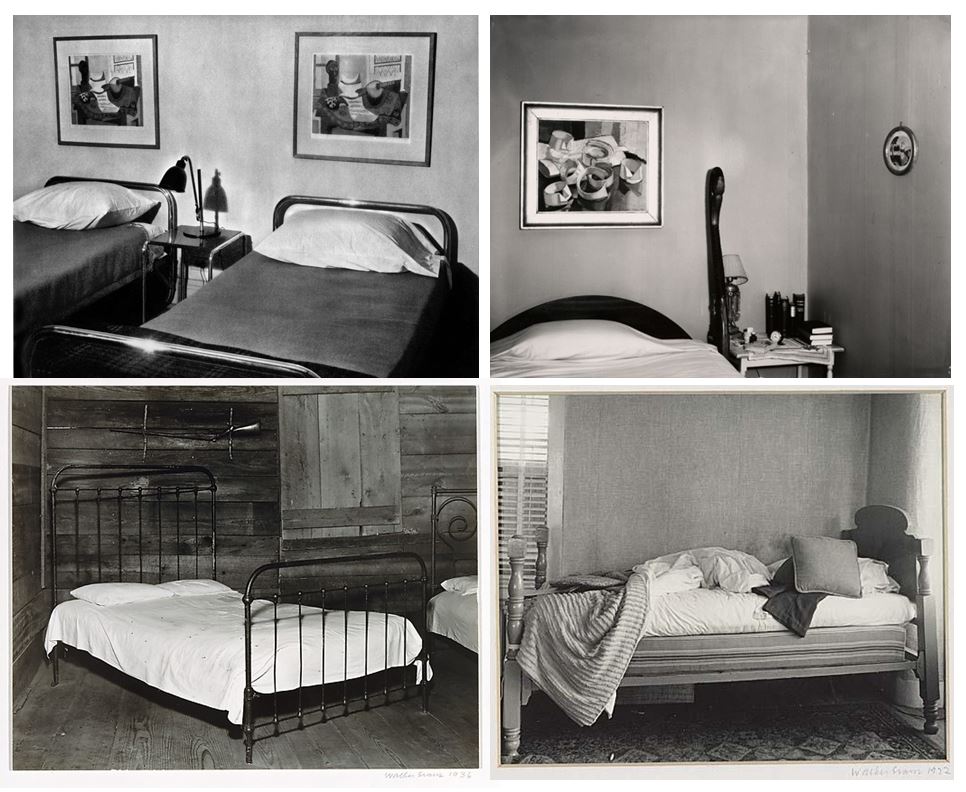
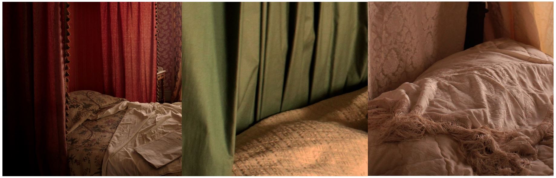
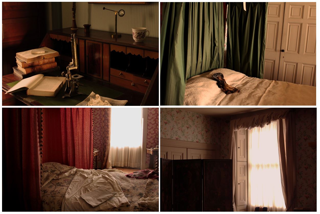
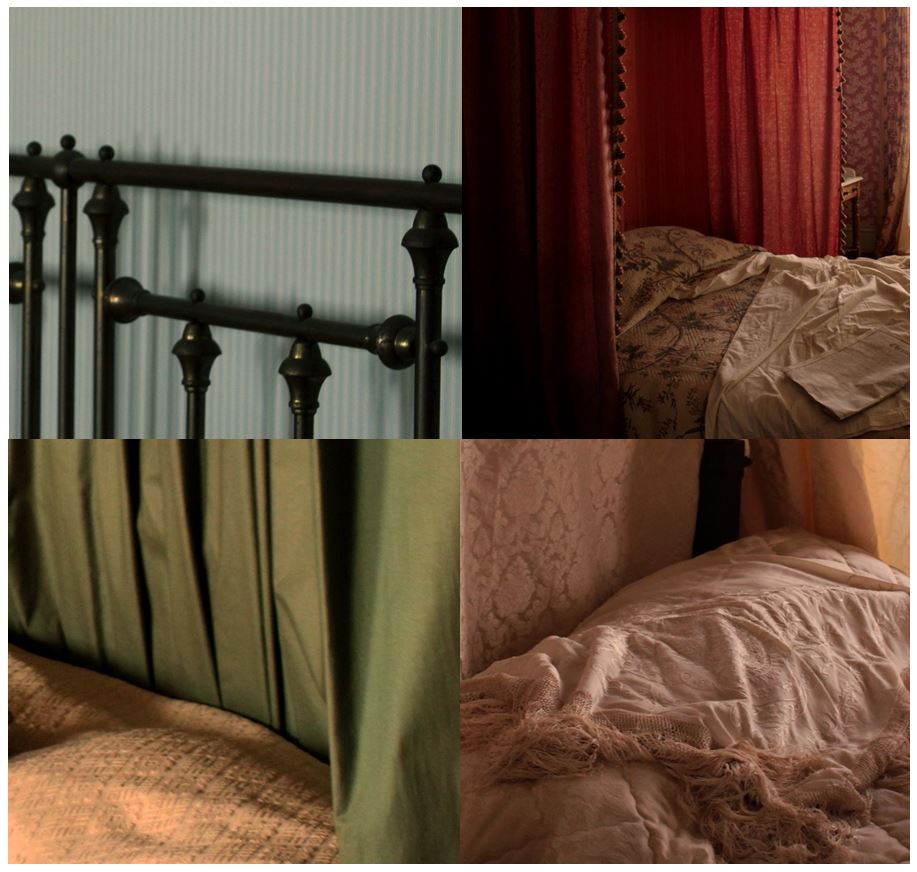 My first image is an edit from my 4th photo shoot. I cropped the original images to focus in on certain section of the original images. I did this to focus on the different textures created by the different materials on the beds in the Merchants house set in 1860’s at the Jersey Museum. I think the way this is displayed is more interesting than the images by themselves as it compares the different colours, tones, textures and patterns. I tried to emphasise the contrasting colours by using the different images containing different colours in each e.g the top left has cold blue colours, the top right has red curtains with pink tones in the bed sheets, the bottom left has green curtains with yellow undertones, and the bottom right has brown and yellow undertones. These colours would have been noticeable if the images were displayed by themselves separately, but are emphasised when displayed together. The concept of this image is to show how conventional objects and furniture have history and stories connected to them. The objects and furniture shown in these images create the impression that someone still uses them based of the casual appearance the settings give. This links to Walker Evan’s images where he pays particular attention to the inanimate objects that are present, almost representing them as characters themselves, also representing absence and the passage of time. My images show furniture and rooms like someone is living and using the furniture, but there aren’t any people, also representing, like Walker Evan, absence and the passage of time
Experimentation:
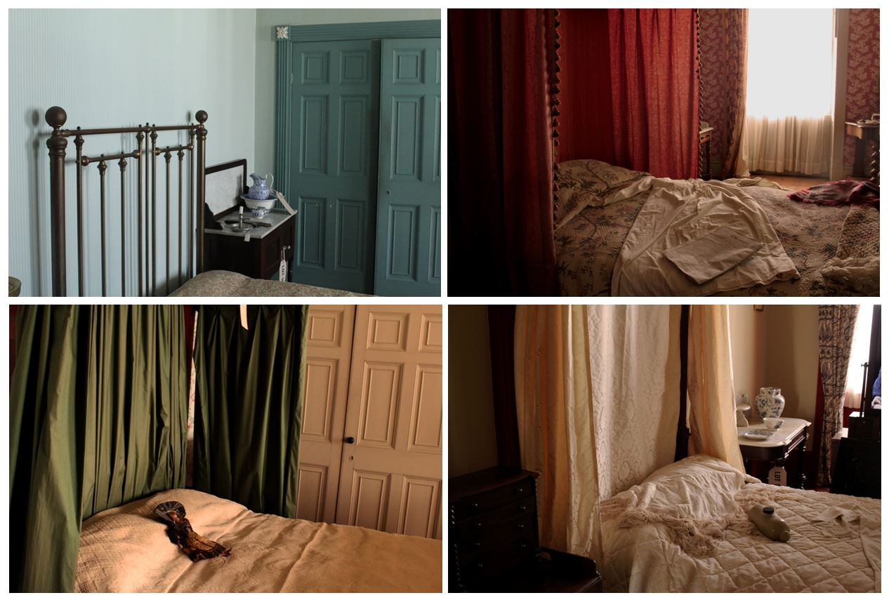
Displayed above is the original images that were cropped. Below i have displayed how i experimented with the cropping on each image.
This image has natural lighting which emphasises the yellow and brown undertones within the image. I specifically tried to make the images in this shoot look natural so the setting would not look manipulated and staged like it was in real life. I used a fast shutter speed when taking this image as i wanted it to be clear and detailed with no blur. This photo has a range of light and dark tones within it, the bottom left corner is dark brown and contrasts with the lighter colours of the bed sheets and the light shining through the window. When experimenting with cropping i decided to focus on the textures created through the materials of the bed sheets and draping around the bed.
This image contains warm and cool colours, the bedding having yellow tones contrasting with the cooler green colour of the draping from the four post bed. There are vaeriety of patterns created in this image, from the squares on the wardrobe door contrasting with the vertical lines created by the material of the green drapings. When cropping this image i wanted to incorporate the pattern created by the green draping but also she the texture of the bedding.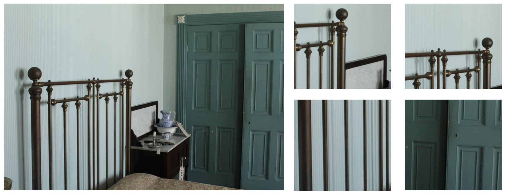 The image on the top left has cold tones from the wallpaper behind which contrast with the dark metal bars in front. The bars from the bed create bold geometric shapes within the image and shadows behind, adding more depth to the image. When cropping this image i wanted this image to contrast from the other cropped images so looked at the geometric shapes and lines compared to the texture and patterns of the material in the other images. I also wanted to show the shadows created.
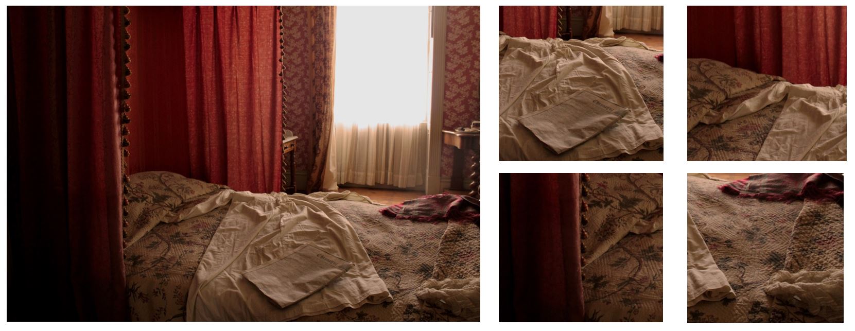
This image contains pink tones and shows the red draping from the four post bed. I cropped this image, focusing on the bed sheets on the left side rather than the window and light on the right side as I think the lighting is too bright and intense. By cropping the audience doesn’t get distracted by a bright light, but the bed it still lit up naturally from it. I like the contrast on the red draping to the bed sheet that has yellow tones and also the pattern of vertical lines created by the draping and the pattern printed on the bed sheet. I wanted to incorporate all these features when i cropped the original image
Compare and Contrast
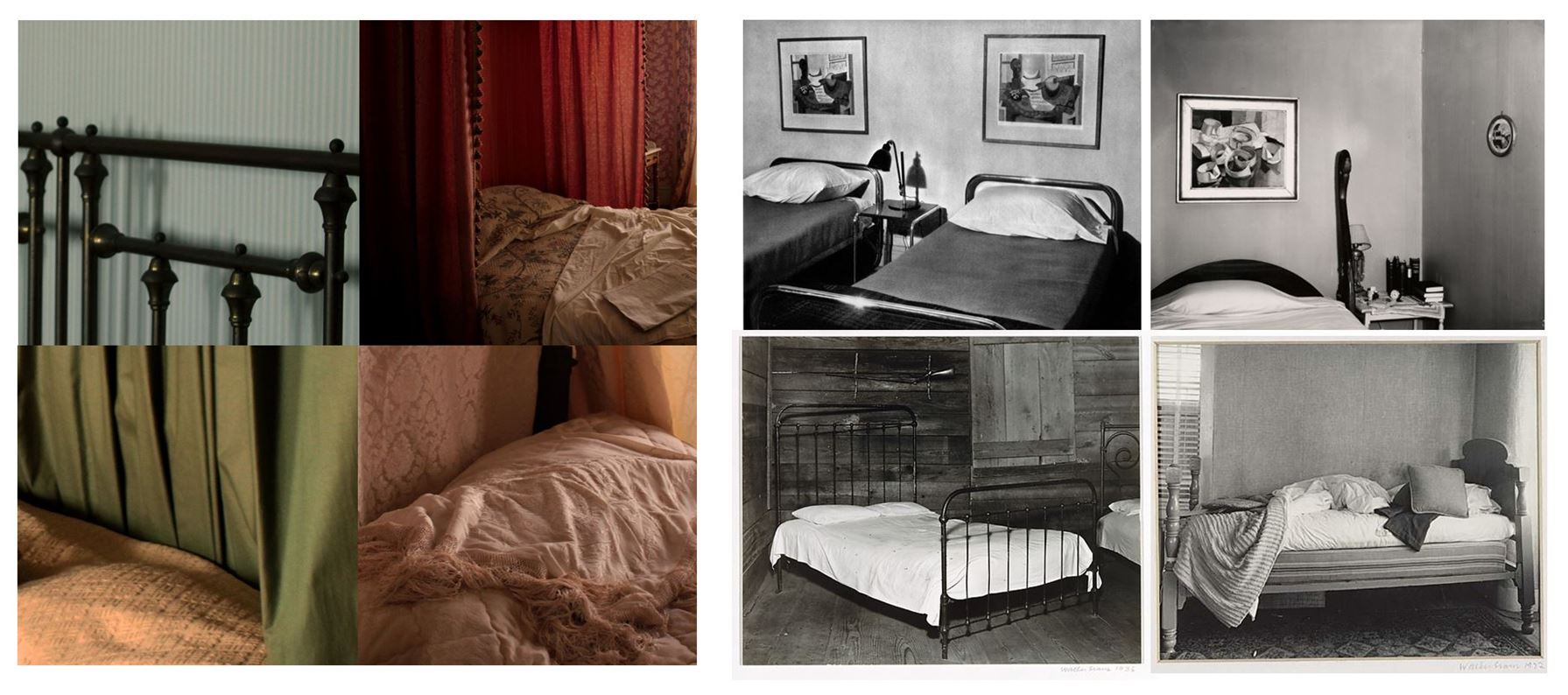
One similarity between mine and Walker Evans photography from his book ‘Message from the Interiors’ as we both pay particular attention to the inanimate objects that are present, almost representing them as characters themselves. I think the images I took represent the passage of time and absence, showing furniture and beds of people in the 1860’s, but the absence of people in the images show the history and how a conventional objects within a house can have more meaning than the purpose of what it was built for. One difference between mine and Walker Evan’s images are that my images are of settings recreated of the 1860’s, whereas his images are actually depicting the 1960’s, the time he was living in. He uses black and white photography presenting the bed as they are in that time in single photographs, whereas I display my images as a collection of coloured images. I decided not to edit my images black and white as when i was editing i focused on the contrast between the warm and cold colours between each picture and the contrast in textures. If i had edited the images in black and white it wouldn’t show the contrast in colours and therefore the textures wouldn’t be significantly different.
Image 2:
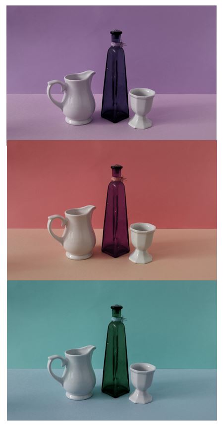
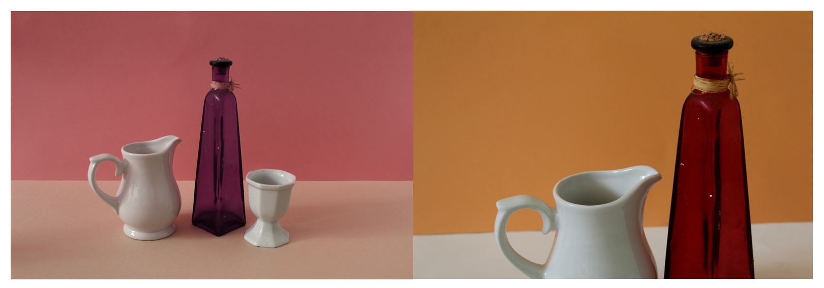
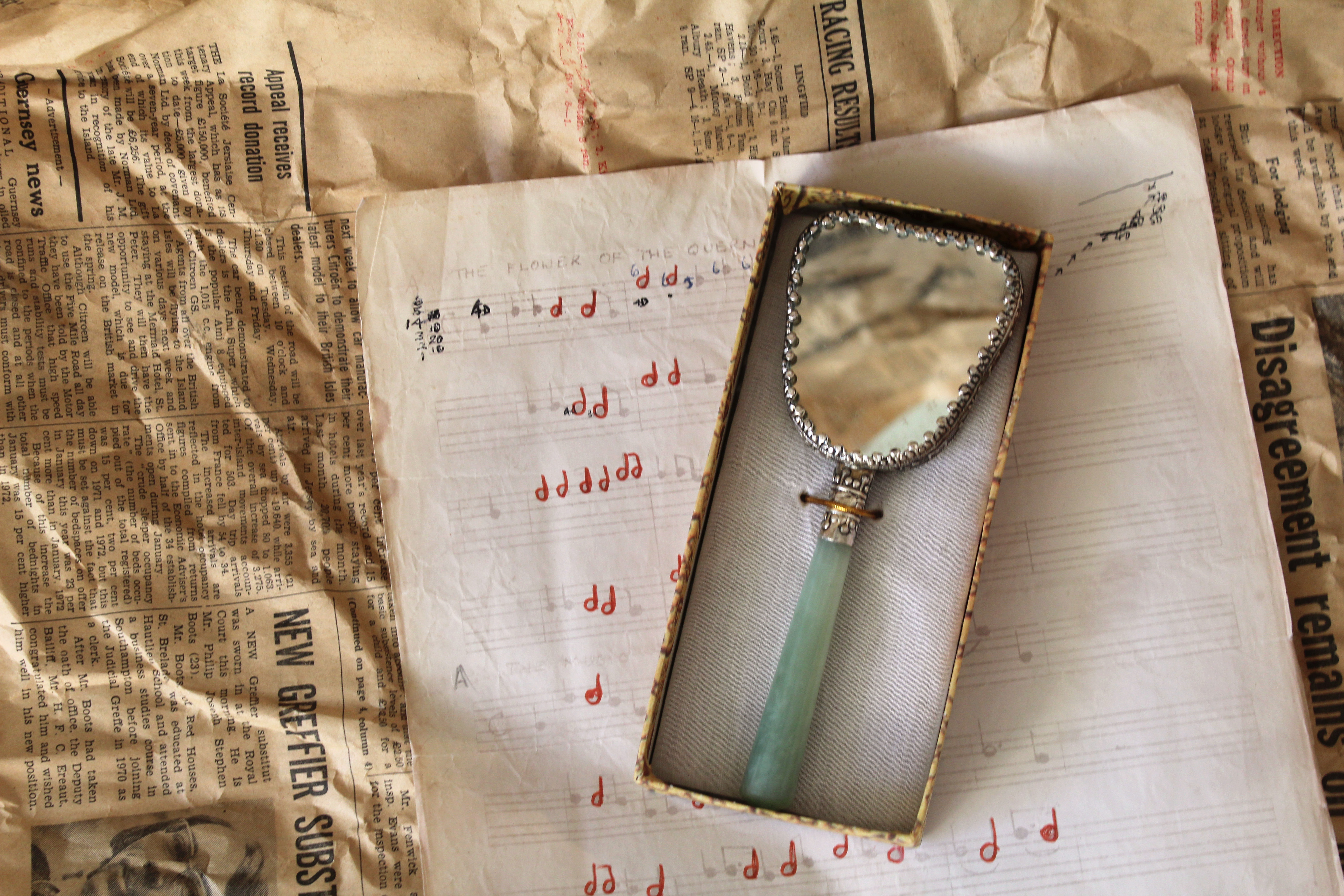 This second image is from my 3rd photoshoot. The mirror in this photo was owned by my grandma, the piano music is something which my grandad sent me in a letter when i was younger, and the newspaper background, which is seen in most of my images from this shoot, is newspaper dated back to Feburary 16th 1973 which i found in a box where my great great grandma’s silver tea set was kept. This is my favourite image from the 3rd shoot as it includes different aspects of my family that are important to me, combined together and shown in one image. It also links closely into Mari Mahr’s work using deeply personal objects and resoning behind her images. I chose to take this image to show how an photo containing conventional objects can have historic links and also personal ones and that there is more to an object the what meets the eye as there’s probably a story or personal connection to it. For example, in this image I used objects from past family members displayed together in one picture showing how what might just look like objects arranged in a certain way actually have personal and autobiographical meaning with stories behind them,
I experimented with both artificial lighting and natural lighting and found that natural created a more authentic, personal look, compared to the artificial that made the objects look staged, manipulated and in the spotlight. The natural lighting coming from the left side lights up all aspects of the photo but focuses more on the left side of the image, emphasing the folds and creases in the newspaper and creating a small shadow on the right side from underneath the piano music.This allows for a range of tones to be presented. For many of my images in this photoshoot i used a tripod, but for this image i didn’t as it’s taken from an above angle, so i used fast shutter speed.
The newspaper, used as one of the background layers in this image, creates an interesting texture as it dates back to 1973, showing how the condition over the past 45 years has deteriorated. The colour of the newspaper links to the other images as they all contain brown and yellow undertones, emphasisng the fact that what is being photographed is old. This contrasts with the off-white colour of the piano music, which also shows signs of ageing around the corners. The tones of the newspaper link into the colour of the outsides of the box containing the mirror. This makes the overall image more aesthetically pleasing as the colours and tones all complement each other and make for a more balanced image. I also reflected newspaper in the mirror so it wasn’t completely white and so it complements the newspaper background. I arranged the objects in a way so that the angles each object were placed at balanced each other out, e.g. the piano sheet music angled to the left, complemented the box with the mirror angled to right, together creating horizontal lines and different layers and aspects in the photo
Experimentation
I edited the image in different ways, one way to interpret Mari Mahr’s work more, one to emphasis the shadows in the image and others to experiment with the tone of the image.
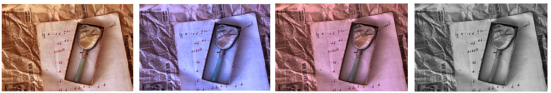
I decided to choose the black and white image as my final piece as it interprets Mari Mahr’s work, but also emphasises the mall details within the image, like the shadows created by the creases in the old newspapers and shadows that have been created on the right side of the box by the light shining in the left.
Compare and Contrast
I think it is hard to compare photos to the style of Mari Mahr as each of her photographs is so different, unique and represents a different part of herself and her life within it, being deeply personal. So i’ve displayed a selection of her photography above in comparison to mine. One similarity between our images is that we both used personal objects that have meaning in our lives. She uses objects from her family, photos and objects that remind her of her mother, and objects that remind her of her childhood in Geneva. In my photos i used objects that were owned by me and my family members. For example, a tea set owned by my great great grandma in 1896, piano music my grandfather sent to me in a letter when I was younger, a camera owned by my great uncle, and my grandmas mirror, all linking to me my family history. Both me and Mari Mahr’s photos are autobiographical and have connections to out families and childhoods wishing the images. On difference between mine and Mari Mahr;s work is that her work addresses universal human concerns regarding where it is that each of us come from, and where it is that we each belong. My work does not do this as much as i focused on linking my images to my family history, although does address how where each of us comes from in terms of my family.
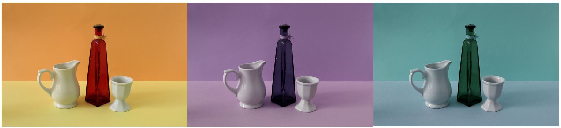
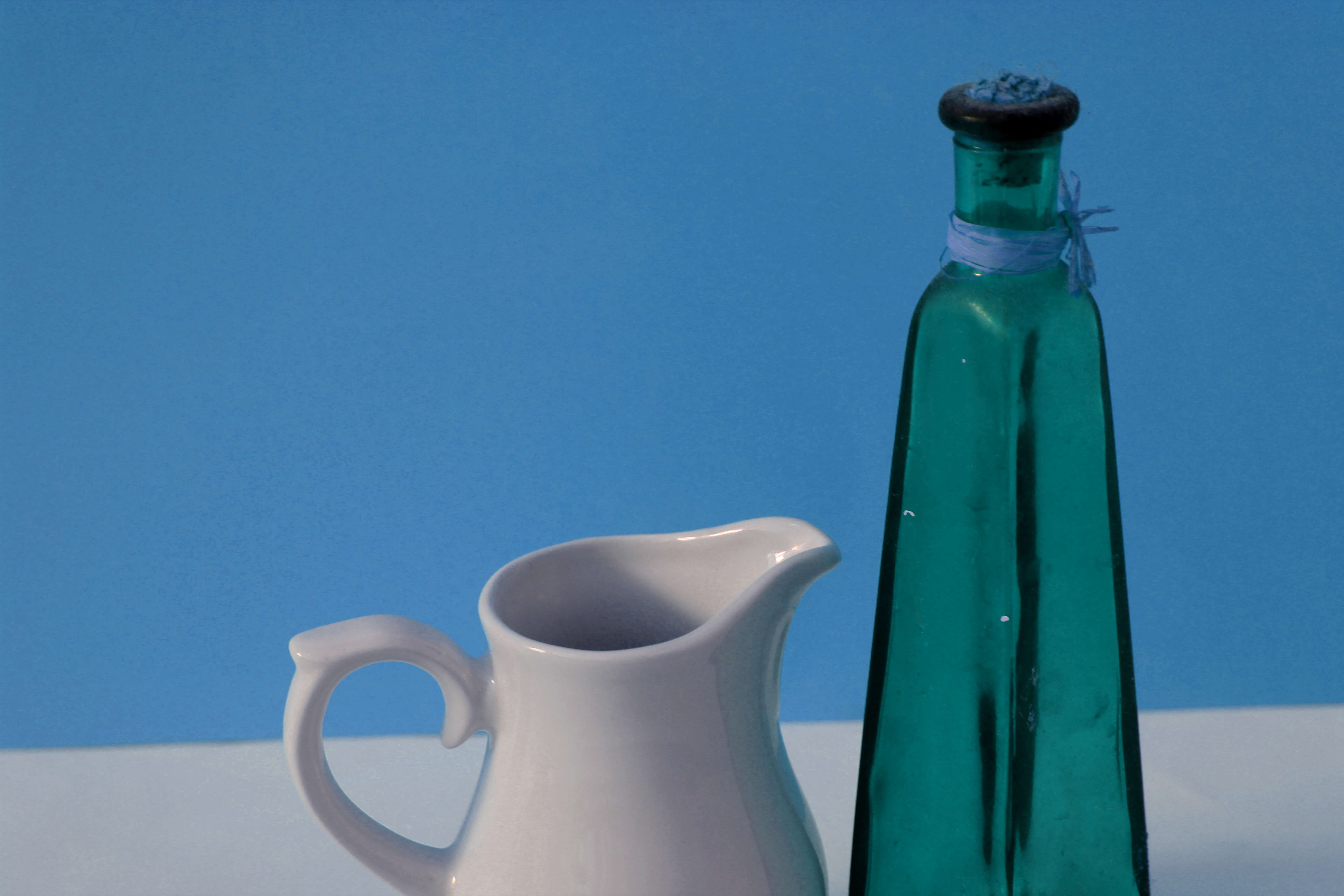
Image 3: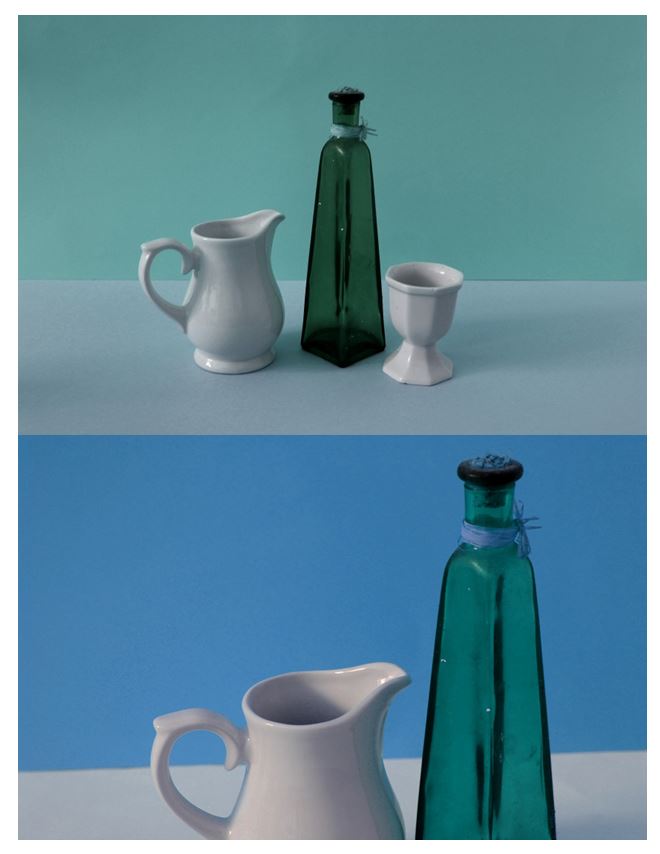 This 3rd image is from my second photoshoot, taking inspriation from the artist Giorgio Morandi where his painting have contain simple domestic objects with solid colour background creating a simplistic yet detailed image. I decided to use these images as one of my final outcomes as it significantly contrasts with my other images from this project and shows the variety within my work. The others taking a more authentic, eclectic style looking at the history of objects and the personal connections and stories behind them. This image however still links in to the idea of objects having a story and personal connections, but look at it in a much more modern way, using bold colours and geometric patterns within the image.
The lighting used in this image is artificial, i used this so the whole image was lit up rather than a certain section. This emphasises the bright colours and the objects in the foreground of the photo. The second image of this collection is closer up than the first, gaining a different perspective on the same scene. Most of the colour used in these images are cold, which is another aspect that contrasts form my other images form this project where they mostly use brown and yellow tones creating an authentic look. The cold colour used make the images seem more modern, although the objects in these images are not. This demonstrates how a certain backgrounds can change the concept of the image, and even make the audience think the photos are taken in a different time. These images create geometrical shapes and focus on the straight lines eg. the horizontal line across the background contrasting with the vertical lines on the vase showing how it’s 3D. When arranging these domestic objects I looked at the levels each objects where at, placing the vase in the center as it’s the tallest and the main object because of it’s colour. I placed the smaller white objects either side of the vase to complement it , putting them at different angles to gain different perspectives of each image. In the second image I took the photo with sides of the two objects coming of the photo, creating a different composition than the first image so I could display them together. The concept behind this image is linked into the theme coneventions like all my other photoshoots in this project, looking at domestic household objects and looking at how an object may only be seen as the purpose it was made for, but can have personal stories and connections behind. This reasoning is the same as my other still life photographs, except this photo shoot was more staged and planned.
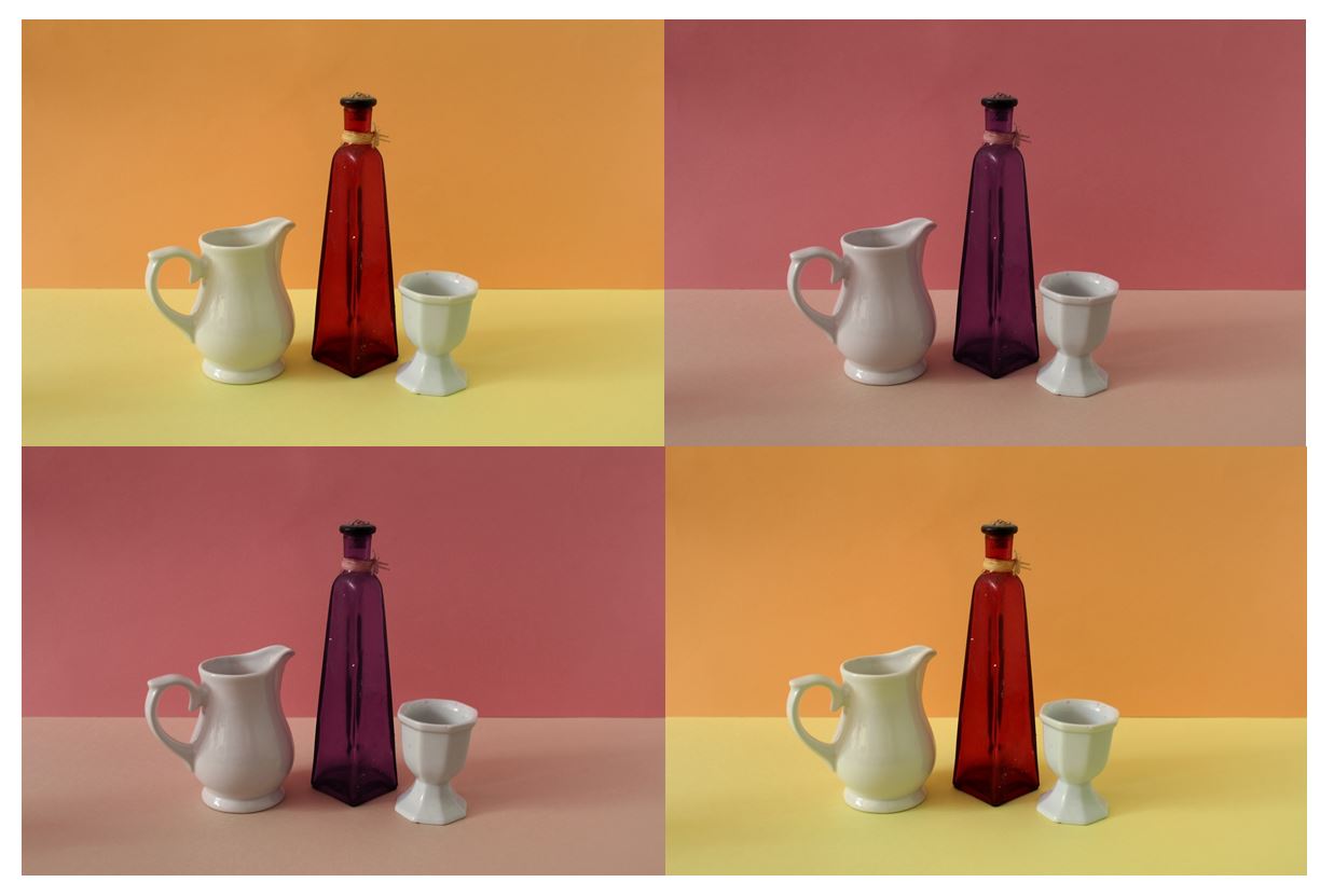
Experimentation: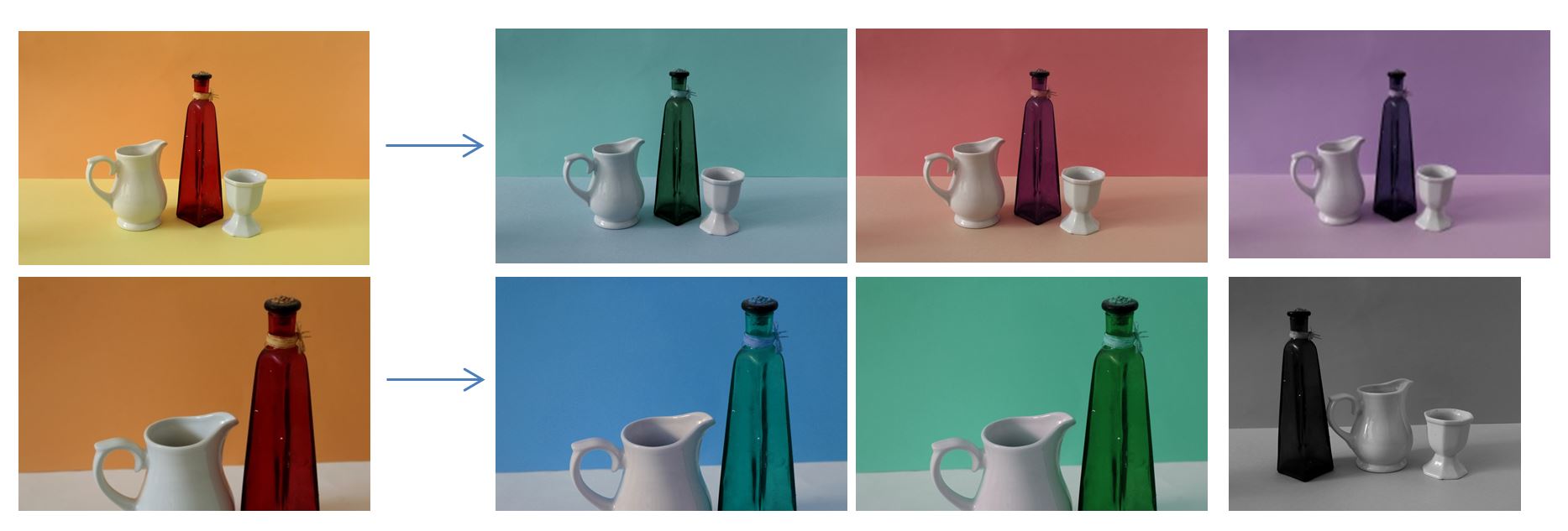 To edit and experiment with the original images i decided that the solid colors in the images could be easily change so i could see if warm or cool colours would look better. I adjusted the hue in photo shoot and change the colours on each of the images. The original images contained the warm colour orange, yellow , and red, wheres the best edited versions had blue and green changing the overall tone of the images from warm to cool.
Compare and Contrast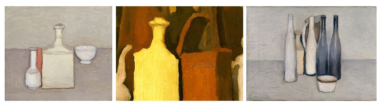
One similarity between mine and the artist Giorgio Morandi’s work is that we both looked at domestic household objects, presenting them simplistically with plain background and solid colours. Although his painting’s were simplistic they were detailed at the same time looking at the tone and textures of the objects he was painting. I also think i have achieved this in my photographs, for example I emaphasised the dark vertical lines going the the vase in the center of the image to create depth and show how the object is 3D. One difference between mine and Giorgio Morandi’s work is that where he uses neutral tones like cream, brown, oranges for his background and objects, I used bright bold colours. My original image had a bright yellow and orange background, but i edited so it’s blue in one image and green in the other. I did this as i think the bright colours emphasise the objects in the foreground. Another similarirty between mine and Giorgio Morand’s work is that in nearly every still life painting, he has a horizontal line creating a division through the center of the image, splitting it in half. I also tried to achieve this in my images, showing the contrast from the darker tones behind the objects and the lighter tone underneath. Creating this horizontal line adds more depth to the image as it make the set the objects are placed look 3D. If the background was only one colour than the image would look 2D.
Edits
To experiment with the presentation of my images and to start displaying images from all the photo shoots combined I explored different layouts and arrangements of the photos.
This first layout are images from my fourth photoshoot where i went to the Jersey museum and took photos in the style of Evan Walker. For this edit I focused in on smaller sections of the images and cropped them into square shapes so the overall layout would be square and symmetrical. Focusing in on certain sections of the original images. I did this as i liked the photos as single images but think more of a concert is formed when the are displayed together.
I also tried editing the images into different arrangements like horizontal and vertical rows seeing which ones looked the most aesthetically pleasing. I found that this worked less well that the display of 4 as the composition in each image is too similar but adding the fourth image balances it out, also making the overall display symmetrical and balanced.
The images shown below I have edited on photo shop so that the colour in each photo is different. I did this so I could display a selection of the same images together, rather than having a single image by itself. It also develops from the original image. I decided to edit bright colours rather than in the neutral tones that Giorgio Morandi used in hi paintings as I didn’t want to completely copy his style and wanted to make my photographs unique in some way.
I tried arranging the different coloured images in different layouts, repeating the same images more than once in different colours and also incorporating other images from the same photoshoot to gain a different perspective of the same setting. The bold, bright colours I have edited in emphasise the straight lines and geometrical shapes within the image, and also emphasise the objects in the foreground of the image . I found the images that worked best were the ones with the greatest contrast between the two colours in the background from dark to light as it creates a division across the image and adds another aspect, rather than the background being plain like the first part of that photoshoot.
Displaying my Prints:
For the images I printed out i wanted to display them as a collection of images together rather than single images by themselves. If these images were displayed separately I don’t think they would make sense, displaying them together gives the images a story. They also all link together though the brown and yellow tones in each image, giving the display as a whole an authentic and eclectic style. I decided on using a white background as it emphasises the yellow tones within the images and makes the photos seem brighter.
Global Warming Photoshoot
Photo shoot Plan
Genre / Artist – Surrealism
Concept – Capture images to reflect a sense of secrecy and display the environmental issues going on which people are unaware of, as well as using codes to portray this.
Location – Studio for portrait images and urban areas for the backdrops.
Shot type – Landscape and portraits with varied angle dependent on subject matter
Lighting – Natural Lighting for landscape shots and spot lights and reflectors for the studio portrait images.
Contact Sheet
Edits (Before Lightroom)
Edits (After Lightroom)
Analysis
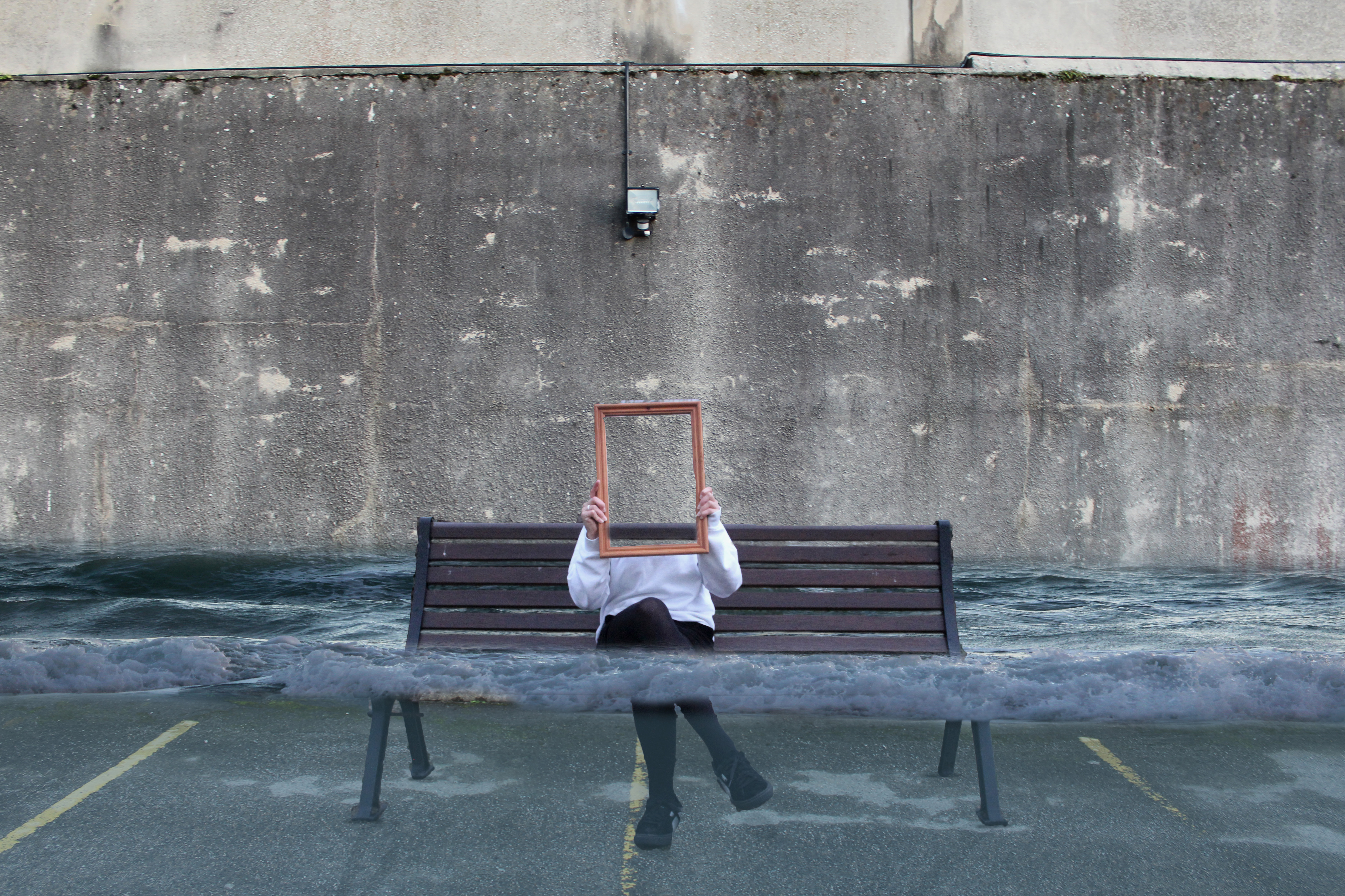
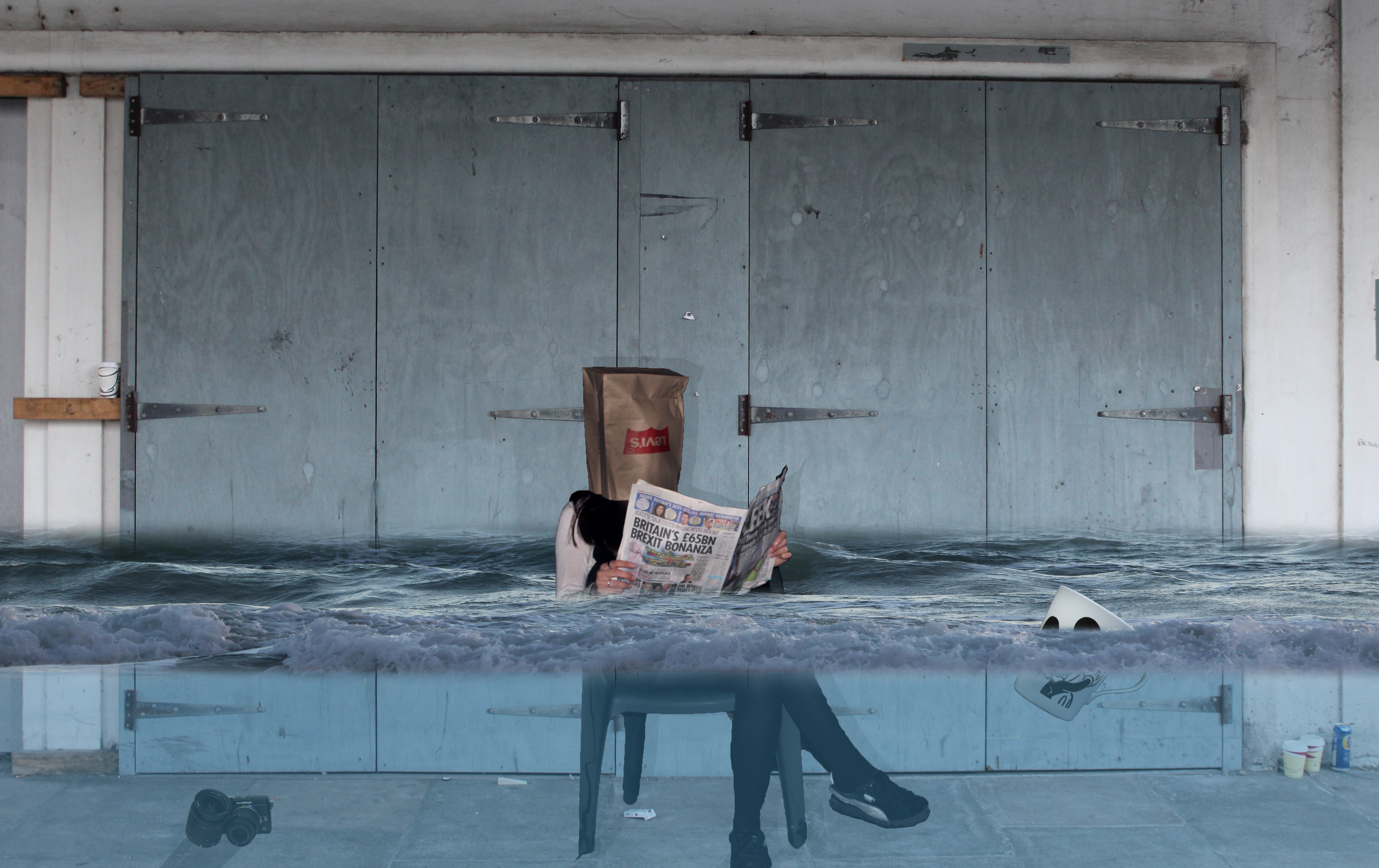
I believe these edits are strong in reflecting a sense of humanity’s destruction to the earth. I have used surrealism to emphasize the effects of global warming in which we inevitably are causing which contrasts with the political ideas from Donald Trump in which he believes climate change is not happening. These images therefore can be viewed as a response to Donald Trumps thoughts on climate change or simply a creative surrealist approach in raising awareness for humanities destruction on earth.
These image are split into 3 main sections, the top middle and bottom. The middle part is the main focus which contains the main subjects, thus being the person and the surface of the water. Where as the top and bottom contain some interesting textures and tones, this is not what stands out and catches the viewers eye immediately. There is a definite contrast within this image, with the black and whites exaggerated through the use of high clarity to create a more intense vibe. All the combined images have been taken using natural light which I believe helps to convey this idea that one day the world will look like this, and it will be ‘natural’.
These photos were taken in 2018, a time period at which global warming has been at its worst. Everyday more greenhouse gases are being let free into the air contributing to increasing temperatures and rising sea levels across earth. It is a known fact that sea levels are rising and it is as a result of humans. These images reflect this and bring awareness to these disasters through the use of exaggeration and surrealism that will get the viewers thinking about what life will be like if we continue to contribute to global warming in this way. It makes viewers consider social change in order to protect the environment. The images can also be viewed as a political response to Donald Trump saying that ‘climate change isn’t happening’.
In both images I have ensured to incorporate an emotional response to these environmental impacts that us humans have caused. Clearly in both images the persons face has been covered, in one she is hiding behind a mirror and in the other she has a bag over her head. This can connote that the person is ashamed that she has been part of the society that has contributed and lead to this disaster.
collections photoshoot
Photoshoot Shoot Plan
Concept: I am going to take photos inspired byJim Goldens collections work, this is his most popular work and has a very unique style. I want to create the same impact as his photos where the unique and intreeging items are shown
Location: I will take photos In front of a white infinity screen which I will make by draping a sheet over the sofa to make a curve and give the photos a clean and professional look.
Lighting: I will use natural lighting which will come in through a south facing skylight, this means the room will be very bright but not in direct sunlight.
Camera settings: I will use the manual setting on my camera so I can change the exposure and shutter speed depending on the lighting and the item I am photographing.
Props: I will need a plain white background and possibly a tri-pod to create a studio style setup. I will also need to gather the collections of items which tell a story about their owners passion and life.


Photoshoot-4

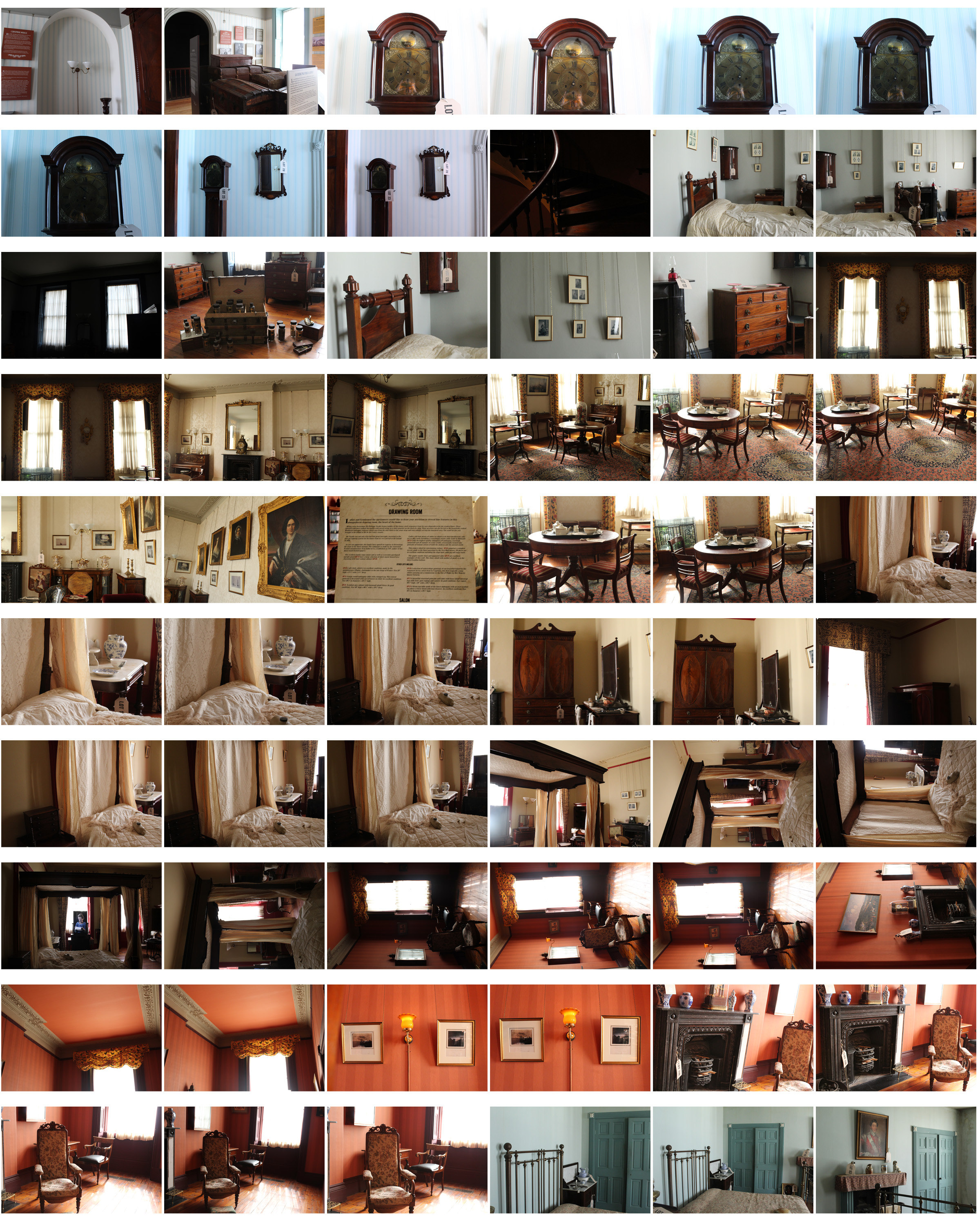
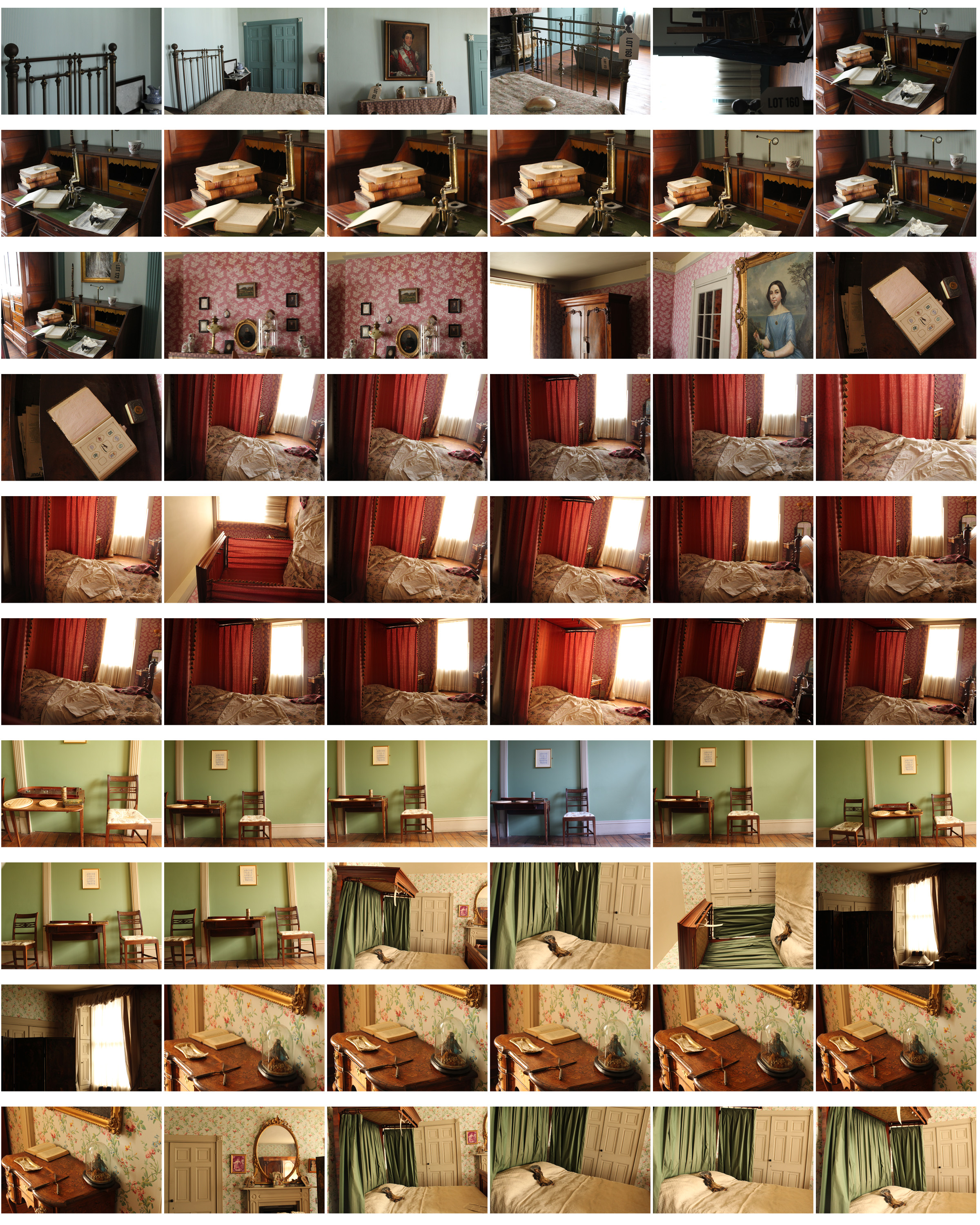
 For my fourth photoshoot I decided to go to the Jersey Museum and focus on the Merchant’s house, looking at the old furniture. I wanted to interpret Walker Evan’s photography, specifically the photos in his book ‘ Message from the interior’ where he pays particular attention that he pays to the inanimate objects that are present, almost representing them as characters themselves.
The Merchants house is a recreation of the home of Dr. Charles Ginestet, homeopathic doctor and political activist. The house was built in the English Georgian Style in 1818 by Philippe Nicolle, in what was then the red light district of St. Helier. It has been furnished to represent what it would have looked like in 1862.
Philipe Nicole was one of the most successful merchants pf his time with about 20 ships. He and his wife had 13 children but upon his death in 1836 the house was left to one of his daughters, Jeanne.
At the age of 47 Jeanne met Charles Ginestet who had been imprisoned in France for his political views and was recently widowed with three children to support. Within the year Jeanne married Charles who moved into the house with his children.
Technical
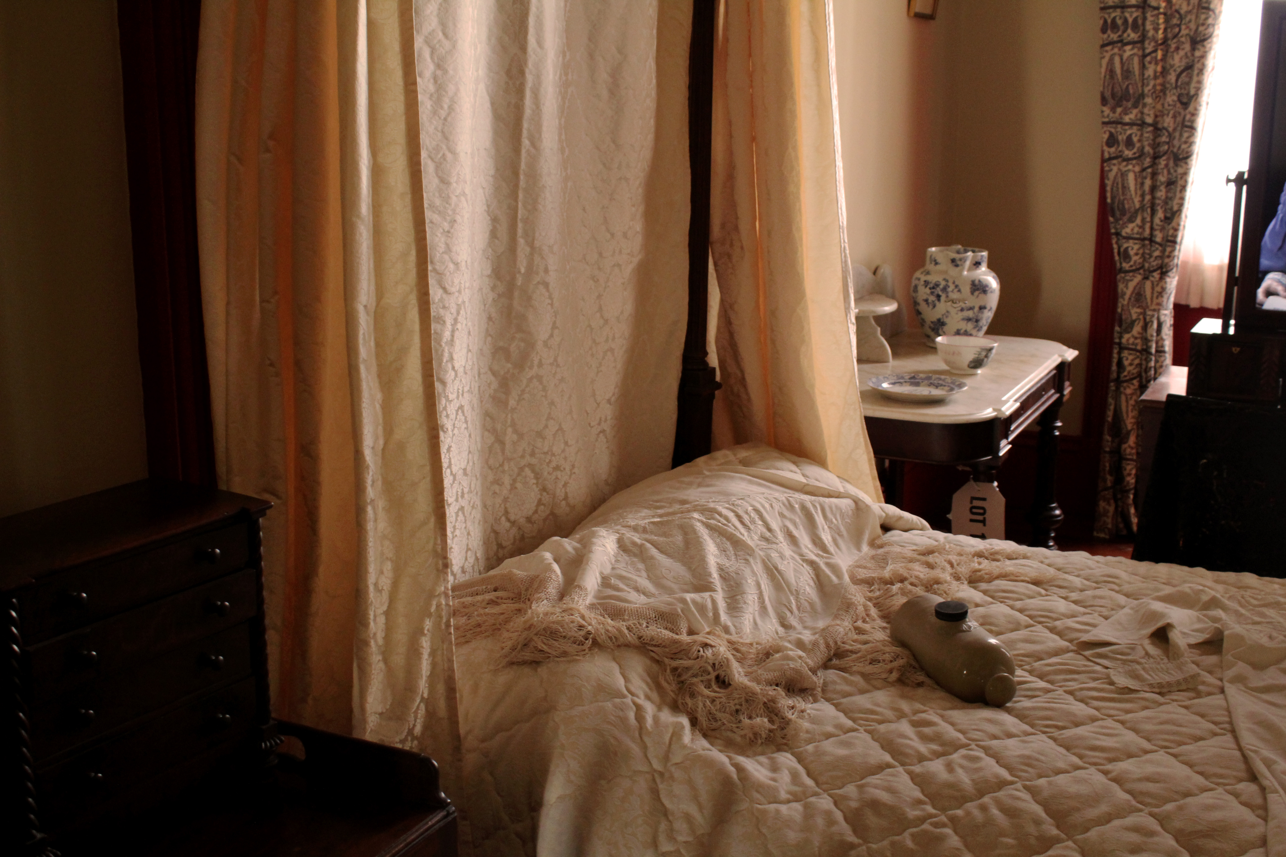
- The lighting used in this image is natural, the light coming from the window on the right. This gives the image a more authentic look as it doesn’t look manipulated or too intense. I used a fast shutter speed so there was no blur in my image.
- The angle this image was taken looks at the a four post bed from a sideways angle creating an interesting composition, rather than the image being taken from a front angle.
- This images ranges with dark brown tones to light ones, dark brown in the bottom left corner, which is then contrasted with the light bed sheets and canopies which have yellow and brown undertones.
Visual
- The lighting in this image creates light undertones, linking on with my other images from my project where the images look authentic and natural.
- I specifically wanted to photograph beds when i went to the merchants house as i wanted to interpret Walker Evan’s images of different beds in houses from the book ‘Message from the Interior’.
- The texture created by the material on the bed is what i focused on when taking the photo which gives the image depth and adds more detail. There’s a contrast in patterns made by different materials on and around the bed, e.g the checked pattern on the bed sheet, compared to the texture of the blanket on top and the pattern on the canopies on the four posts.
- This image depicts what a bedroom was like 1860, the appearance of the bed looks like a person has just slept in it and the casual placing of the furniture and the ornaments surrounding the bed giving the appearance of a natural setting rather than a staged one. This makes it easy for the audience to imagine that the image was taken in 1860.
Contextual
- The image is taken of a recreation of a bedroom from the 1860’s in the Merchant’s house.
- I took these images of the recreation of bedrooms and rooms in the 1800’s as i wanted to show what life was like then and show how conventions have stayed the same and some have changed. E.g some aspects like furniture have stayed similar, but the conventions of how we live have changed from the 1800’s to now.
Conceptual
- I wanted to take photos of furniture from a house in the 1880’s to link to my projects theme of how conventional objects and furniture have history and stories connected to them.
- The objects and furniture shown in these images create the impression that someone still uses them based of the casual appearance the settings give.
- This links to Walker Evan’s images where he pays particular attention to the inanimate objects that are present, almost representing them as characters themselves, also representing absence and the passage of time.
- My images show furniture and rooms like someone is living and using the furniture, but there aren’t any people, also representing, like Walker Evan, absence and the passage of time.
Rooms shown in the pictures:
Anne Nicolle’s bedroom:
- Her room is decorated in red, reflecting her family’s association with the Rose party.
- Gas lighting was installed in the 1830’s but paraffin lamps and candles were still used.
- Her was an ‘Albert’ with a partial canopy curtained for privacy and warmth and four posts.
Sydney Nicolle’s bedroom:
- His father (Jeanne’s brother) died and his mother remarried and movies to England, too he stay in Jersey and lived with his aunt Jeanne.
- His room was very simply furnished with a brass bed and various Militia items- uniform and sword.
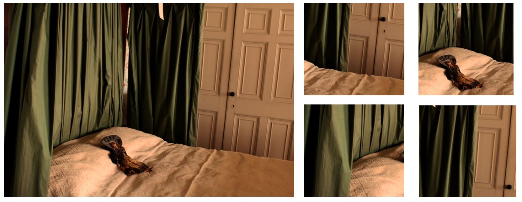
Berthe and Alice Ginestet’s Bedroom:
- They shared the albert bed for warmth, and it was unusual for everyone to have their own bedroom in 1862.
- The room is typically floral with French wallpaper, drapes and privacy screen
Schoolroom
- Education in 1862 was not compulsory but those wealthy enough employed a governess to educate their children at home.
- Toys were designed for an educational purpose or to develop skills to take you into adult life.
- In a horse drawn society, a young boy would need to know how to ride a horse which is what the rocking horse was for.
- Jigsaws orientated from cutting out maps and scenes and fitting them back together, and the cup and ball encouraged hand/eye coordination and was known to be played by Queen Victoria.
- Children’s clothes did not exist before 1860 an they wore cut down versions of adult clothes i.e. sailor suits.
The flooring throughout the house is mahogany, imported from South America on board one of Nicolle’s ships. The floors were caulked with tarred string, like the deck of the ship. Victorians liked to show off their wealth, particularly if they were ‘new money’. The clothes they wore and the buildings they lived in demonstrated this. Paintings were often displayed in the hallways indicating the occupant’s wealth and status because this is where the guests were received.
I edited some of the images from the photoshoot black and white to better interpret Walker Evan’s work and displayed them above. Below I have shown some of his photography to compare our images. I think I successfully interpreted his work paying particular attention to the inanimate objects that are present, almost representing them as characters themselves. I think the images I took represent the passage of time and absence, showing furniture and beds of people in the 1860’s, but the absence of people in the images show the history and how a conventional objects within a house can have more meaning than the purpose of what it was built for. In one of Walker Evan’s images shown below it displays a bed where it is clear someone is living in it as the bed is unmade like someone has just slept in it, which is also what I think i showed in my images. One difference between mine and Walker Evan’s images are that my images are of settings recreated of the 1860’s, whereas his images are actually depicting the 1960’s, time he was living in.