
Monthly Archives: May 2018
Filters
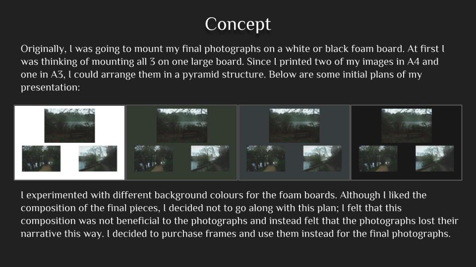


Secrets, Codes and Conventions – Critique
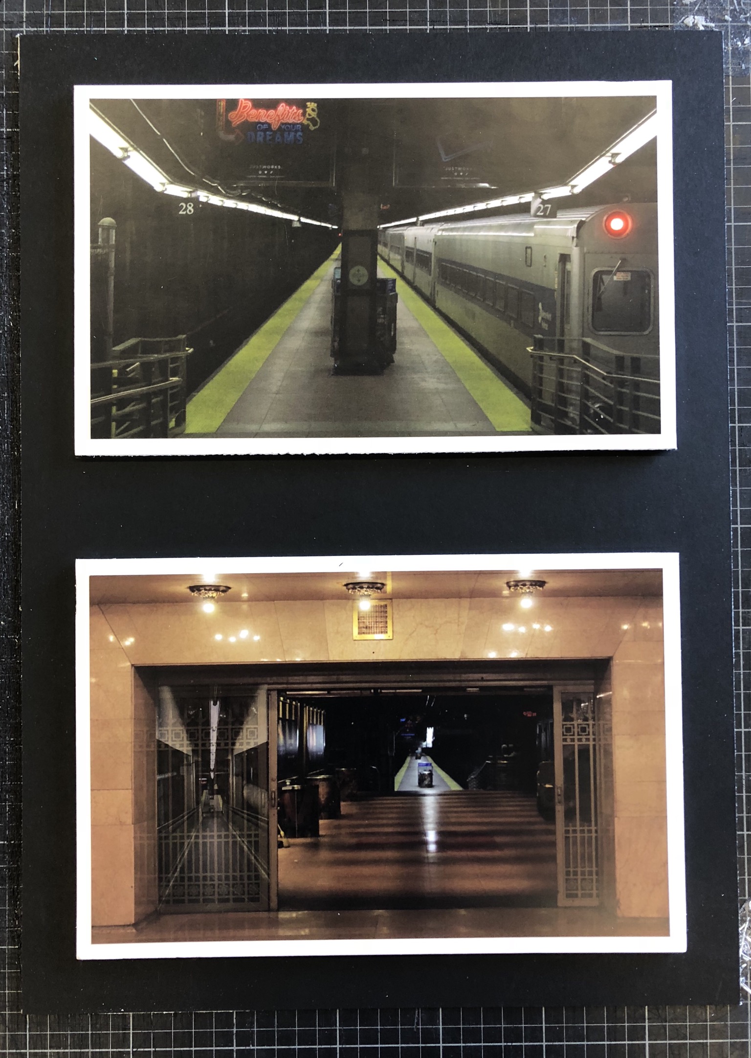
Above is my final set of photographs presented on white foam board and then on black mount board in order to provide a nice border for the photographs and to create more contrast within the photographs.
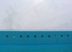
My main goal when I set out on this project was to explore the theme of secrets, more specifically the secrets within both man-made and natural habitats. I think that I have achieved this and shown this thoroughly throughout my work as I have explored natural structures such as caves, nature, abandoned man-made structures and constantly used man-made structures in New York. This set of photographs that I have chosen to present shows inspiration from the photographer Gregory Berg as I used the setting of the New York underground and captured it as if it was deserted – which it is quite the opposite of. This showed the exploration within the underground and how it can vary from being packed with people to having no people around, whilst this is going on there is a whole other world walking around above this. This tucking away of the underground introduces lots of interesting characters in the subways which people native to large cities would not normally see, and this exploration shows secrets of the city and the underground.
I think that I have achieved my goal throughout this project quite well but could improve it further by possibly attempting to recreate the final photographs in a busy area of the subway in order to provide contrast between images and more contrast between my photographs and Gregory Berg’s work. Another way that I could’ve achieved my goal further would be by looking at other areas within New York such as the less well-off areas in order to shine some light on how differently people live as we are so sheltered in Jersey.
Final Images and Presentation Ideas
Final Image selection

I have decided that for my that I will present all of my on the same level as i think that are all of the same stander and that the focus should be on all of the images equally.I have printed all of these images at the size of A4, i think that they are all complementary to each other and have a clear directive theme through out them
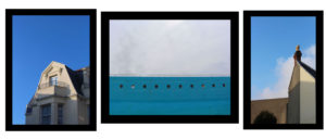
Final Layout Choice
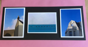
I decided to keep the final layout design very similar to what i had thought about previously , I did experiment with the overall layout choice through out the day,but i think that with more experimentation with different sizes of images the presentation would have been more interesting. But Icame to the decision that the most effective look was have images mounted on a a white foam board and then stuck onto a contrasting black colour card board. I took the two images on the outside in the shoot that i did of the area surrounding my house, whereas the middle images is from the shoot that i did down at Harve De Par. Overall I think that this small and clear presentation works well in the predestination and that the overall composition for the final sets works well to highlight the thinking themes of secrets,codes and conventions. Because i was focusing on minimalism for the inspiration of the project. By having this simplest design it helps to reinforce and highlight these areas in my work. One thing that I think would have improved the overall presentation of the composition, would have been if I had printed the landscape image to a bigger size as there is a lot of dead space around that area and it looks slightly out of place.
ESA AS EXAM
Photoshoot


The Editing Process
The first thing that I did when i began to edit my images was to increase the overall brightness, as i wanted the colour of the sky to stand out. I also then increased the levels of saturation to makes the colours in the images stand out more. A in abstract images the colours are one of the main stand out features
I then selected the spot healing brush tool. as I wanted the remove the bushes at the bottom of the frame, by doing this the image the mage a overall minimalist look too it which is what I wanted to achieve.
![]()

Finally I copped the image as there was natural line that had been formed and by cropping the image, it made the overall look of the image more aesthetically pleasing which is what i have wanted to achieve, as when studying Grant Hamilton this was an aspect of his work that I wanted to incorporate into my work.

Final Outcome – Prints (Presentation 1 of 2)
FINAL PRINTS
This post covers my final outcomes which i have decided I would like as prints and how I will present them. My following post to this will be looking at the light-box part of my final presentation. For my final prints I wanted to have a balance between white and black backgrounds of the images which I choose.
I have chosen this image as a final print as I believe it is very striking but with a large amount of detail. As a viewer your eyes don’t stop moving with this image because there is so much going on within the image. Although this could be seen as a negative aspect I believe it is successful due to the style of image which i have been wishing to produce throughout this project.


With the two above images I have decided to have them printed as i believe they are very successful pieces in terms of their balance of colours, shapes and text. Also the subjects/objects really stand out on top of the white background in order to create a very striking visual.
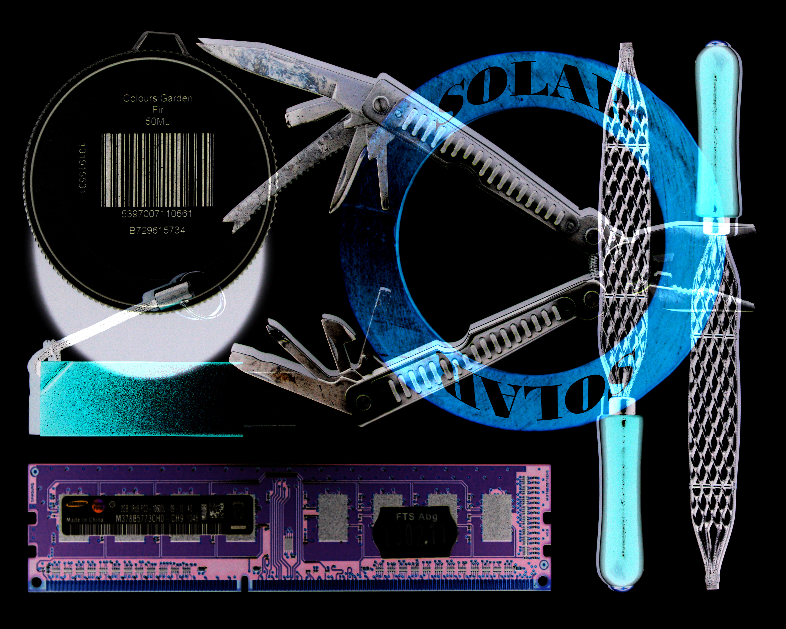


The three above images I believe are successful in terms of how they display layers and hidden elements. Hidden (secret) being something I have wanted to explore since the beginning of the project.
As I am also using a light-box as the main part of my presentation, I want to display my prints in a simple and minimal way. I will do this by putting each print individually onto a trimmed piece of foam-board and then place these pieces onto white mounting board. Here is the layout of how I plan to display these prints…

Johnathan Ducruix experimentation
Experimentation
Image I am planning on replicating.

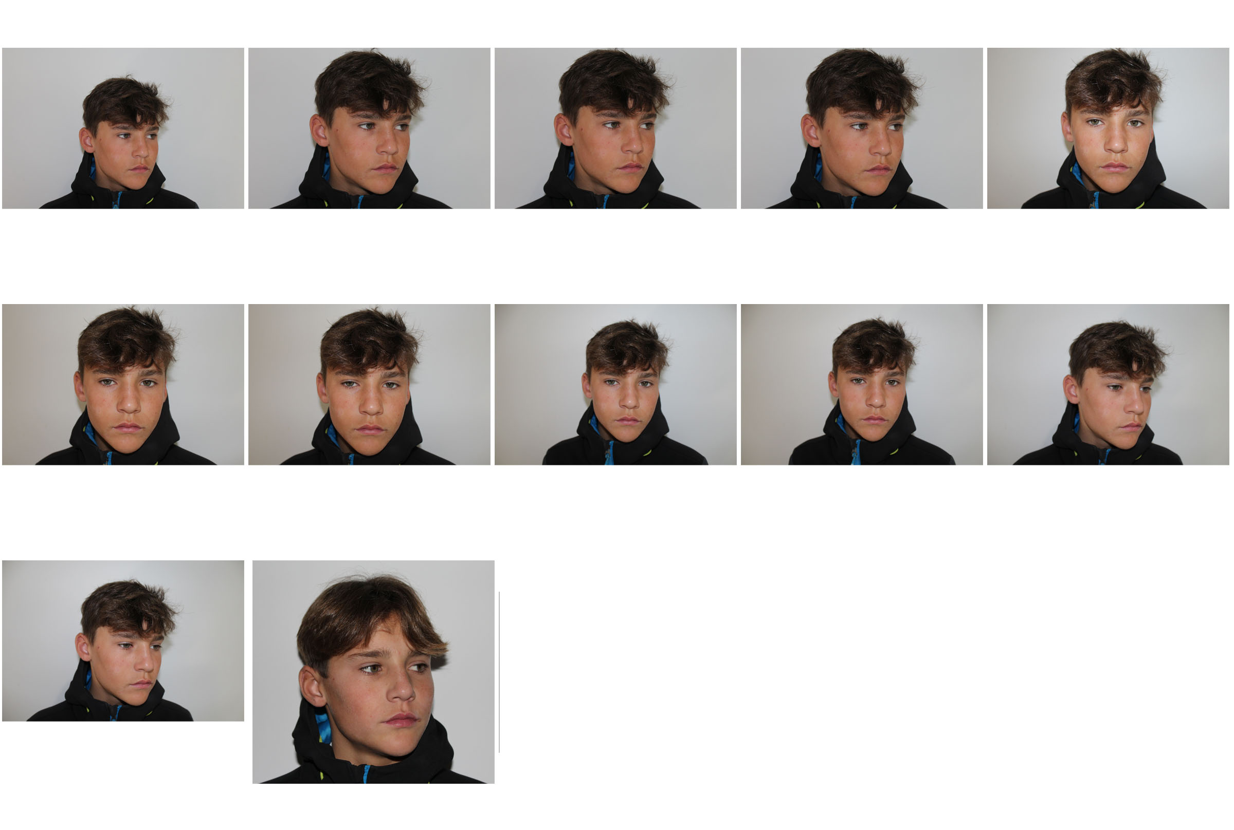
Contact sheet

My interpretations


Further Experimentation / Black and white


Creating an image in the style of Johnathan Ducruix
Original image

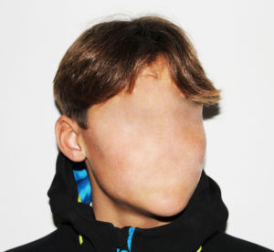
To begin with, I cropped the image as the chosen image had too much unnecessary background space.

Once cropped, I used the healing tool to remove the facial features.


Once I was happy with the image I then moved on to changing the brightness and contrast and then converting it into black and white for further experimentation.

Final image – Colour

Further Experimentation final image – Black and White

JONATHAN DUCRUIX
Who is Jonathan Ducruix?
Jonathan Ducruix is a digital artist who goes by the name Me&Edward. Ducruix has a diploma in 2D and 3D computer graphics. He has always been attracted to the world of fashion and design which is clear in his work. Ducruix says that he has a more spontaneous style of work – when he has a specific idea in mind he will work on it right away. His impulsive projects are often the ones that satisfy him the most. The name ‘Me&Edward’ comes from the fact that he wanted to separate the I – as a photographer from the I – as a human being.
Examples of Jonathan’s work


Photo analysis of one of Jonathan’s pieces
A neutral skin-colour range was used for the colour pallet for the cover up of the models facial features. This natural colour contrasts with the unnatural subject of the photograph. The use of the light and dark aspects in this photograph varying from the shine on the face to the shadow on his throat creates a strong contrast in the photograph. There is a smooth texture throughout the photograph this adds a sense of confusion to the image.
The shadows and position of the model creates a 3D effect to bring the supernatural looking subject to life. The subject appears to be placed in the middle of the photograph this creates an uneasy atmosphere in the photograph.
It is clear that studio lighting was used when taking this photograph from the artificial looking tones on the models body. It appears that a quick shutter speed was used due to the image not being too dark and it being completely in focus and sharp. A low ISO will have been used as it is a photo in a studio, Ducruix will have used a low ISO to balance the overexposure from the shutter speed to keep the image very high quality. It appears that a neutral/warm colour cast has been used on this photograph.
This is an image I am going to try replicate as I think there are a number of different way I will be able to create this image in the same style Jonathan has done.
Richard Billingham
Richard Billingham is an English photographer, his work has mostly concerned his family. He came to prominence through his candid photography of his family in Cradley Heath, a body of work later added to and published in the acclaimed book Ray's A Laugh (1996). Ray's a Laugh is a portrayal of the poverty and deprivation in which he grew up. Billingham chose to use the cheapest film and development he could find. Ray, his father, and his mother Liz, appear at first glance as grotesque figures, with the alcoholic father drunk on his home brew, and the mother, an obese chain smoker with an apparent fascination for nicknacks and jigsaw puzzles. However, there is such integrity in this work that Ray and Liz ultimately shine through as troubled yet deeply human and touching personalities.

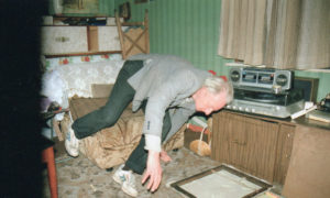


"The pictures shown here are of my father Raymond (born 1931): my mother Elisabeth (born 1950) and my brother Jason (born 1977). Ray is a chronic alcoholic and has drunk for as long as I can remember. He has not worked since he was mode redundant from his job as a machinist around 1980. Liz very rarely drinks but she does smoke a lot of cigarettes. My younger brother still does not seem to know what he wants: he gets a job for or week or two and then leaves it. I think he is very lazy. I started using a camera about six years ago. I felt I needed some kind of reference material for my paintings as it is quite difficult to get people to give their time to pose for you. I was still living with my dad at the time. Ray stopped in his room almost constantly drinking and sleeping. If he went outside he become ill. He drank to get to sleep. He had a friend from a neighbouring towerblock -himself an alcoholic -  who came around to make strong home-brew for him. This was much cheaper than 'buying' alcohol and meant that Ray didn't have to venture outside to the off-licence. He kept the home-brew bucket by the side of his bed for convenience and drank from a plastic jug that he would dip into the brew. It tasted as bad as it looked but it must hove nourished him somehow because he otherwise never ate. Liz wasn't living with us then: she had left due to Roy's incessant drinking and moaning. She seldom visited. This was all quite sad and I wanted to make paintings about it that were very moving: that would express the tragedy of it all. When I printed up those photographs (I worked in black-and-white then because it was cheaper than colour) I was apprehensive about letting on to anybody about who they were of for fear of becoming unpopular with the other students who were, I believe, all from much more financially and spiritually secure family backgrounds. I was fairly introvert as a teenager because I had always been somewhat embarrassed about the state of my family. Yet after a few months at college I realised that by letting students and, especially, tutors know who the paintings and photographs were really of I could come clean about the family history and hence relate to people naturally. This was quite a load off me and since then I think l've been taking pictures of my close family not just as reference for paintings but also as on attempt to comprehend myself and them more fully. I have done very little painting since graduating partly because of a lack of funds for studio space and partly because I has a supermarket job stacking shelves. Instead, I worked on the book 'Ray's a Laugh’ which was published in April. My parents and brother are very happy with the book. Neither I nor they ore shocked by its directness because we're all well-enough acquainted with having to live with poverty. After all, there are millions of other people in Britain living similarly… It is certainly not my intention to shock, to offend, sensationalise, be political or whatever. Only to make work that is as spiritually meaningful as I can make it. Whatever the medium.”

Richard Billingham, May 1996
http://www.saatchigallery.com/artists/richard_billingham.htm