Presentation methods

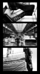
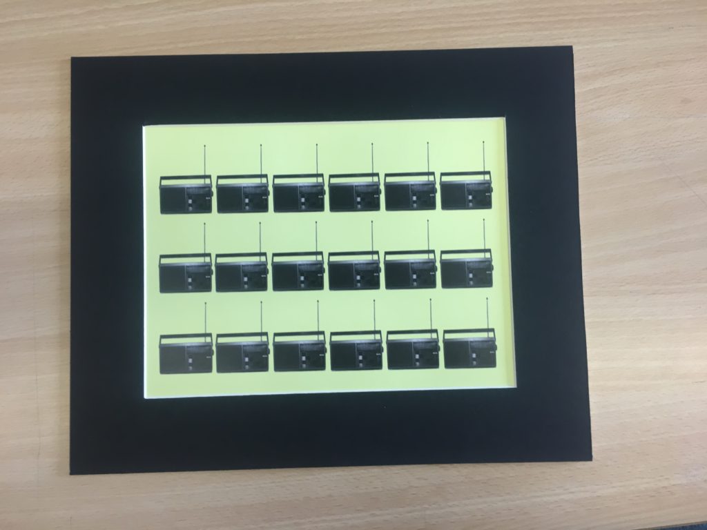
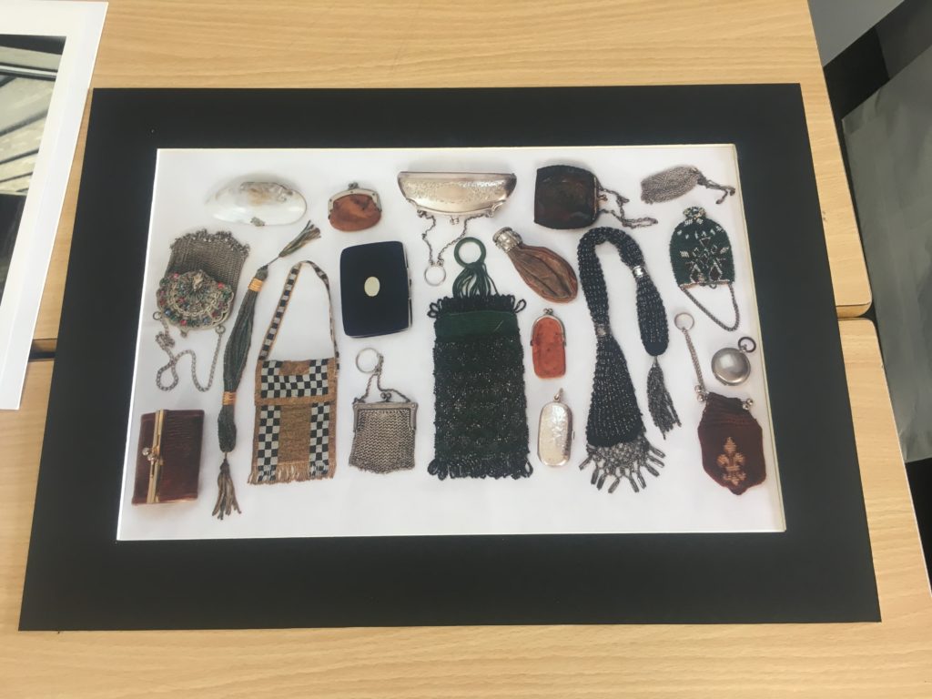
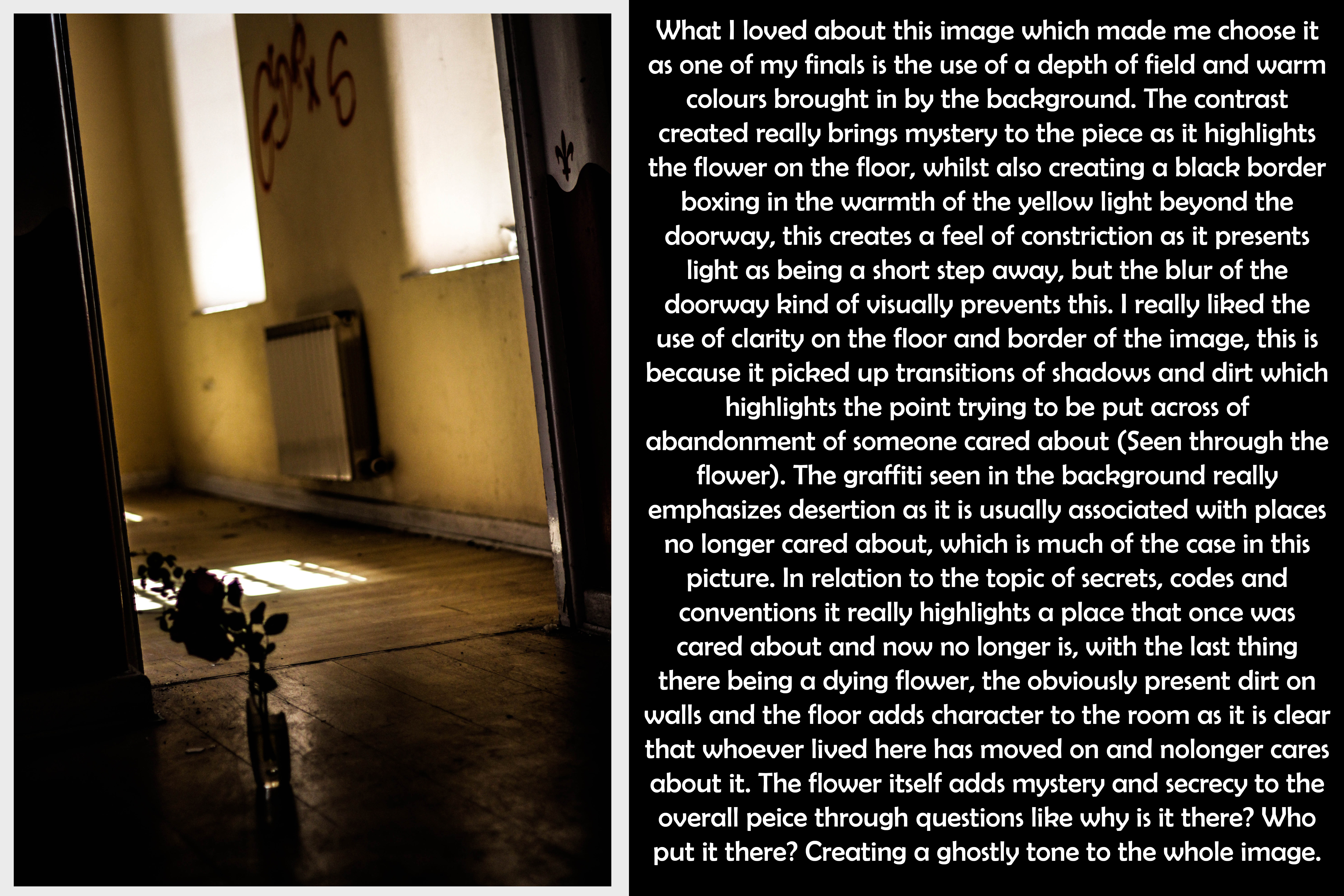
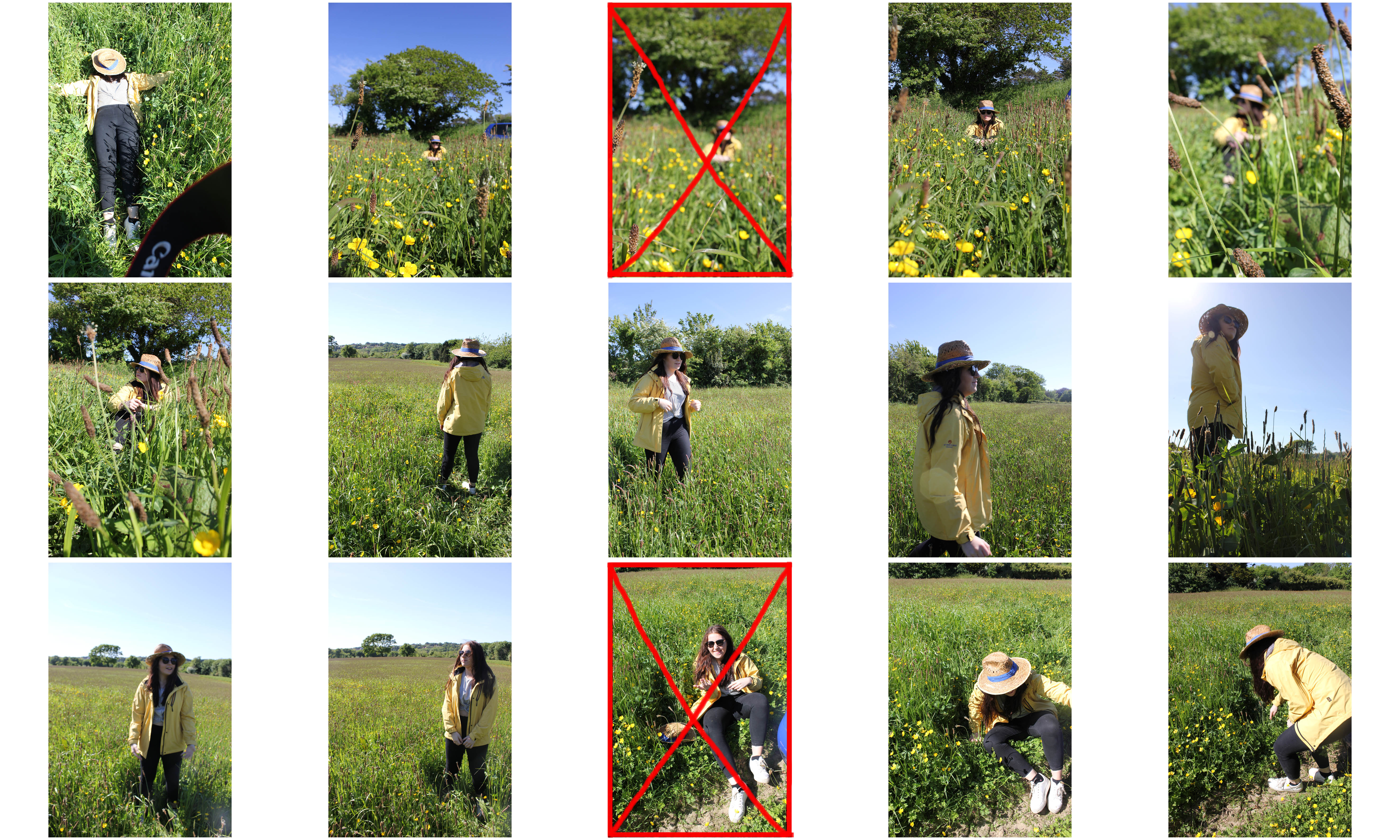
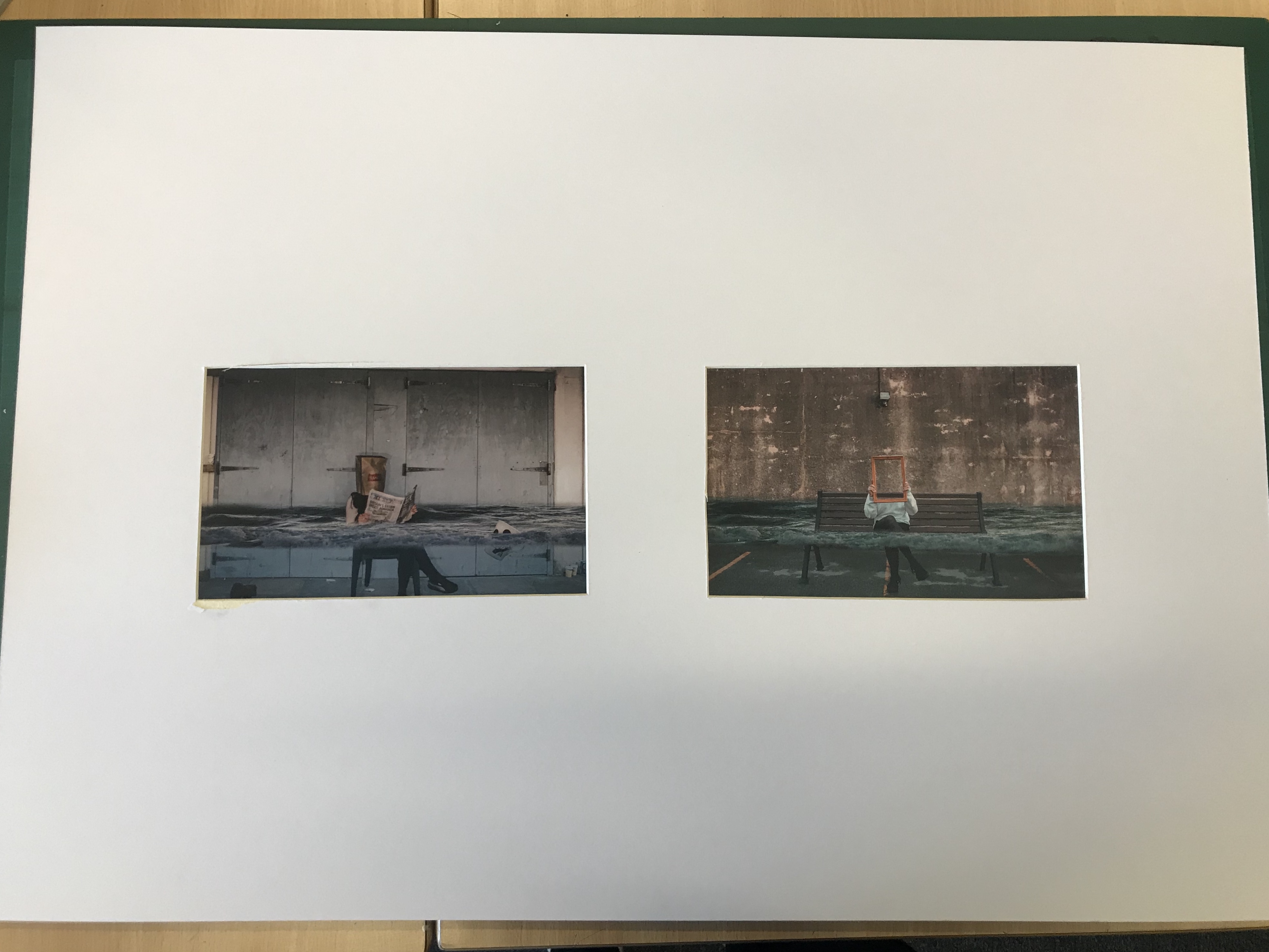
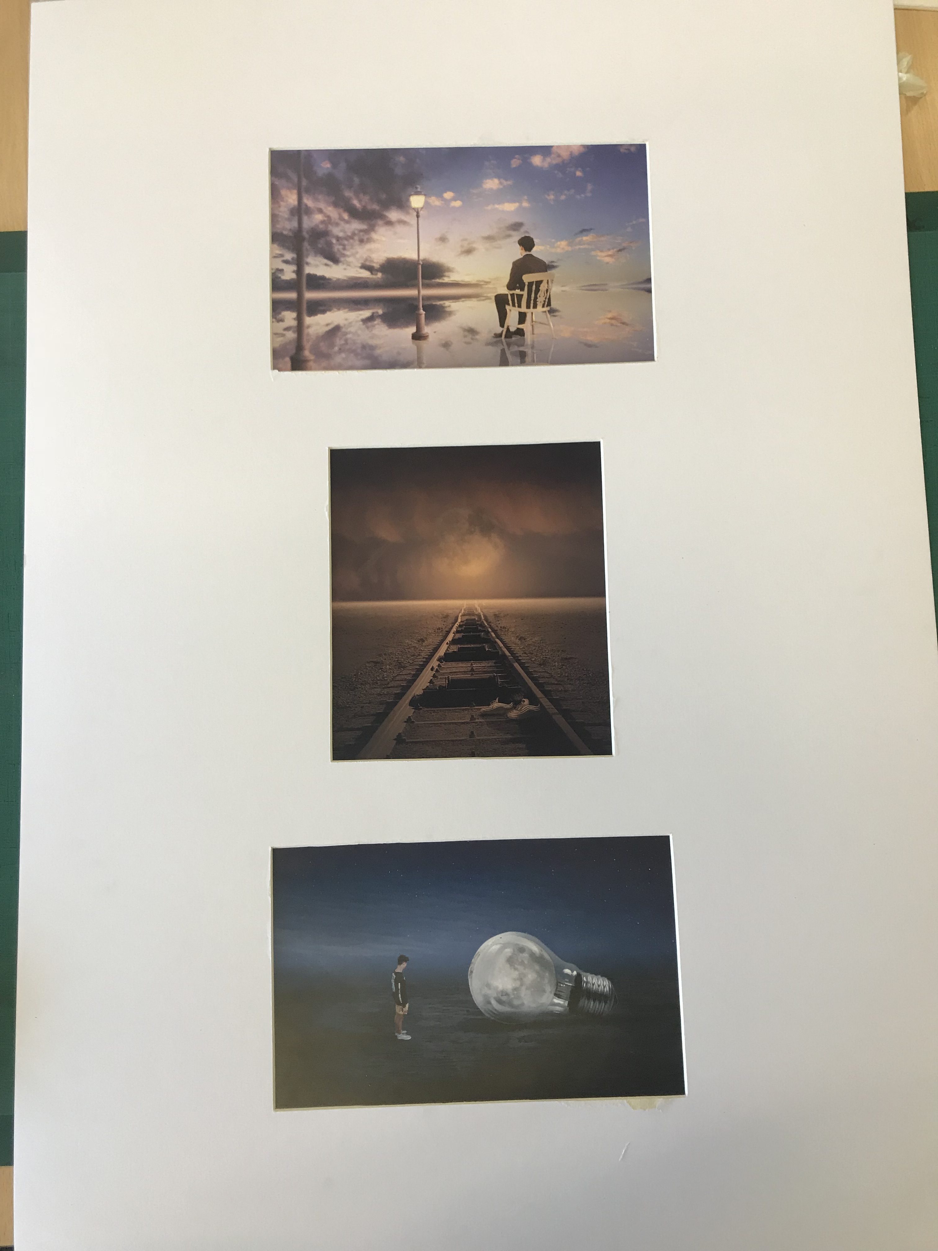
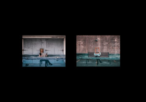
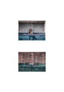
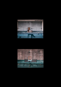
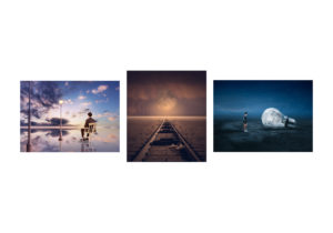
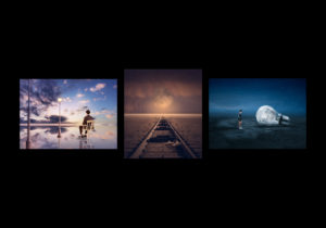
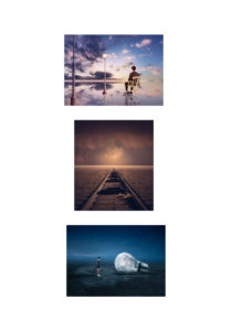
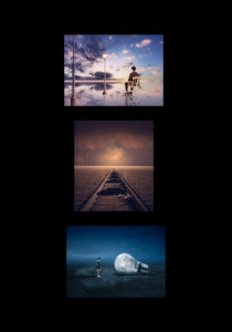
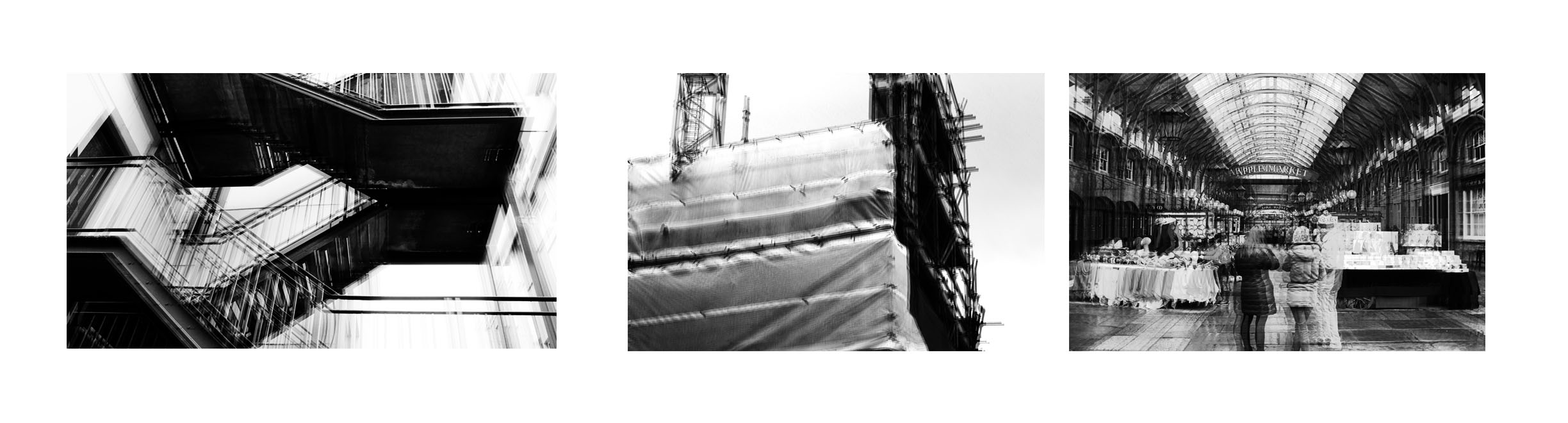
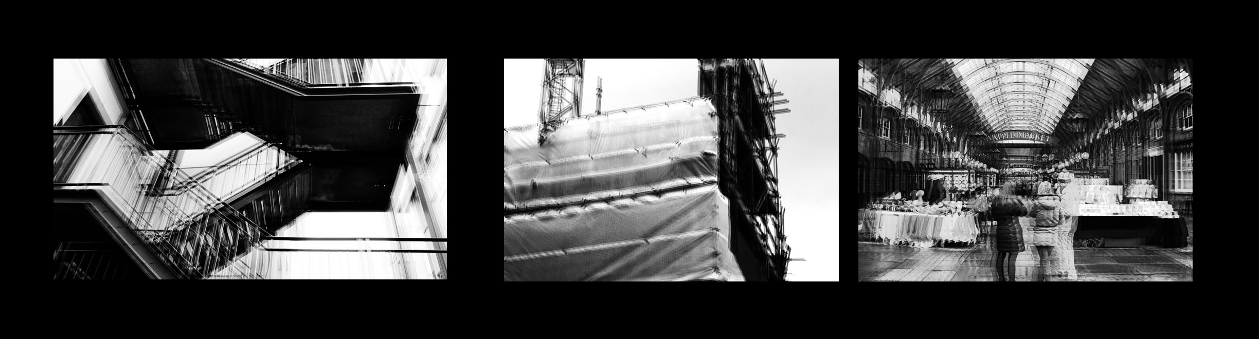
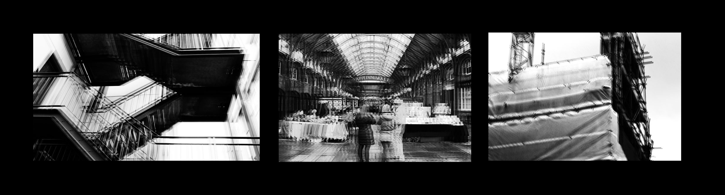
I had a number of different ways I wanted to present my work. I wanted to display my images either horizontally or vertically, like shown below. The reason for this is because I thought it would clearly and neatly display my images in a presentable way that would allow them to stand out. I finally decided on displaying my images vertically as I though that would be the neatest way for this specific set of images to be displayed. As the images where in black and white I then had the decision of displaying them on white or black card. The set of images that I had chosen had a lot of white patches which made me single out the white background as it didn’t really allow them to stand out. However, on black card the images really stood out in comparison. Furthermore, the black background and the images created a strong contrast which contributed to them standing out more. The layout of the images was chosen by the first image which I thought was the strongest image. The image with the people at the front, I thought, was the odd one out in this group of images which is why I placed it in the middle. This decision allowed me to separate the two man made images with some urban landscape. When displaying them I Created  window mounts for the images as I thought this was the strongest way of displaying them and I thought it reflected my final images clearly.

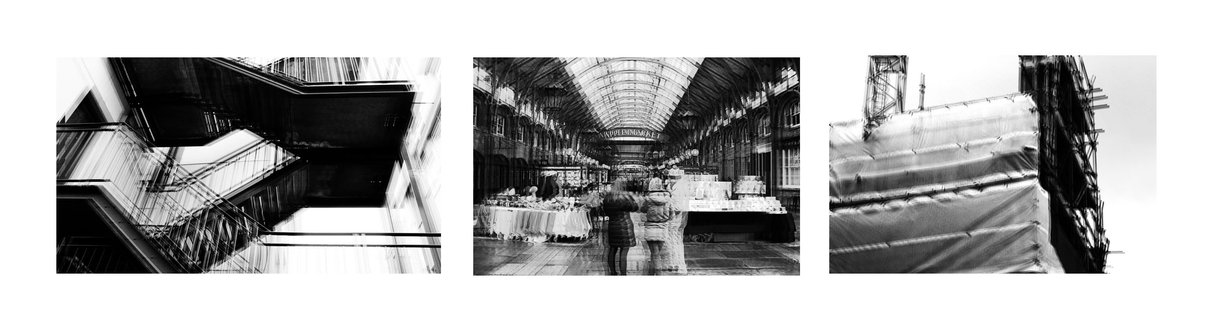
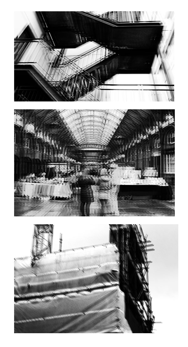
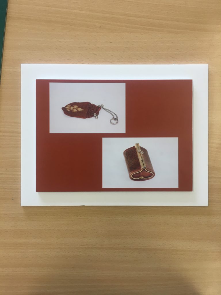
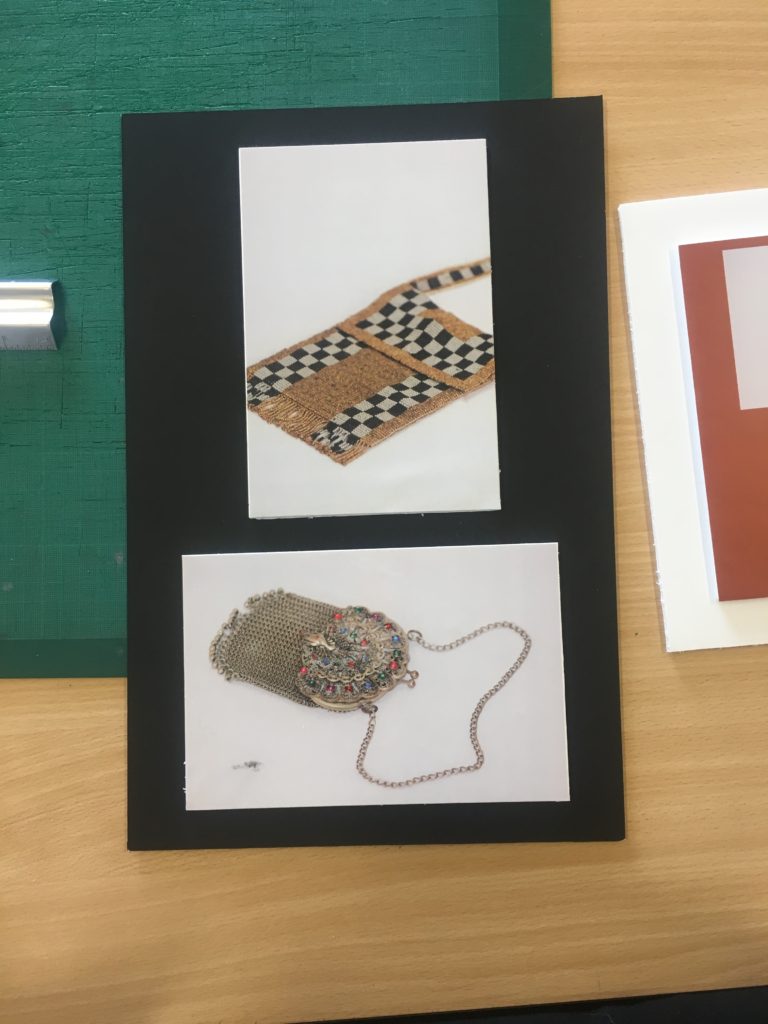
This was my final outcome.


Richard Billingham response

My response to Richard Billingham
In response to Richard Billingham I decided to document my grandparents, the main focus being my grandmother who has Alzheimer's, I wanted to show the difficulties for someone who has Alzheimer's and also the effect it has on the people around them, in this case my grandfather who looks after her. My intention was to try and capture candid moments of their everyday life to show how Alzheimer's takes away memory of people and places, by capturing the constant surprised and dazed look of my grandmother who can see me taking her photo but does no necessarily know who i am or what i'm really doing, but also everyday functions such as eating, speaking and walking, as you can see in the photos she spends most of her day lying in bed because she simply doesn't know how to do anything else anymore.
These are a few of the images that I selected from my shoot as i think they best represent my intention.

Planning and Selection for Final Image

When selecting photos and planning  for my final presentation I have been looking at how Miyako Ishiuchi (my original artist reference) displayed her work. The photos in the Frida series were taken for a catalog which we can see bellow.

I like how minimal the layout is with no writing or patterns taking away from the impact of the image. The background surrounding the photo is white which brings out the rich colours in the silk. the background in the actual photograph is an off white colour and has shadowed areas, if the photo was displayed without a pure white boarder we might not notice these small details. These two images were selected to be placed together because they both display the different parts of the same item.

The photographs in the last two images have been displayed in white frames and hung on walls in different arrangements. Again they have been displayed in a very minimal way to keep a focus on the colour in the image. I love how the yellow background in the second display matches the colour in the image perfectly and brings the two frames together. I took inspiration from this for my own edits and used the eyedropper tool to sample the colours in the image onto the background.

Final Images:

I took these two images of coin purses from the same shoot and chose to arrange them together as a set. Both the photos have a very similar colour schemes and I wanted to use this to link them together. I used the eye drop tool to select a red/ brown colour which matched both photos and made a new page, filling it with the selected colour. I then dragged the images onto the page and arranged them so that there was negative space in between filled with the colour.

I will cut out and glue these two photographs on to white foam board because I want the colours to stand out on their own, I also think this will give them the clean minimal look i was going for.

I chose these four photos of old coin purses for my final images because i think they show how how my ideas have developed through the project and display what i have learnt from studying my chosen photographers. The link to the theme of secrets, codes and conventions due to the  museum style and unknown history in the items I have photographed. I wanted the photos to display what the antiques look like in real life and show their imperfections rather than re touching them to look perfect.

Another photo I have chosen to print is this one of a radio repeated multiple ties on a yellow background, again this shows an old item which has a story and a secret however also links to the theme of code in the way signals are transmitted to radios. I want to frame this image in a black window mount which will compliment the black parts of them image.

Final Outcomes

For my final images I gathered together the best photos I had taken from each shoot to compare with each other, by comparing analysis with each one it would really allow me to understand the reason for each ones success. At the same time as I analyse these images I have sent out nine of my favorite images to be printed so that I can present them in the way I want. Here are my choices for my top five pictures:   

My Responses to Richard Tuschman and Edward Hopper

Photoshoot Plan:

Concept:Isolation
Location:A field with tall grass to give an overwhelming effect that the subject is surrounded yet alone
Lighting:Natural Lighting, however depends on weather
Camera Settings: Usual Camera settings
Props: A hat similar to the one featured in Edward Hopper's "Jo sketching at Good Harbor Beach"

I first decided to not use the images that featured the subject smiling as many of Hopper’s paintings depict a person alone and I also wanted to present this feeling of isolation.

Richard Tuschman | Edward Hopper

Richard Tuschman began experimenting with digital imaging in the early 1990s, developing a style that synthesized his interests in photography, painting and assemblage. Tuschman holds a BFA from the University of Michigan in Ann arbor, and has been exhibited widely, both in the US and internationally. His photographs have been published on numerous online magazines/journals including Slate, LensCulture, LensScratch and Huffington Post. Tuschman lives and works in New York City.

Hopper Meditations is a photographic response to the work of the American painter, Edward Hopper. Richard Tuschman originally began by basing each work on a specific Hopper painting however progressed to create his own compositions inspired more by Hopper’s style and vision.

Tuschman created his own sets by digitally marrying dollhouse-size dioramas with live models.  A lot of the furniture is standard dollhouse furniture, but he also made some himself. He photographed his models separately and photoshopped them into the scene.

Image Analysis

-The natural lighting in Hopper’s Painting is shown coming  from a window, Tuschman recreates this with his own made set. The images have an overall quiet narrative presented by the emotional states of the models in both images. Richard Tuschman manages to heighten this feeling using dramatic lighting to create shadows around the model. However, Tuschman imagines the lighting almost as another character that echoes and evokes the inner life of the woman on the bed in comparison to Hopper who uses his lighting more harshly.

-The interior of the room has a cold temperature in comparison to outside the window which appears warmer, showing that isolation can be felt within.

-The woman in the painting, modeled after Hopper’s wife, Jo, faces the sun impassively and seemingly lost in thought. Her visible right eye appears sightless, emphasizing her isolation. The bare wall and the elevation of the room above the street also suggest the bleakness and solitude of impersonal urban life.


Final Piece Evaluation


My final piece shows a collection of visual research about humanity’s impact on earth and digital manipulation photography which I have done in order to reach my final piece. I was trying to capture a sense of how our earth is changing by highlighting disasters such as rising sea levels and light pollution. This links to one of my artist studies, Thomas Barbey. He try’s to capture images which show two negatives within society and some which give an indication of our earth being ruined. He mainly uses black and white, which is the same as another artist reference i used, Tommy Ingberg. In contrast, my images display this idea of our earth being ruined with bright colors to attract the viewer. Similar to Tommy Ingbergs photos my final piece relates to how the people in my image could be feeling. For example, the concept of the top final piece is that our sea levels are rising and the person within the image is hiding from the camera suggesting she is ashamed to be part of society which has caused this.

The exploration of secrecy within my final piece is clearly shown by raising awareness of these environmental impacts that some people do not know about therefore they are secret to them. I used codes throughout my images to portray this sense of destruction for example the lampposts in the fantasy landscape image act as a code that we are unnecessarily building onto our land. Also, the idea of conventions has also been captured through my work. Modern day photography conventions are focused on editing and photo manipulation to create stories and make subjects more interesting. This convention is seen in much of the commercial photography that we consume daily, for example a magazine making a holiday destination look more beautiful than it actually is by enhancing the tropical colors.

A successful aspect to my final piece is that the edits are very strong and are shown of well with a simple presentation style. After having made this piece I have a better understanding of how digital manipulation images are created and how serial pictures can be achieved and used to create meaning. I think that if I were to do this piece again I could have explored with my presentation style more to perhaps create something 3D which would captivate the viewer better.

Final Piece Planning

My final idea to present my work is to simply create window mounts and stick my photos down. I think that due to the great deal of editing that has gone into these photos, there is no need for a creative presentation of the photos as the photos are very creative already. I considered mounting my images onto foam board however I think that it wouldn’t have such great impact on allowing my images to stand out.

Resources Needed

                                                                 Size A1 card                                                                                                                             My prints                                                                                                                                   Cutter                                                                                                                                           Masking Tape                                                                                                                           Pencil                                                                                                                                           Ruler

My Chosen Edits for Printing


All these edits which I have chosen, strongly contrast with one another as the dominant colors are all different. I think that this will be effective when presented as a final piece because it will allow each individual photo to stand out. Also, I have tried to ensure each image can tell a slightly different story whilst still focused on the topic of environmental impacts caused by humans.

The two images with water involved pair with each other very nicely and would work much more effectively apart from the other images. Initially, I intended on mixing all of the images together into one final piece but after arranging them together, I noticed that there is too much going on and therefore distracting for the viewer. Also, pairing up the two images with flooding involved will allow the viewers to be drawn to the issue of global warming more effectively and make them think about it more.

The images bellow shows my experimentation of my original final piece idea and clearly shows how crowded it looks. After having done this mock up I decided against putting all my images together and thought that It would be best to put to the water ones together and the other three together too.

The images below show my experimentation with how my final idea will actually look. I mixed around the photos and backed them onto black and white to come to my final decision.

Piece 1

Final Decision For Piece 1

Piece 2


Final Decision For Piece 2