Final image analysis and evaluation

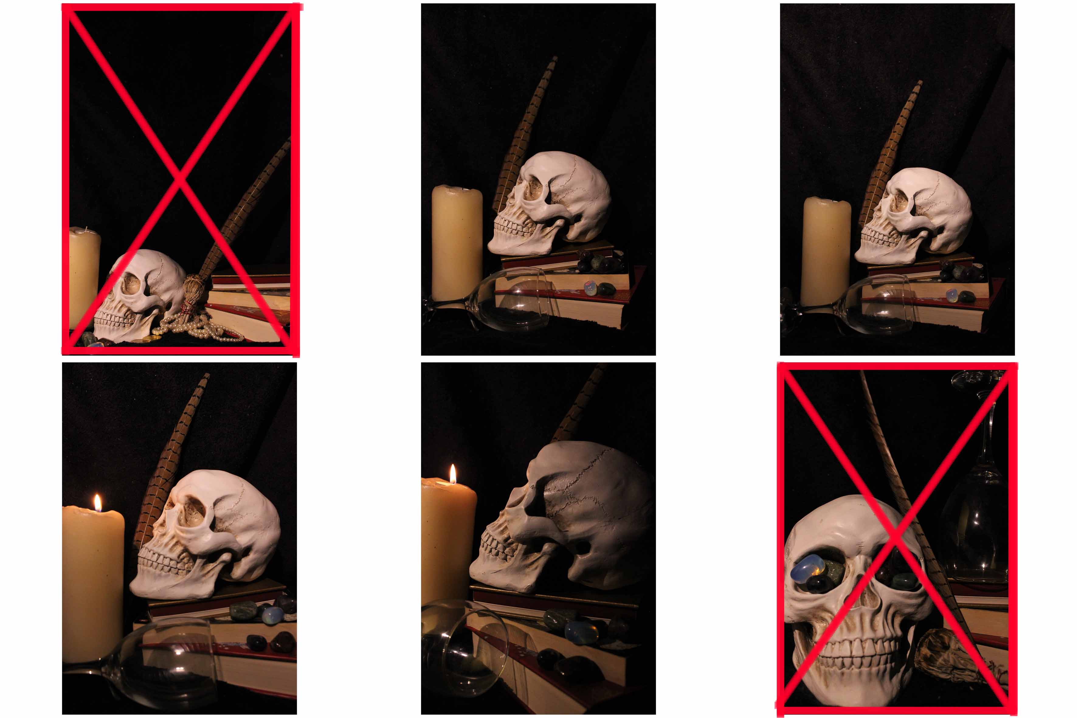
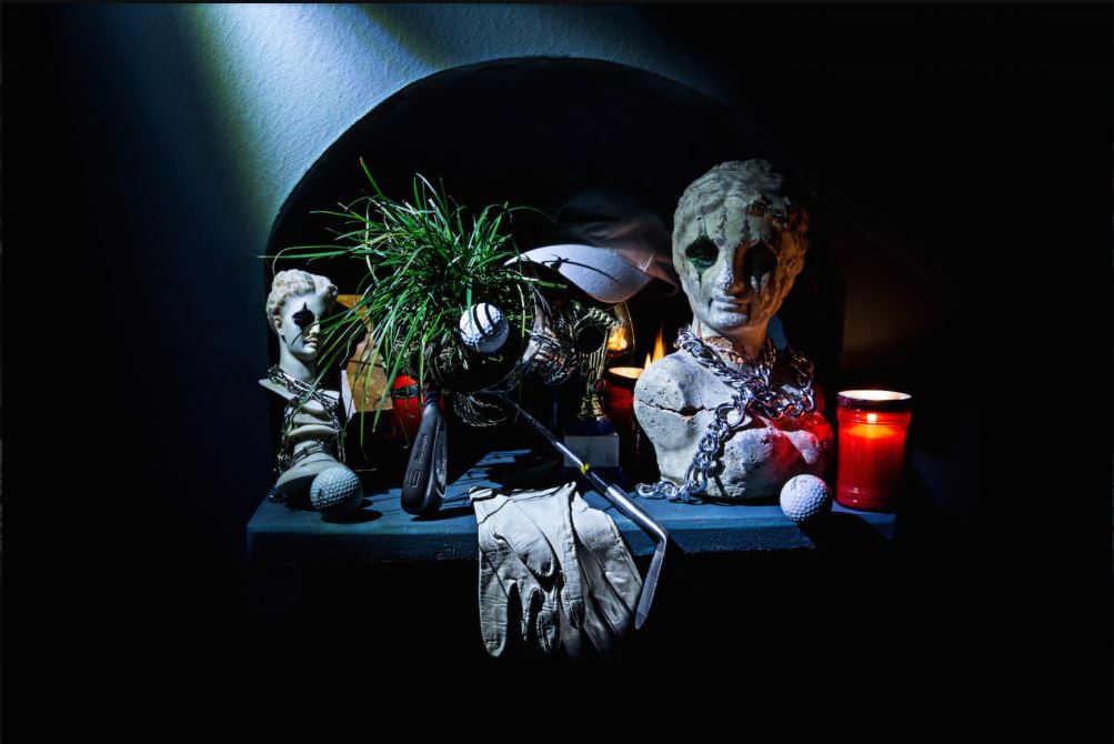
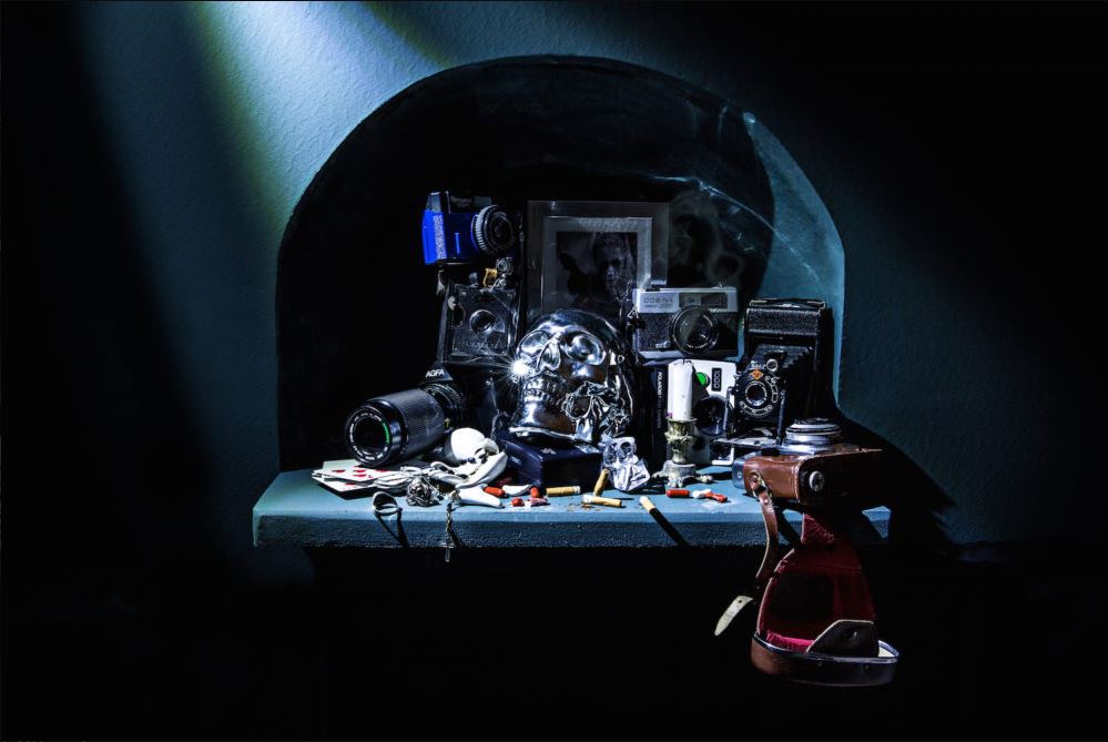
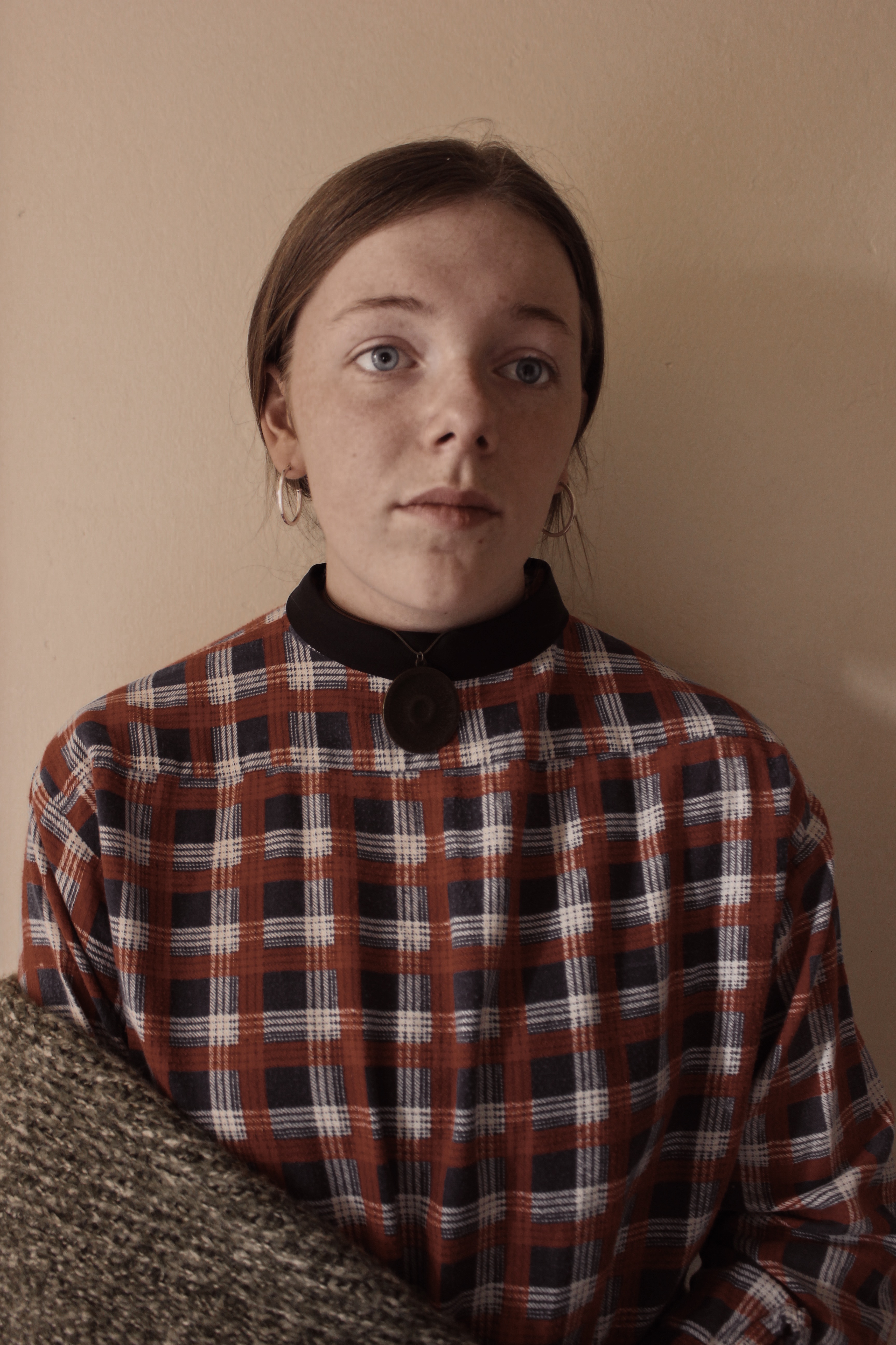
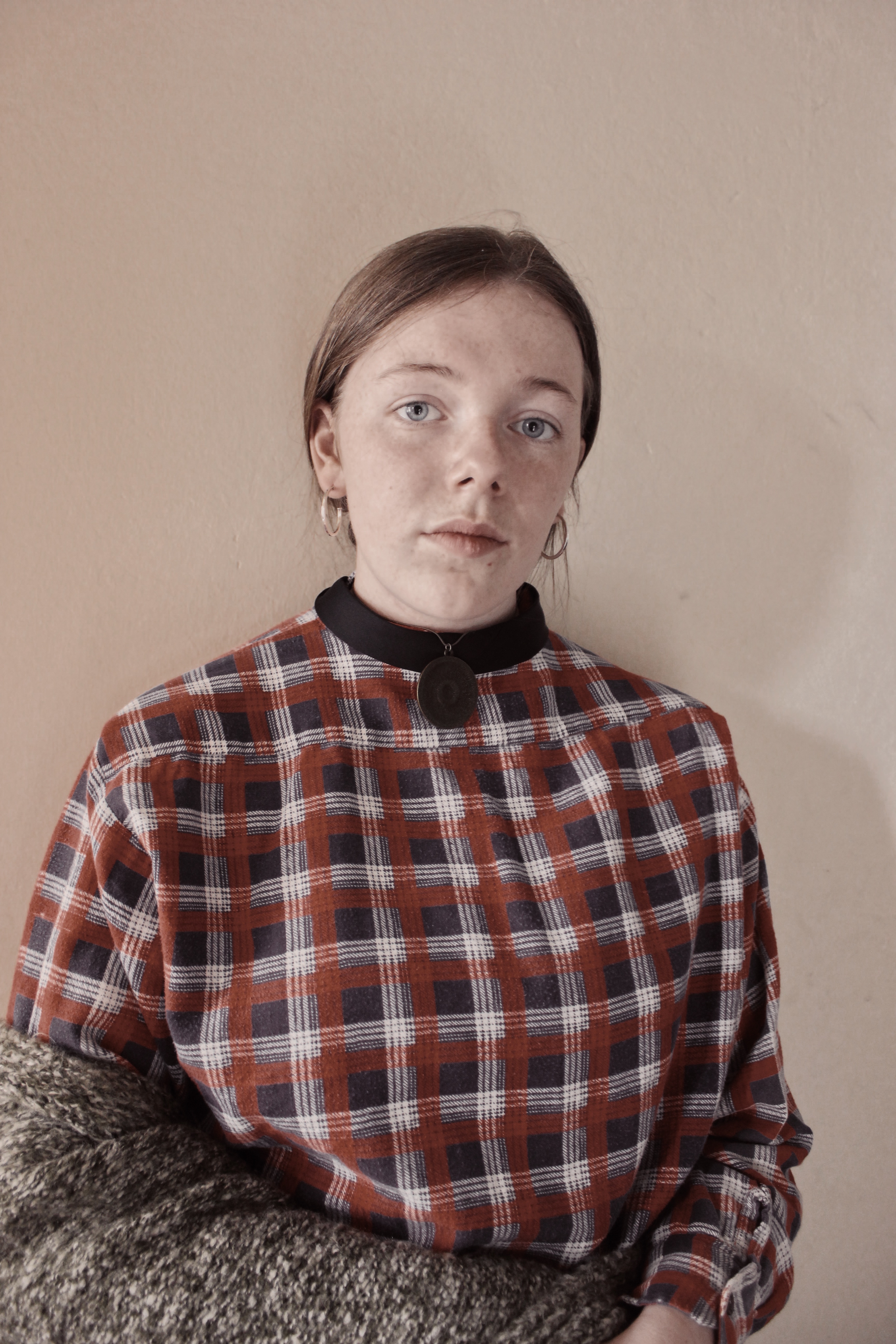
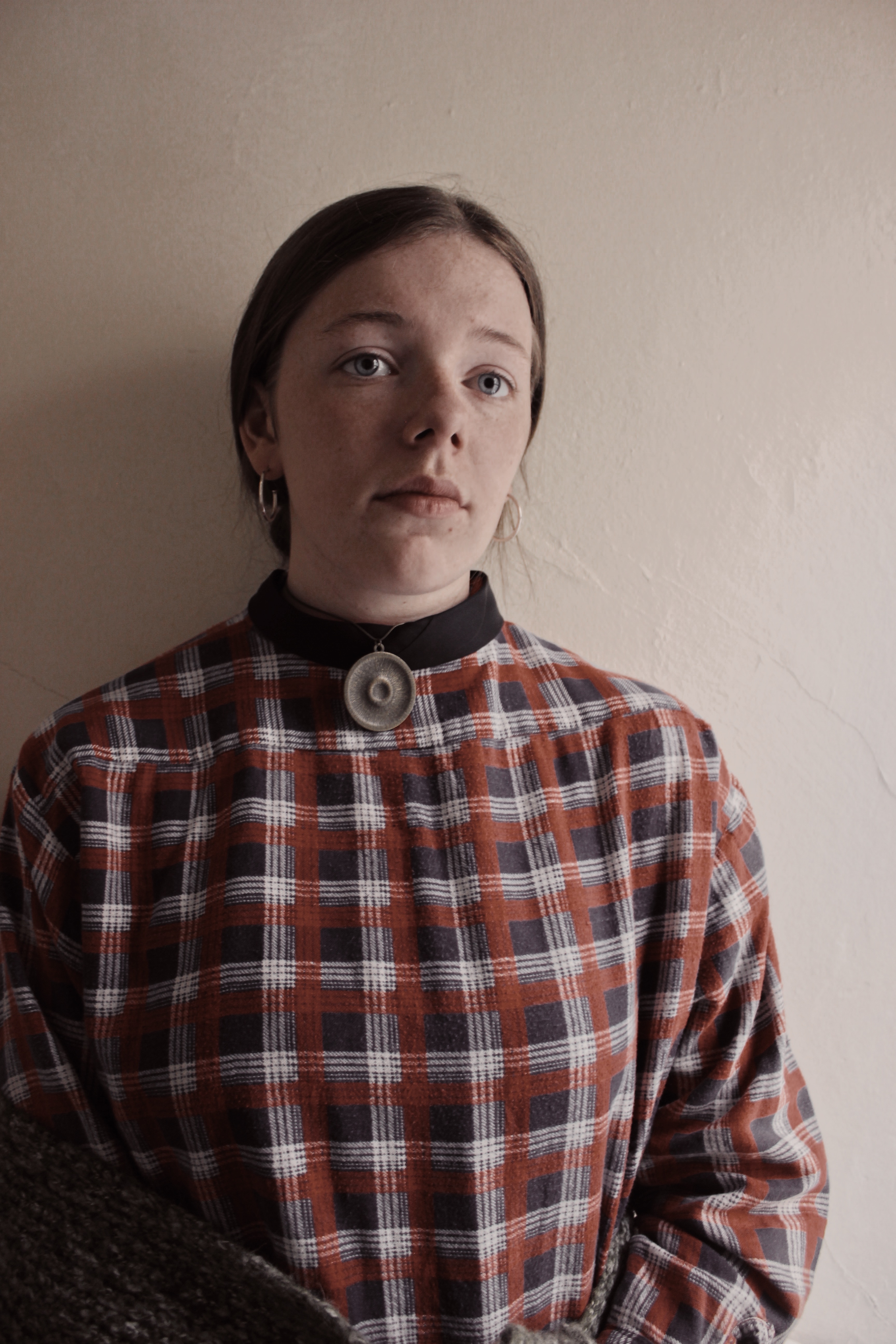
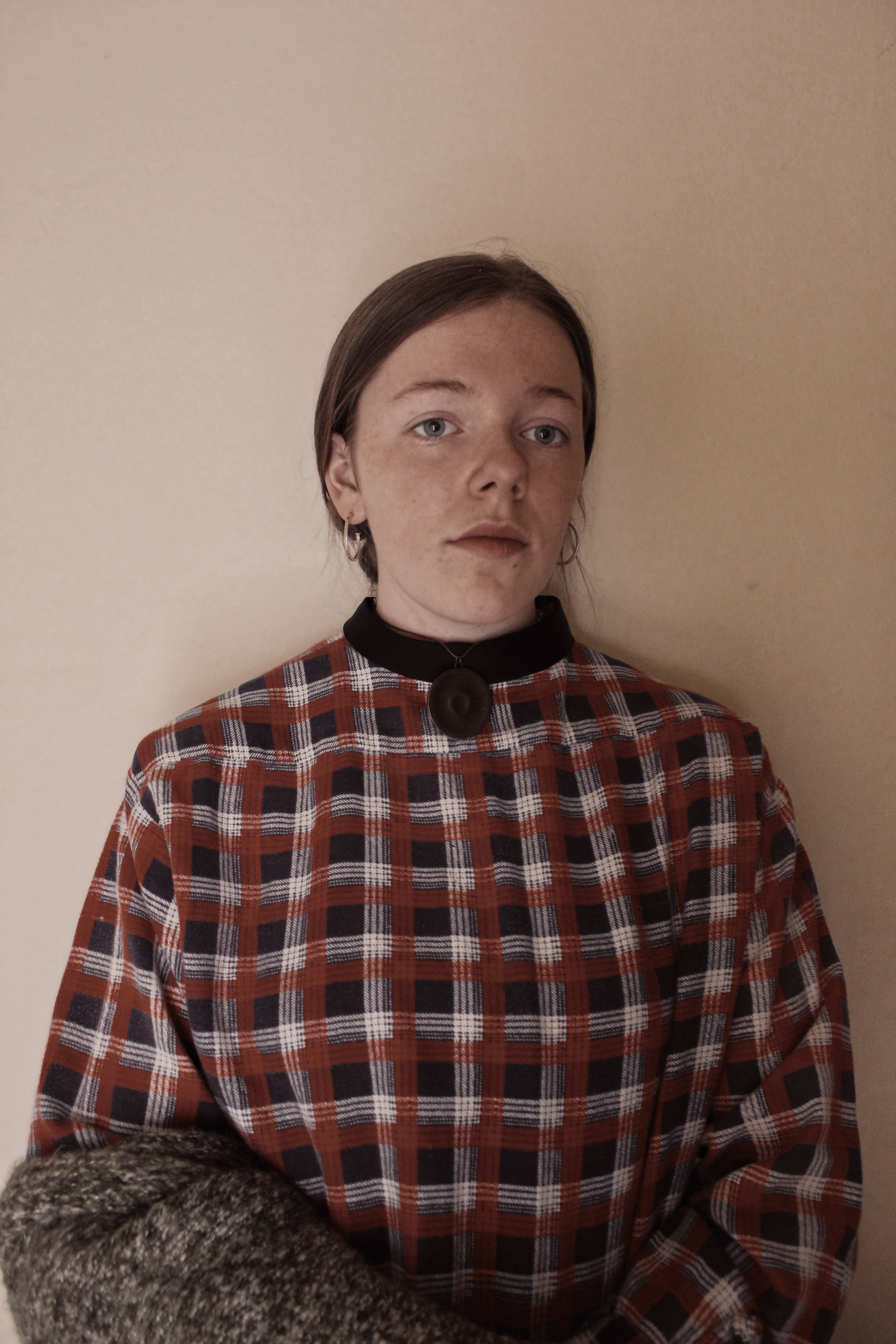
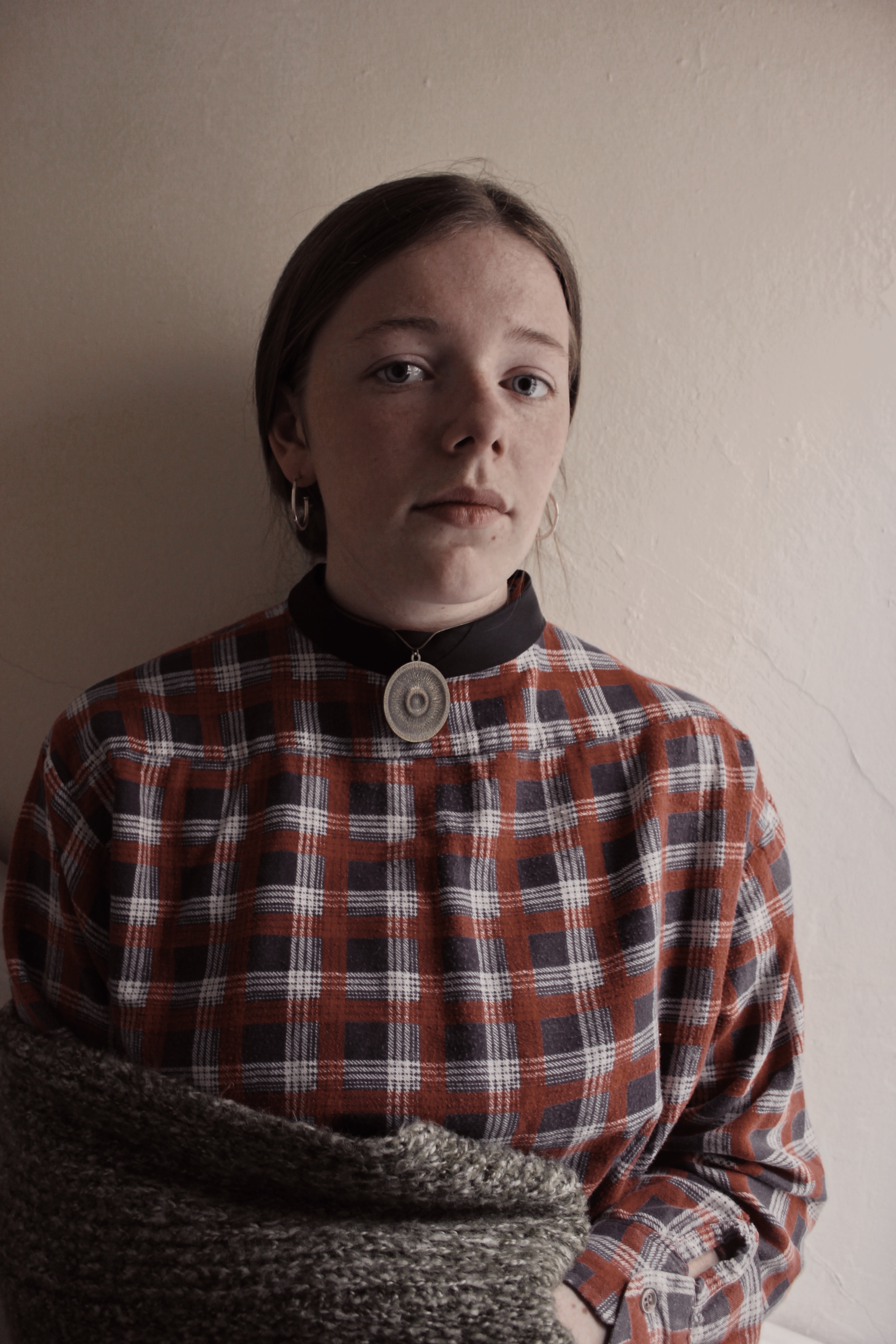
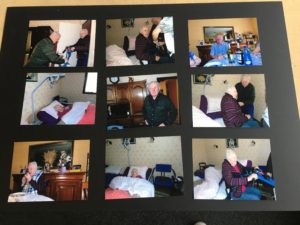
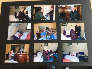
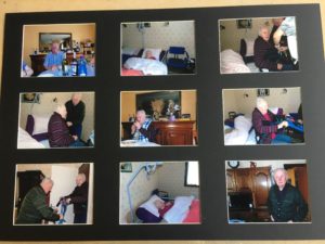
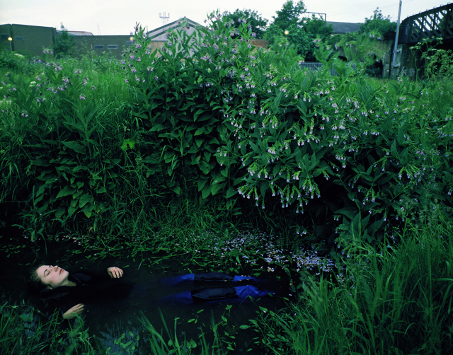
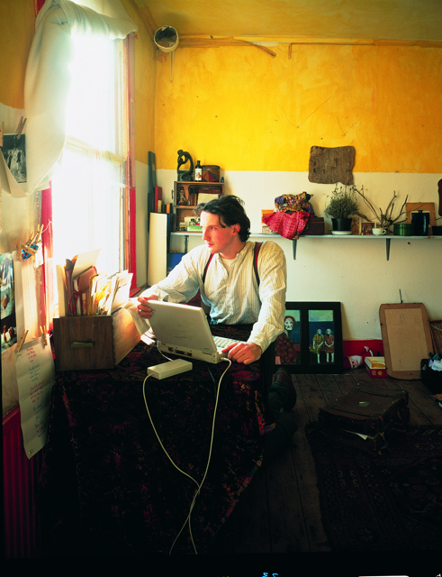
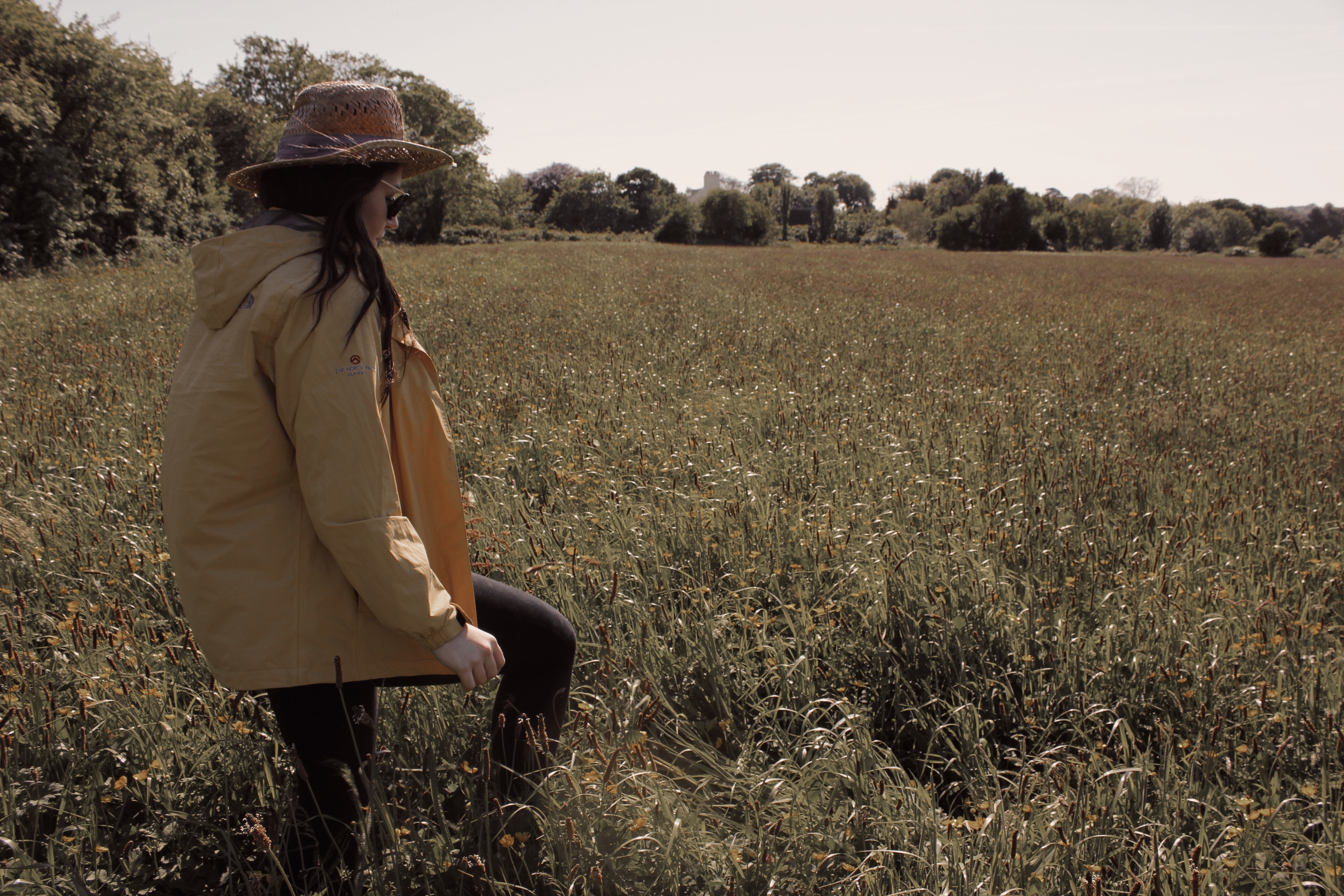
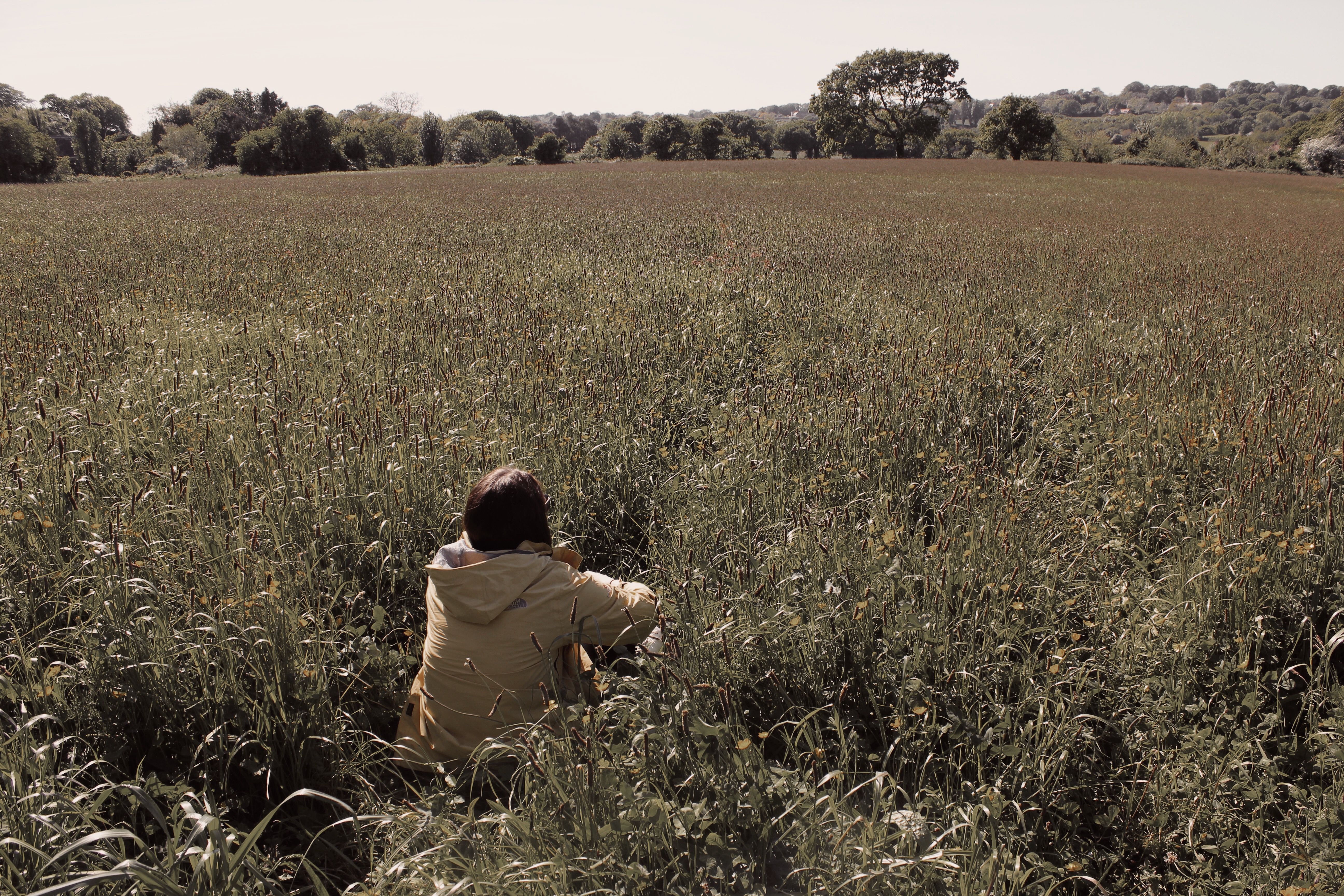
The set of images I have chosen, strongly contrast with each other as they are all different but all have specific similarities. This will be effective when presenting them as it will allow each individual photo to stand out.  Furthermore, I have made sure that each image isn’t too similar as I don’t want them all conveying the same story.

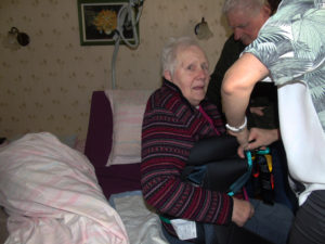
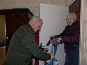
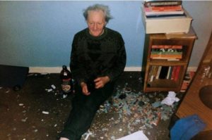
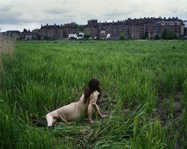
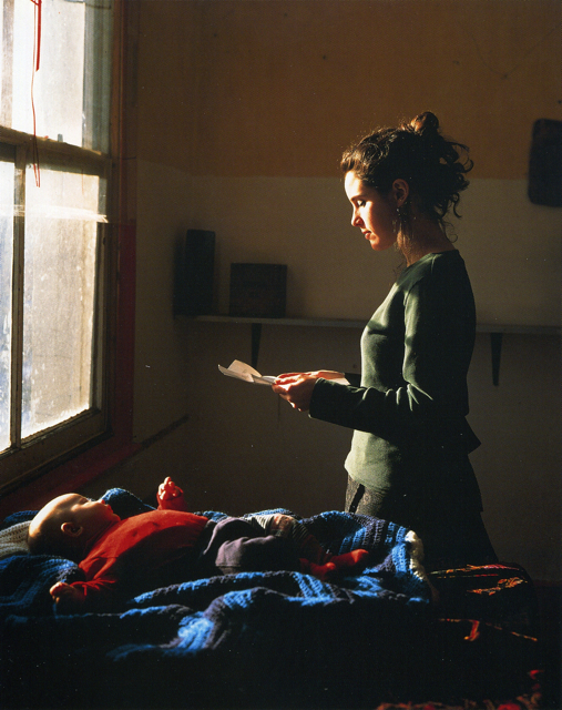
The top and the bottom image are to do with man made structures and contrast each other well but with a clear difference. Furthermore, they both have connotations of secrecy as both images where taken in abandoned areas of London which allows them to have clear links.  The center image was focused more on urban landscape with a sense of secrecy running through it due to  the lack of emotion from the 3 subjects in the front of the image. Therefore, allowing this image to link to the other two images through the conventions of secrecy.

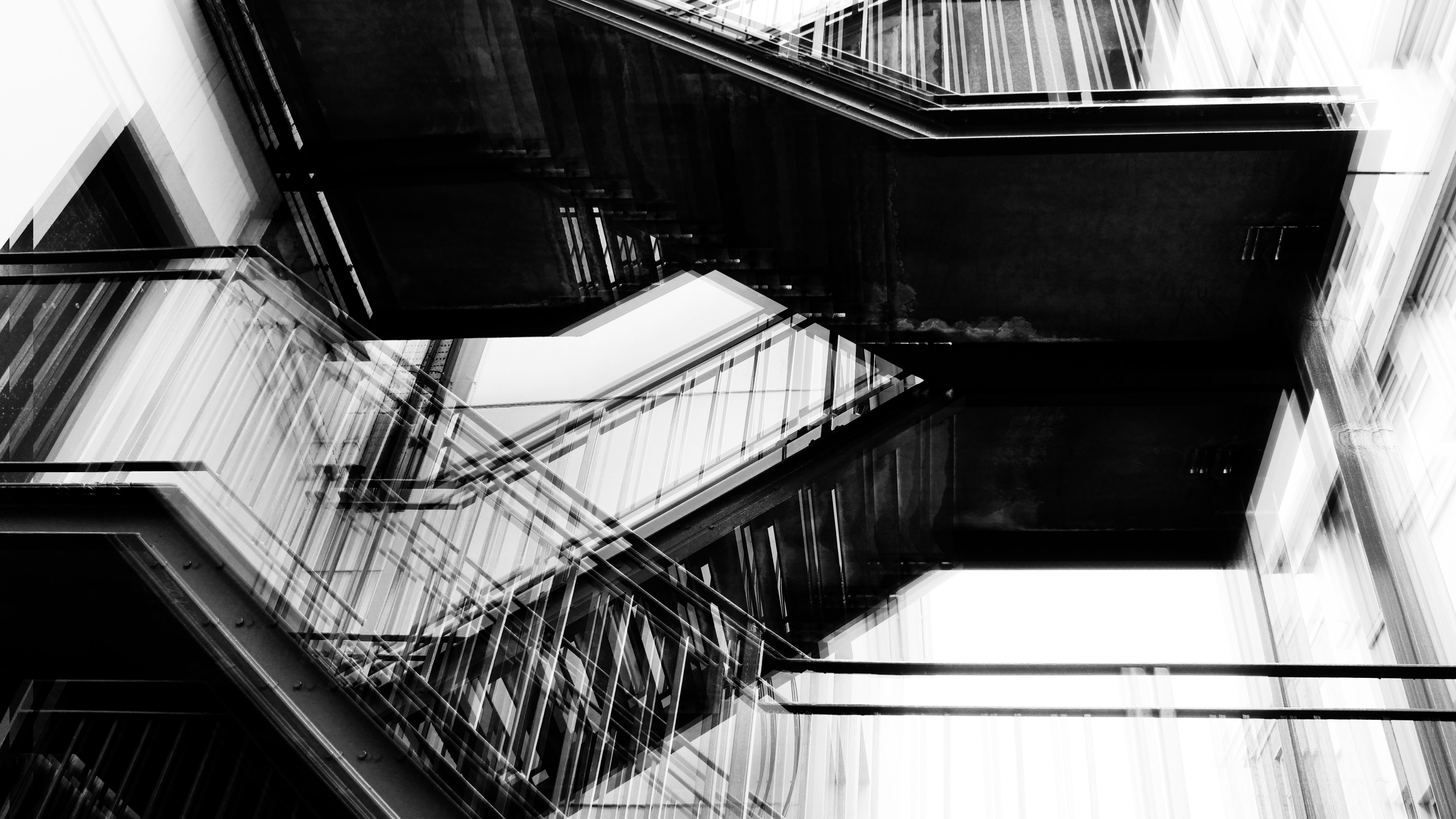
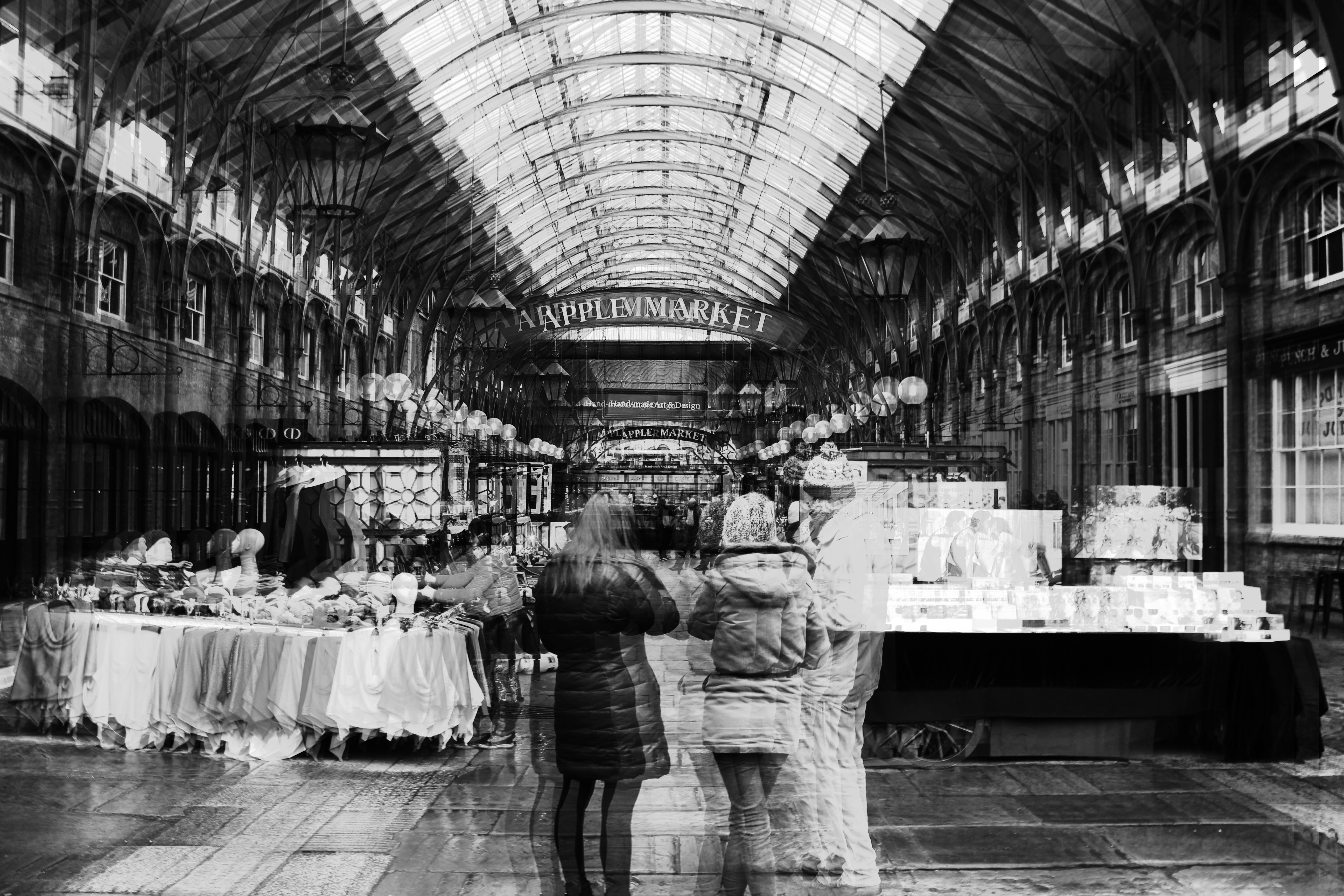
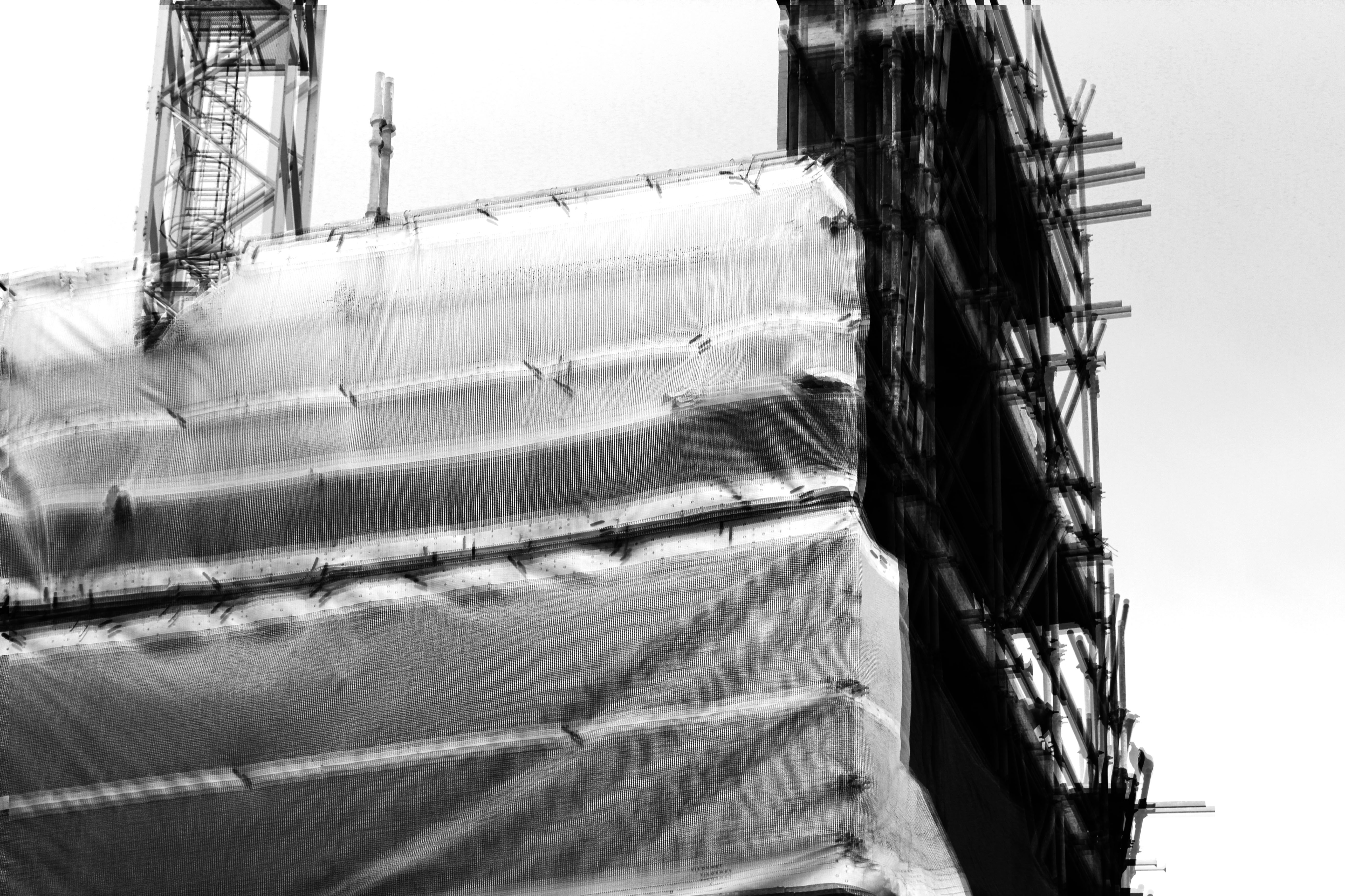
My final piece shows a set of three images of visual evidence of man kinds effect on the landscape and the barriers within which I have been able to shown through layered photography which I have used to create my final piece. This links to one of my artist studies, Lewis Bush. Lewis try to push the boundaries and capture the negative impact they are having.  Lewis uses black and white when taking his photographs which links to my work as I have also taken my final images in black and white therefore, linking our work together. Our work also have clear links through the way we have taken and edited our images which allows a clear comparison to be made between our work.

Secrecy is shown within my final piece due to the derelict and emotionless images which conclude with no reason. However, if looked further into the image, a story is conveyed through the derelict and emotionless images which bring the images to life and allows them to stand out. In addition, the sense of conventions has also been captured through my work due to the editing and manipulation of my final images and how present day photography is presented and made to have a story behind each image.

I think an important feature seen in my final piece is that my images have bee edited in a way that allows them to stand out and are presented in a way that allows them to stand out to the fullest. Furthermore, the balance between black and white creates a strong contrast bringing forth the structures and landscape shown. Through my final pieces I have also been able to show the ever-changing and jarring landscapes that man kind is evolving round and being blocked by these unnecessary boundaries that are effecting  people from accomplishing everyday things.


Evaluation

Comparison of my work to artists work.
These are three of my final images compared to three images by Richard Billingham, overall I think you can see the influence of Richard Billingham's work in my images, I have tried take influence from his style by capturing conventional moments of people in their natural environments getting on with their everyday lives, trying to give a sense that you are not looking at an image but are just another person in the room that they don't notice.The main focus of my images was to document and capture the life of my grandmother who has Alzheimer's, my intention was to try and capture candid moments of their everyday life, by capturing the constant surprised and dazed look of my grandmother and them going about their everyday life. I wanted to be able to follow the idea of Conventions and groups of people and by taking photos of my own family I think that I have captured a different and more personal perspective than if I had documented strangers. I tried to make sure that the composition of each photo reflected the closeness of the topic and how it was from a personal perspective rather than an outsider, as part of the composition of the images I wanted the people to be the main subject but also have their everyday surroundings which are a big part of their lives also be a focus of the images. As I wanted the images to be a reflection of the people and their lives I tried to keep the lighting quite dull and the colours neutral to reflect the emotions and slow energy of their lives.

Images by Richard Billingham

Vanitas Edits

Processed with VSCO with hb2 preset
Processed with VSCO with a6 preset
Processed with VSCO with m5 preset
Processed with VSCO with c1 preset
Processed with VSCO with a6 preset

I applied filters to all these images to make the orange tones in the skull, candle and books stand out more. I reduced the exposure to make the background darker, and to emphasise the shadows on the skull.

Dan Bannino | Vanitas

Someone described Banino’s work as “Pop-Renaissance” or “Pop-Baroque”, mixing popular culture and Old Masters. He has gained international recognition with his photos and has been published internationally in a variety of magazines including National Geographic, The Times, The Daily Mail, The Guardian, Harper’s Bazaar, Elle, Cosmopolitan and many others.

His work resembles the style of famous Vanitas paintings.

The two images above are examples of Vanitas Paintings by Pieter Claesz.

Image Analysis:

The image uses little lighting except one spotlight that hits the objects, this guarantees the viewers attention will be on these objects.
I believe the photographer would have used a quick shutter speed to take this image as there is a cloud of smoke that appears still above the candle
The arrangement of the items in this image help tell the story of the person who owns them.
Dan Bannino’s ‘Niche of Wonders’ dedicates personal collections  of items intended to reveal something about how their owner saw the world. His inspiration came from the historical items people owned in the renaissance era.
This provides the vanitas style without the meaning of death, however is personal to owner and reveals mysteries about them.


Tom Hunter | Edits

Processed with VSCO with dog1 preset

I applied the filter to all my images to give them the same temperature effect as Gwen John’s self portrait has. I chose these as I felt the shadows in the images don’t take the attention away from the subject in the centre.

Final selection of images and presentation

For my final presentation of my images I have decided to make a selection of nine of my strongest images and present them in a window mount, i have selected the nine images that I think best represent my intention of showing the candid moments and emotions, I decided to present them in a 3x3 black window mount because I think that photos show more when they are together rather than being presented as single images.
These are the nine images that I selected to present.

Before attaching the photos to the mount I tried out a few different arrangements to see which would look best. I tried to find a layout which made each photo stand out and so that there was a variation of compositions and colours in each row/column to make it more aesthetically pleasing to look at.

This is my final arrangement attached to the window mount. I feel that this was the best layout because there is a variety in each row and i tried to make sure that similar compositions would not be to close together even though all the photos are quite similar there is some variety so i tried to lay it out so that there was variation of lighting and composition.

Tom Hunter Response

Photoshoot Plan:

Concept: The self portrait of Gwen John shows her isolation and struggle for recognition in a career dominated by men.
Location: I will position my model near a window with a clear background
Lighting: Natural Lighting from the side to create the similar soft effect and light shadow on one half of the face.
Camera Settings: Just clear focus on the subject
Props: I chose my model as I thought they looked similar to Gwen John. They will wear a shirt, tie and necklace backwards and ring earings. They will hold a grey cardigan over their arm.

This image is the inspiration behind my images. It is titled ‘Self-Portrait’ By Gwen John.

I decided not to use any of the images that had  too many shadows in them.

Tom Hunter & Various Artists

^Christina’s World by Andrew Wyeth

Tom Hunter is an artist using photography and film, living and working in East London. He is Professor of Photography at the London College of Communications, University of the Arts, London, Honorary Fellow of the Royal Photographic Society and has an Honorary Doctorate from the University of East London. Tom has earned several awards during his career, his latest in 2016, the Rose Award for Photography at the Royal Academy, London.


^ Ophelia by John Millais

^The Geographer by Johannes Vermeer

Many of Tom’s series show he is inspired by famous artists such as Johannes Vermeer and John Millais, He even takes inspiration from Biblical Tableaux paintings.

Image Analysis:

-In Johannes Vermeer Painting titled ‘Girl Reading a Letter at an Open Window’  the open window is on one level intended to represent “the woman’s longing to extend her domestic sphere” beyond the constraints of her home and society, while the fruit “is a symbol of extramarital relations.” The letter that she holds is a love letter either planning or continuing her illicit relationship. Tom Hunter re-imagines this image in current times showing a woman reading a possession order that tells her she has to leave her home.

-Hunter uses natural lighting to hit the side of the woman’s face allowing for emphasis of her emotional state.

-The ISO that Tom uses appears to be low as the image is mainly darker in tone. This is used as an advantage to give focus to where the light hits, the woman and the baby.

Richard Tuschman and Edward Hopper | Edits

Processed with VSCO with dog1 preset

Like Tuschman, I was more inspired by Hopper’s Style to create my own work. Similarly, I used one subject in my photos to share the same meaning of isolation. In my photos, you can never see the eyes of the subject. This is supposed to deny the viewer from seeing the ‘windows to the soul’ and adds mystery to how the subject feels. I added the filter to reduce the warm temperature that was in the original images.

This image titled ‘Jo Sketching At Good Harbor Beach’ by Edward Hopper was probably my biggest inspiration for these images as I liked how the viewer was denied access to the eyes of the subject. It was also the reason I chose to feature a hat in my photos.

Just another Hautlieu Creative site