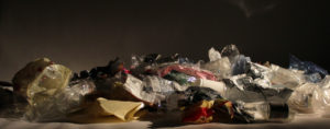
Over the course of two weeks me and my family produced 6 bin bags of plastic. On average we throw away 5 full bin bags a week of general waste. Over the two weeks 6 out of 10 bin bags were full of plastic.

My focus during the photo shoot was to capture a clear picture of the plastic pile and making use of the coloured lighting to illuminate one side of the pile. This means when I edit the photos later I can easily cut up and compose an image.

I experimented with different lighting states, from darker to lighter states with only hints of colour, giving the frame a deeper depth of field. The coloured lighting is very bright and sickly. I would like to reflect some of the colours in my edits.
Monthly Archives: May 2018
Filters
A2 PHOTOGRAPHY COMPONENT 1 (PERSONAL INVESTIGATION)
plastic photoshoot plan
https://news.nationalgeographic.com/2018/05/plastics-facts-infographics-ocean-pollution/
Another issue I would like to try and show an expression for concern that targets my chosen word 'secrets' is plastic.
Talking about plastic and accepting that it is an important concern is not enough. As humans we should take blame for the disruption of the environment and take action on it. For some people that means they need to stop performing the selfish action of littering because it's an inconvenience for them to walk to a bin. Like the meat industry it is another problem we ignore because we don't want to accept how destructive and harmful it is. Plastic waste doesn't directly affect us yet but, it has affected other parts of the world that we don't see or hear about every day. The general attitude is that until this problem starts to have an immediate impact on our lives; it's non of our concern.

My plan for my next photoshoot is to collect every plastic item in my house that would go straight to the bin over two weeks. This will give me and my family an idea of how much plastic waste we produce and contribute to the growing problem of plastic waste.
editing
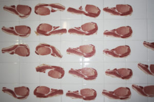
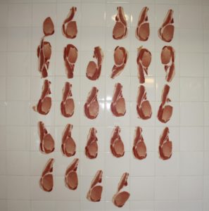
I ended up choosing pictures that included every piece of bacon so I could use each one to add to the quantity of bacon so it could reflect mass slaughter and production of meat.

The editing for these pieces took a few hours to complete because of the intricacy of cutting out the background. I cut out each slice of bacon so I could easily remove the background and move around the slices of bacon to achieve my desired outcome. To add more to my bacon quantity I duplicated some of the bacon slices and flipped them upside down or mirrored the image to add diversity.

The placement of the bacon was important because I wanted it to take in the same amount of satisfaction as eating bacon, yet obviously a synthetic satisfaction achieved by looking at the piece with the bacon perfectly placed in line with each other by using the rule of thirds.

Adding colour was my last step to compliment the meat. I have used colours associated with being artificial to add to the effect of the unnatural process of the meat industry. I also used red for one edit to emphasize the colour because of its significance in the process of the killing and eating of meat.
krista svalbonas
In terms of my presentation I admire Krista Svalbonas' execution of demonstrating her story and issues in her pieces. Her images are very abstract yet are easy to deconstruct and interpret different meanings behind them. I want to reflect her work in the presentation of my work by keeping the focus on the subjects of my images and making the focal points stand out and clear for the audience.Contextual - Krista Svalbonas Krista's assembled photographs carry a heavy weight of personal and political meaning about immigration and the political influences that took away the meaning of a home for her family and herself, and replaced the idea of 'home' to be contingent due to their historical displacement. Technical - The images have been cut and reassembled in sets of three, 'creating hybrid structures that reinterpret and reinvent architecture, disrupting space, light, and direction'. Svalbona’s 'Migrants' series began with photographs the artist took in the three locations she called home over the past eight years – the New York metro area, rural Pennsylvania, and Chicago. The use of three images creates a 'stability that acts as a counterweight to the sense of dislocation'. Visual - The structures of her images almost replicate a triangle- the use of three sides lining up and becoming a whole image with a sense of continuity. Conceptual - The use of three makes the abstract imagery wholesome and complete with each part integral for Krista's desired effect. The fact she uses three separate pieces to create a continuous image shows the longing for continuity in terms of a home life.
photoshoot klaus pichler
Contact sheet -I had successful outcomes in my material in my photoshoot, finding the correct white balance and ISO was tricky due to the lack of lighting I had because I was in a bathroom, which meant I couldn't bring in any additional lighting other than the main light and relying on the little natural light that came through the window as a result of the lack of plugs. I realised I couldn't take a picture without flash because a shutter speed that was too fast would not capture enough light and a shutter speed too slow made it hard to capture a clear picture when there is no tripod. The images I captured were not exactly how I imagined in my head in terms of the composition and what the images emulated. This has led me to think of new ideas of presentation. The bathroom wall emanates a sinister and dark tone which I feel takes away my point of mass production and focuses on the unethical issues of slaughter. Everyone feels guilt towards eating meat, yet they abandon the guilt and push it to the back of their mind. That reason alone is not enough for people to think and act on the problem. I don't want people to look at my images and only think my purpose behind it is to make them feel guilty with the consumption of meat, I want my pieces to trigger some kind of interest in the problem and the audience to realise the process of killing and eating animals is not just unethical but a root cause to problems in the worlds future. My images do not reflect the issue of mass production and therefore during my editing process I will add to the amount of bacon to have a greater effect.

planning klaus pichler response
My aim for my response to Klaus Pichler is to tackle the similar issues he faces in his pieces. I don't want to directly copy his work so I will take a slightly different approach that reflects mass production and waste aimed at the meat industry as I believe this industry is a core problem to environmental issues. This issue is kept quiet and avoided by the Government and ignored by the public because we are uneducated about the issue and its detrimental effects to our lives.http://theconversation.com/five-ways-the-meat-on-your-plate-is-killing-the-planet-76128 From asking 20 people what meat they could not live without, giving them the options of beef, chicken, bacon or pork, 4 stated beef, 5 chicken, 8 bacon and 3 pork. Bacon was the most popular meat and therefore it will be my chosen meat to feature in my photo shoot. I will use my bathroom because I will be using raw meat which is not suitable for a studio due to fat, grease and general juice produced by raw meat. Hopefully the bacon will stick on my bathroom walls so I can easily compose my pictures.
Evaluating The Process
Creating paintings and creating photographs are two different processes. Often a painting presents what was truly seen at that moment in time but a photograph can be manipulated to show people what they want to see. My decision to appropriate old paintings of different meanings into current photographic pieces made it difficult as I would not have all the features of the artwork, such as the location, or the items of clothing. My ability to use the things that I have would be my advantage to creating identical pieces to the artists but I learnt that I did not need to ‘copy’ their work. Resembling the important meanings that these artists used like the photographers who appropriated them allowed me insight into using the same meanings but with current conventions.
Displaying My Final Images
I displayed my photos in frames to resemble fancy paintings that hang up on walls. I believed this would give my images the appearance of more status. The frames also made the images themselves feel more historical demonstrating their secrets and meaning.
Final Image Choices
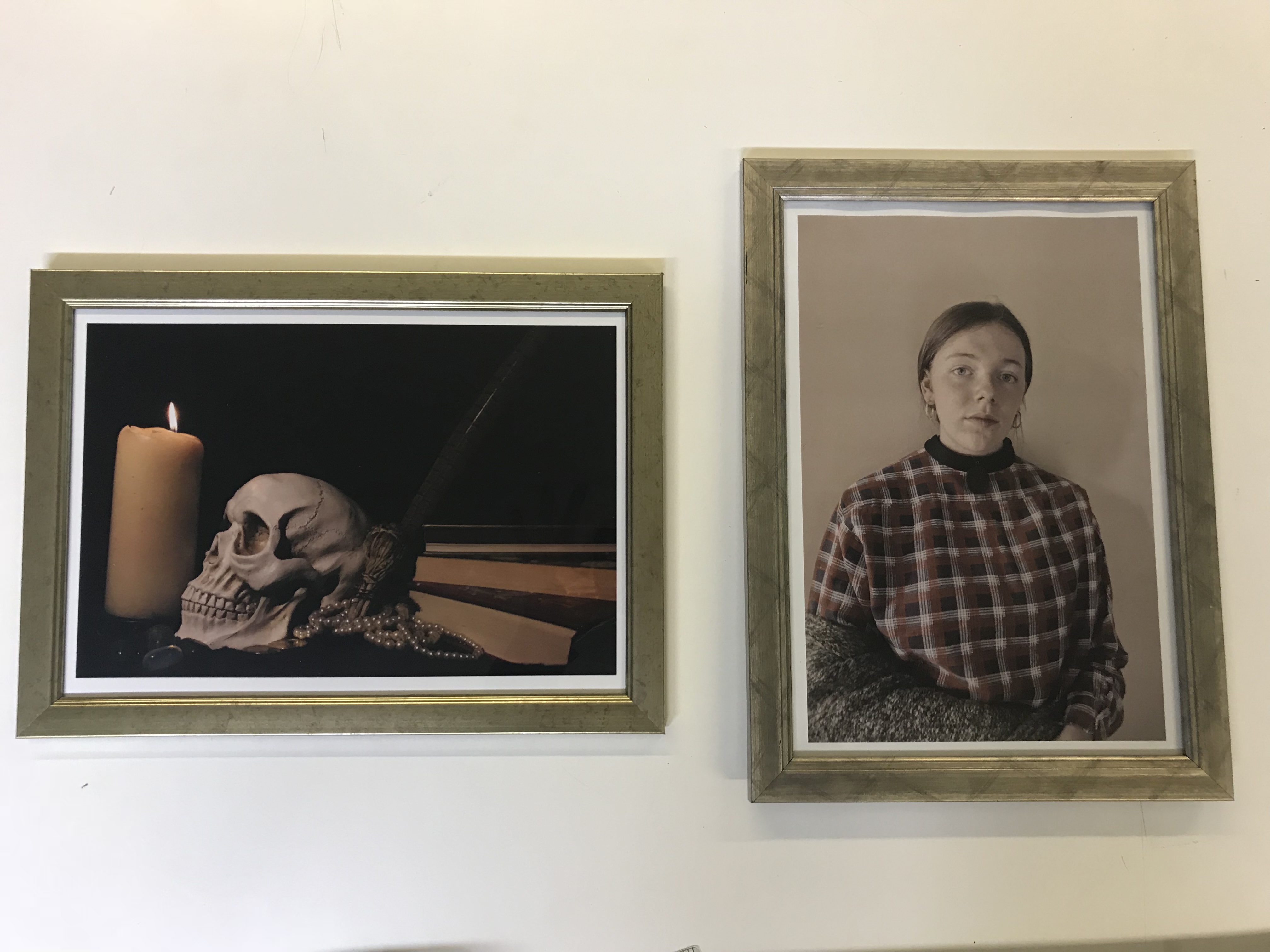
I chose these two images as they are representative of two styles of paintings, Vanitas/Still Life and Portraits.
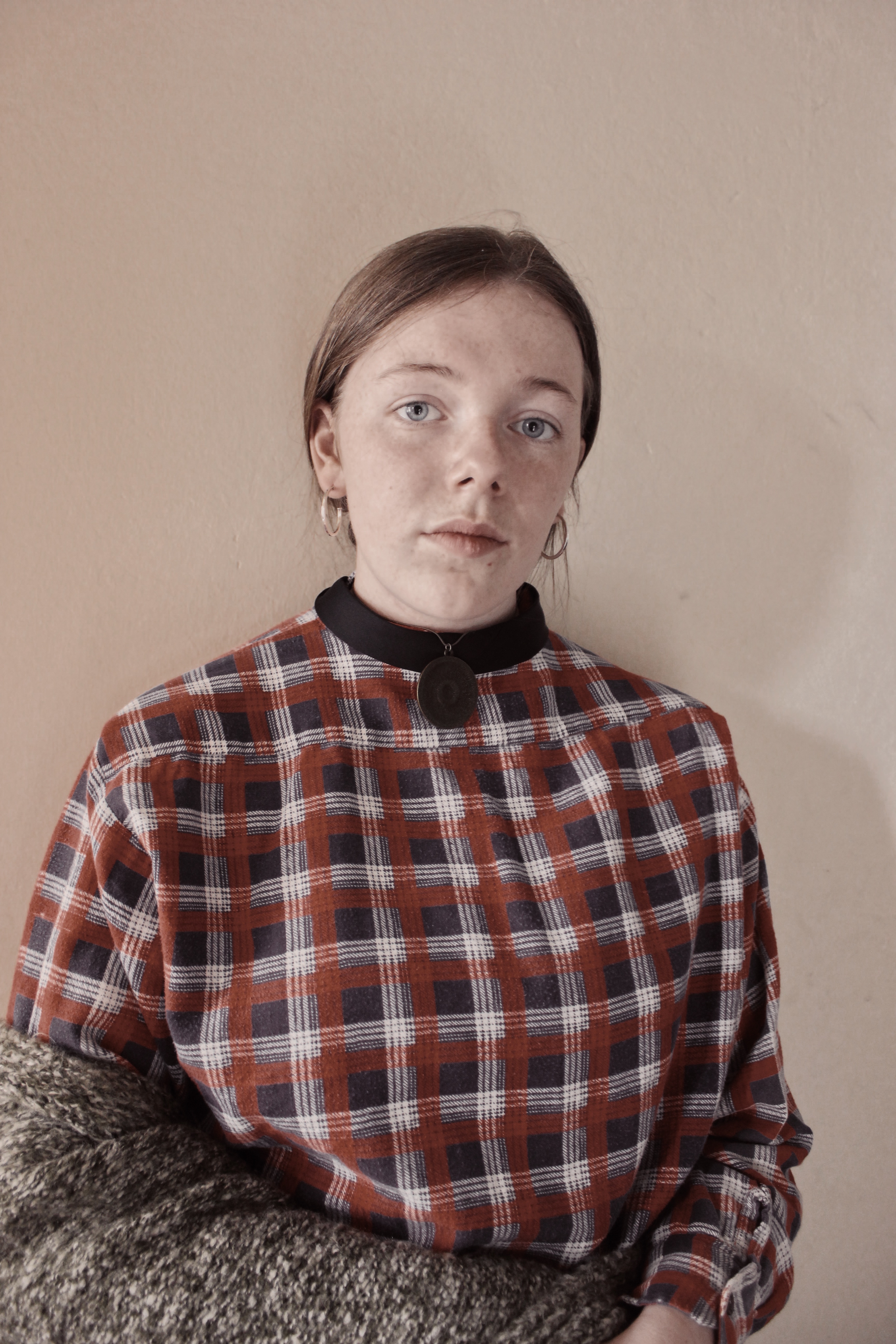
The Portrait image resembles Gwen John’s work from the model to the choice of clothing. This allows it to share meaning with the original piece of art whilst also gaining more meaning from the secrets behind the more modern subject. The light hits the subject’s face creating a subtle shadow that doesn’t destroy the image with harshness. The model stares intensely directly at the viewer allowing a link between their two lives, creating a more personal feel.
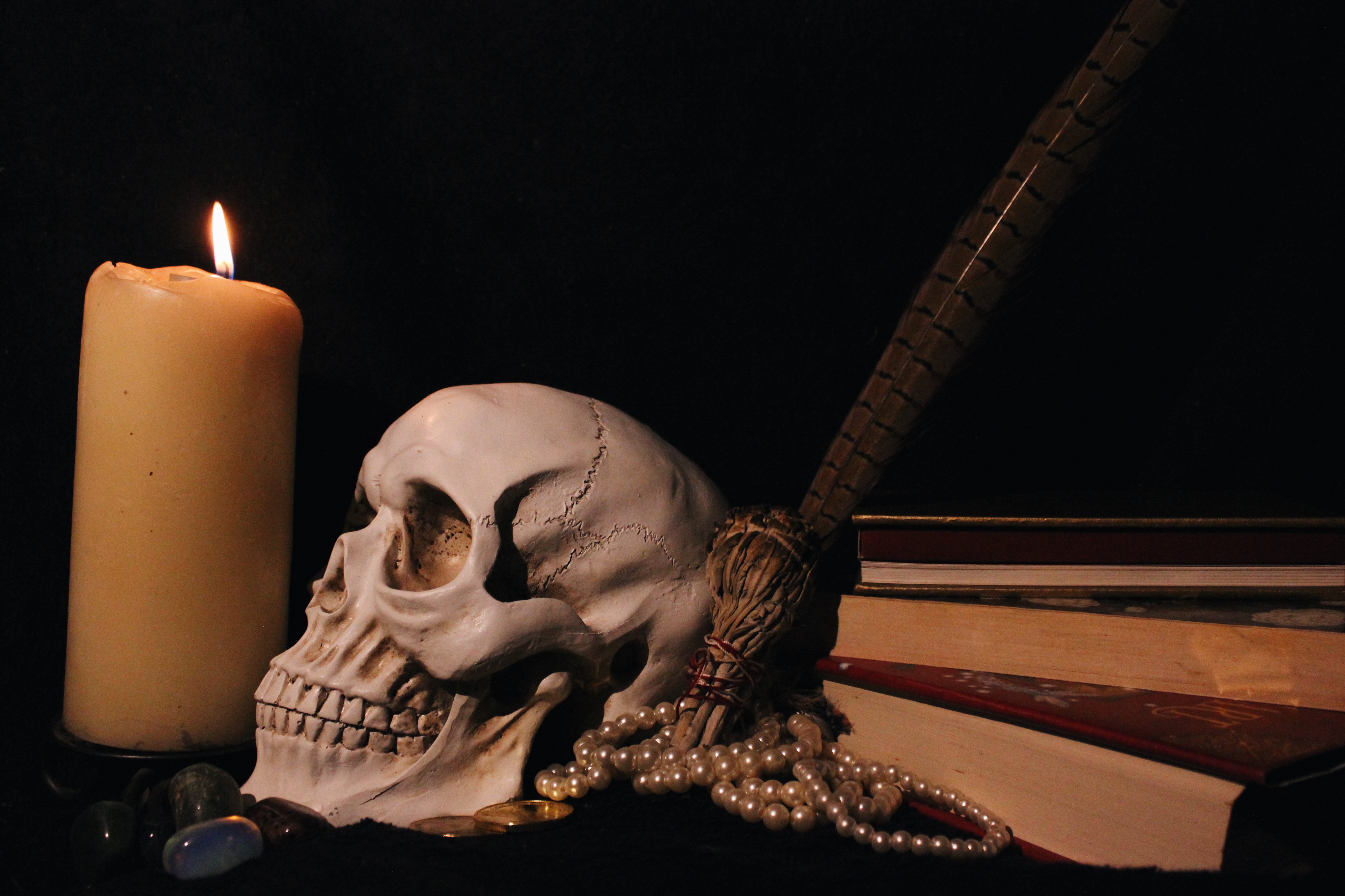
The Vanitas image holds a dark atmosphere in both visual and conceptual terms. It accurately represents the meaning of inevitability of death by the choice of items in the image, from the skull to the lit candle to the books, all common features of the vanita style. Although I took this image with a simple background, it still appears interesting by allowing the viewer different items with different stories to analyse.

