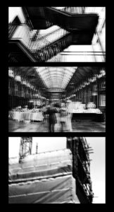
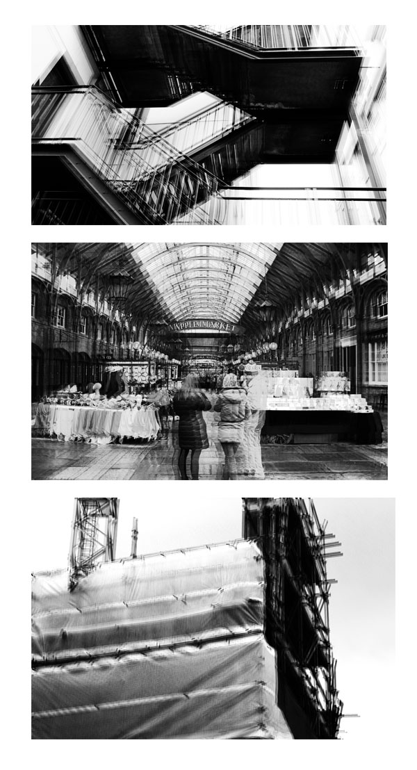
I had a number of different ways I wanted to present my work. I wanted to display my images either horizontally or vertically, like shown below. The reason for this is because I thought it would clearly and neatly display my images in a presentable way that would allow them to stand out. I finally decided on displaying my images vertically as I though that would be the neatest way for this specific set of images to be displayed. As the images where in black and white I then had the decision of displaying them on white or black card. The set of images that I had chosen had a lot of white patches which made me single out the white background as it didn’t really allow them to stand out. However, on black card the images really stood out in comparison. Furthermore, the black background and the images created a strong contrast which contributed to them standing out more. The layout of the images was chosen by the first image which I thought was the strongest image. The image with the people at the front, I thought, was the odd one out in this group of images which is why I placed it in the middle. This decision allowed me to separate the two man made images with some urban landscape. When displaying them I Created window mounts for the images as I thought this was the strongest way of displaying them and I thought it reflected my final images clearly.
This was my final outcome.


