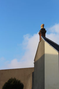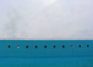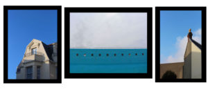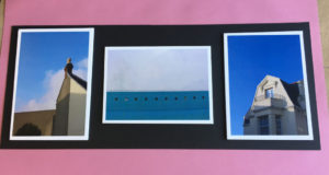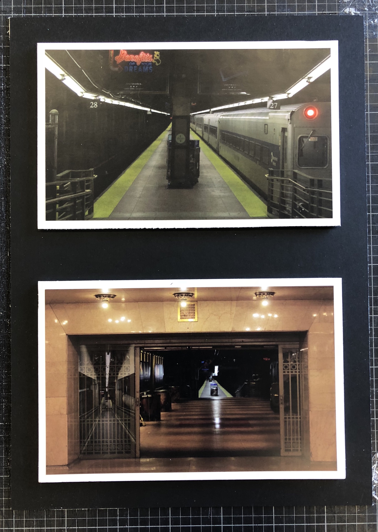
Above is my final set of photographs presented on white foam board and then on black mount board in order to provide a nice border for the photographs and to create more contrast within the photographs.
My main goal when I set out on this project was to explore the theme of secrets, more specifically the secrets within both man-made and natural habitats. I think that I have achieved this and shown this thoroughly throughout my work as I have explored natural structures such as caves, nature, abandoned man-made structures and constantly used man-made structures in New York. This set of photographs that I have chosen to present shows inspiration from the photographer Gregory Berg as I used the setting of the New York underground and captured it as if it was deserted – which it is quite the opposite of. This showed the exploration within the underground and how it can vary from being packed with people to having no people around, whilst this is going on there is a whole other world walking around above this. This tucking away of the underground introduces lots of interesting characters in the subways which people native to large cities would not normally see, and this exploration shows secrets of the city and the underground.
I think that I have achieved my goal throughout this project quite well but could improve it further by possibly attempting to recreate the final photographs in a busy area of the subway in order to provide contrast between images and more contrast between my photographs and Gregory Berg’s work. Another way that I could’ve achieved my goal further would be by looking at other areas within New York such as the less well-off areas in order to shine some light on how differently people live as we are so sheltered in Jersey.


