Many artists paintings hide secrets of the subjects in them or demonstrate the conventions of the time whether it be political or the social norms. Photographers are able to look at these mysterious pieces of art and become inspired by recreating aspects in a more modern style to represent current conventions. This inspired the premise of my project where I hope to be able to recreate styles of art, sections of a painting or even techniques.
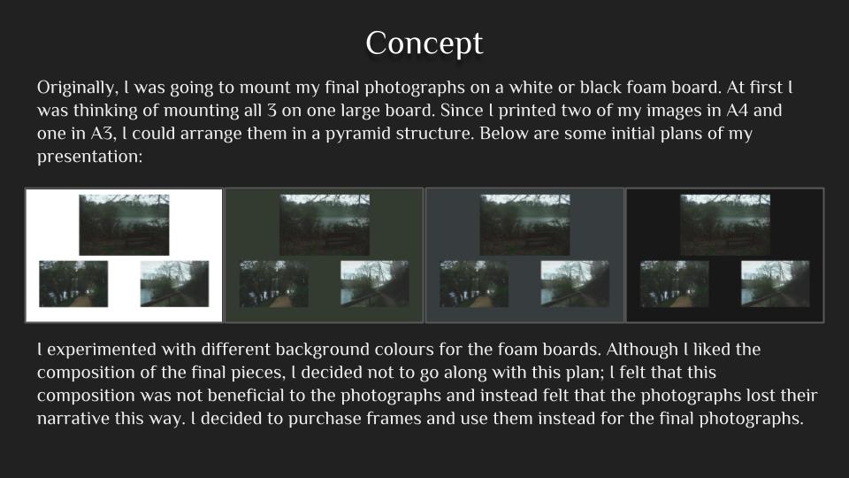
My final piece is combination of three images. I changed the overall layout from what I had thought to do originally, I stuck my images onto white foam board and then onto black cards with the two portraits on the outside and the landscape in the middle. I printed the images at size A4, but looking back I would have printed them at A3 so you could see a greater amount of detail, I have placed the images next and on the same level to as because I think that they are all of the same quality and standard and the focus should be split between all three of the images. I think that the two portrait images have a closer link to each other, this is because they where taken during the same shoot.
Overall I feel that this project has been successful, but as a whole i think it is not my best work. I think if I was going to go back and do the project again I would ensure to take more photo-shoots, at a range of different locations, focusing a on different colours, as the running theme through the final images is a rage of different blues. I would also ensure the take photos at different times during the day to see how the light effects the overall look of the colours. But have had liked finding out about a range of different styles in photography and different photographers who look at colour, abstraction and minalsim. William Eggleston for his framing of everyday life photos, Grant Hamilition for the inspiration for the use of colour, and Hiroshi Sugimoto for his abstraction work. Overall I feel that these images incorporate a wide ranges of styles, abstract,minimalism, and colour photography. My work is clearly taken elements by the three photographers, that i have studied by are not replicas of their work, I feel that i have touched upon each one of the stimulus words, ‘Conventions’, as it it look at things we see everday in a differen way, breaking away from the norm.’ Secrets’ as unless you stop and take you time to look for similar images like this you would past by them in everyday life. And finally ‘Codes’ is seen through the repetition of the colour theme through this project.
I used the VSCO cam app to edit some of my photos from my Ishiuchi inspired photoshoot because I wanted them to have a specific filtered look. I edited all the photos in two different filters so I could decide which looked best as a group.
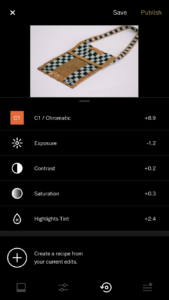
Processed with VSCO with c1 preset
bellow shows the process to took to edit the photo, I tinted the background to a slightly pink/ purple colour to resemble Miyako Ishiuchi’s style.
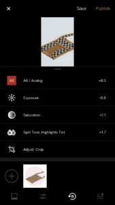
Processed with VSCO with a6 preset
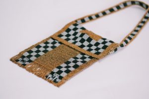
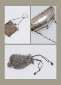
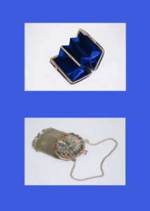
I wanted the photos to show off the personality of the purses rather than looking like perfect studio images. This is why I cropped the image so it just focuses in on detail of a specific area.
After editing them on the app I then moved them into photoshop and stared to arrange them in groups with other images that had similar colours.
Overall I think that both images are very similar in looks and skills. Both of these images where taken using the natural daylight of the sun and during golden hour,which has created an effect that has increased the overall saturation and vibrancy of the colours. The images both have a similar colour palette, blue being the main colour. The two images could be compared to what house and the way that people live like in the US compared to the Uk. Conceptually the Eggleston’s image could be used to represents the ideas that are the main images for Americans, as the TV antenna in the center of the frame, where as my image has a chimney in the center of the frame, which could signify that in the UK people care more about coming around a fire as a family more than watching the Tv where as in the us it could be the other way. The images are also very similar in relation of the colour palette of the images, My image has more earthly tones where as Eggleston’s has more white and brighter colours. But I think that it is quite evident to see the similarities between the pieces and that the techniques that where used by William Eggleston I have been able to transfer over to my work.
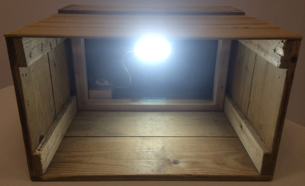
As part of my final presentation I have constructed a light-box with slides and a holder for these slides. My plan for the making of this light-box is 2 posts previous.
Here are some photographs of the actual presentation before the use of any slides…
full displayslide holderempty light-boxtitle tabshole for wiretop of light-box
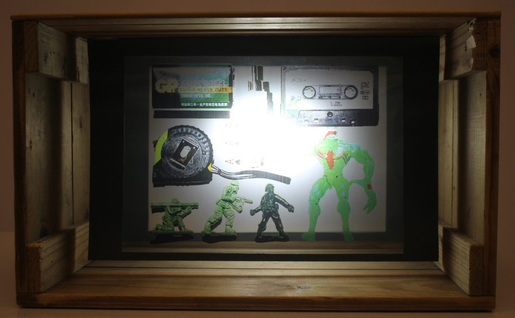
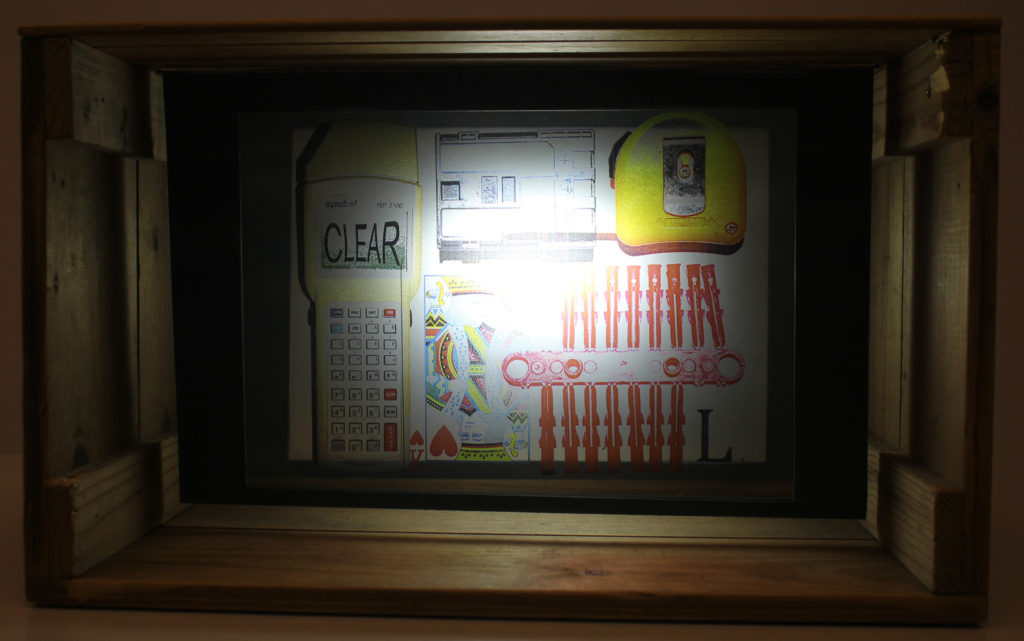
Here are the 14 outcomes which I decided to have printed on acetate to be the slides…
I chose these 14 images to be printed on acetate, as I believe from a viewer’s point of view they are very interesting compositions of: colour, texture, shape, tone, layer and text. I chose the images that I had produced with the white background as once printed on acetate the white will be transparent, allowing light to pass through creating a layered visual of various images.
Below are 14 photographs of each individual slide in the light-box not layered with any other slides…
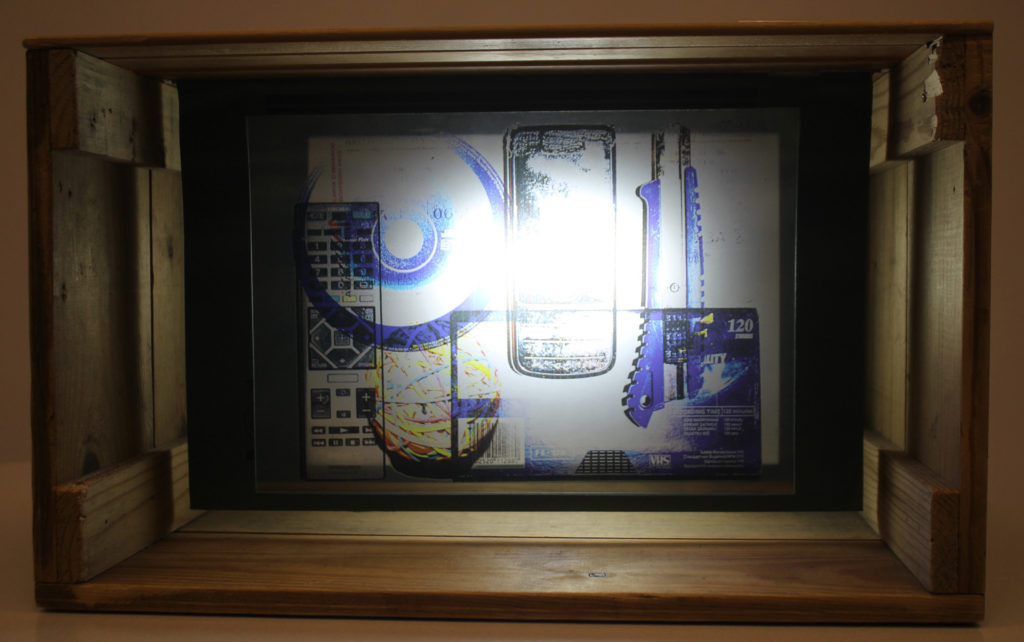
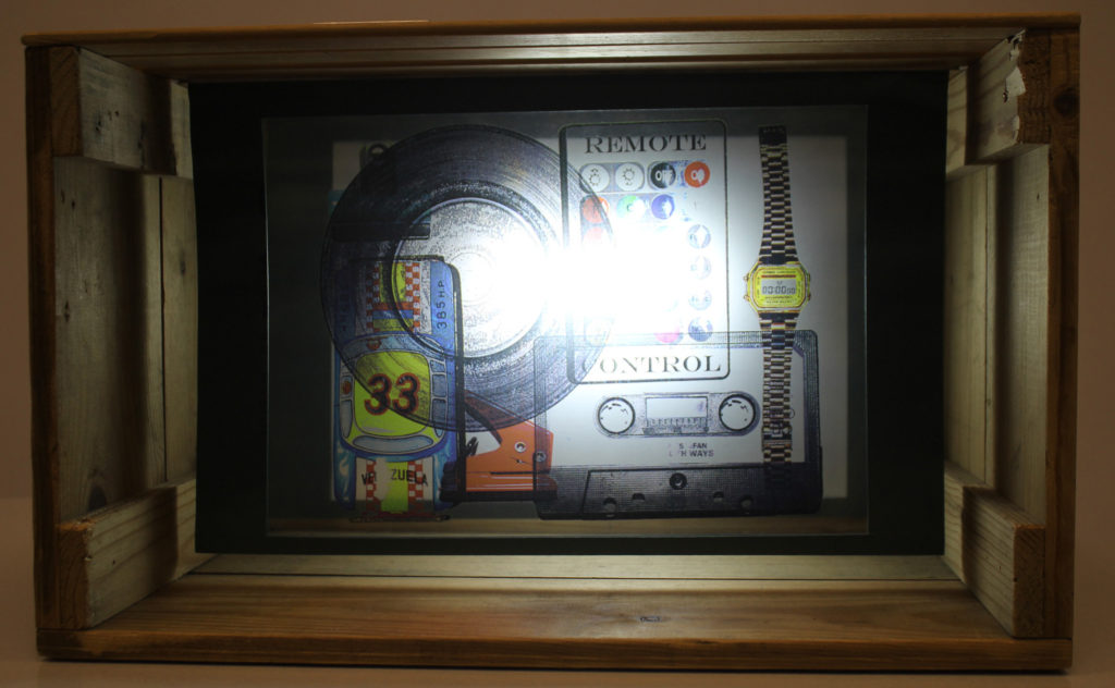
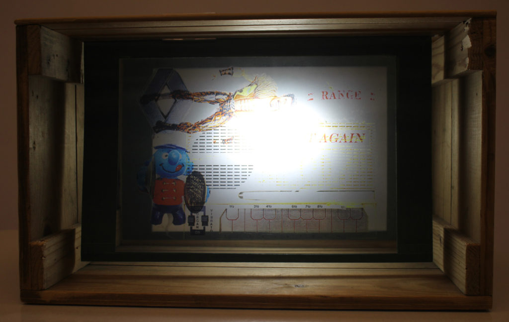
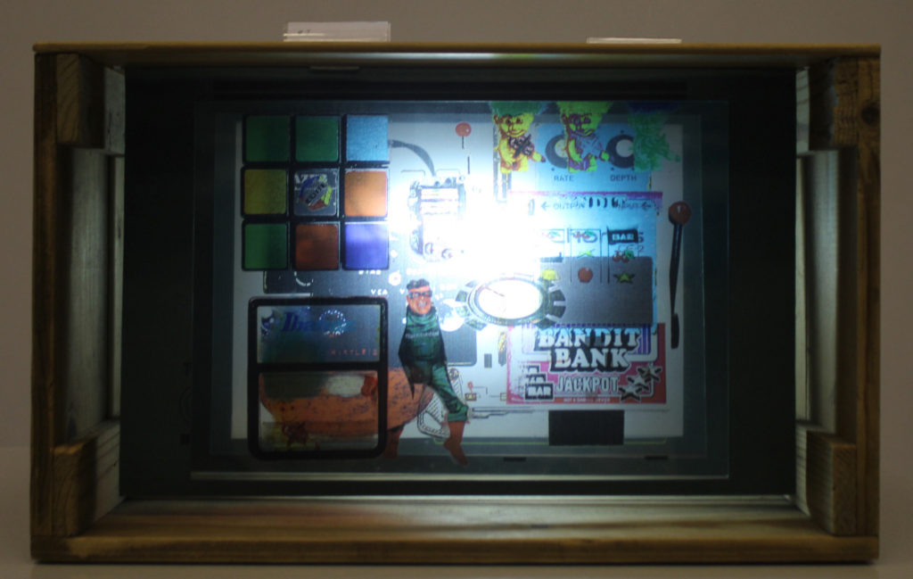
I believe that as slides in the light-box these images are very successful. Below are some photographs of the slides layered onto of each other in the light-box…
Overall I am very satisfied with the outcome of this presentation as it it very similar to what I expected it to look like when having the idea for it. The way that the slides diffuse the light in the box and cast shadows of the objects is something that I believe is very aesthetically pleasing. Therefore I believe this idea came out as a success in response to my initial ideas. It shows response to Maha Malluh and Jim Golden (the two photographers who I’ve looked at in this project) and my idea of the x-ray scan aesthetic. The images display good understanding and control of composition, contrast, colour, texture, shape, tone, layer and text.