FINAL PRINTS
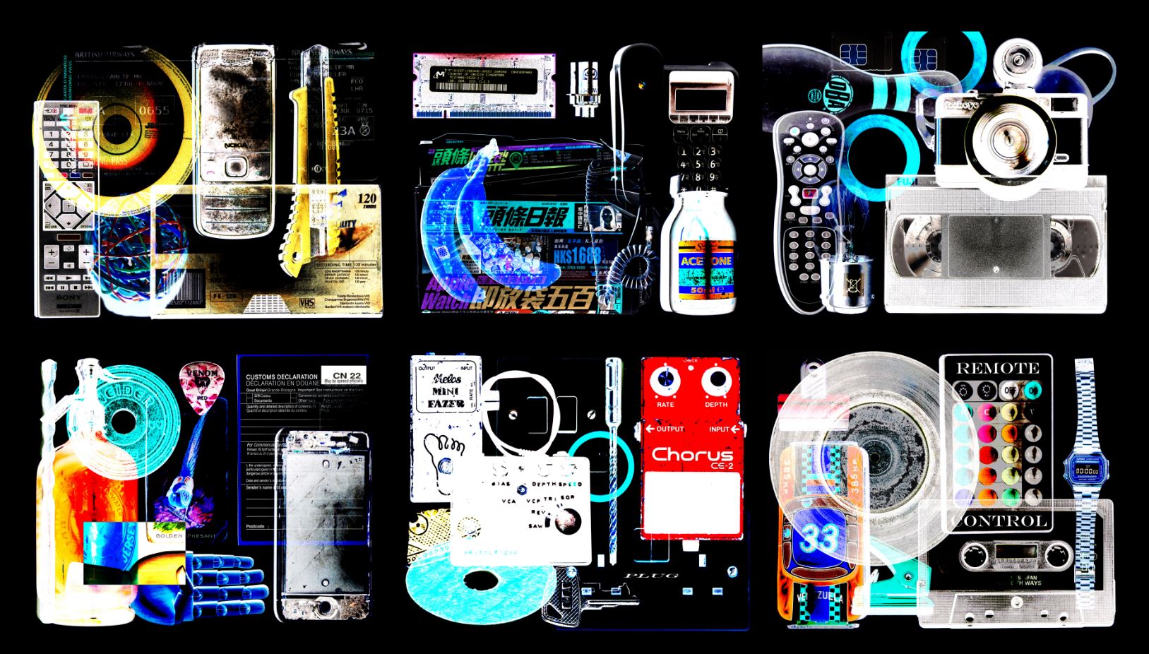
This post covers my final outcomes which i have decided I would like as prints and how I will present them. My following post to this will be looking at the light-box part of my final presentation. For my final prints I wanted to have a balance between white and black backgrounds of the images which I choose.

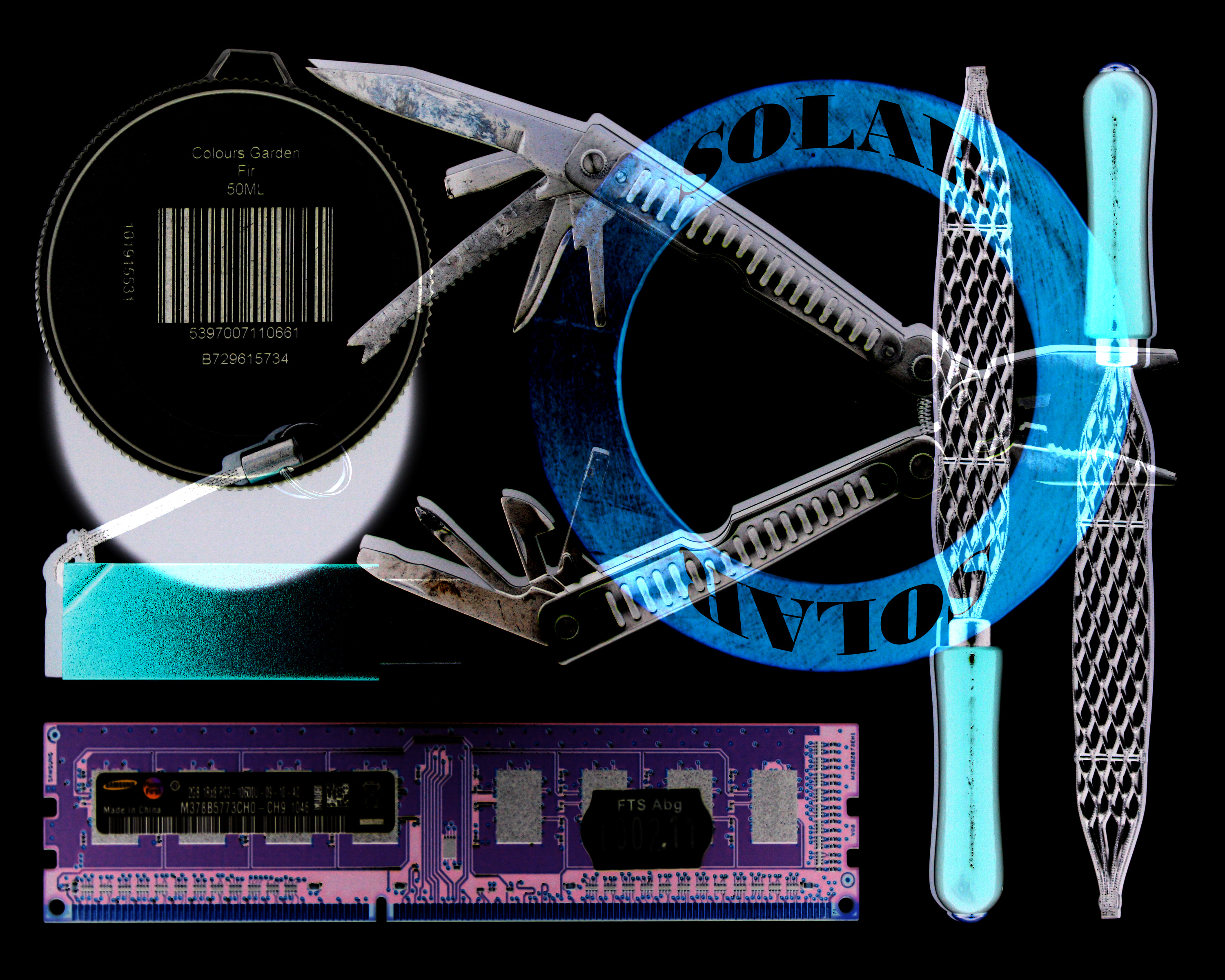
I have chosen this image as a final print as I believe it is very striking but with a large amount of detail. As a viewer your eyes don’t stop moving with this image because there is so much going on within the image. Although this could be seen as a negative aspect I believe it is successful due to the style of image which i have been wishing to produce throughout this project.


With the two above images I have decided to have them printed as i believe they are very successful pieces in terms of their balance of colours, shapes and text. Also the subjects/objects really stand out on top of the white background in order to create a very striking visual.


The three above images I believe are successful in terms of how they display layers and hidden elements. Hidden (secret) being something I have wanted to explore since the beginning of the project.
As I am also using a light-box as the main part of my presentation, I want to display my prints in a simple and minimal way. I will do this by putting each print individually onto a trimmed piece of foam-board and then place these pieces onto white mounting board. Here is the layout of how I plan to display these prints…

