
Daily Archives: May 14, 2018
Filters
Photoshoot


The Editing Process
The first thing that I did when i began to edit my images was to increase the overall brightness, as i wanted the colour of the sky to stand out. I also then increased the levels of saturation to makes the colours in the images stand out more. A in abstract images the colours are one of the main stand out features
I then selected the spot healing brush tool. as I wanted the remove the bushes at the bottom of the frame, by doing this the image the mage a overall minimalist look too it which is what I wanted to achieve.
![]()

Finally I copped the image as there was natural line that had been formed and by cropping the image, it made the overall look of the image more aesthetically pleasing which is what i have wanted to achieve, as when studying Grant Hamilton this was an aspect of his work that I wanted to incorporate into my work.

Final Outcome – Prints (Presentation 1 of 2)
FINAL PRINTS
This post covers my final outcomes which i have decided I would like as prints and how I will present them. My following post to this will be looking at the light-box part of my final presentation. For my final prints I wanted to have a balance between white and black backgrounds of the images which I choose.
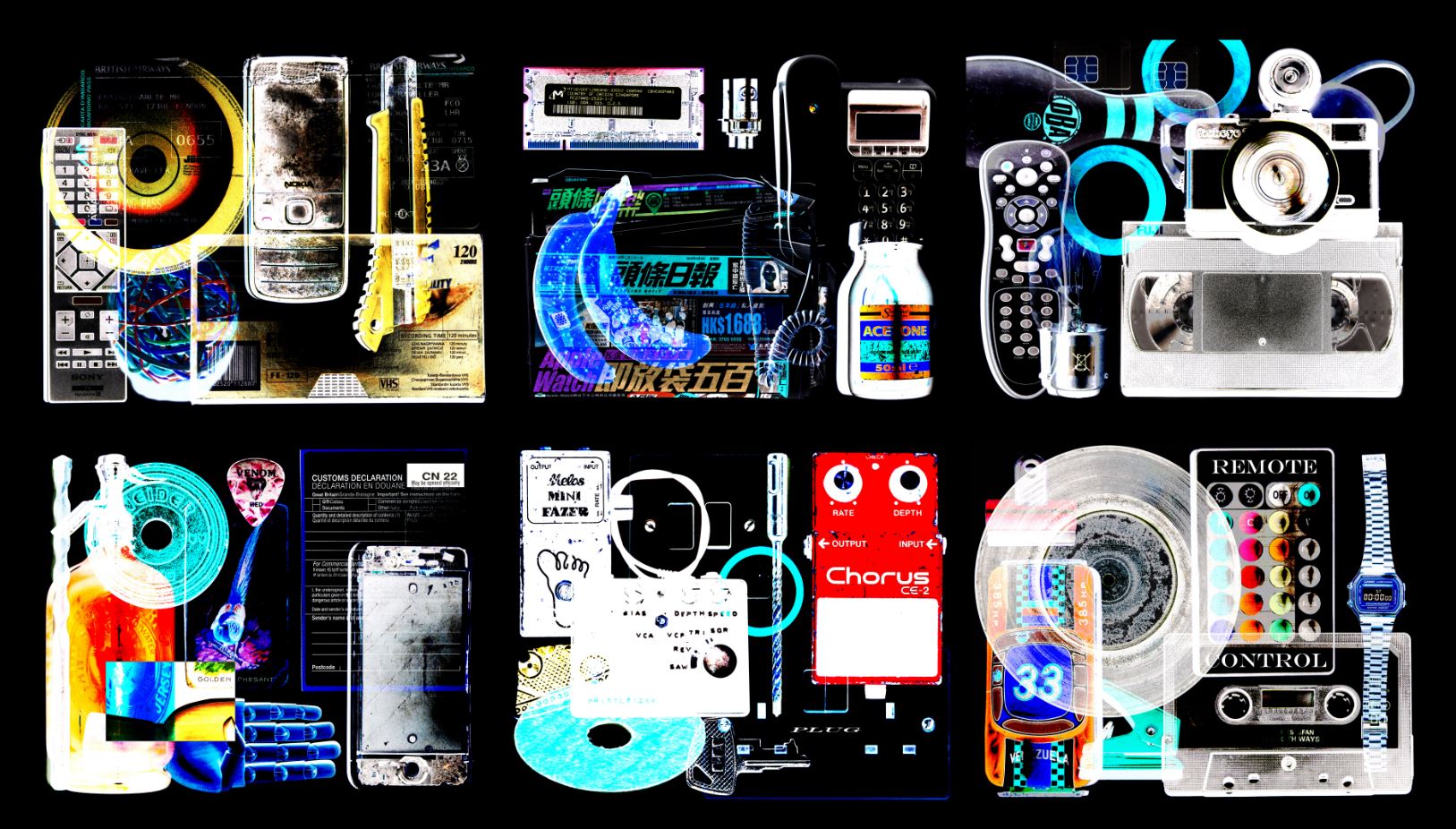
I have chosen this image as a final print as I believe it is very striking but with a large amount of detail. As a viewer your eyes don’t stop moving with this image because there is so much going on within the image. Although this could be seen as a negative aspect I believe it is successful due to the style of image which i have been wishing to produce throughout this project.


With the two above images I have decided to have them printed as i believe they are very successful pieces in terms of their balance of colours, shapes and text. Also the subjects/objects really stand out on top of the white background in order to create a very striking visual.
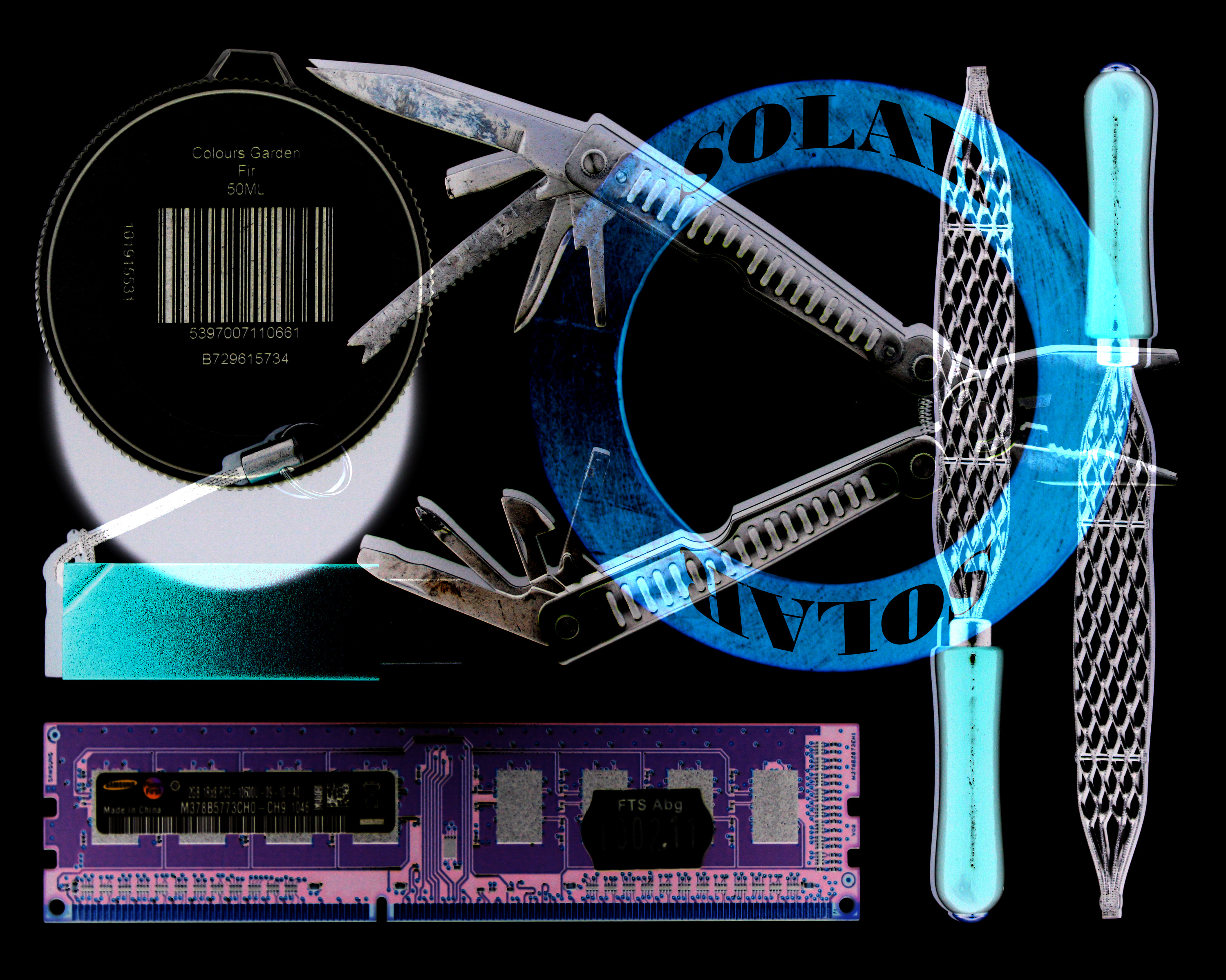


The three above images I believe are successful in terms of how they display layers and hidden elements. Hidden (secret) being something I have wanted to explore since the beginning of the project.
As I am also using a light-box as the main part of my presentation, I want to display my prints in a simple and minimal way. I will do this by putting each print individually onto a trimmed piece of foam-board and then place these pieces onto white mounting board. Here is the layout of how I plan to display these prints…

Johnathan Ducruix experimentation
Experimentation
Image I am planning on replicating.

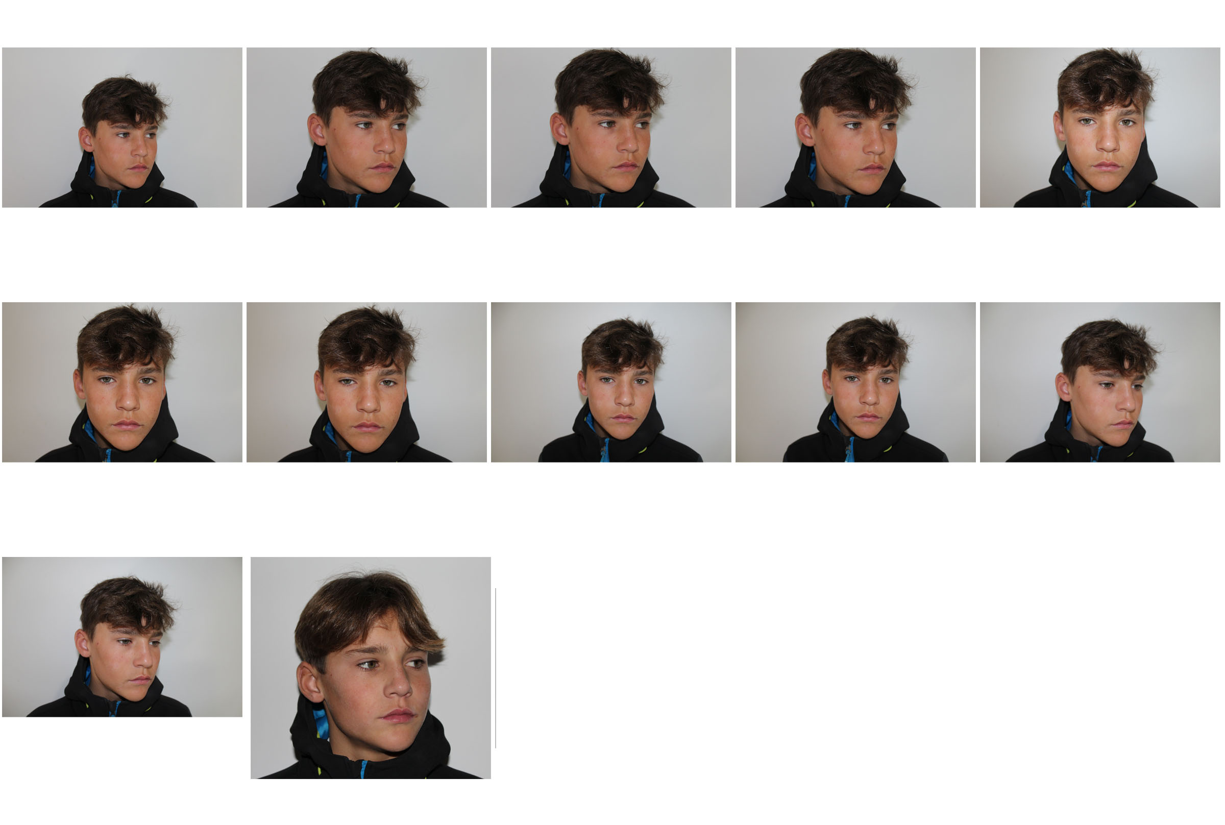
Contact sheet

My interpretations


Further Experimentation / Black and white


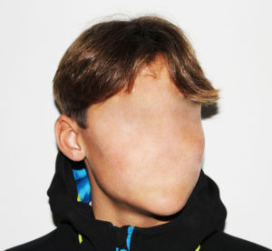
Creating an image in the style of Johnathan Ducruix
Original image

To begin with, I cropped the image as the chosen image had too much unnecessary background space.

Once cropped, I used the healing tool to remove the facial features.


Once I was happy with the image I then moved on to changing the brightness and contrast and then converting it into black and white for further experimentation.

Final image – Colour

Further Experimentation final image – Black and White

JONATHAN DUCRUIX
Who is Jonathan Ducruix?
Jonathan Ducruix is a digital artist who goes by the name Me&Edward. Ducruix has a diploma in 2D and 3D computer graphics. He has always been attracted to the world of fashion and design which is clear in his work. Ducruix says that he has a more spontaneous style of work – when he has a specific idea in mind he will work on it right away. His impulsive projects are often the ones that satisfy him the most. The name ‘Me&Edward’ comes from the fact that he wanted to separate the I – as a photographer from the I – as a human being.
Examples of Jonathan’s work


Photo analysis of one of Jonathan’s pieces
A neutral skin-colour range was used for the colour pallet for the cover up of the models facial features. This natural colour contrasts with the unnatural subject of the photograph. The use of the light and dark aspects in this photograph varying from the shine on the face to the shadow on his throat creates a strong contrast in the photograph. There is a smooth texture throughout the photograph this adds a sense of confusion to the image.
The shadows and position of the model creates a 3D effect to bring the supernatural looking subject to life. The subject appears to be placed in the middle of the photograph this creates an uneasy atmosphere in the photograph.
It is clear that studio lighting was used when taking this photograph from the artificial looking tones on the models body. It appears that a quick shutter speed was used due to the image not being too dark and it being completely in focus and sharp. A low ISO will have been used as it is a photo in a studio, Ducruix will have used a low ISO to balance the overexposure from the shutter speed to keep the image very high quality. It appears that a neutral/warm colour cast has been used on this photograph.
This is an image I am going to try replicate as I think there are a number of different way I will be able to create this image in the same style Jonathan has done.