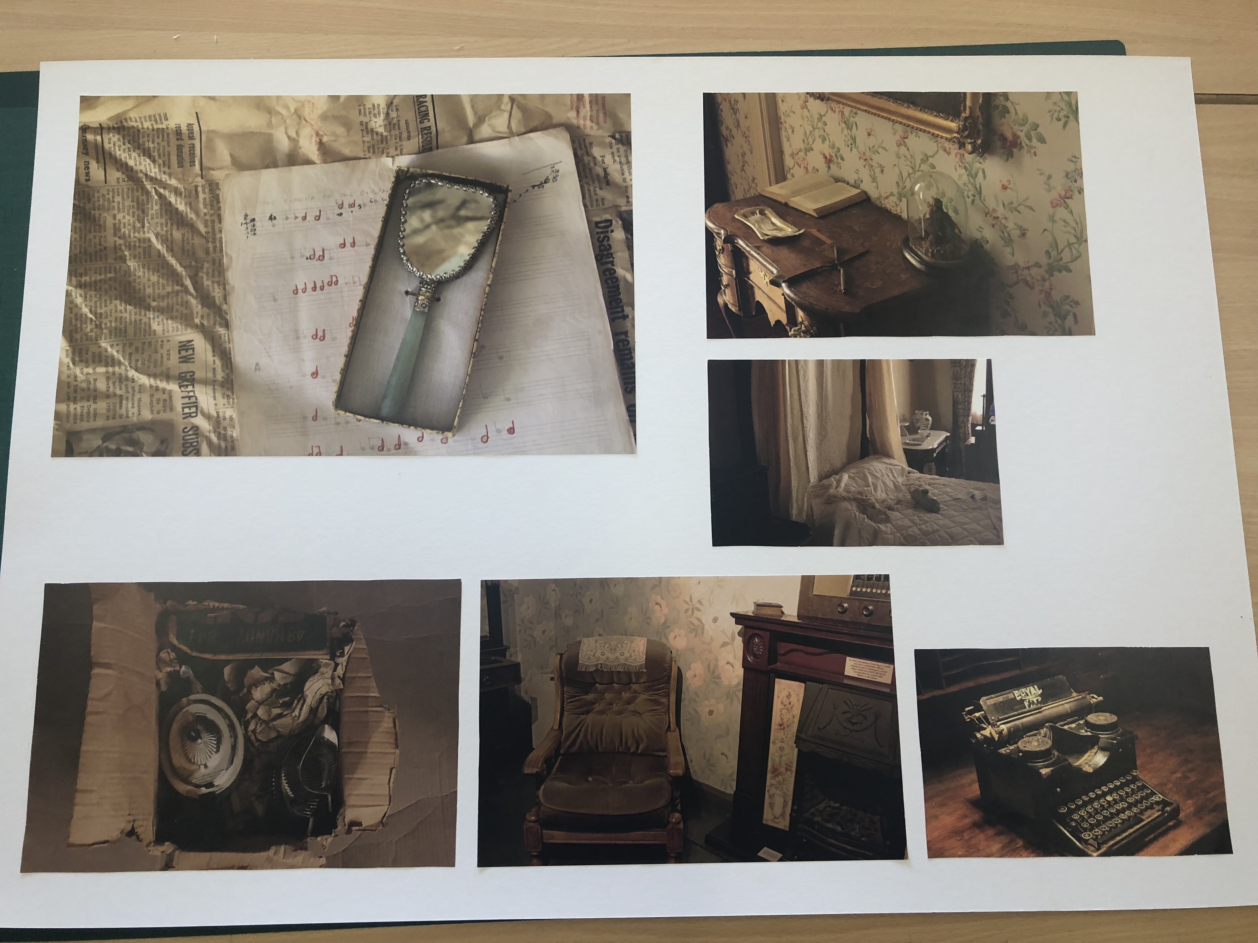
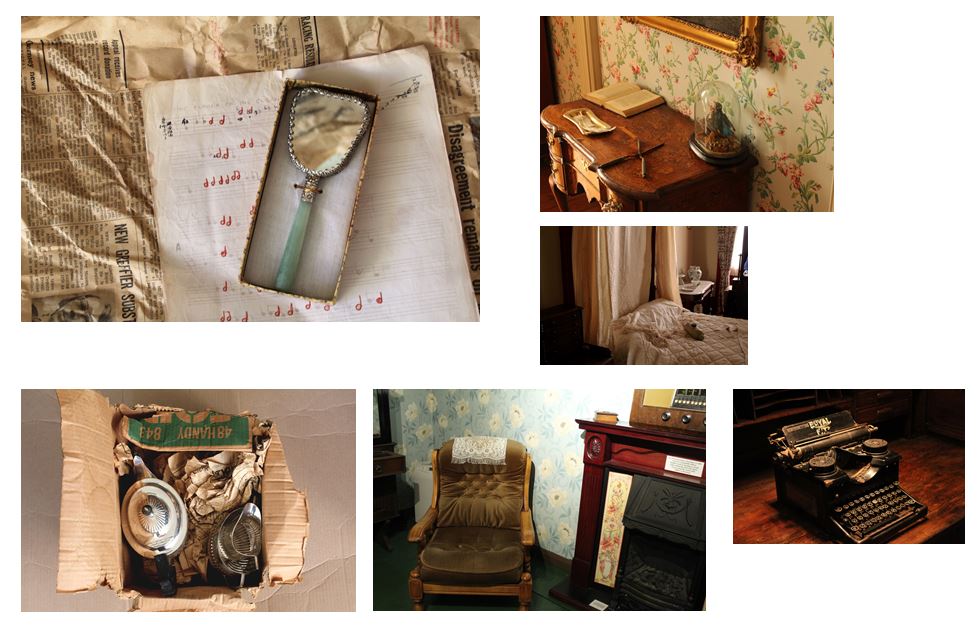
To experiment with the presentation of my images and to start displaying images from all the photo shoots combined I explored different layouts and arrangements of the photos.
This first layout are images from my fourth photoshoot where i went to the Jersey museum and took photos in the style of Evan Walker. For this edit I focused in on smaller sections of the images and cropped them into square shapes so the overall layout would be square and symmetrical. Focusing in on certain sections of the original images. I did this as i liked the photos as single images but think more of a concert is formed when the are displayed together.
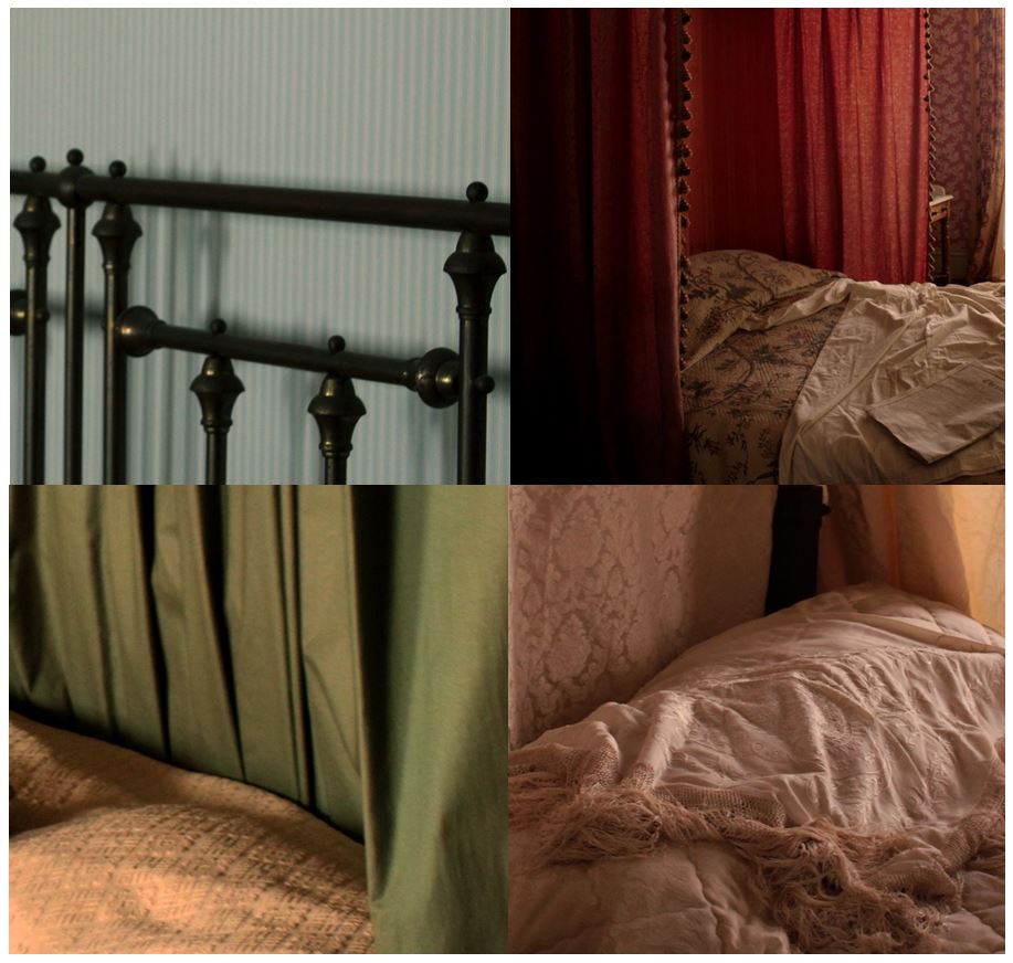
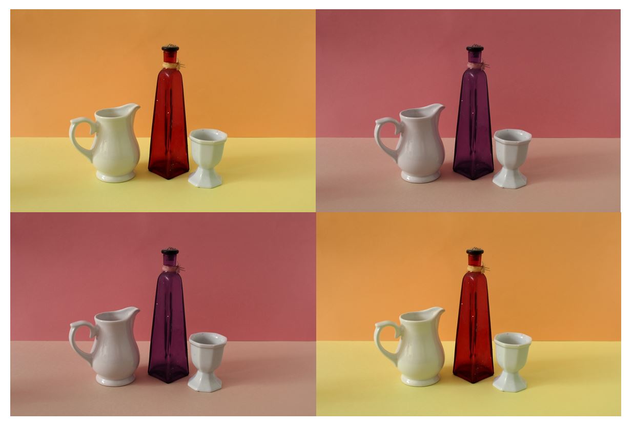
I also tried editing the images into different arrangements like horizontal and vertical rows seeing which ones looked the most aesthetically pleasing. I found that this worked less well that the display of 4 as the composition in each image is too similar but adding the fourth image balances it out, also making the overall display symmetrical and balanced.

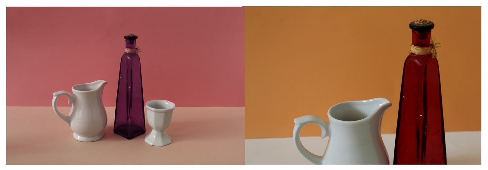
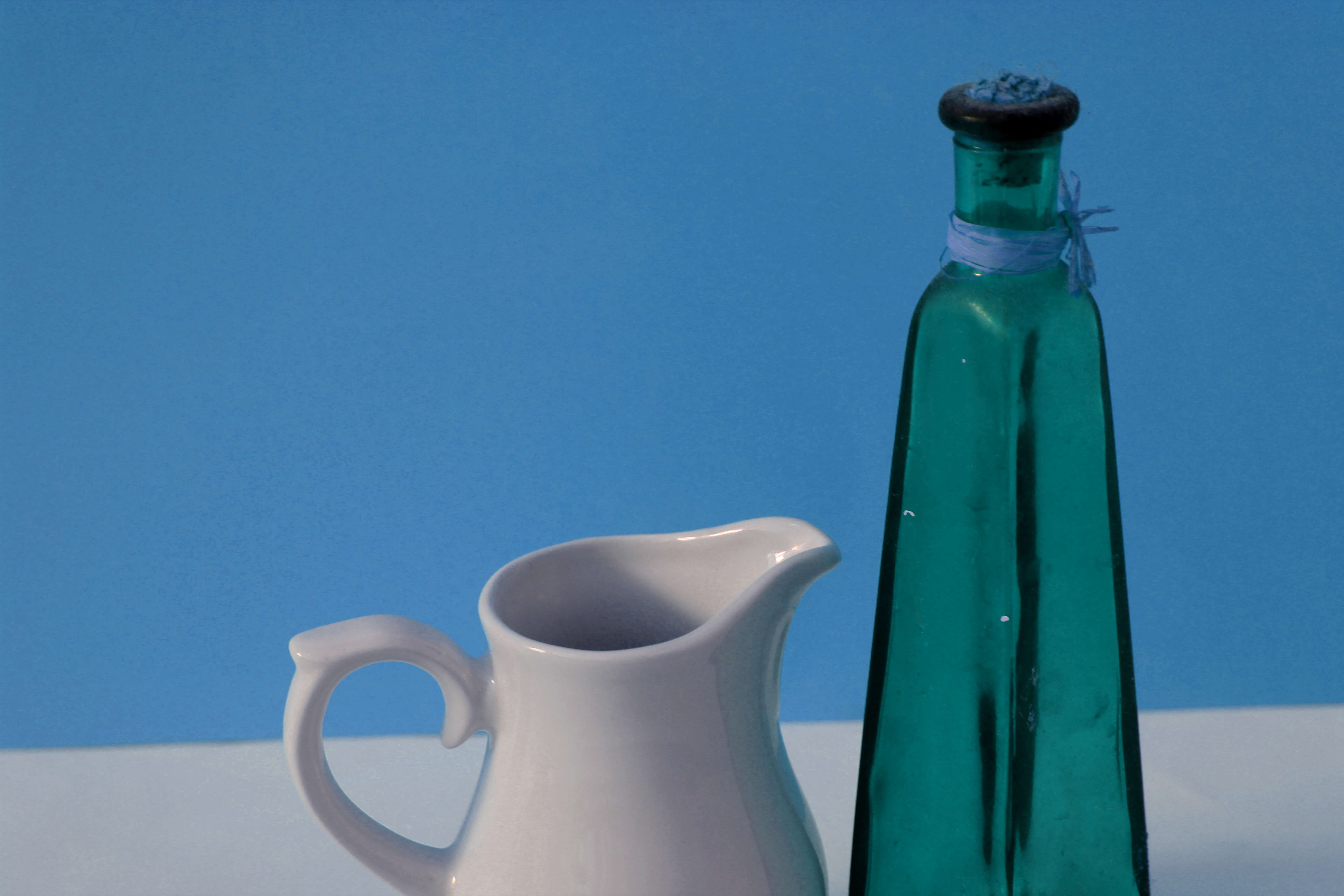
The images shown below I have edited on photo shop so that the colour in each photo is different. I did this so I could display a selection of the same images together, rather than having a single image by itself. It also develops from the original image. I decided to edit bright colours rather than in the neutral tones that Giorgio Morandi used in hi paintings as I didn’t want to completely copy his style and wanted to make my photographs unique in some way.
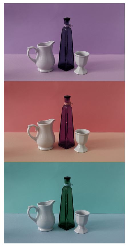
I tried arranging the different coloured images in different layouts, repeating the same images more than once in different colours and also incorporating other images from the same photoshoot to gain a different perspective of the same setting. The bold, bright colours I have edited in emphasise the straight lines and geometrical shapes within the image, and also emphasise the objects in the foreground of the image . I found the images that worked best were the ones with the greatest contrast between the two colours in the background from dark to light as it creates a division across the image and adds another aspect, rather than the background being plain like the first part of that photoshoot.

Displaying my Prints:
For the images I printed out i wanted to display them as a collection of images together rather than single images by themselves. If these images were displayed separately I don’t think they would make sense, displaying them together gives the images a story. They also all link together though the brown and yellow tones in each image, giving the display as a whole an authentic and eclectic style. I decided on using a white background as it emphasises the yellow tones within the images and makes the photos seem brighter.
