Monthly Archives: April 2018
Filters
Jesse Draxler:shoot 4
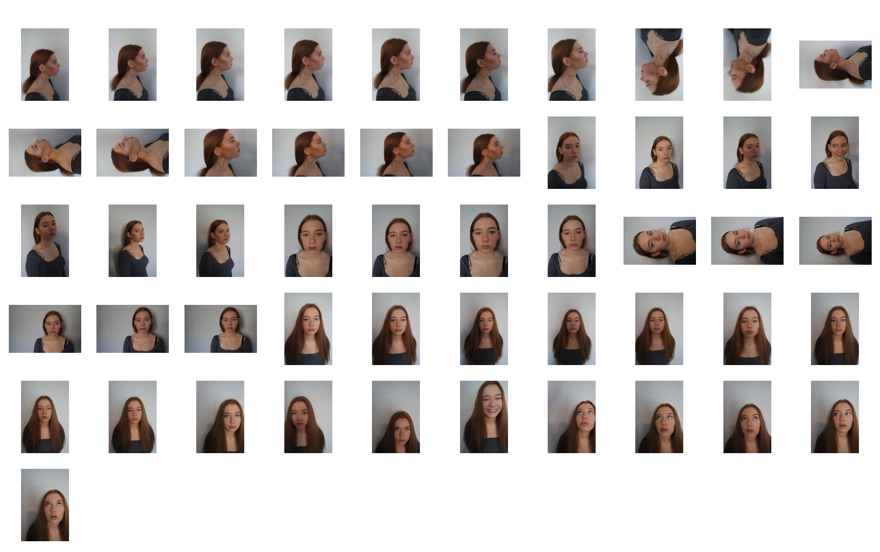
For this shoot I really wanted to focus again upon the conventions of human behavior being neglected and removed from being treated as a person as this is what the artist does. I wanted to edit the images in order to reflect a personal emotion onto the image and present how human behavior works through the overall representation of the image itself.
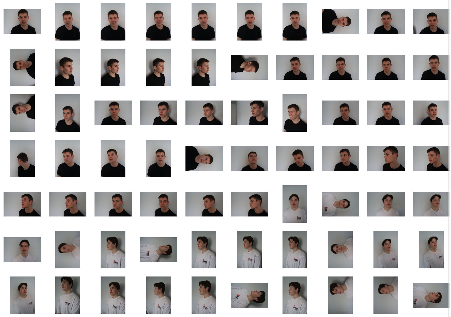
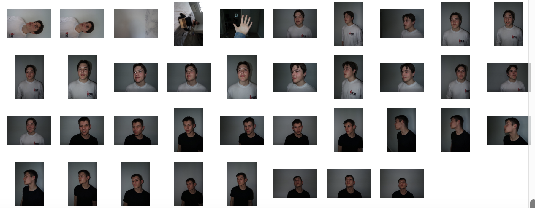
original photos,contact sheet:
Final edits:
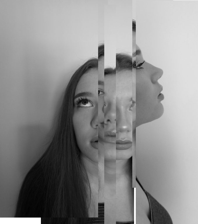
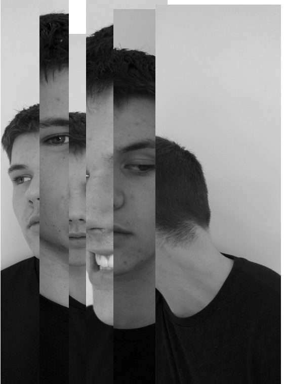
For these two images I was inspired by some of draxlers images where he cuts different profiles and angles them up in order to form a new composition of faces and a new style and angle to the original.I wanted to completely alter the images in order to create a whole different meaning behind them.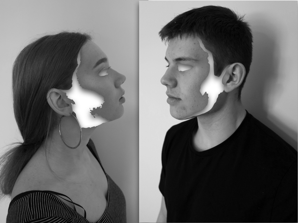
The editing for these images I wanted to connote the removal of identity and how the unique abstract purposes a complexity to human behaviour. Although there is still a strong highlighted effect of surrealism within the images,the effect of emptiness creates a sense of suspension and secrecy within the image as they no loner represent who they are.
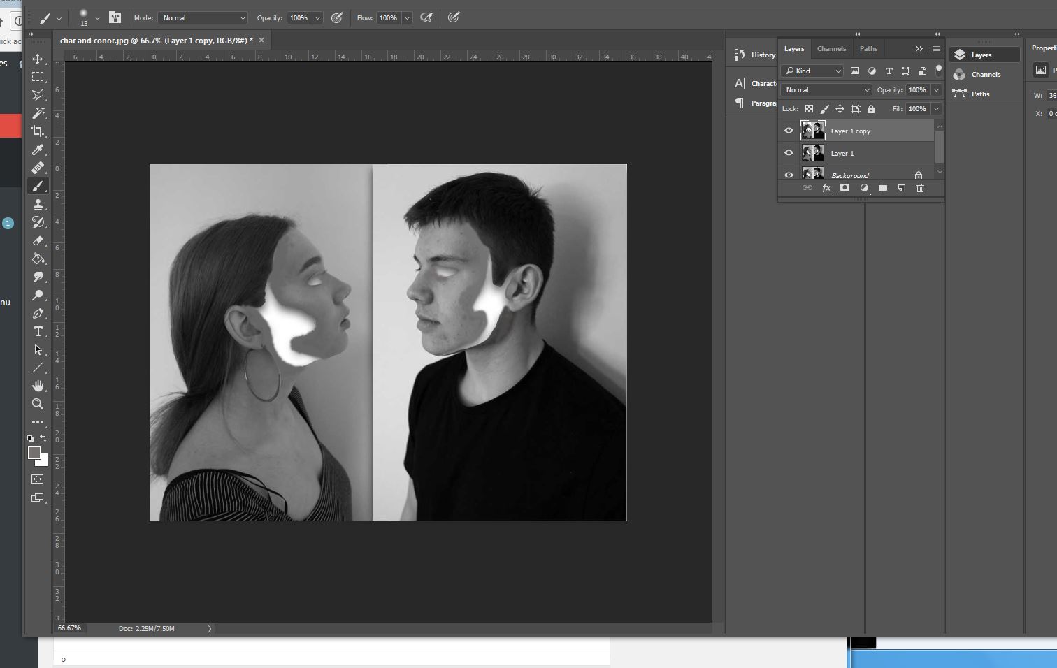
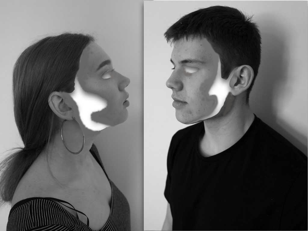
To edit the images I wanted to remove sections of structure and a flowing sense wihtin the face, In this case being the cheeks line and the side of the face,addtionally I wanted an absence of eyes wihtin the images, to do this I used instant alpha and removed sections at a time,but it was not as smooth as I wanted the overall image, because of this I filled in tonally with the brush tool with the same skin tone and rounded off the edges.This is more effective and creates a better overall finish to the images.lastly I created shade within the inside white area to create a more three dimensional real effect to the images.
Final edit:
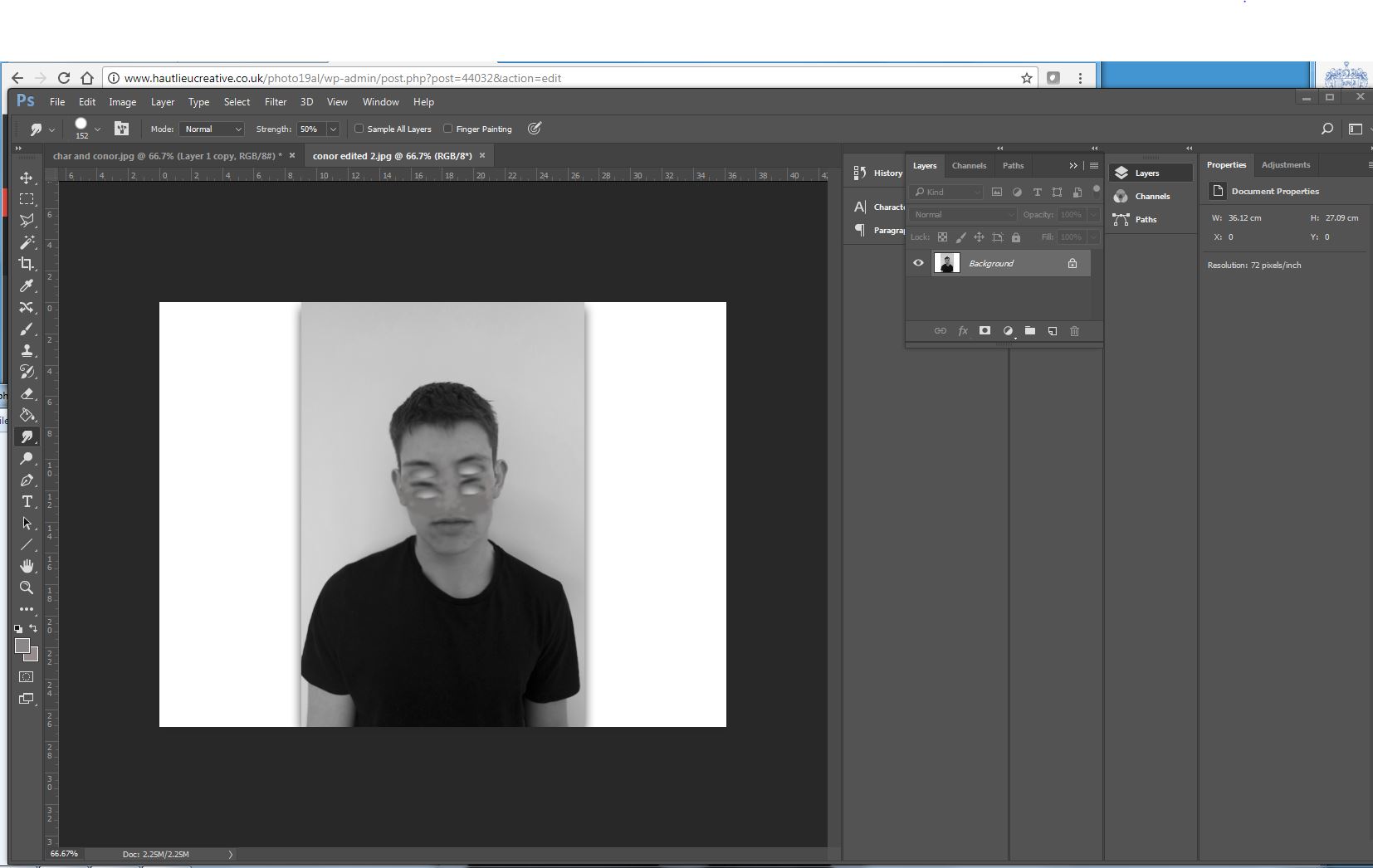
Similarly with the previous image I wanted to remove the eye but then copy that section below to form many missing sections of eyes, again to do this I used instant alpha and then used photoshop to smooth over the image and make it seamless throughout(using the smudge tool),This image is meant to presets a mask to identity but still an absence of our real behaviour.
Final edit: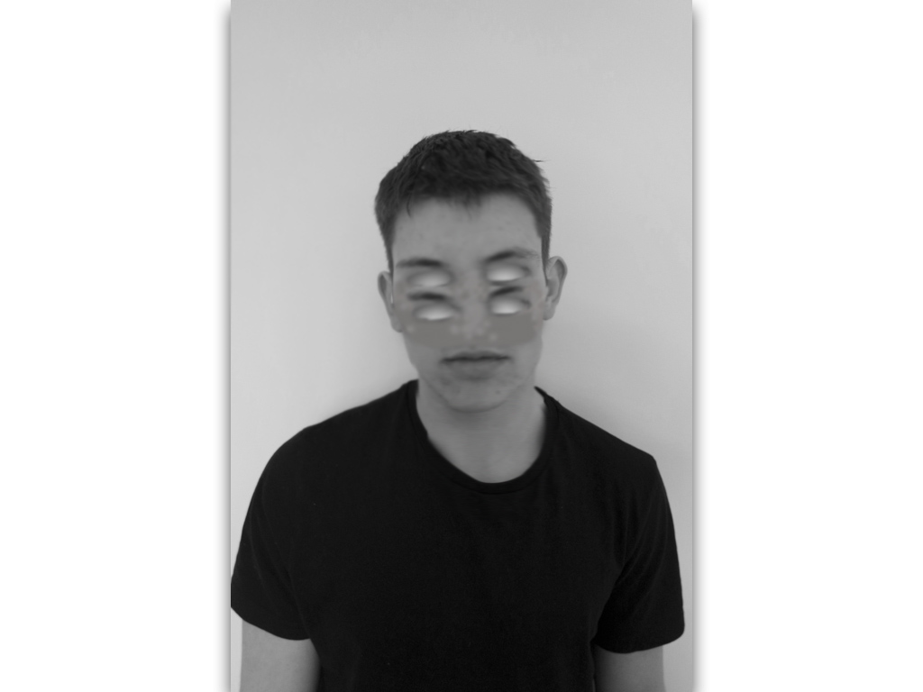
similarly I repeated this technique but wanted to form an effect of a mask so not blending the eyes in but showing a shape that has been repeated, to do so I experienced in different methods to find the most successful:

Final edit:
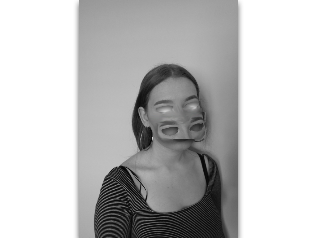
Final edit:This image is purposely experimentation to try and remove and cover a different sense of identity and not just purely eyes.
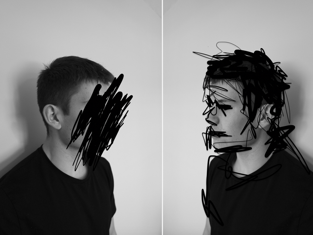
The next two images I think are less successful and more concentrated on experimentation;within these images I wanted to find an interesting composition of repetition of faces of different angles and edit them all into one to from an abstract and surrealistic piece. I did this similarly to my artists inspiration of demonstrating the combination of many different human emotions that we have and representing this in an abstract method.
Final edit:
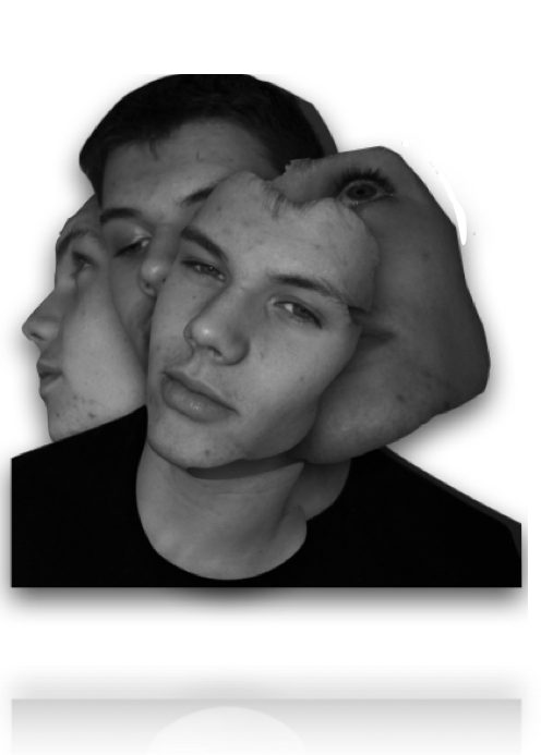
I edited the images by removing the body and editing only the sections of the faces that I wanted,I the framed them into an interesting composition and surged the lines to form a more synced piece.
Final edit: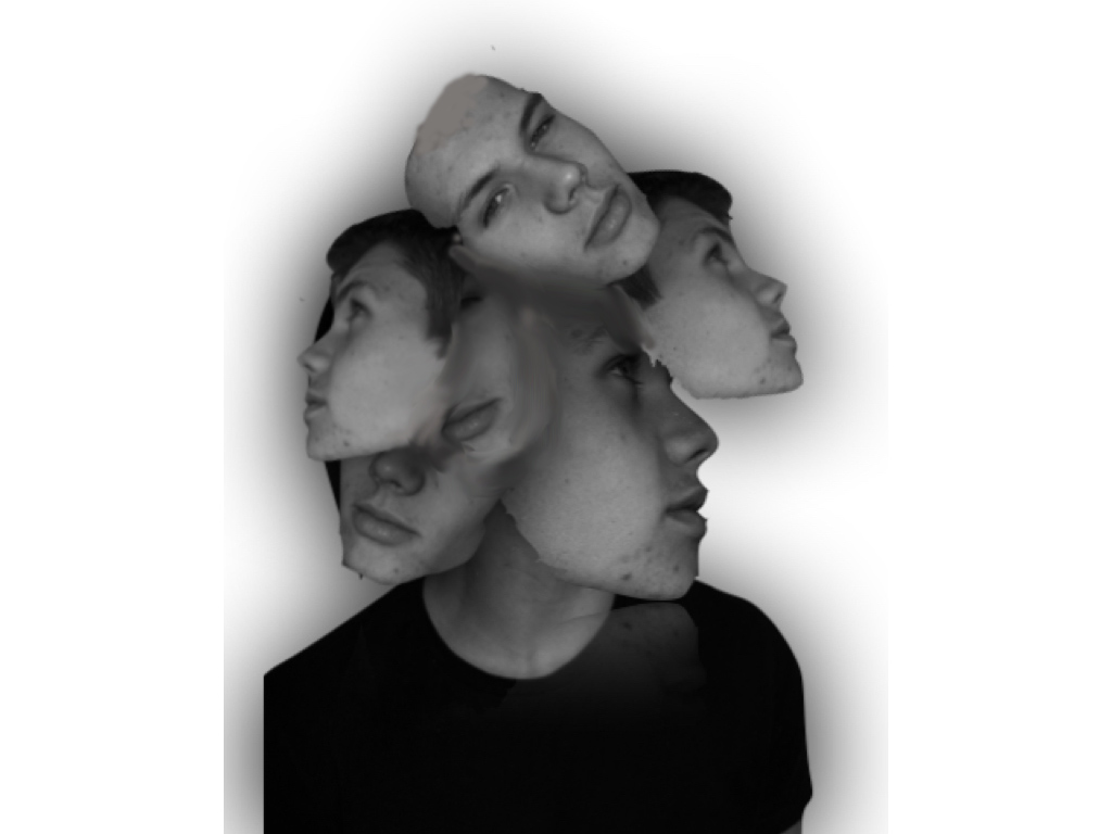
Overall I think the most successful images was the removal of facial features, this is due to the most successful editing and a simplicity but effectiveness of connection of human absence within the images themselves.
Threshold Experimentation
THRESHOLD EXPERIMENTATION
Just as an experimentation, I decided to see what effect it would have on my images by using the threshold tool in order to get rid of any colours and shades, to see what my images would look like in bold black and white.
Below are some of the outcomes of this experimentation…
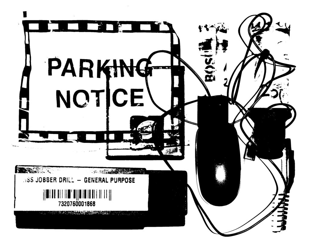
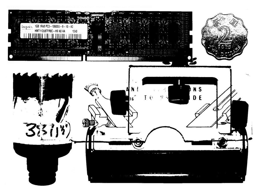
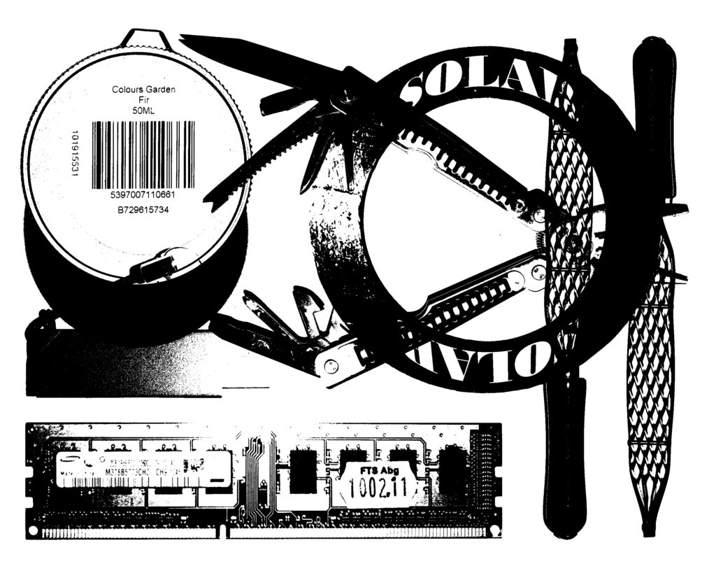
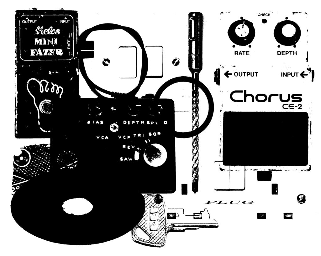
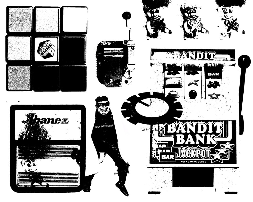
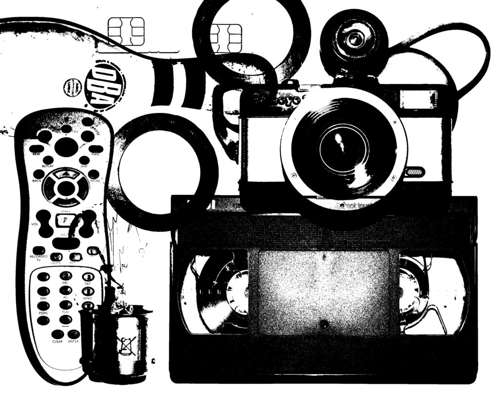
Personally I was not as much of a fan of this style of the images, as I believe the element of colour in the images I have previously produced have a high visual value to the image. This lack of colour being the downside of these images, I decided that changing the black for alternative colours could work, and here is what I came up with…
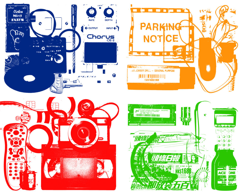
But I was still not a fan of this threshold style. I think this is because the colours within my original images give a lot of visual information about the textures, layers and contrasts of the objects within the images, and this is lost within this style. Therefore I believe this experimentation was unsuccessful in terms of image production, however it has helped me to look at the objects in terms of their shape and their placement.
Un-inverted Editing
WHITE BACKGROUNDS
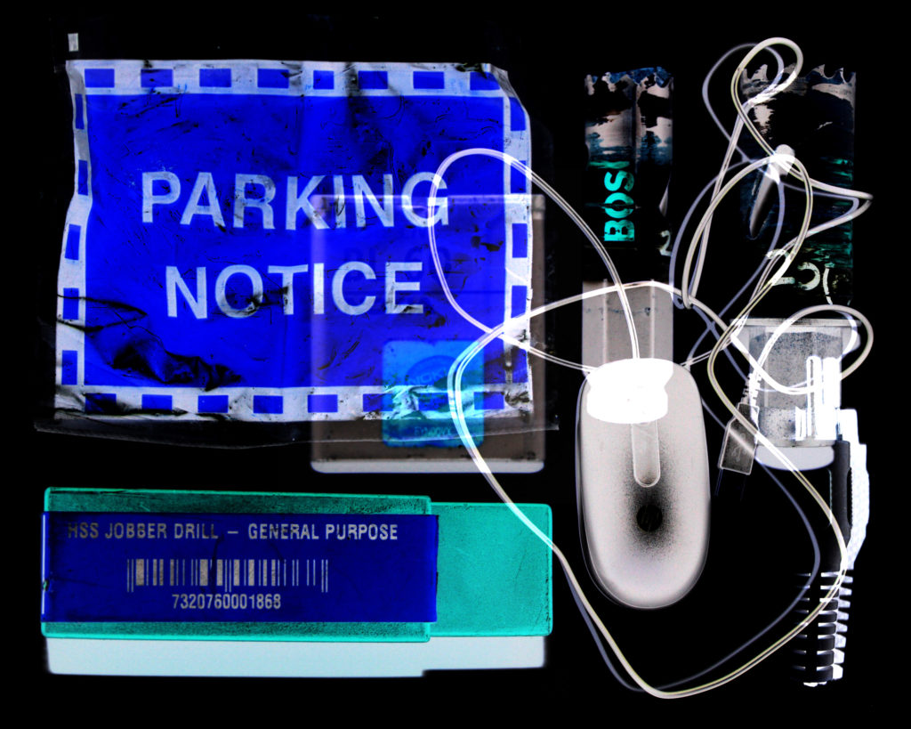
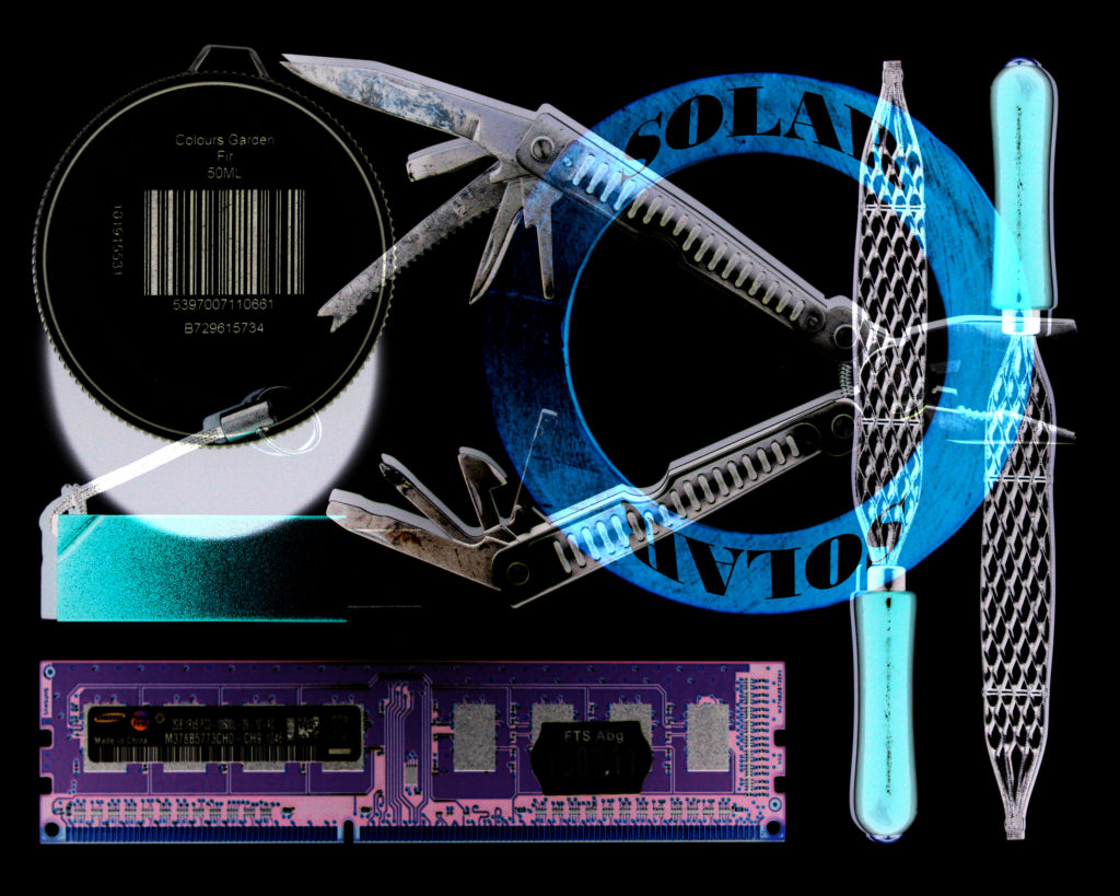
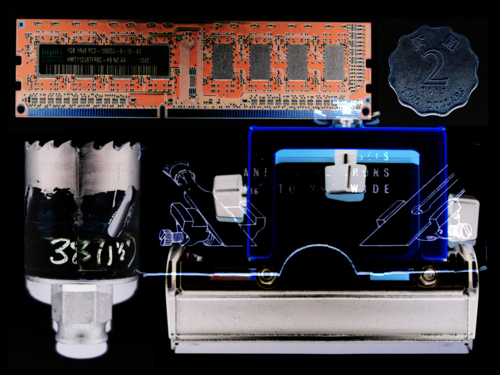
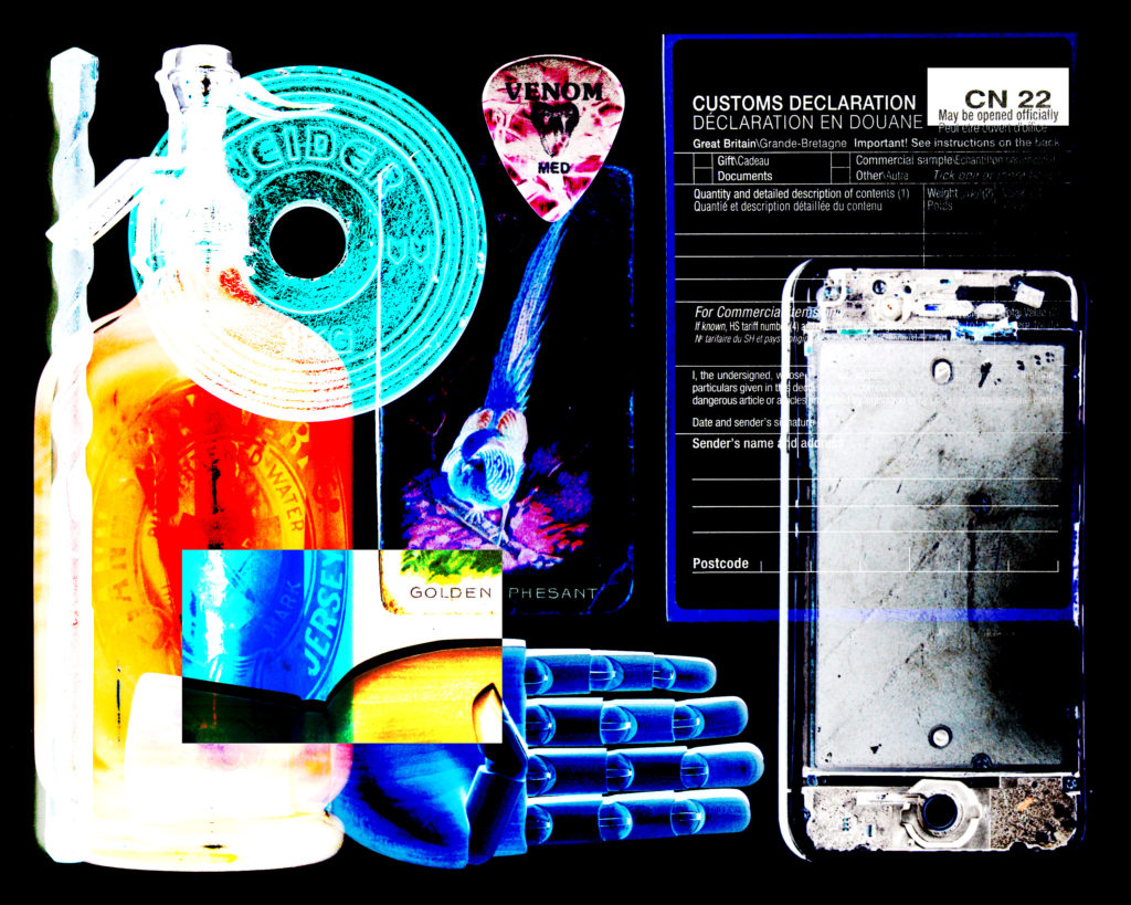
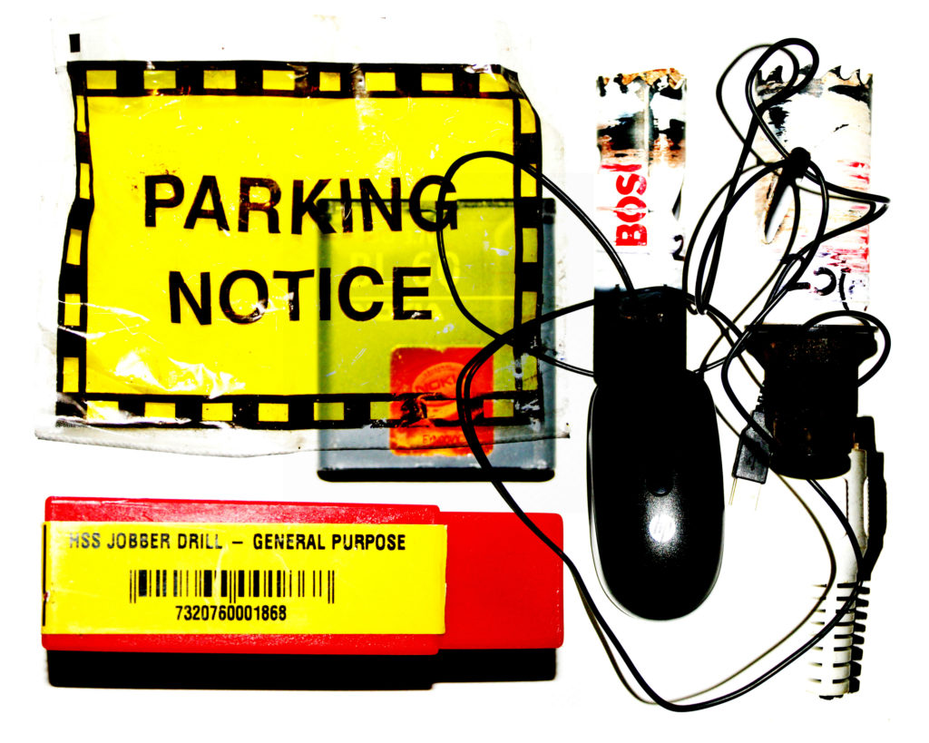
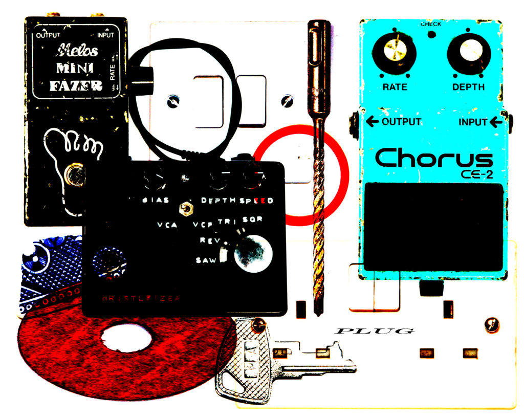
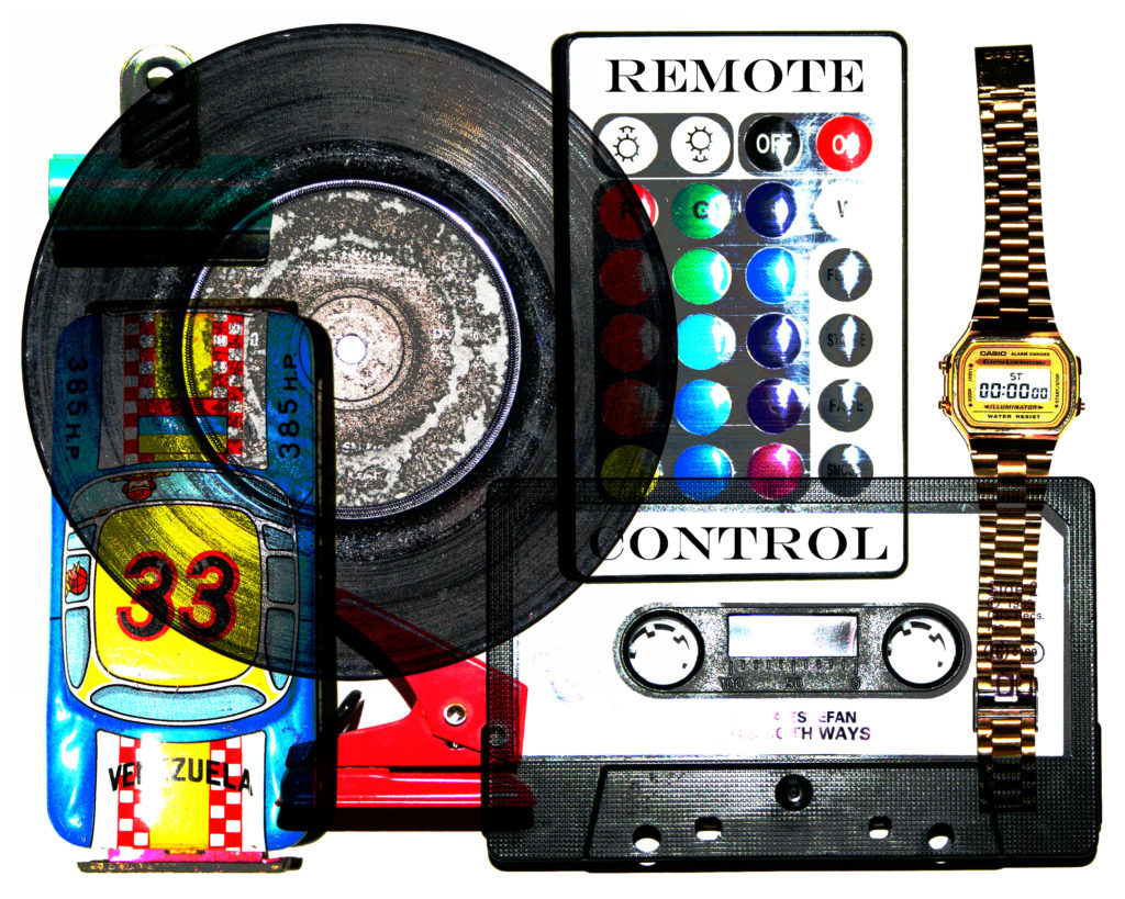
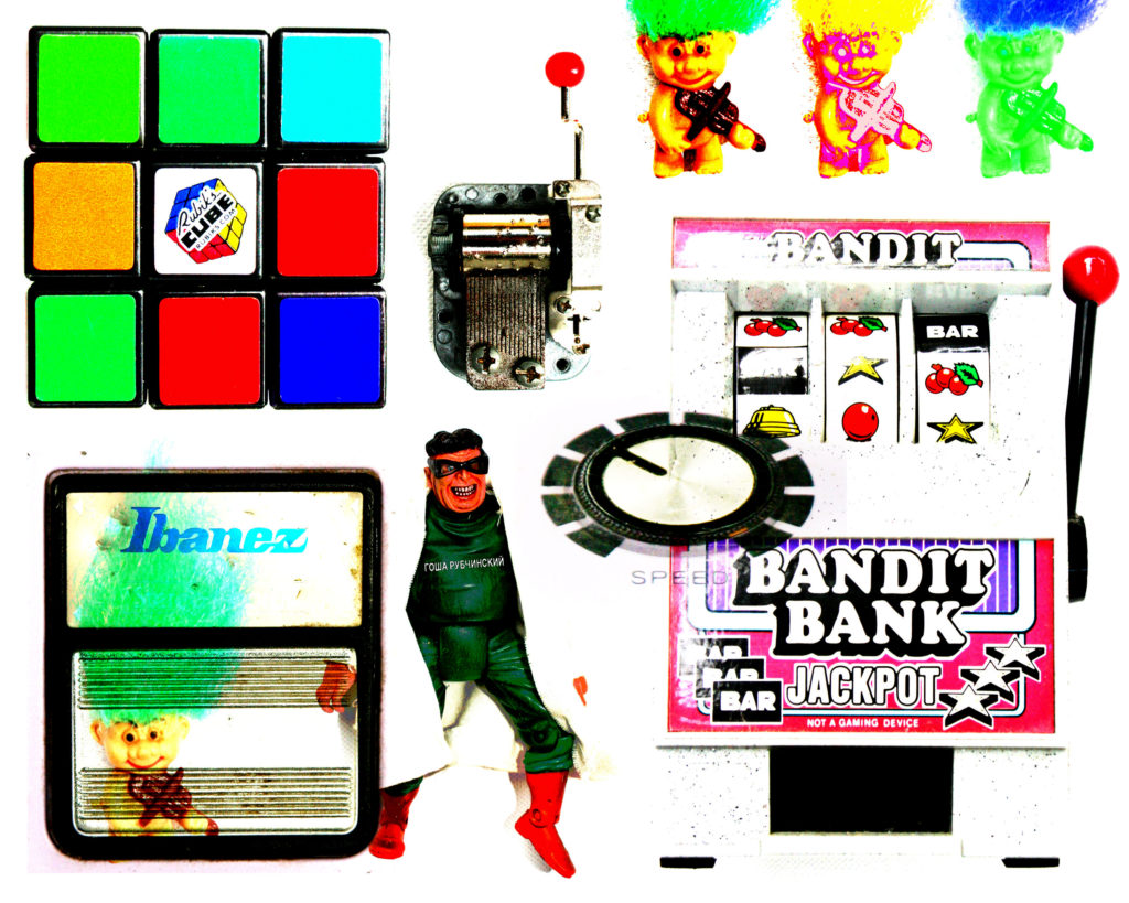
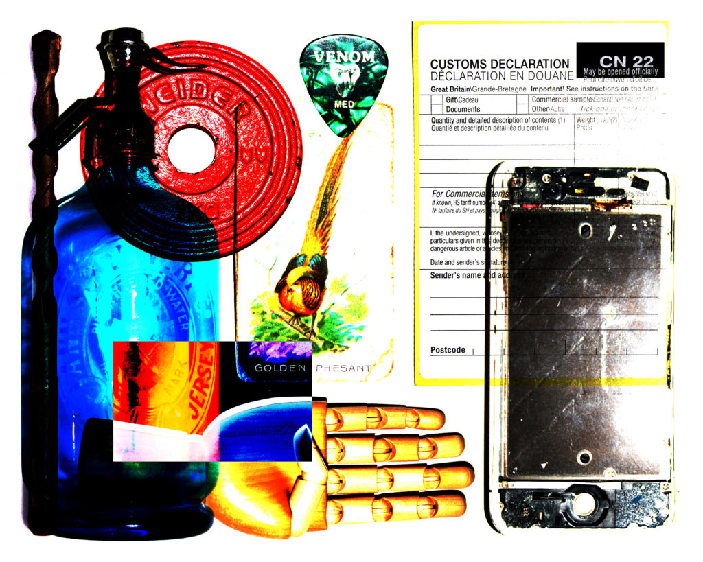
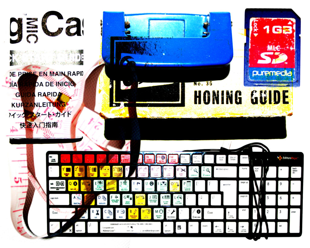
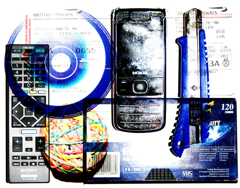
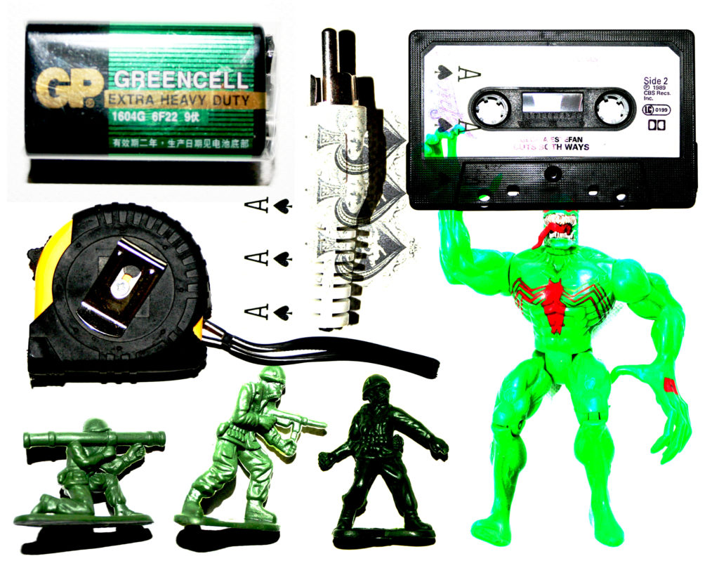
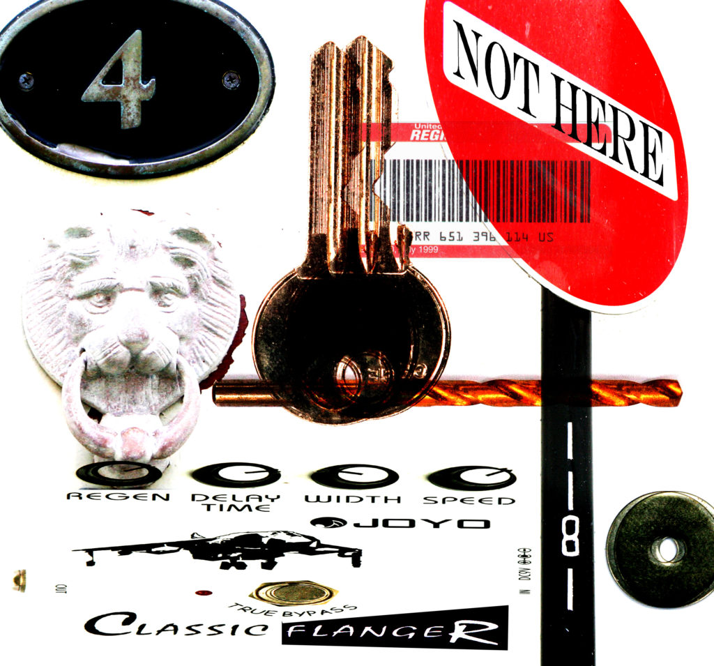
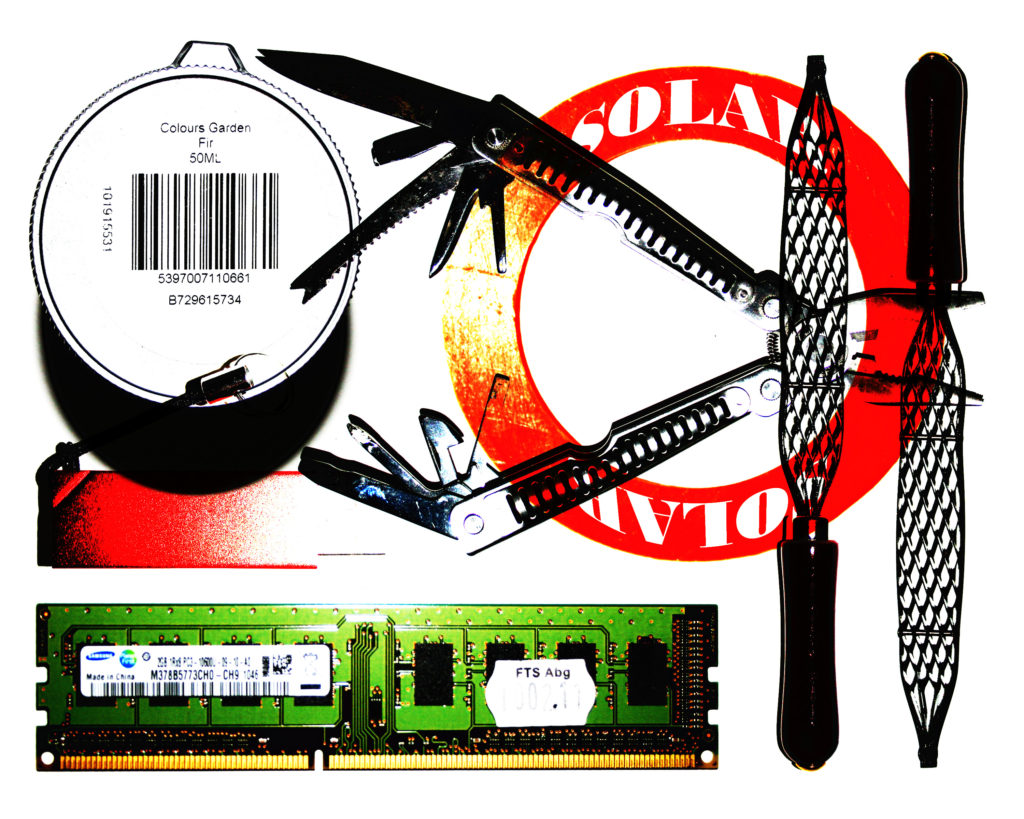
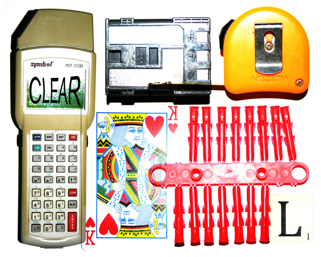
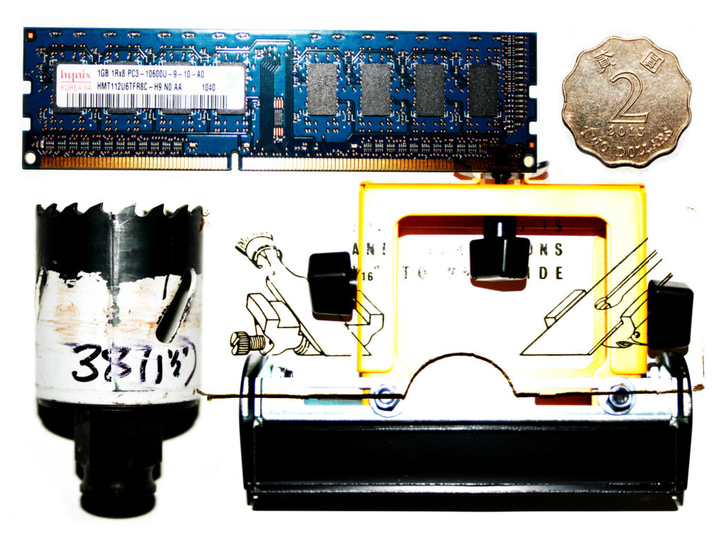
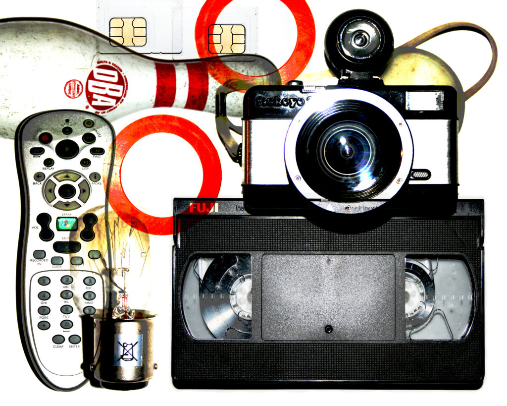
After looking at the work of Jim Golden, I decided to experiment by inverting and enhancing the colours of the images which I have already produced, in order to see how a white background with the real object colourways work in comparison with the inverted colours on black. The outcome of these images is something that I am very satisfied with, as I believe that they have an alternative but equal visual value as the original inverted images. I simply used the curves tool on Photoshop in order to un-invert the images and enhance the colours. I enhanced the colours and I like when they’re enhanced they stand out a lot from the white background, due to the strong contrast. This allows the viewer to have focus simply on the objects without having any surrounding distraction in the images.
Here are the outcomes of this experimentation…

inspiration 5:Ketty La Rocca
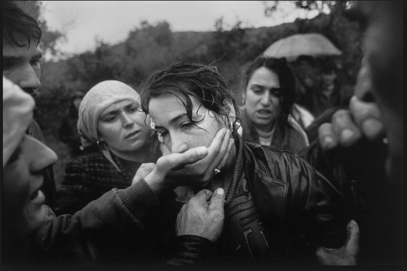
I was inspired by this image due to the composition of the piece centring the women and how she connotes a struggle of her voice being taken away with all the hands heading towards her mouth, It presents a strong relation of humans to violence,and the most important weapons we have is our voice. Although how we are expected to act a certain way due to the environment we grow up in or dependent on our gender.Furthermore the lack of eye contact presents her human emotion and how she is not addressing us directly as she is seen as powerless wihtin the image once again indicating human behaviour of fear due to others influences.
I would further develop this image in order to present more surrealist values possibly adding more hands and creating a more conceptual feel to being trapped and isolated.It again highlights the sense of human struggle and relationships people have to form due to the codes and conventions as where they were raised.
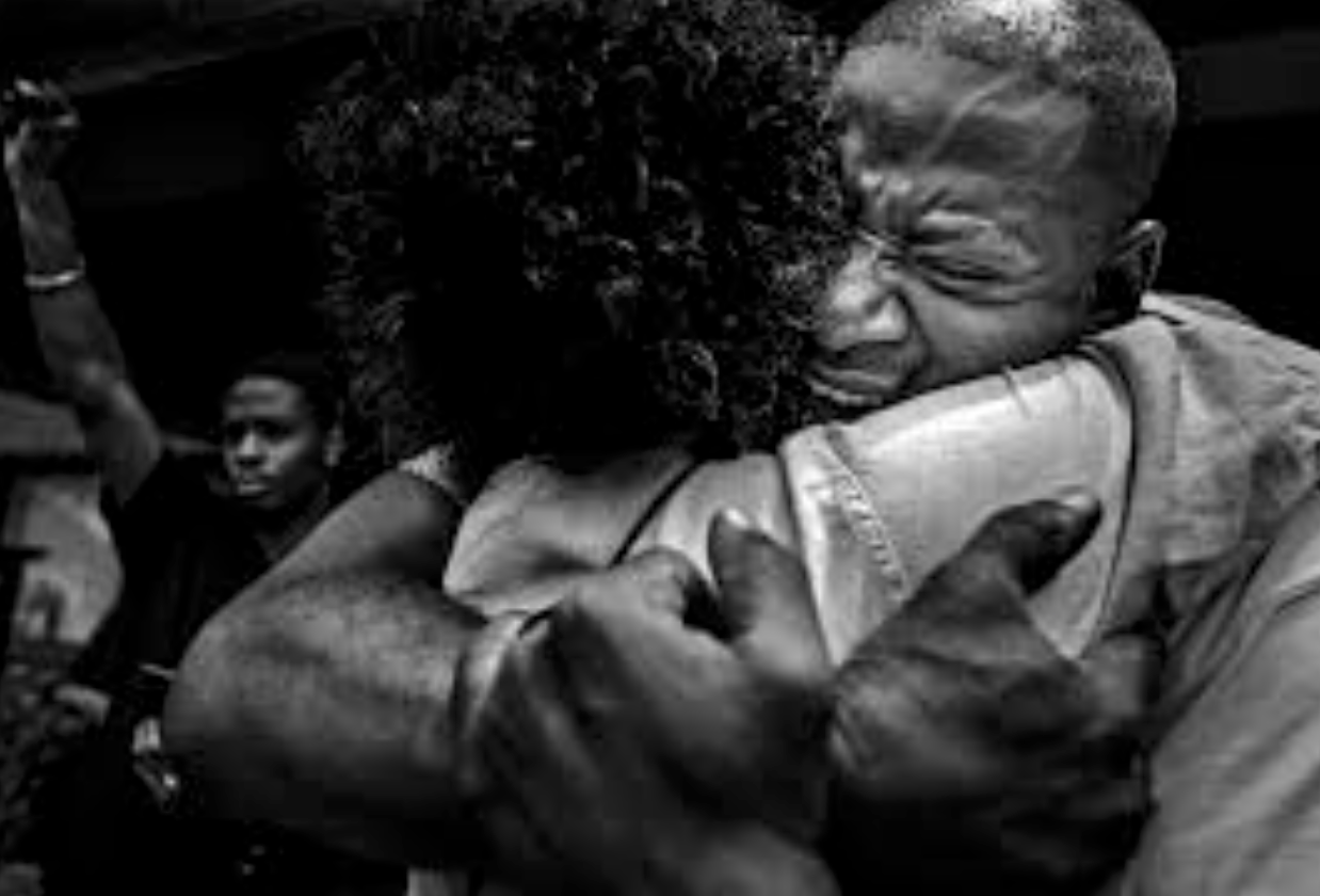
Secondly this image shows a strong sense of raw emotion and additional themes of photo journalism, it shows a presence of emotion as well as conceptual idea presenting peoples feelings and also what they want in the world.
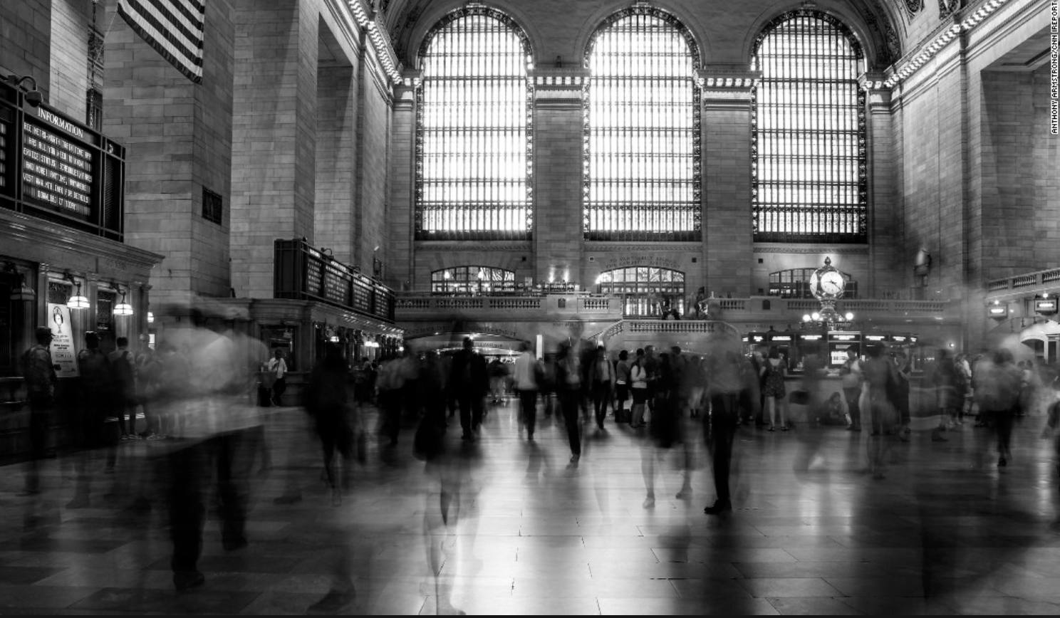
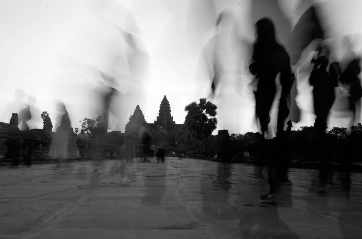
These last two images I was inspired as it tracks human behaviour and activity as one existence and conceptually how we all ignore each other and do not view each other as equal.I think this demonstrates a movement as a wide view to capture society.I wasn’t influenced by a apseicifc artists but more the means at which all photojournalism and surrealism artists work to capture people in a certain light to present a conceptual meaning of truth.
for my shoot I too want to capture truth but will additional edit the images to presents a surrealism effect such as manipulating and adding more hands, or editing the scenario they are surrounded by. locations need to be areas in which travel is highly occurring and used to presents a humans active life and actions .It also presents conventions of a persons life and a routine in which we all stick to as a society because it is how we are expected to behaviour and act as a whole group.
Ketty la rocca
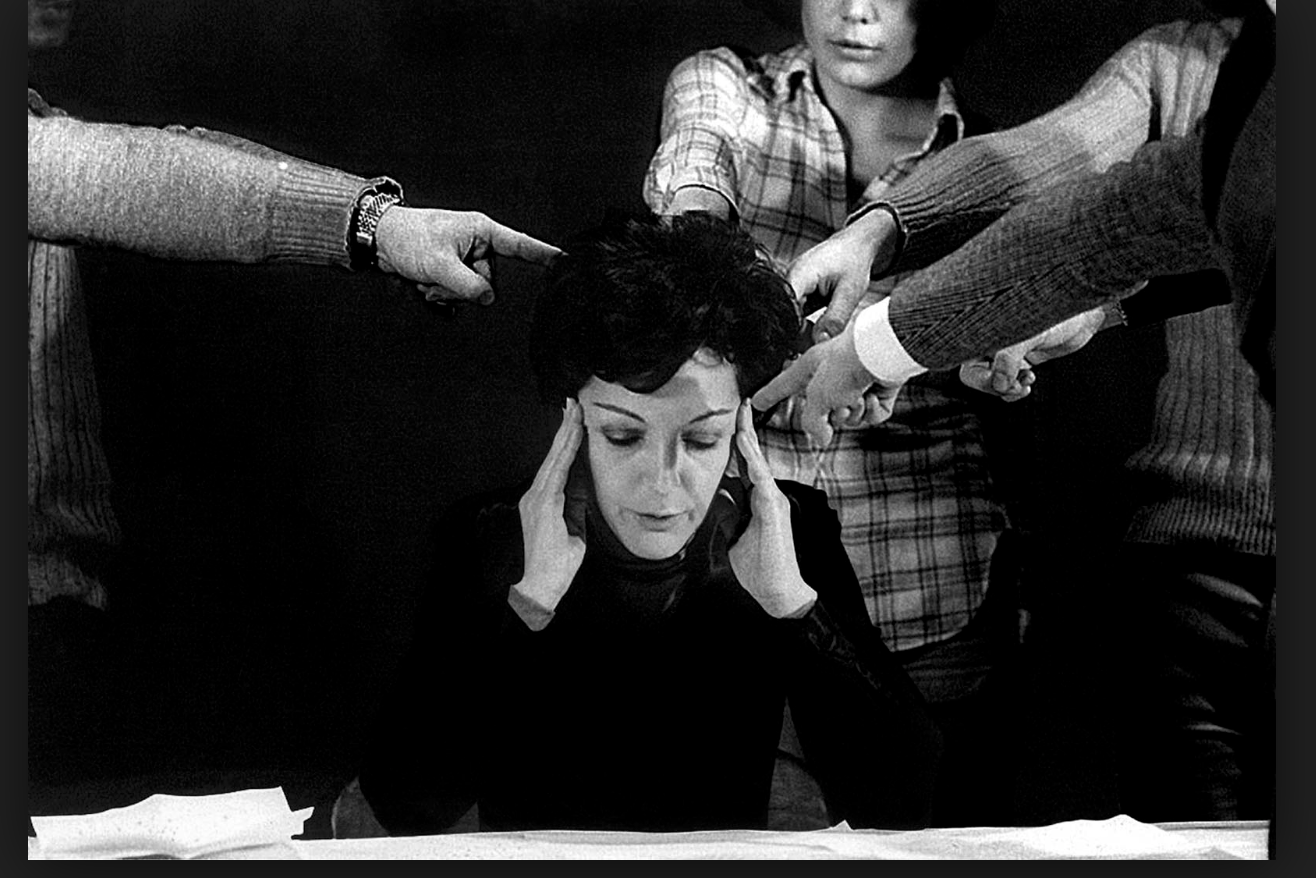
Ketty La Rocca was born 14 July 1938, in La Spezia, Kingdom of Italy – and died 7 February 1976, in Firenze,
Her work focus on beauty conventions and breaking them, this artist specifically also demonstrates human behaviour and the relationship people hold within each other;The art of La Rocca acts as a form of visual poetry, visual art, and performance. She explored language, images, and scenes of the everyday world. She emphasized the imagery of bodies.She examined their potential for expression. She combined hands and words. She desired to create a different language, a more visceral communion in which the physical body, gestures and the written word were intertwined. She was a leading exponent of body art and visual poetry movements.
Analysis of her work:
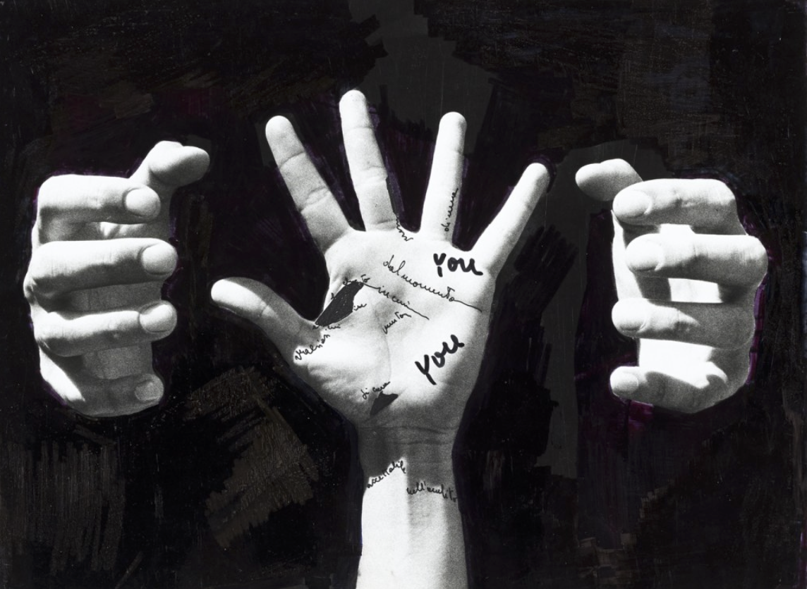 This image is almost symbolic for how we are tried and confined by a certain behaviour or have a constant fear to act or look a certain way. I think my previous idea and this artist would make a very interesting shoot altogether.
Jim Golden Photographer Research
JIM GOLDEN
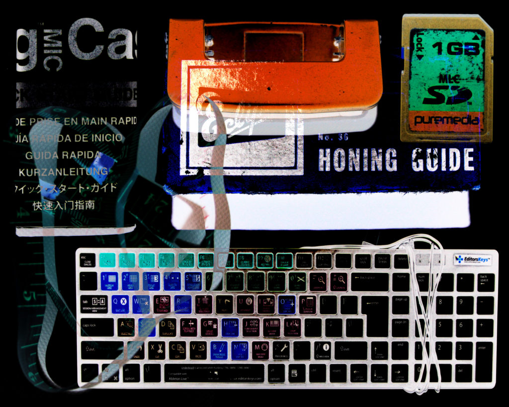
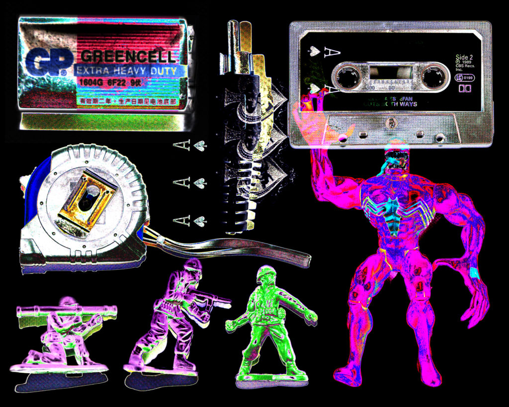
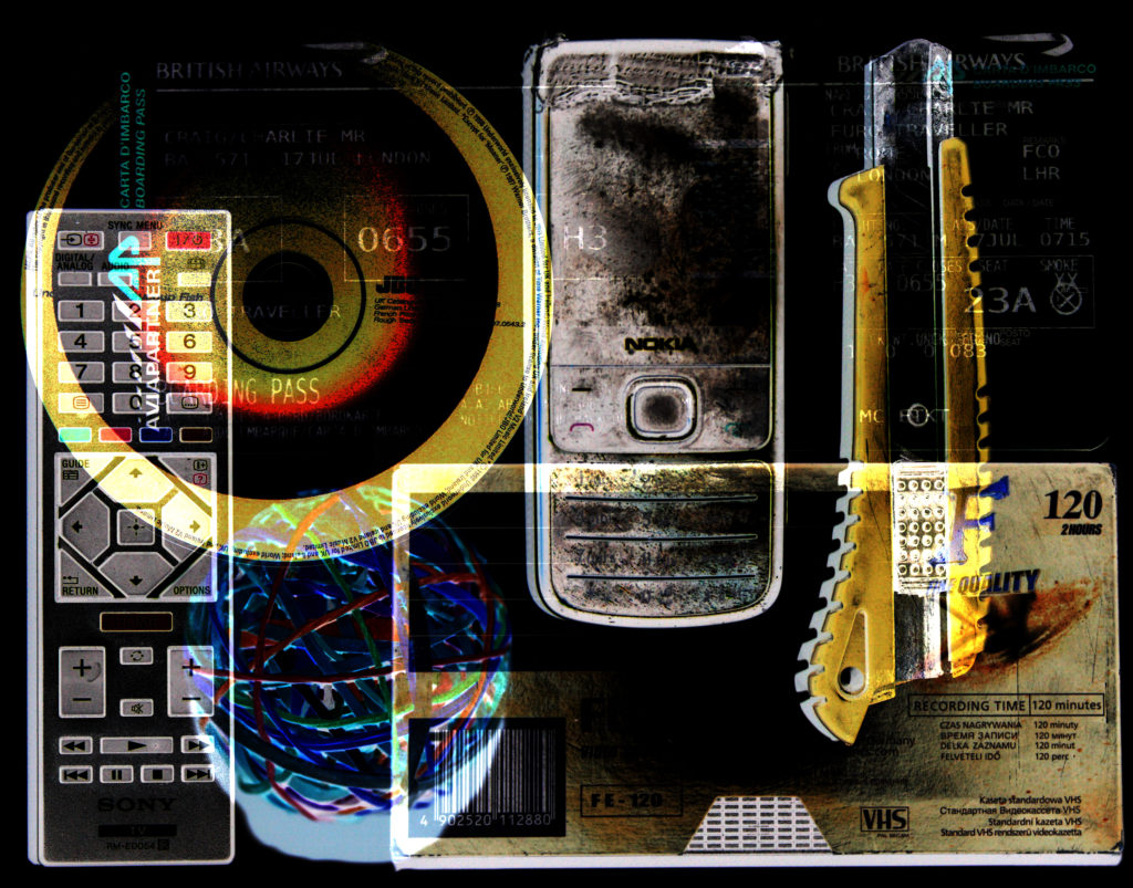
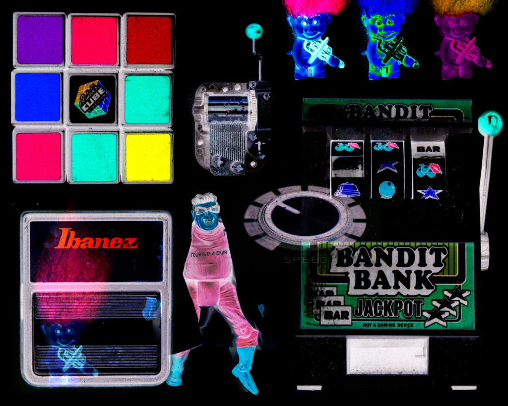
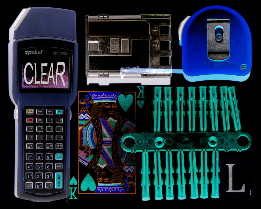
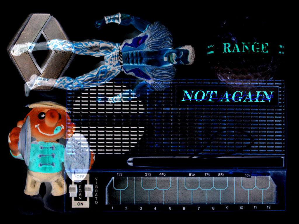
Jim Golden is a Portland based photographer who in this instance has produced various works which explore the idea of collection and objects. His work is very carefully layed out in order to balance composition and the effect of colour on lighting. The layout of these objects makes many things one collective, which is something I really like about his work.
Below are some examples of Golden’s work which I particularly am a fan of…
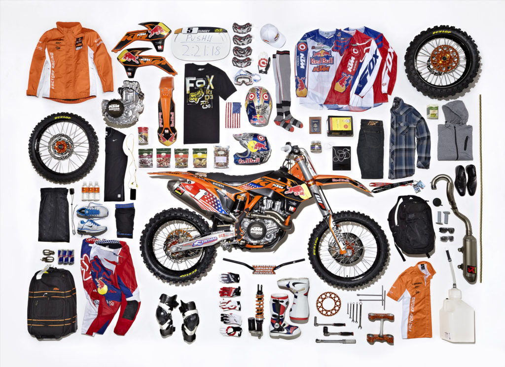
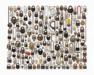
His work explores a large number of composure elements such as: Colour, Texture, Pattern, Contrast and Shape.

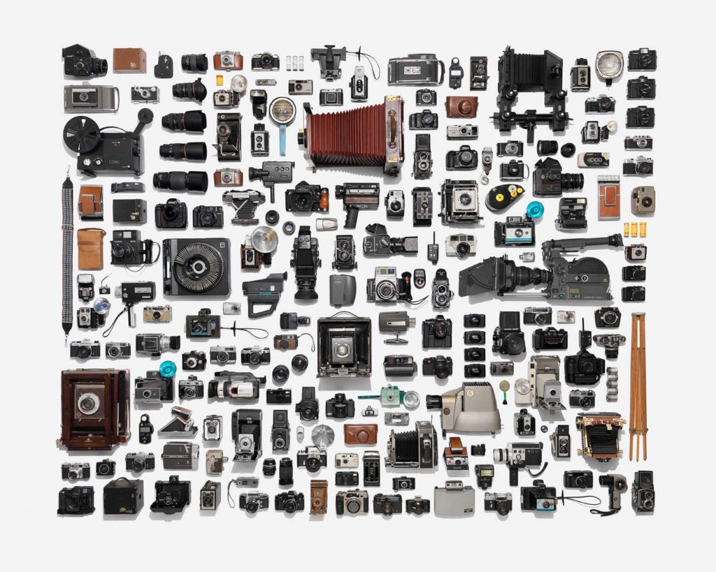
Here is a link to an article which looks at this particular collection of Golden’s work and the ideas behind it…
https://www.wired.com/2013/09/this-photographer-is-a-high-class-hoarder/
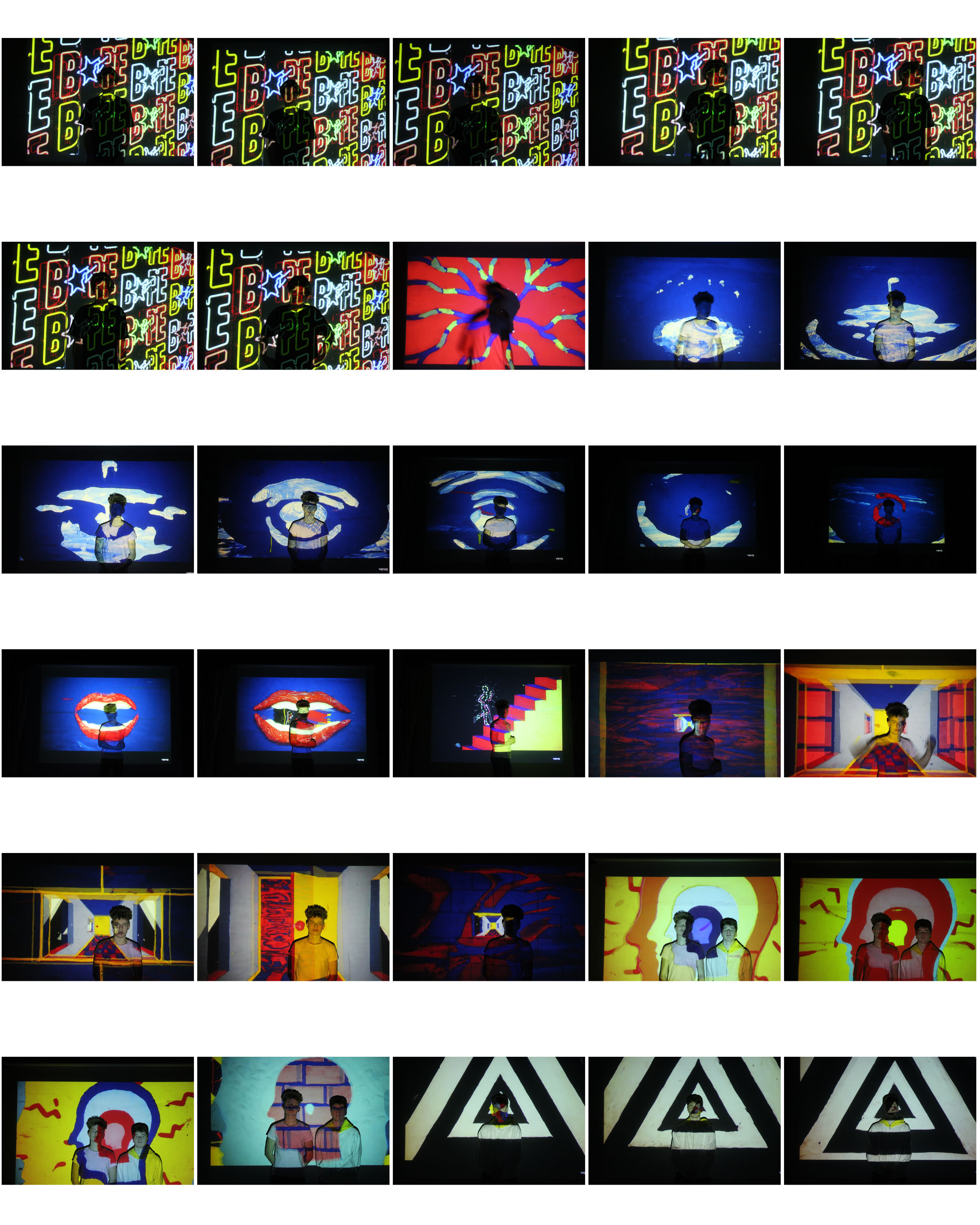
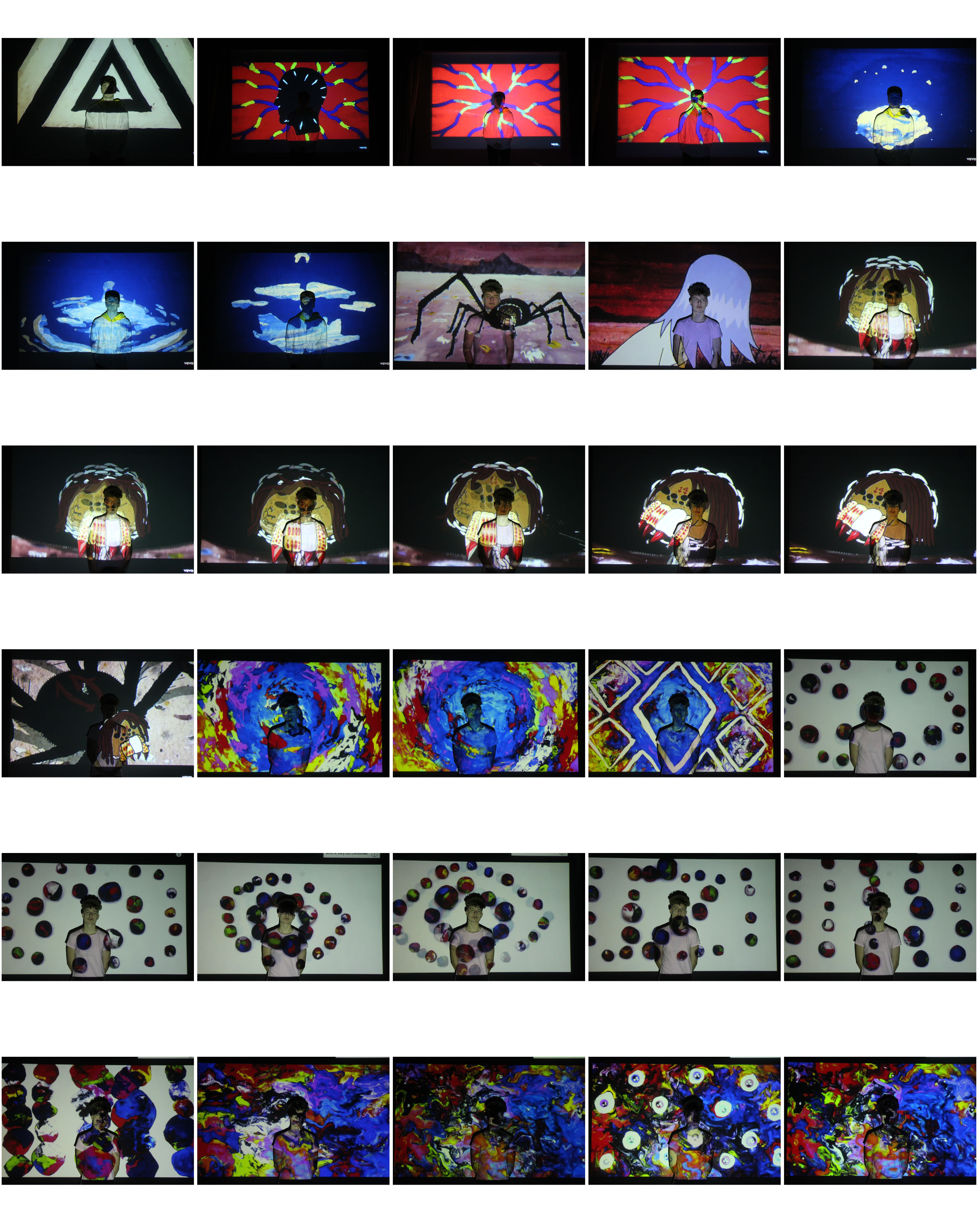
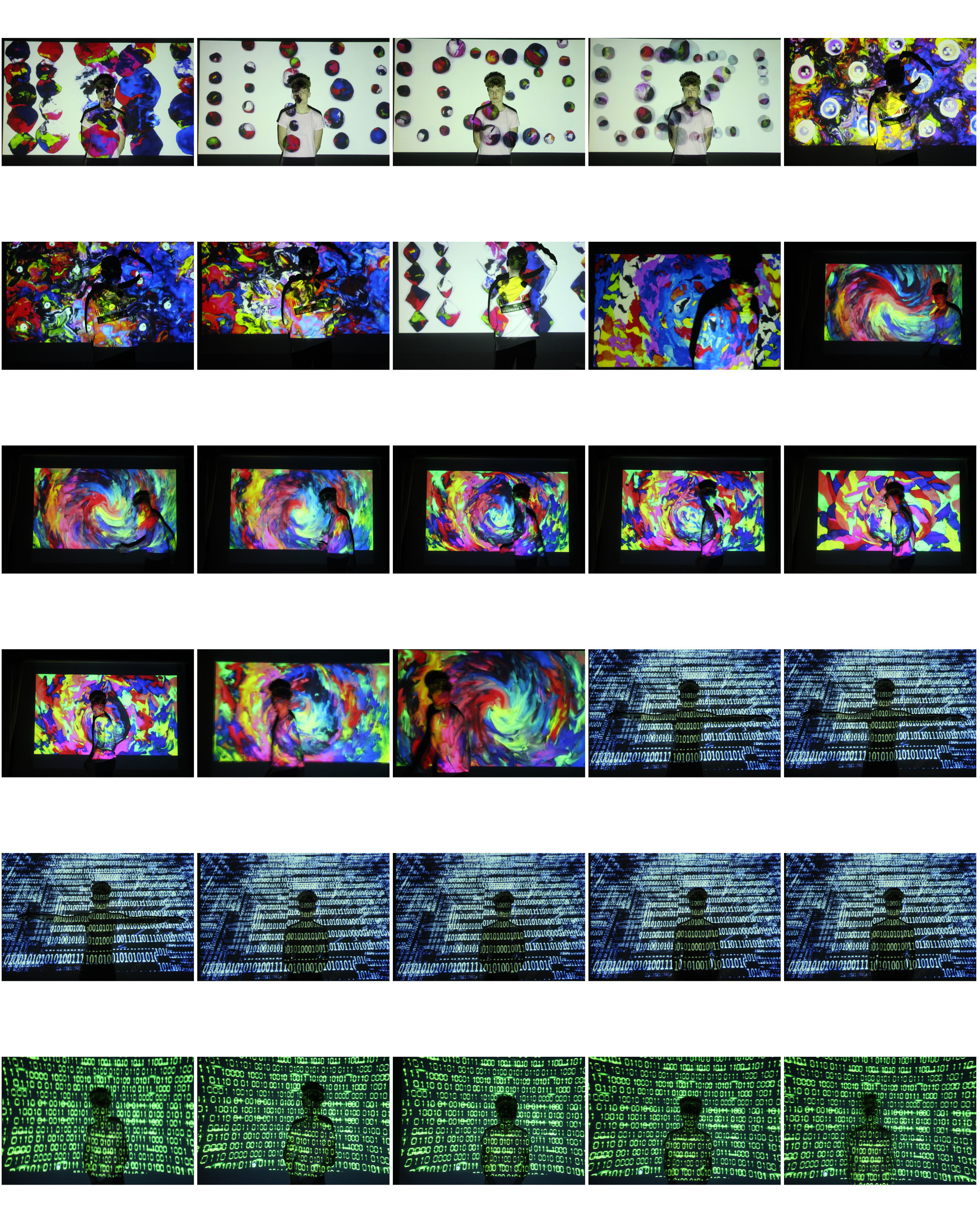
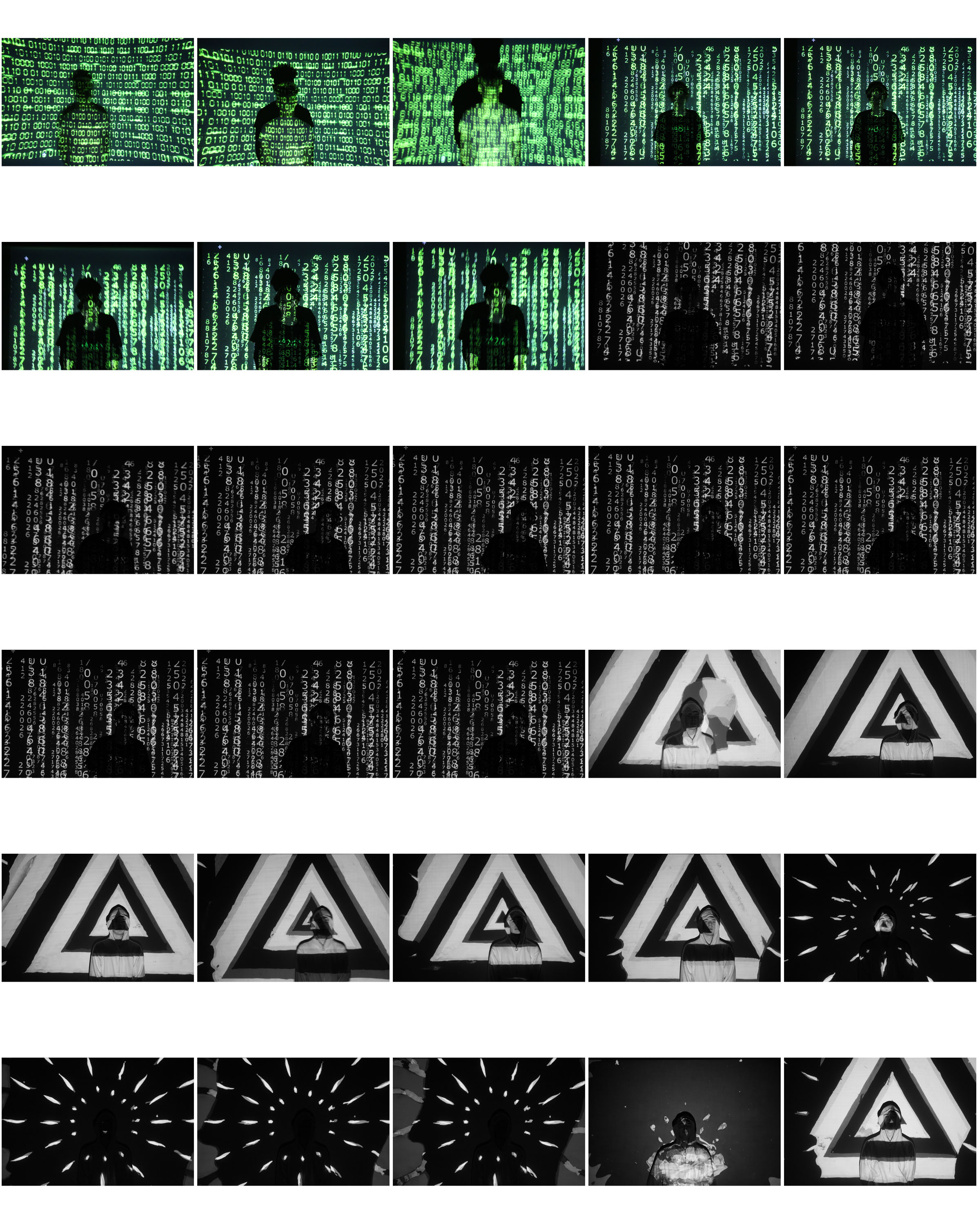
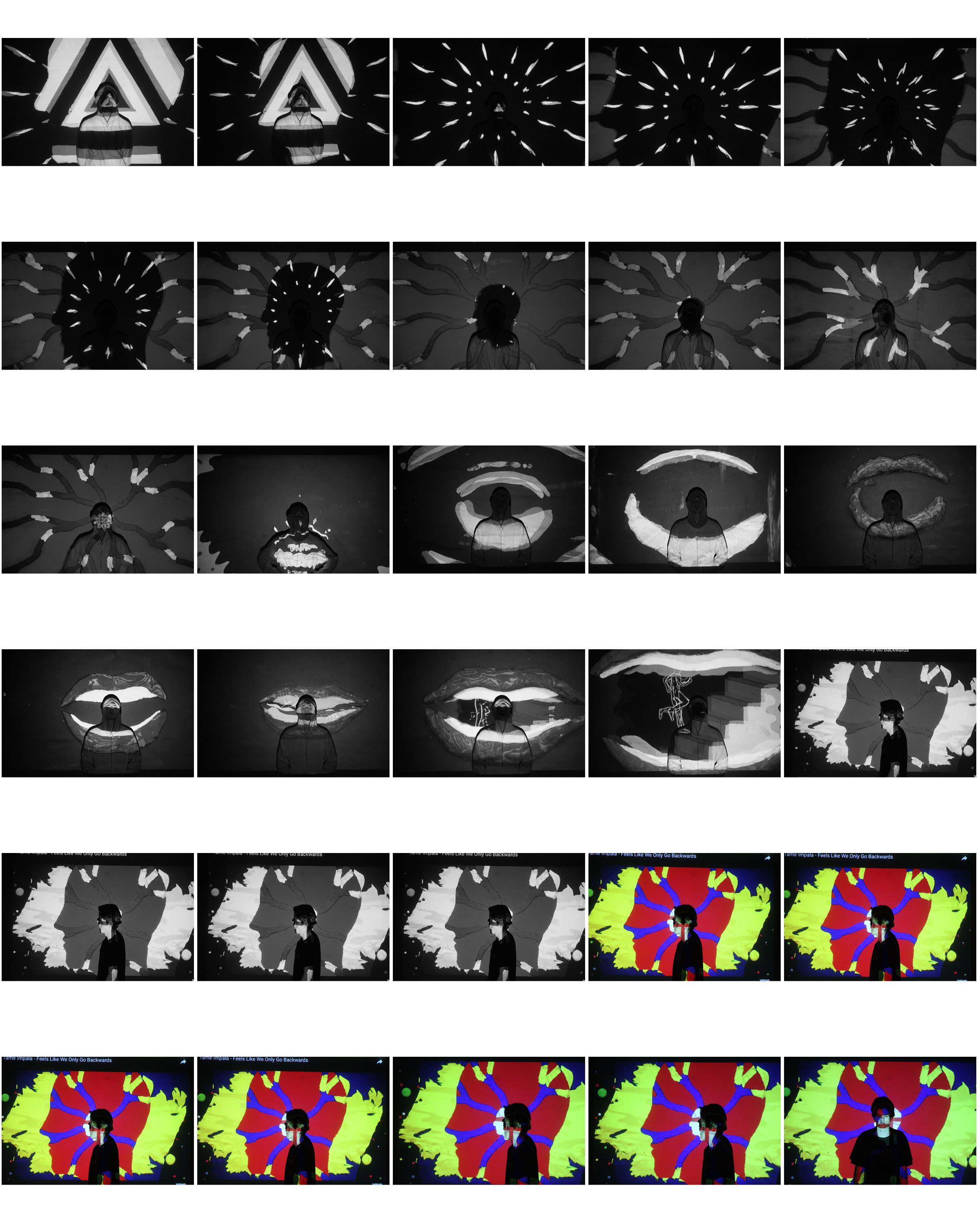
Photo shoot plan
Photo shoot Plan
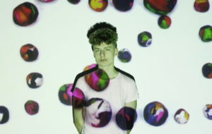
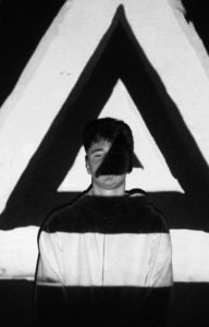
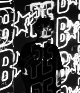
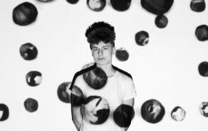
Genre / Artist – Portrait/ John French
Concept – Identity, Secrets, Codes
Location – School studio
Props – Tripod, Projector, Computer
Shot type – Portrait
Lighting – Studio
Settings –Portrait, No flash
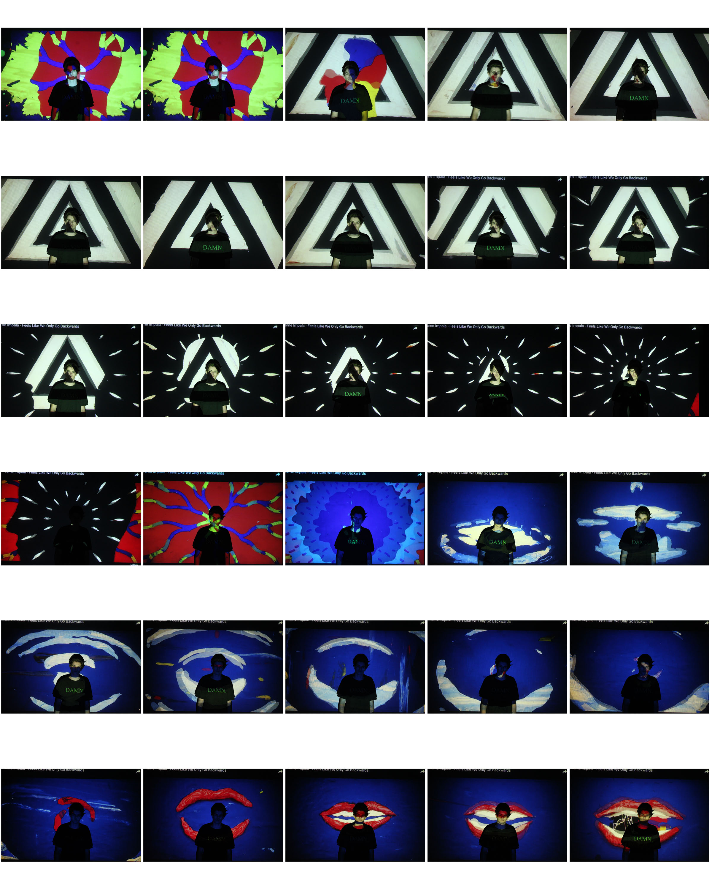
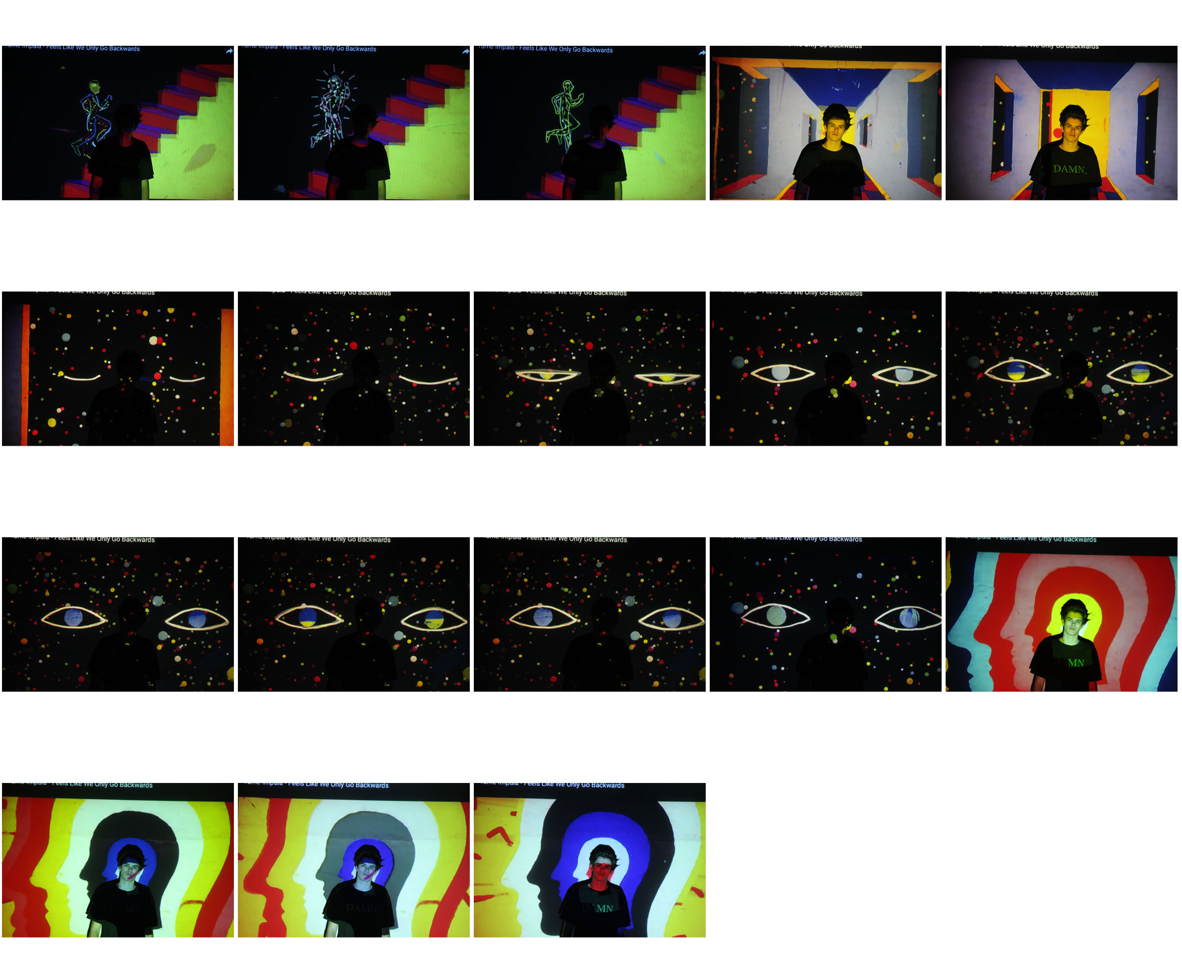
Contact sheets
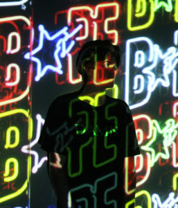
My favorite interpretations
Further experimentation’s
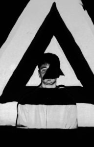
John French
Who is John French?
John French, was a English fashion and portraits photographer. French worked for many editorial magazines and newspapers, like the Daily Express. He developed a new form of fashion photography from bouncing light from reflector boards to create an aesthetically pleasing image that would reproduce well. French is known for his clear, stylish, uncluttered black and white photographs taken against clean backgrounds. He preferred to work closely with his models, devoting much attention to their posing and his sets.
French was on of the first photographers who thought about how photo projection on a human body could create a new type of art. He started this form of work in the 1960s, where he photographed models with floral and 60s style patterns projected onto their bodies instead of clothes.


Photo Analysis

Further Outcomes
FURTHER OUTCOMES
As I was very satisfied with how my initial outcomes came out, I’ve decided to continue producing images using the same editing and composure techniques in order to produce the following images ,which I believe are strong pieces…
