Grant Hamiltion
http://sxseventy.com/sxseventy/Home.html
Grant Hamilton shoots in a way that almost focuses on color, and he only shoots Polaroid film . Before he bought his first Polaroid camera in 2006 he has been shooting abstract, geometric and minimalist photos with a digital camera. He has a keen eye for hidden color, shape, and form in everyday life, and this itself is the subject he chooses to photograph most often. Because of the way in which he shoots, there is no room for error. There are no negatives, no memory cards, and no post-processing. Each image is exactly as he saw it in real life, and there’s a sense of honesty and beauty to that. Since there are only ten images in each film pack, he has to examine each subject with meticulous detail before taking the shot. More time is taken to consider shape, form, light, color, and subject. His photographs range from the corner of a motel sign to balloons on a ceiling to the words on a neon sign , no subject is left untouched.
“Although I felt like I was onto something, those images seemed sterile and lacked soul. I was introduced to Polaroid images through the internet and thought that the imperfections and characteristic colors perfectly suited the types of subjects I was interested in.Through my photos, I strive to find beauty in the mundane. It is hard to describe to passers-by why, exactly, I am photographing the side of a bus or standing on a ladder on the side of a road, trying to reach a sign. Most of the time, however, people will see the beauty that I am seeing and will smile. Often they will remark that they never noticed that before.”
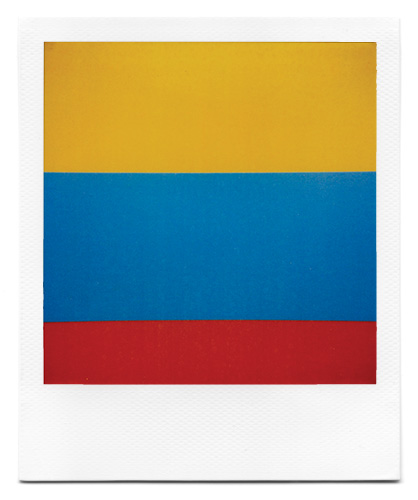
This image is called Rugby and way taken in Denver in 2008. The image was taken on a SX-70 film Polaroid film. I was inspired by this image, as Grant would go out into everyday environments and find places where colour could be taken out of content and presented in a way that is unique and different this image.
Hiroshi Sugimoto
https://www.sugimotohiroshi.com/
Hiroshi Sugimoto was born in 1948 in Tokyo. He took his earliest photographs in high school, photographing film footage of Audrey Hepburn as it played in a movie theater. After receiving a BA from Saint Paul’s University in Tokyo in 1970, he traveled west, first encountering communist countries such as the Soviet Union and Poland, and later Western Europe.Through different bodies of work he has shown many different interests, including minimalistic dioramas, wax portraits and photographing early photographic negatives. His photography tends to blur the lines between painting, illustration, photography, and architecture. From seascapes to natural history dioramas, there’s something about Sugimoto’s photographs that resonates with viewers. Like Kenna, Sugimoto only photographs in black and white. He prints all of his images himself with a great understanding of silver print, creating images with unbelievably beautiful tones of black, white and gray.







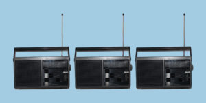
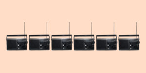
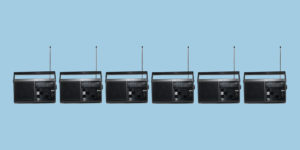
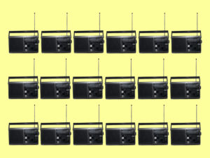


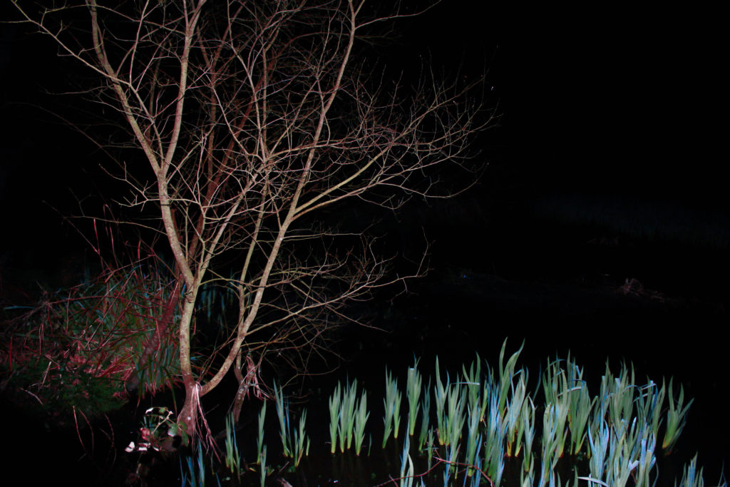
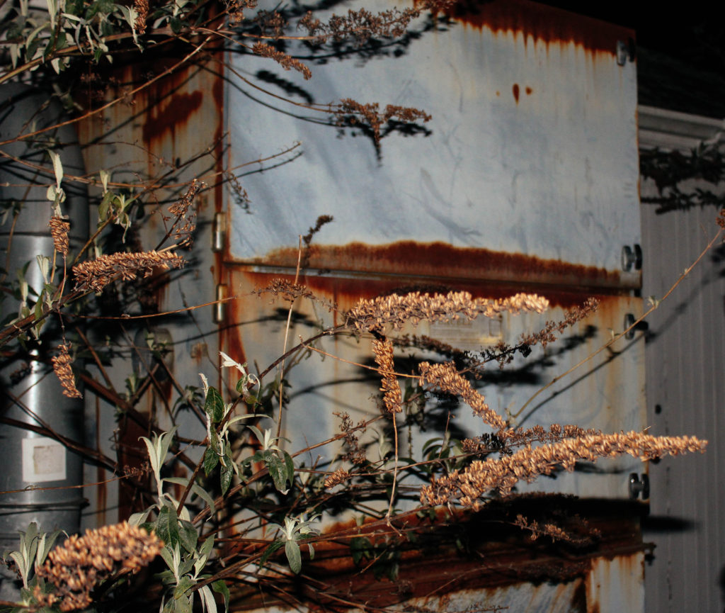

 Before he bought his first Polaroid camera in 2006 he has been shooting abstract, geometric and minimalist photos with a digital camera. He has a keen eye for hidden color, shape, and form in everyday life, and this itself is the subject he chooses to photograph most often. Because of the way in which he shoots, there is no room for error. There are no negatives, no memory cards, and no post-processing. Each image is exactly as he saw it in real life, and there’s a sense of honesty and beauty to that. Since there are only ten images in each film pack, he has to examine each subject with meticulous detail before taking the shot. More time is taken to consider shape, form, light, color, and subject. His photographs range from the corner of a motel sign to balloons on a ceiling to the words on a neon sign , no subject is left untouched.
 He took his earliest photographs in high school, photographing film footage of Audrey Hepburn as it played in a movie theater. After receiving a BA from Saint Paul’s University in Tokyo in 1970, he traveled west, first encountering communist countries such as the Soviet Union and Poland, and later Western Europe.Through different bodies of work he has shown many different interests, including minimalistic dioramas, wax portraits and photographing early photographic negatives. His photography tends to blur the lines between painting, illustration, photography, and architecture. From seascapes to natural history dioramas, there’s something about Sugimoto’s photographs that resonates with viewers. Like Kenna, Sugimoto only photographs in black and white. He prints all of his images himself with a great understanding of silver print, creating images with unbelievably beautiful tones of black, white and gray.
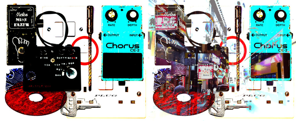
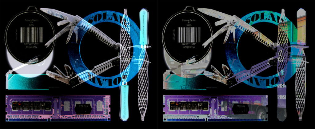
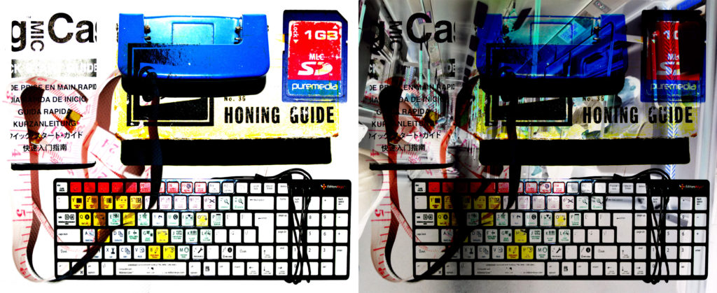
 entury artists, using a minimum amount of components such as colour, shape, line and texture. Within the art world it is considered an extremely subjective concept, leaving interpretation and meaning up to the viewers perception of the work. Minimalism emerged in the late 50′s when artists such as Frank Stella, whose Black Paintings were exhibited at the Museum of Modern Art in New York in 1959, began to turn away from the gestural art of the previous generation
 Abstract photography, also known as non-objective, experimental, conceptual or concrete photography, is a means of depicting a visual image that does not have an immediate association with the object world and that has been created through the use of photographic equipment, processes or materials. An abstract photograph may isolate a fragment of a natural scene in order to remove its inherent context from the viewer, it may be purposely staged to create a seemingly unreal appearance from real objects, or it may involve the use of color, light, shadow, texture, shape and/or form to convey a feeling, sensation or impression. The image may be produced using traditional photographic equipment like a camera, darkroom or computer, or it may be created without using a camera by directly manipulating film, paper or other photographic media, including digital presentations
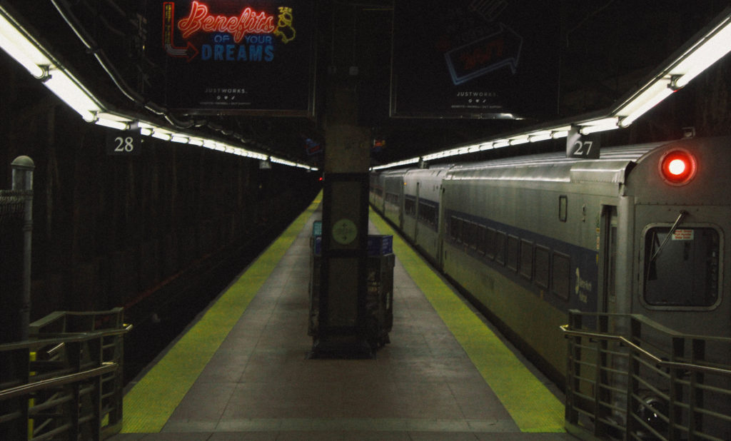
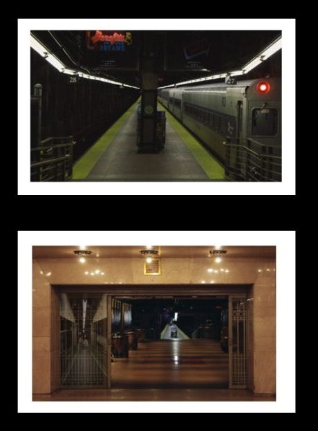
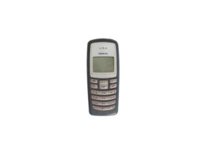
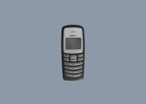
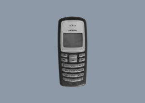
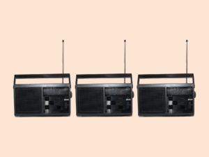
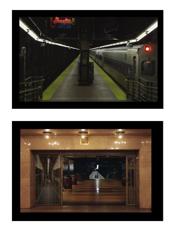 On black board
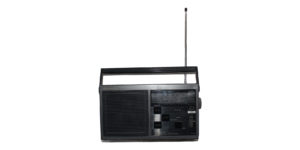
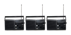
 On white board