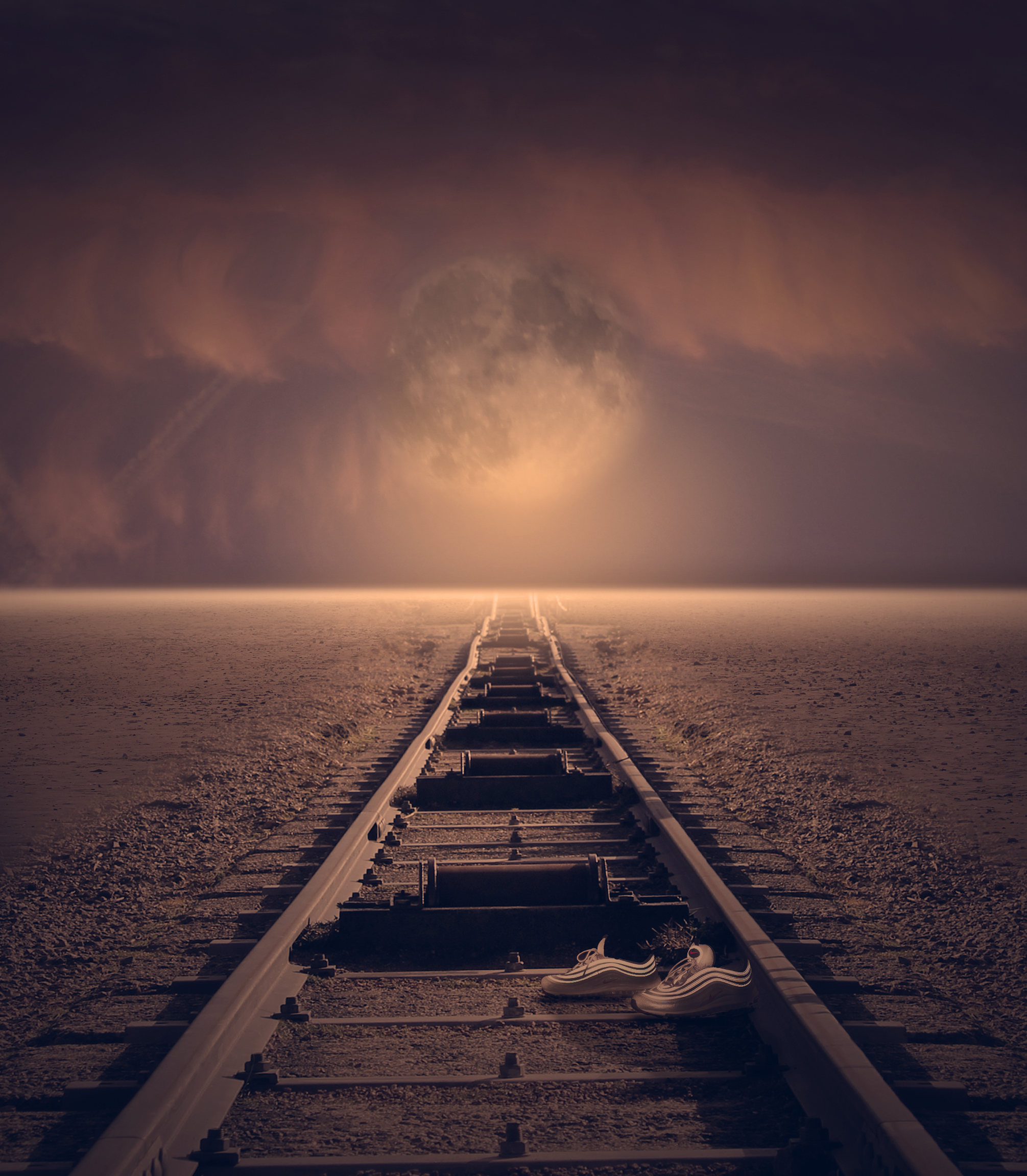
This final edit has been crafted through inspiration taken from all of the artists I have looked into. Most of all Thomas Barbey, who’s work is shown at the top. The main inspiration point i have taken from Barbey’s work is the conceptual ideas that he portrays through his cleverly manipulated photos. The generic ideas behind his photos are that humans are over ruling the world and recklessly destroying it with unnecessary man made features. He does this by exaggerating the effects we are having and combines two images to do so. In this case he has taken, what appears to be someones house corridor and put the golden gate bridge going through it. The cars on the road are clear indications of humans, and that it is us destroying earth. Similarly I have taken a very fantasy landscape image and merged train tracks into the scape to give a sense of destruction. Also I have added a pair of shoes into the photo to show the presence of humans.
The framing, composition and editing style was inspired mostly from Tommy Ingberg. Keeping a great deal of depth within the image, just like Tommy Ingbergs, allows for a sense of secrecy of what lies at the end of the tracks. It also helps to guide the viewer down the picture and be taken on the journey that would be taken by the people who made the tracks and obviously the train that drives down them. It also helps to direct the viewer up into the horizon and then the fantasised sky. The blown out horizon was influenced by Tommy Ingberg however the sky as a whole contrasts with what Ingeberg usually would do. Ingbergs photos usually have a rather aggressive sky with high contrast and menacing clouds, however I have gone for a more tranquil vibe to enhance the beauty of our earth and give this fantasy feeling, along with the enlarged moon. Furthermore, Tommy inberg also has this use of leading lines, consistently through his work as well as positioning his main subject in the middle of his frame, just like i have also done.
The sky, and colouring of this picture in general, was inspired by my first photographer i looked at which is Micheal Steric. There are direct links between the colouring/lighting in his images and my edit. He usually goes for saturated, vibrant feels to enhance the beauty of our world and give a positive view on earth. I believe this is the exact effect that the lighting and colour scheme have in my work and as a whole allow the consumer to be positively influenced that earth is a beautiful place. I have furthered my inspiration from Micheal steric and edited my image to become more fantasised by adding in a large moon and creating interesting reflections from it.
 your ability to select and edit images effectively:
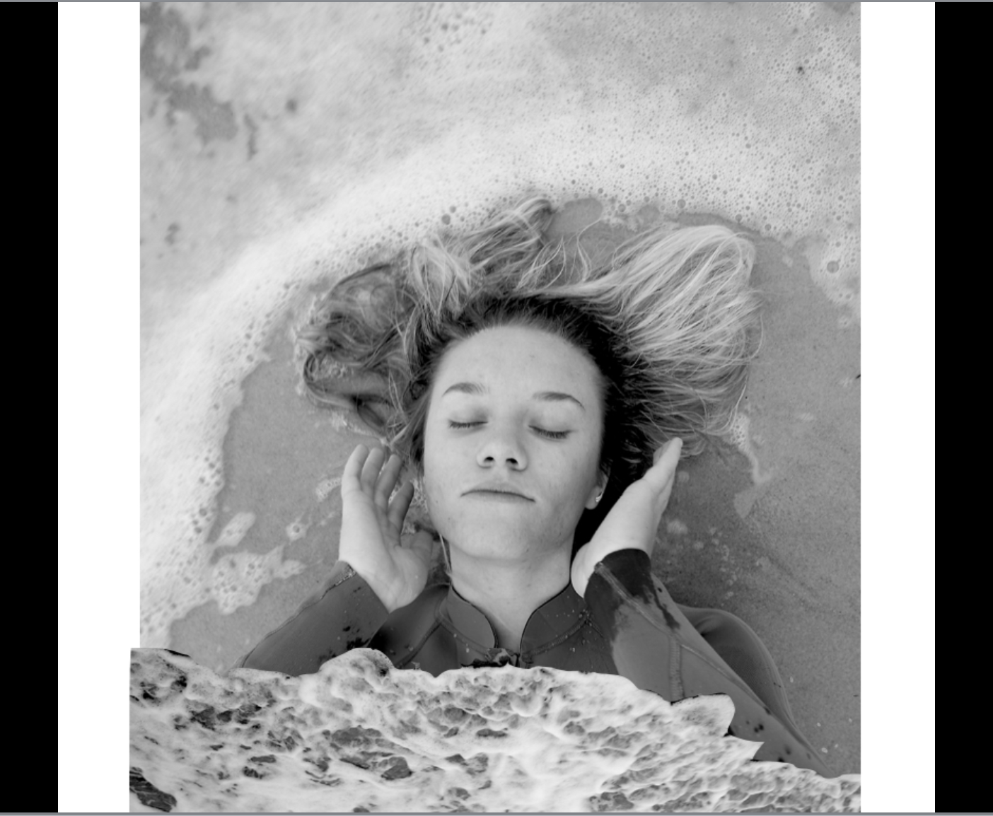
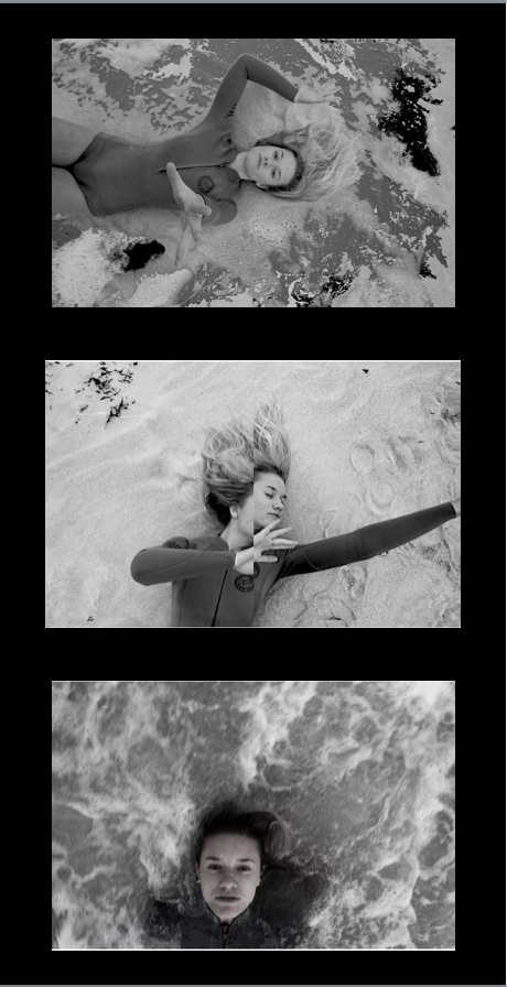
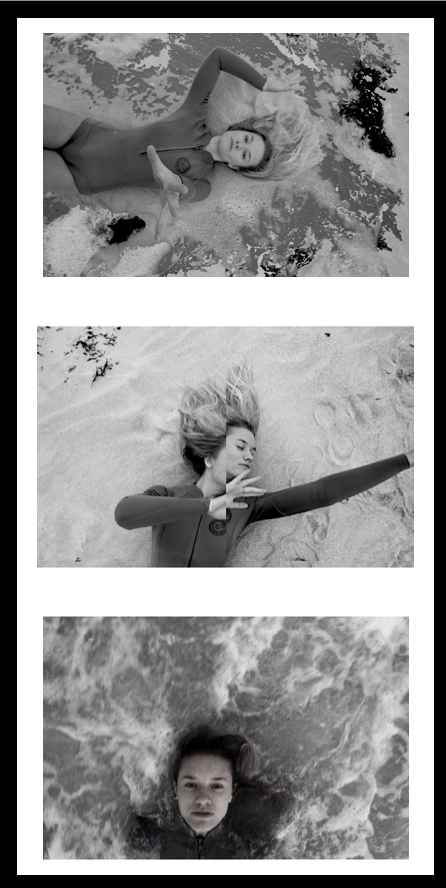
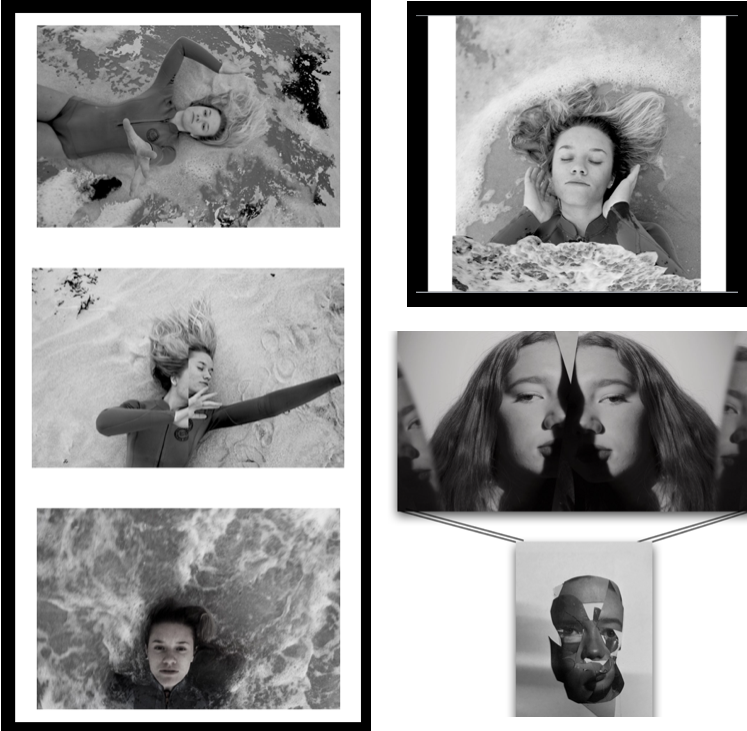
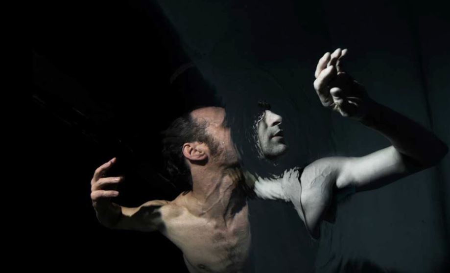
when selecting my images I wanted to give a variety of techniques and presentations of human behavior,I have done this by choosing three separate shoots. I chose my primary shoot to be focused on the combination of human and nature behavior and how when formed together present the convention of loss of identity and isolation within the water itself.I chose this shoot as it it the most creative shoot with the combination of editing and real captured shots,I think overall all the images are very dynamic and able to work as individuals too.
your ability to select and edit images effectively:
when selecting my images I wanted to give a variety of techniques and presentations of human behavior,I have done this by choosing three separate shoots. I chose my primary shoot to be focused on the combination of human and nature behavior and how when formed together present the convention of loss of identity and isolation within the water itself.I chose this shoot as it it the most creative shoot with the combination of editing and real captured shots,I think overall all the images are very dynamic and able to work as individuals too.
 your ability to respond to a key artist:
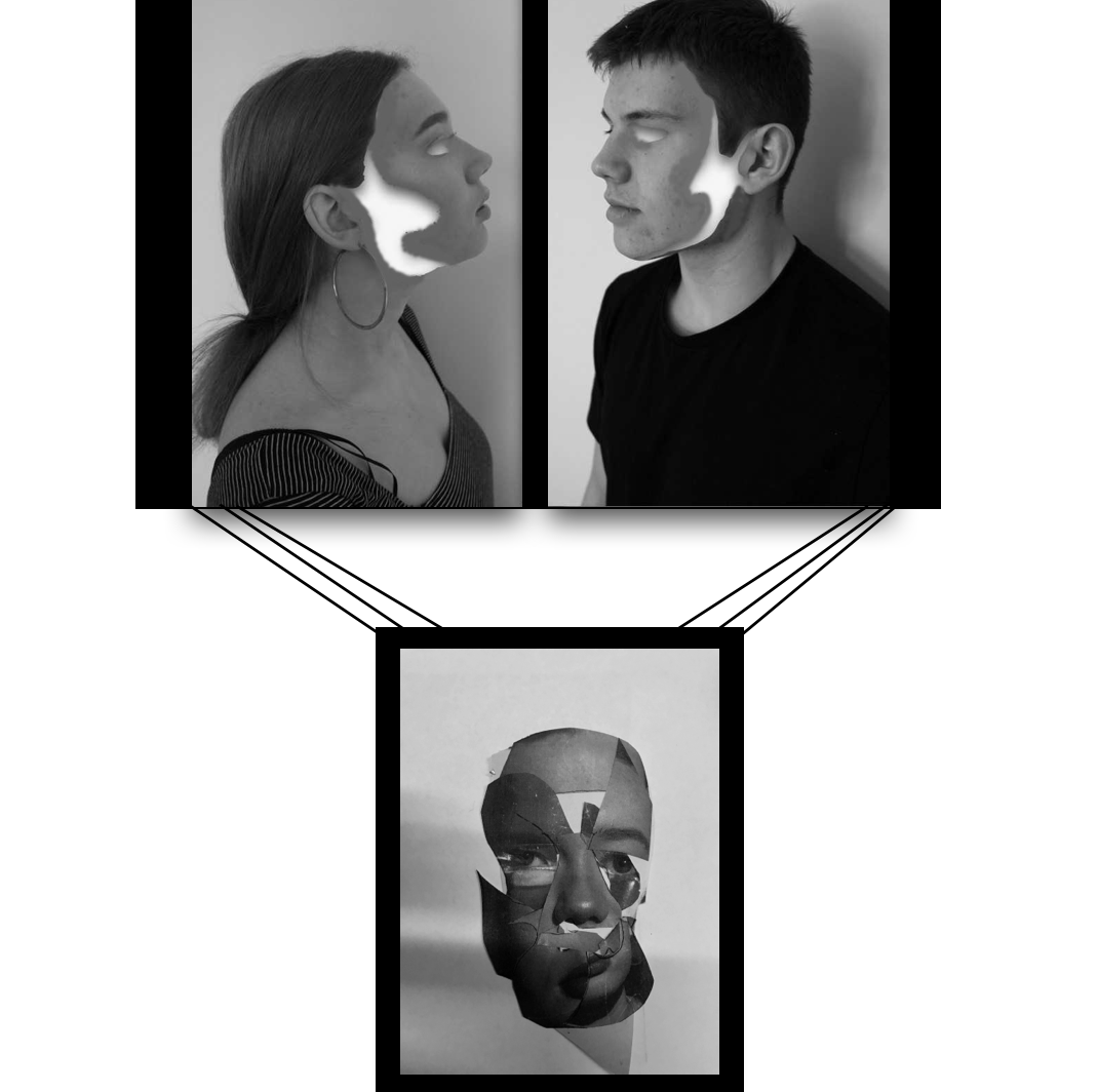
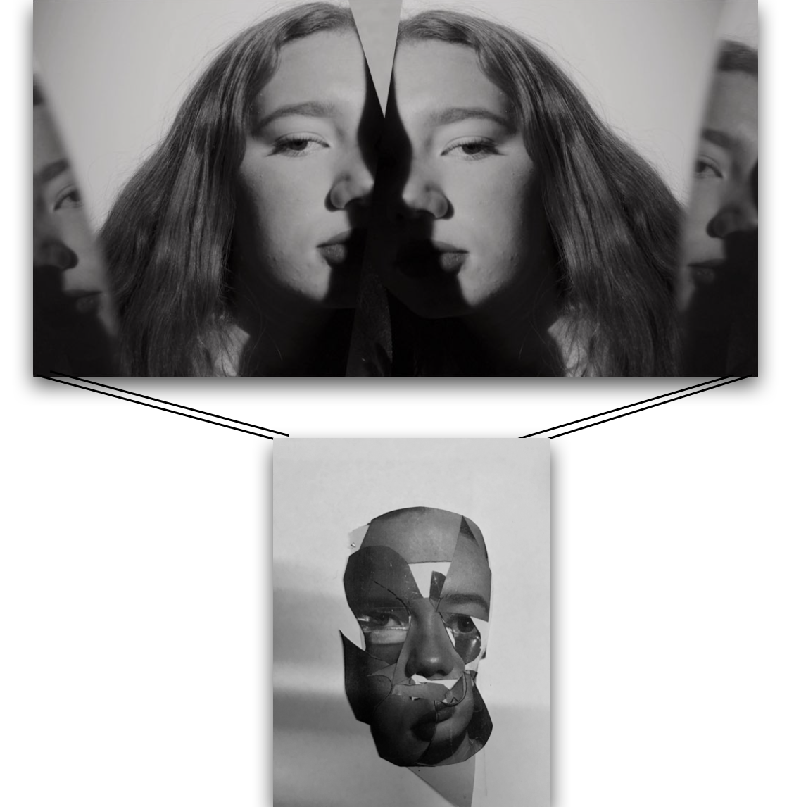
as previously shown my main aim for every shoot was the same theme of human behavior but my inspiration for each shoot was inspired by a different artists,although the main two artist for my final images was Midori Harima and conni imboden,both of their work is used presenting people in different mannerism and showing a more gruesome side to their personalities,I have shown their techniques using collage and additional editing techniques of removing eyes and finally submerging people within water.
your ability to respond to a key artist:
as previously shown my main aim for every shoot was the same theme of human behavior but my inspiration for each shoot was inspired by a different artists,although the main two artist for my final images was Midori Harima and conni imboden,both of their work is used presenting people in different mannerism and showing a more gruesome side to their personalities,I have shown their techniques using collage and additional editing techniques of removing eyes and finally submerging people within water.