Daily Archives: April 19, 2018
Filters
Jesse Draxler:shoot 4
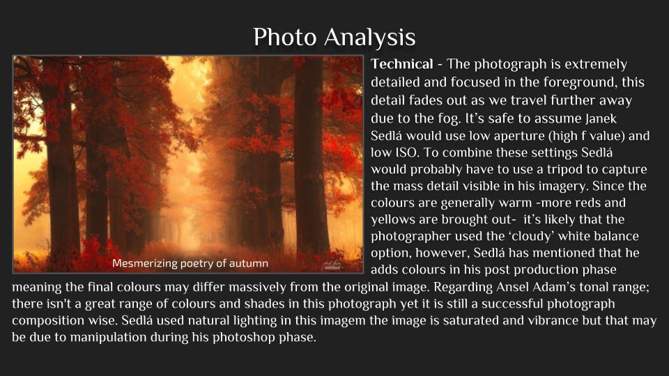
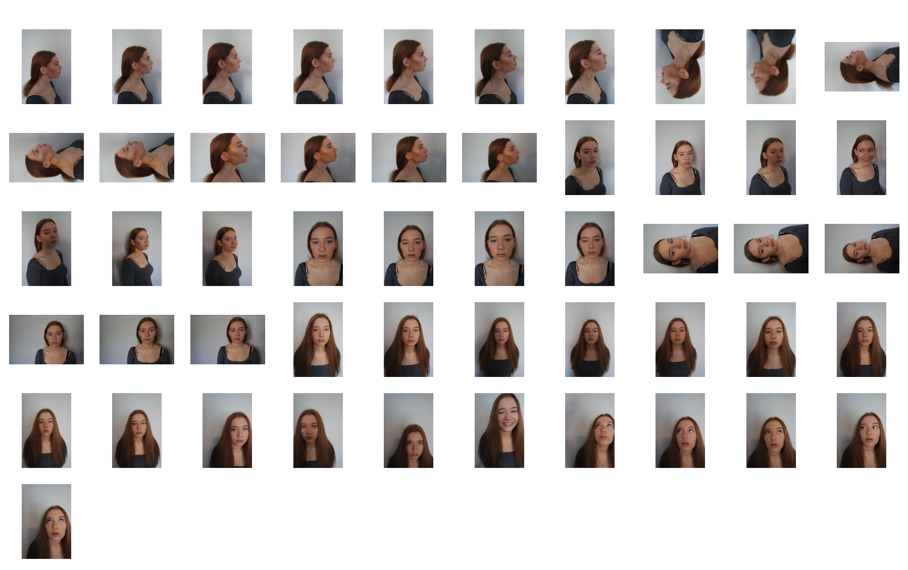
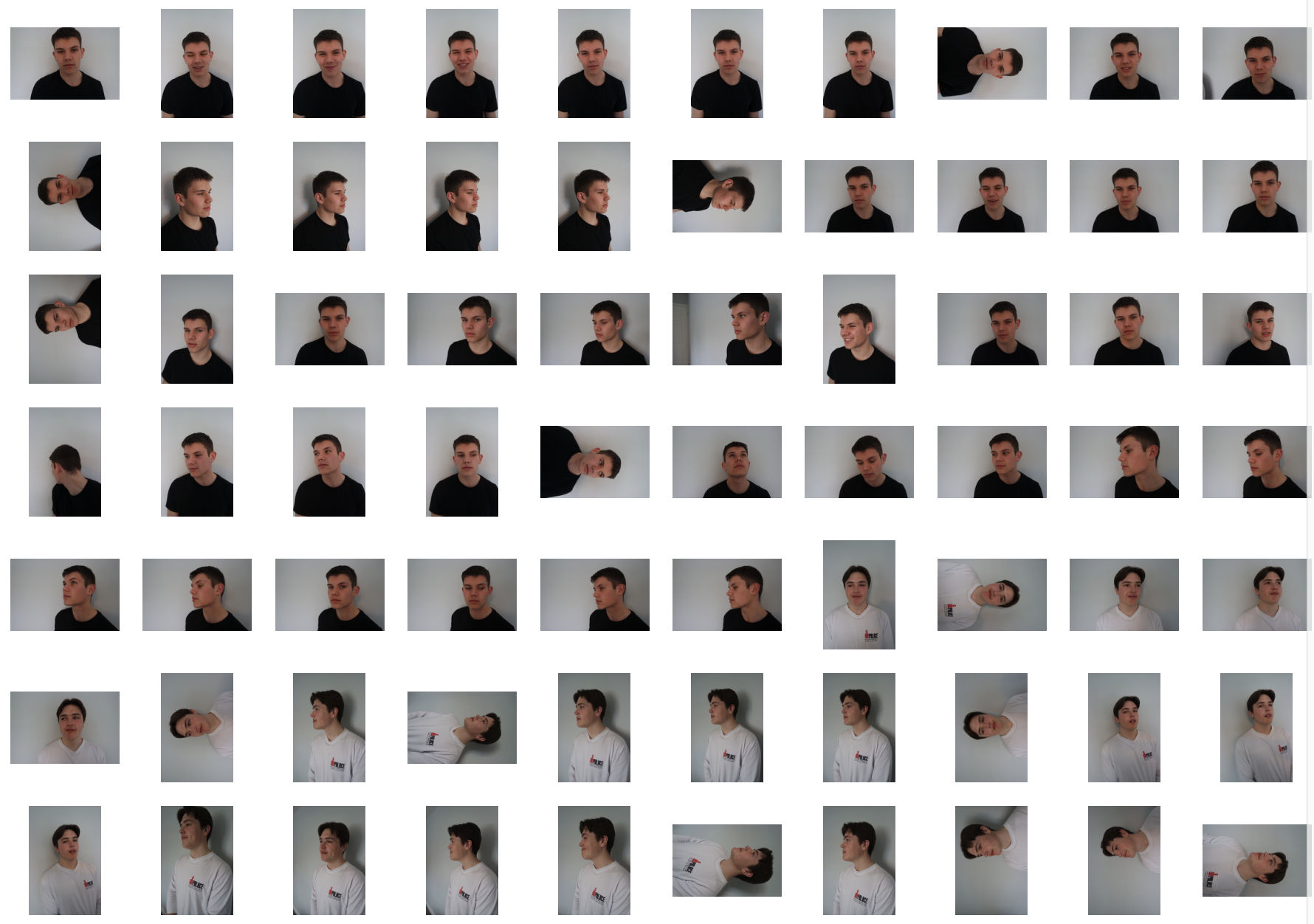
For this shoot I really wanted to focus again upon the conventions of human behavior being neglected and removed from being treated as a person as this is what the artist does. I wanted to edit the images in order to reflect a personal emotion onto the image and present how human behavior works through the overall representation of the image itself.
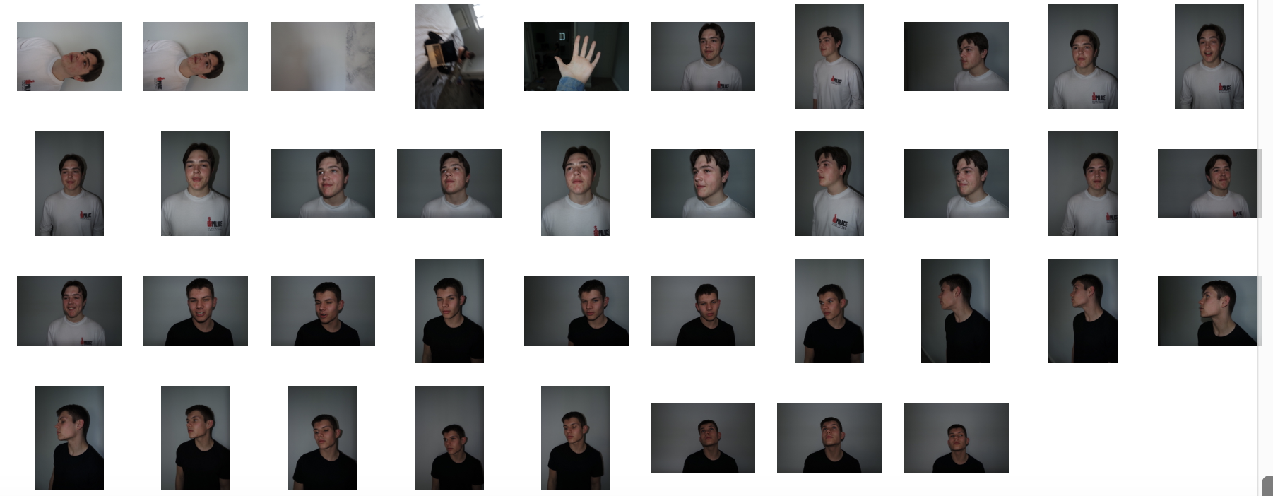
original photos,contact sheet:
Final edits:
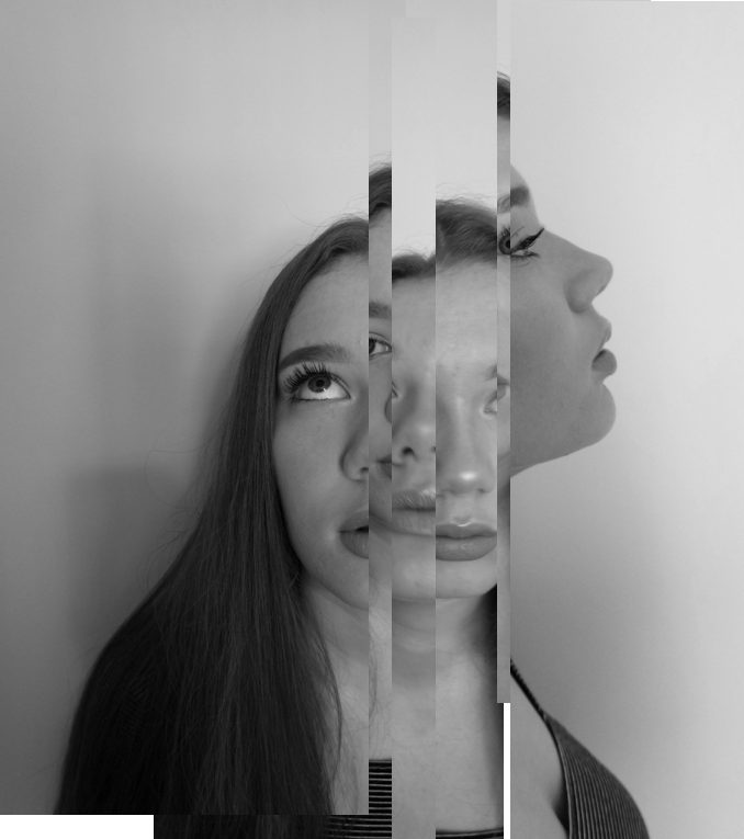
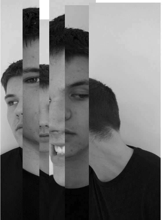
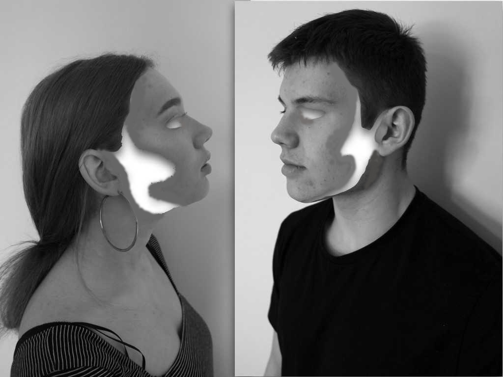
For these two images I was inspired by some of draxlers images where he cuts different profiles and angles them up in order to form a new composition of faces and a new style and angle to the original.I wanted to completely alter the images in order to create a whole different meaning behind them.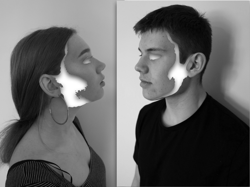
The editing for these images I wanted to connote the removal of identity and how the unique abstract purposes a complexity to human behaviour. Although there is still a strong highlighted effect of surrealism within the images,the effect of emptiness creates a sense of suspension and secrecy within the image as they no loner represent who they are.
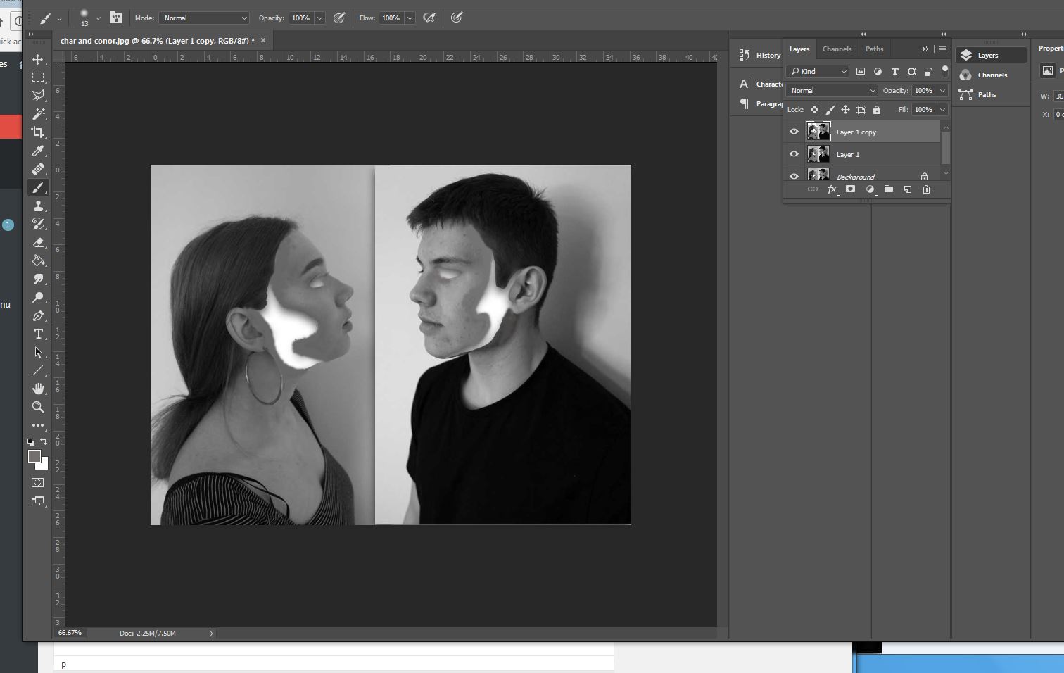
To edit the images I wanted to remove sections of structure and a flowing sense wihtin the face, In this case being the cheeks line and the side of the face,addtionally I wanted an absence of eyes wihtin the images, to do this I used instant alpha and removed sections at a time,but it was not as smooth as I wanted the overall image, because of this I filled in tonally with the brush tool with the same skin tone and rounded off the edges.This is more effective and creates a better overall finish to the images.lastly I created shade within the inside white area to create a more three dimensional real effect to the images.
Final edit:
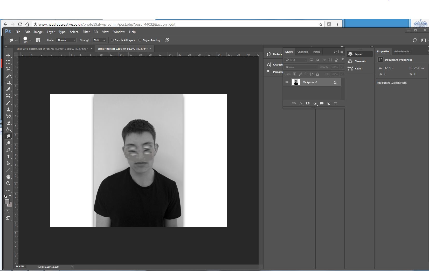
Similarly with the previous image I wanted to remove the eye but then copy that section below to form many missing sections of eyes, again to do this I used instant alpha and then used photoshop to smooth over the image and make it seamless throughout(using the smudge tool),This image is meant to presets a mask to identity but still an absence of our real behaviour.
Final edit: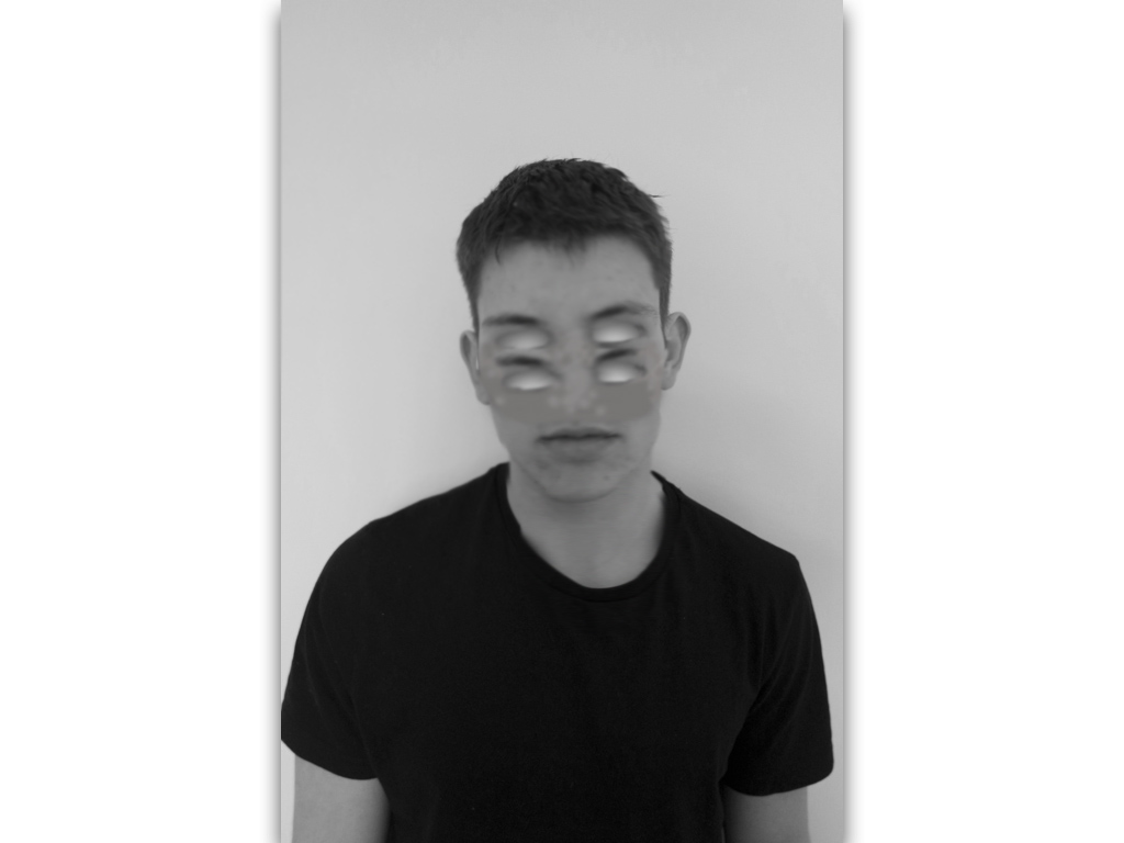
similarly I repeated this technique but wanted to form an effect of a mask so not blending the eyes in but showing a shape that has been repeated, to do so I experienced in different methods to find the most successful:

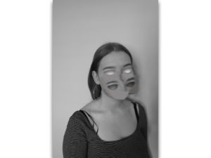
Final edit:
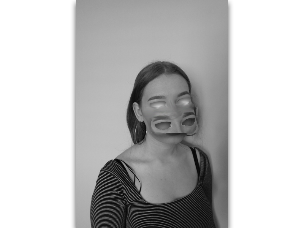
Final edit:This image is purposely experimentation to try and remove and cover a different sense of identity and not just purely eyes.
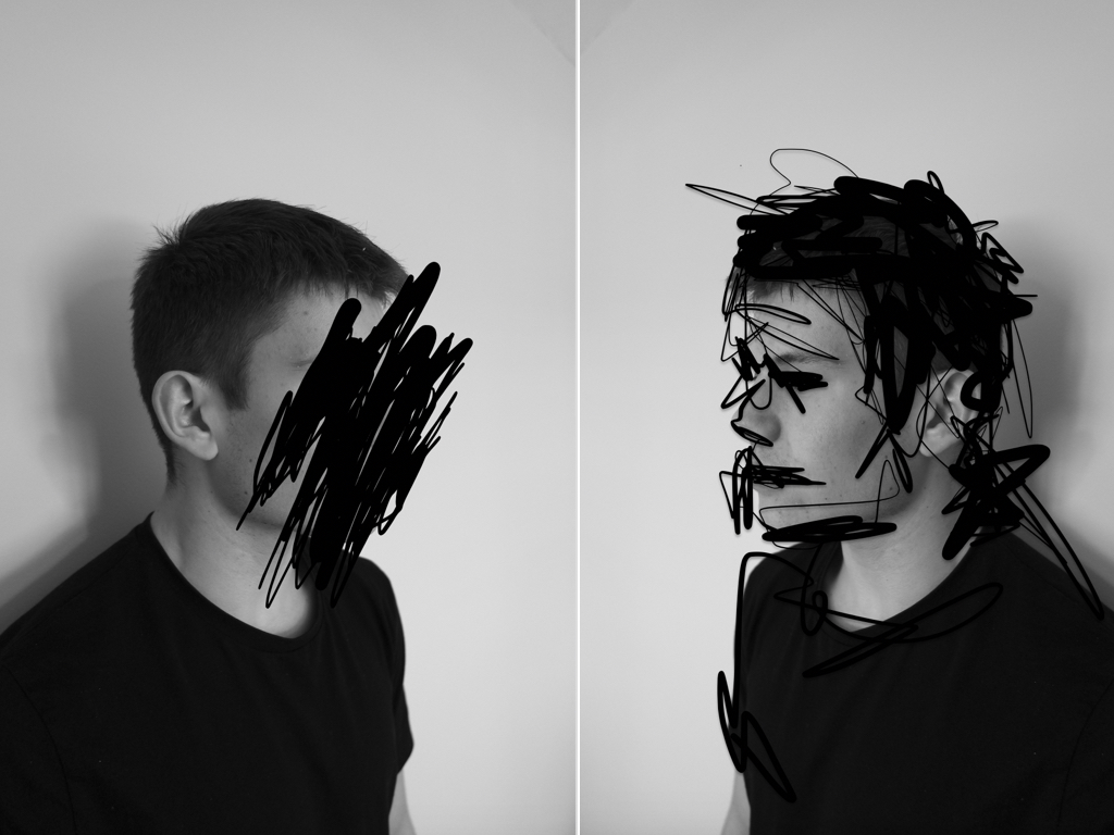
The next two images I think are less successful and more concentrated on experimentation;within these images I wanted to find an interesting composition of repetition of faces of different angles and edit them all into one to from an abstract and surrealistic piece. I did this similarly to my artists inspiration of demonstrating the combination of many different human emotions that we have and representing this in an abstract method.
Final edit:
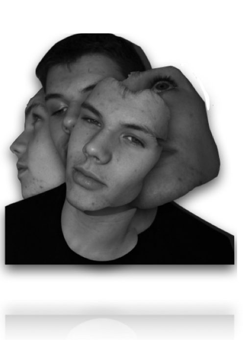
I edited the images by removing the body and editing only the sections of the faces that I wanted,I the framed them into an interesting composition and surged the lines to form a more synced piece.
Final edit: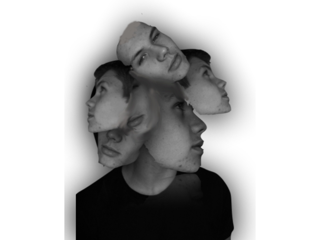
Overall I think the most successful images was the removal of facial features, this is due to the most successful editing and a simplicity but effectiveness of connection of human absence within the images themselves.
Threshold Experimentation
THRESHOLD EXPERIMENTATION
Just as an experimentation, I decided to see what effect it would have on my images by using the threshold tool in order to get rid of any colours and shades, to see what my images would look like in bold black and white.
Below are some of the outcomes of this experimentation…
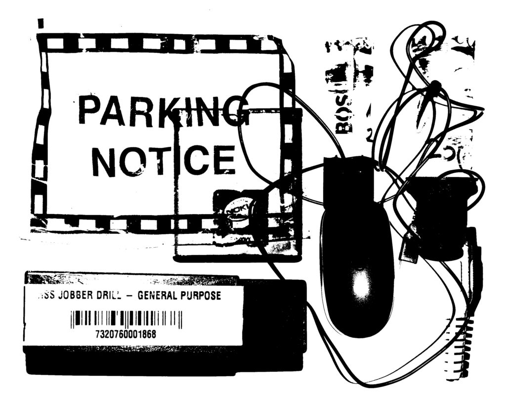
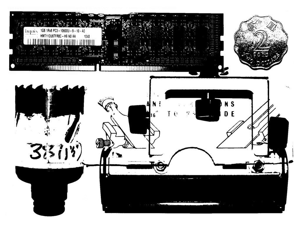
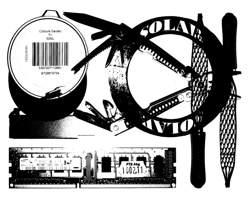
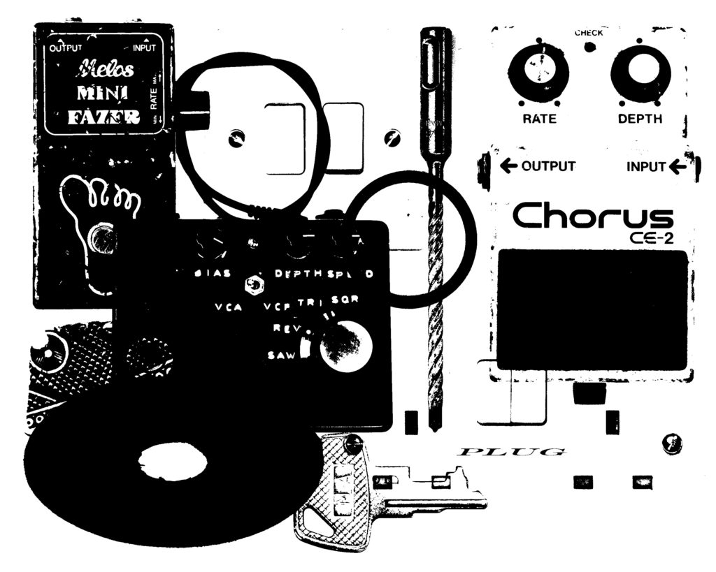
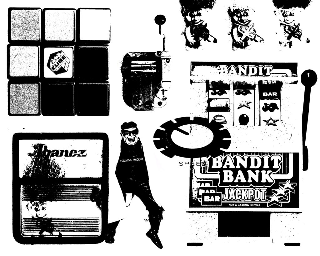
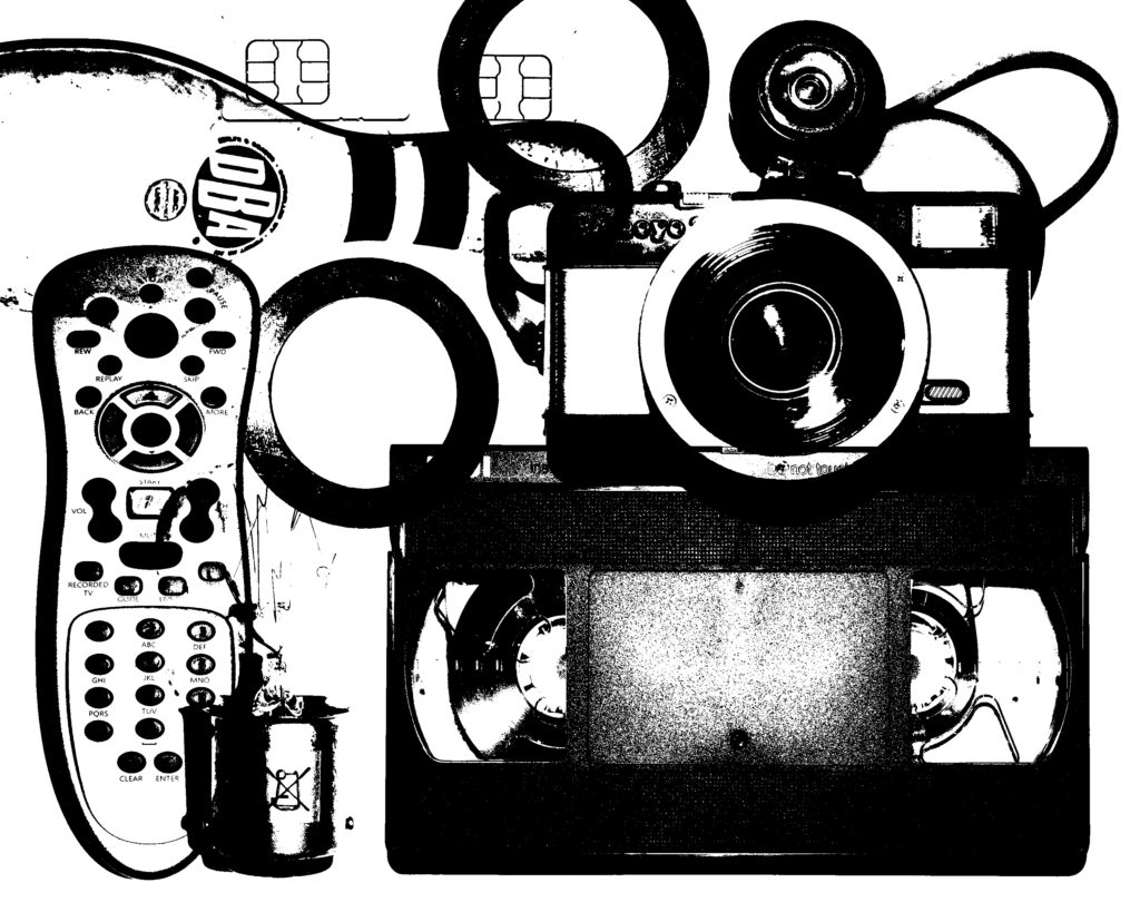
Personally I was not as much of a fan of this style of the images, as I believe the element of colour in the images I have previously produced have a high visual value to the image. This lack of colour being the downside of these images, I decided that changing the black for alternative colours could work, and here is what I came up with…
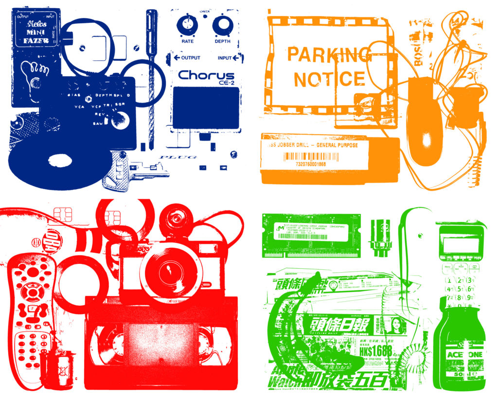
But I was still not a fan of this threshold style. I think this is because the colours within my original images give a lot of visual information about the textures, layers and contrasts of the objects within the images, and this is lost within this style. Therefore I believe this experimentation was unsuccessful in terms of image production, however it has helped me to look at the objects in terms of their shape and their placement.

