'No matter how rich or poor the country, the report found, one-third of food produced for human consumption goes to waste, due to factors such as consumer decisions and lack of distribution channels, while over nine hundred million people are starving.' - Klause Pichler interviewcontextual - Pichler used his bathroom as a studio and for storing various foods kept in plastic containers as they began to flourish in mold and rot. He grew up in a rural province in Austria where raising and eating meat was an important part of their culture. Pichler later defied these customs and became a vegetarian. technical - This picture has been flipped to make it look like the string is holding the lemons up like flowers. The use of lighting is cleverly done, Pichler has lit the lemons from the front and bottom which gives a shadow on the floor of the picture [the ceiling], adding to the illusion that the lemons are standing up on 'stalks'. visual - As Klaus Pichler said, the initial sense of his work may seem beautiful and appetizing until the viewer realizes what they're looking at. He's set up this scene to remind the audience of something beautiful; flowers, with the string set up like stalks and the lemons displaying bright and vivid yellow and green colours. These colours relate to toxicity, beauty and nature creating conflicting views on the picture for the audience - is it beautiful or repulsive? conceptual - The photograph is set up like flowers, giving connotations of beauty and life, directly contrasted with decay and effectively death. It gives the underlying message that everything comes to an end, highlighting that the luxuries we take for granted will slowly diminish with the natural reckless behaviours accompanied by humanity. Pichler has created these pictures to make us question the everyday actions that seem normal to us; throwing away rubbish, littering, driving cars, material consumption etc. - where does it come from and where does it go? We've been bred to do and not think.
Monthly Archives: March 2018
Filters
landscape sea shoot development,third artist:Tony Hertz
Original inspiration
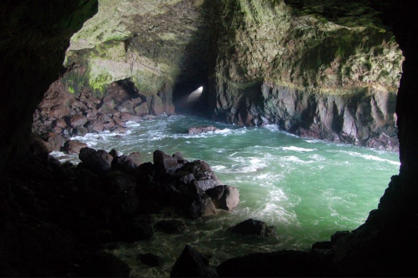
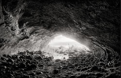
For my third artists I wanted to expand my ideas further from the behavior of people and focus upon the behavior of nature and a pathetic flallsey effect and how nature has emotions and more power over humans.I want to portray a more free sense of nature and the environment not being held back by man made creations. I was originally inspired by the following images:I also want to focus on the conventional laws of how nature and how it is seen to behave and how we cannot actually predict its actions and its behaviour is a clear opposition to the lack of identity that people continuously show.

Third artists:Tony Hertz
He’s been recognized with top awards for his landscape photographs.His work has been published widely, including Outdoor Photographer Magazine, Photographer’s Forum, Silvershotz and Black and White Magazines. Tony has over 35 years of professional photography experience with 10 years of it as a daily newspaper photographer. While working as a photojournalist it helped refine his compositional instincts.Then he turned to focus mainly on landscape and nature subjects for personal and fine art photography work. he become interested within photography in his early years of childhood when fining a box camera.At age 10 he was drawn to LIFE magazine and any book or tabloid that contained photos which in turn inspired him on his creative adventure. in 1971 he soon enrolled in a photography class in San Bernardino Valley College.Afterwards he earns a liberal art degree and continued to teach photography.,while also learning the composition and techniques of the newspaper photographs. he soon became ;photojournalist;list of the year’ gaining skills of editing images and communicating within editors and photographers on story ideas and preventions. in the mid 1980’s he started to refine his compositional instincts and technically hone his photography skills. More importantly, it brought himself into many situations and experiences with interesting people and events that shaped me professionally and personally.
I Chose this work due to the way the phototherapy divides his time equally shooting and then editing his work and additionally teaching traditional film photography and digital photography. within his work he has such diverse techniques and methods in order to capture the different atmospheres within landscapes and different methods in which to present nature and water,some of his work:

image anyslsis:

critical anyslsis:I Was inspired by this image as it presents a softer feel to nature and a long shutter speed in order to capture a movement of the water,This questions the conventions of the expectation of nature and the presentation of how it works and can be presented.for my shoot I can develop the behaviour of nature demonstrating more stormy isolated weather as seen before and more romantisced nature to symbolises a behaviour we present and don’t show to people,furthermore the abstract sense and unpredictability that nature symbolises demonstrates the power nature has over people and how its strength can change the way people act and behave.
Johnny Joo Case Study
Who is he?
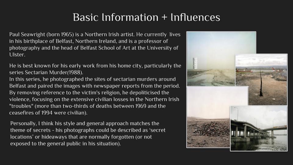
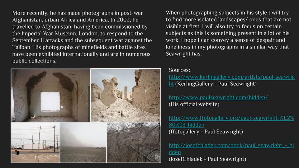
Johnny Joo born in Cleveland Ohio focuses on photographing places that have been forgotten through his camera. Joo is an urban explorer but aims to highlight the effect and beauty of places left behind that are not often seen without human intervention creating eerie effects whilst reminding viewers that all things must come to an end. His photos are meant to make the viewers aware of how humanity’s waste impacts society and nature when left behind through the destruction present throughout each image.
Joo photographs a range of abandoned areas from malls, stadiums, schools, hospitals etc with many images going world-wide. His work has been at the attention of many media outlets, much of his work is inspired by Salvador Dali from how the colours used pop out and wants to incorporate this into his own to create a realistic surrealism. Most of his work consists of the influence nature has over human structures and how eventually they will be re-claimed, but much of it has to do with a lack of human influence in an area and how this creates haunted and eerie images as a result due to it not being conventionally normal.
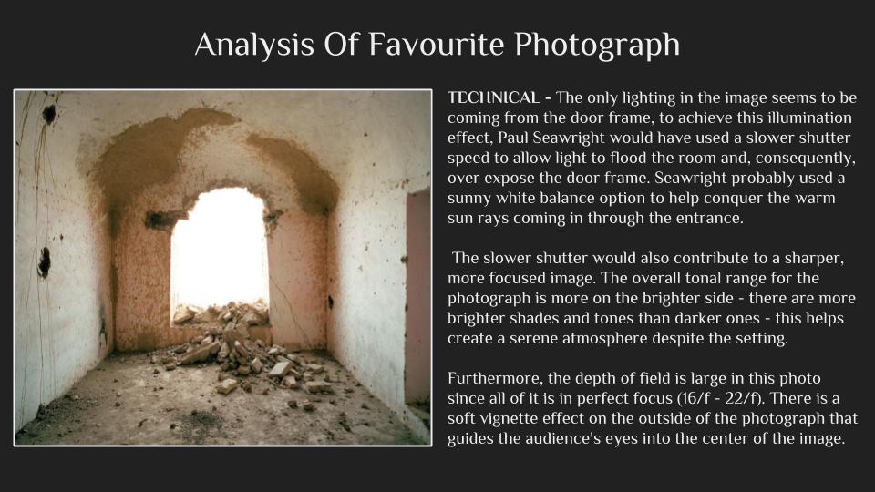
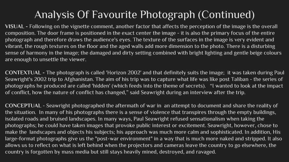
Here are some examples of his imagery: Once looking over his images I decided I should analyze it to see what made it effective as an image, to do this I would take into consideration the technical, visual and conceptual aspects of the photo. By doing this it would enable me to direct it to my own images and how I could relate this specific style into various shoots. The photo I chose to analyze is called Silent Hill:
 Technical: The piece uses a high shutter speed to create a broad overview of everything in the theatre and capture the whole picture. Joo has used a higher exposure to capture parts of the shadows around the seats and ceiling to emphasize the sense of eeriness around the idea of abandonment, by doing this it removes much of the sense from a light-hearted area. The use of including part of the floor before the seats creates the impression of long-term abandonment due to the rubble present throughout.
Visual: Visually the piece uses symmetry in its composition to not only create aestheticism through the use of patterned seating arrangements, but also to make the viewer understand the scale of the effect of abandonment in areas left behind or forgotten. The focus points consist around the entrance door lights which instantly draws the viewers attentions to the seats surrounding them.
Conceptual: The piece is meant to highlight the issues regarding forgotten places and how damage and neglect can ruin areas completely, however it is also meant to focus on the hidden beauty that arises from these areas in the process as the places photographed are rarely seen by the public eye. Joo also wants to make evident how nature always takes back what was built on it and the effects of it doing so.
midori harima shoot :shoot 2
This shoot again was more abstract and focuses on more surreal aspects in the way their identity is pretested. I wanted to use aspects of mirrors and also collage to show a representation of altered reality and identity to who someone is and who makes us who we are.This is also done in order to cover their identity with a different representation of themselves and how human behavior changes and is altered depending on the circumstances in which they are surrounded.I took this shoot in a room which the lighting was easy to control,due to the environment not being of high relevance but the main concentration upon collage and editing.
I have five main ideas for this shoot, collage,covering of identity,mirroring and using a doll to indicate a person beauty and false sense of covered identity and a lack of their real behaviour.
contact sheet:


edits:
for the edits I used photoshop, with the addition or real life positioning with paper in order to indicate an effects of ripping off skin and covering of identity,addtionally I did many edits focusing upon mirroring and forming surrealism illusions within how a face is formed and how we have different sides and values to ourselves which can be viewed differently by different people. for my next experimentation within this shoot I will do a collage and from an abstract afce with the remaining images.
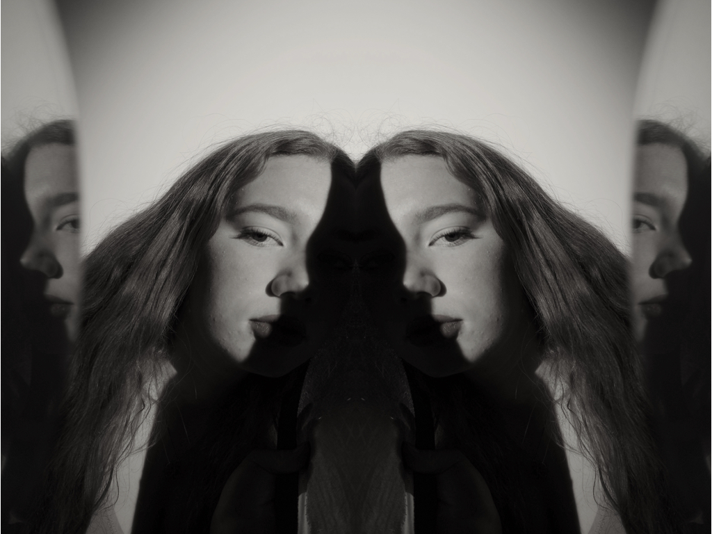
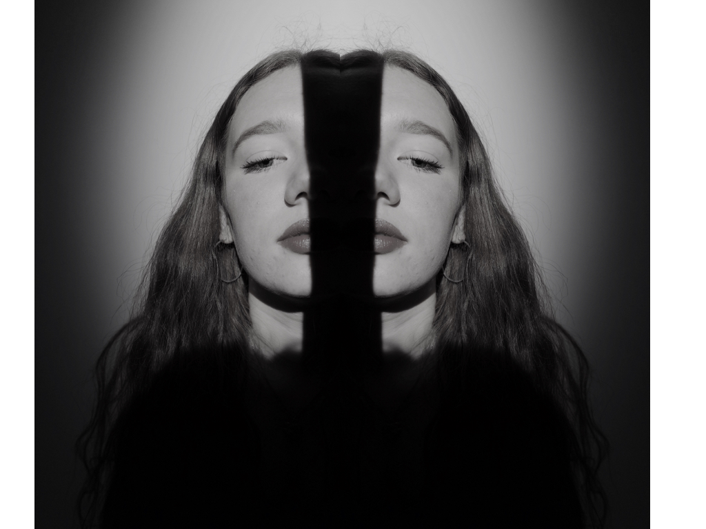

 within these four images I repeated and flipped the images and edited the angles to create an altered reality to the positioning of her face.I originally did this by the lighting technique and blocking out light on half of her face originally.
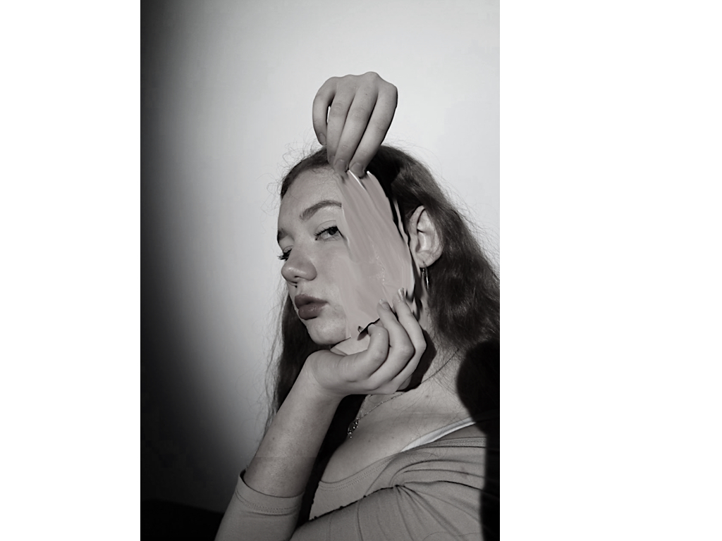
to edit this image I originally placed a piece f paper in order to introduce the angle and size of the effect that I would wants layered the image and used a lasso tool to segment the part of the skin I want to repeated and then shaped it to the size of the paper, removing access. lastly I used the smudge tool to allow a movement of the skin coming off and a pulling effect. 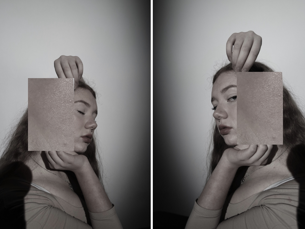
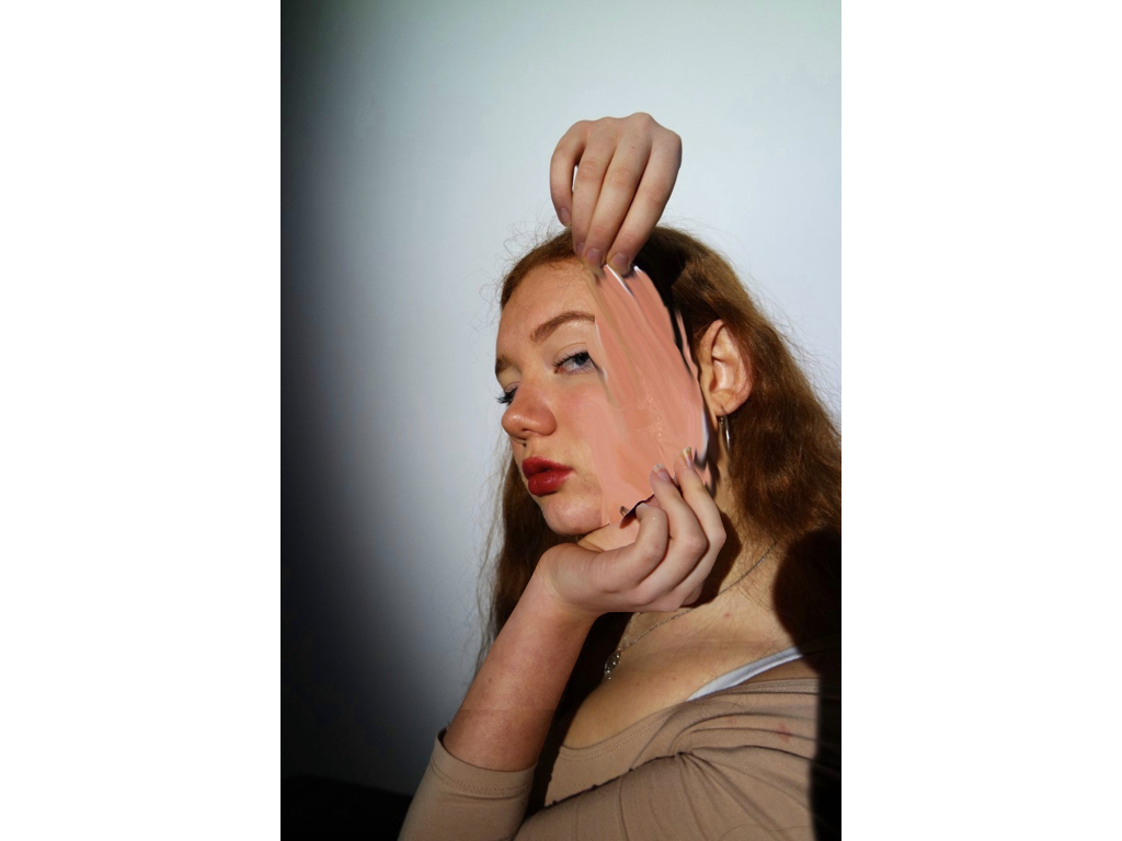
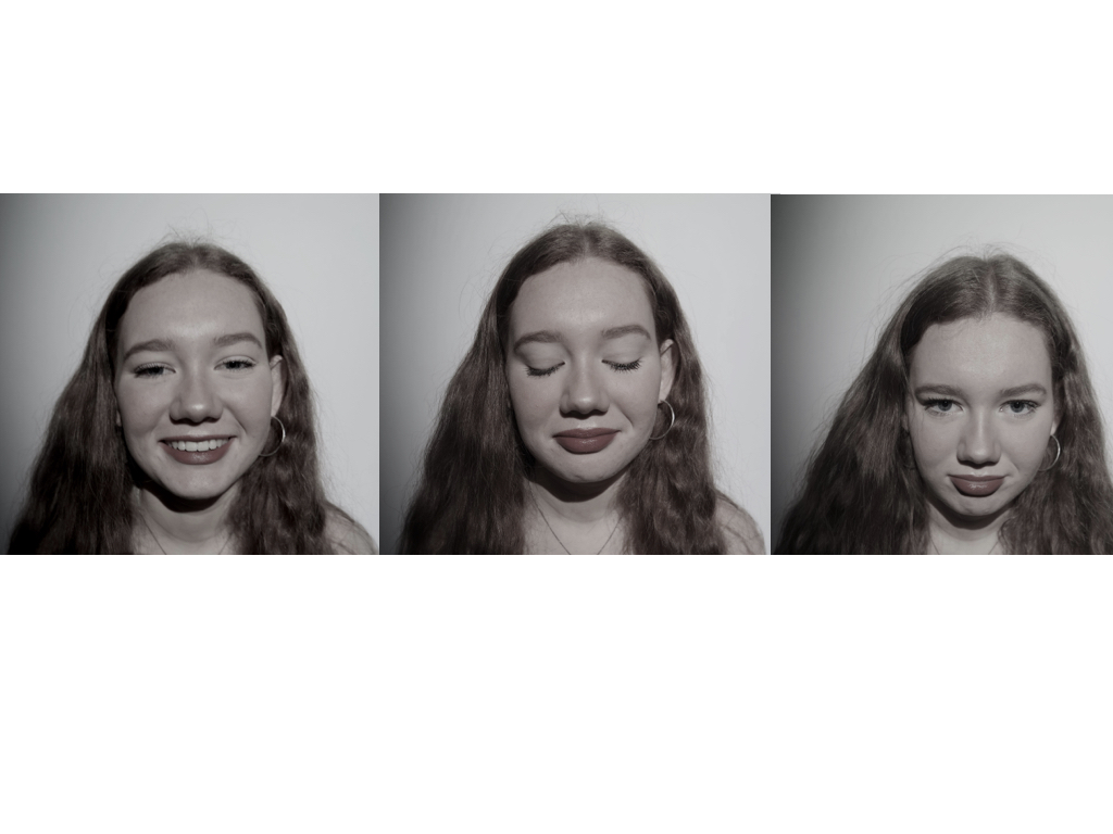
within this idea I wanted to develop more on human behaviour and emotion and what we show and cover as a secret to our identity,this tracks emotions to which people feel but will not consciously present to society.
best images and image analysis:
this is my favourite image as it uses many techniques of half lighting, and a mirror in order to recreate a face in a altered angle,I then repeated the image and positioned the faces to be facing each other to portray a whole face and then tonally edited the piece itself.Overall it symbolises a question of attitude and mystery to what a person thinks and presents through their behaviour to others,there is a sense of suspension of altered personalities to which are fake and not ourselves.
Inspiration 2 – Tommy Ingberg
Tommy Ingberg
Tommy Ingberg is a photographer and visual artist, born 1980 in Sweden. He works with photography and digital manipulation, creating minimalistic and self-reflecting surreal photo montages dealing with human nature, feelings and thoughts.
Tommy leaves the interpretation of his work up to the viewer but says, “For me, surrealism is about trying to explain something abstract like a feeling or a thought, expressing the subconscious with a picture. For my work I use my own inner life, thoughts and feelings as seeds to my pictures. In that sense the work is very personal, almost like a visual diary. Despite this subjectiveness in the process I hope that the work can engage the viewer in her or his own terms. I want the viewers to produce their own questions and answers when looking at the pictures, my own interpretations are really irrelevant in this context. “
Tommy Ingbergs main focus are people and the atmosphere/feeling that relates to the them. He portrays these feelings through his work by focusing on mainly on dark, saddening and depressing moods to reflect this idea of isolation or hidden identity. The running theme throughout Tommy Ingbergs pictures are that they are all in black and white which to me suggests a sense of depression and sadness. I chose to study Tommy Ingbergs work because not only does he create extraordinary surreal illusions but the links between secrecy, codes and conventions are all evident. Clearly his work linking to secrecy due to the secret locations and secret identity occurring within his photographs. His work links to conventions due to the ideas of of modern day portrait photography conventions being conveyed and also the use of objects create connotations linking to the idea of codes.


Exploring Lighting To Create Effect
Here I will be exploring the effect of tinted lighting through the editing of images, for example I will be changing the colour produced by lights and the contrast they have against the backdrop. My inspiration comes from Todd Hido who uses coloured lighting to empahise a certain feel in a room, to which I want to use so I can emphasise the idea of lights in empty areas which conventionally have people in. I will be showing my process on how I get to the current result with the software used, and how I manipulate it. First I will be starting with regular lighting imagery of areas around my house, next I will apply a saturated filter etc over it to change the colour and the outcome produced. Here are my outcomes and process:
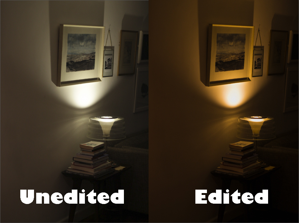

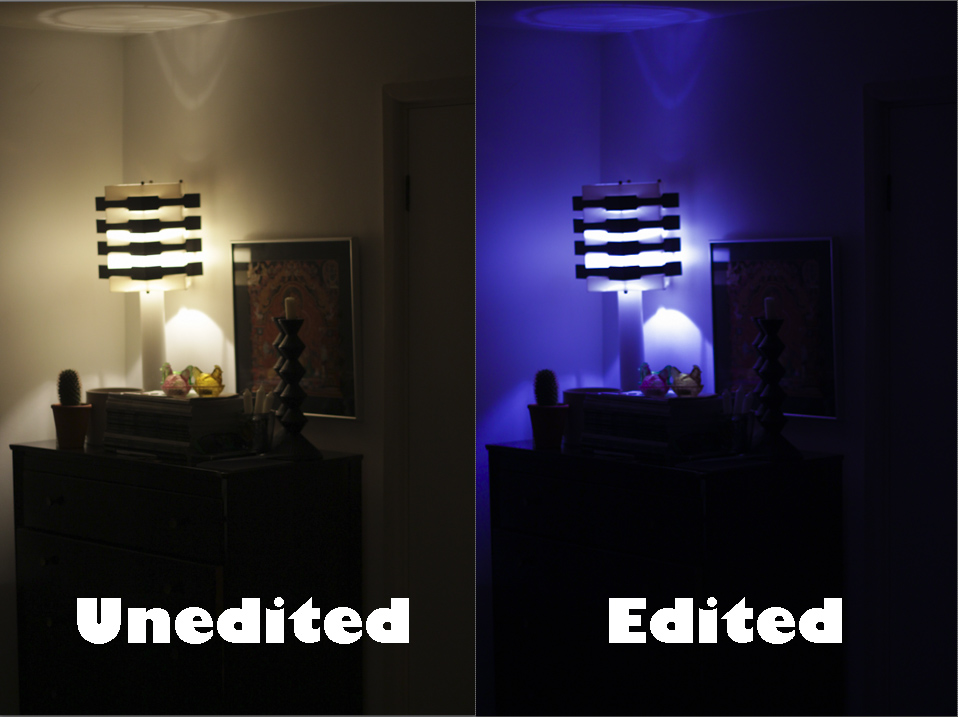
 Here is the process on how I got to the current stage in each image:
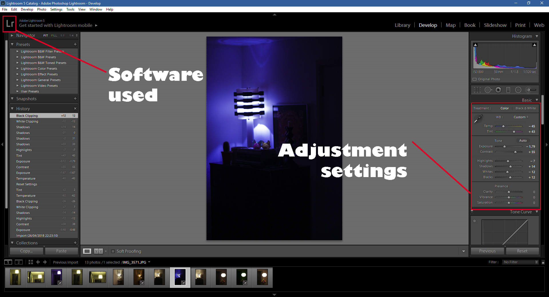 Within Lightroom I used the adjustments tab located on the right to change the saturation and exposure etc. By doing this it enabled me create more dramatic images mixed with coloured lighting to maximize the effect wanted, whilst the highlights, shadows and white effects created and took away any shadows or unnecessary parts of the lighting that ruined the image. By experimenting with this it opening photographing abandoned areas up to new techniques to fully emphasize the message I wanted to get across of conventions related around public areas and the way they are perceived.
Case Study – Paul Seawright
Todd Hido Inspired Photo-Shoot
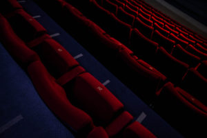
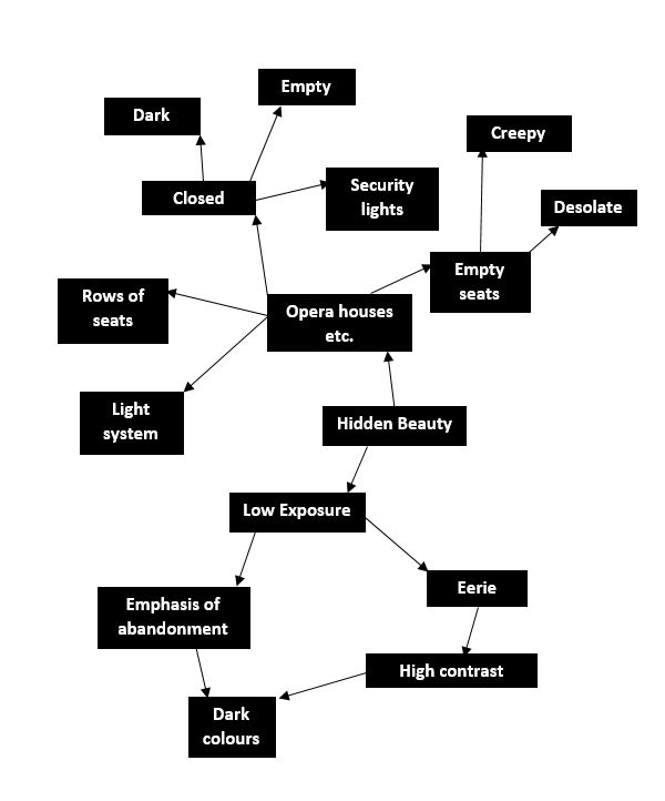
In this shoot I will be using abandoned spaces and their hidden beauty beneath to photograph, when doing this I will be looking at symmetry and lighting to create colour and pattern that makes an aesthetically pleasing result. A photographer that focuses on this is Todd Hido, Hido focuses on the secret beauty of household spaces that have been left abandoned and disregarded, I will be using him as the basis of my ideas for my shoot. To do this I would visit empty spaces such as cinemas and opera houses whilst closed, doing this would make use of the minimum lighting available whilst creating an aesthetically pleasing result.
Here are some examples of his work that inspired this shoot: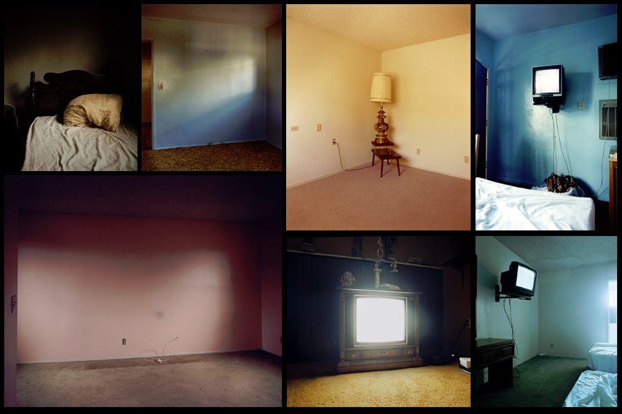 After deciding on what I wanted to focus on I made a mind-map, this would enable me to channel my ideas to specific topics that I should focus on in my shoot. This would remove all unnecessary time-wasting as it would allow me to get straight to what I wanted. Here are my ideas for the shoot:
 Once done I was ready to move onto the shoot itself, I had gotten access to the local theatre and was now able to know exactly what I wanted to focus on whilst there. After that I would take the image count down to a top ten photographs that I thought stood out from the rest, from there I could then take them down again to the best image of the entire shoot. Here are my results:
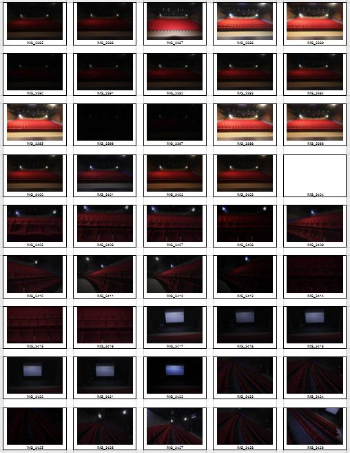
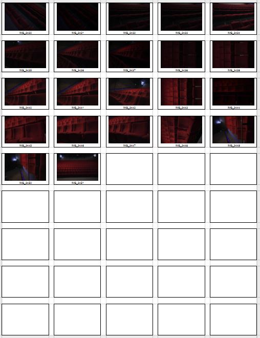 After previewing my images I decided to pick ten images from the shoot which I could later narrow down to five and then one overall image that I think best reflected the topic of secrets, codes and conventions. By doing this process it would allow me to analyse and really think through each decision I made regarding each of the images. Here were my choices:

I next went on to bringing my top ten images to only five, from here I would analyse and describe the technical aspects of each picture furthermore allowing me to find the one that I incorporated the best to the topic title. These were my picks for the best five images:
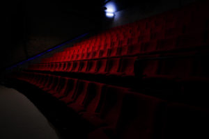
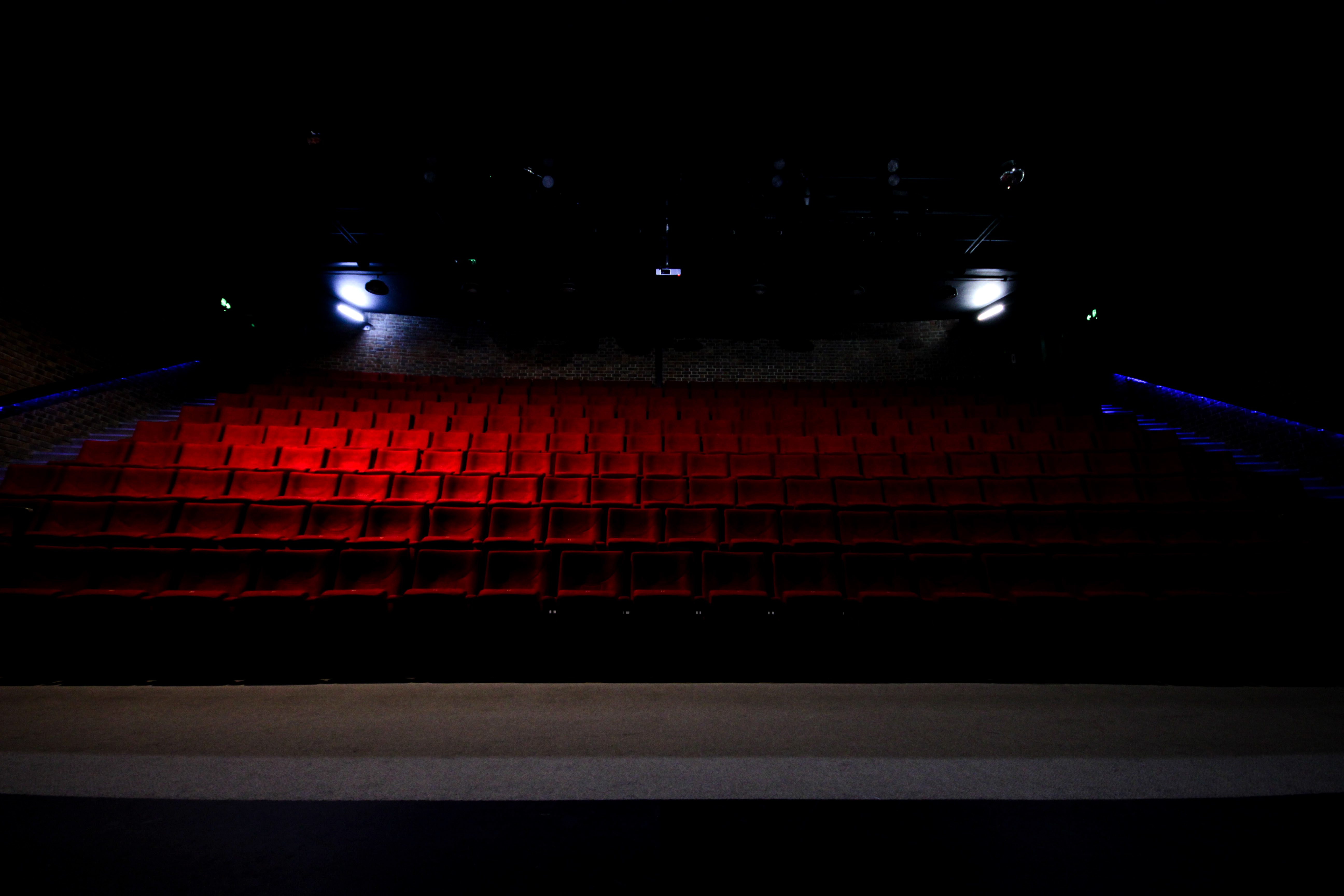 I chose this image because of the effective use of lighting and the symmetrical composition of the piece. I found that the more dominant light created an orange gradient that transitioned as it went across the seats, this produced an effective balance throughout the picture making it aesthetically pleasing as a result. The blue lighting the trims either side of the seats disrupts the other wise dominant use of red, but at the same time does not overpower or look out-of-place compared to everything else, I really liked this from how it added other elements into the picture creating greater contrast. The symmetrical composition adds to the aesthetics of the image with the two lights being focus point of the piece since they highlight the seats and are the first things the viewer looks at. This allows this idea of abandonment to be emphasized from how the gradient and lighting adds eeriness as it is meant to resemble an area that is currently unused by any human presence.
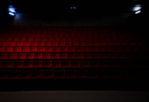
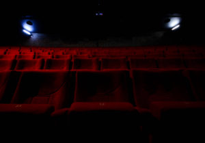
 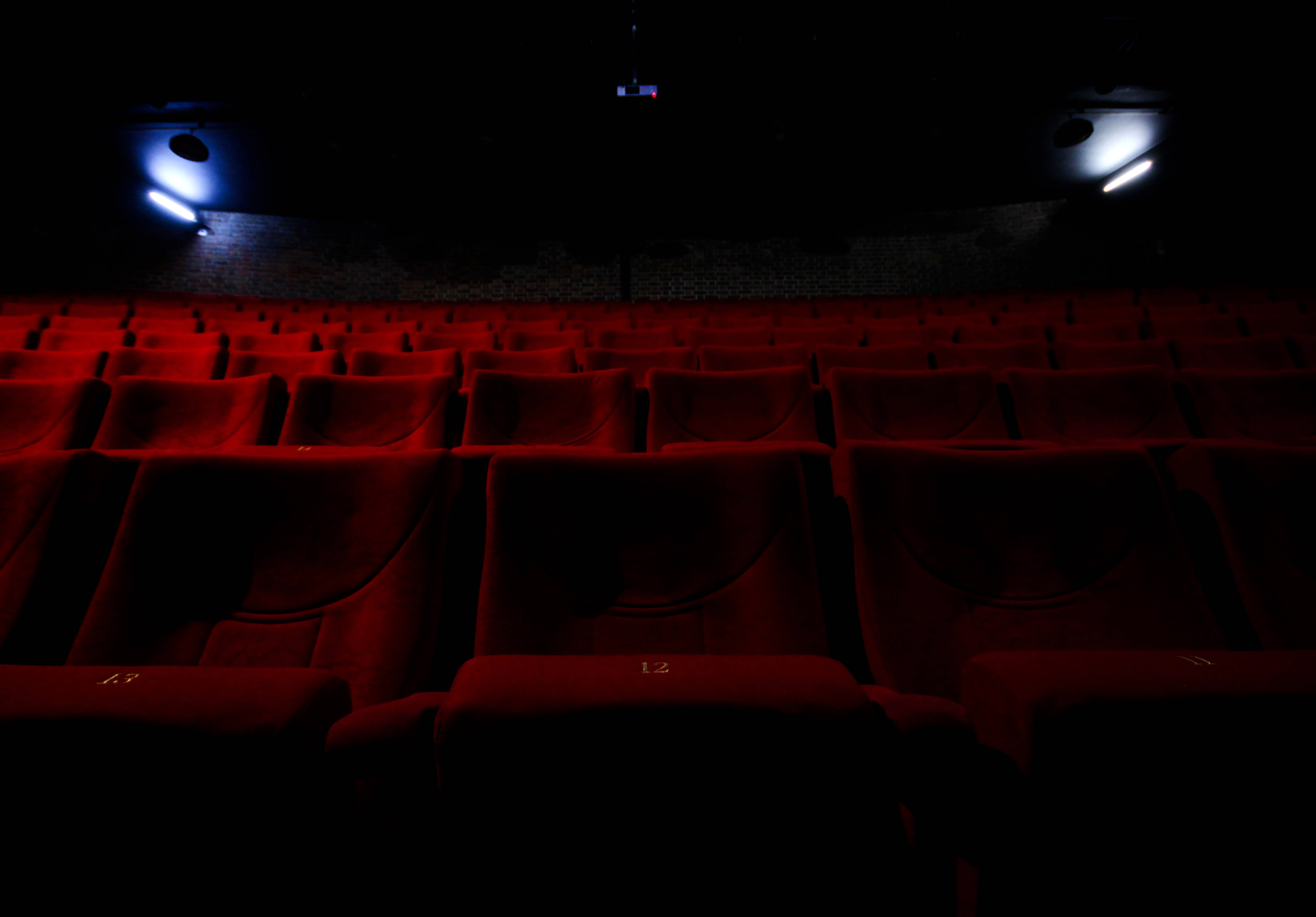 What I loved about this image was the use of a depth of field contrasted by the use of light. Because of this it divides the image into two sections, a light and a dark, with as a result contrasts the darkness of the ceiling and the two lights either side of the picture. The depth of field emphasizes the idea of abandonment through how the seats seems to go endlessly back but contain an absence of people, this fits into the category of conventions as it highlights a should be full area that is now unused and left behind until taken notice of.
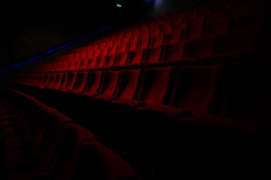
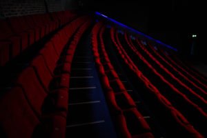
 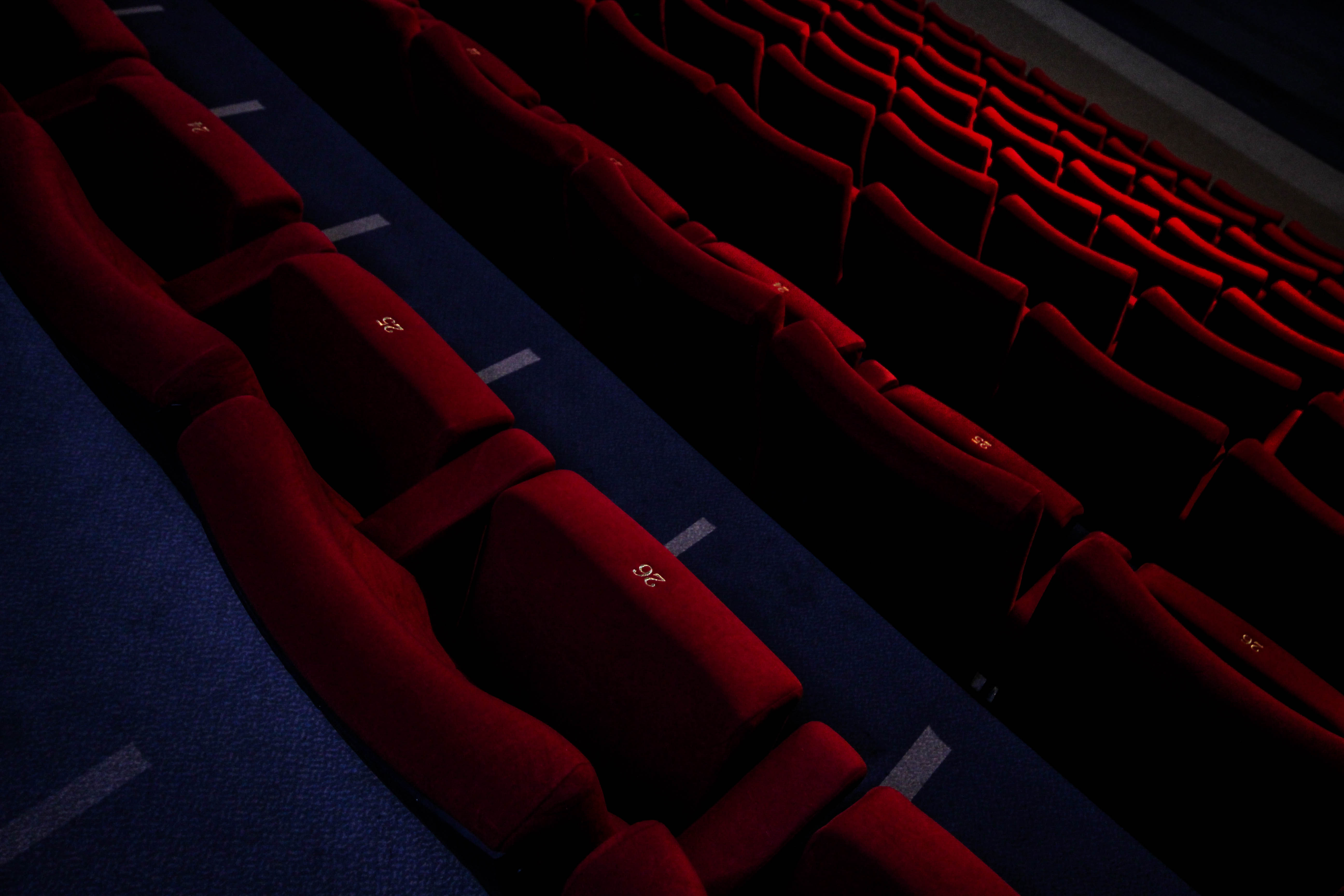 In this picture I found the composition to be most effective due to the angle at which it was taken at. The slant which the image was taken creates a broadened sense of desertion seen through a depth of field that blurs out the bottom rows, this makes the image seemingly unsettling from how the area should contain people, but instead lacks it. However the use of a highlight produced by the overhead lights breaks the dull red colour range of the image adding oranges into the mix by breaking the otherwise purely dark colours.
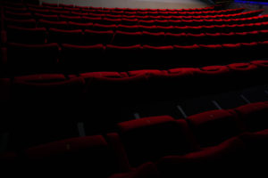
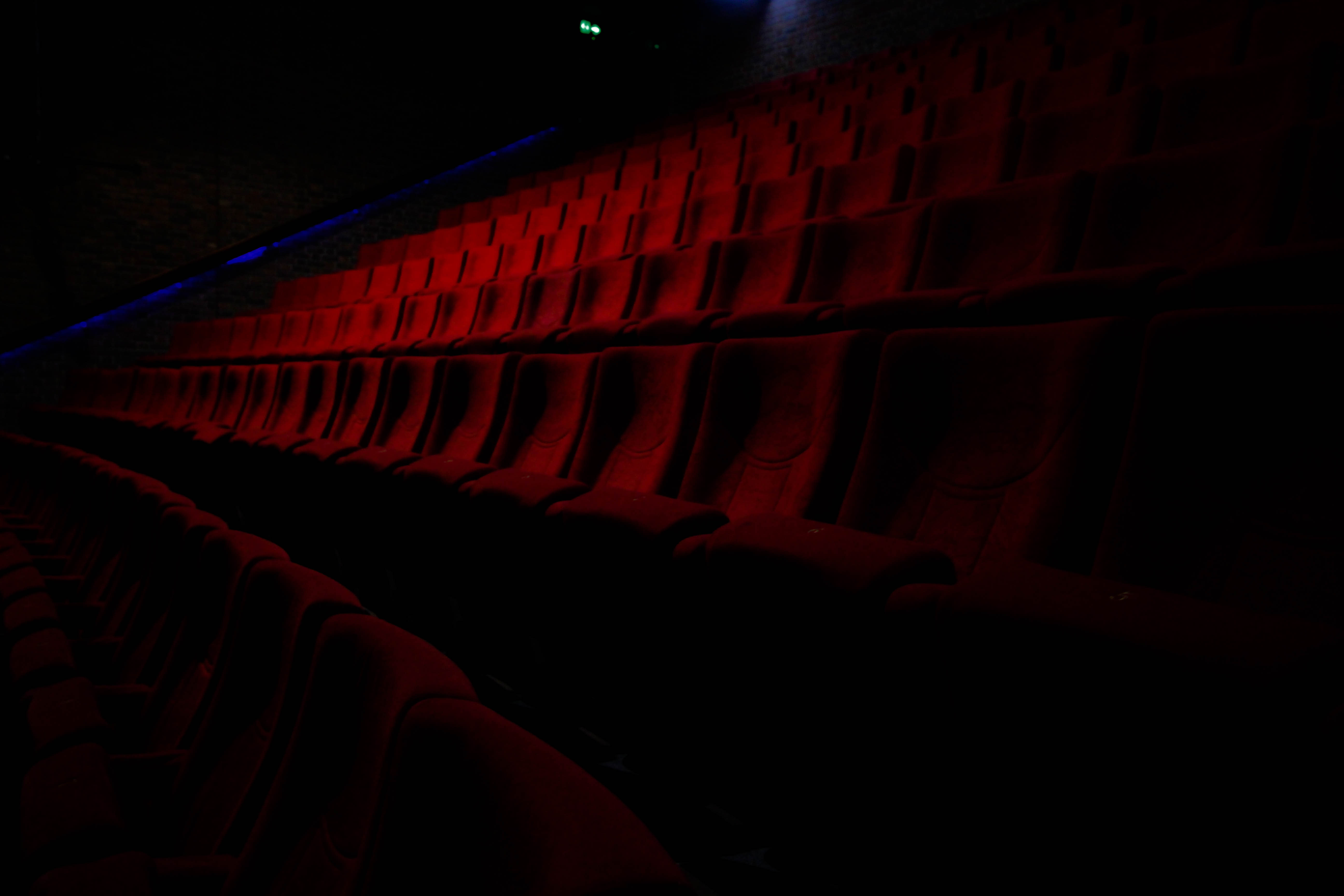 I found that the depth of field in contrast to the dark colours of the rest of the image produced a nice gradient breaking the otherwise bland colour scheme as a result. The faint use of blue streaks used in the far distance of the picture add other elements into the picture when looked at closer, this is also provided the dark border of the image which the chairs seemingly fade into existence from, creating the impression that the place is now deserted and is also forgotten (seen from the hazy darkness).
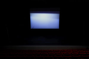
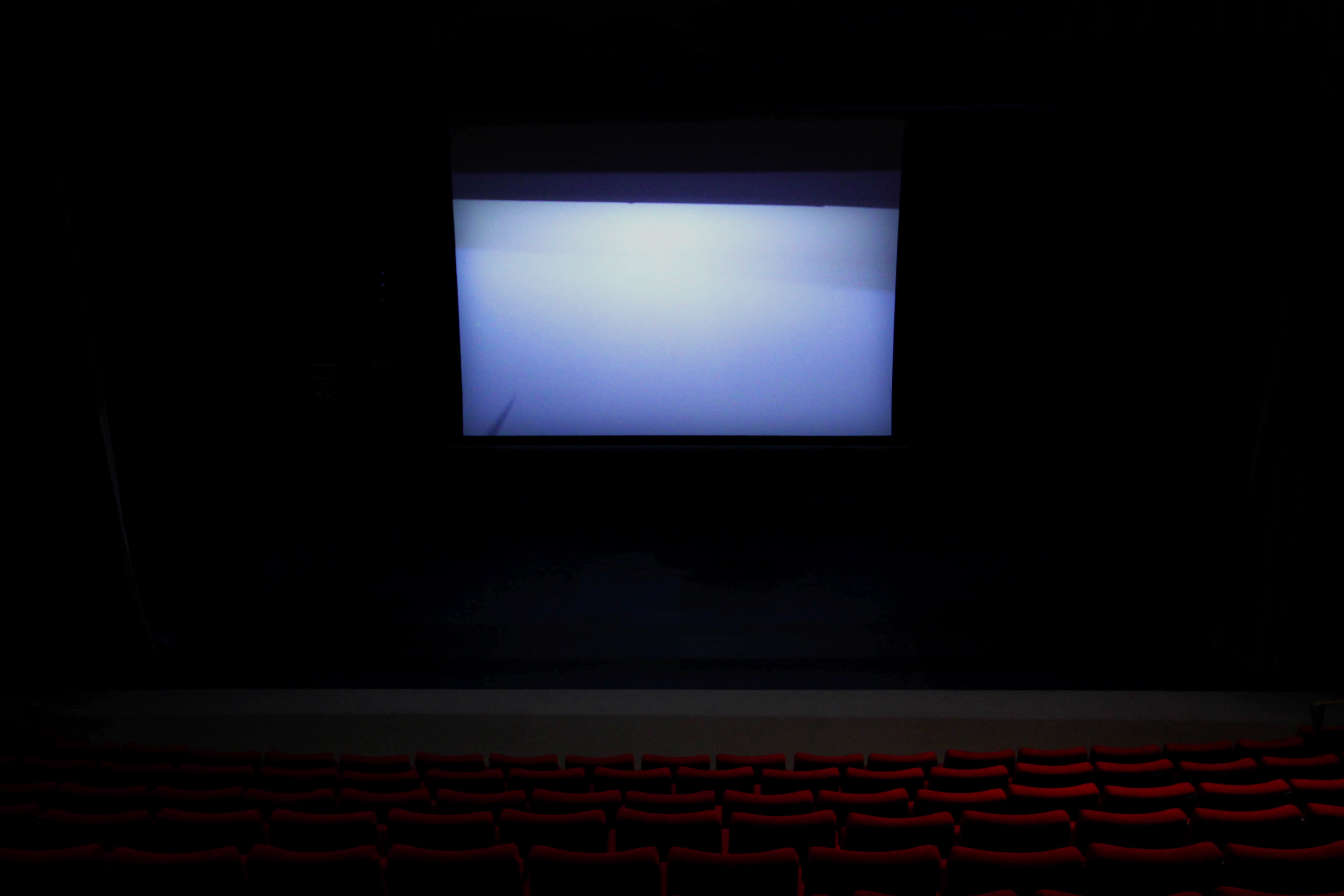 Finally I chose this image due to the overwhelming use of the white screen projecting a ghostly light onto the seats facing it. I found that this produced an almost mesmerizing effect, whilst creating the result of the seats fading into darkness as they went further left to the photo. As a result I found that this created the impression of minimal human influence over the area hence the ghost like product from the contrast.
After looking at these images I was happy with how they reflected the topic I wanted to focus on of conventions, I thought this was done effectively from each images use of darkness to create a contrast between the little light available portraying an eerie effect onto each row of seats that were occasionally broken by hints of orange. Once this was complete I went on to decide the final image of the shoot that I think best portrayed this effect. This was my final result:
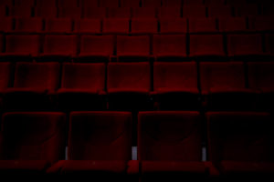
Final Image:
 What I loved about this image that made me choose it as my final piece was overall the contrast, this was because of how it allowed for a black border that the chairs seemingly fade into existence from, and with minimal light available creates a very eerie impression onto it. The symmetrical composition of the photo makes it aesthetic through how everything is an equal distance away from each other, this also divides the piece into both a light and a dark side highlighted by the use of orange shades on the far left. In relation to the topic of conventions I found that it really emphasized how usually crowded areas when empty, create an almost haunted feel to them due to the norm of not being able to see them like this.
Todd Hido Case Study
Who is Todd Hido?
Todd Hido was born 1968, America, Kent. Hido’s work is of suburban and urban homes shown in galleries and business throughout the world. In 1991 he was awarded a BFA from Tufts University and a MFA from the California College of Arts and Crafts, currently he is the professor at the California College of Arts and Crafts in San Francisco. Hido is most famous for images taken of home areas across the US using lights to create detailed and luminous imagery. These show the despair and loss of the falling housing market.
Hido’s images are used worldwide, this includes The New York Times Magazine, The Face, and Vanity Fair, with other instances that can be seen in museums in New York, Chicago and Los Angeles. Hido makes it evident in his photographs that he branches out to other styles of photography such as portraiture, with all his works receiving critical acclaim. Each of his images are meant to resemble the hidden beauty that hides beneath the surface, with each image having its own story of memories and failed dreams.
Hido has won several awards, including the Barclay Simpson Award in 1996, and the Best First Monograph in 2002 for 2001 photo-eye books and prints.
Some examples of his works can be seen below regarding the topic of hidden beauty: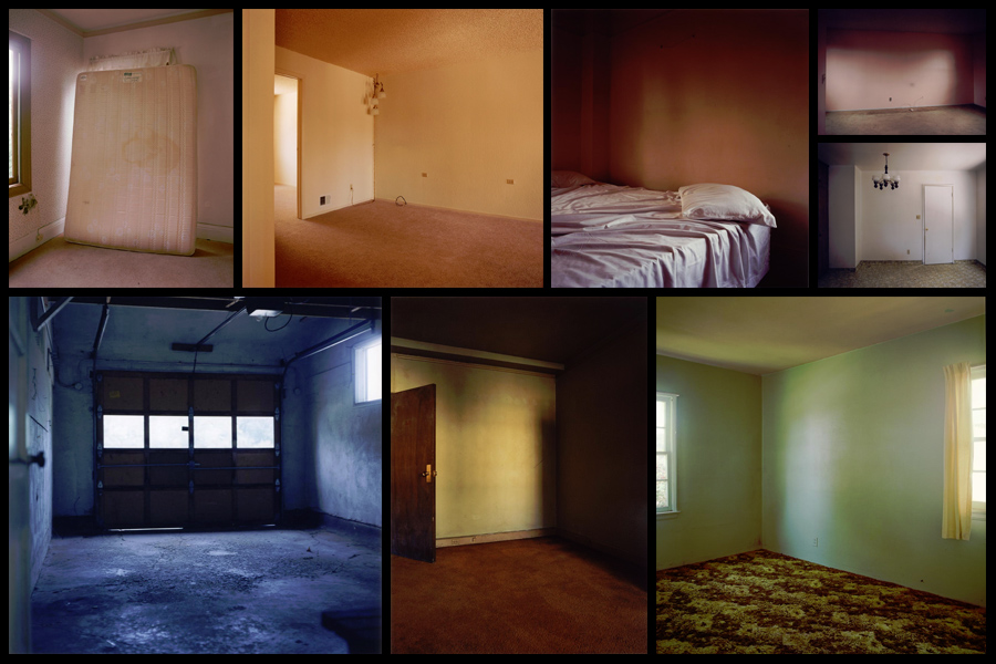 After looking over his style and influences I decided I should analyze one of his pictures to find what made it so effective as a piece, to do this I would look at the technical aspects etc to determine what made it the way it was.
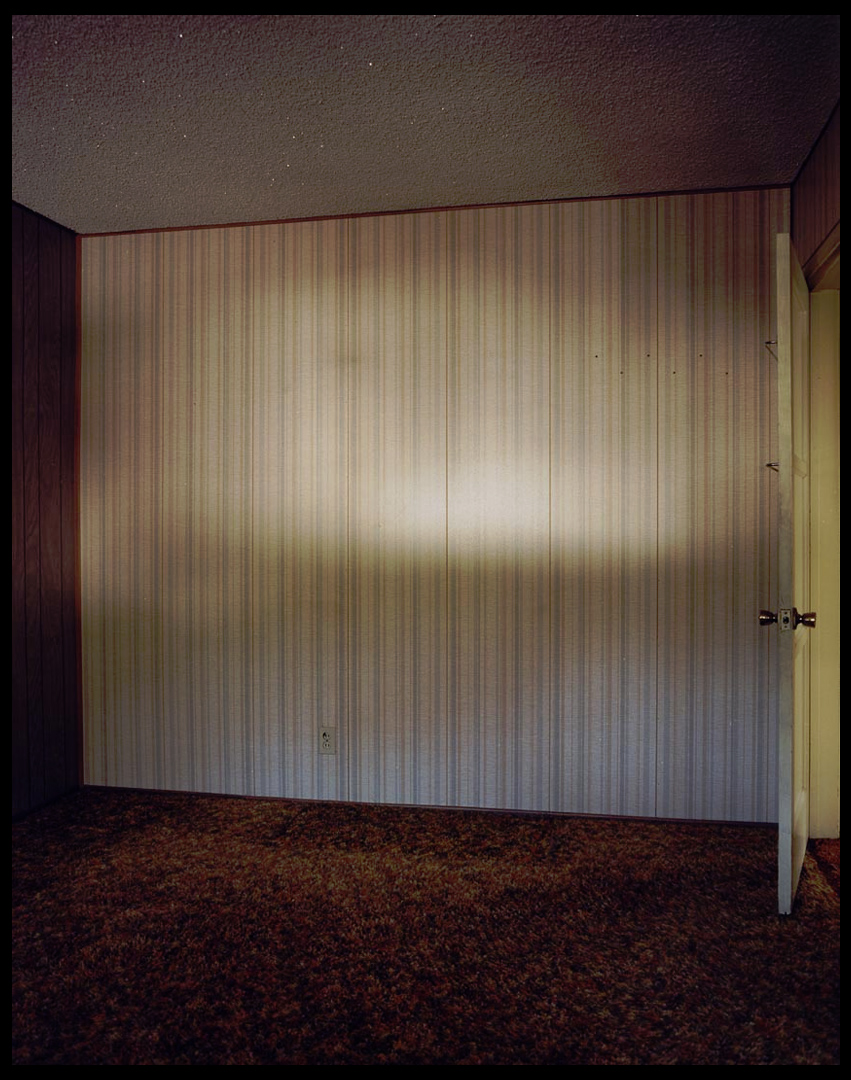 Technical: The images makes use of the little available to the room creating a gradient along the wall, this emphasizes the shadows and dark coloured floor and walls, creating an almost eerie effect to the room itself. The use of a half opened door breaks the otherwise dull looking room by adding some yellows into the picture, to a viewer this creates an aesthetically pleasing result from that disruption of pattern. A low exposure can be seen being used from how the contrast between the lights and darker areas almost pop out at you due to the emphasis of colour.
Visual: Visually the image is aesthetically pleasing from how the range of colours used compliment each other as a result. The composition of the image itself it photographed at an angle, but still keeps intact elements of symmetry between the far left and right walls, allowing for an effective interpretation of what the rest of the room is like. The dramatic used of the gradient light in the center of the wall probably made by a small dusty window creates a break between the dark theme of the room, however this as well as the door, pose as the center of attention within the image, instantly drawing our eyes towards it.
Conceptual: The image is meant to highlight the remains of dreams that were previously there but abandoned, whilst basing the idea around the concept of the hidden beauty in objects and areas left behind or currently uninhabited. The piece is also meant to be surrounding a controversial issue of the failing market at the time and in a way is voicing his opinion about the topic.
Exploring Surrealism
What is Surrealism
Surrealism is a 20th-century movement in art and literature which sought to release the creative potential of the unconscious mind, for example by the irrational juxtaposition of images. Surrealist works feature the element of surprise and unexpected juxtapositions.
The purpose of this movement was to destroy the borders between reality and dream and to release the passion.
Photography Surrealism
Surreal photographs present pictures that are unlikely to find in the real world and deals with producing photographs that appear to have some kind of special impacts.
Surrealism photographs usually represent overlapping photographs, abstract forms or blasts of light that trick the viewer senses.
Their brain perceives that the things they are observing are quite impossible in reality, yet at the same moment their eyes are viewing a remarkably realistic-looking photo.
Examples of Surrealism
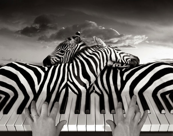

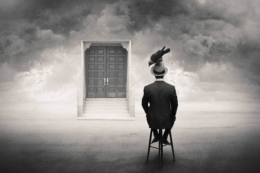
What I intend to do with surrealism
Using surrealism I intend to exploit the exaggeration of environmental change that humans are creating. I will use artists for inspiration and create work in a similar style while using my own ideas. This will link to the exam title as i will be defying early day photography conventions and complying with photography conventions of modern day which are all about photo manipulation and using Photoshop to alter images. It will link to the idea of secrecy because I will be raising awareness of the environmental impacts that humans are creating that not everyone is aware of, therefore uncovering the secrets to why and how our world will be destroyed and what it will look like.

