PHOTO-SHOOT PLAN
Based on my initial ideas (2 posts previous) for this project, I have made a plan for an initial photo-shoot that will get me started on composing my desired images.

Based on my initial ideas (2 posts previous) for this project, I have made a plan for an initial photo-shoot that will get me started on composing my desired images.

Who is he?
Robroek is a 31-year-old urban photographer born in the South of the Netherlands, who as a child was surrounded by empty, abandoned and decaying buildings. Further into his life curiosity struck him and he wanted to know the story behind the reason for the state of each building, who used to live there? This led him to travel the world looking for places like these, allowing him to witness areas closed to the public eye. His aim is to create the memories and images that may once have been provided by these rooms, and wants to improve the perspective of those who look at the images.
Robroek specializes in uniquely capturing interiors and exteriors of a wide variety of buildings, cultural heritage sites and monuments, working only with the natural light provided. It is evident in his work that he wishes to highlight what is not usually seen to the public, and how there is a beauty in the untouched nature of it all. His photos range from a variety of locations, from tombs to churches, to mansions, each image showing as little human intervention as possible, creating eerie but beautiful landscapes through the use of natural lighting from the deteriorating landscape.
After researching the background of the photographer I decided to make a mood board and then analyze one of his images, this would help me in my next shoot to be inspired by composition and lighting in location. Here are some examples of his work: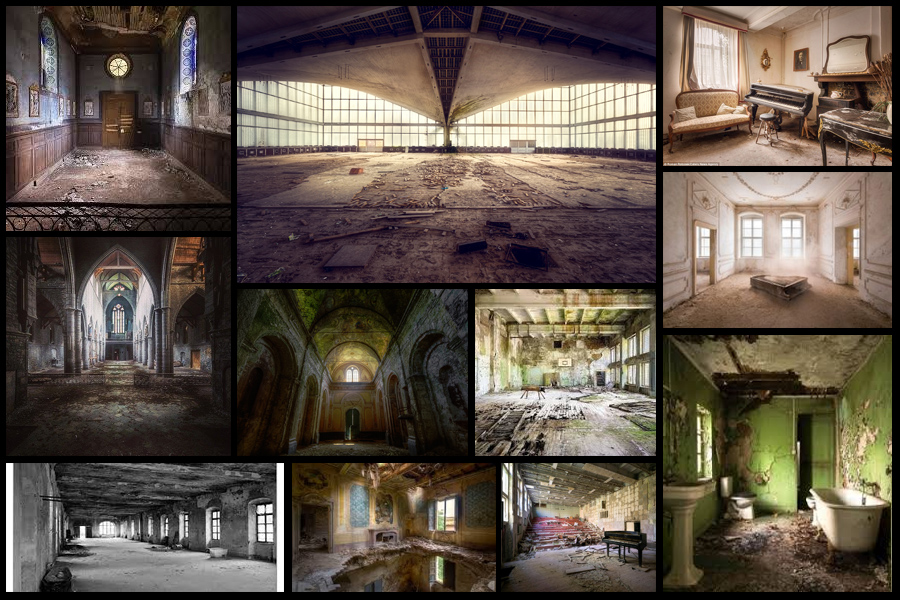 One of his images I decided to analyze was ‘Sitting in a church’, I chose this because of its relevance to the topic of chairs that most of my shoots have within them.
  Technical: Within the image Robroek uses a low exposure to capture a contrast between the lights and darks illuminated through the windows of the chapel. The idea of abandonment is portrayed drastically by how Robroek has used people covered in old blankets to bring together the time when the church was and wasn’t used by people, this as a result creates eeriness to the piece as the hidden bodies and faces creates a haunted uneasiness to the overall picture.
Visual: Visually the photo is well composed, this is mainly brought about through the implementation of symmetry which highlights the ghostly figures sat in the furthest corners of the church whilst also creating aestheticism as well. The center window is used as the focal point of the entire image which puts emphasis on not just the light sources but also the figures illuminated by them, from this it allows a more uplifted perspective of the entire image as it does not cast the figures in a dark light, rather than just a forgotten one.
Conceptual: Conceptually the image is meant to focus on the contrast between the building before and after it was abandoned, by doing this it creates an image from two different time frames and almost freezes it capturing the past in a modern image. This highlights hidden beauty that would not usually be seen in a church being used or just an abandoned one, rather instead a contemporary one.
Here I will be exploring the use of blur effects on Photoshop, by doing this it will allow me to further develop my images and editing process when doing future shoots. Here I intend to use iris and tilt blur to create a focus on any part of the image I want so that it becomes the focal point of the image. To do this I will be going to the cinema to photograph empty chairs, to which I will be attempting to make the center of focus the scattered food or drink. My inspiration for this comes from a general use of depth of field used in my camera, I found that this when taking other imagery really helped pinpoint certain aspects, and so wanted to incorporate this into my topic of secrets, codes and conventions. Here are my outcomes:
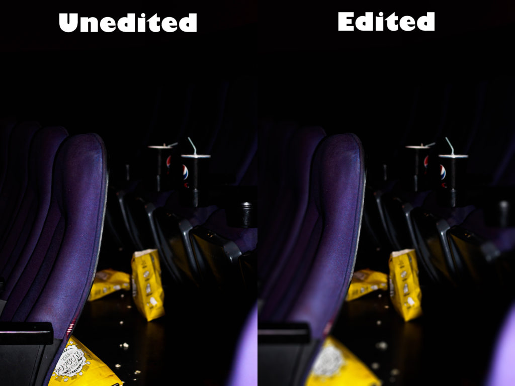
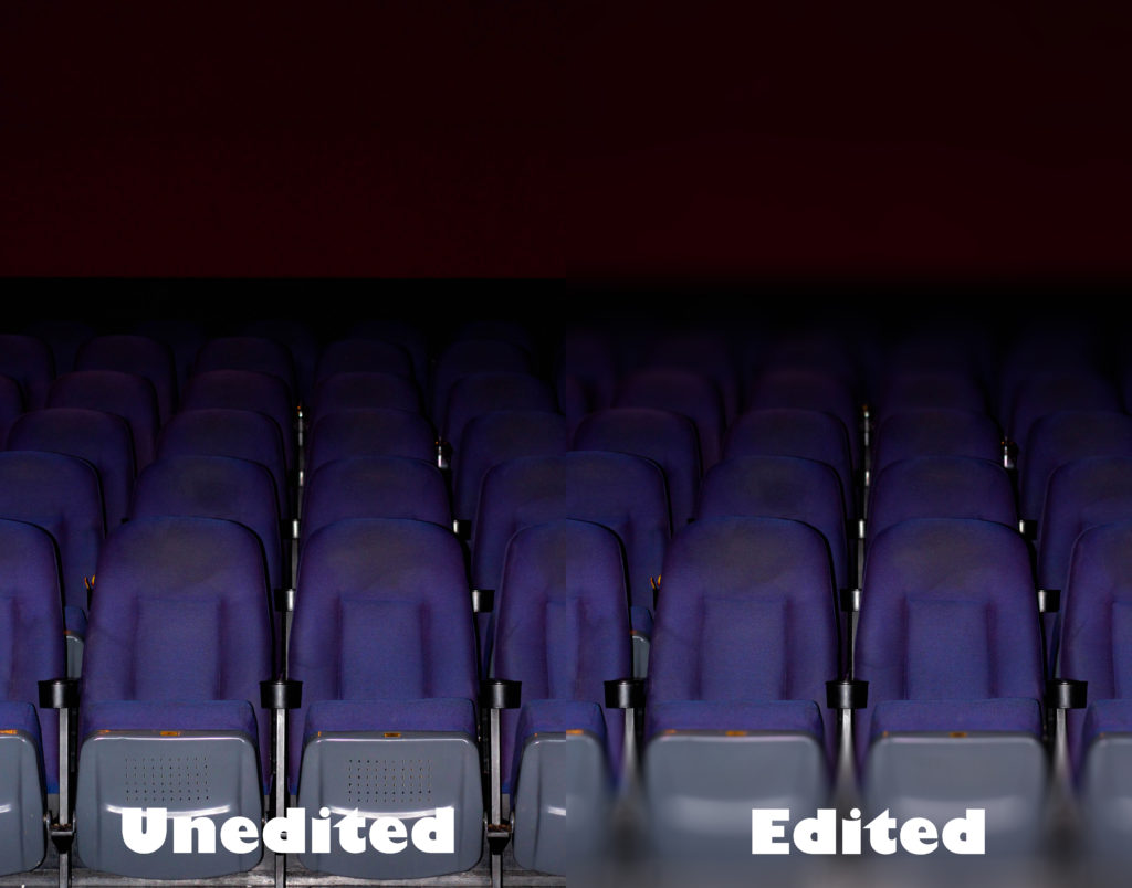
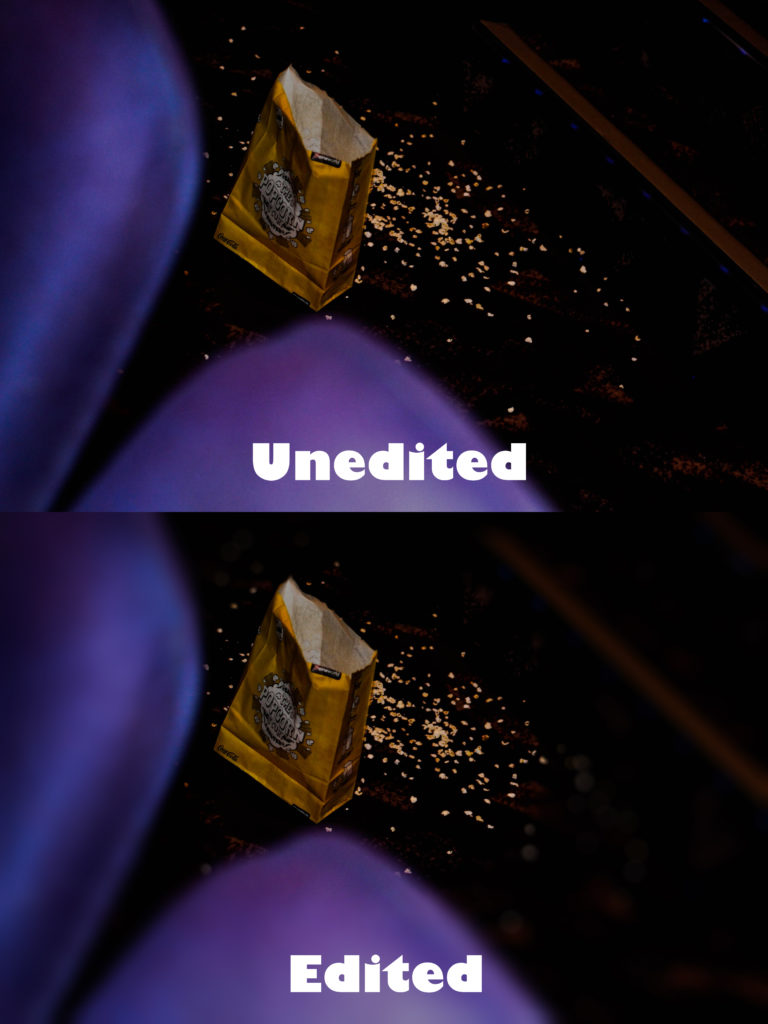
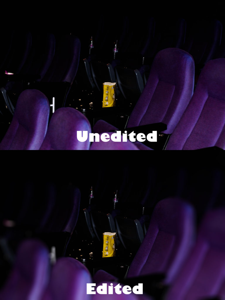 Here is my editing process for how each image was done:
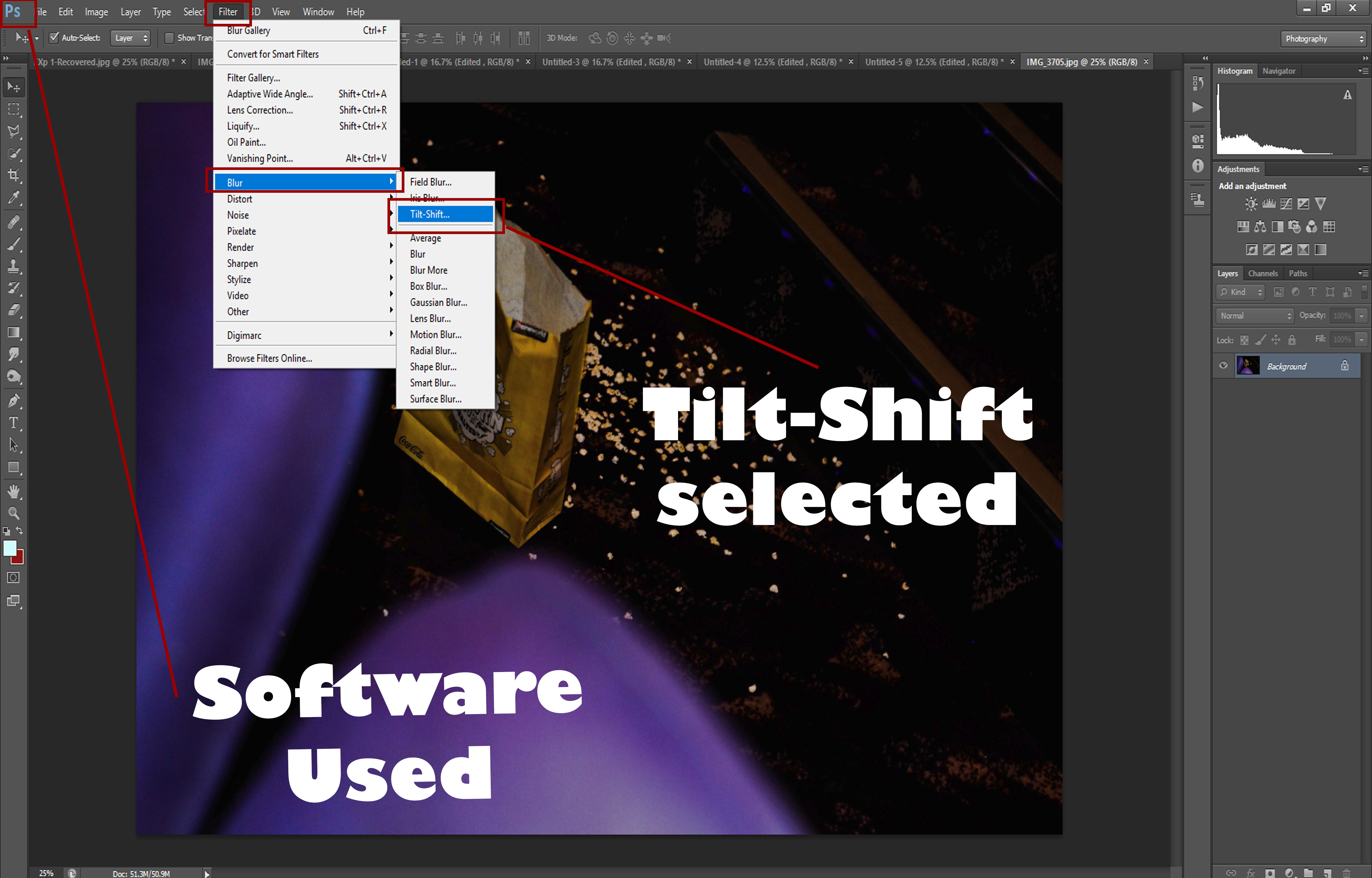
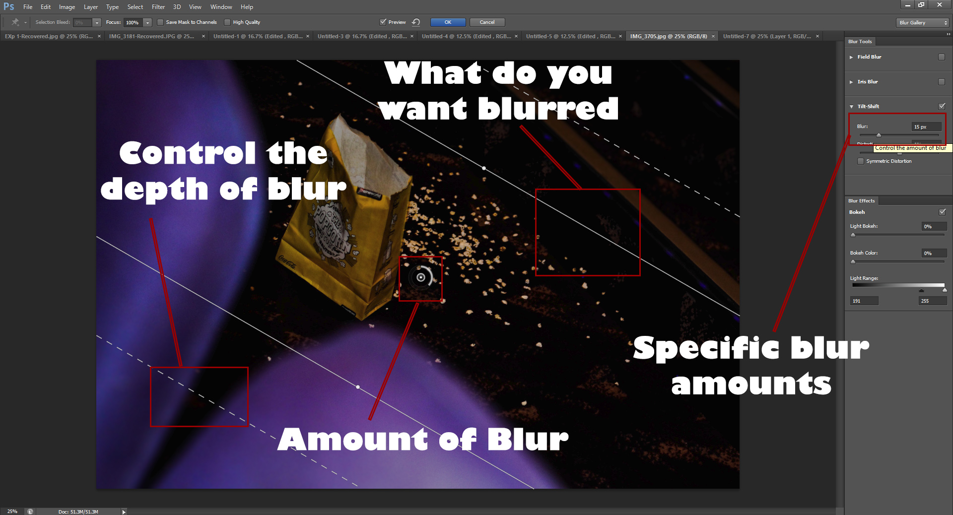 I used Photoshop because it allowed me a variety of different blurs which could be used to change the perspective of how each image would be viewed, by giving me more choice it really allowed me to try with different method to find what I wanted. By controlling the depth of blur and what I wanted blurred, it gave me full control over everything as it made it possible to pin-point certain details in the image I wanted to remove or be unnoticed, whilst giving me the outcome desired.
Within this shoot I will be particularly focusing on the idea of abandonment in areas such as opera houses which reveal the hidden beauty of the overall design. Inspired by Johnny Joo, I will be mainly focusing on composition to emphasize desertion through the use of symmetry and contrast which hopefully will produce dark seating but a high contrast of lighting, showing the lack of human activity usually seen in such areas and the uncomfortable feeling that is related to such imagery. Joo chooses particularly a technique of composition combined with an effective use of contrast especially on lighting to create dramatic photos centered around seating etc and areas people used.
Here are some example of Johnny Joo’s work: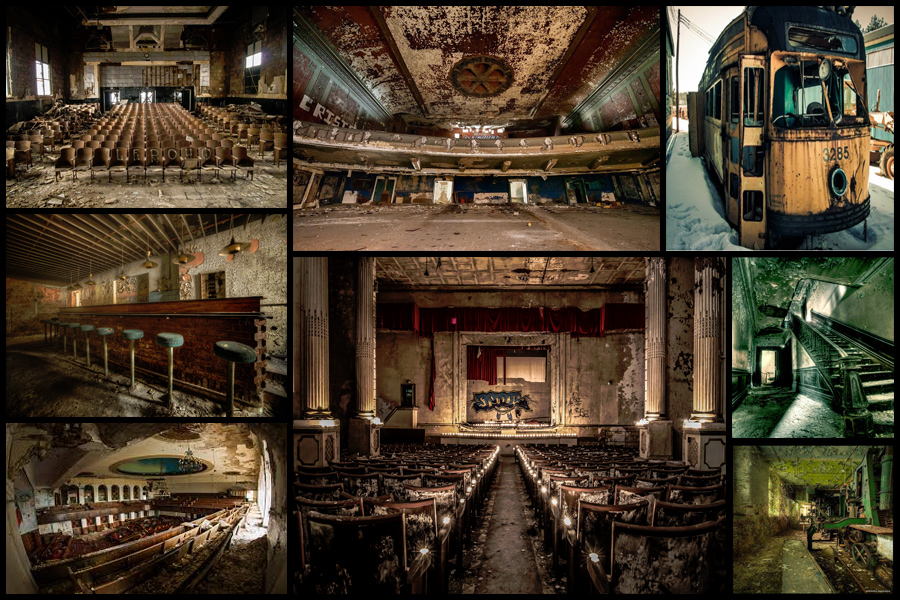 Once researching some of his work to draw inspiration from I decided I would make a mind-map from various ideas I had for the shoot, this would include things like angles, lighting and what to take. By doing this it would reduce the time needed on the shoot as I would know specifically what to do when there and how to take the images needed. Here are my drafted ideas for the shoot:
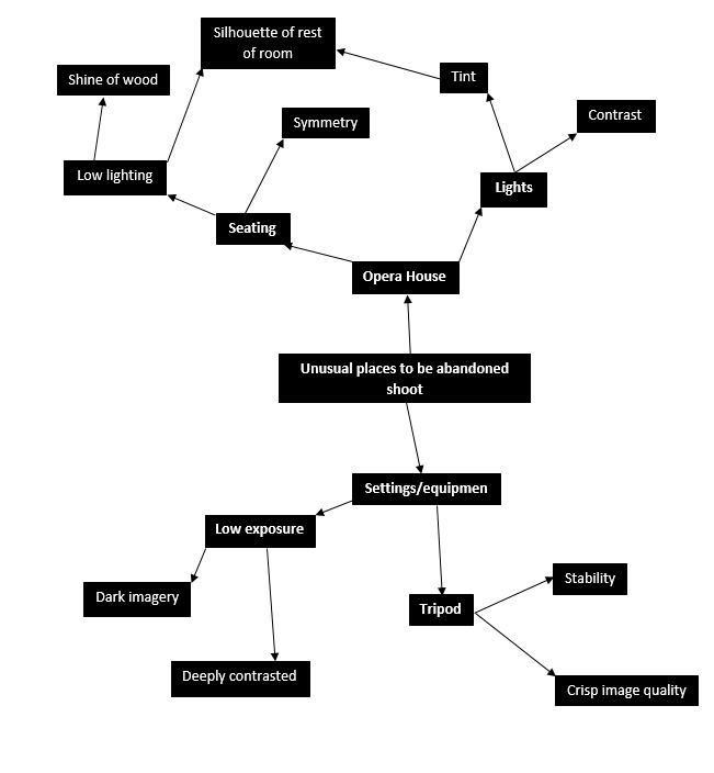 After I had completed my mind-map I thought it would appropriate to go ahead with the actual shoot itself whilst taking into consideration the ideas I had planned in advance. For the shoot I had gotten access to the abandoned opera house in town, these were my results:
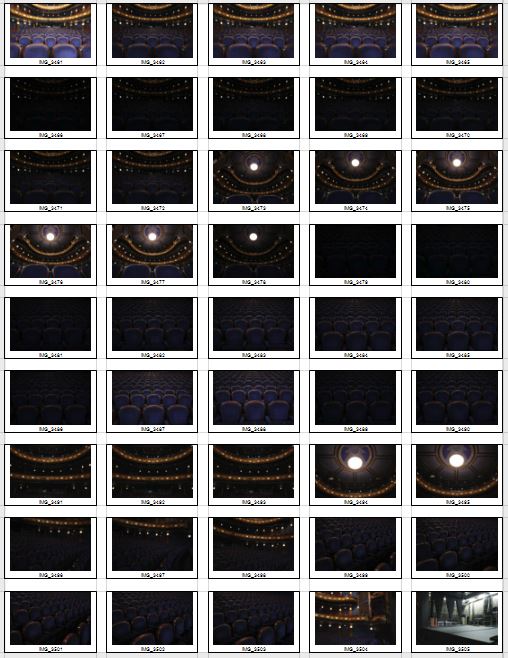

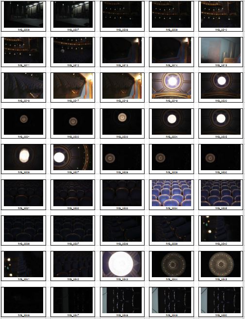 After this was done I started to whittle down the shoot to a top ten images, by doing this it would enable me to more easily find the overall best image of the shoot with in the process taking into consideration the aspects of each image that made it effective and how it could be related to the theme of secret, codes and conventions. These were my choices for my top ten best images of the shoot:
Once I had selected the top ten images I thought reflected the intention of the shoot and the were technically the best out of the rest I then wanted to drop that to only a top five. By doing this it would allow me to individually analyze each image to further know what photo would be the best result from the shoot. These were my results:
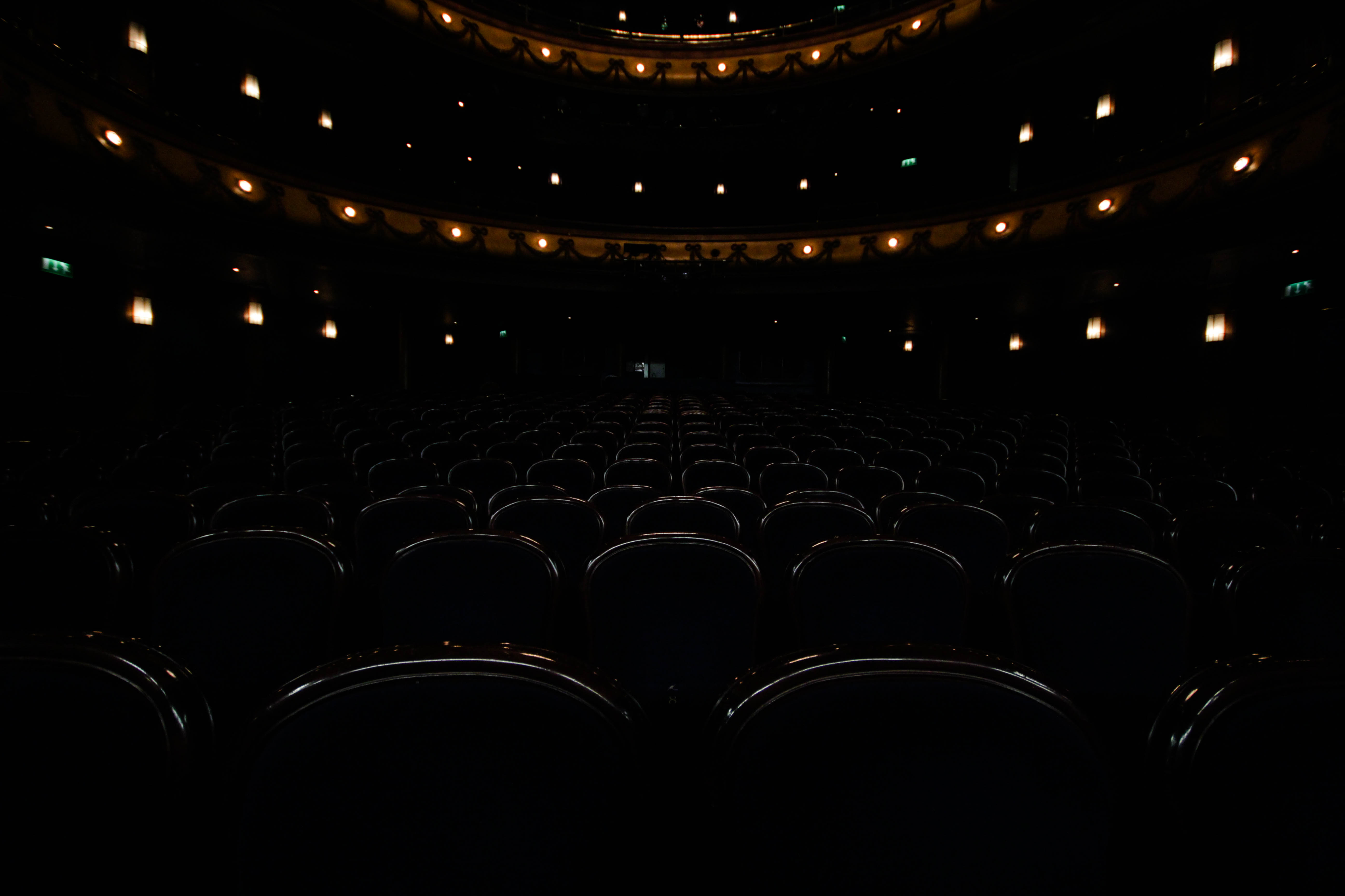 I chose this image because of how I really think it emphasized the ghostly effect created by the use empty seats. This is because of how the area it not usually seen without human interaction, and to see it devoid of anyone makes it feel unnaturally deserted, this is great for linking it to the topic of conventions as it’s not a place usually seen in this state. I found the composition great from the use of symmetry which I found particularly effective as it makes the picture aesthetically pleasing to view, with the seats having the lighting reflected and a depth of field used, it seems that the seats go on forever as if forgotten and unused. The orange lighting that surrounds the seats creates an even more ghostly effect from how it breaks the otherwise bland selection of colours present in the image.
 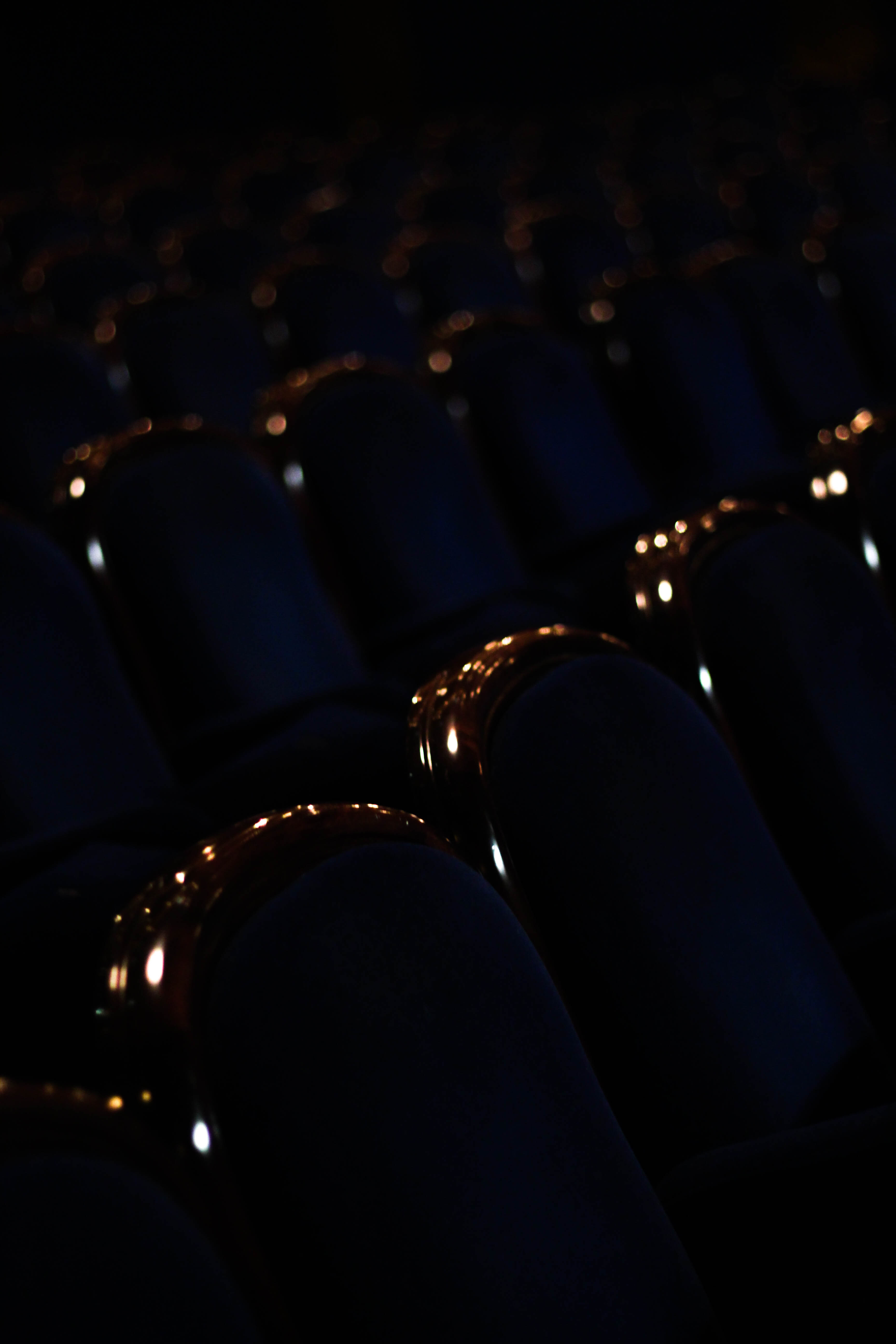 What I liked about this image was the use of a depth of field and the contrast of the shine on each seat. The use of a depth of field creates a sort of gradient that fades the lights away into the almost deserted distance, this is linked to conventions from how seats are usually linked to people sitting, and to see them abandoned in such a large-scale seems uncanny due to not usually perceived like this. The use of contrast between the lights of the shine on the chair and the darkness I found effective from how they provide enough light to define the objects but enough to make each chair into a silhouette.
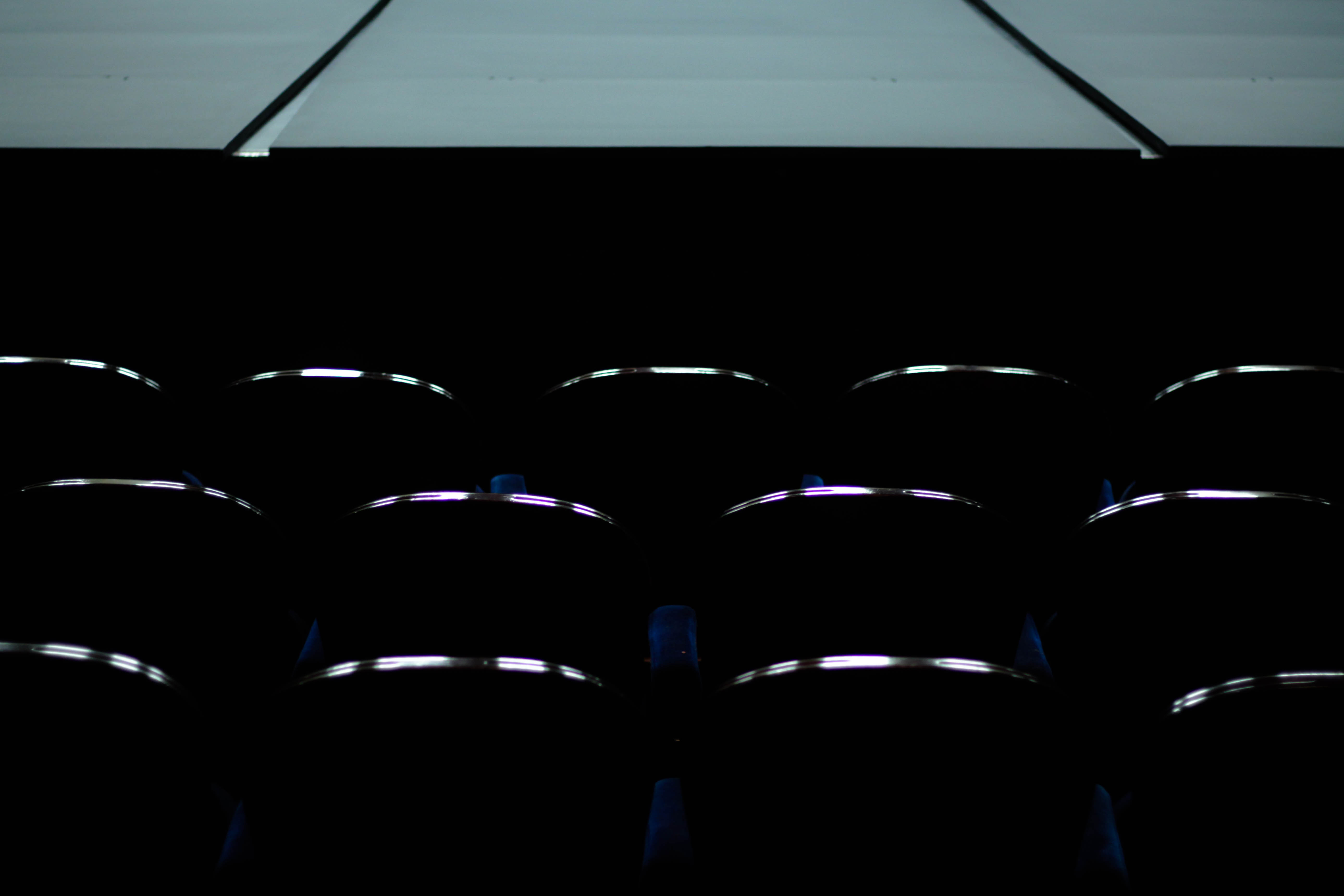 I loved how in this image there was a really clear contrast between the lightness of the stage and the darkness of the seats only defined by the shine on the wood. By doing this and through the use of symmetry I found it to be very aesthetically pleasing from how it the stage breaks the pattern that otherwise would only consist of dark chairs. The shine created from the chairs brings the image together from how it stops the stage from being too dominant in the picture and overpowering the rest of the image, this is helped by the black space between the stage and the chairs which stop the two different contrasts from colliding and ruining the symmetry and pattern. The image also reflects a ghost audience that is no longer there due everyone being long gone, thus creates an eerie effect of abandonment of the unusual.
 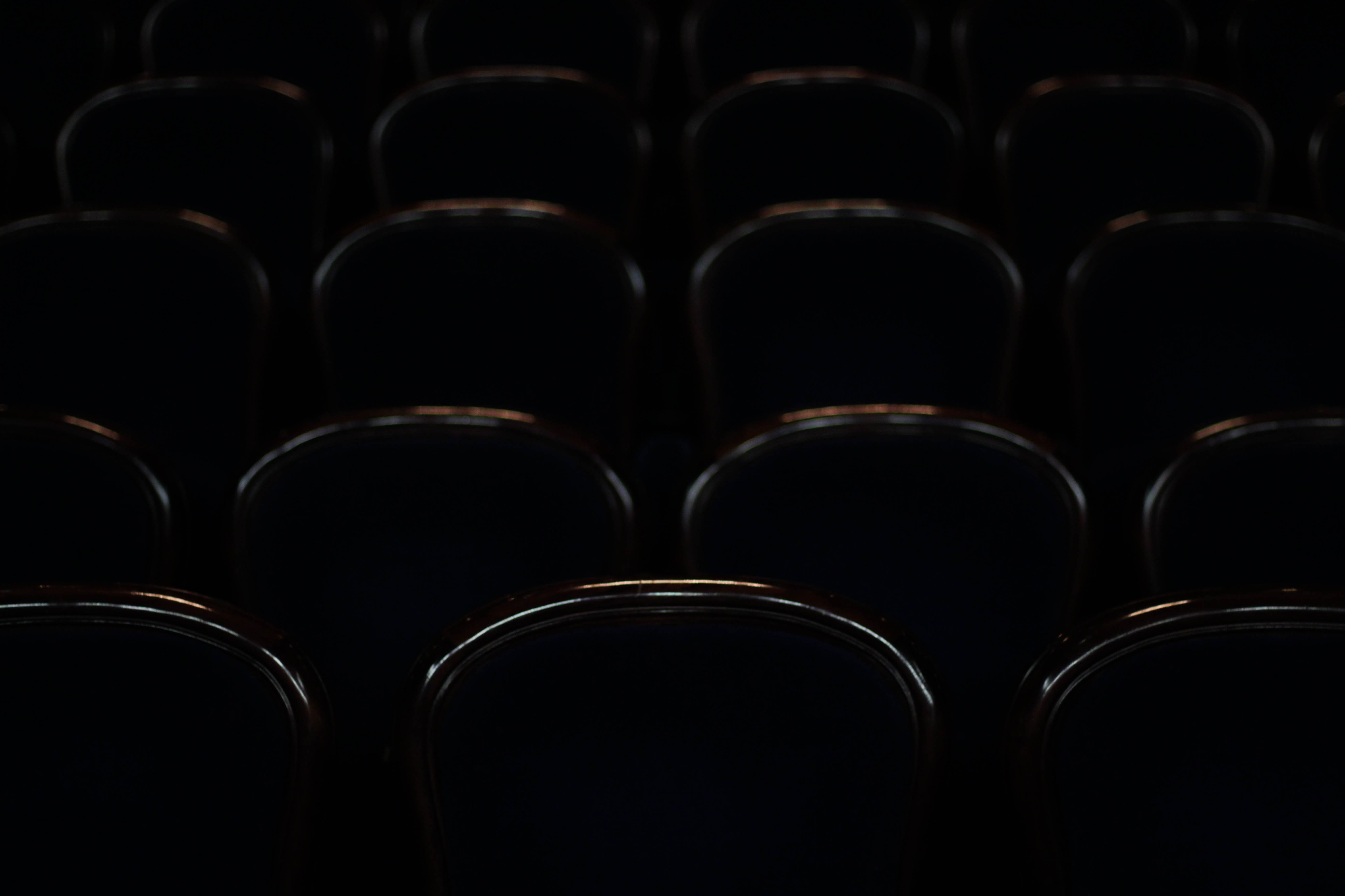 I chose this image purely because of the silhouettes and defined shine created by each of the chairs, this in my opinion combined with symmetry allows for an aesthetically pleasing result that is balances the darks with the top of each chair. This could be linked to conventions by how you could say each chair represents a former shell of what they use to be used for creating an atmosphere of desertion. The sheer darkness between each seat creates a symmetrical pattern with nothing displacing or ruining it to the eye making the piece as a result easy to look at.
 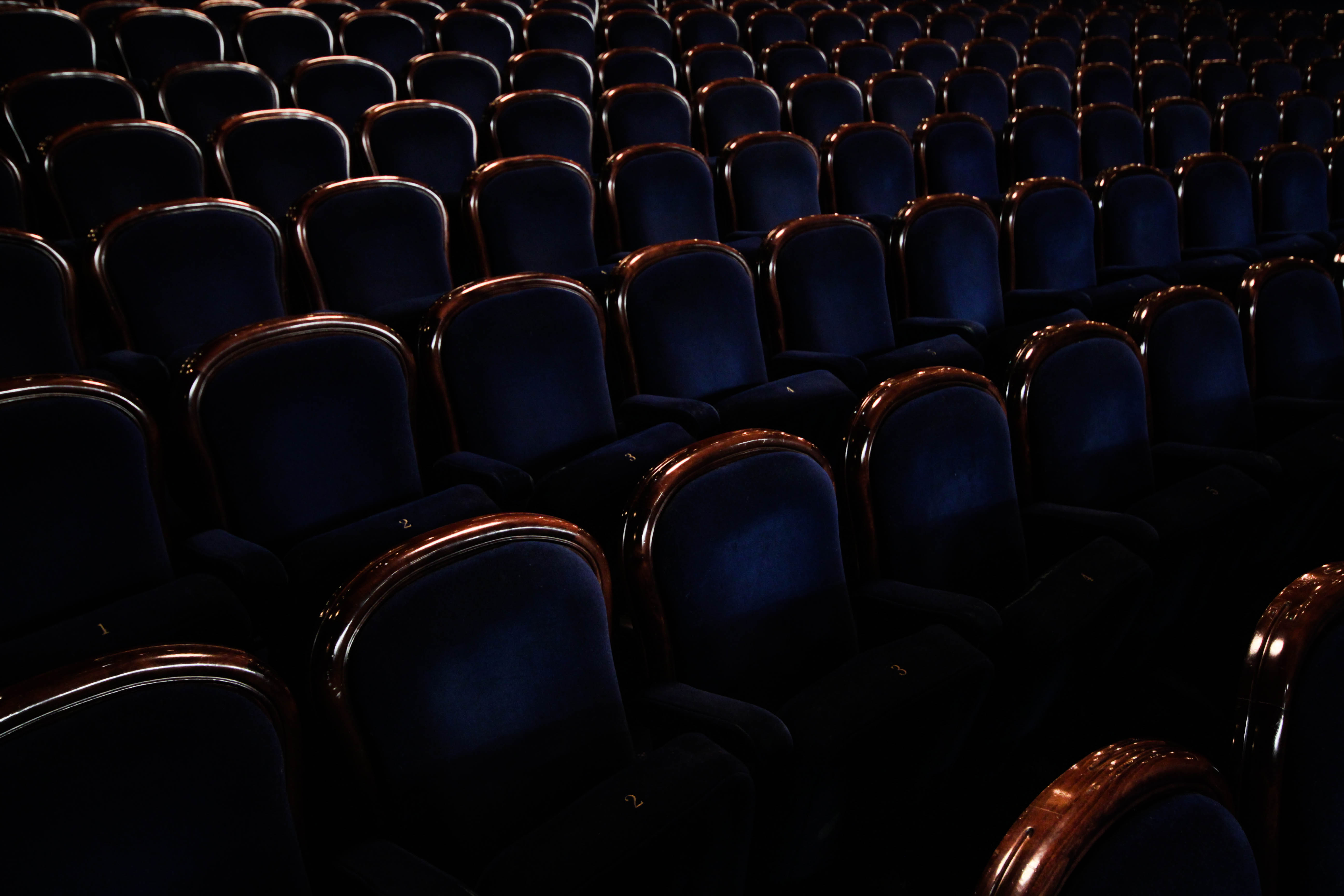 Finally the reason I chose this picture was because of angle and emphasis on abandonment from the amount of chairs present. I found that this image put particular emphasis on desertion from how the rows of chairs create an arc like formation throughout the image, with each one lacking people sitting in them. This conventionally is unusual, as seeing this amount of seats would usually indicate that people are present which is what the photo lacks. There is also a clear contrast present between the blues and browns of the seats which break up block colours to make the piece more visually appealing.
After analysing each image and how it related to the idea of conventions, whilst taking into account the technique each image used to create a visually pleasing result, I found it enabled me to decide the image I wanted to choose for my final and most successful image of the shoot. This was my decision:
Final Image:
 The reason I chose this image as my final and most successful image of the shoot was because of the clear contrast and pattern present within it. The use of the stage’s white against the darkness of the chairs I thought really made the image pop and draw the eye to it, with the indents of the stage stopping the white from being too consistent. However this is contrasted by the patterned symmetry made by the rows of seats present, with the definition of the shine creating a ghostly and empty feel to the image, completely opposite to that of the clean and plain stage. It also I thought related well to the topic of conventions as the empty seats and stage are usually seen full, especially in theatre, and to see them abandoned creates an eerie and unnaturally spacious feel to the overall photo.
What are Codes ?
Codes are a system of words, letters, figures, or symbols used to represent others, especially for the purposes of secrecy. Codes within photography are also known as symbolic codes, technical codes or written codes
http://jakehicksphotography.com/
Born in Cornwall, he first discovered his love for photography when his father first gave him a camera, but his real interest in the subject began when he found that photography was the only path left for him as he had to fail at most of his academic subjects. His work could be described as bold, bright and colourful, as lighting colour is the main focus of his images

PhotoShoot
| Concept | Genre / Artist | Location | Props | Shot type | Lighting | Settings |
| Codes | Jake Hicks/Abstract/HDR | Studio | Tripod-Gel Sheets | Portrait | Artificial/Studio Lights | Manual focus,f/2.8-f/4, 1/60 shutter speed ISO-100 |
Contact Sheet
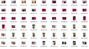

Best Images from the shoot 
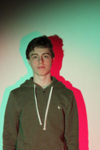
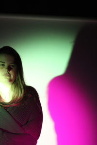
Overall this shoot was okay but I didn’t produce the outcome of images that I wanted. So I have decided that I am not going to carry on this idea, but I will use some of the backgrounds in some of the final outcomes
Task – Take 150-200 photos exploring the theme of exploration under the key word ‘secrets’
Props – I will be using the natural environment such as trees and overgrown areas along with people and a rundown building.
Camera Settings – Due to deciding to do the shoot in the dark will have to use flash in most of my photographs in order to illuminate the subjects enough. I will be using this with an ISO of 800 and a shutter speed of 1/40.
Lighting – I will be using strong torches or flash from the camera in order to capture these photographs.
Location – St. Saviours hospital
Context – I am looking at the theme of exploration for my AS level externally set assignment.
Concept – I hope to take photographs of the secrets that are the abandoned hospital and the overgrown areas around it whilst taking inspiration from Emmanuel Tecles
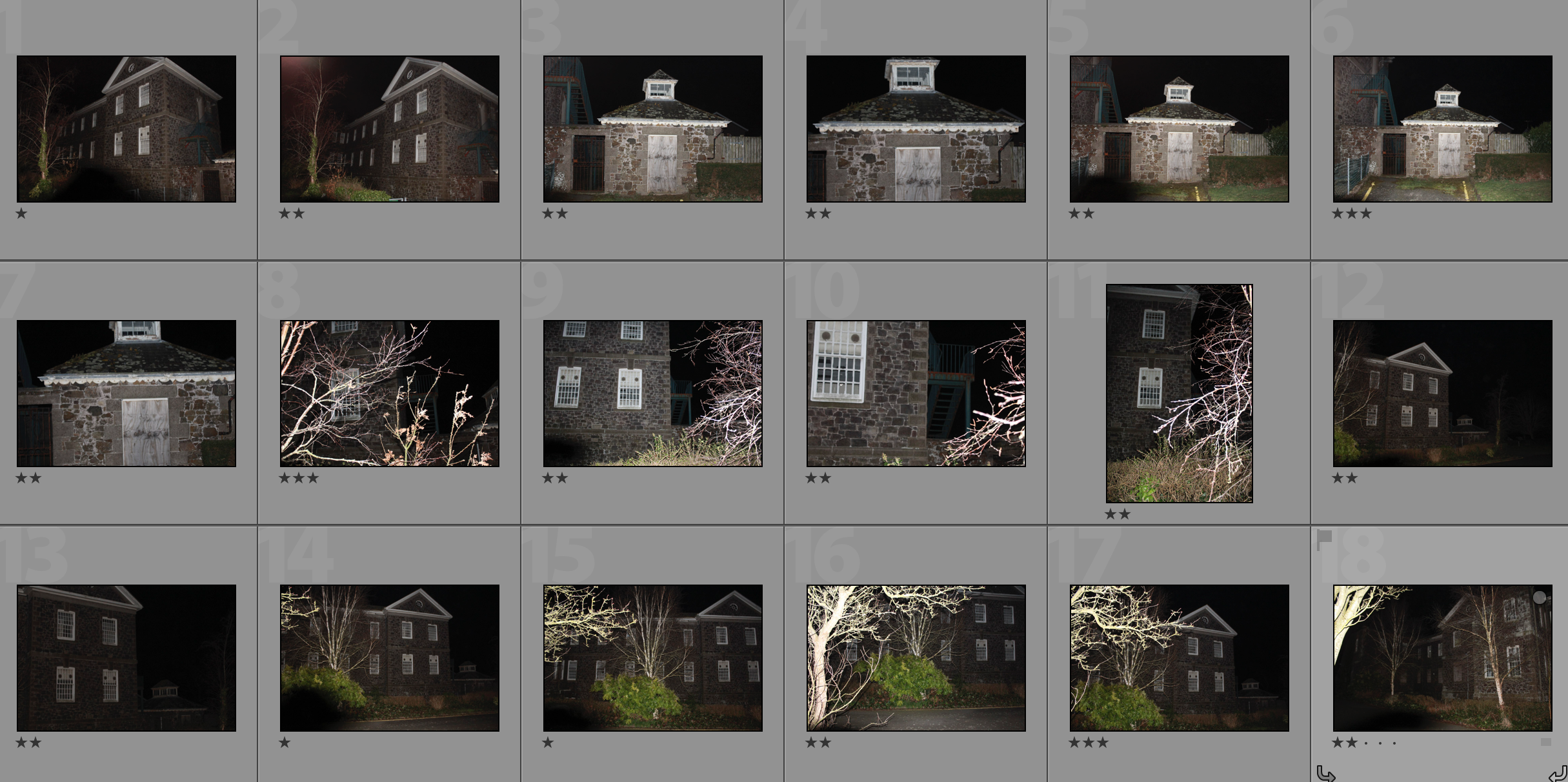
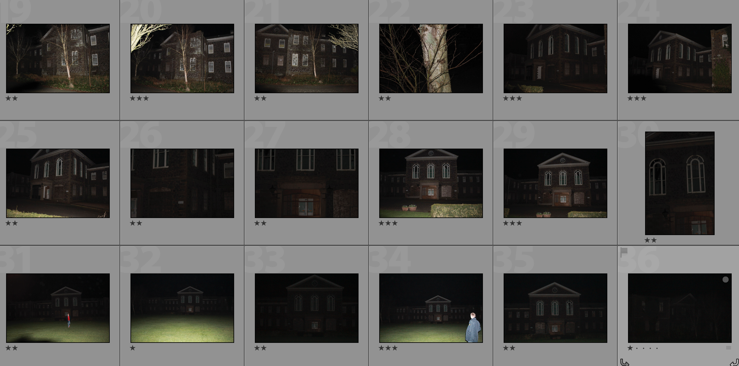
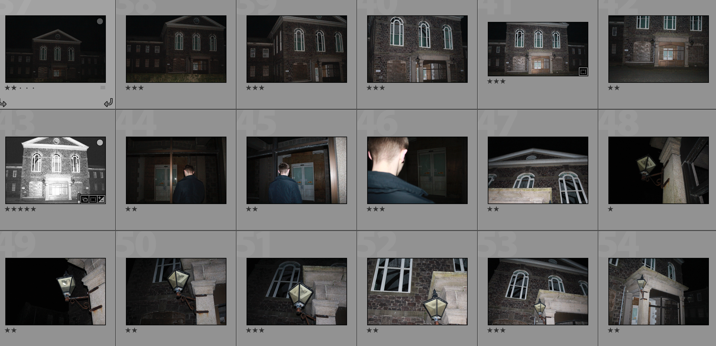
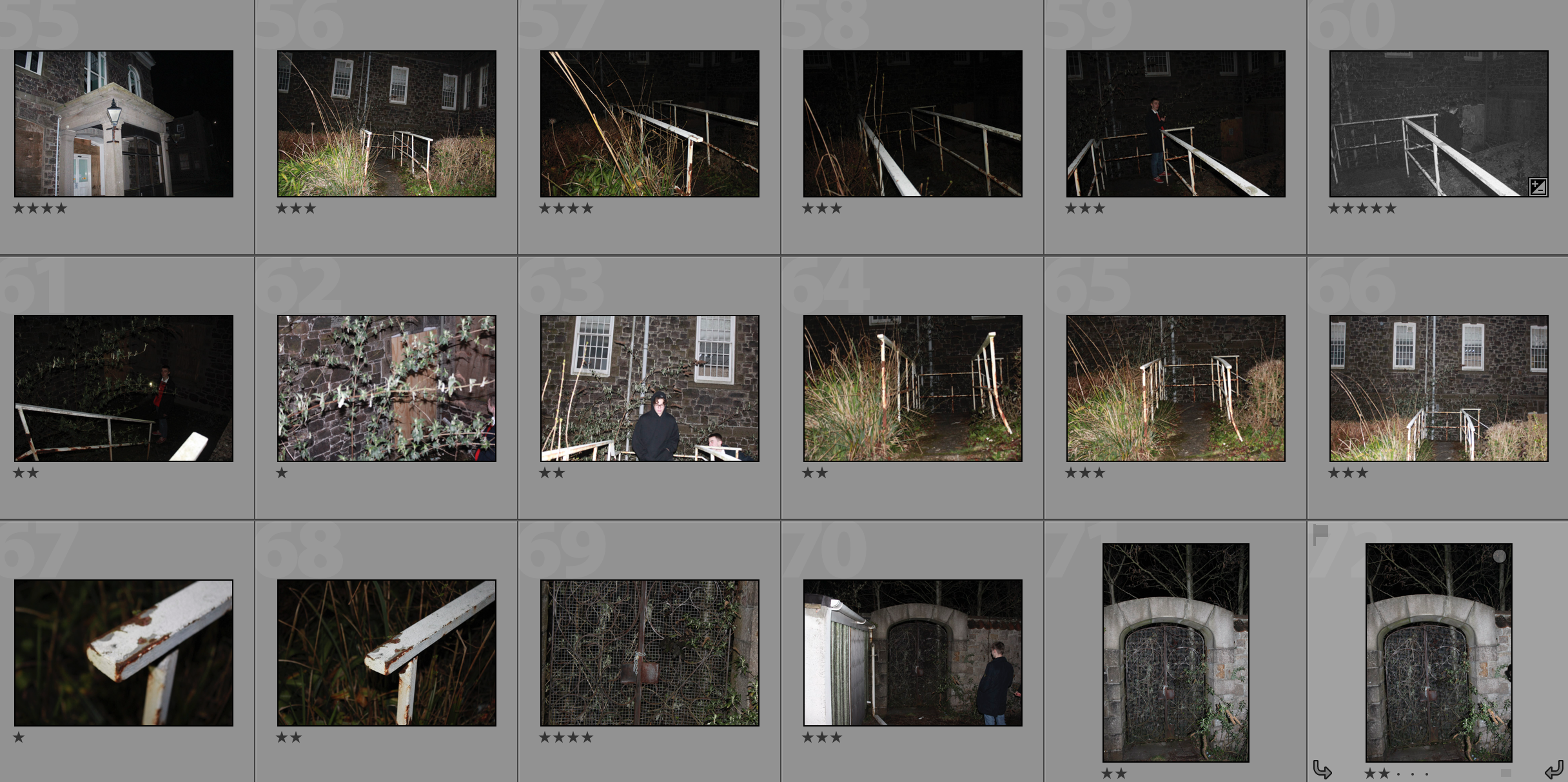
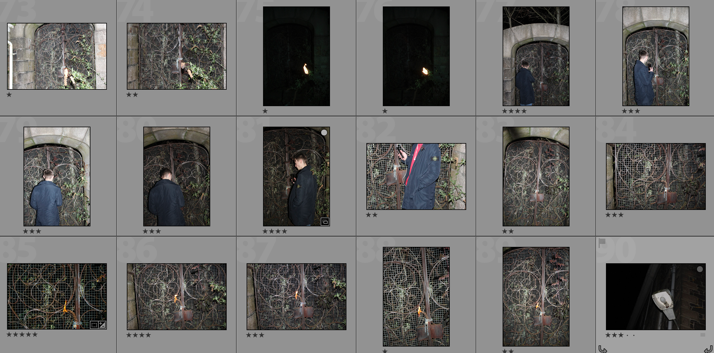
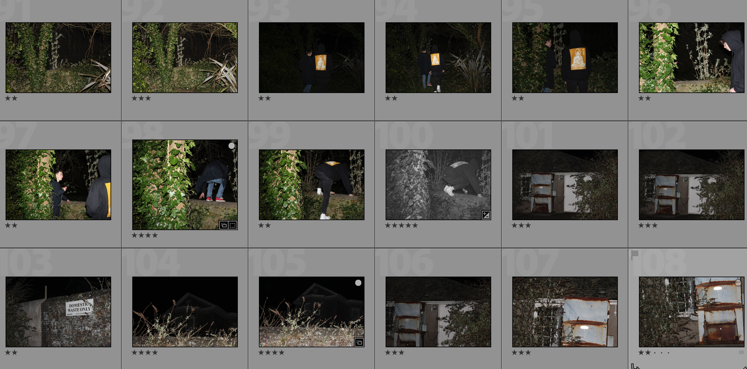
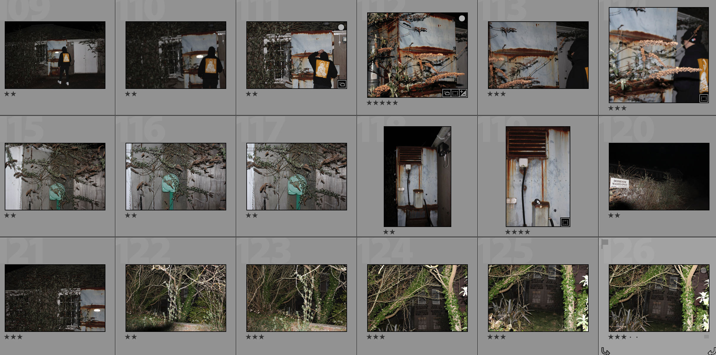
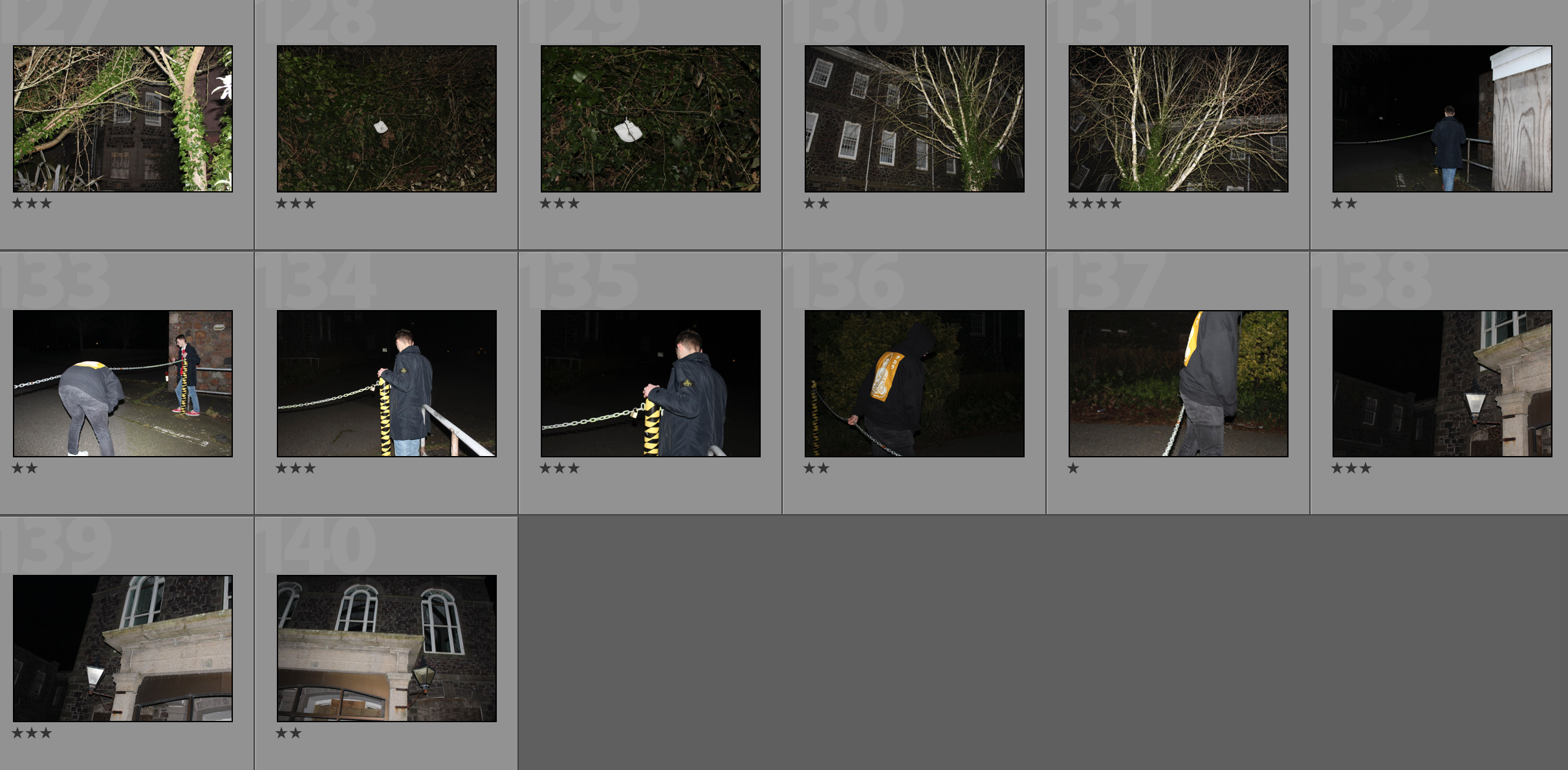
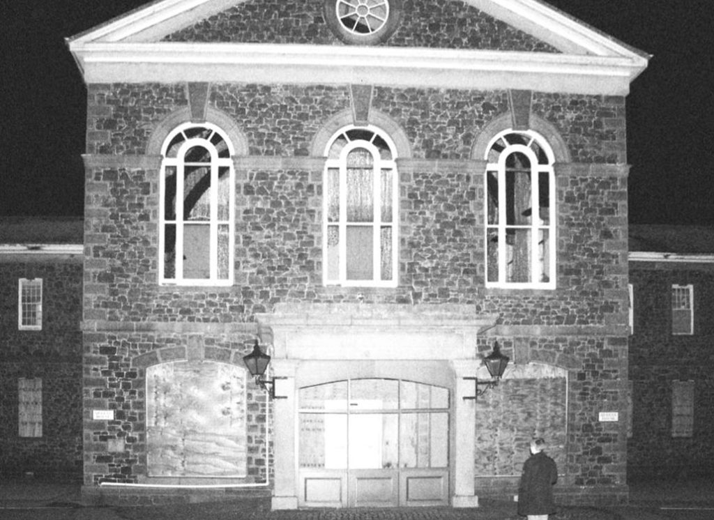
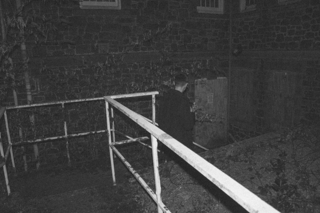
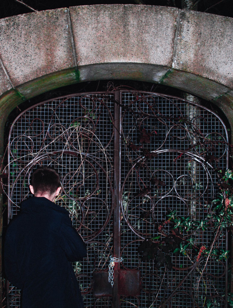

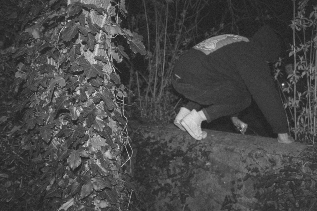
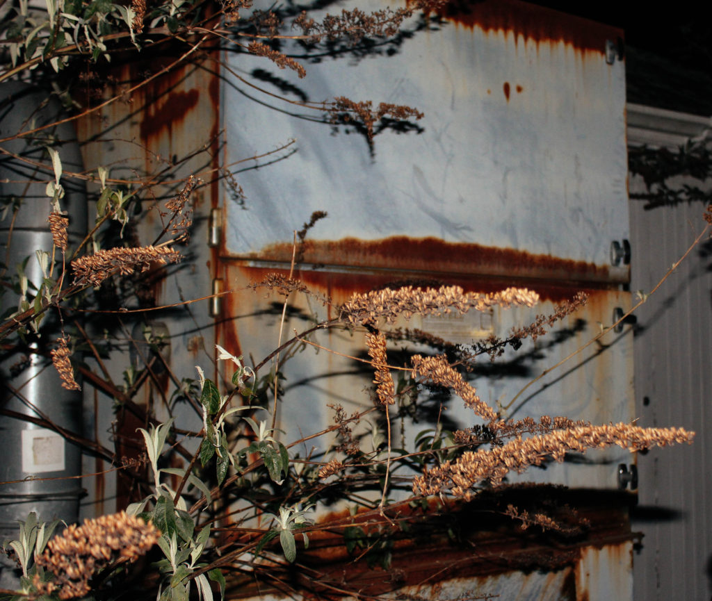
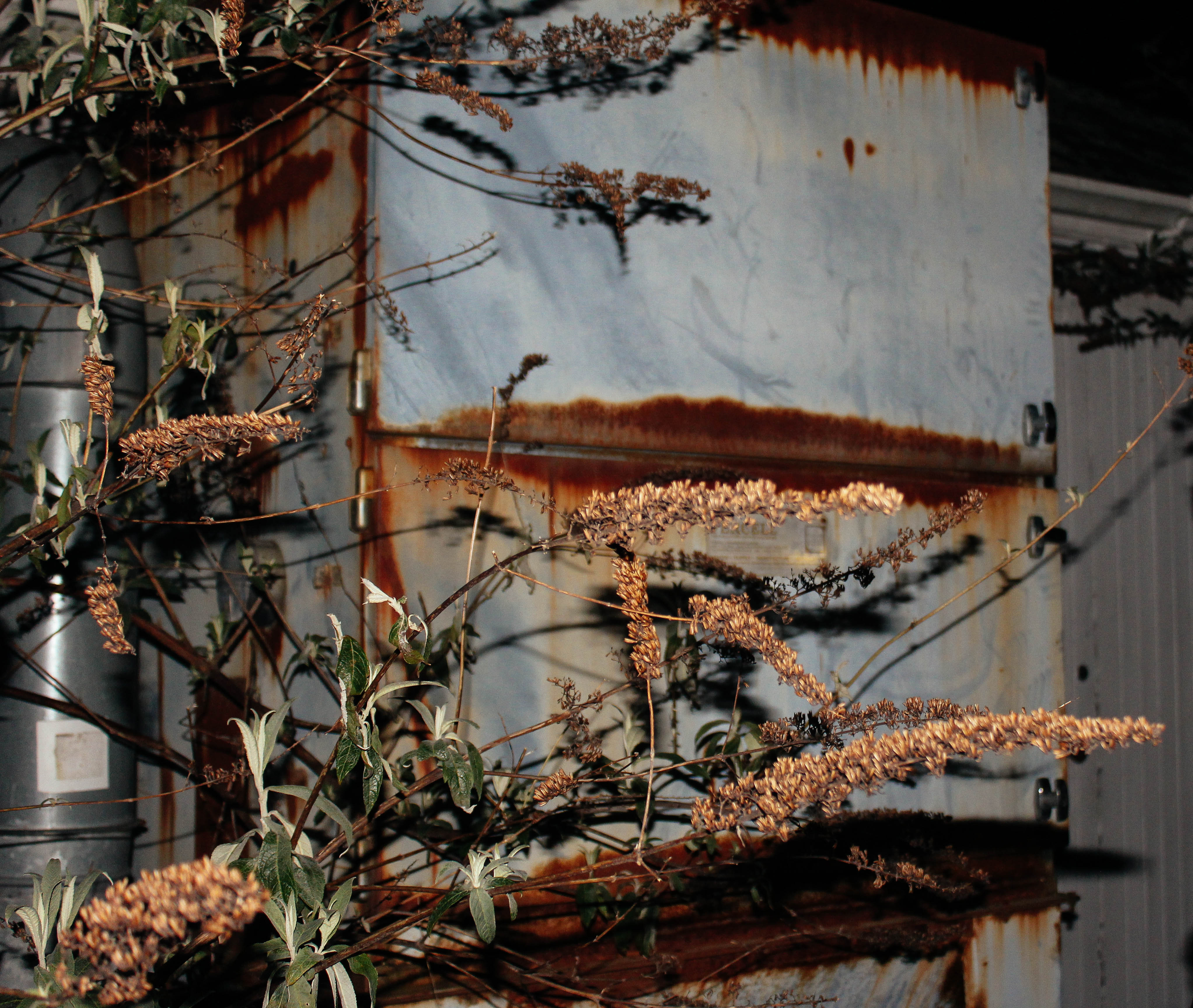
This photograph was taken with the flash on. This allowed me to create contrast between the shadows and the highlights within the photograph. I used a flash as the environment that I was taking photographs in was dark. Along with the flash I used an ISO of 400 to brighten up the photograph and a shutter speed of 1/40. For aperture I used a shallow depth of field, as this created a slight blurred effect in the background in order to separate the background and foreground.
In this photograph I used a natural colour scheme consisting of yellows and browns. This helped to convey a sense of natural decomposition. There is quite a 3D effect in this photograph due to the use of the flash and the low depth of field as the foreground and background have been separated. The tonal range in the photograph is fairly dark which creates a more mysterious photograph.
I took this photograph outside of the abandoned St. Saviours hospital – I chose this location due to the mystery and secrets about it. A lot of the area is overgrown and worn down so I decided to capture photographs of the disintegration of the area. This photograph in particular looks at a mysterious and dark atmosphere. It looks at the traces of the mystery of the area and the nostalgic history behind it. In this photograph I attempted to bring mystery and a sense of exploration into it in order to show that the building has many secrets about it that remain untouched in the abandoned area.

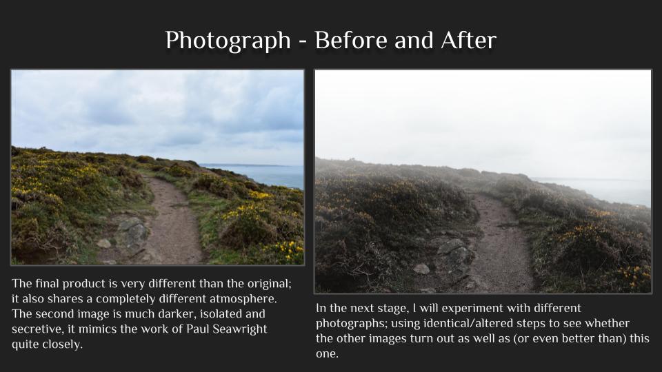
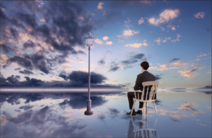
I believe this edit follows the suggested words for our exam title very effectively. It links to secrecy due to the isolation and sense of no where that is created. The clouds in both the sky and reflection help to draw the viewer down the picture into the background that is completed isolated, having connotations of mystery and secrecy. My edit has a connection with conventions because it demonstrates how modern day photography is in the way photography nowadays is about photo manipulation and telling stories through this as a-pose to documentary styles of showing the truth. Also it can link to codes in the way that the objects in the photo, like the lamp posts, are symbolic and convey a secret meaning. In my opinion, the lamp posts help to create the overall surrealism of this photo because usually lampposts are found in urbanised areas however in my edit I have juxtaposed this by putting them in a very open, empty place.
Photos Involved in the edit
Photo 1
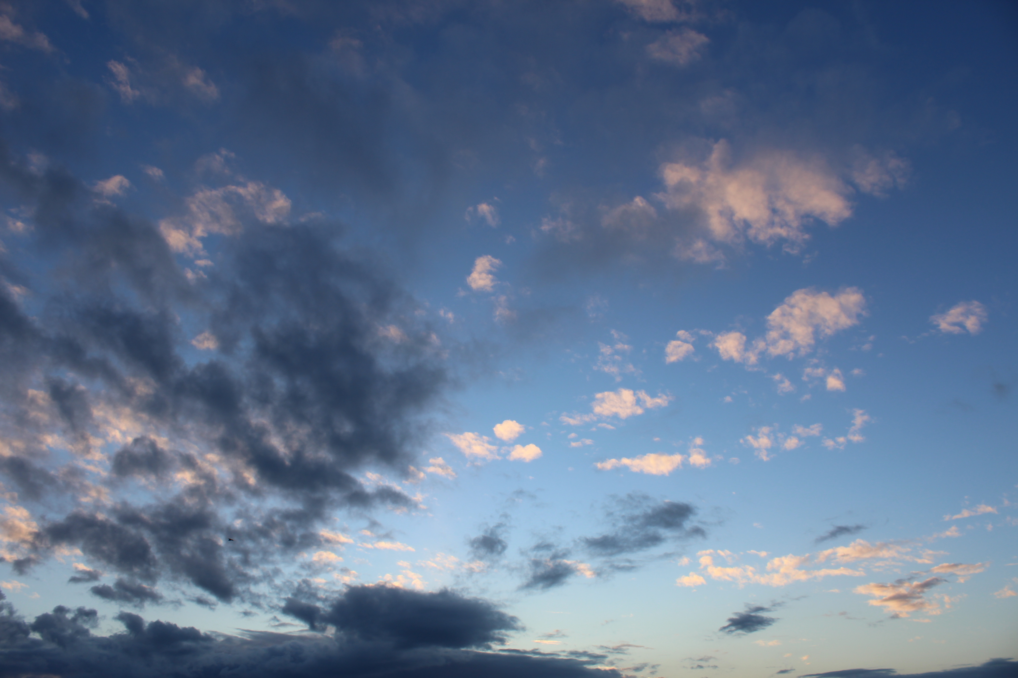
Within the edit I used this photo twice because I duplicated it to create the refection that my model appears to be sitting on. I used the gradient tool on the reflection to add a blue fade to make it seem as if it is actually a water reflection. Using the colour balance throughout the edit I ensured to create a more interesting image by adding in purples and pinks within the sky.
Photo 2

Again, within my final edit, I used this image twice. I made a duplicate of this image and then flipped it vertically and adjusted the opacity to 40% to create a reflection of the model in the floor.
Photo 3 (From The Internet)

This photo was used three times within the final edit, twice for the actual lampposts and one for the reflection of one. I think the lamp posts in this edit really help to give a depth of field and add to the isolation and loneliness of the photo. It helps to create the surrealist feeling because usually lampposts are in urbanised areas and in this image it is used to emphasise the isolation.





For this collage piece it wad inspired by my second artsit,I took many profile shots at different angles and edited them all to be darker tonally, then I made a plan and decided upon the sizing and angles at which I wanted the images to be cut up,lastly I positioned the imagine in order to create a fragmented segmented appearance of a face.

I think this image is unique because I also cut the images in rounded lines in order to indicated an almost 3d effect,addtionally,this shows that is it also the shape of a human head and demonstrates the inspired artist pieces of the young boys 3d body.


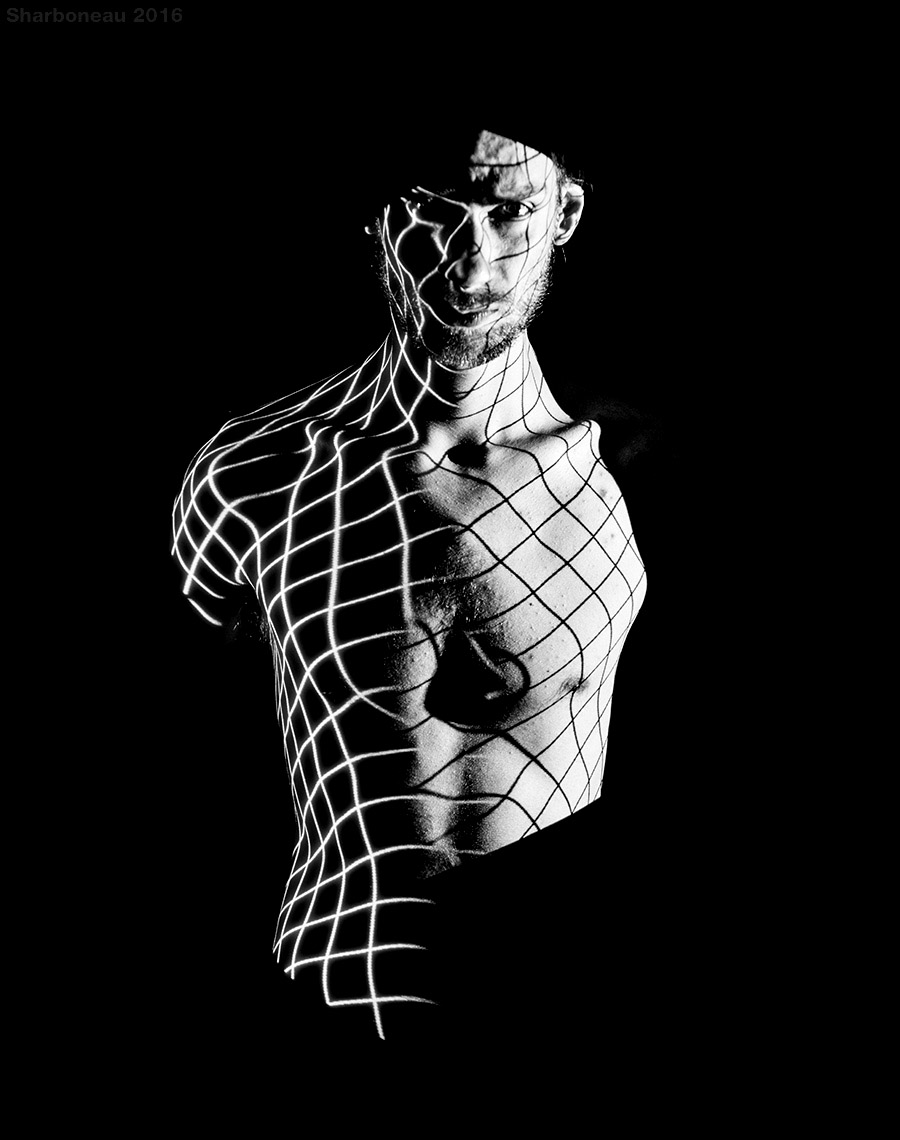
Projection is the use of equipment and lighting to cause an image of an object to be seen on a screen. Usually the image is larger than the original and the projected image is positioned to be easily viewed or used for another process.
Black and white projections were popular in the 60s. However, it developed to colour through the years. As projectors improved, their colours and brightness also become increasingly more defined and vibrant. Projector photography became increasingly more popular since the vast improvement of projectors.
Projection art and photography has become more popular over the years as photographers and artists have discovered this useful, adaptable resource to produce art and photography. John French was a famous photographer who used projection art photography in the 1960s.
Examples of projector photography


