Analysis
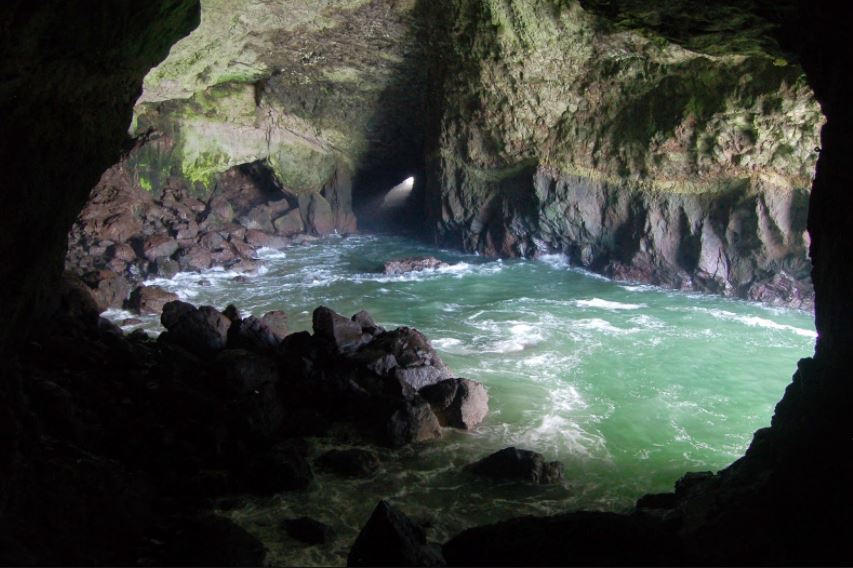
I believe this edit follows the suggested words for our exam title very effectively. It links to secrecy due to the isolation and sense of no where that is created. The clouds in both the sky and reflection help to draw the viewer down the picture into the background that is completed isolated, having connotations of mystery and secrecy. My edit has a connection with conventions because it demonstrates how modern day photography is in the way photography nowadays is about photo manipulation and telling stories through this as a-pose to documentary styles of showing the truth. Also it can link to codes in the way that the objects in the photo, like the lamp posts, are symbolic and convey a secret meaning. In my opinion, the lamp posts help to create the overall surrealism of this photo because usually lampposts are found in urbanised areas however in my edit I have juxtaposed this by putting them in a very open, empty place.
Editing Process
Photos Involved in the edit
Photo 1
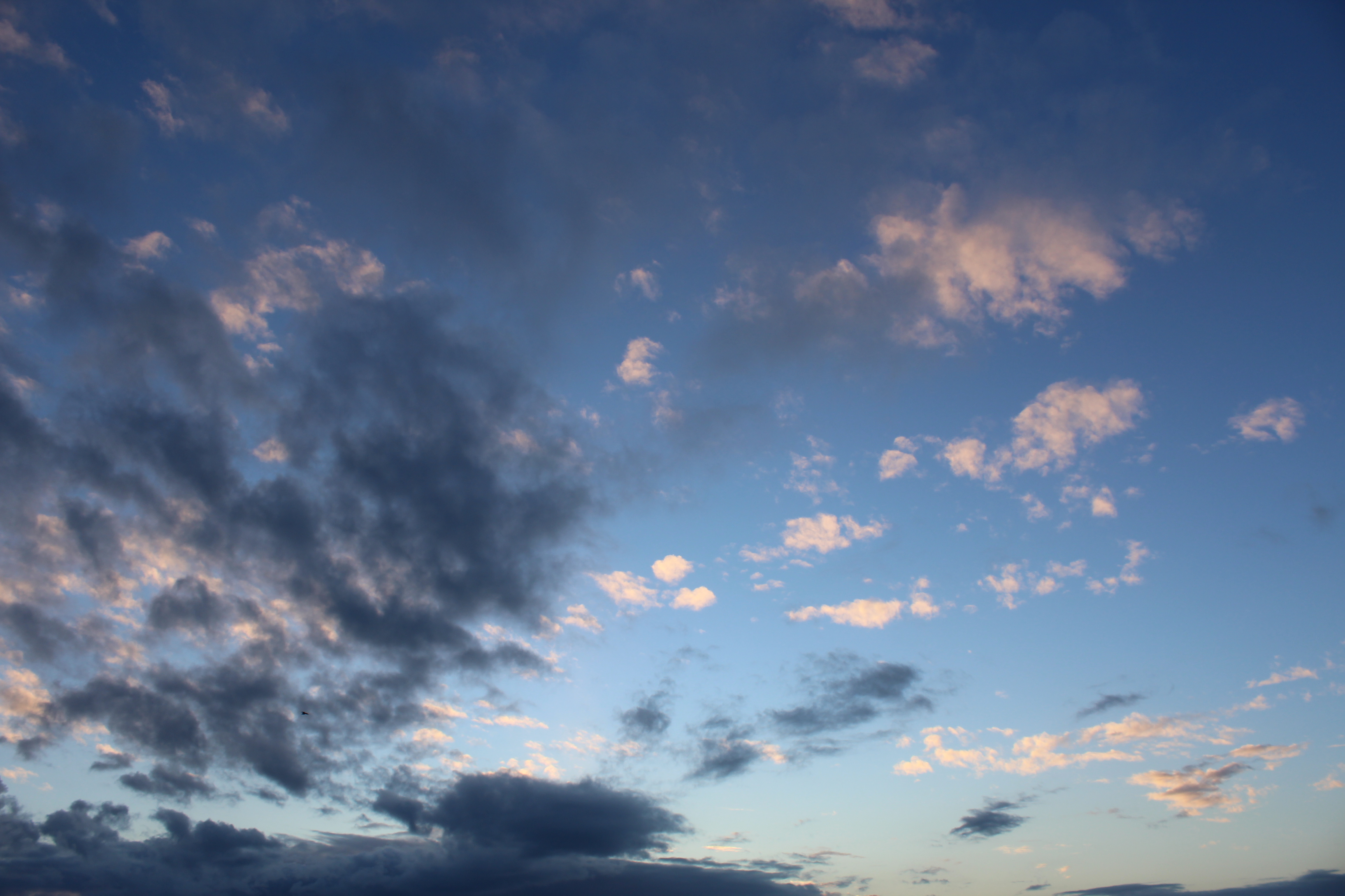
Within the edit I used this photo twice because I duplicated it to create the refection that my model appears to be sitting on. I used the gradient tool on the reflection to add a blue fade to make it seem as if it is actually a water reflection. Using the colour balance throughout the edit I ensured to create a more interesting image by adding in purples and pinks within the sky.
Photo 2

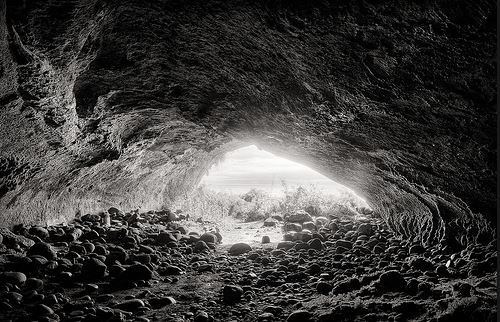
Again, within my final edit, I used this image twice. I made a duplicate of this image and then flipped it vertically and adjusted the opacity to 40% to create a reflection of the model in the floor.
Photo 3 (From The Internet)

This photo was used three times within the final edit, twice for the actual lampposts and one for the reflection of one. I think the lamp posts in this edit really help to give a depth of field and add to the isolation and loneliness of the photo. It helps to create the surrealist feeling because usually lampposts are in urbanised areas and in this image it is used to emphasise the isolation.
Step By Step
The Layers














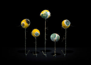 contextual - Pichler used his bathroom as a studio and for storing various foods kept in plastic containers as they began to flourish in mold and rot. He grew up in a rural province in Austria where raising and eating meat was an important part of their culture. Pichler later defied these customs and became a vegetarian.
technical - This picture has been flipped to make it look like the string is holding the lemons up like flowers. The use of lighting is cleverly done, Pichler has lit the lemons from the front and bottom which gives a shadow on the floor of the picture [the ceiling], adding to the illusion that the lemons are standing up on 'stalks'.
visual - As Klaus Pichler said, the initial sense of his work may seem beautiful and appetizing until the viewer realizes what they're looking at. He's set up this scene to remind the audience of something beautiful; flowers, with the string set up like stalks and the lemons displaying bright and vivid yellow and green colours. These colours relate to toxicity, beauty and nature creating conflicting views on the picture for the audience - is it beautiful or repulsive?
conceptual - The photograph is set up like flowers, giving connotations of beauty and life, directly contrasted with decay and effectively death. It gives the underlying message that everything comes to an end, highlighting that the luxuries we take for granted will slowly diminish with the natural reckless behaviours accompanied by humanity. Pichler has created these pictures to make us question the everyday actions that seem normal to us; throwing away rubbish, littering, driving cars, material consumption etc. - where does it come from and where does it go? We've been bred to do and not think.
