
In this shoot I will be using abandoned spaces and their hidden beauty beneath to photograph, when doing this I will be looking at symmetry and lighting to create colour and pattern that makes an aesthetically pleasing result. A photographer that focuses on this is Todd Hido, Hido focuses on the secret beauty of household spaces that have been left abandoned and disregarded, I will be using him as the basis of my ideas for my shoot. To do this I would visit empty spaces such as cinemas and opera houses whilst closed, doing this would make use of the minimum lighting available whilst creating an aesthetically pleasing result.
Here are some examples of his work that inspired this shoot: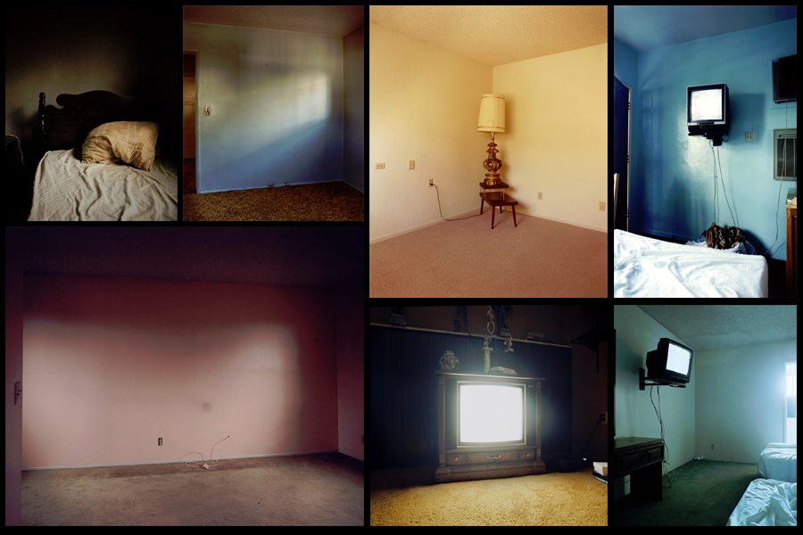 After deciding on what I wanted to focus on I made a mind-map, this would enable me to channel my ideas to specific topics that I should focus on in my shoot. This would remove all unnecessary time-wasting as it would allow me to get straight to what I wanted. Here are my ideas for the shoot:
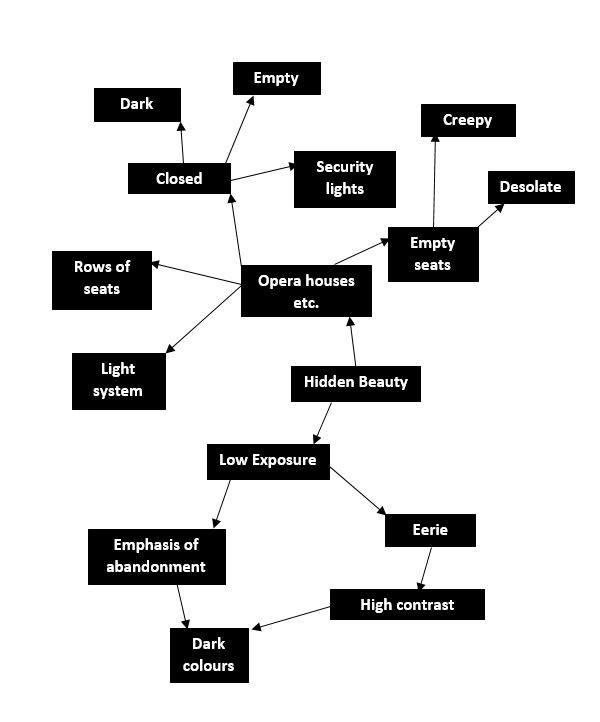 Once done I was ready to move onto the shoot itself, I had gotten access to the local theatre and was now able to know exactly what I wanted to focus on whilst there. After that I would take the image count down to a top ten photographs that I thought stood out from the rest, from there I could then take them down again to the best image of the entire shoot. Here are my results:
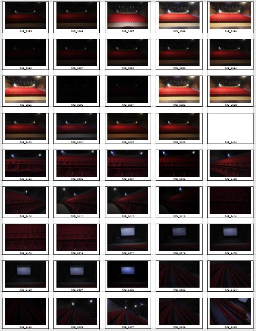
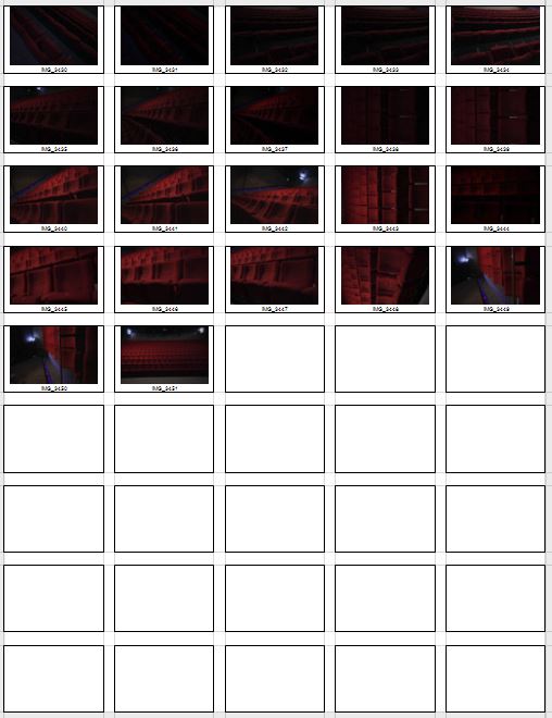 After previewing my images I decided to pick ten images from the shoot which I could later narrow down to five and then one overall image that I think best reflected the topic of secrets, codes and conventions. By doing this process it would allow me to analyse and really think through each decision I made regarding each of the images. Here were my choices:

I next went on to bringing my top ten images to only five, from here I would analyse and describe the technical aspects of each picture furthermore allowing me to find the one that I incorporated the best to the topic title. These were my picks for the best five images:
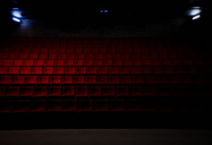
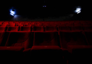
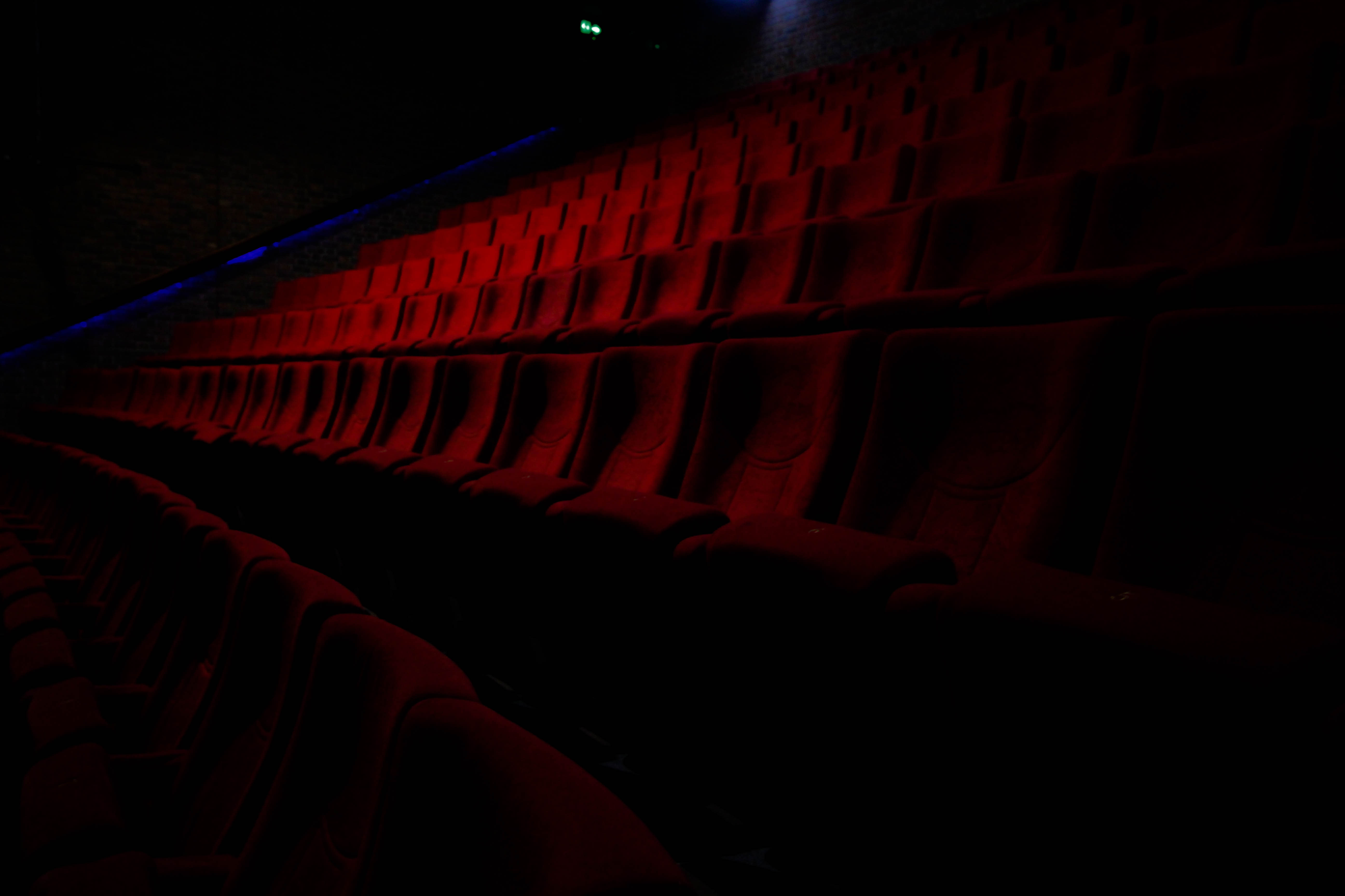
 I chose this image because of the effective use of lighting and the symmetrical composition of the piece. I found that the more dominant light created an orange gradient that transitioned as it went across the seats, this produced an effective balance throughout the picture making it aesthetically pleasing as a result. The blue lighting the trims either side of the seats disrupts the other wise dominant use of red, but at the same time does not overpower or look out-of-place compared to everything else, I really liked this from how it added other elements into the picture creating greater contrast. The symmetrical composition adds to the aesthetics of the image with the two lights being focus point of the piece since they highlight the seats and are the first things the viewer looks at. This allows this idea of abandonment to be emphasized from how the gradient and lighting adds eeriness as it is meant to resemble an area that is currently unused by any human presence.
 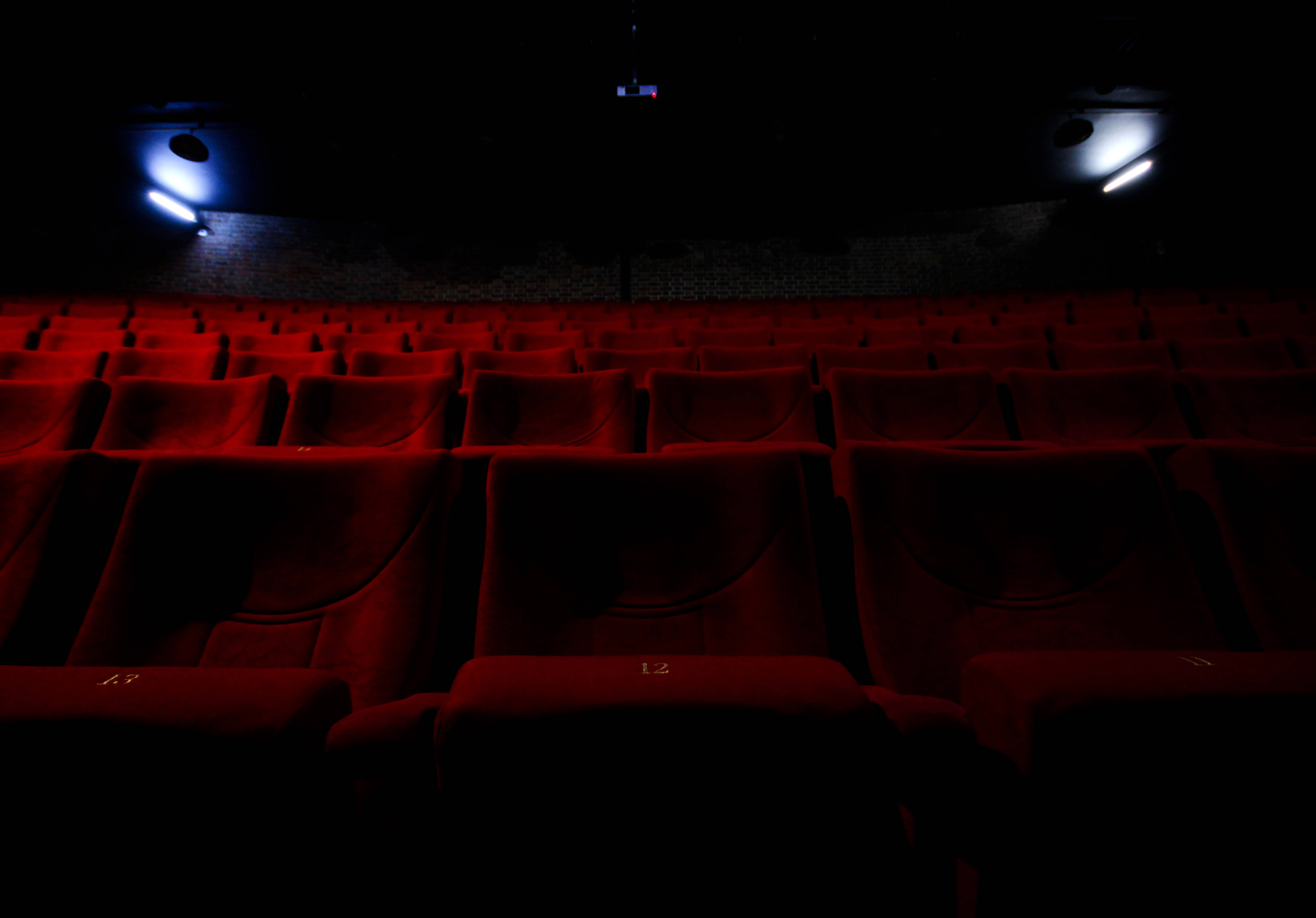 What I loved about this image was the use of a depth of field contrasted by the use of light. Because of this it divides the image into two sections, a light and a dark, with as a result contrasts the darkness of the ceiling and the two lights either side of the picture. The depth of field emphasizes the idea of abandonment through how the seats seems to go endlessly back but contain an absence of people, this fits into the category of conventions as it highlights a should be full area that is now unused and left behind until taken notice of.
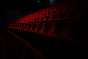
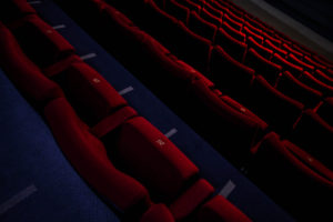
 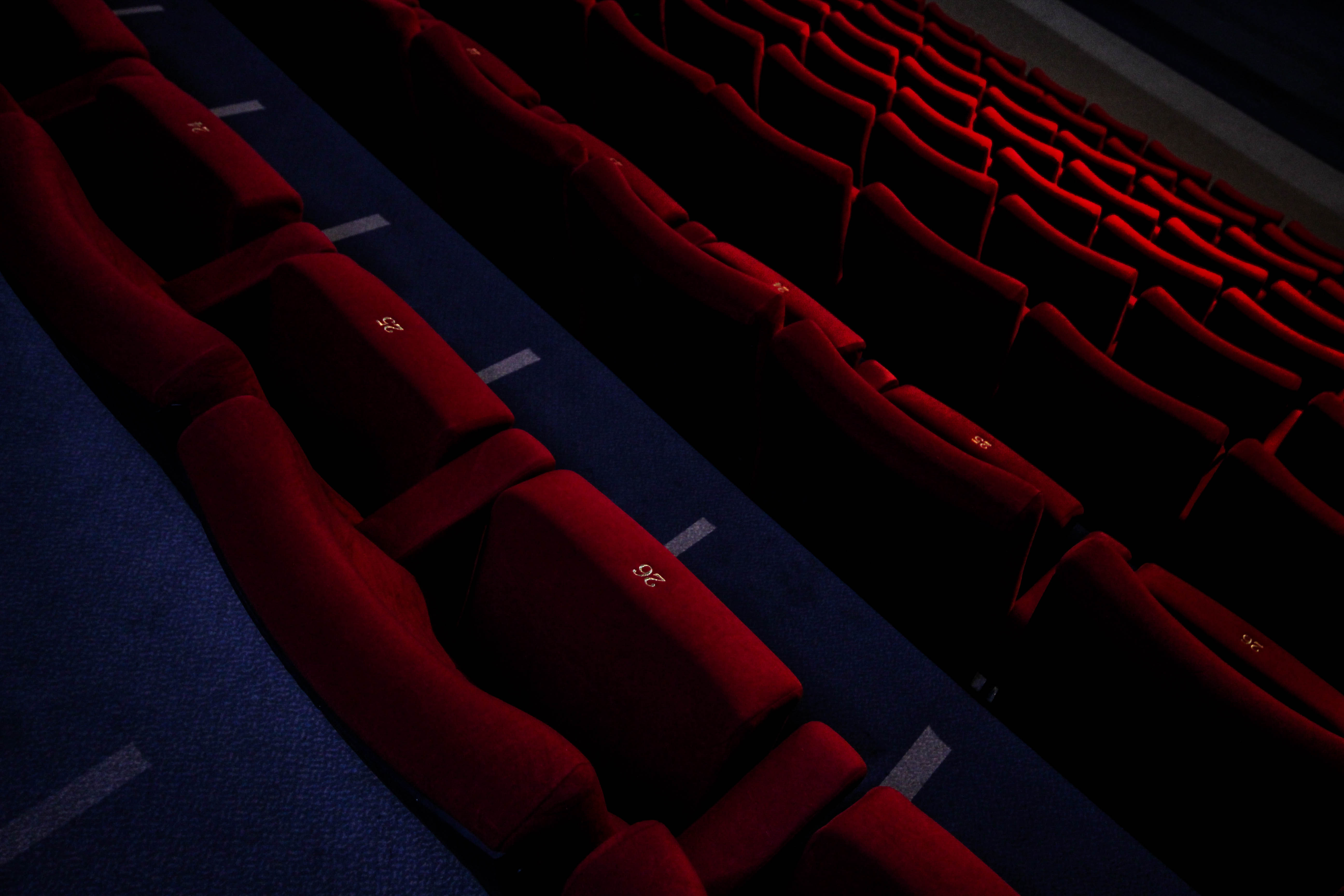 In this picture I found the composition to be most effective due to the angle at which it was taken at. The slant which the image was taken creates a broadened sense of desertion seen through a depth of field that blurs out the bottom rows, this makes the image seemingly unsettling from how the area should contain people, but instead lacks it. However the use of a highlight produced by the overhead lights breaks the dull red colour range of the image adding oranges into the mix by breaking the otherwise purely dark colours.
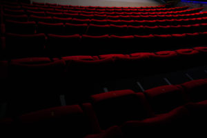
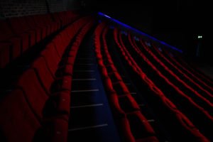
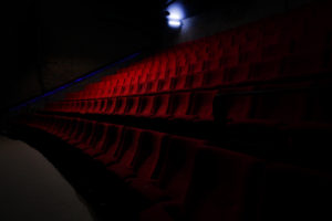
 I found that the depth of field in contrast to the dark colours of the rest of the image produced a nice gradient breaking the otherwise bland colour scheme as a result. The faint use of blue streaks used in the far distance of the picture add other elements into the picture when looked at closer, this is also provided the dark border of the image which the chairs seemingly fade into existence from, creating the impression that the place is now deserted and is also forgotten (seen from the hazy darkness).
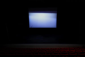
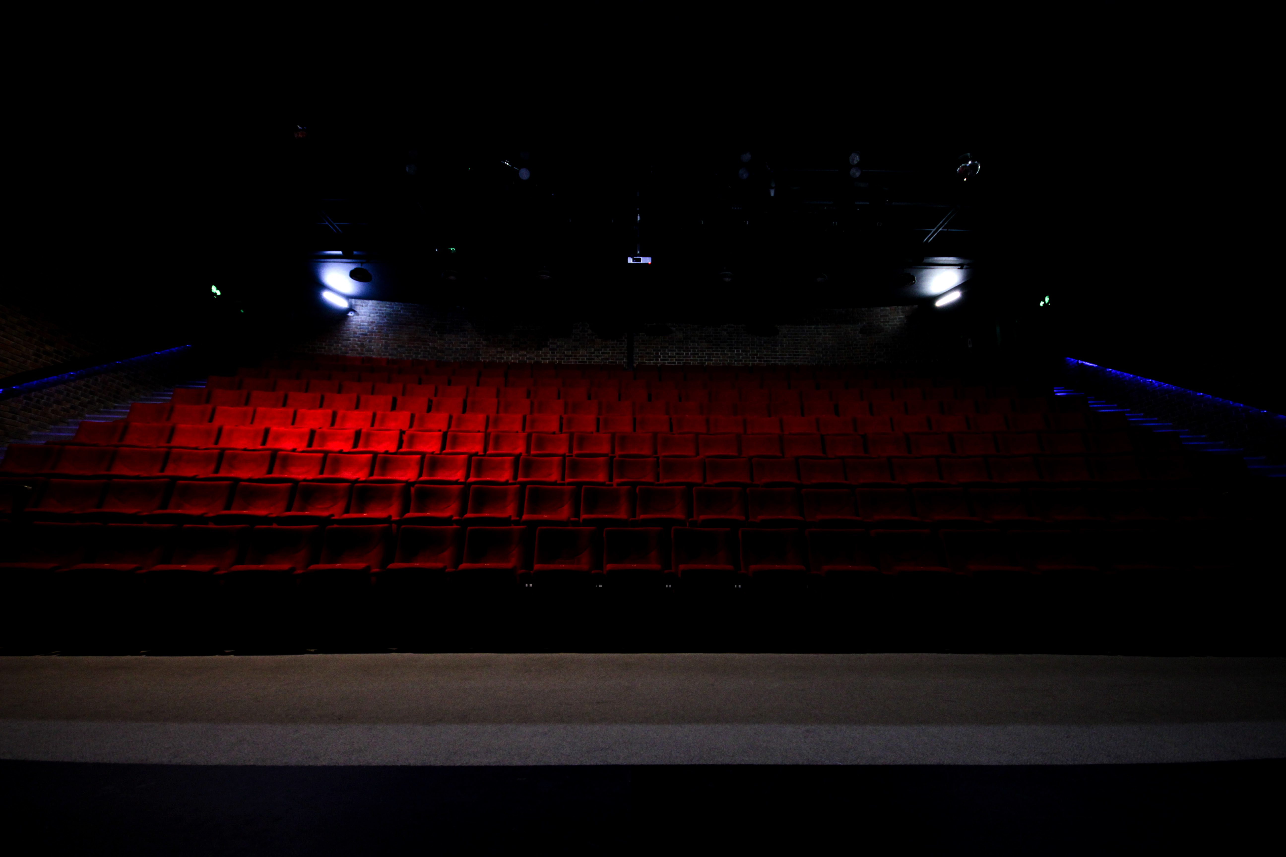
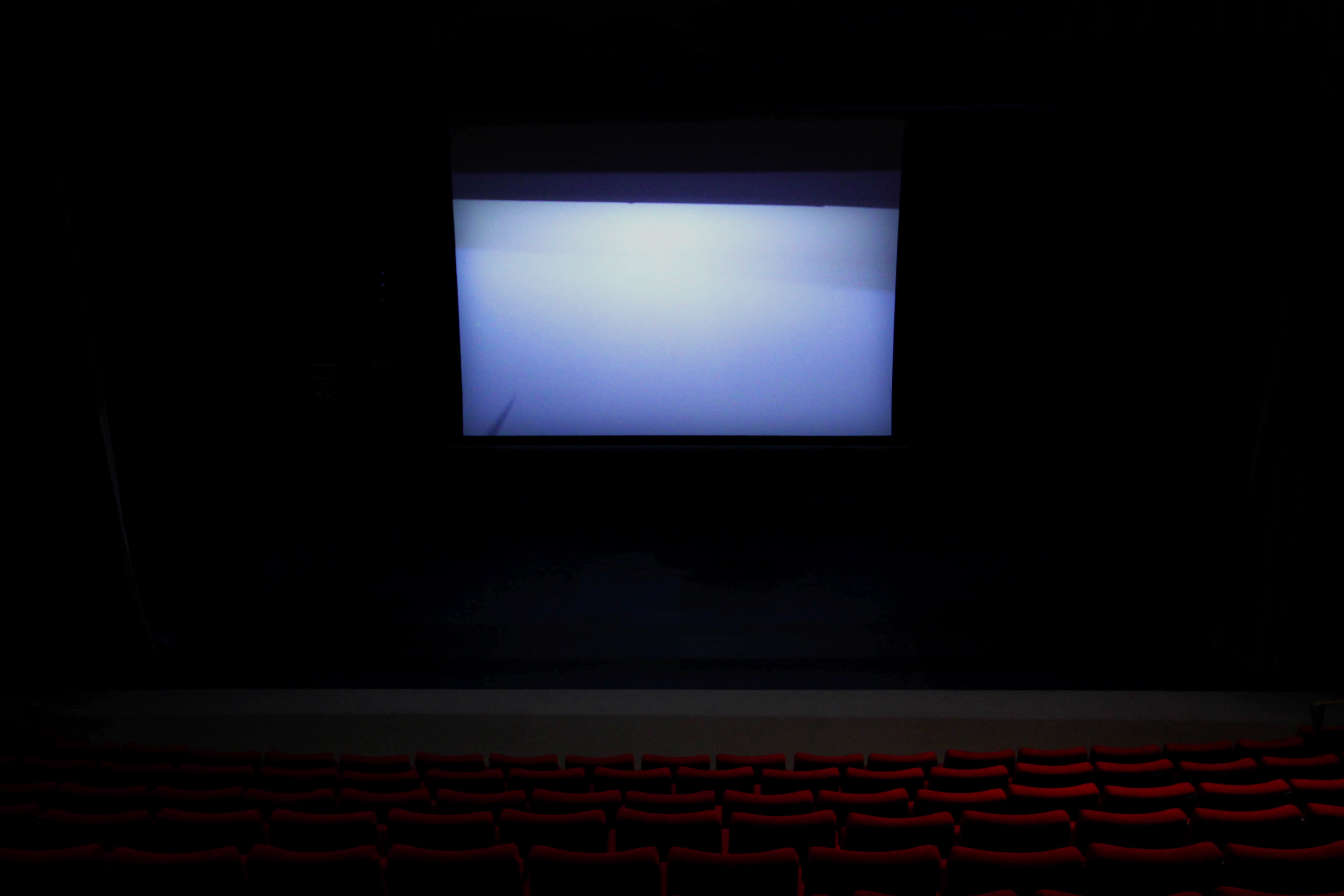 Finally I chose this image due to the overwhelming use of the white screen projecting a ghostly light onto the seats facing it. I found that this produced an almost mesmerizing effect, whilst creating the result of the seats fading into darkness as they went further left to the photo. As a result I found that this created the impression of minimal human influence over the area hence the ghost like product from the contrast.
After looking at these images I was happy with how they reflected the topic I wanted to focus on of conventions, I thought this was done effectively from each images use of darkness to create a contrast between the little light available portraying an eerie effect onto each row of seats that were occasionally broken by hints of orange. Once this was complete I went on to decide the final image of the shoot that I think best portrayed this effect. This was my final result:
Final Image:
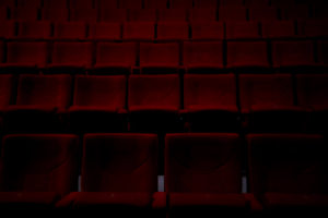
What I loved about this image that made me choose it as my final piece was overall the contrast, this was because of how it allowed for a black border that the chairs seemingly fade into existence from, and with minimal light available creates a very eerie impression onto it. The symmetrical composition of the photo makes it aesthetic through how everything is an equal distance away from each other, this also divides the piece into both a light and a dark side highlighted by the use of orange shades on the far left. In relation to the topic of conventions I found that it really emphasized how usually crowded areas when empty, create an almost haunted feel to them due to the norm of not being able to see them like this.