
Who is Todd Hido?
Todd Hido was born 1968, America, Kent. Hido’s work is of suburban and urban homes shown in galleries and business throughout the world. In 1991 he was awarded a BFA from Tufts University and a MFA from the California College of Arts and Crafts, currently he is the professor at the California College of Arts and Crafts in San Francisco. Hido is most famous for images taken of home areas across the US using lights to create detailed and luminous imagery. These show the despair and loss of the falling housing market.
Hido’s images are used worldwide, this includes The New York Times Magazine, The Face, and Vanity Fair, with other instances that can be seen in museums in New York, Chicago and Los Angeles. Hido makes it evident in his photographs that he branches out to other styles of photography such as portraiture, with all his works receiving critical acclaim. Each of his images are meant to resemble the hidden beauty that hides beneath the surface, with each image having its own story of memories and failed dreams.
Hido has won several awards, including the Barclay Simpson Award in 1996, and the Best First Monograph in 2002 for 2001 photo-eye books and prints.
Some examples of his works can be seen below regarding the topic of hidden beauty: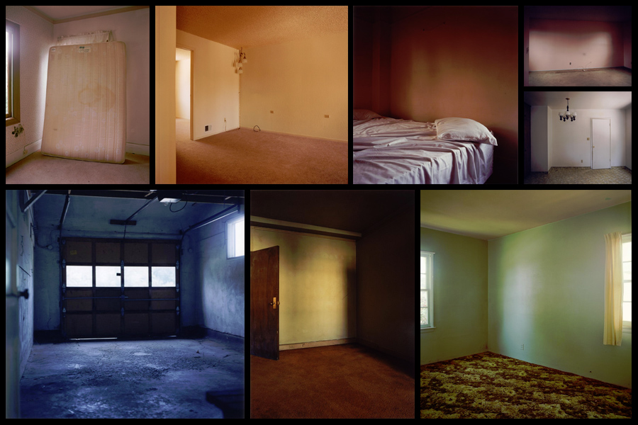 After looking over his style and influences I decided I should analyze one of his pictures to find what made it so effective as a piece, to do this I would look at the technical aspects etc to determine what made it the way it was.
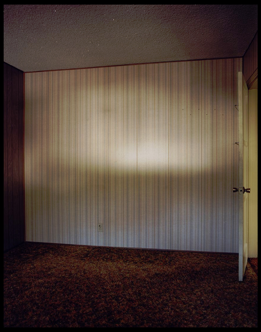 Technical: The images makes use of the little available to the room creating a gradient along the wall, this emphasizes the shadows and dark coloured floor and walls, creating an almost eerie effect to the room itself. The use of a half opened door breaks the otherwise dull looking room by adding some yellows into the picture, to a viewer this creates an aesthetically pleasing result from that disruption of pattern. A low exposure can be seen being used from how the contrast between the lights and darker areas almost pop out at you due to the emphasis of colour.
Visual: Visually the image is aesthetically pleasing from how the range of colours used compliment each other as a result. The composition of the image itself it photographed at an angle, but still keeps intact elements of symmetry between the far left and right walls, allowing for an effective interpretation of what the rest of the room is like. The dramatic used of the gradient light in the center of the wall probably made by a small dusty window creates a break between the dark theme of the room, however this as well as the door, pose as the center of attention within the image, instantly drawing our eyes towards it.
Conceptual: The image is meant to highlight the remains of dreams that were previously there but abandoned, whilst basing the idea around the concept of the hidden beauty in objects and areas left behind or currently uninhabited. The piece is also meant to be surrounding a controversial issue of the failing market at the time and in a way is voicing his opinion about the topic.