Photo shoot Plan
Genre / Artist – Landscape Photography
Concept – Capture images to portray modern day conventions of photography
Location – Town, Liverpool City centre, Corbiere
Shot type – Landscape, varied angle dependent on subject matter
Lighting – Natural lighting for outside shots, creating correct exposure for sky and not worrying about the foreground as it is easier to adjust the foregrounds lighting without losing quality compared to the sky.
Settings – 30 second exposure for light trail photographs,
F/16, 1/30 shutter speed with iso of 100 for sunset shots.
Contact Sheet an Edits
Location 1 
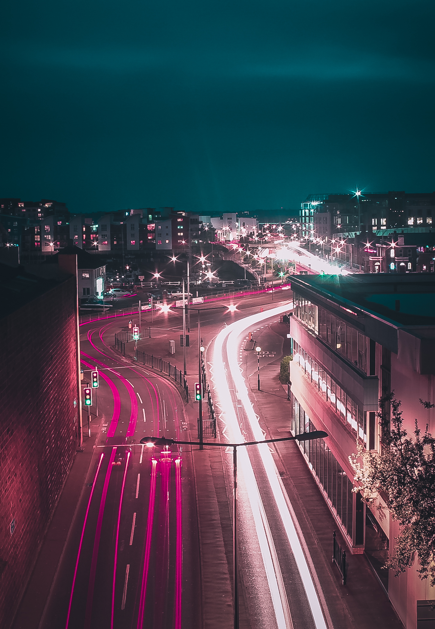
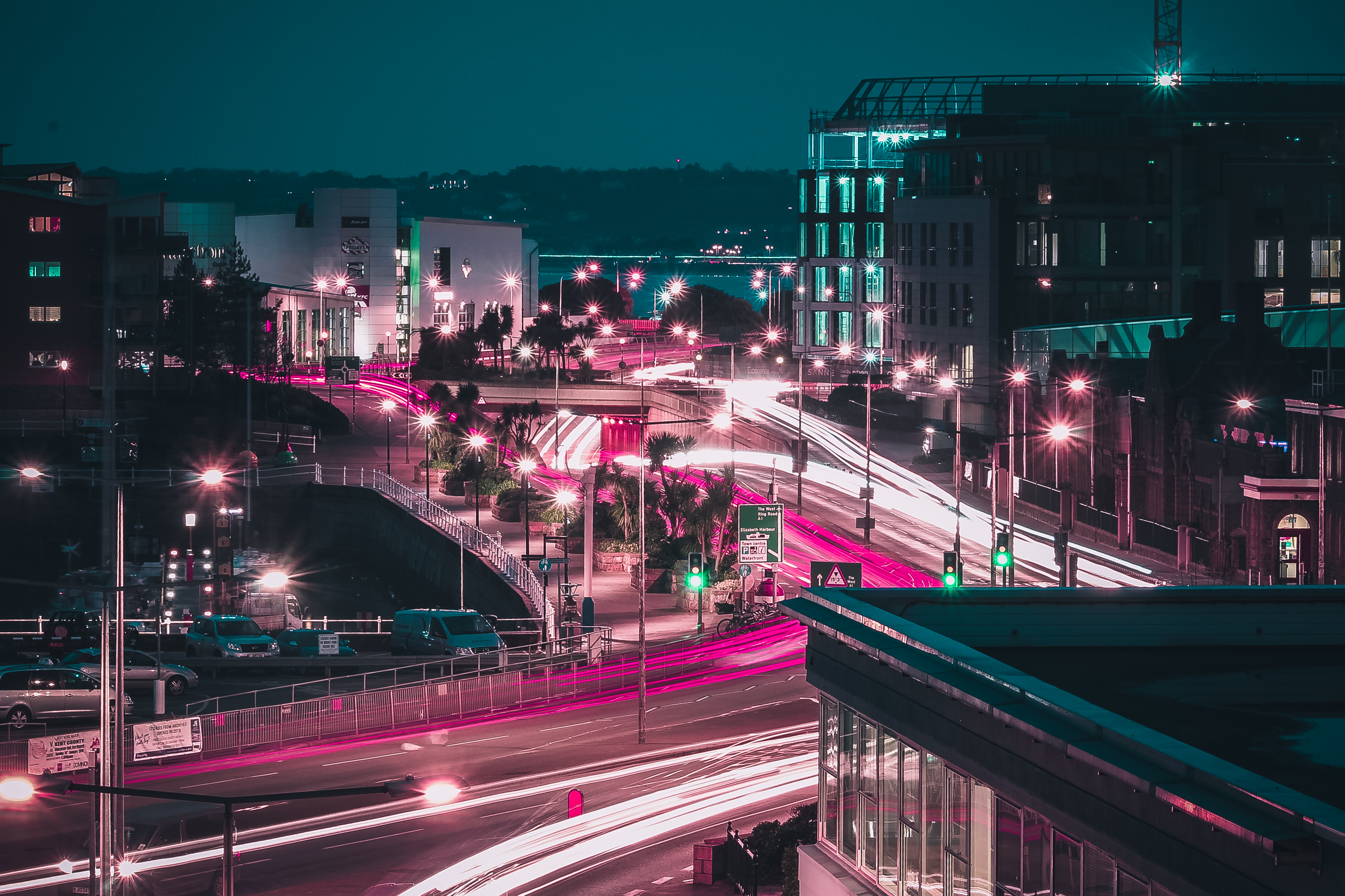
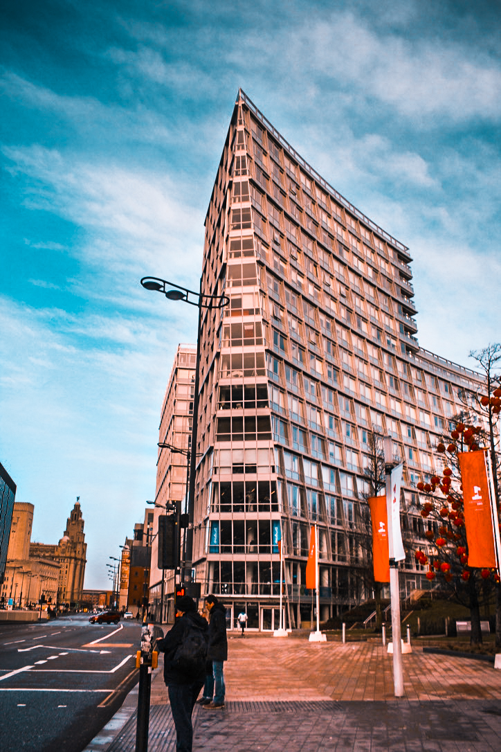
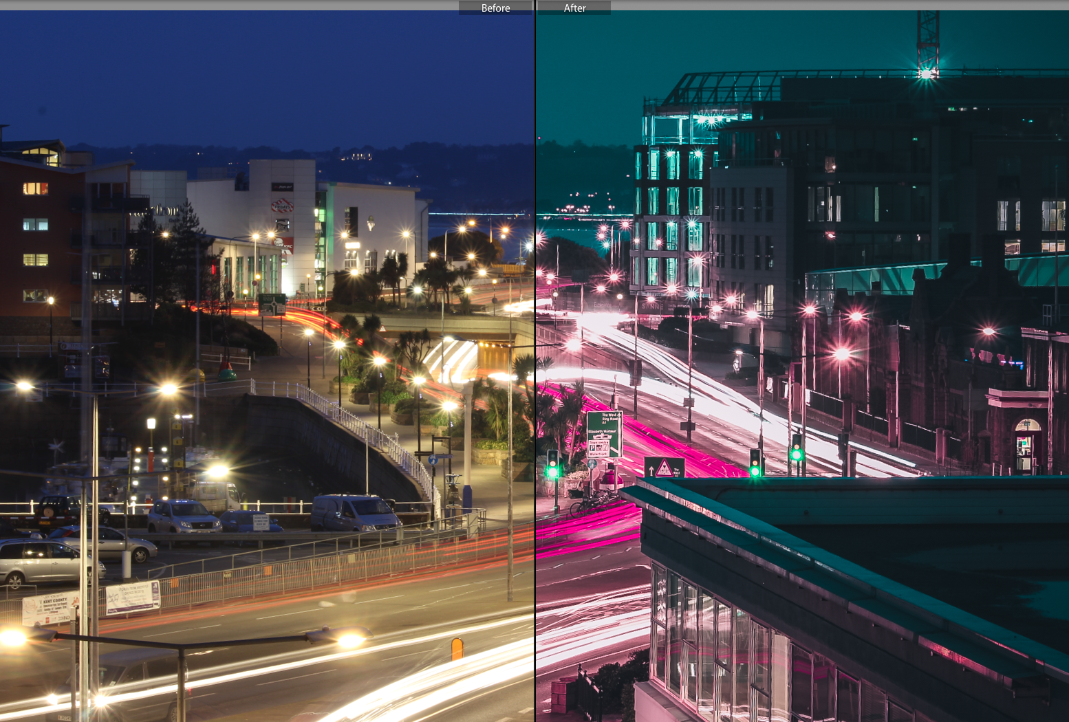
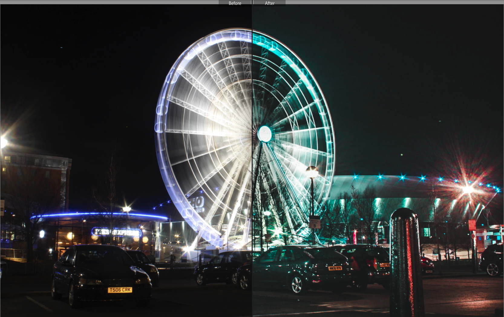
I think these edits are very effective in representing the constant movement and rush within town centres and the chaos associated with them. I believe the use of three prominent colours help to make this image visually pleasing and the composition and use of leading lines draws the viewer around the picture to key aspects of the images. These photos most definitely link to modern day photography conventions in the way there is a use of shutter speed to create a sense of surrealism and the vast alter of colours and lighting to add to this.
Location 2
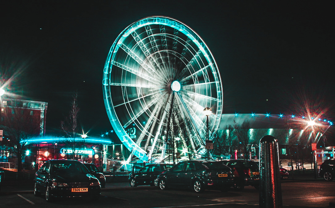
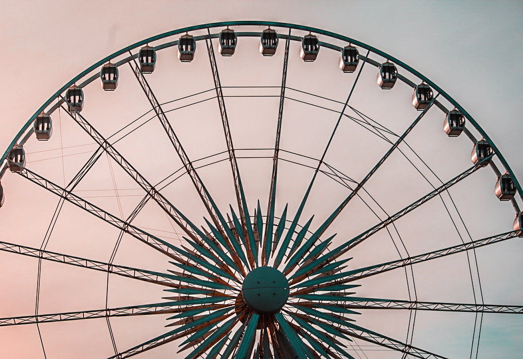
Location 3
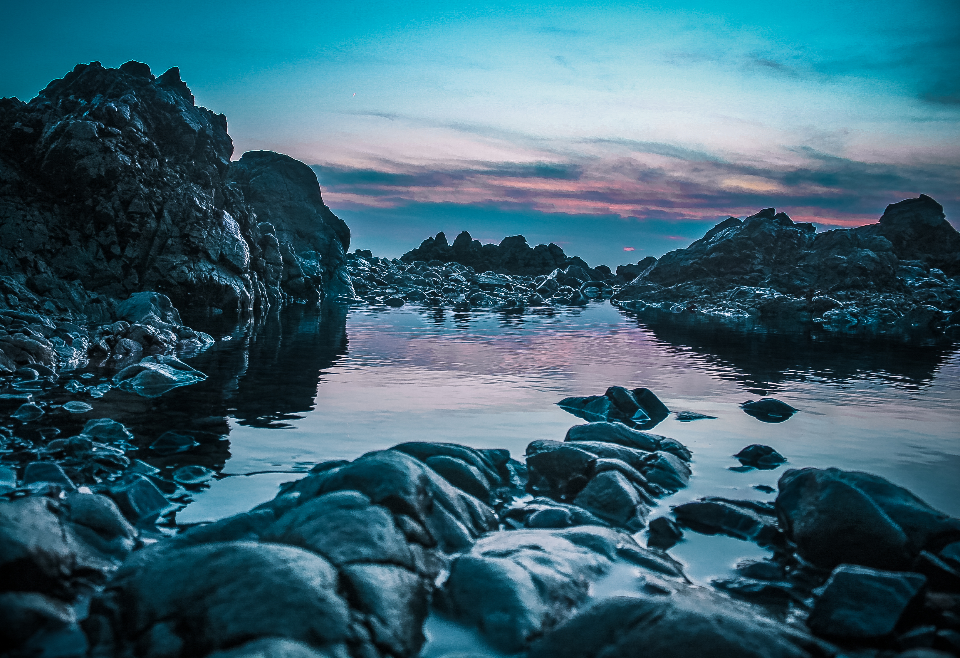
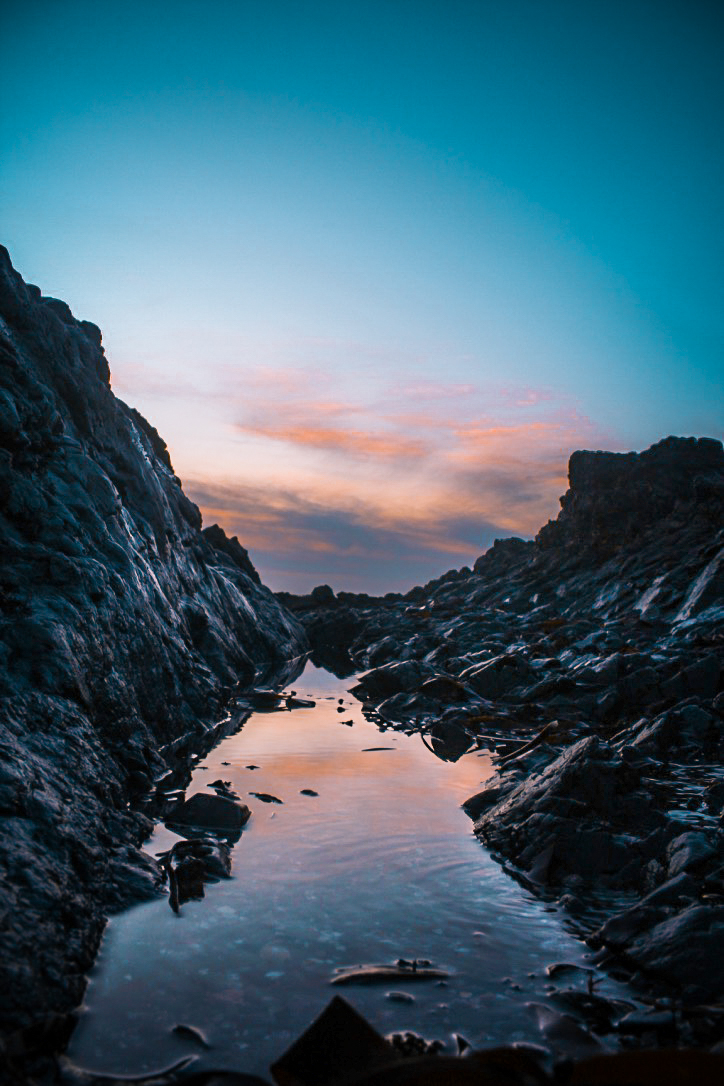
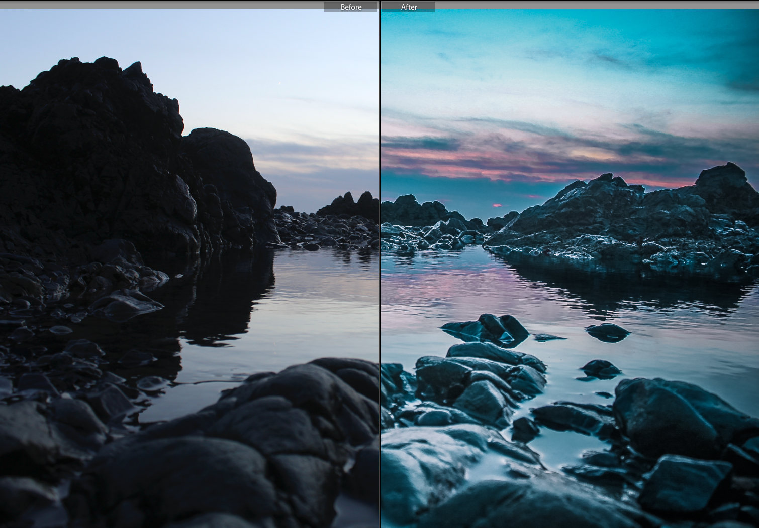
These edits are personally my favourites due to the vast change of colours in which I added to create a more interesting sunset and the realism it continued to carry. Also I think the use of leading lines in the bottom photo helps to captivate the viewer and then lead them down the water to the main focus of the photo, this being the sunset.
Location 4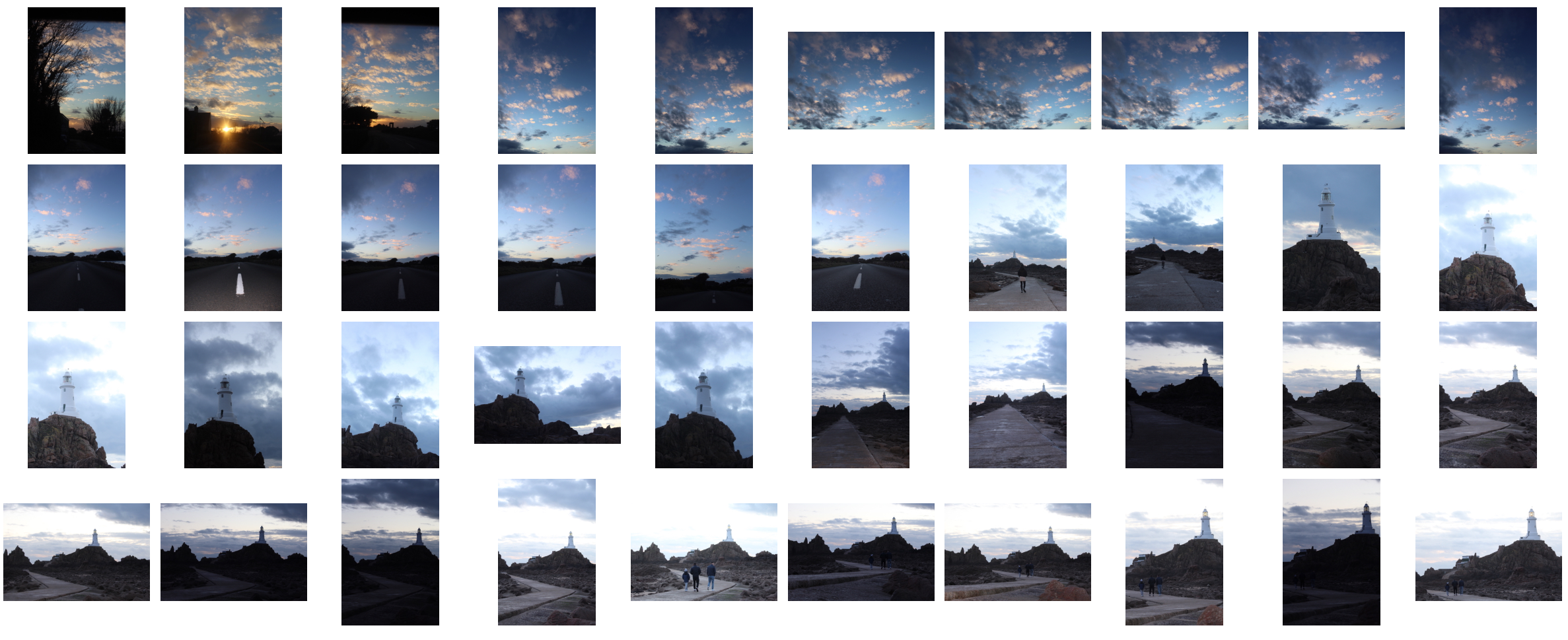
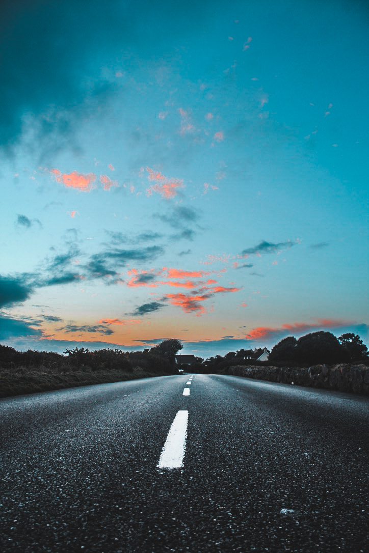
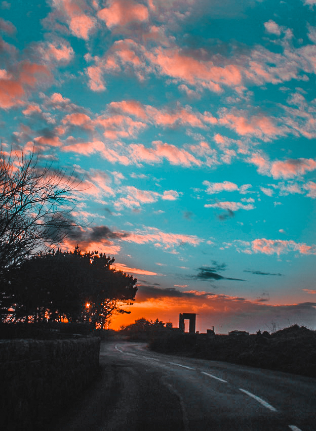
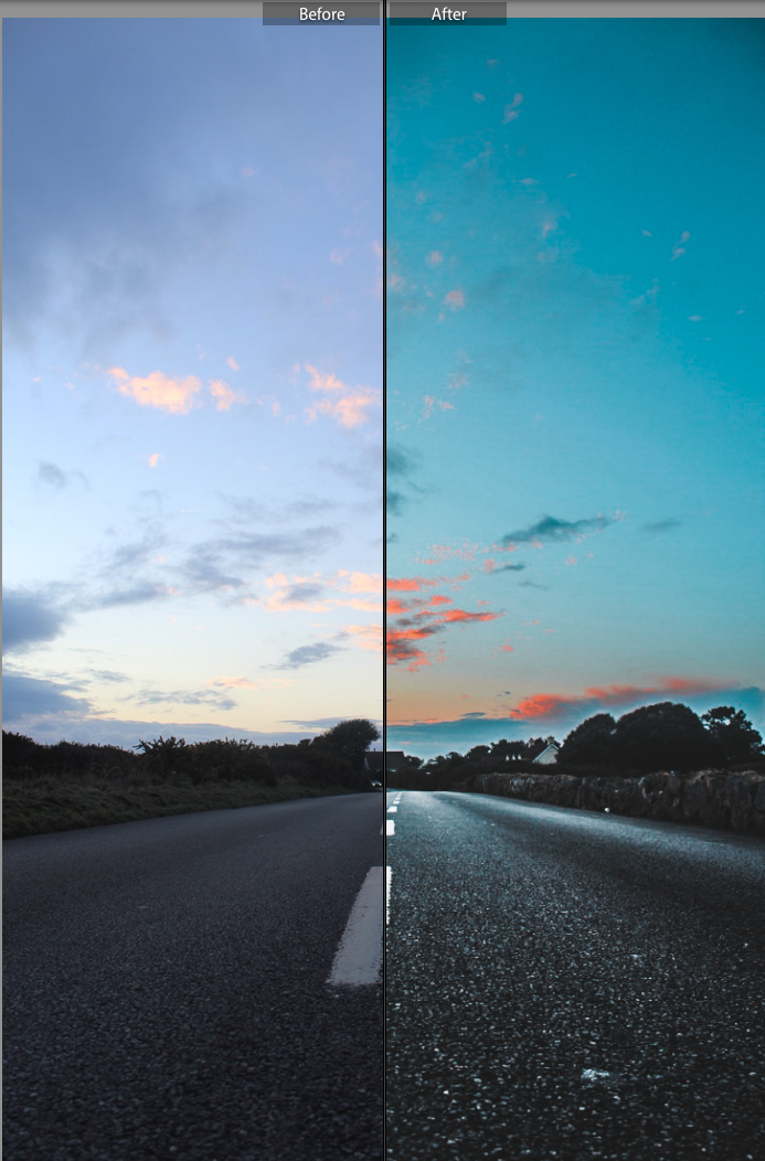
Again, I believe these edits are very effective in portraying a sense of modern day photography. Many people, enjoy photographing the sunset, more recently it is a very popular subject matter with many people capturing the sunset on their phones for social media sites such as Instagram. People always imagine and dream of the ‘perfect sunset’ consisting of pink/orange and teal colors however this is a very rare thing to actually come across. Therefore people often will edit their photos to portray this dream sunset and create a more interesting photo like I have tried to implement into my photos.
Here are a few comparisons between the original photographs and the post production images.


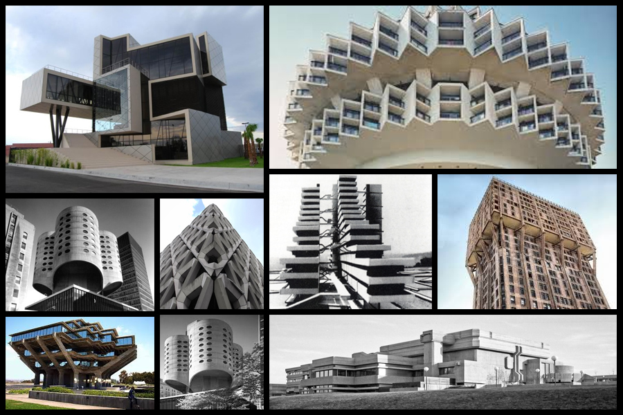 Once looking over the images I decided to analyse one of them to identify common features or styles that each possesses.
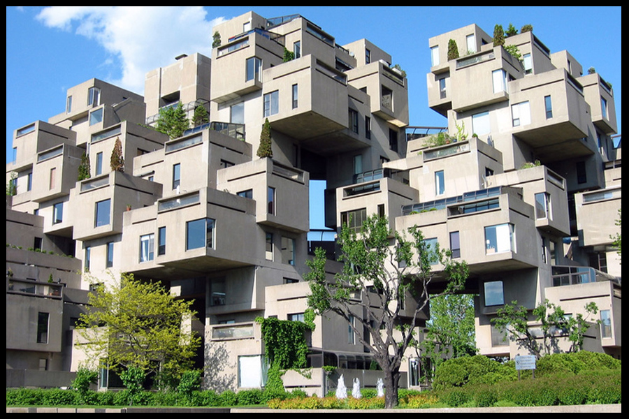 When looking at the style of architecture I found that all the buildings were based on a geometrical structured design, by doing this the outcome would look artificial and almost surreal to images and passers-by due to how these houses and offices would not match the environment surrounding them. Each building was made to look displaced and abstract, whilst many incorporated nature into the designs. Symmetry, pattern and randomness I found was the most common influence over the structures, due to how it gave the place an aesthetically pleasing look. As a result to this many viewed this style of architecture as a form of art.