These are some examples in which I was inspired(separate from the artists work):
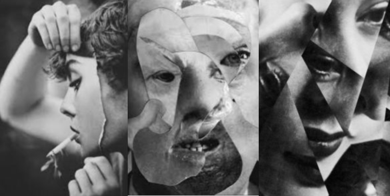
I was fascinated with the distortion within people due to either a self inflicting issue reflected onto themselves to mirror an emotion, this would come under their own personal secret and view of themselves and the continuous convention of people being subjected to portray a certain aspect of themselves to others.This would come under a surrealistic aspect and also possibly from using mirrors and or collage as well as Photoshop techniques within the image.
Second artist:Midori Harima
Harima relocated to the United States in 2001, and currently maintains a studio in New York. She is known for her technique of creating hollow paper sculptures from archival paper, onto which she has pasted photocopied images from magazines, newspapers, and other conventional media. By gathering and linking together fragments of the visual information that inundates today’s society, and thereby raising issues that cannot be represented by other means, her work leads to the discovery of intuitive beauty for which her practice is highly acclaimed.During her more recent work she links her ambition to projects featuring democracy and new inspiration from daily life such as every daily consummations and considering how this effects the democracy and as a whole within society.
why I chose her work:
I was originally inspired by the somewhat gruesome observations of identity and the conventions that we are not who we present others that we are, I was also interested wihtinn the collage and inventive way in which the faces were formed or even futher experimented wihtin using dolls and a reflection of behaviour and almost a code of a set way in which we have to behavouir and also look all the time. Harima relates sucessfully to this as her work shows a sense of emotion of a 3d image but onto a face stuture,bringing alive something that does not exist,and an emotion and we deem relastic to the surrounding society.
Favourite image analysis:
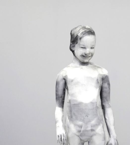
This image holds many connotations of being removed in many aspects, which creates an eerie sense due to the lack of colour and loss of humanness wihtin the image itself, it possess many characteristics to which a human should obtain but are lacking, such as movement and an expression but most importantly the image of the face is added over the head so the proportions are a way to present the image .It possesses many questions and fits into secrets codes and conventions as their is such a lack of colour and being it possess so much mystery wihtin the relationship of the body and the image form of the head itself,It once again fits into a theme of isolation and a confromative act of behaviour in which we have to comfort to as a code and how the face is smiling but is clearly a fake emotion.This could also be produced by collage seen above by my unrelated originally inspired images which led me to this artist.There is a clear sense of insecurity projected from herself onto her work and once gain highlights a false sense of security whitin a child being not being real.
inspiration from her work:
what I can take from her work is the way in which she forms a structure in order to demonstrate a false emotion and a consistent juxtaposition of trying to demonstrate a positive emotion. This links to my first artists as it constitutes for an act of behaviour and false sense of self.

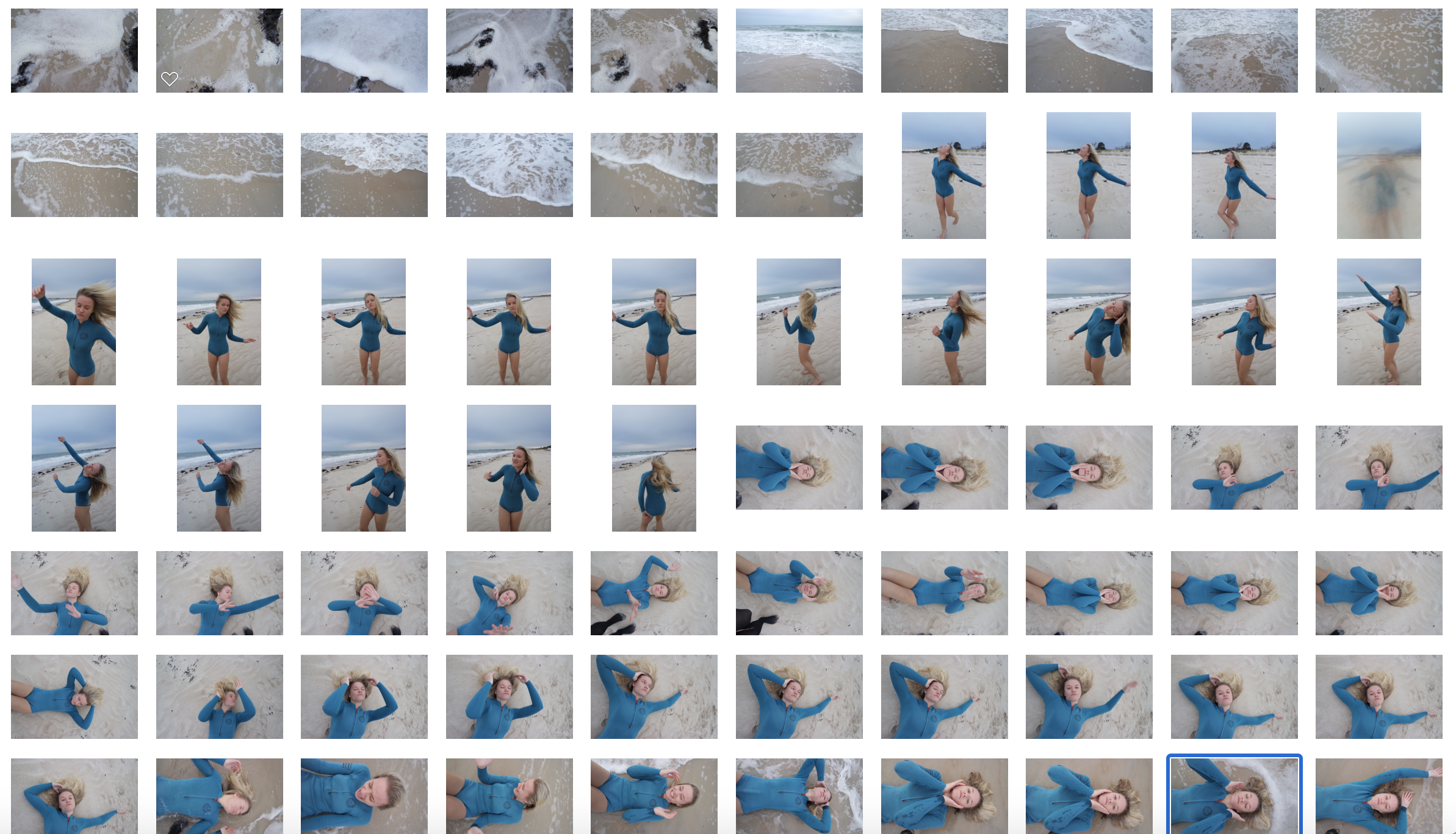
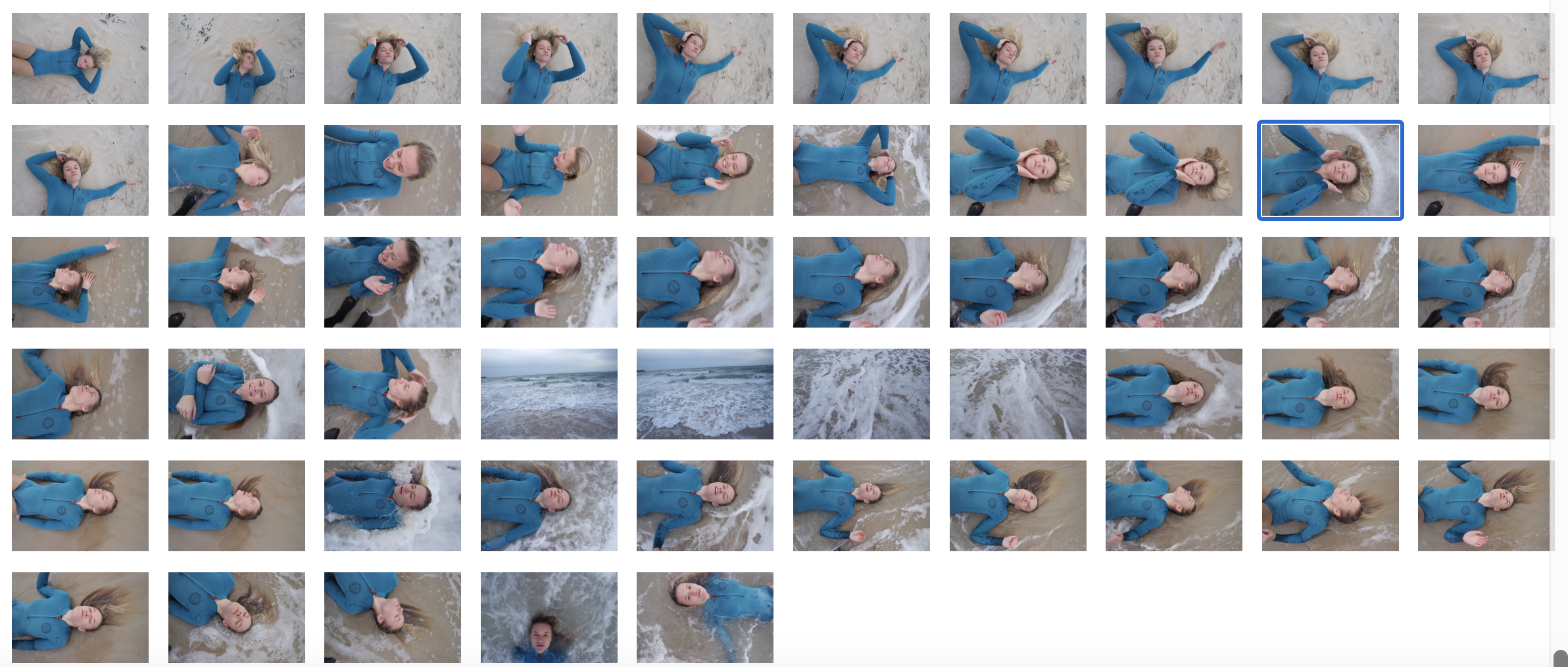
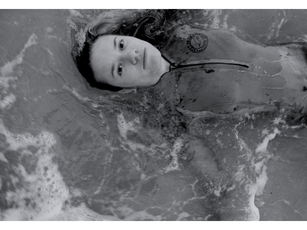
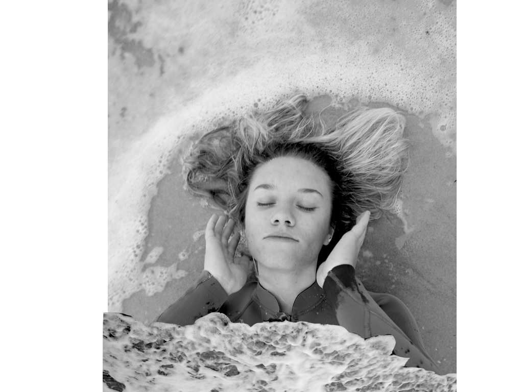
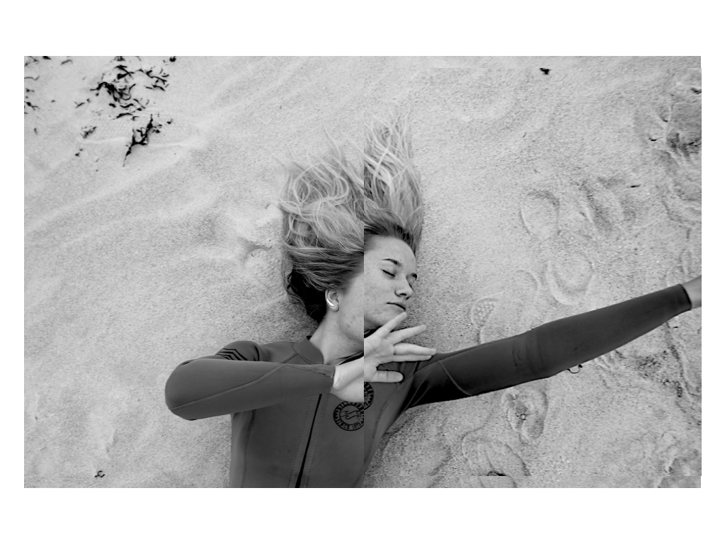
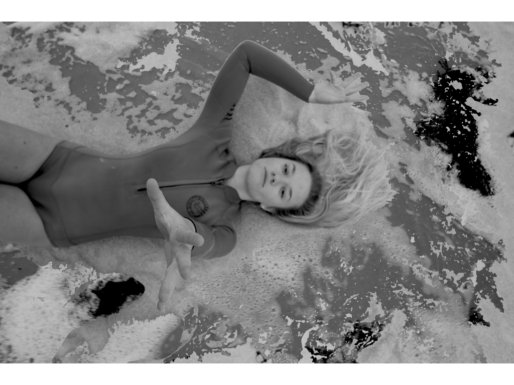


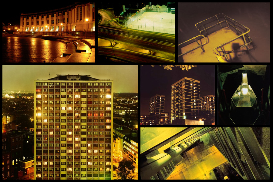 Once completed I decided it was time to move onto my ideas for the shoot, this consisted of creating a mind-map to allow me to focus on specific ideas I think would be most effective when taking imagery. This would make the shoot more efficient to do as I would know exactly what to do. Here are my ideas:
 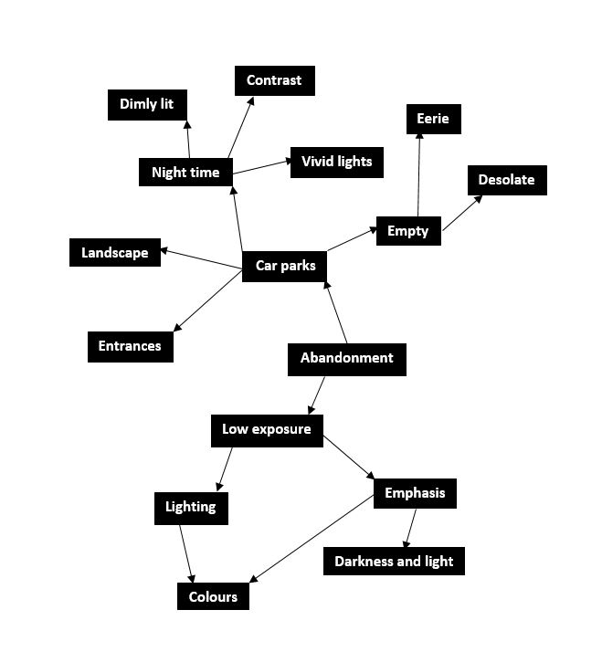 After I finished developing my ideas I decided it was time to focus on the shoot itself now, to do this I drove around Jersey visiting various car parks during the night to capture the images desired. Using a low exposure to produce the outcomes I found that it proved to emphasise the areas of choice like intended. These were my results:
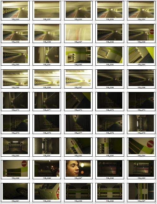
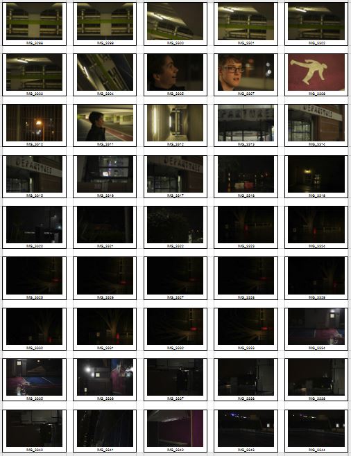
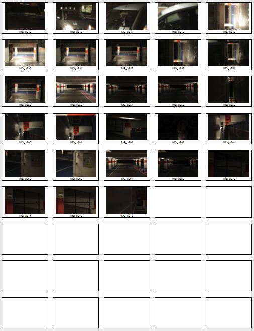 After I had compiled the images into contact sheets I was able to whittle them down into a top ten images that I thought stood out from the rest of the pictures. This would make it easier to choose the final and most successful image out of the entire shoot. Here are my ten final choices:
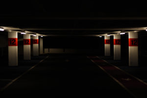

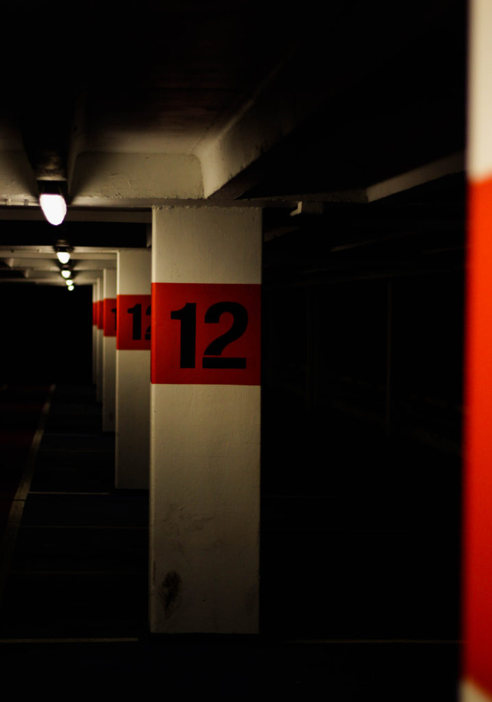
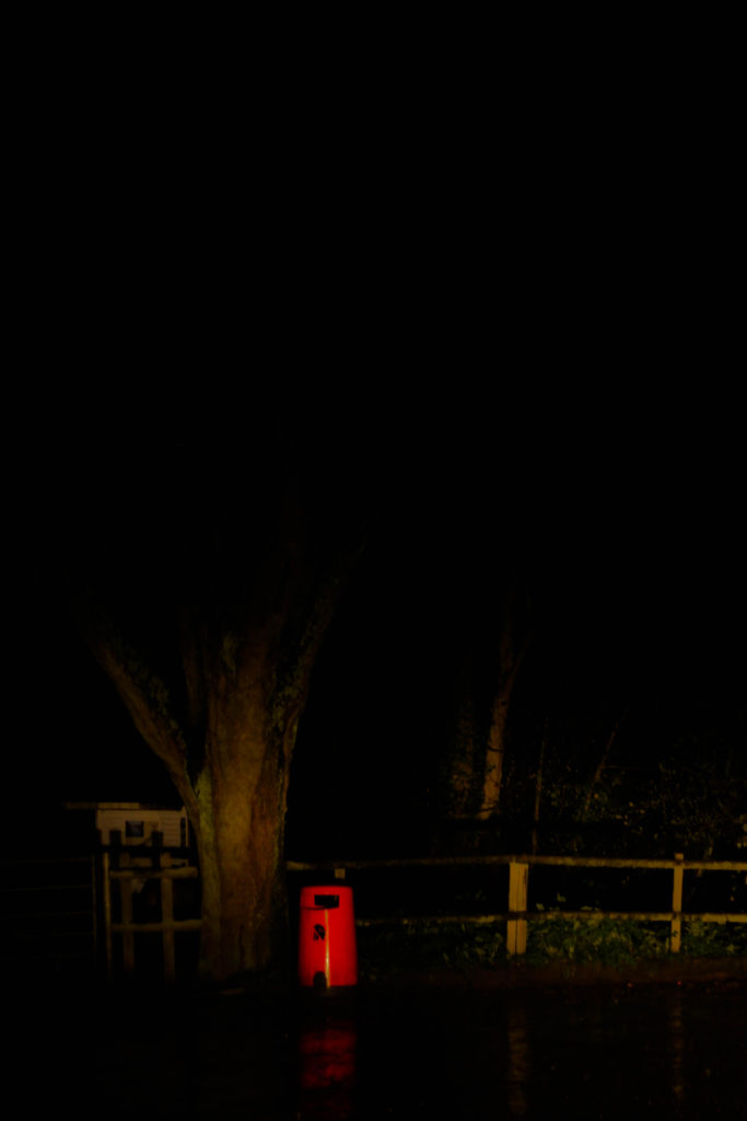
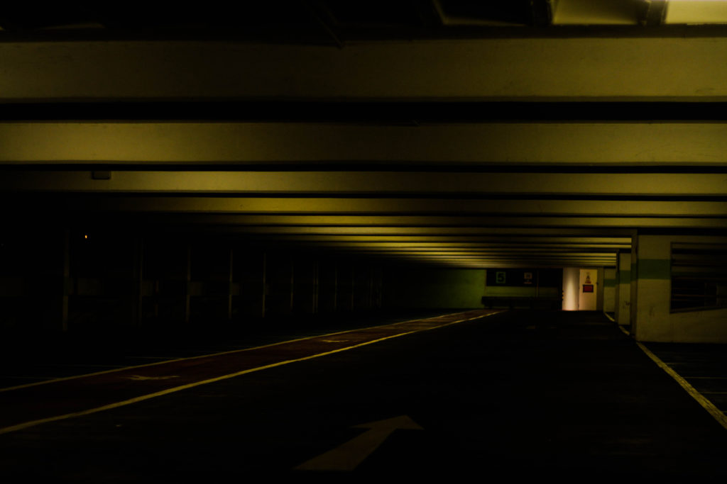
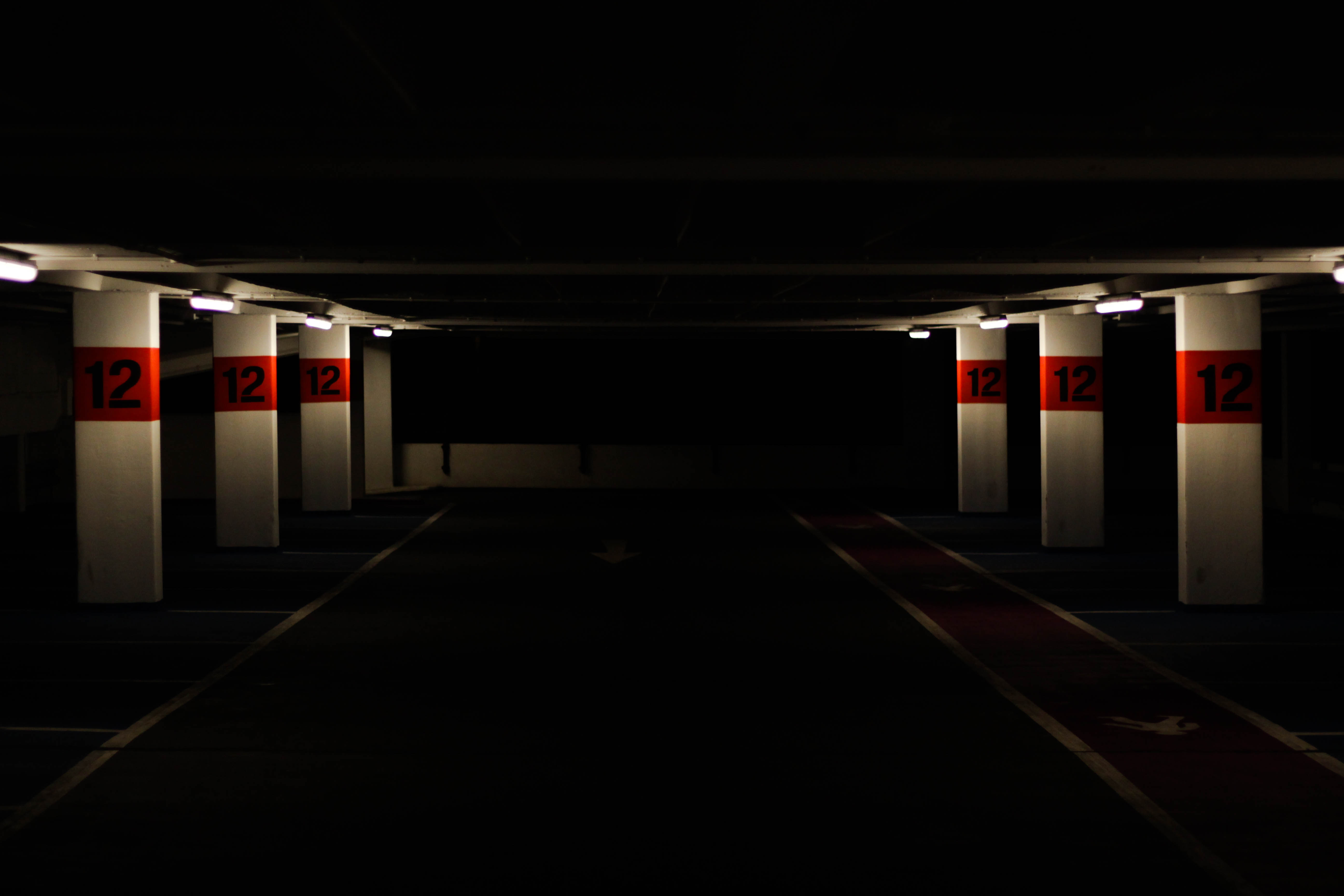 I chose this image as one of my selection of five because I found it contained an effective use of contrast between light and dark, combined with a use of depth of field I thought it gave across an eerie impression of a deserted atmosphere. The red use around the number I found to really balance the image from how the only light sources illuminated those areas whilst emphasizing the depth and darkness of the car park. I found the symmetry used within the image proved effective from how it created a sense of aestheticism with a border made from the use of the slanting ceiling.
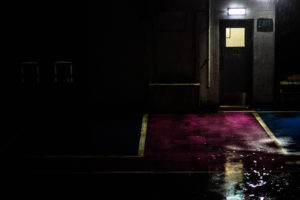
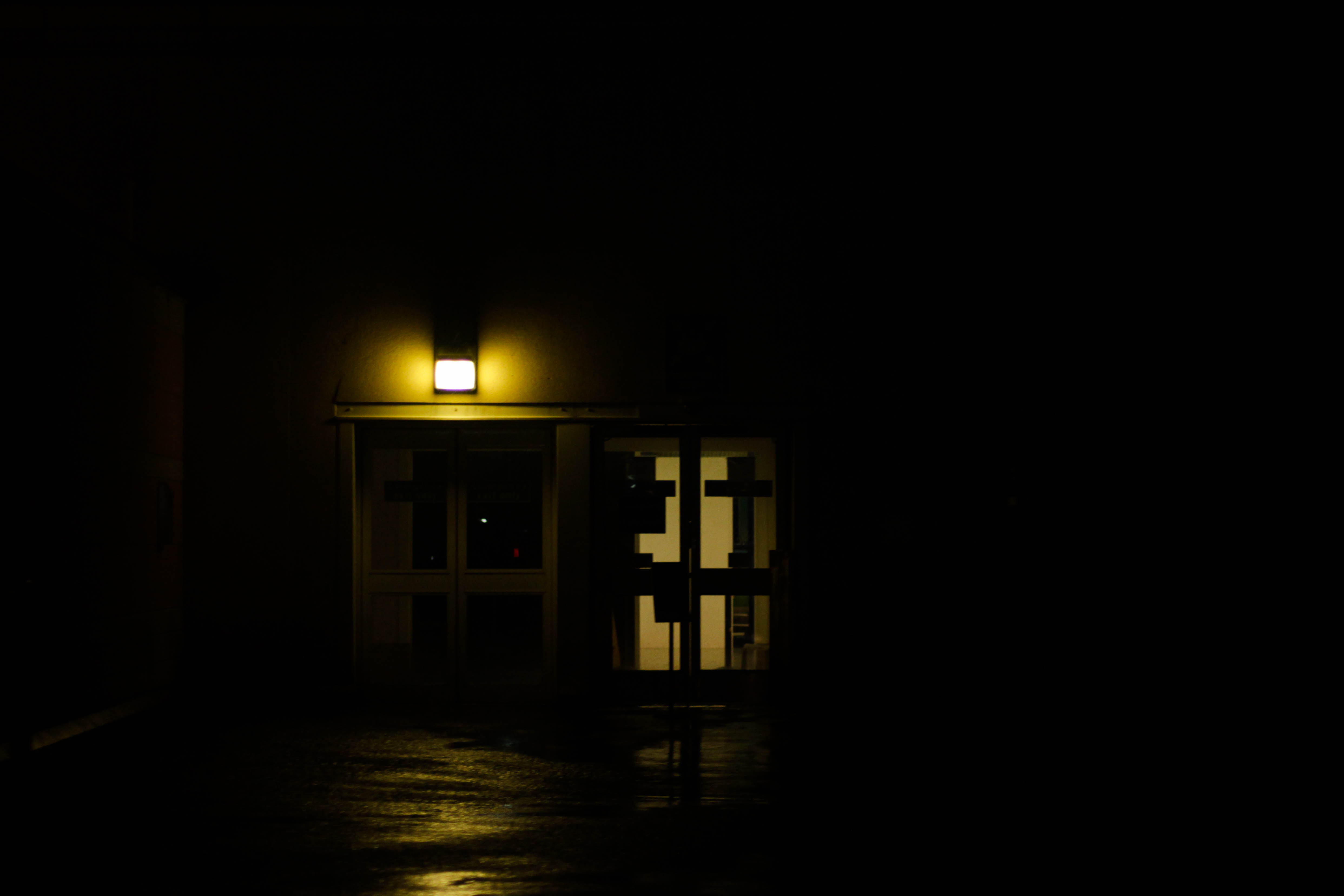 What I particularly liked about this image was the use of a dim yellow light illuminating a small radius around two doors, I found that this combined with the puddles reflecting and emphasizing the colours really gave the impression of an area deserted by human activity. This also produced a contrast between the doors and the rest of the image from how the darkness around it defines it even more the dimly lit imagery exit of the airport. The use of a singular light source present creates a creepy feel from how it creates silhouettes of objects around it allowing your mind to perceive what it wants of it.
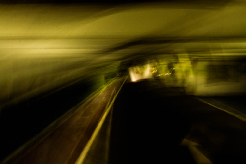
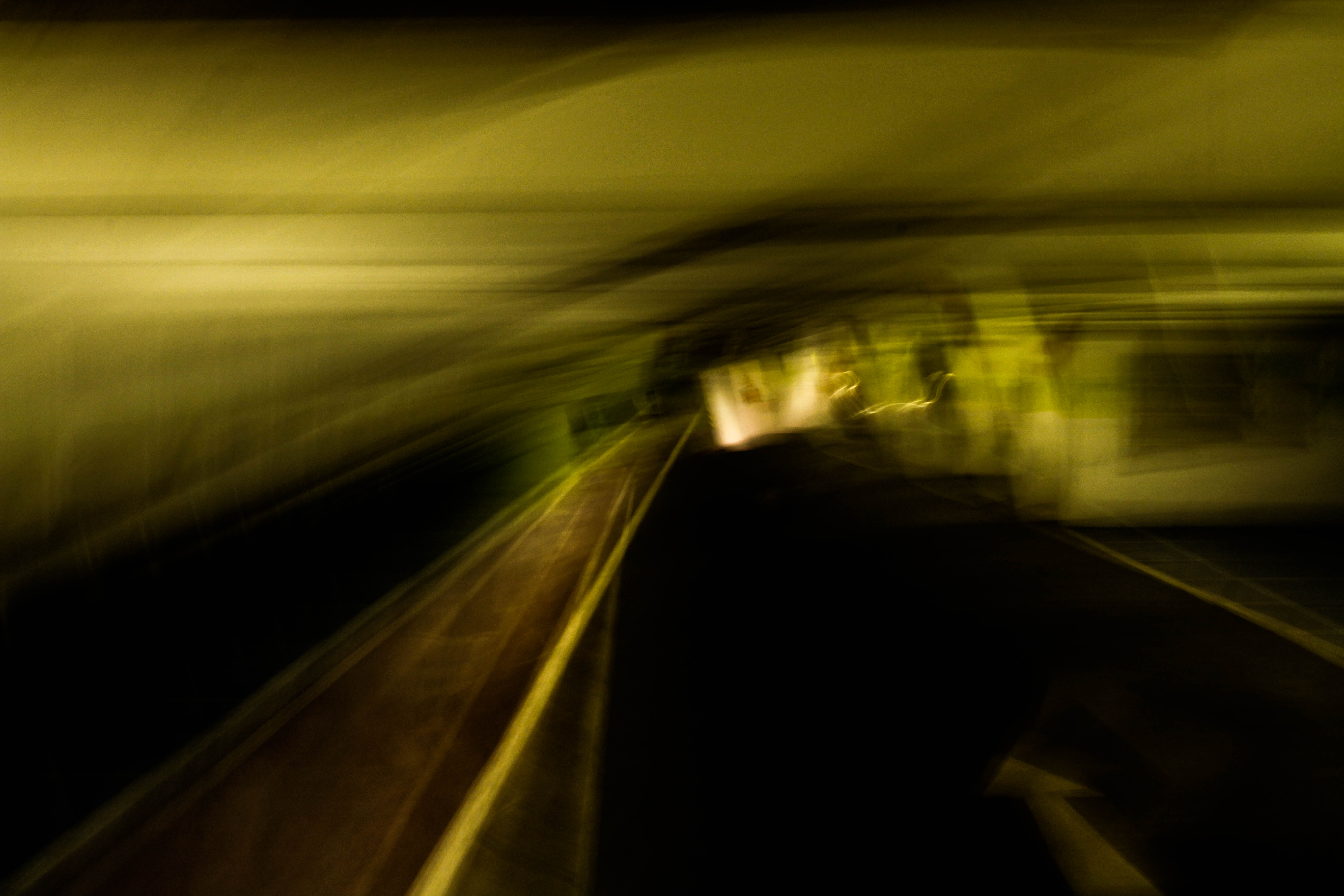 What I loved about this piece was how the blur created by the low shutter speed creates an abstract and almost dreamy landscape of the car park leaving your mind to interpret what it would look like. The combination of yellow and green compliment each other combined with the dark floor allows for and aesthetically pleasing result, however I found that the un-blurred road balances the image as it adds normality to the rest which is essentially is unbalanced.
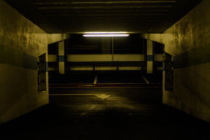
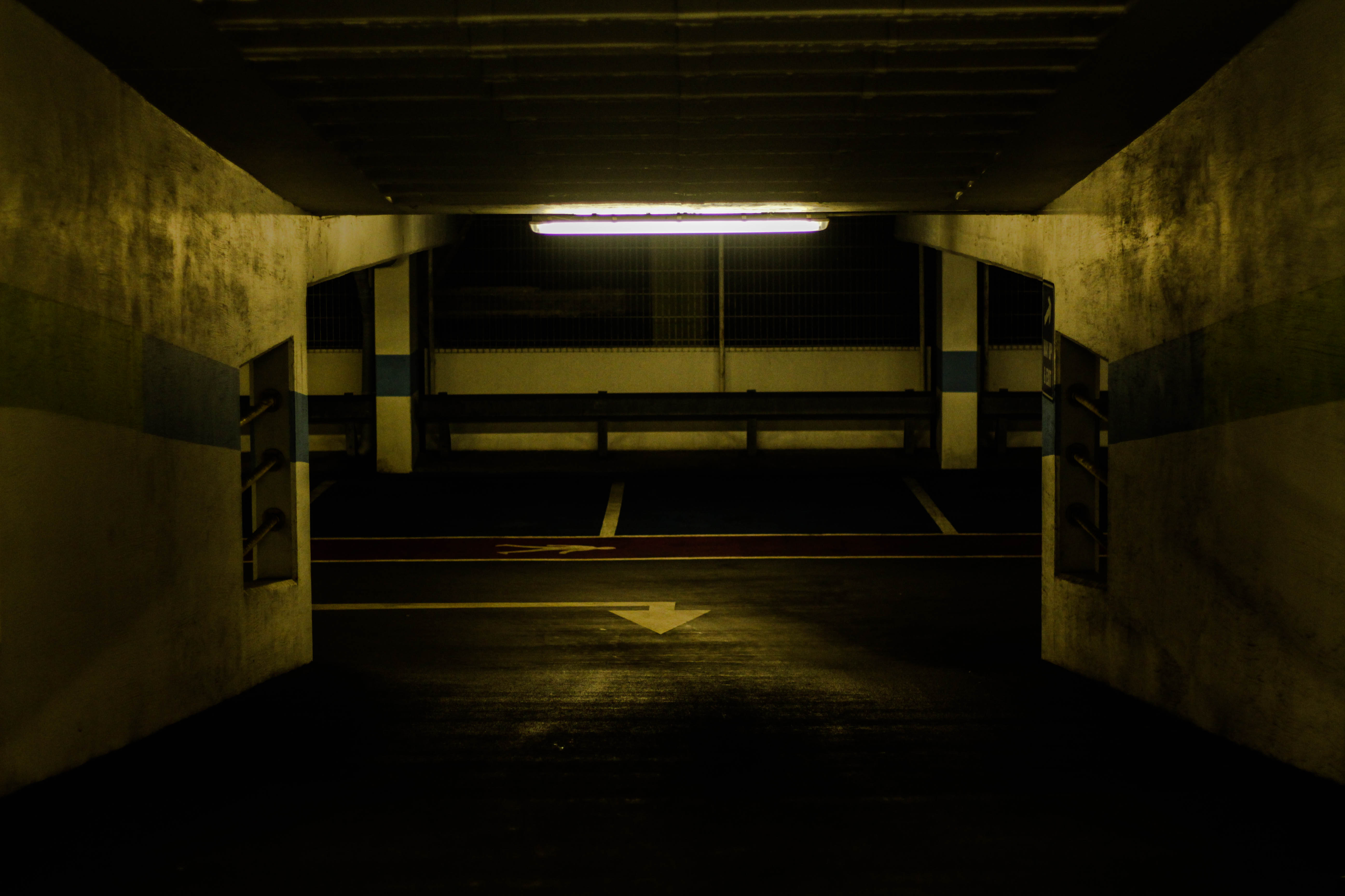 Within this photo I loved the use of a single light source illuminating the dirty walls with yellow lighting, I found that the impression imprinted by this allows a look of derelict and abandonment to the area from how the colours are dimmed with light sources emphasized. I found that the composition was particularly effective from how it was symmetrical throughout allowing for an aesthetically pleasing outcome with the light being the center of the image and the main focus point. The use of depth of field on the far end of the car park wall adds balance to the piece from how the detail is removed from it allowing the viewer to mainly focus on the walls and ceiling without much distraction.
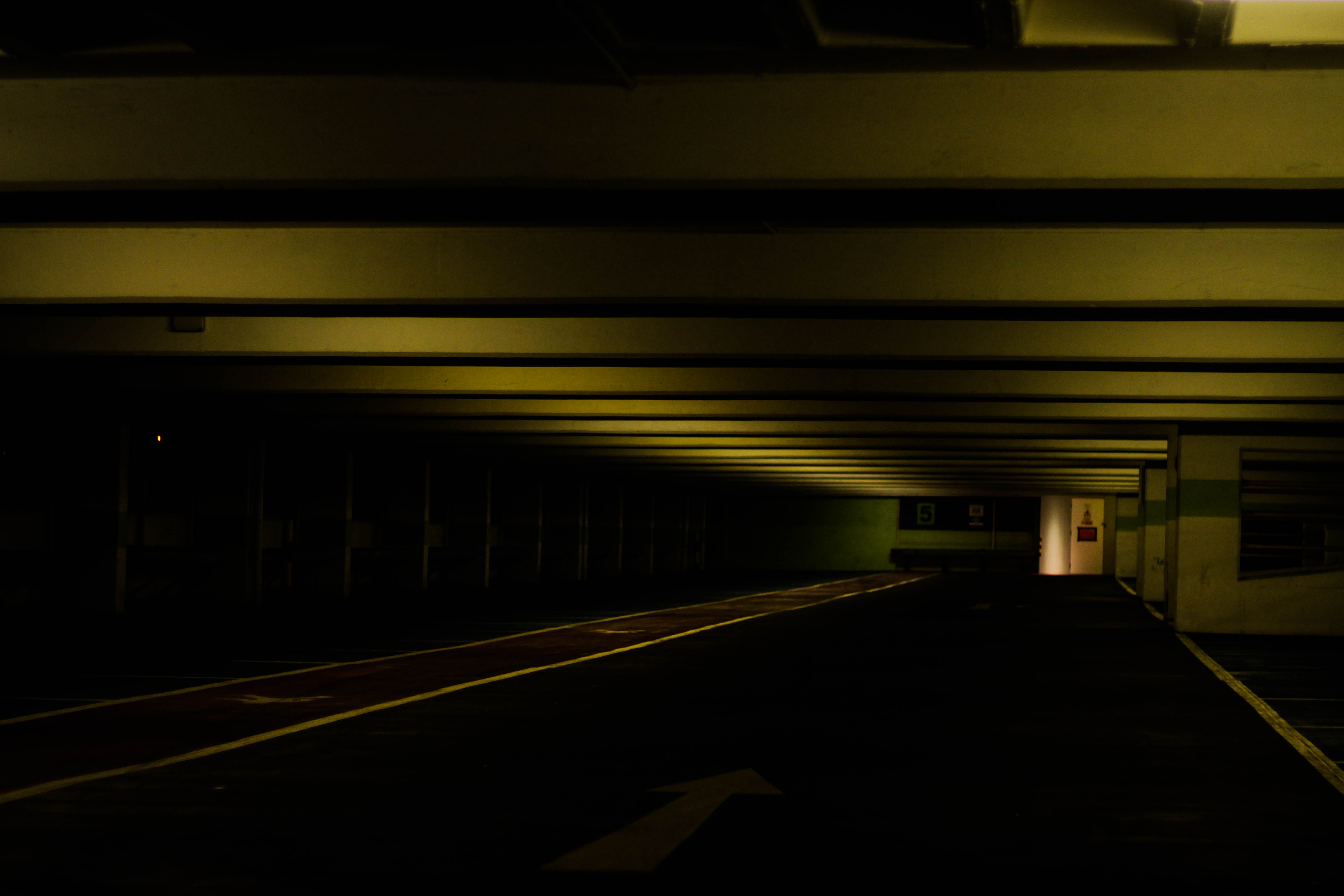 Finally I chose this piece because of how the use of a depth of field and the yellow tinted lights compliment due to how the ceiling is slanted off to the right in the distance. On top of this there is a significant contrast between the floor and ceiling presenting it as a sort of unknown area where the side cannot be seen only the ceiling and exit, with the remaining parts a mystery to what is there. The composition is slanted like most of them, but the patterned ceiling adds interesting features to the piece rather than being head on, presenting it as a large corridor like structure.