
For my third photoshoot I wanted to develop the idea from my 2nd photoshoot and improve it, taking conventional objects and adding more aspects into the images like backgrounds and multiple objects and layer them together. I also wanted to take inspiration from Mari Mahr and take personal objects from my life so they have conceptual reasoning into why i took the images.
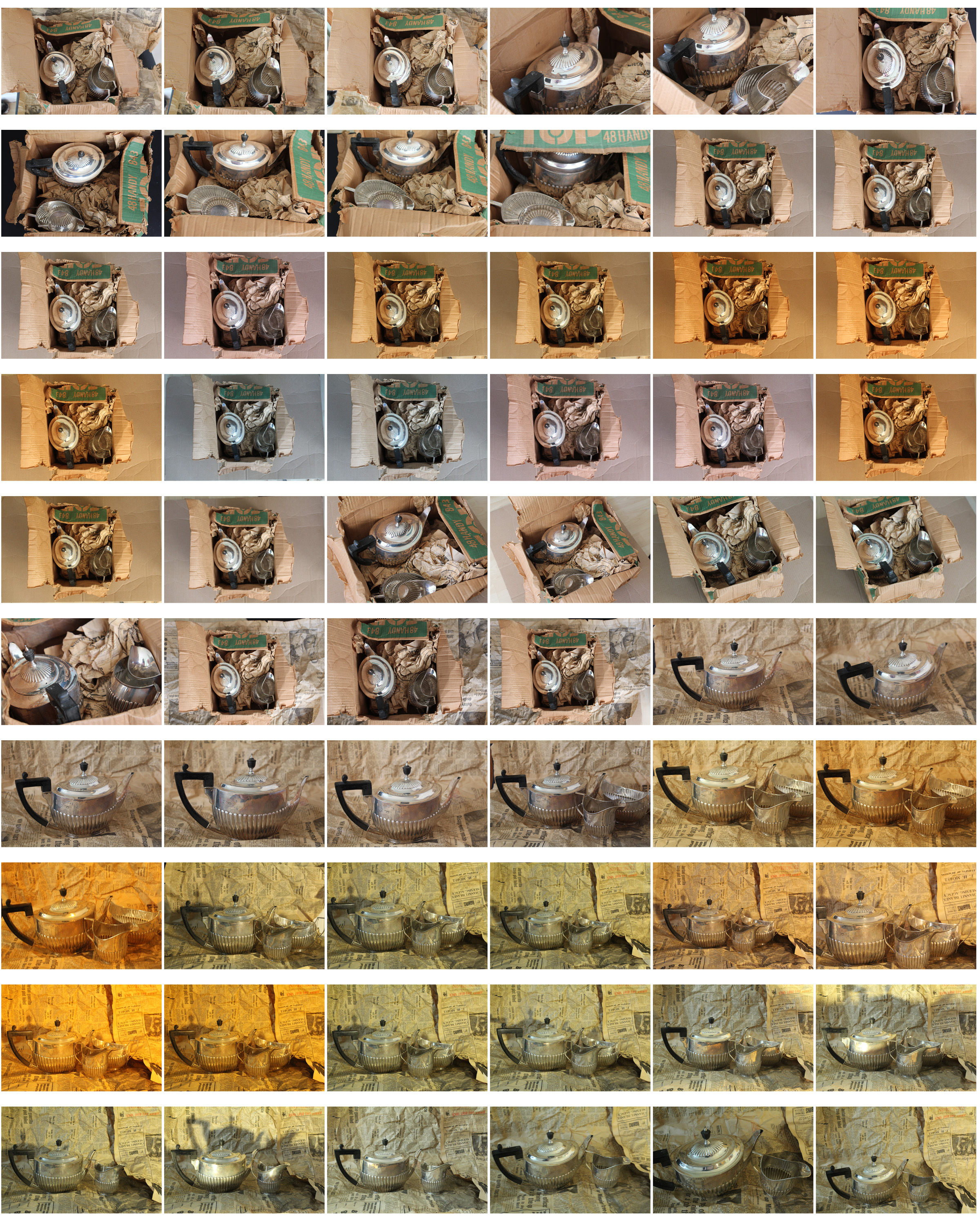
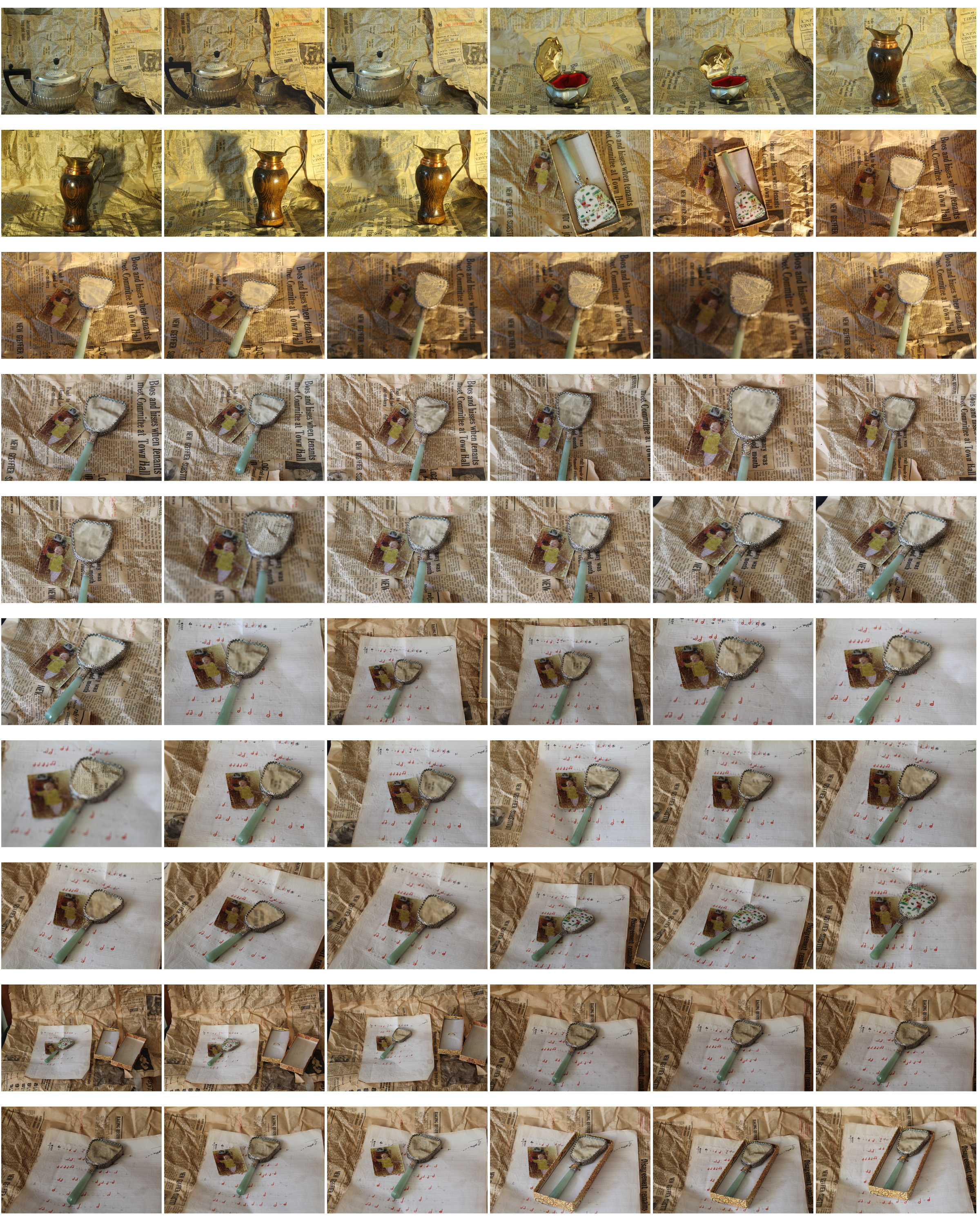
Throughout this photoshoot i tried to arrange the objects in as many arrangements and compositions as possible, experimenting with the white balance and natural and artificial lighting to see which would produce the most aesthetically pleasing image. I also tried to emphasise the warm undertones of the objects so they had a more historic and aged look to them. I found the natural lighting work best for most of the images so it didn’t look so intense and harsh. I used a tripod for the photos where the angle of the image is from the side to make sure the photos were clear and detailed, but didn’t use a tripod where the photos are taken from a downwards angle. Many of the objects used in these images relate to my life an family.
Technical
- I experimented with both artificial lighting and natural lighting and found that natural created a more authentic, personal look, compared to the artificial that made the objects look staged, manipulated and in the spotlight.
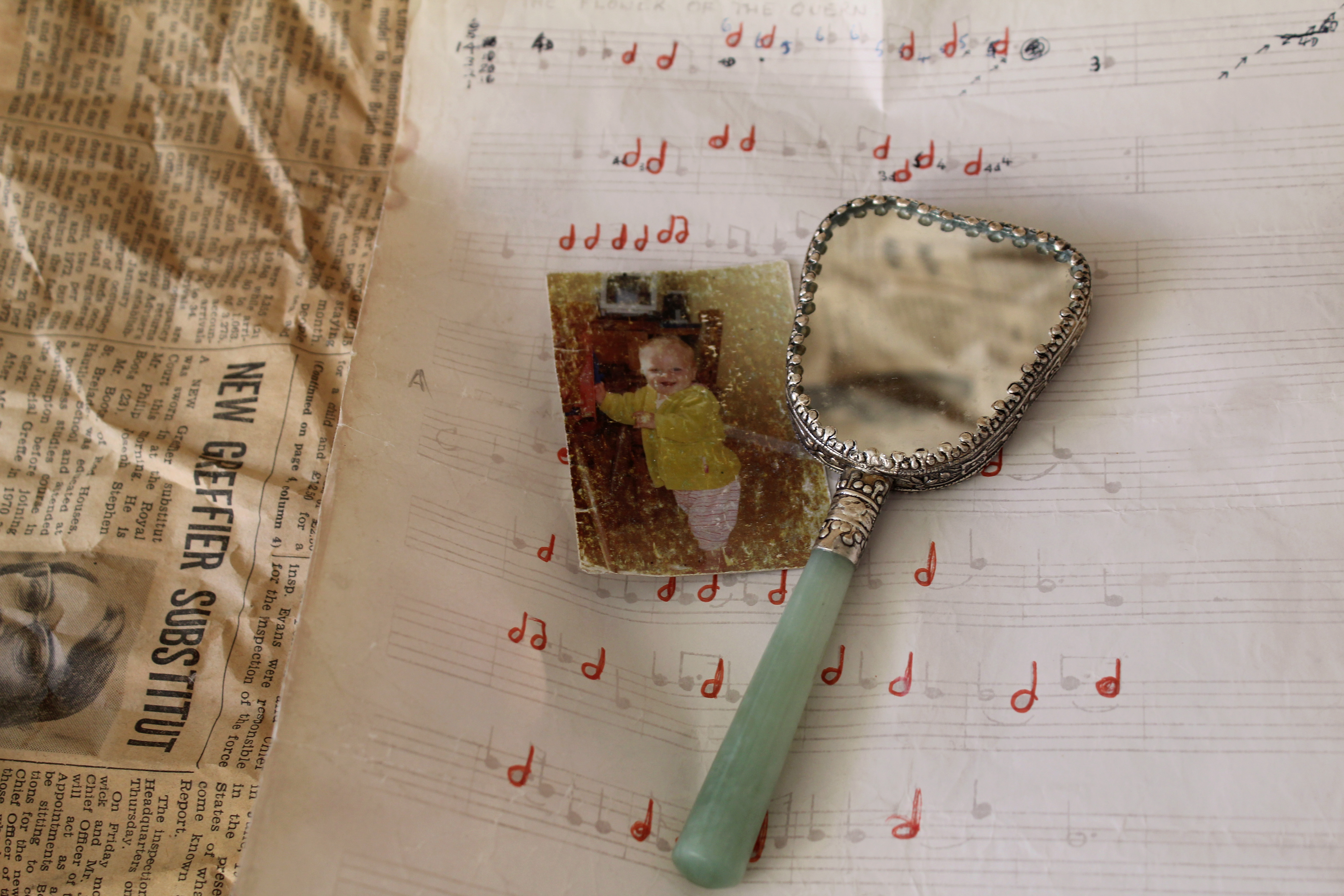
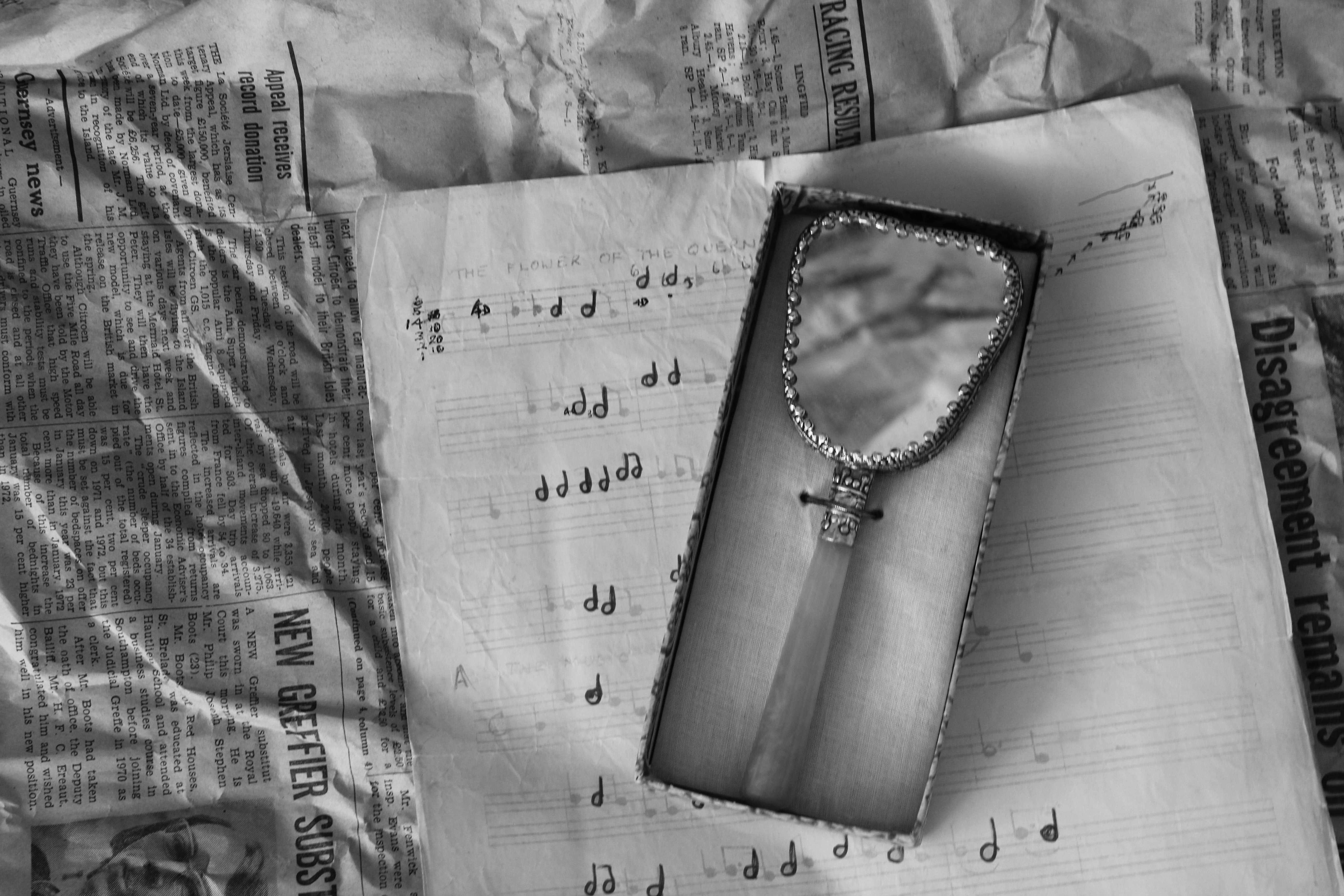
- The natural lighting coming from the left side lights up all aspects of the photo but focuses more on the left side of the image, emphasing the folds and creases in the newspaper and creating a small shadow on the right side from underneath the piano music.
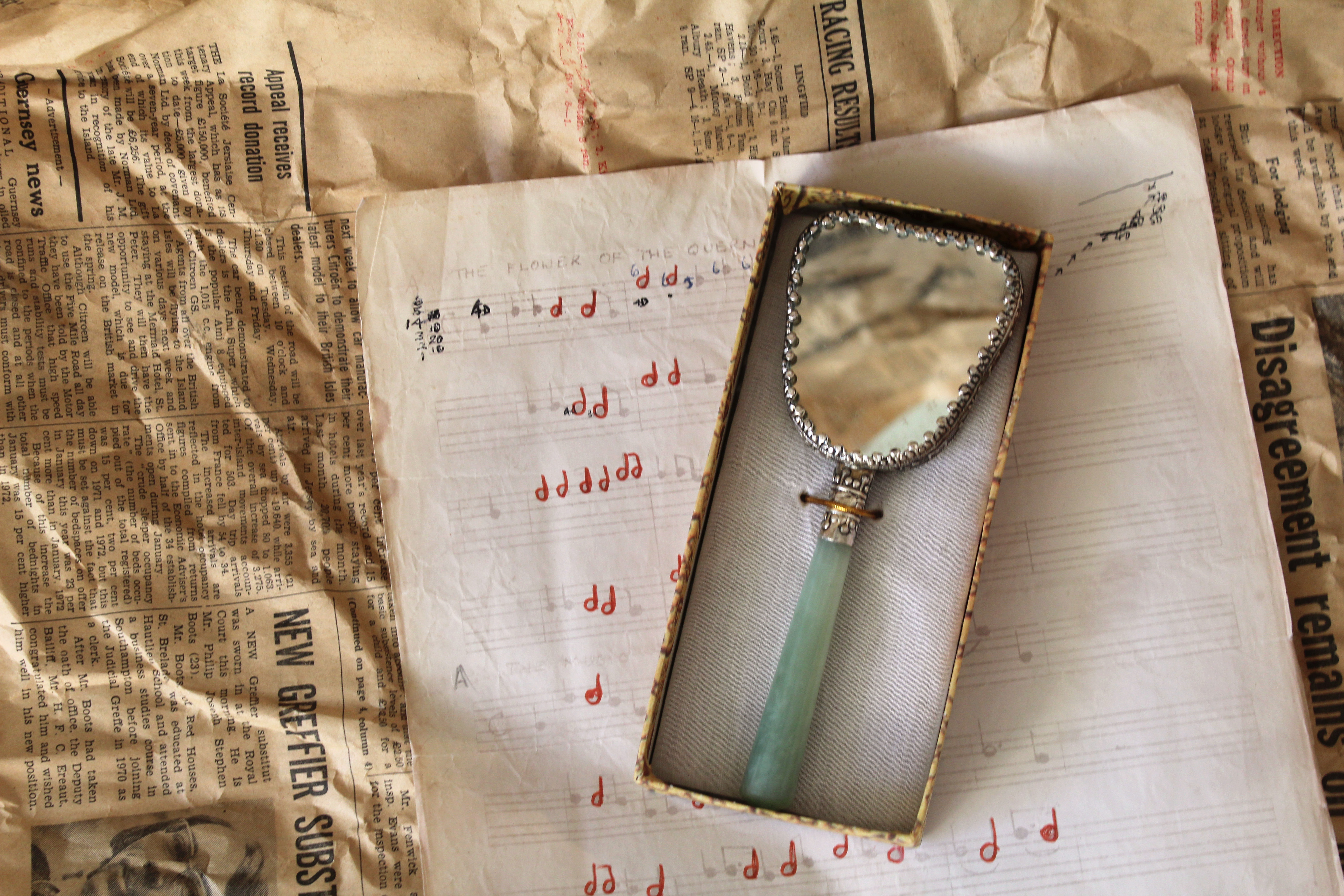
- This allows for a range of tones to be presented. For many of my images in this photoshoot i used a tripod, but for this image i didn’t as it’s taken from an above angle, so i used fast shutter speed.
Visual
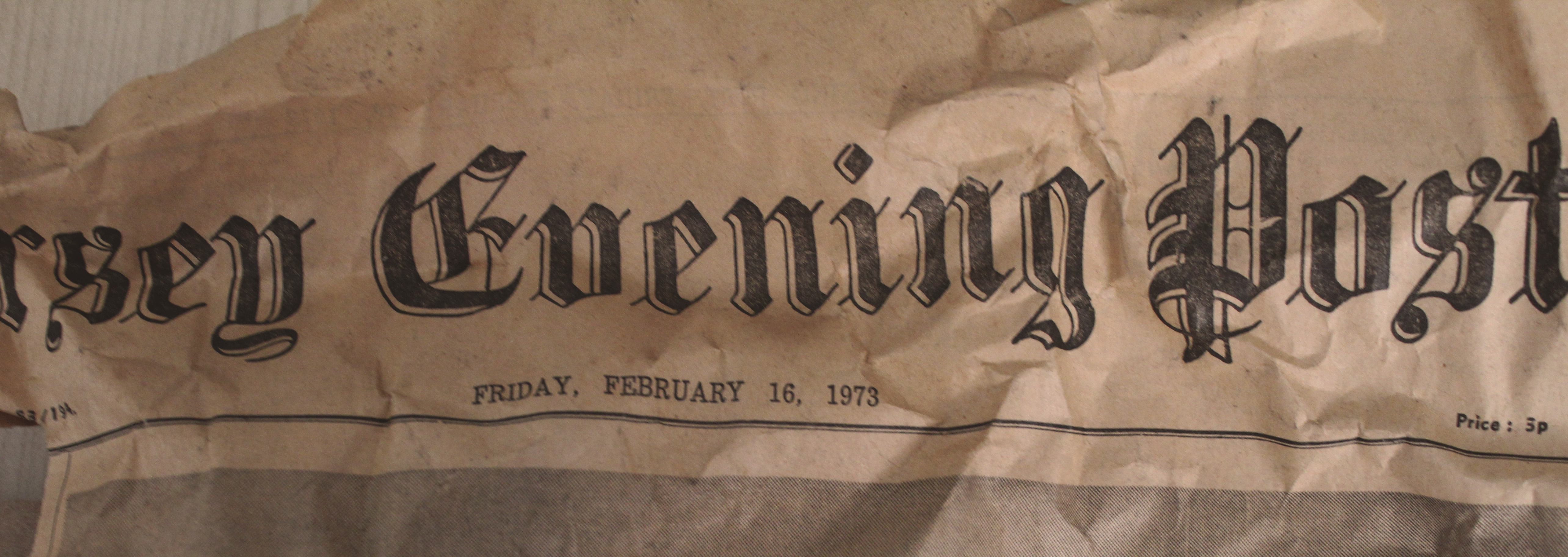
- The newspaper, used as one of the background layers in this image, creates an interesting texture as it dates back to 1973, showing how the condition over the past 45 years has deteriorated.
- The colour of the newspaper links to the other images as they all contain brown and yellow undertones, emphasisng the fact that what is being photographed is old. This contrasts with the off-white colour of the piano music, which also shows signs of ageing around the corners.
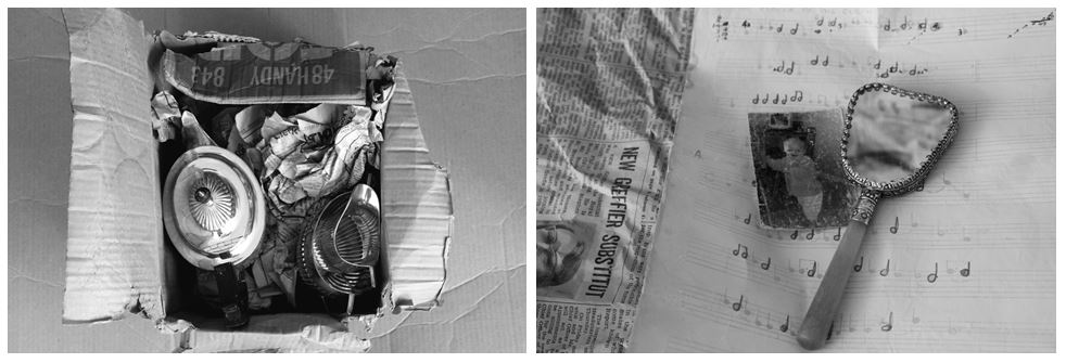
- The tones of the newspaper link into the colour of the outsides of the box containing the mirror. This makes the overall image more aesthetically pleasing as the colours and tones all complement each other and make for a more balanced image. I also reflected newspaper in the mirror so it wasn’t completely white and so it complements the newspaper background.
- I arranged the objects in a way so that the angles each object were placed at balanced each other out, e.g. the piano sheet music angled to the left, complemented the box with the mirror angled to right, together creating horizontal lines and different layers and aspects in the photo.
Contextual
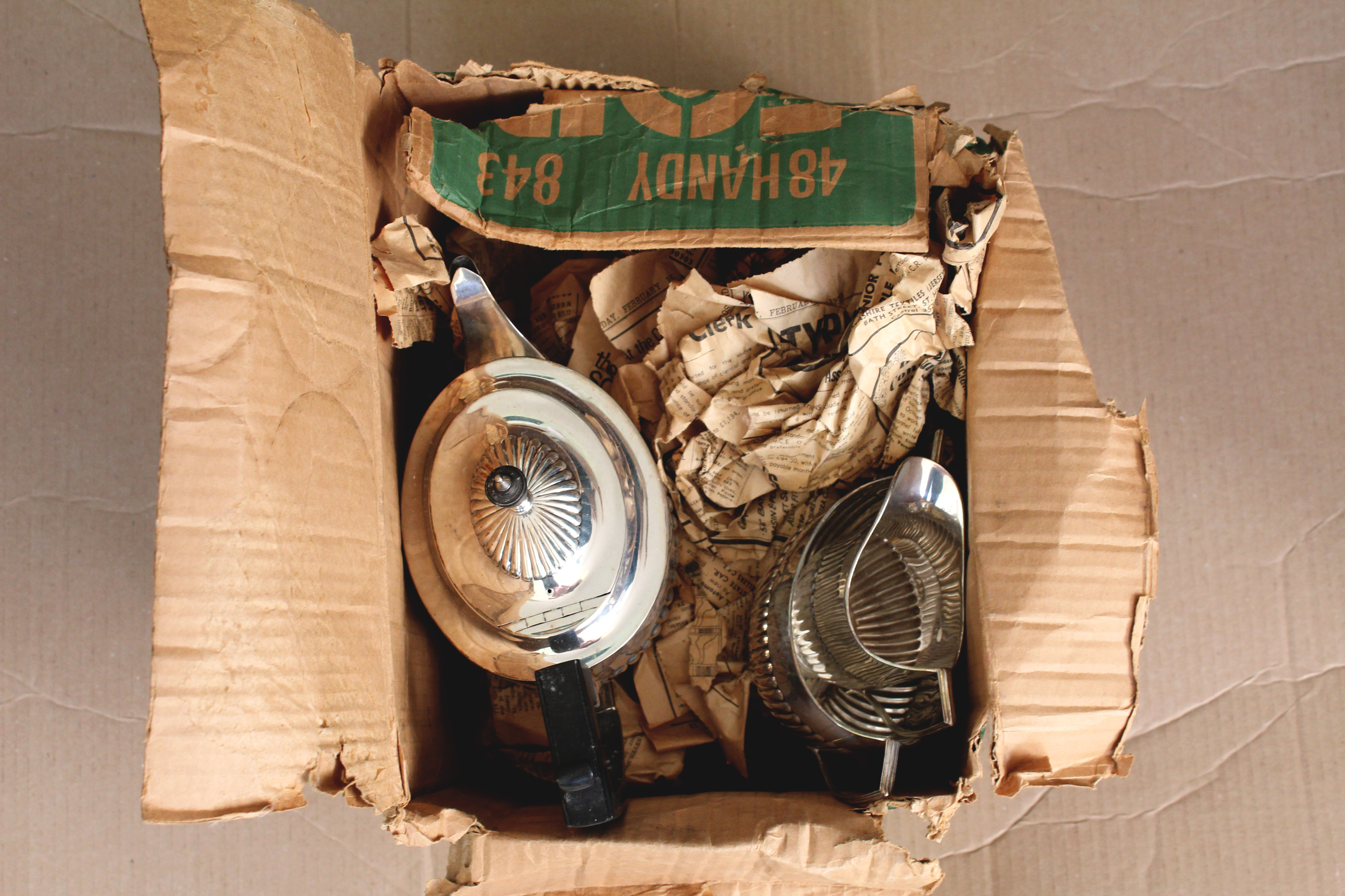
- The mirror in this image was owned by my grandma, the piano music is something which my grandad sent me in a letter when i was younger, and the newspaper background, which is seen in most of my images from this shoot, is newspaper dated back to Feburary 16th 1973 which i found in a box where my great great grandma’s silver tea set was kept.
- This is my favourite image from this shoot as it includes different aspects of my family that are important to me, combined together and shown in one image.
- It also links closely into Mari Mahr’s work using deeply personal objects and resoning behind her images.
Conceptual
- The reasoning behind this image is to show how an image containing conventional objects can have historic links and also personal ones and that there is more to an object the what meets the eye as there’s probably a story or personal connection to it.
- For example, in this image I used objects from past family members displayed together in one picture showing how what might just look like objects arranged in a certain way actually have personal and autobiographical meaning with stories behind them.


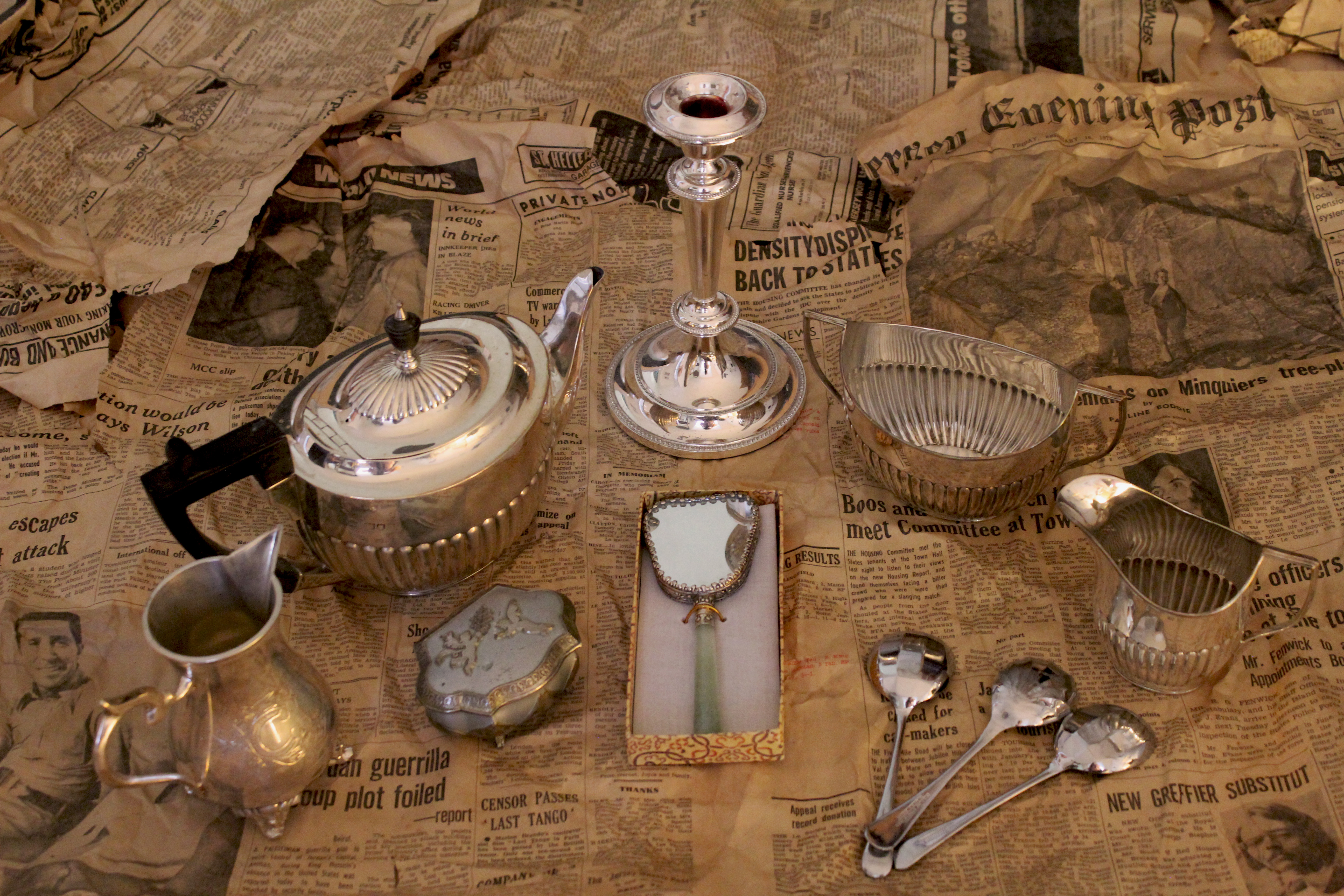
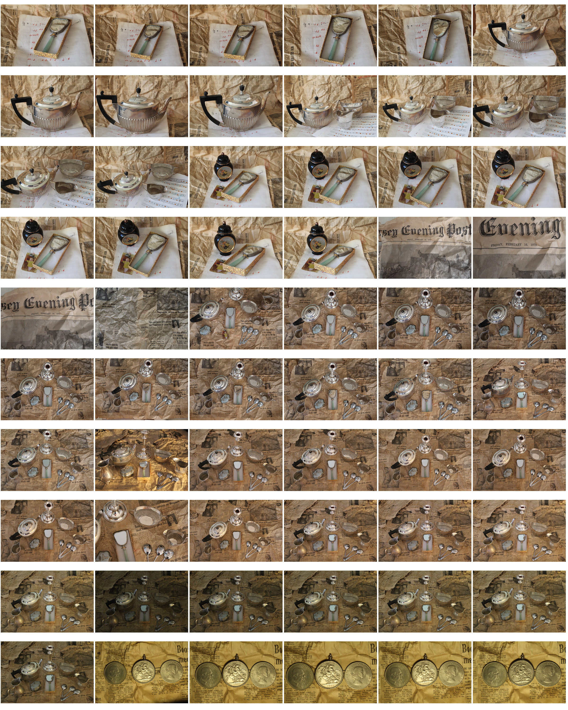
For this final image I displayed all the objects i had for this photoshoot together and arranged them in a symmetrical like layout. Most of the objects in this photoshoot were old silver conventional obects (tea pot, candle holder, teaspoons etc). In some of the images i included actual photographs, adding another element and layer to the image, making it more personal.
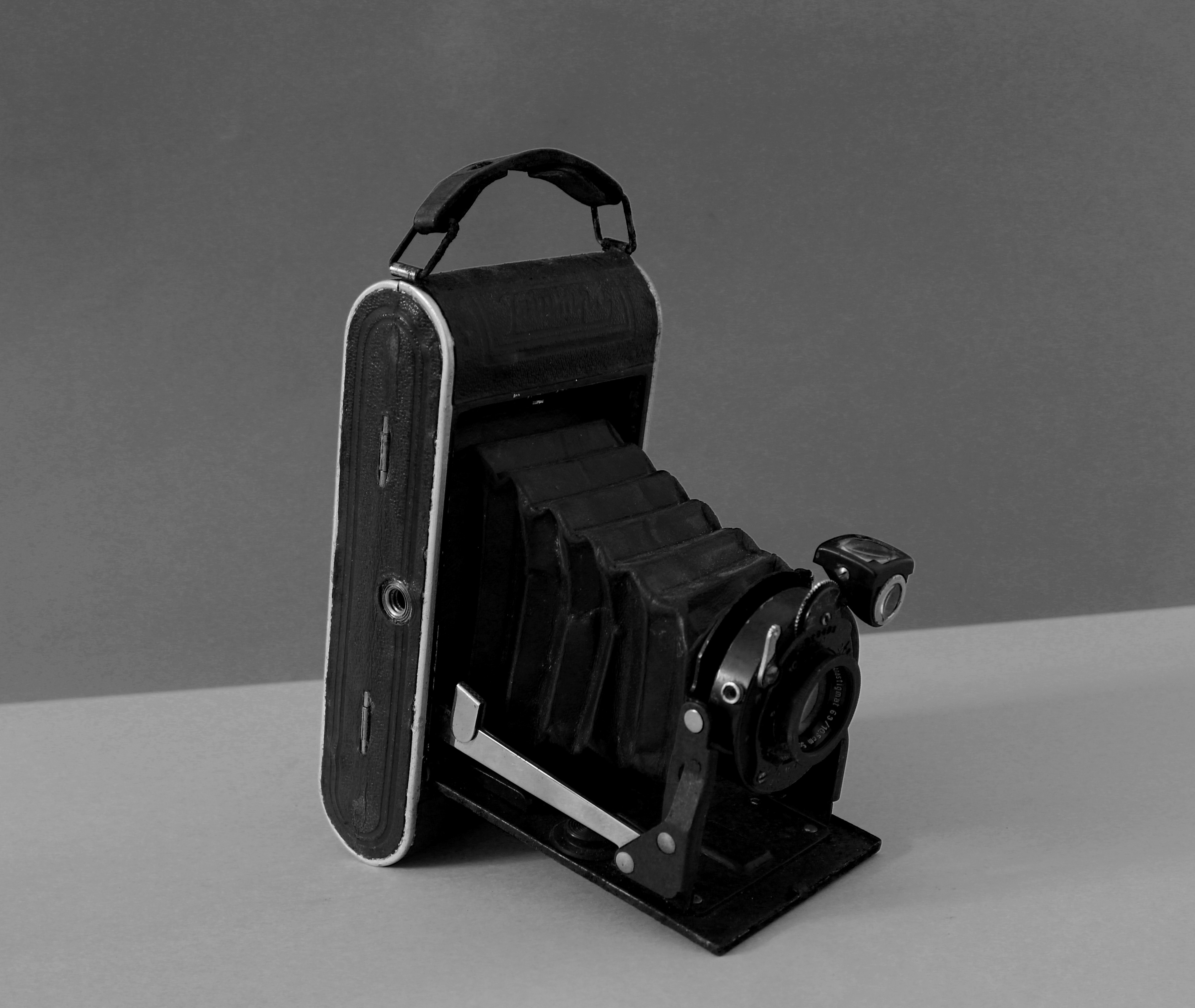
I chose the images i thought were most effective from the photoshoot and wanted to have them interpret Mari Mahr’s style of photography more, so i edited each one into black and white. I like the way these images turned out but think i prefer them edited in colour as they give off a more personal authentic feel with the warm undertones of the images. Although the images in black and white do give more emphasis to the small details in the images, like the creases and folds in the newspaper background and the shadows created, giving the image more texture and depth. The black and white also gives the images a more historic appearance like they were taken on a black and white camera at the time these obejcts were being used.
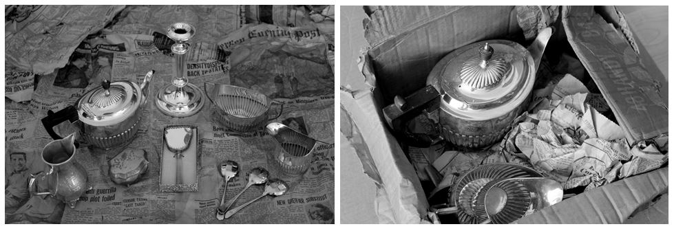
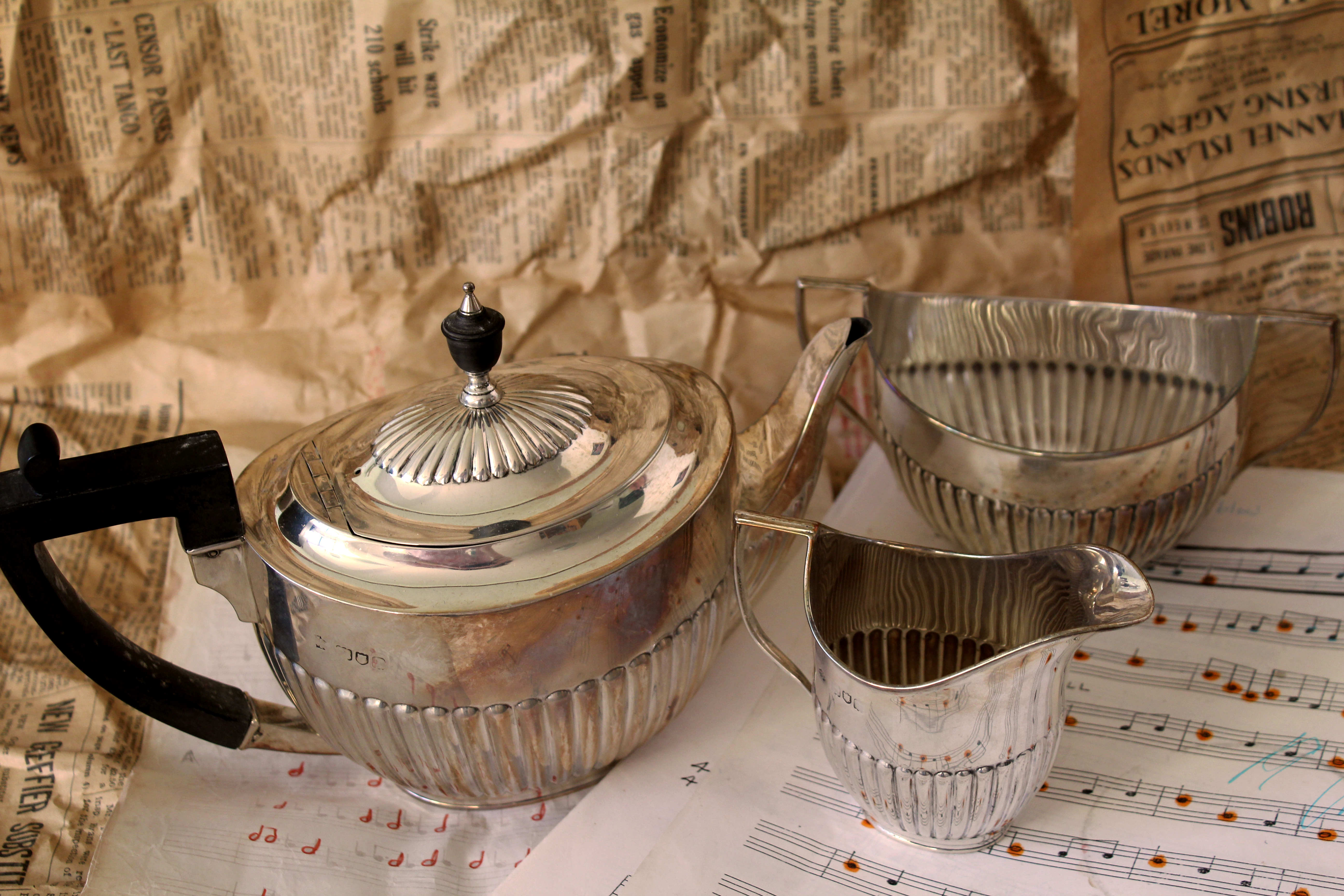
The tea set in this picture above was owned by my great great grandma and dates to 1896 (122 years old) so is late Victorian. The maker’s mark of ‘William Hutton & sons LTD’ is a London silversmith. The style is sometimes called ‘Queen Anne Style’ and is somewhat of a misnomer as the late Victorians reproduced the neo classical style of Georgian period with the tea set. It is also described as ‘half-fluted’ due to the decoration.
I decided to use this tea set owned by my great great grandma as it’s very personal and links into the work of Mari Mahr and how her work is deeply personal and autobiographical, yet addresses universal human concerns regarding where it is that each of us come from, and where it is that we each belong. It also interprets how she constructs her photographs from artefacts of her past life and that of her family.
In the second part of this photo shoot I took my great uncles camera and photographed it using a variety of backgrounds.
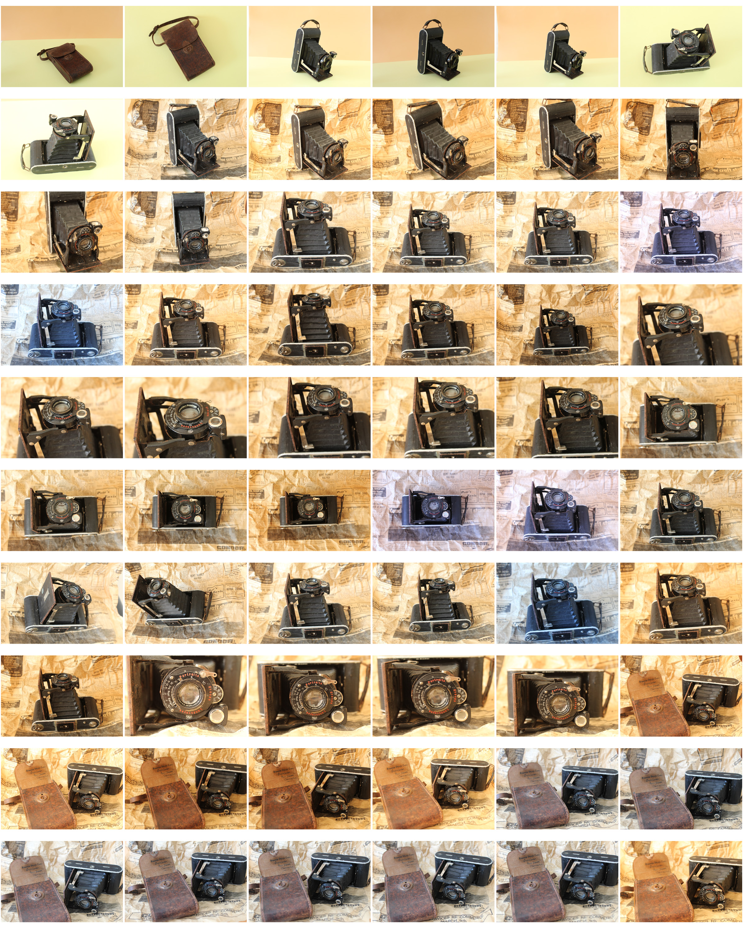
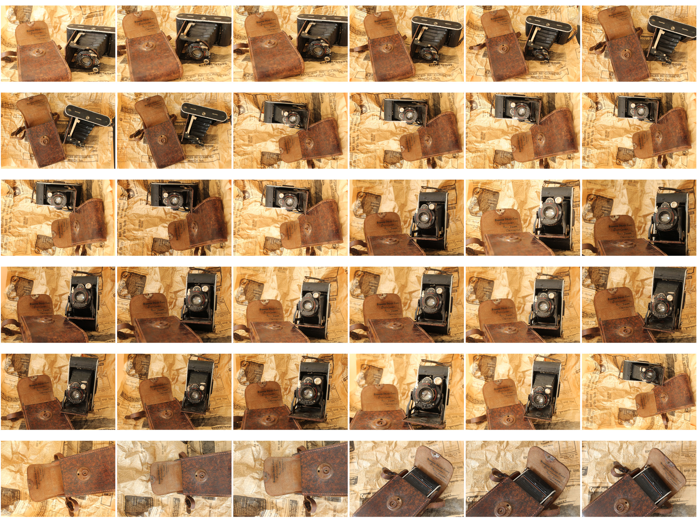
I decided to incorporate my great uncles camera into this photo shoot as it shows another aspect of my family, linking to Mari Mahr’s work again. I tried out two different backgrounds for this shoot, the same newpaper from 1973 used in the first part of this photo shoot, and solid coloured paper, creating a division horizontally through the center of my work. The image below is edited in black and white and has the background of two solid coloured pieces of paper. The different colours create lighter and darker tones in the background and emphasise the camera centered in the middle of the image.
I think this is a good continuation from my second photoshoot and shows how my ideas have developed over the two. In this photoshoot i included more aspects and layers to my images, adding backgrounds and multiple objects, rather than a black background, making the images look more natural and not staged.