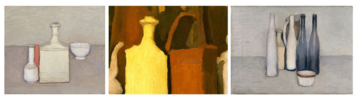
Starting point: taking inspiration from Mari Mahr i decided to interpret her work creating similar concepts. Her work is deeply personal and autobiographical so my plan was to take personal objects from my life and photograph them. This idea links into the theme of secrets and conventions: secrets as they are objects from my life and show history and conventions as some of the objects are domestic objects used around the house. I first gathered the objects which i have displayed below which i took in a studio setup with artificial lighting. I also wanted to take inspiration from the artist Giorgio Morandi in this photoshoot, incorporating object with simple backgrounds and to experiment using artificial lighting an natural lighting,
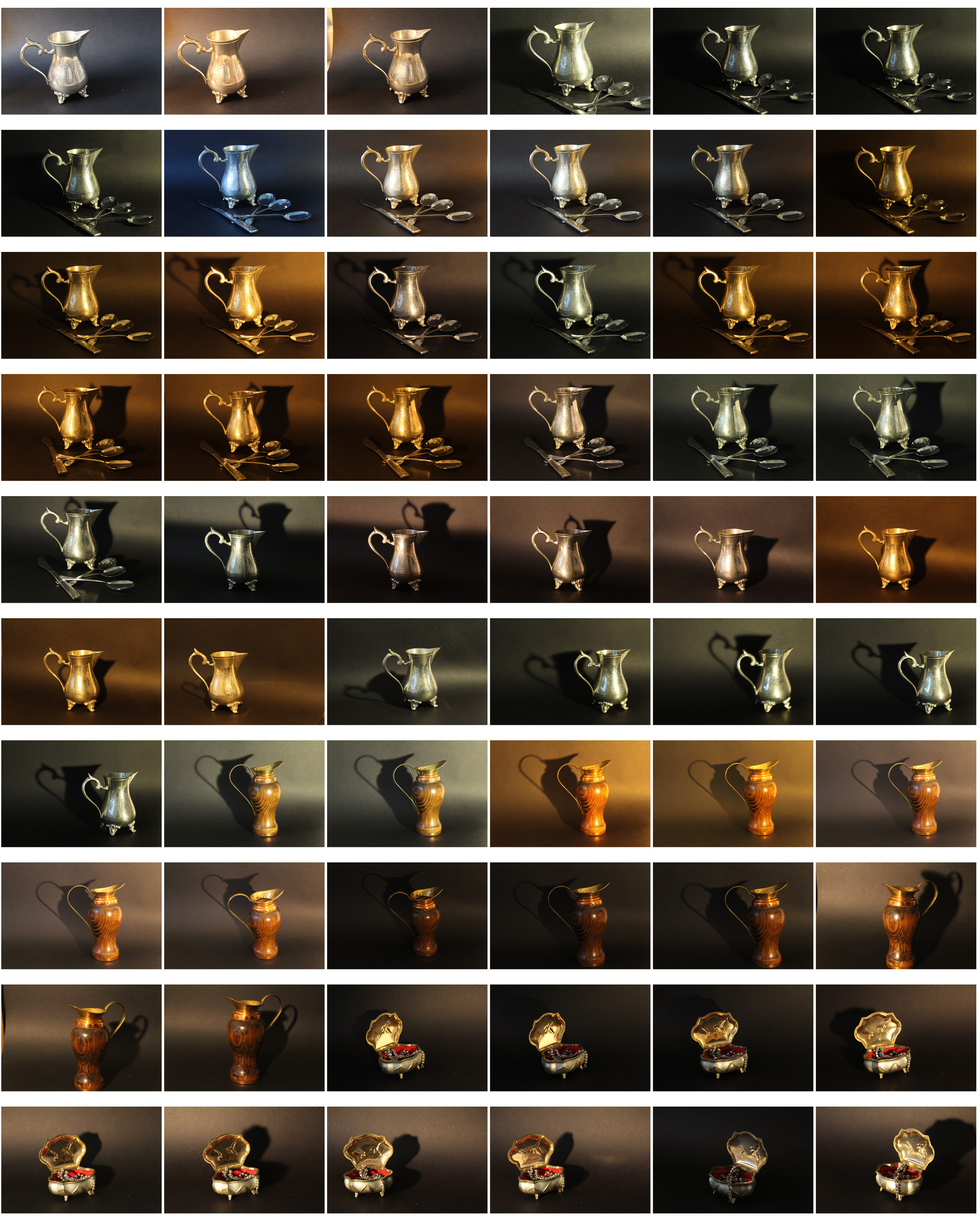
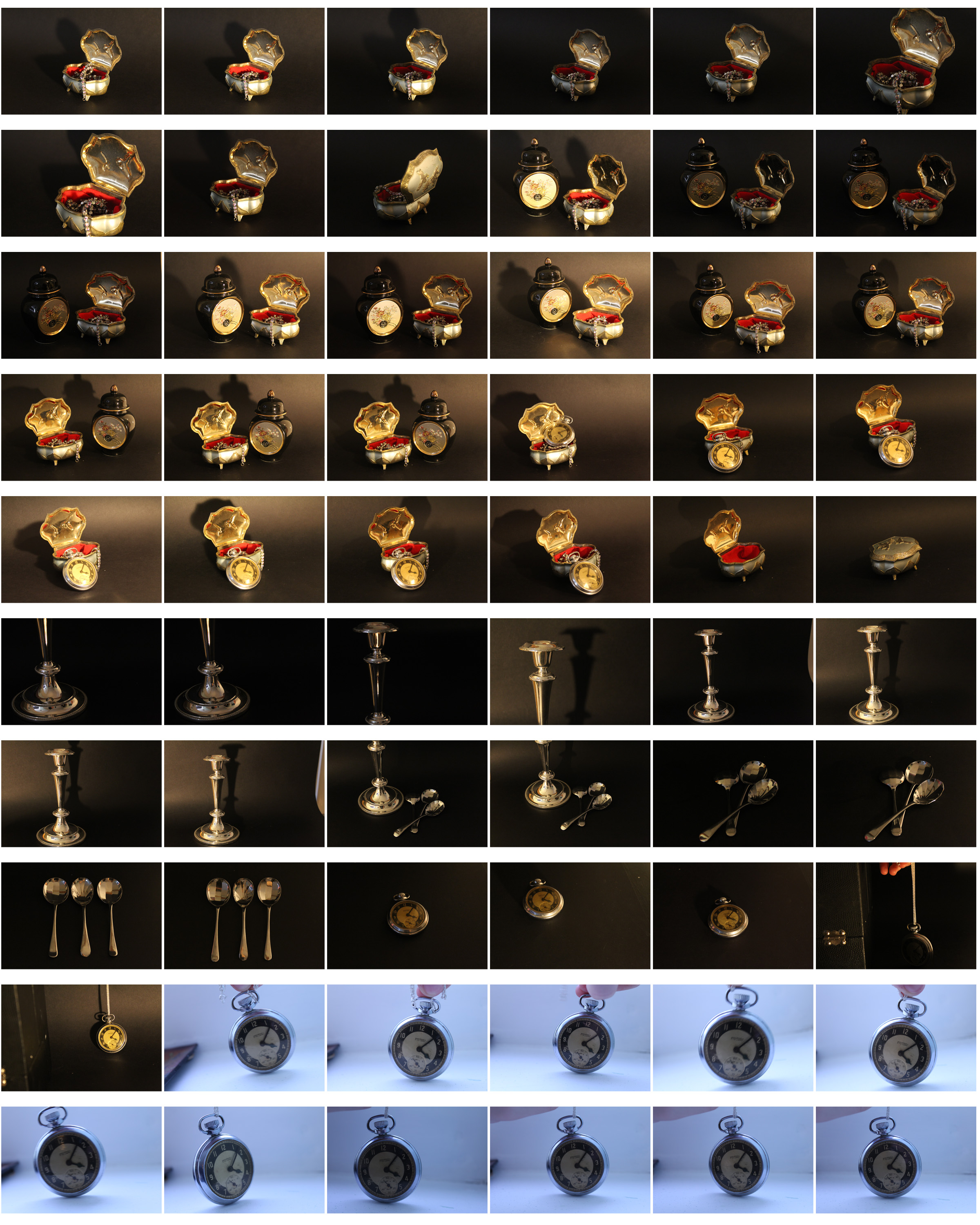
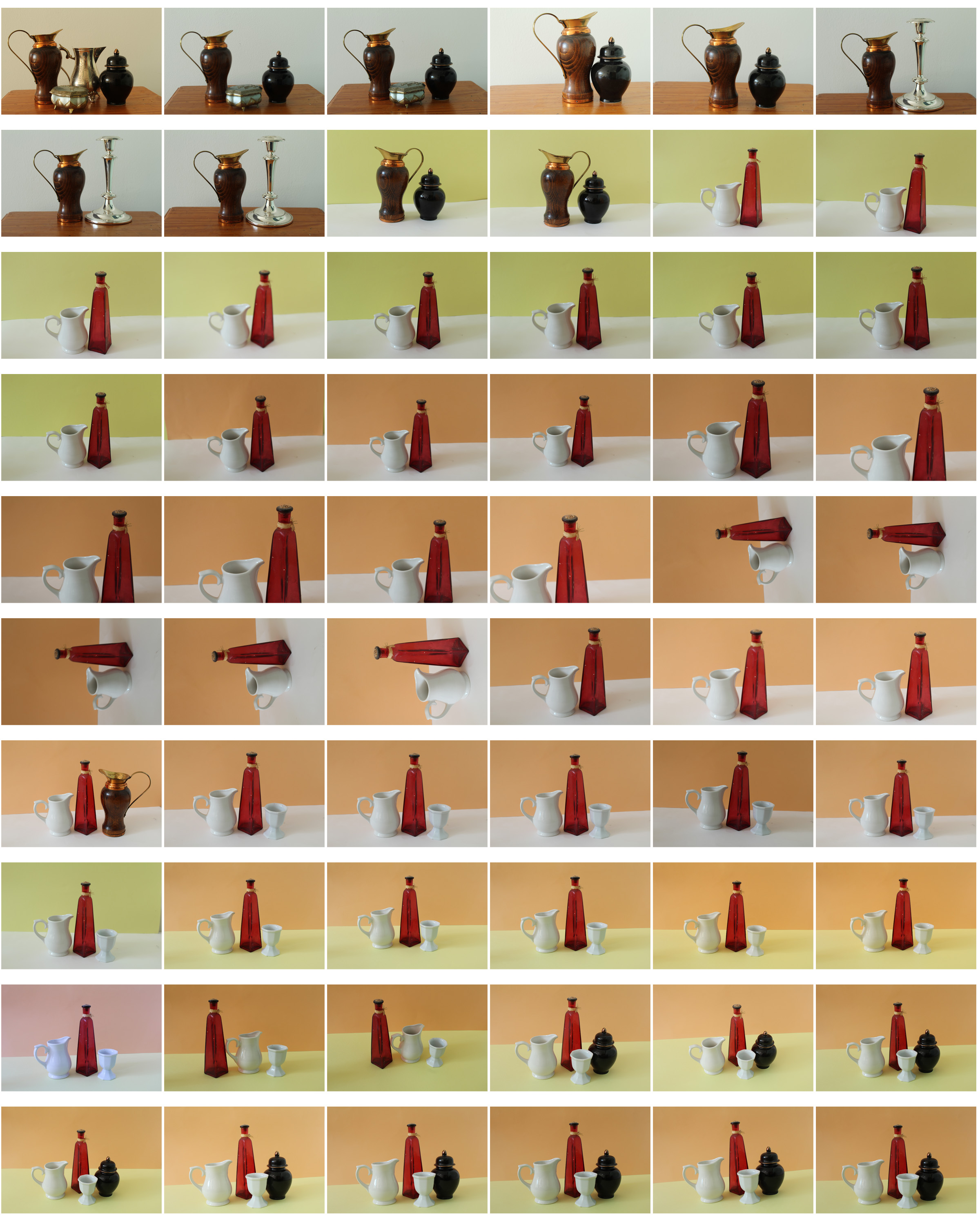
For this first part of the photoshoot I used artificial lighting with a plain black background for most of the photos. I used this to emphasise the tones and colours of the objects i was using. In some images I used single objects and focused emphasising that one objects, and for others I used multiple objects in a image (e.g silver cutlery, silver candle sticks, jewellery boxes, pocket watch).
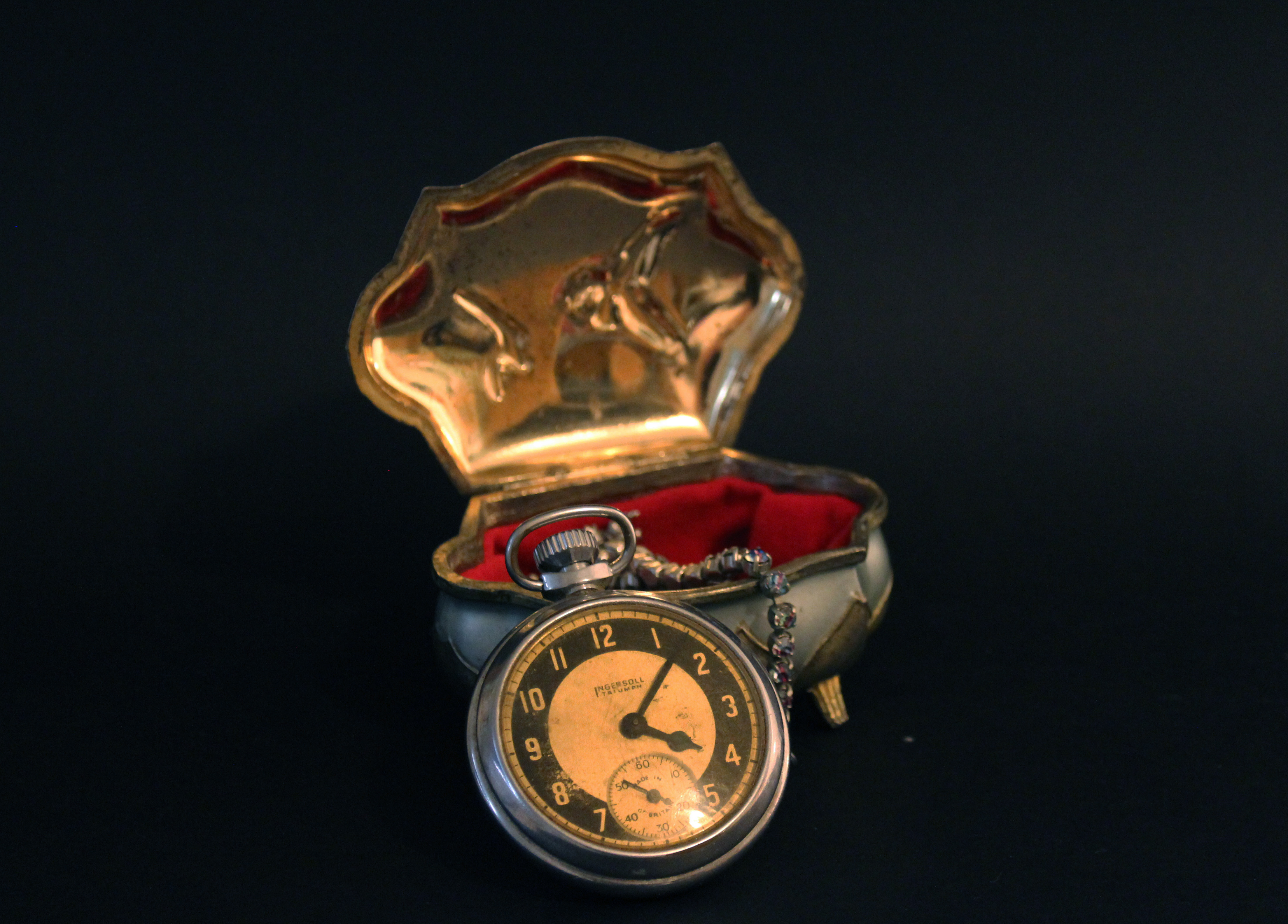
I like this image from the photoshoot as the reflection on the jewellery box from the lights creates gold and brown undertones making the objects look old and antique. The black background I created draw the attention to the objects centered in the middle of the image and creates negative space around it. To improve this image I would add a more interesting back drop to create a different aspect to my image. The reason i didn’t do this in this photoshoot is because Giorgio Morandi’s paintings all have simple block colour backgrounds and waned to incorporate that element in my photography. The difference being that I used a dark colour whereas Giorgio Morandi used lighter colours, but I think the black brings more emphasis the the gold tones than a white background would.
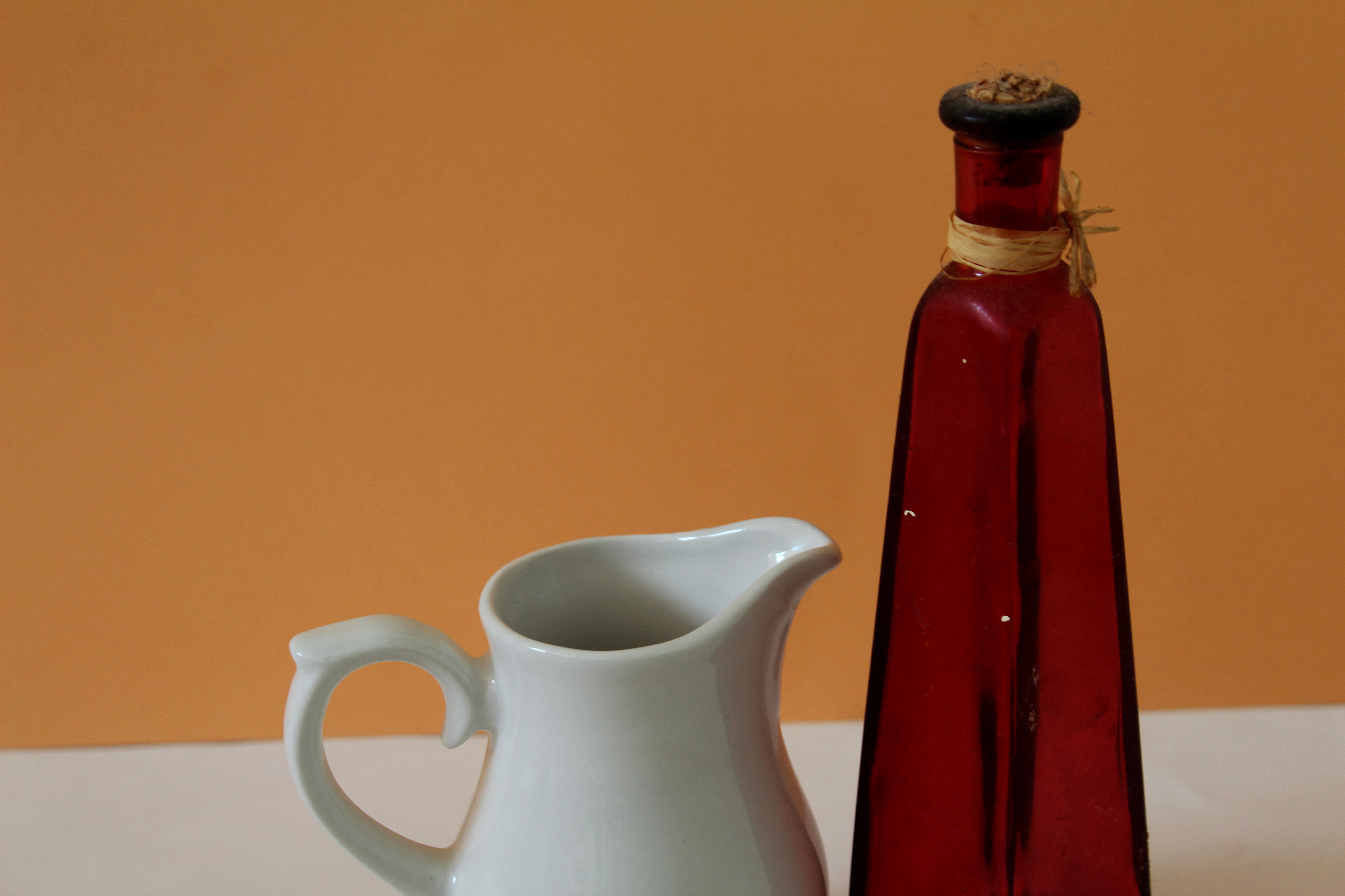
For the second part of this photoshoot i decided to interpret Giorgio Morandi using simple black colour backgrounds with multiple objects in the foreground. Everything in the image being neutral.I wanted to develop from the first part of my photoshoot by being in more neural colours to the background, rather than solid black. I used yellow, orange and white backdrops to see the comparison. I prefer the lighter backdrop as it gives the images a more natural look and makes the images seem less manipulated. I also used natural lighting in this part of the photoshoot to compare to the artificial lighting and found I prefer the natural as it looks less intense and more like Giorgio Morandi’ paintings.
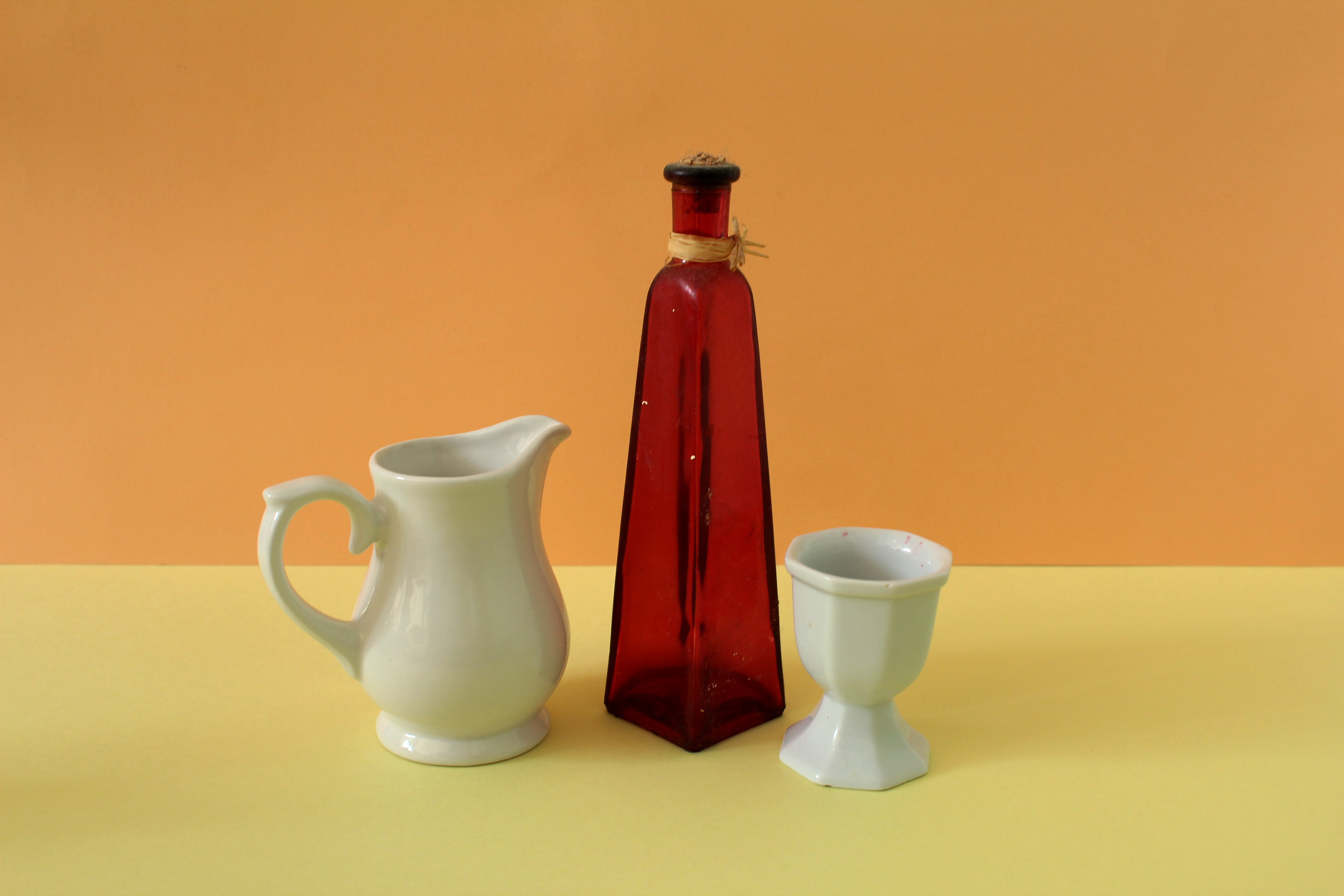
I prefer my second part of this photoshoot as it looks at a more abstract approach, using bold colours. I used to different coloured card for each image creating a division in the middle of the image like Giorgio Morandi did in his painting. For this image i decided to use a orange and yellow background as i thought it contrasted with the red vase in the center of the image in an aesthetically pleasing way. The lighting used in this image is artificial so the whole of the image is lit up, rather than a certain section where the natural light in coming from. Using artificial lighting helped me emphasise the bright colours within the image. I think i successfully recreated Giorgio Morandi’s painting style in a photograph, which is influential for its close study of unremarkable elements of daily life, imbuing them with implications of deeper significance by emphasizing their painterly beauty and simplicity. He normally displays multiple domestic objects on a table or surface, normally having a horizontal line through the middle creating a division.