Final Images


Presentation Method
For the following images I chose a simple framing method; this is mainly because I feel like the images are rather complex and I think a complicated display would only harm the photographs as the viewer would be too distracted.
I bought 3 simple glass frames with a black outline; I found out that the images were too small for the frames alone so I decided to make borders in order to fill the empty space. I experimented with different sizes and colours before I then cut out 2 white borders (for the A4 prints) and 1 black border (for the A3 print).
Evaluation & Critique
Overall I am rather happy with the final outcome and how everything tied together; during this project I explored a variety of different landscapes (both man made and naturally occurring) but settled with a self made landscape.
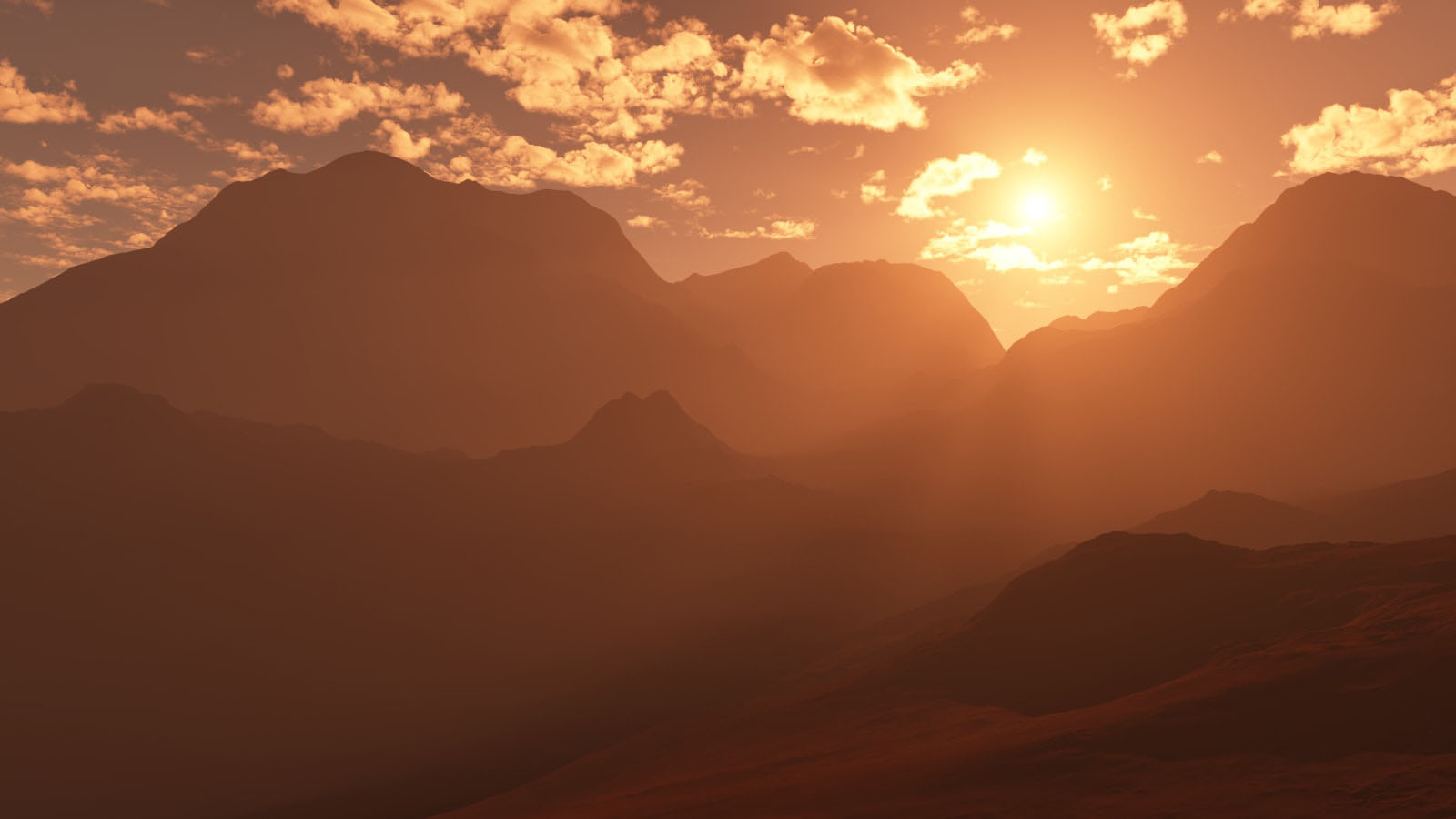
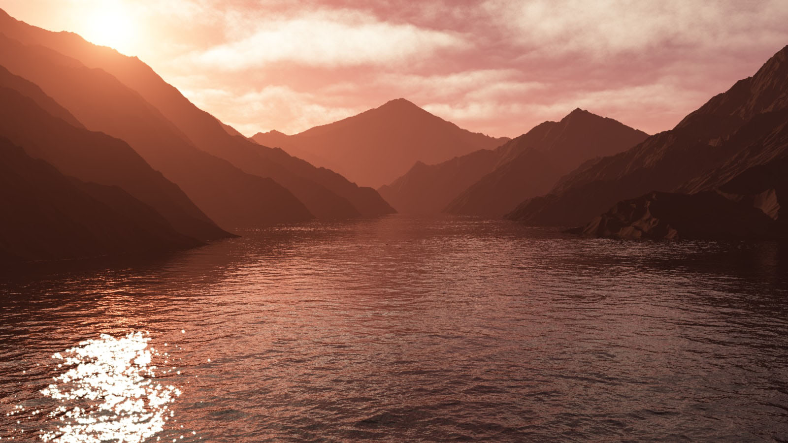
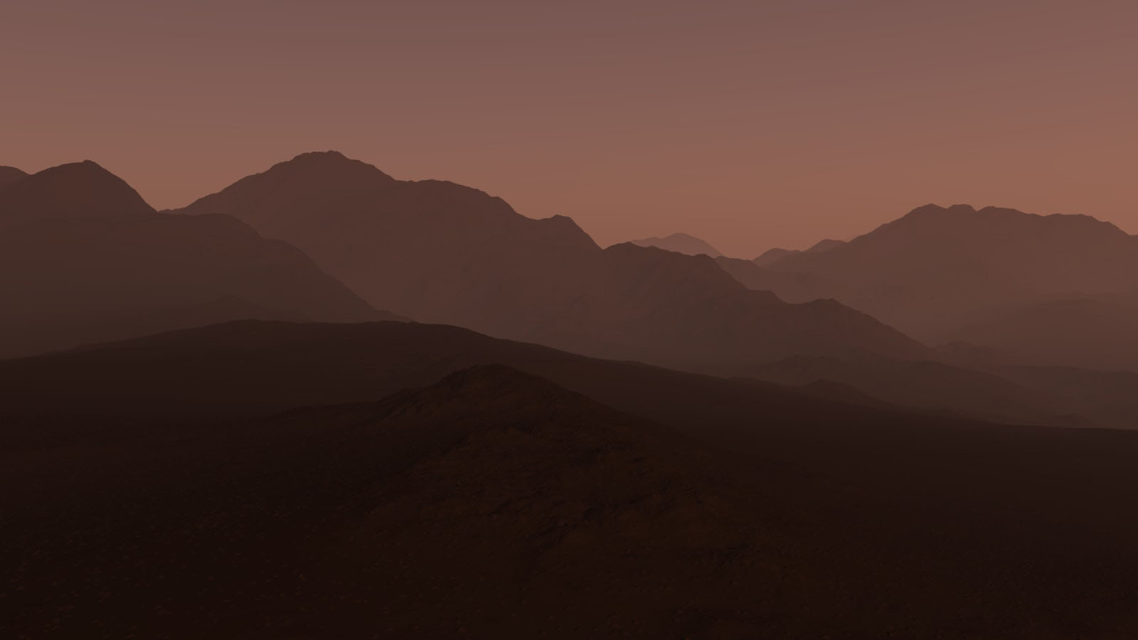
I liked the control I had over the geo-mapped landscapes; I could alter every last detail which wouldn’t be possible in a real life situation. Due to this i’m rather pleased with the photographs. The first image has a warm, morning atmosphere, the main focus of the image is the sun in the middle left. The second image has more pink undertones which give it a more surreal feel. The last photographs contains more purples which results in a colder, evening perception.
The lighting would have been natural if the photographs were of real landscapes, otherwise it’s technically artificial as it came from a fake source designed to act like the sun. Since most of the images are in focus, it is safe to assume a small aperture was used (f/20+) and the shutter speed was a little longer than usual to help capture the detail. Visually, the images are appealing to the eye – there’s a distribution of tone and texture throughout each photograph. In addition to this, the first image follows the Rule Of Thirds (a point of focus is found within 1/3 of the photograph) which contributes to its success. The photos are all shown to be taken from the viewpoint of someone standing below the mountain scenery – which further contributes to the appeal of the pictures.
Critically speaking, the photographs feel detached from reality; they seem too perfect to exist. Maybe this idea of creating a landscape that’s perfect ruins the concept of capturing nature (which, most of the time, is not perfect). Although I enjoyed making these surreal landscapes, it also allowed me to understand Landscapes more deeply and even aided me in obtaining a new view.
