The Editing Process

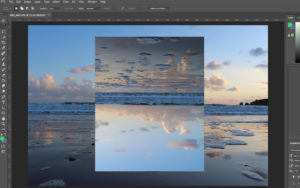
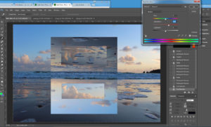
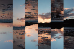
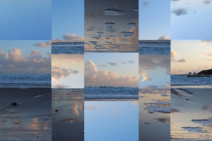
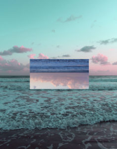
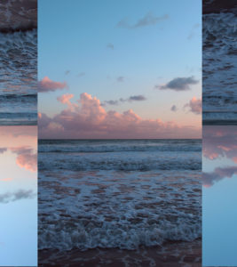
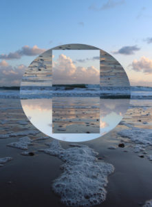
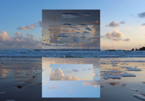
The first thing that I did when I began the editing process was selected the area of the image that Iwanted to flip upsdedown. To do this I first went a selected the rectangle Marquee Tool as this gave me the most freedom when deicing how big I wanted the area to be.

I then went into Edit – Transform – Roate 180 degrees. 

Then wanted to edit then image further to create another reflection within the image. To do this I repeated the process but with a smaller section of the image being selected.

The lastly Iwent and increased the vibrancy, saturation and contrast of the image only very slight as i felt that the image already was very strong colour and contrast wise. I felt as this step was necessary as I wanted this shoot to incorporate elements of the Romanticism genre  buy increasing the levels of all of factors, it has helped the imahge to fall into the category.

Compare and Contrast: Thye Reading

Tyhe Reading Geometric Landscape image which inspired my shoot
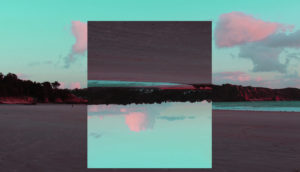
My response to Tyhe’s Image

Overall I think that mine and Cody’s image are very similar in looks and technical skill. When I first began to look at Cody’s images, I noticed that he would only edit his image with a triangle ontop  and no other shape which I didnt like. So I decided that I would stick to only a square/rectangle to edit my image,  The foreground of Cody’s image is very busy with crashing waves, which is one thing that I wanted to make sure I didn’t have in my images as i found it to be very distracting and I wanted the main focus of my image to be the section which has been rotated an]s otherwise the image would have been to busy. One thing that I made sure was the same when I began to edit this image was that when the image was rotated was the the land is the section that had been roasted was inline with the rest of the image.

John Divola – Isolated House’s

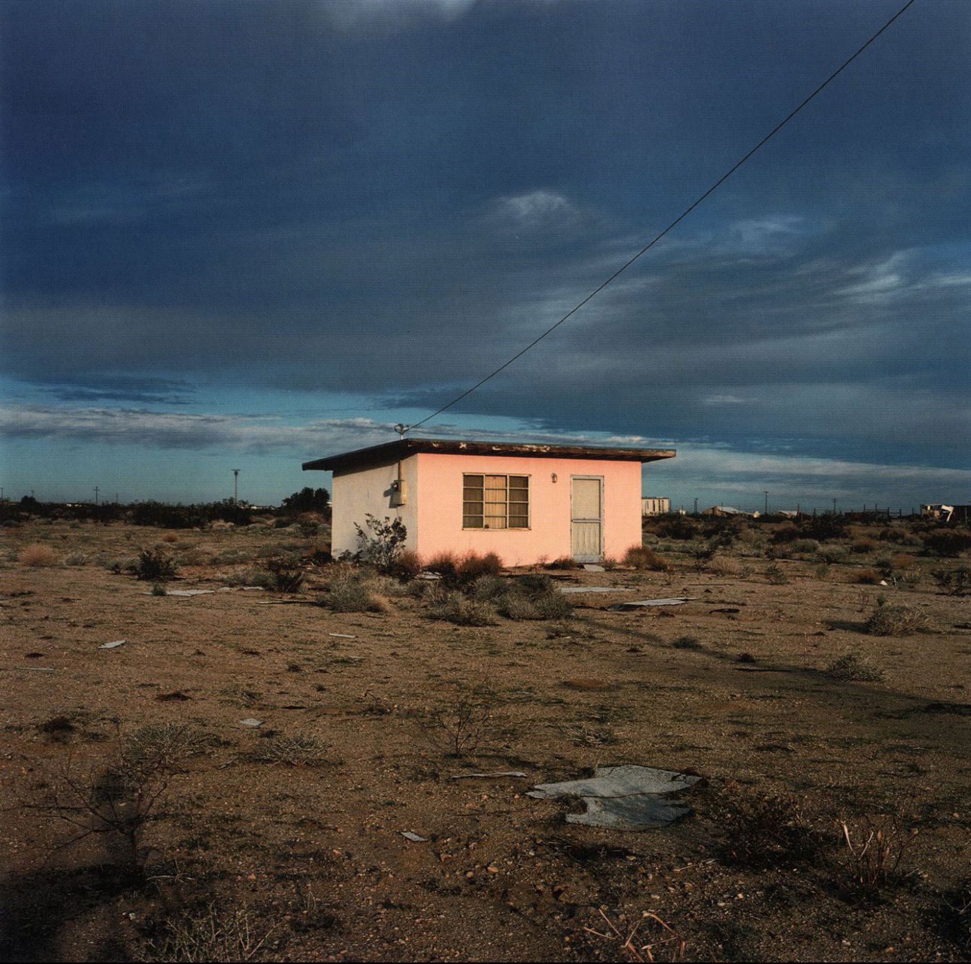
Following on from Johnny Joo, I came across John Divola who is a contemporary visual artist. He currently lives and works in Riverside, CA. Divola works in photography, describing himself as exploring the landscape by looking for the edge between the abstract and the specific. I decided to focus in on the isolated houses book by him, originally released in 2000, as it gives a sense of humanity’s wastefulness which links to Johnny Joo’s work.

I believe this style of work links to the theme of secrecy and hidden identity as it would appear the owners are trying to escape all aspects of civilization and be on their own in their own world.

Image result for john divola isolated housesImage result for john divola isolated housesImage result for john divola isolated houses

Despite the fact these images are rather raw, with little editing, i believe they are effective due to the simplicity of them and the conceptual ideas and meanings behind the images. I think that I can create some interesting images in this style with the use of varying camera settings and editing techniques.

Image result for instagram michael steric

This is an image taken by Micheal Steric, a famous Instagram user. It portrays some very similar connotations to which Divola’s work does however, Micheal Steric has insured to give his audience a more aesthetically pleasing image to visualize by using a series of editing techniques to make it as if the building is on fire and is surrounded by an unusual green glow. This links to both of my views on altered landscapes in the way that the photo has been altered digitally by the photographer but also the way the subject within the photo has been altered by humans and natural disasters. The vibrancy within this image helps to captivate the audience and ensure they appreciate and acknowledge the wastefulness in which humanity evokes.


THE NEW TOPOGRAPHICS

What Is The New Topographics?

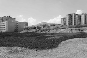
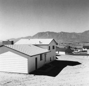
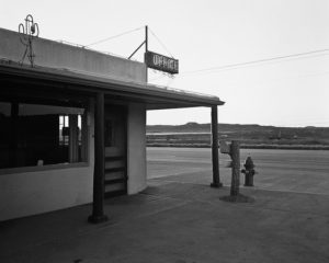
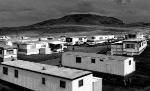
It was a term brought around by William Jenkins in 1975, this term ‘The New Topographics’ described a group of American Photographers whose photographs had a similar aesthetic, as they were formal, mainly black and white and of the urban landscape. The main photographers that are associated with the new topographics are: Robert Adams, Lewis Baltz, Nicholas Nixon, John Scott, Stephen Shore and Henry Wessel.

These photographers focused on urban and altered lanscapes that were fixed with man made structures and buildings such as suburban housing, warehouses and parking lots set or barren bare areas of land. These structures gave the areas a open and industrial feel whilst making the alteration the main focus of the pieces. This work was a response to the growing unease about how the natural landscape was being impacted by the industrial development happening in America at the time.

Here are some examples of the new topographics’ work…

From the work that makes up The New Topographics I hope to display the idea of the contrast between natural and urban landscapes in my own work.

Preparation For Mock Exam

Mood Board

Image result for romanticism photographyImage result for romanticism photographyImage result for romanticism photographyImage result for romanticism photographyImage result for romanticism photographyImage result for romanticism photography

Brainstorming

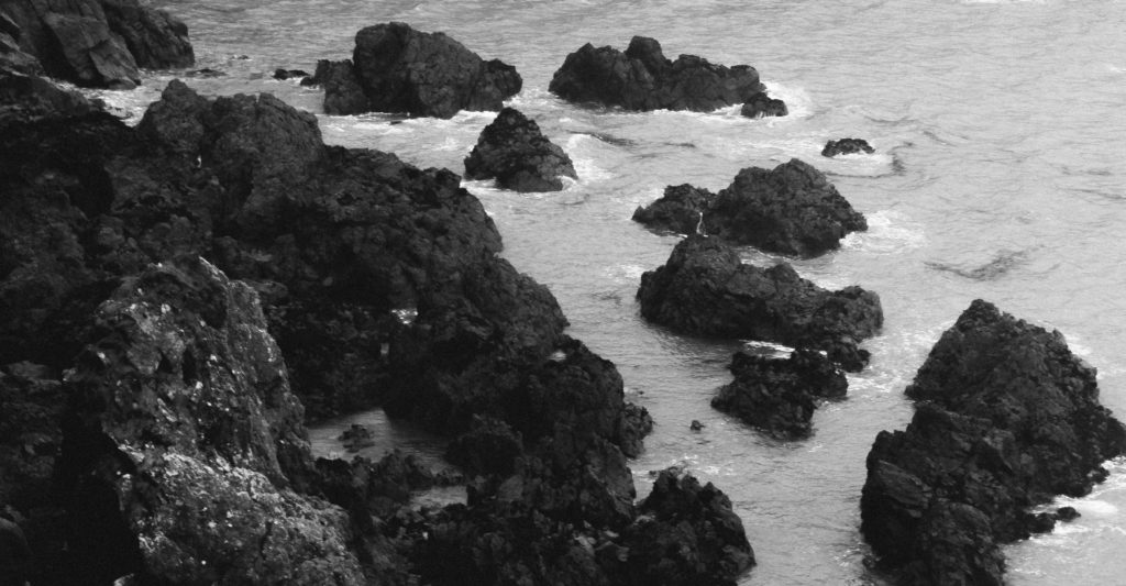
For my final photographs I want to produce pictures of natural landscapes with a moody, dramatic feeling to them.

  • Sunset
  • Cloudy
  • Storm
  • Beach
    • Devils Hole
    • St Ouens
    • Greve De Lecq
    • Gorey
  • Rocks
  • Trees
  • Cliffs
  • Hills
  • High contrast
  • Dark image

Ansel Adams

Ansel Adams (1902 – 1984) was an American photographer and environmentalist. His photos of the American West are often seen on calendars, photos and books.  Adams founded the photography group ‘Group f/64’. He was part of the romanticism movement and produced lots of striking landscape photographs in black and white, often involving a pathway of some sort and interesting weather.

Image result for ansel adams

Image result for ansel adams

My Favourite Photograph

Image result for ansel adams

This photograph was taken using natural daylight with the clouds blocking the harsh sun from the camera, resulting in dramatic contrast between the mountains and the river being brought into the photograph. It appears that a wide angle lens was used to take this photograph as this is what was typically used by the romantics to capture landscape photographs. It looks like a deep depth of field was used as the whole of the photograph is sharp and in focus. A shutter speed of 1/60 – 1/150 was possibly used for this photograph due to no motion blurs being in the photograph. A low/medium ISO appears to have been used as the photograph is not grainy and is quite dark, which will have been intended. There is lots of texture in the photograph, from the grassy bank to the flowing river. It seems to be quite a cold and isolated photograph as there are no signs of civilization around.

There is no colour in this photograph, which allows the viewer to focus on the range of tones, textures and shapes in the photograph rather than the colour. There is a wide tonal range in the photograph ranging from the dark silhouettes of the mountains to the white reflection of the river. It is quite a 3D photograph due to the trees in the foreground and the river running throughout the photograph, leading the viewers eyes from the trees in the foreground all the way to the mountains in the background. There is no rule of thirds used in this photograph, to me this is because Adams is trying to show that it is natural and nothing is set up.

Adams was a big part of the romantic movement in the late 1700’s, typically the romantics would photograph striking black and white landscapes with the idea that there is a deeper meaning than what appears behind everything. Romanticism was a rejection of the Enlightenment movement which took emotion out of writing and art, Romanticism wanted to challenge this by depicting emotions such as horror and untamed nature.

I think that in this photograph, Adams was trying to emphasise the natural beauty of the environment and to show that no editing was needed on the image, it is as it appears. He is trying to challenge the Enlightenment movement by doing this.

My Photographs

Top 5/Edits
My Favourite Photograph

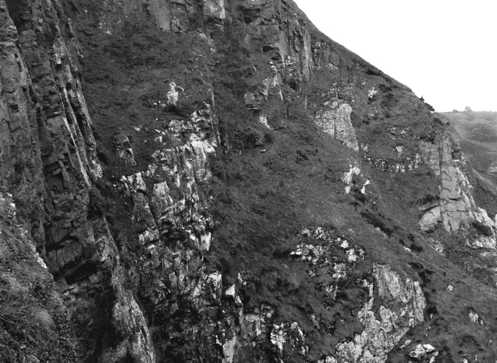
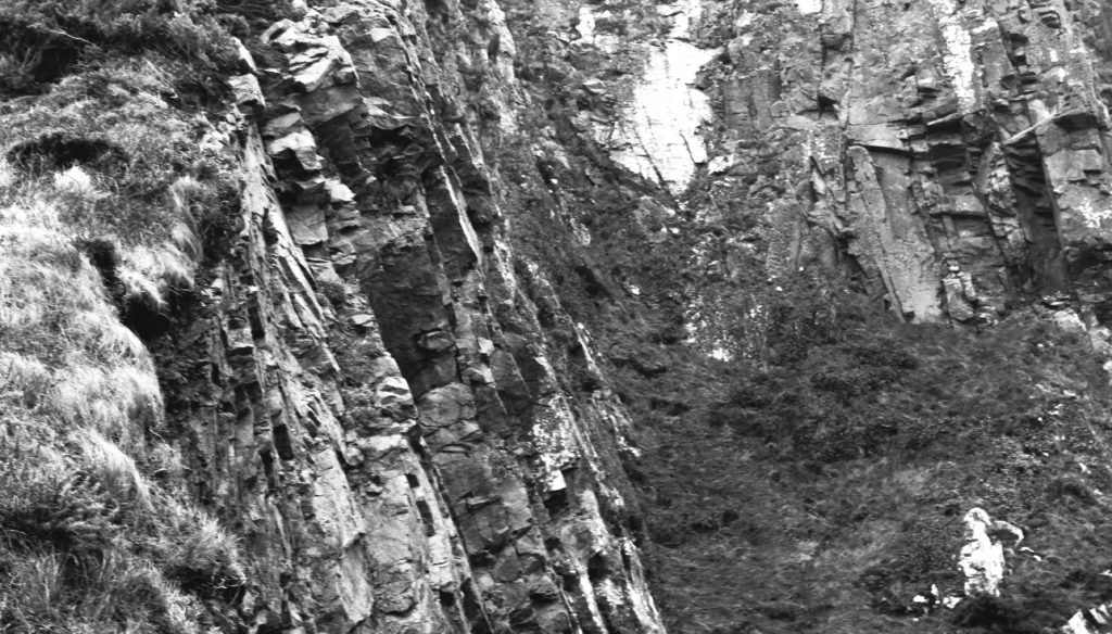
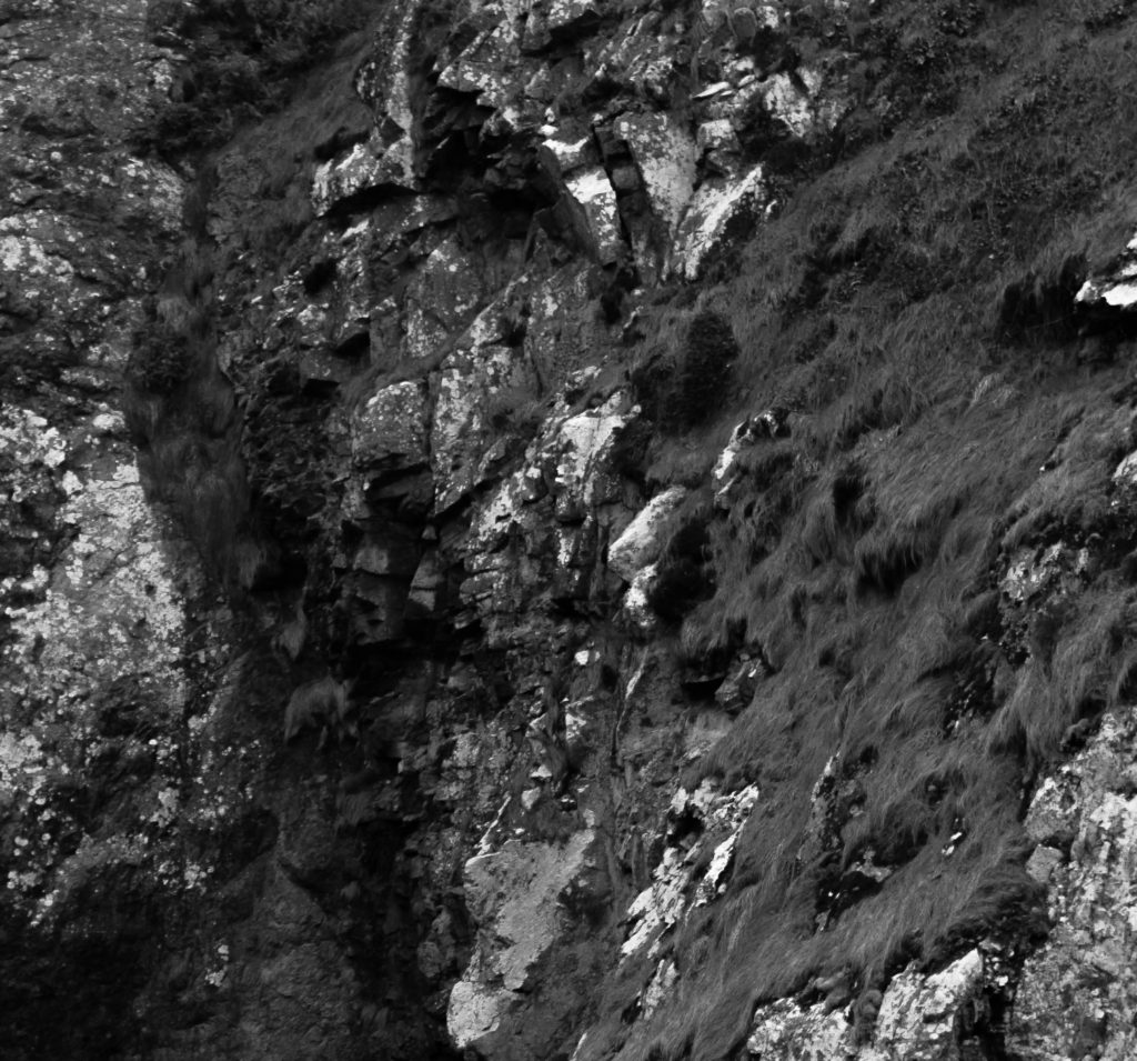
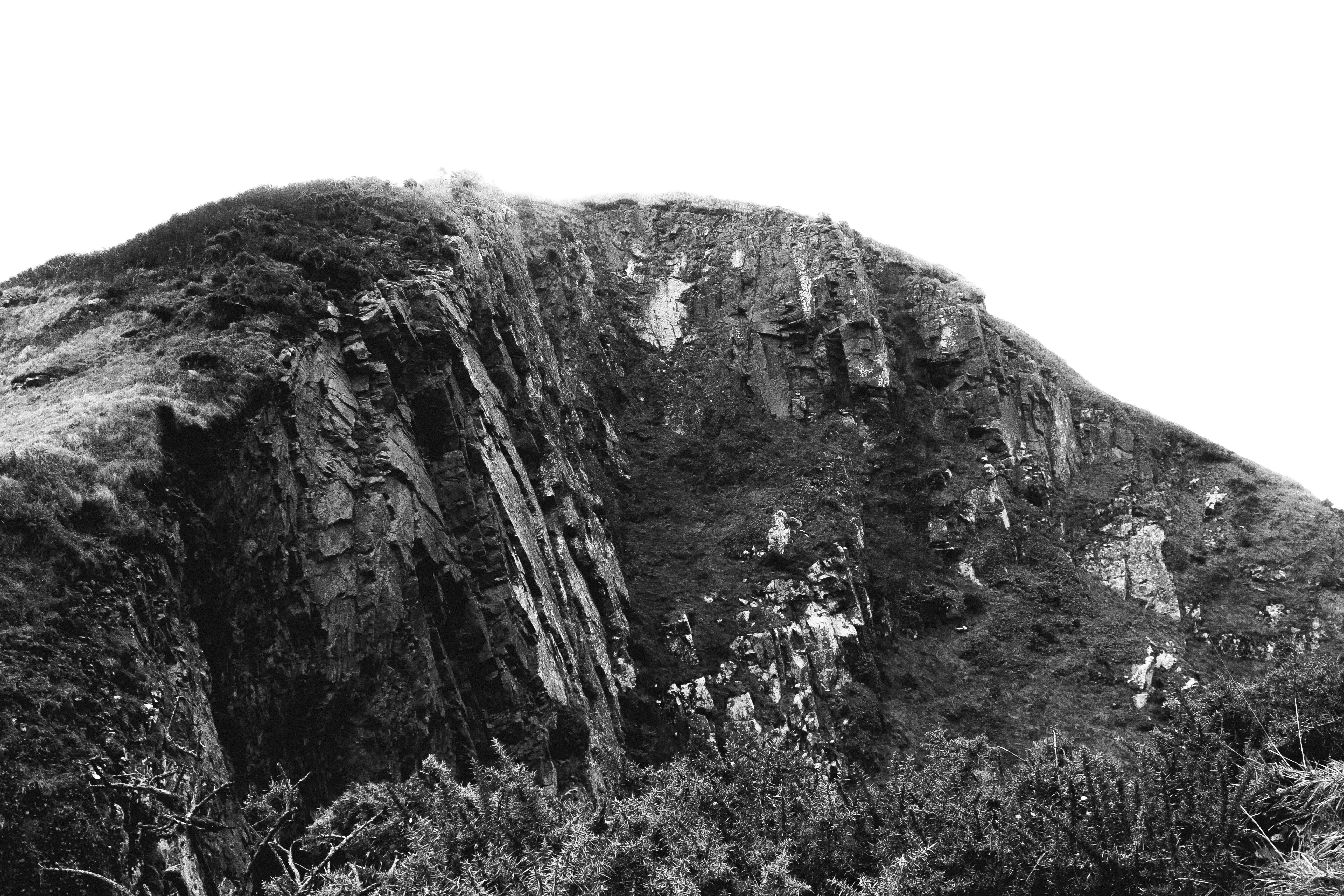
In this photograph I used natural lighting which allowed contrast between the correctly exposed cliff face and the over-exposed sky. This created a very wide tonal range in the photograph. An aperture of 18 was used which allowed the whole of the photograph to be in focus. I used a shutter speed of 1/40 with an ISO of 100 to create a photograph with the highest quality possible. There is a slightly cold undertone in the photograph due to the white balance.

There is no colour in this photograph as it is in the style of the romantics – the lack of colour helps to bring our more contrast and a wider tonal range in the photograph. The texture of the cliff face can be clearly seen which creates a more interesting photograph. There is a slight 3D effect in the photograph due t the shapes and depth within the cliff face.

I took this photograph at Devils Hole. I chose this as the location as it has a rich history and has lots of interest cliff faces surrounding it. I tried to create and edit this photograph in the style of the Romantics in the sense that it is black and white, has dramatic contrast in it and shows only nature. This photograph is similar to the work of Ansel Adams in the sense that it shows the untouched nature in a black and white photograph with lots of shapes and edges within it. My photographs do not have as much contrast and definition in them as Adams’ does but there is clear inspiration from him in my photographs.

Altered Lanscapes Photo Shoot

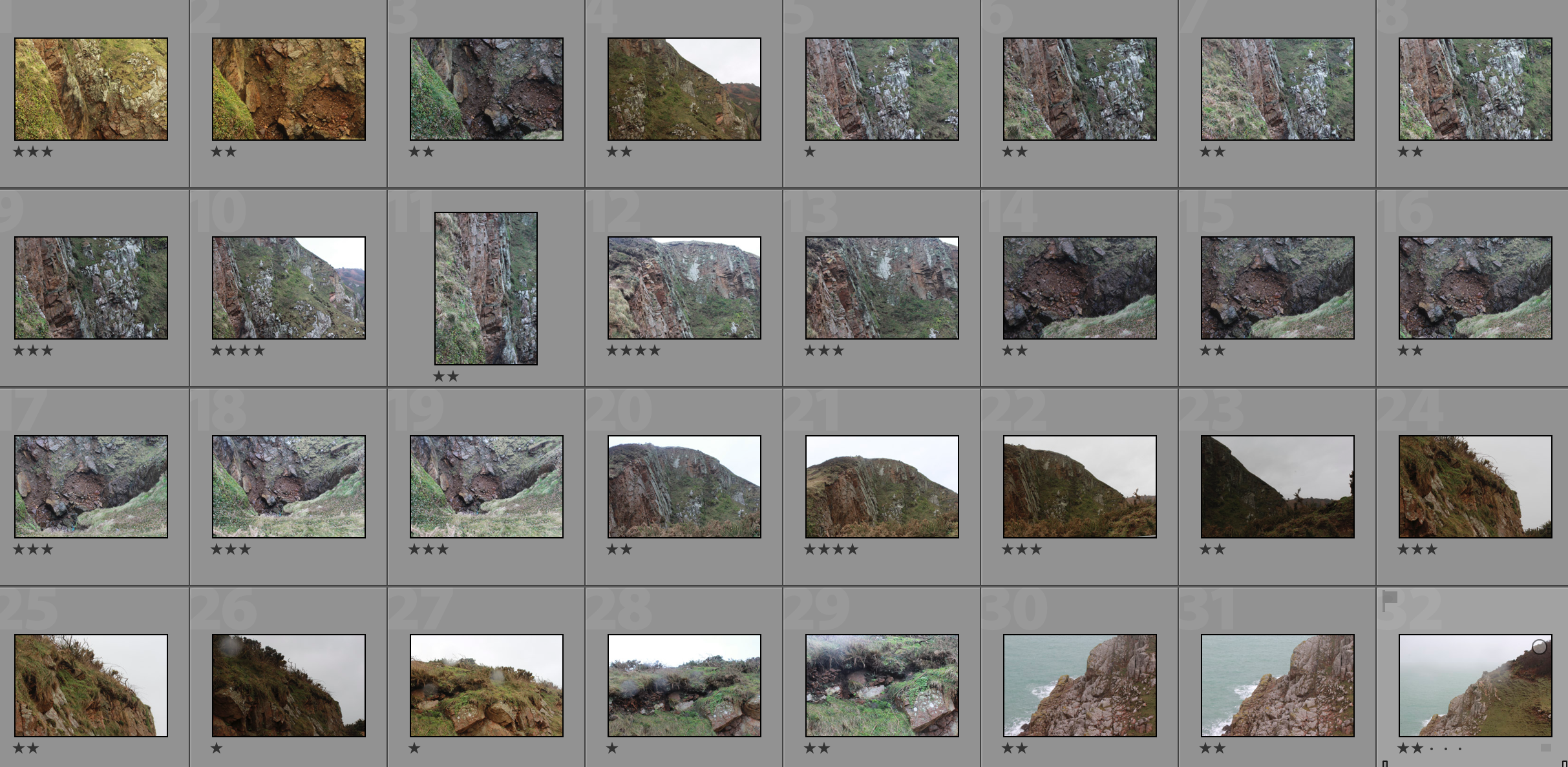
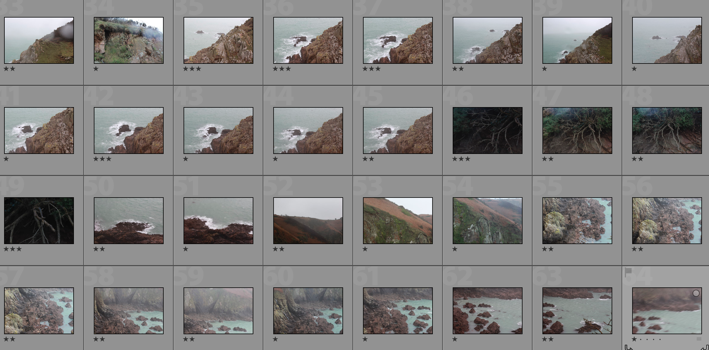
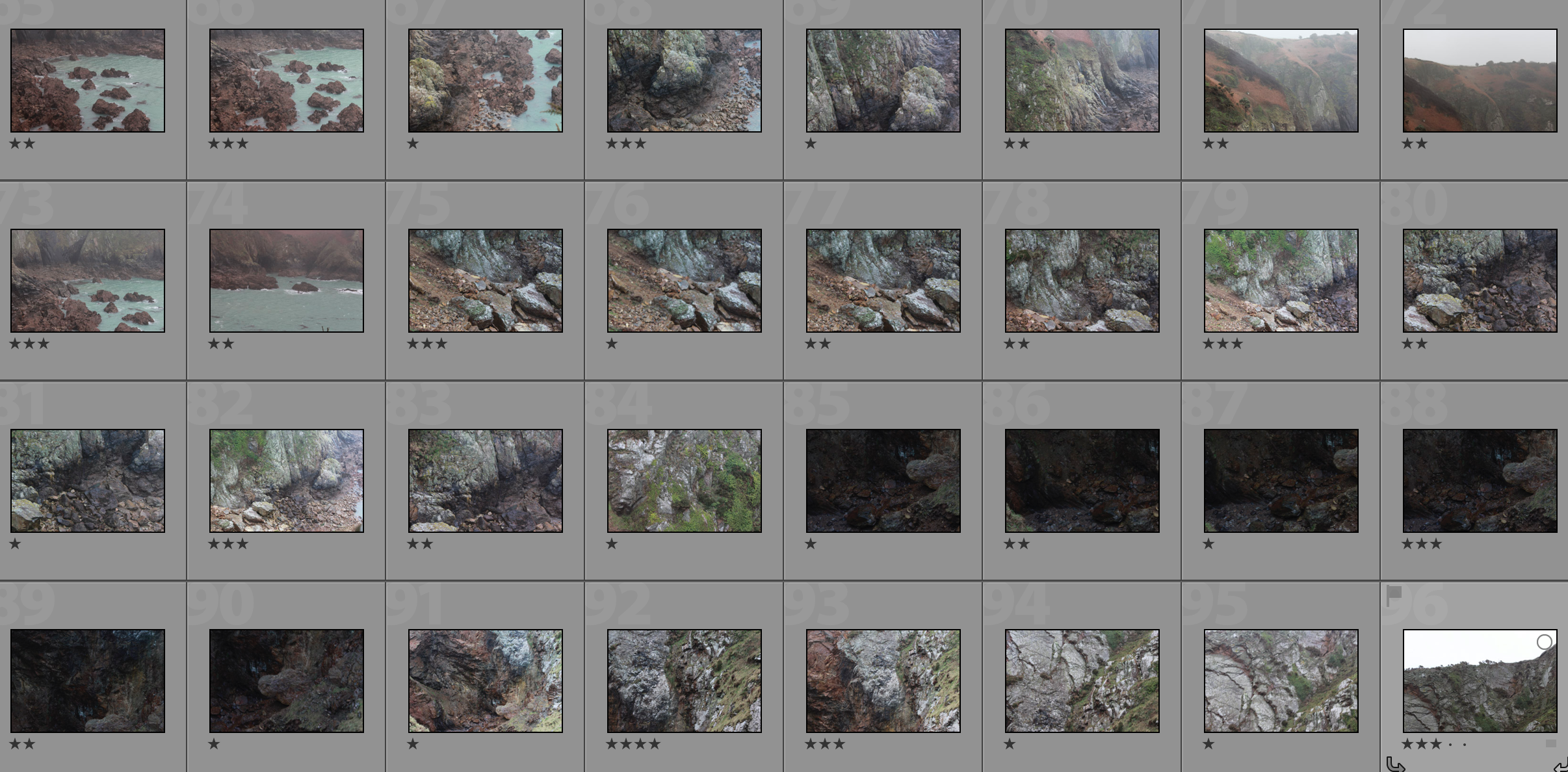
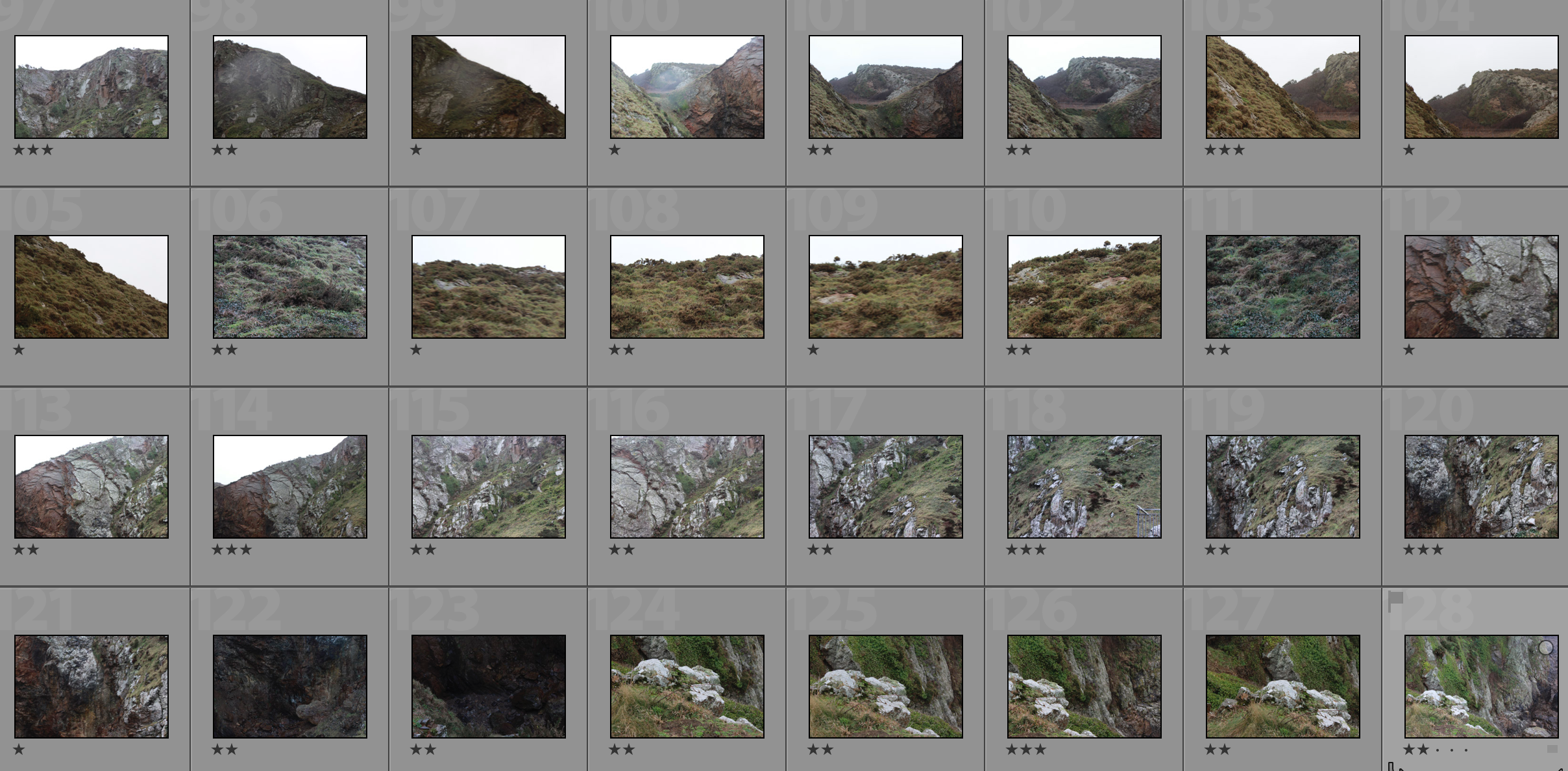
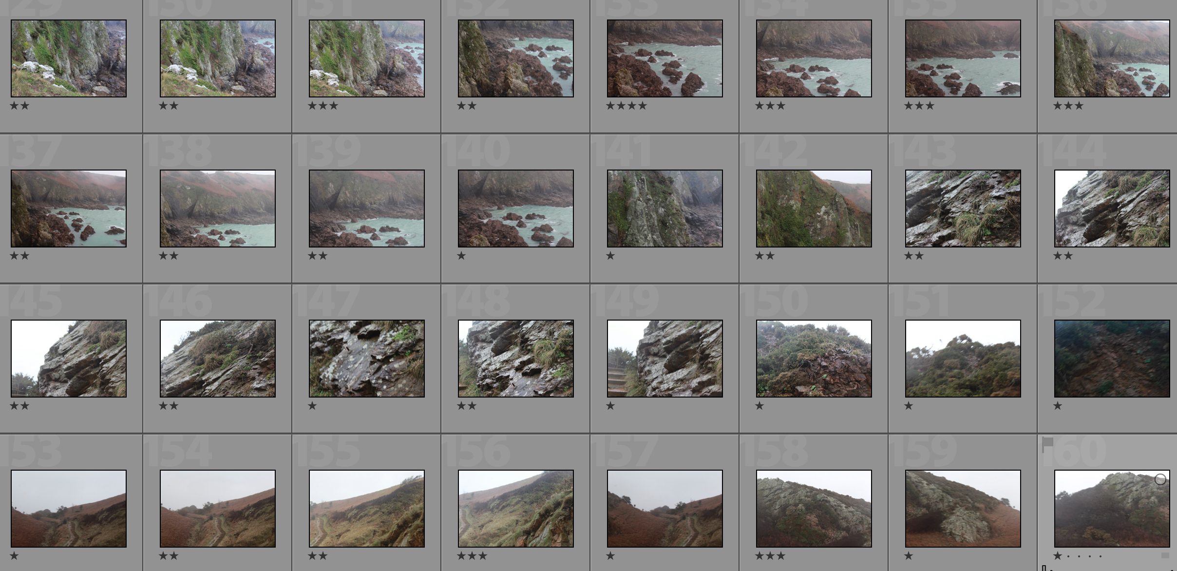
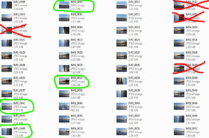
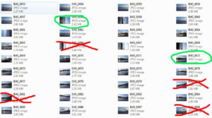
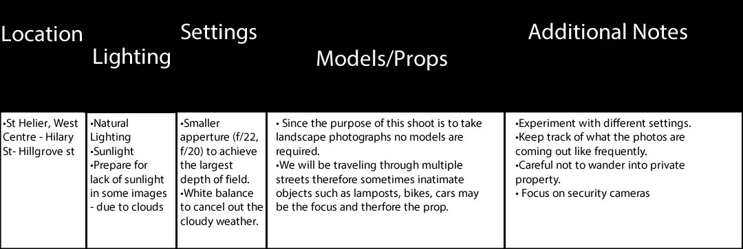
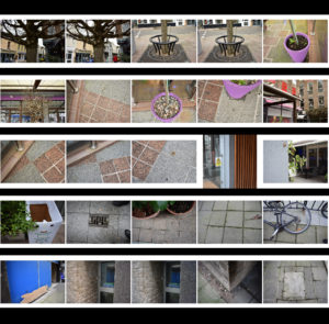
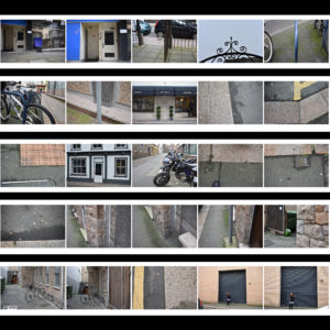
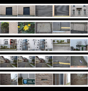
Contact Sheet 


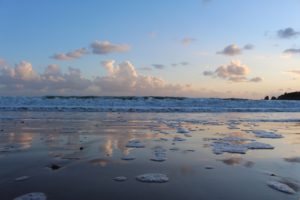
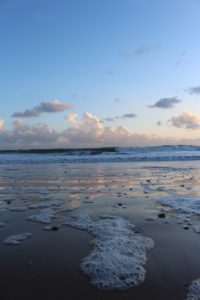
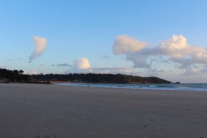
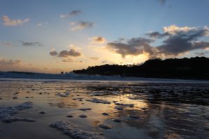
Overall I think that the shoot went well, was planning the photo shoot I wanted to gt the the beach just before sunset during golden hour so I could uses the colours of the sunset to enhance the image, however when I arrived at the beach the sunset had set. But looking back at the images I prefer having the deep contrast between the last remaining beams of sunlight with the contrasting dark clouds in the sky.

Best Images 

Experimentation 

Overall Best  Edit

I feel that this image is the strongest outcome from the whole of the shoot. I took this image using natural lighting, as I went during the golden hour the light helped me to make the image have a Romanticism feel to it. I took this image using a high shutter speed as I wanted the crashing waves to be in focus and sharp and the image to be of a high quality. The image has a slightly cooler undertone to it because of the dominant colour of blue which has then been coupled with the neutral colours that come with the beach setting. I took this image at St Brelades bay I went to this beach specifically as I knew that when the sunsets over the land the area starts to become darker and the remaining light create a dramatic contrast in the sky. I made sure that the tide was coming into shore when I was doing the shoot. As I wanted to be able to capture the reflection of the sun setting on the wet sand which would not have been possible of the sand was dry. The first idea that I wanted to try when I began the editing process was to select a small area of the image and then rotated in 180 degrees so it was upside. When doing this I made sure that the crashing waves that goes across the middle of the image where still one continuous line. When I had done this I wanted to edit the image further as the image looked plain. I then selected a small section of the part that had already been rotated and flipped in upside so it was inline the rest of the image.

Mona Caron

Mona Caron is a San Francisco-based artist, engaging in muralism & street art, illustration, art-ivism, and photography. Her focus is on community-informed and site-specific public art . She has created murals in the US, throughout South America and in Europe, creates stop-motion mural animations, has freelanced as an illustrator, and engages in artivism with social and environmental movements.

The first image is a mural called ‘Outgrowing’ in Taiwan, Mona painted the plants growing, like weeds do, from an inhospitable ground, a disturbed environment. She utilizes a wall’s large size to emphasize this inversion of scale, a micro-to-macro assertion of the power of small things, the power of the grassroots, human or plant.

Public art

Mona has been focusing primarily on murals in public space since the beginning of the millennium. Her goal is to activate public space by simultaneously creating artwork and interactive street happenings, using the painting’s narratives to spark conversations and critical awareness of the space we share.

Several of these murals contain intricate miniature details, invisible from afar. These typically narrate the local history, chronicle the social life of the mural’s immediate surroundings, and visualize future possibility, and are created in a process that incorporates ideas emerging through spontaneous conversations with the artwork’s hosting communities while painting.

Mona’s first period in muralism was defined by very site-specific and community-immersive narrative murals, reflecting the past, present, and future images of their neighborhoods through a uniquely permeable participatory process, considered part of the artwork. Mona’s community process has been the subject, among other publications, of an Emmy-winning documentary film by Paige Bierma.

In recent years, Mona’s stop-motion animation and botanical mural series titled ”WEEDS”,  a metaphor about resilience, has been growing, just like its namesakes, both in numbers and geographic reach, as well as in the scale of her pieces.

  • Currently, Mona likes to combine the poetic with the narrative aspects of her work, as can be seen in her most recent Collaborative work.
  • Mona has also illustrated books, posters for music or political events, news editorials, and more, using various styles of watercolor, block print techniques and more.Mural by Mona Caron
  • This mural, called ‘Taking Root’, features the first wildflower that made it back to a barren piece of land in Union City, California, after its rehabilitation from industrial pollution, and during the construction of a new affordable housing complex.
  • The topsoil had been completely scraped off to remove pollution, killing all vegetation. As the building construction neared completion, the first wildflower she found became the main feature of the mural, a symbol of resilience.
  • https://www.monacaron.com/murals/taking-root-video-documentary- link to video
  • few more videos https://www.monacaron.com/murals/manifestation-station-painted-utility-box
  • https://www.monacaron.com/murals/brush-tenderloin-short-movie-paige-bierma

Dandelion 1 Masjid Darussalam, San Francisco by Mona Caron

http://youtube vid:  https://monacaron.com/weeds -a stop-motion mural animation

“They may be tiny but they break through concrete. They are everywhere and yet unseen. And the more they get stepped on, the stronger they grow back.”

This is a series of paintings of urban weeds, created as a tribute to the resilience of all those beings who no one made room for, were not part of the plan, and yet keep coming back, pushing through and rising up.

weed-1-new

“I look for weeds in the city streets near a wall I’m about to paint. When I find a particularly heroic one growing through the pavement, I paint it big, at a scale inversely proportional to the attention and regard it gets”

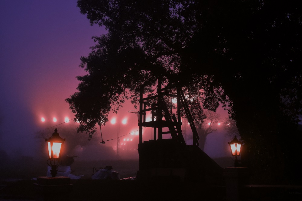
Nature Photoshoot – Fog

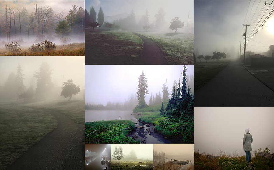
Moodboard

In its simplest form, fog is a cloud that sits on the ground. In more scientific terms, it is condensing atmospheric water vapor created by a temperature drop when relative humidity is fairly high.

Artist Research – Fogaholics

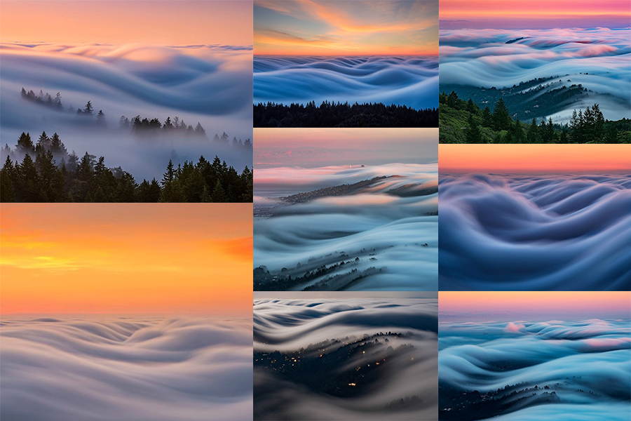
Landscape and cityscape photographers have a love/hate relationship with the fog in the San Francisco Bay area. It can make for some spectacular and moody photos, but it can also leave the area un-shootable – that is unless you seek higher ground. Nick Steinberg and other photographers in the Bay Area have formed a group that they call the “Fogaholics”.

The group consists of around 20 photographers that watch forecasts religiously and seek out the best foggy shooting conditions possible. When the fog rolls in, they make their way to Mt. Tamalpais, which sits at 2,572ft above sea level. This unique vantage point gives them the opportunity to photograph some amazingly beautiful conditions. With the help of an ND filter and exposure times sometimes exceeding two minutes, Nick is able to capture the fog waves as they make their way inland.

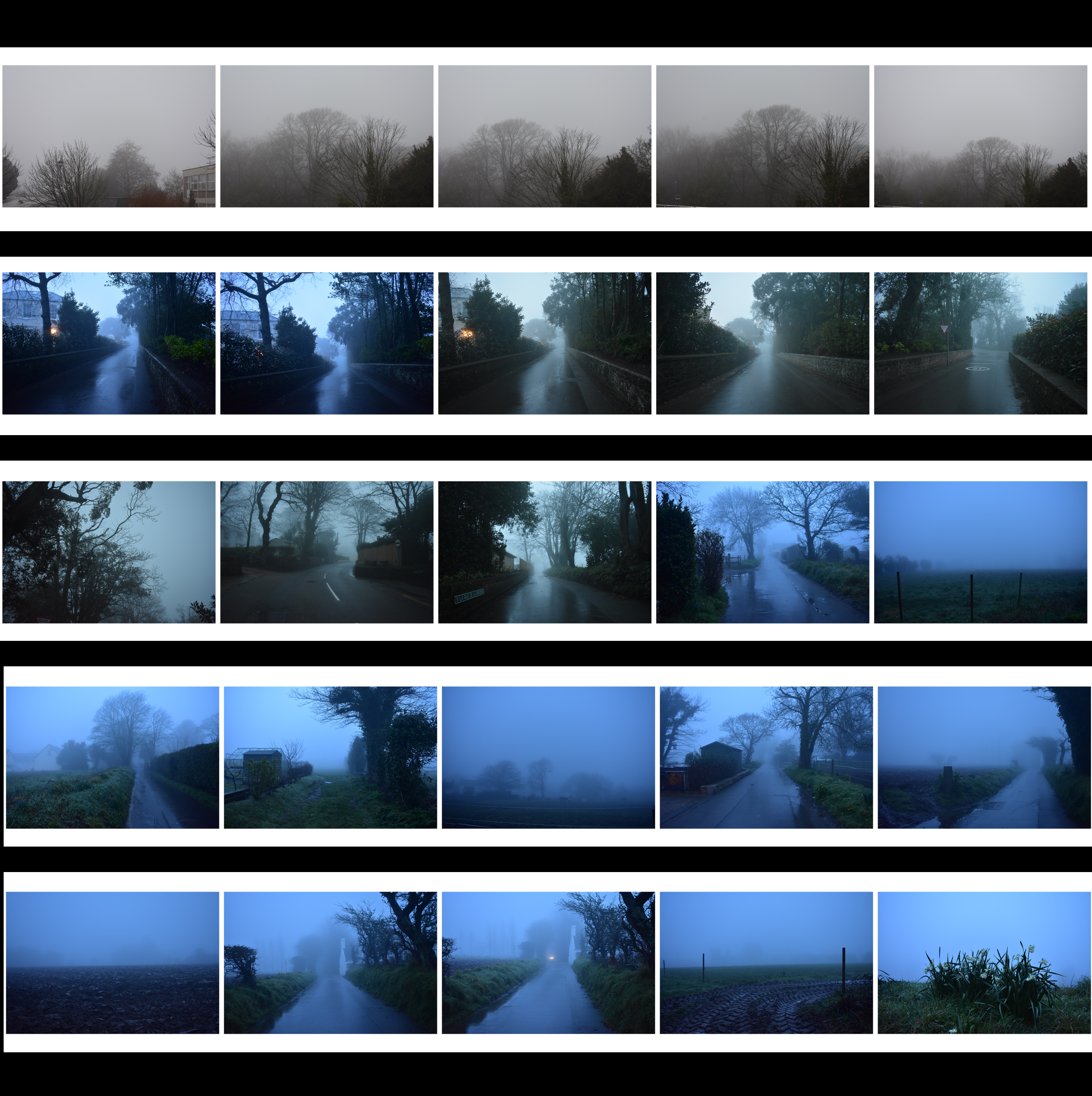
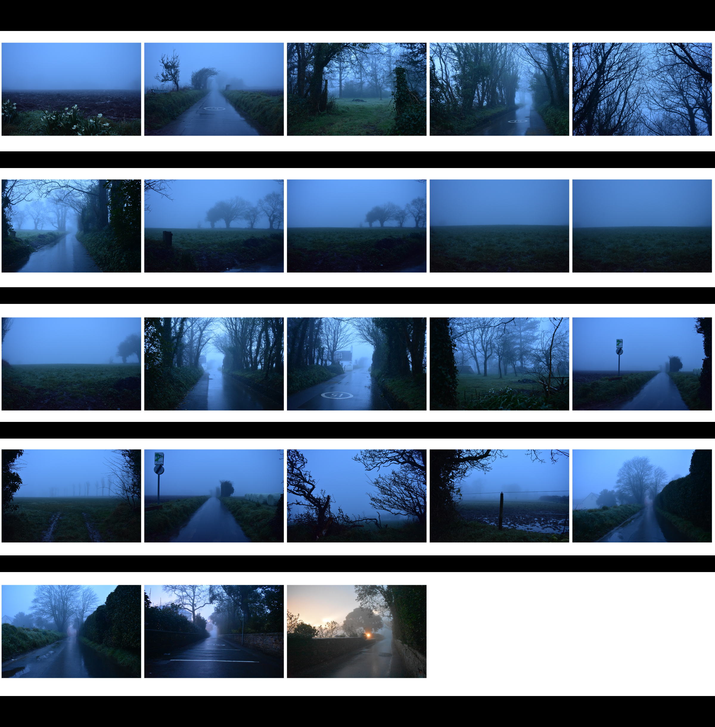
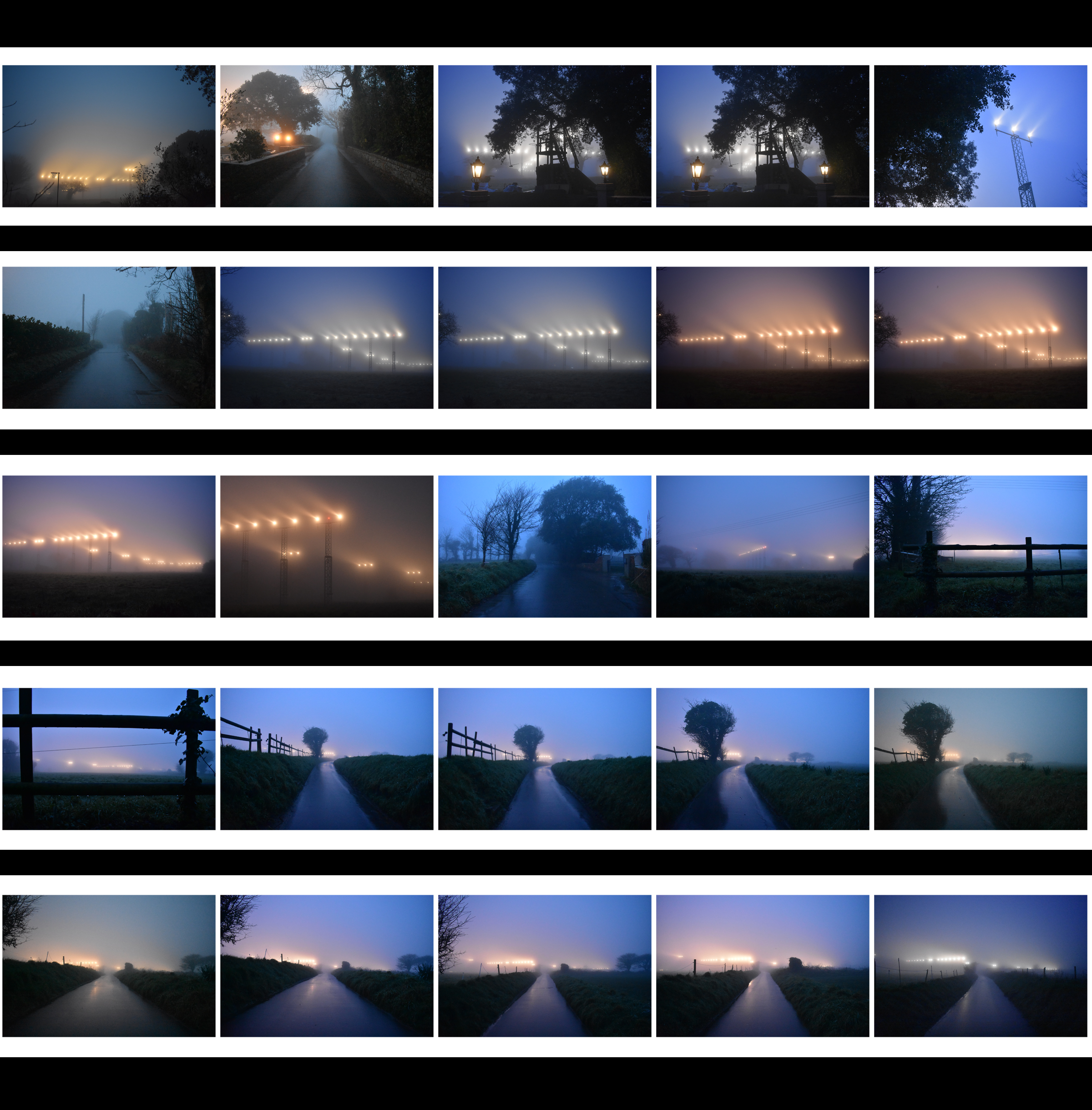
Contact Sheets

Edited Photograph