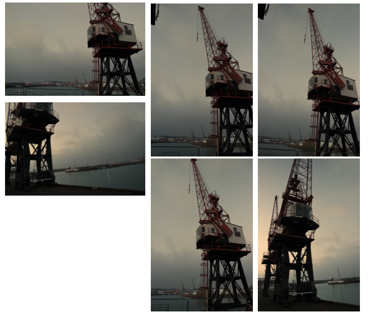
camera skills within landscape work

due to me wanting to capture an array of landscapes from sunny romanticised landscapes to more abstract light exposure night time shits I need to know how aperture works and the concentrating of depth of field in order to focus in on a specific subject matter. I will experiment with this and use it creatively and such. The F number is an optical system of the cameras lens,due to it not having any dimensions

The f-number of an optical system such as a camera lens is the ratio of the system’s focal length to the diameter of the entrance pupil. It is a dimensionless number that is a quantitative measure of lens speed, this is important as it allows you to choose what concept of how much an an image you want to capture and for what effect.

throughout all my shoots I intent to change the  focal length,aperature and also the fouls distance in order to use it as a creative aspect and enhance my image without editing them.

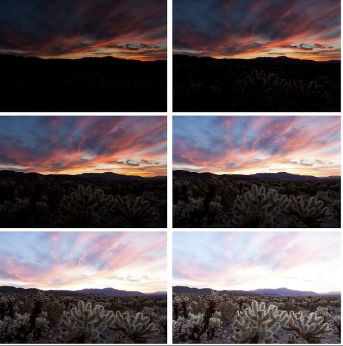
exposure bracketing:

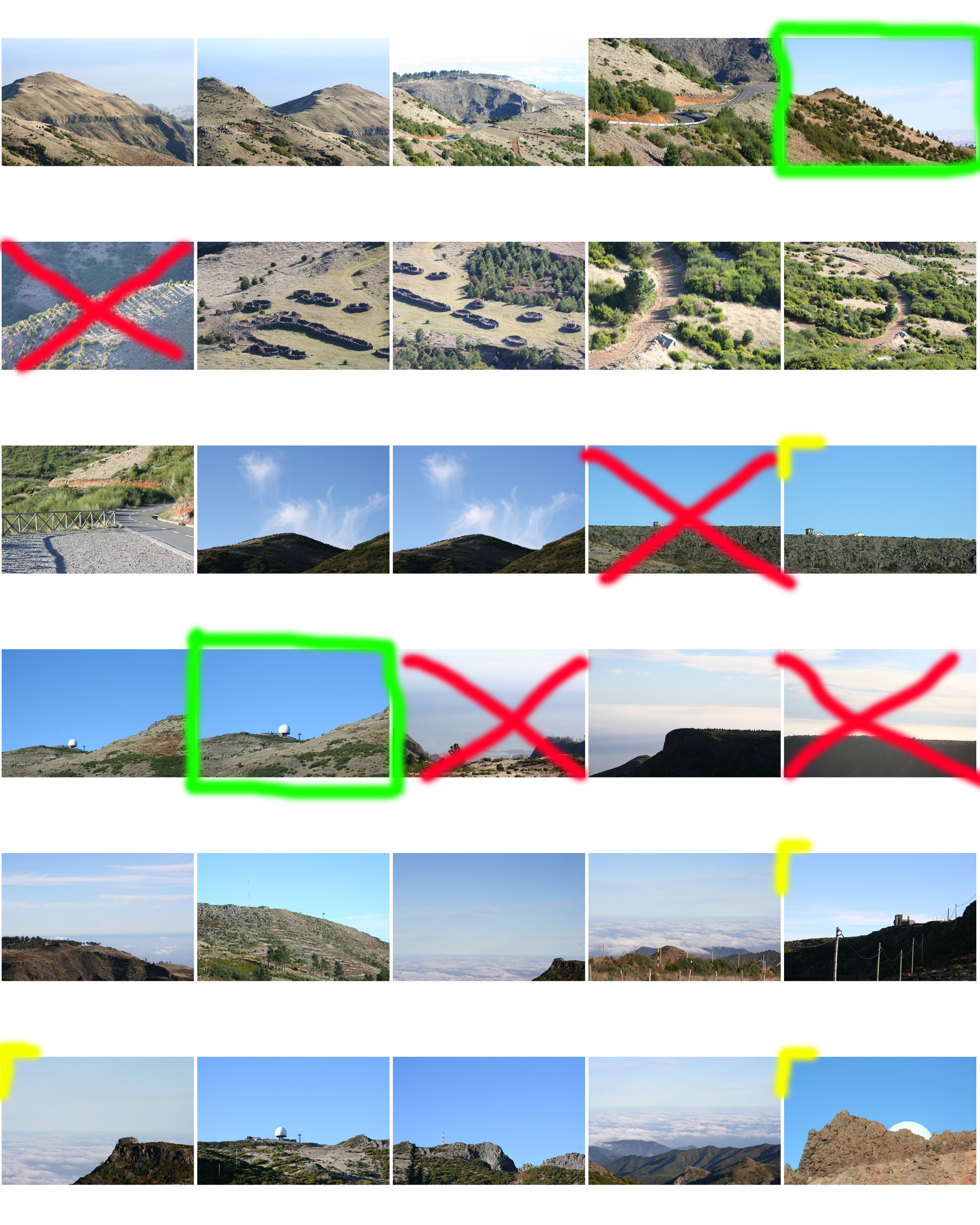
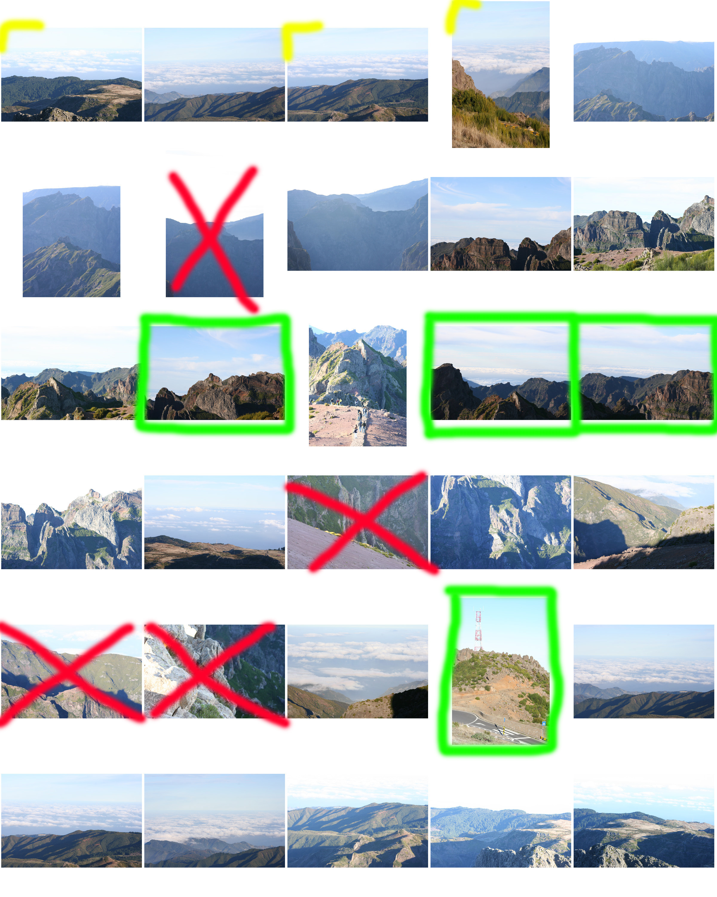
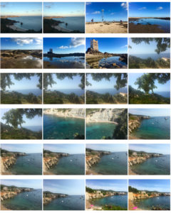
I used exposure bracketing when concentrating on a. romanticised and more natural landscape, this is because depending on weather you are under or over exposed it captures different segments and different details within a pieces overplayed many of my image own order to be able to have different concentrations of detail in different areas such as the example below:
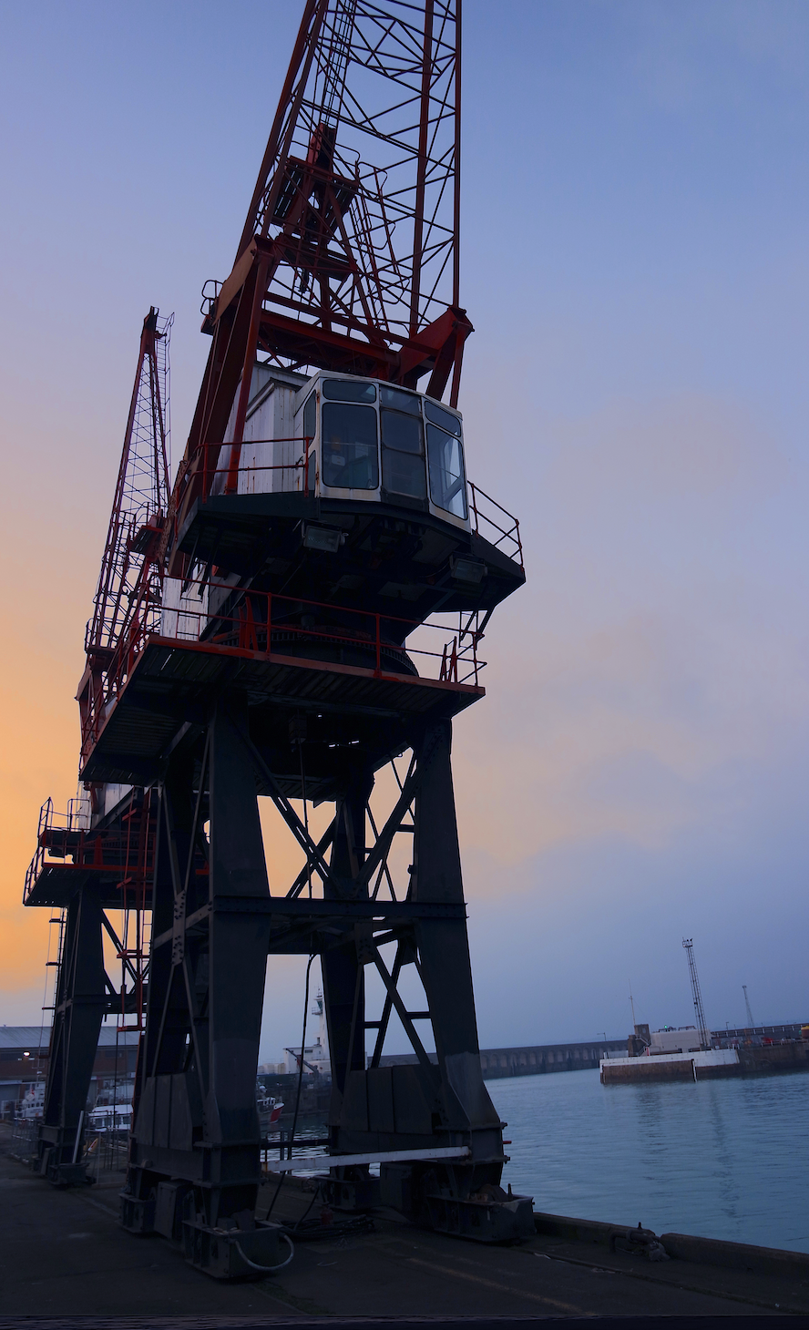
I also want one experiment within experimenting of editing sills such as using HDR Images,and making sure that I am capturing high dynamic details and capturing every element of an image. this is mainly important s prep from my romanticised images as they would be capturing light in a strong manner and also the reflections upon my images. I could do this by putting my camera into its hdr setting and allowing it to capture a high saturated landscapes.

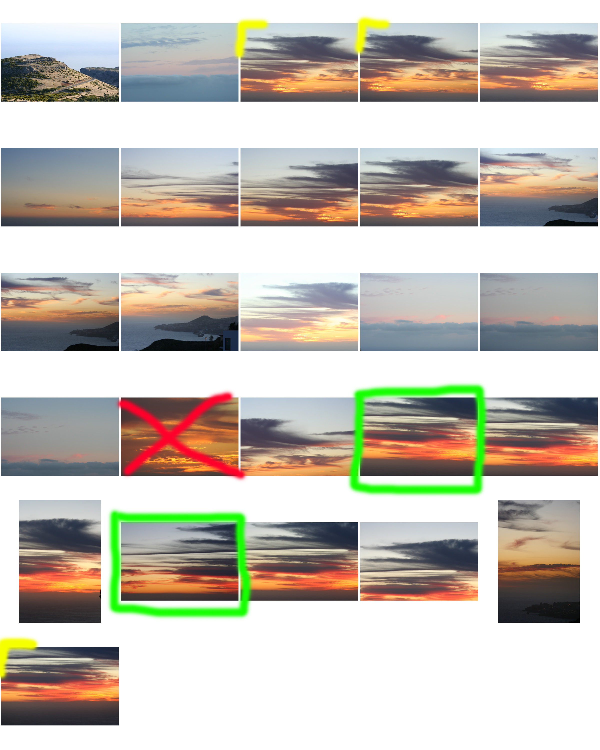
These are my examples of using HDR and then further editing in order to emphasis the colour and how light comes through within all of the images.
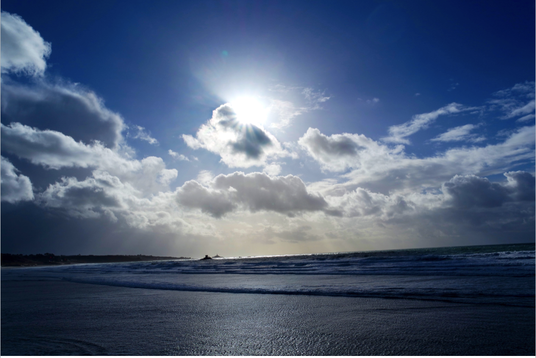
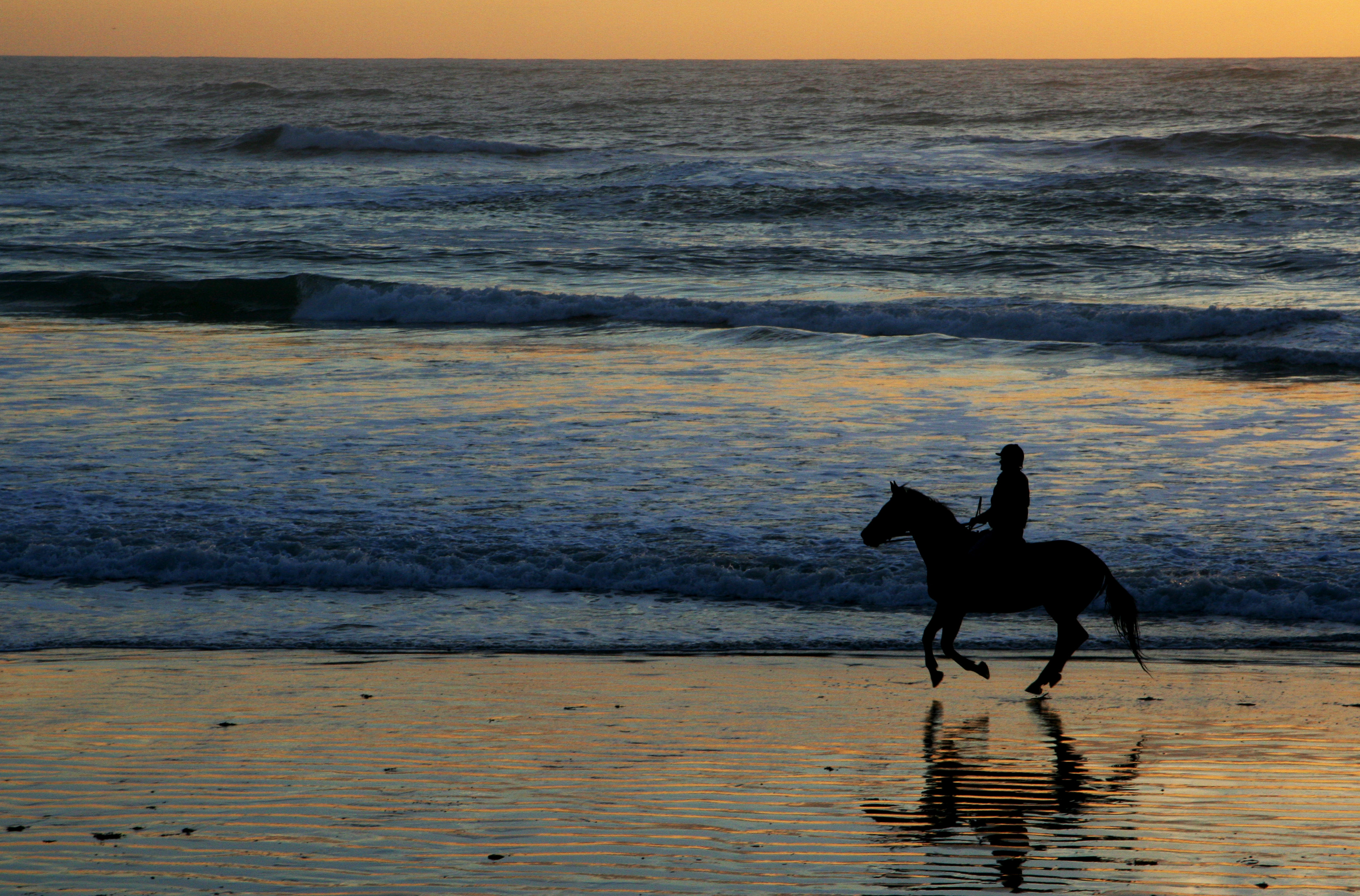
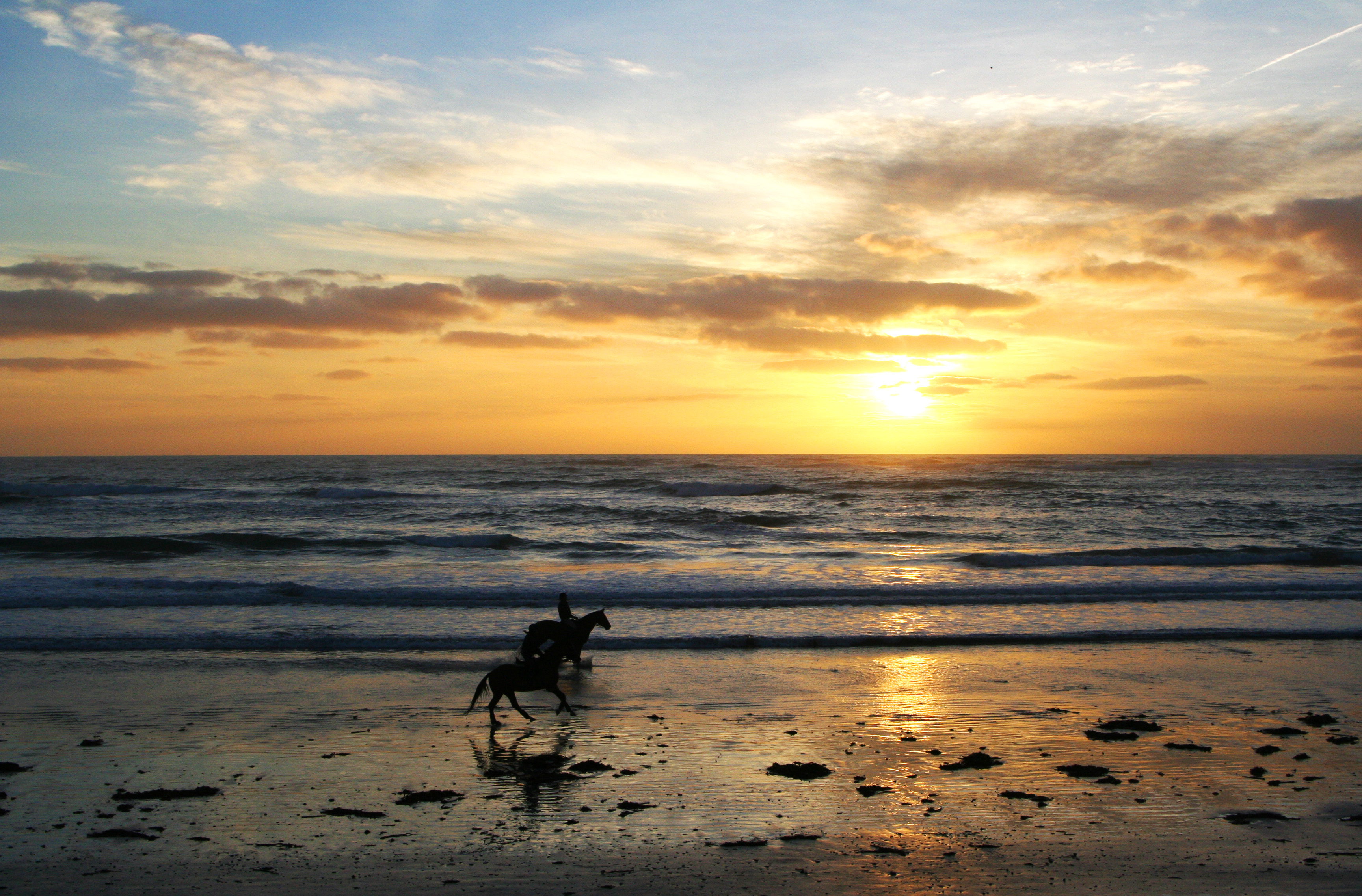
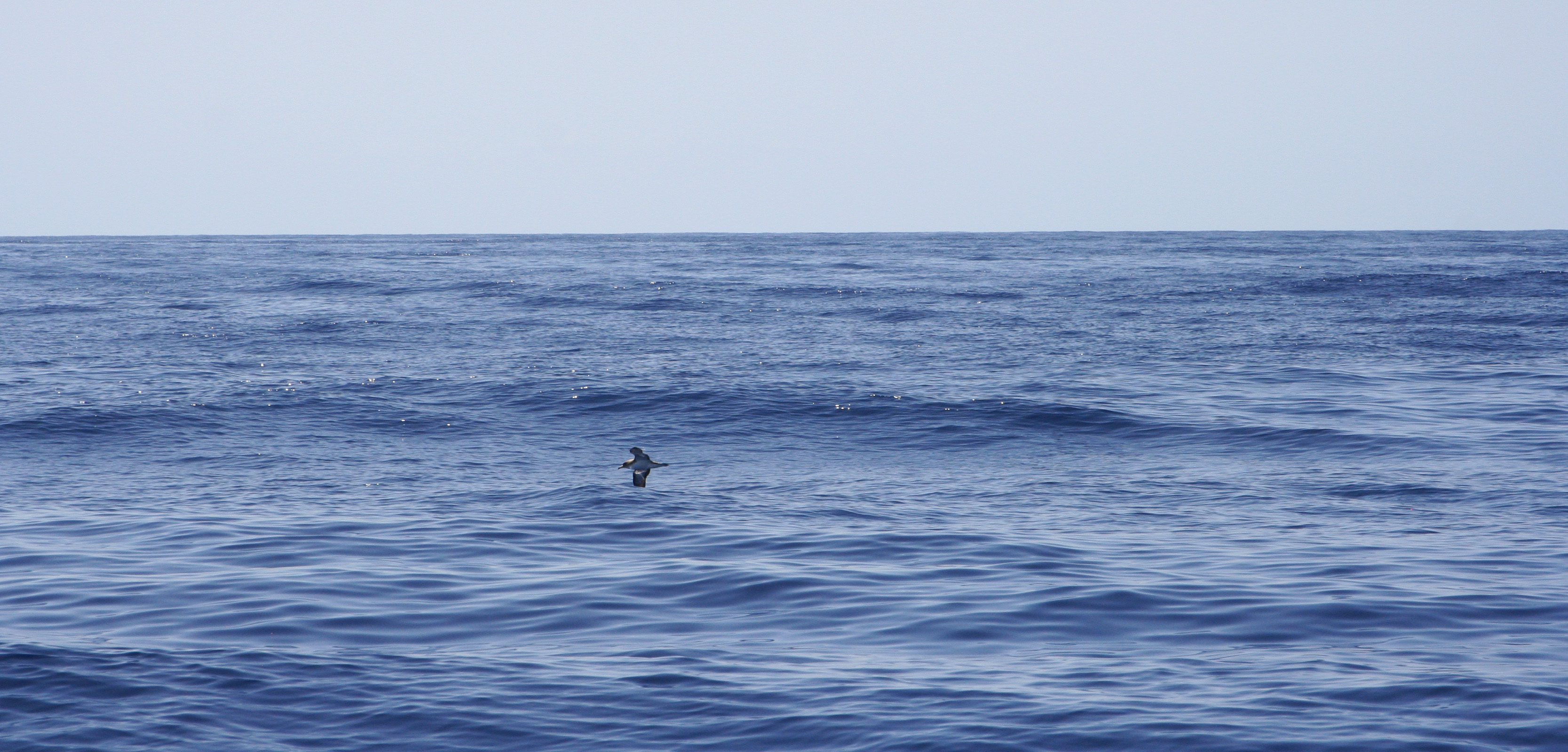
within this first image i wanted to capture a sea scape but then found that the clouds had such a beautiful movement and shape through which the sun comes through with such strong highlights that bounce off the sea,  I included this within the images as I think this would also be a successful base off an image as the water has a solid movement but interesting point of texture. 
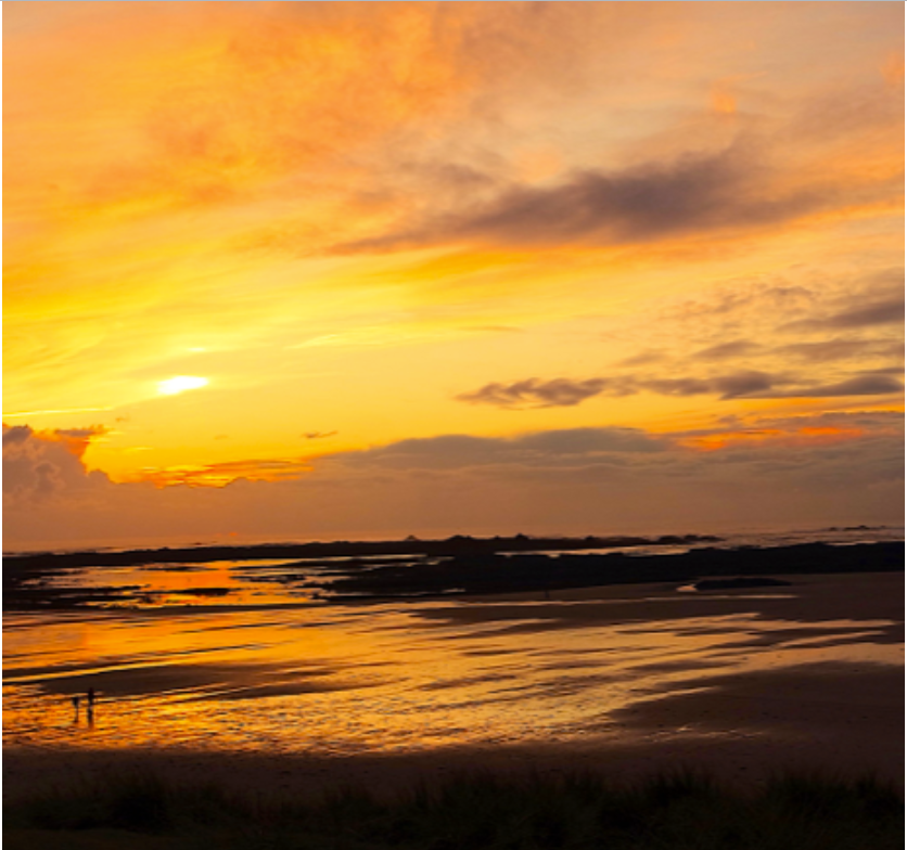
This second image has many differences, this is due to the way in which again the light is reflecting off the sea and the warm tones caused by the light but due to the over saturation has lost a presence of some of the detail.

technically both images have many features that make them successful although conceptually the first image has a more successful HDR theme parented and also presents the use in which I balanced the focal length to allow a wide image and also an equal exposure bracketing too mature the details within every aspect of the image.



Altered Landscapes

Witchoria

Victoria Siemer is a Brooklyn-based American graphic artist who focuses mainly on photo manipulation using Photoshop.

Her inspirations come from the idea of “emotional fragmentation or ‘fragmentation of the self.’“ Since she had no formal photography training, she paid close attention to others, including artist and former roommate Jeff Brown and street photographer Dave Krugman. It was only more recently that Siemer has begun to call herself an artist, rather than a designer.

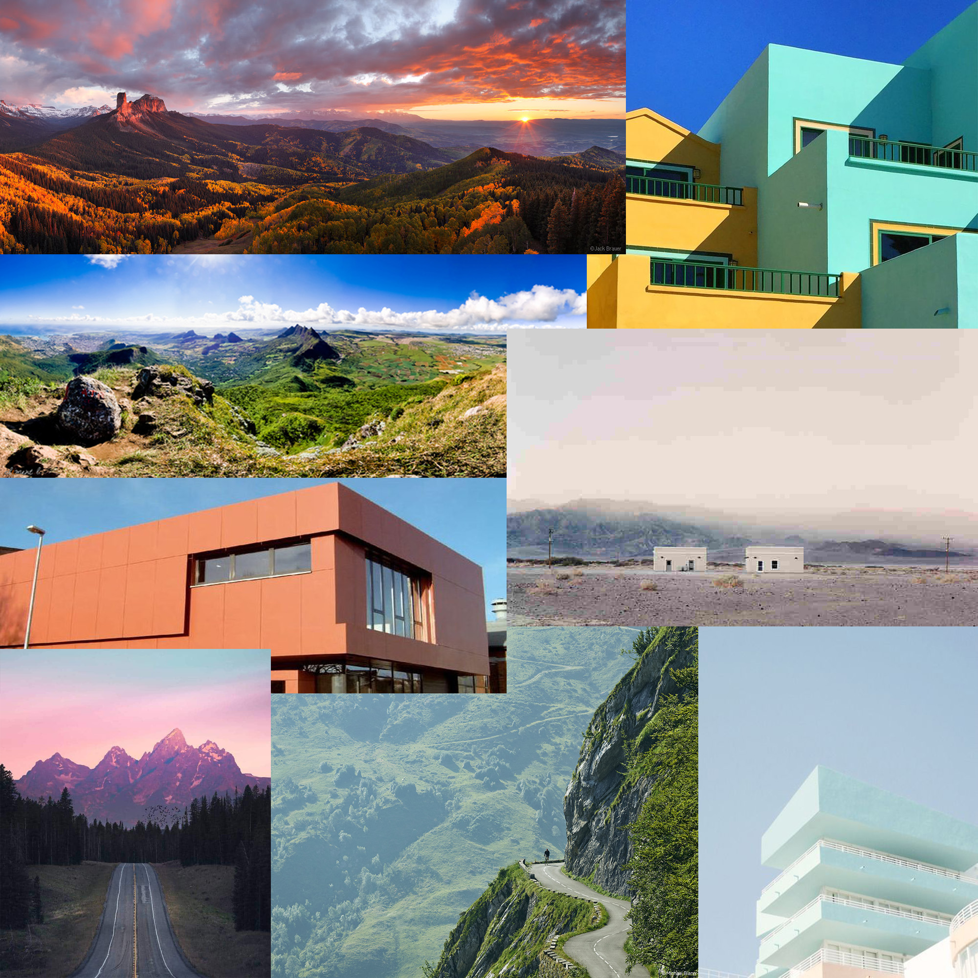
Inspiration for this shoot


Photo shoot Plan

Concept Genre /  Artist Location Props Shot type Lighting Settings
Altered Landscapes Witchoria Beach Tripod Landscape Natural Manual focus,f/2.8-f/4, 1/60 shutter speed ISO-100

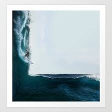
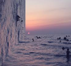
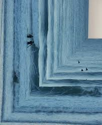
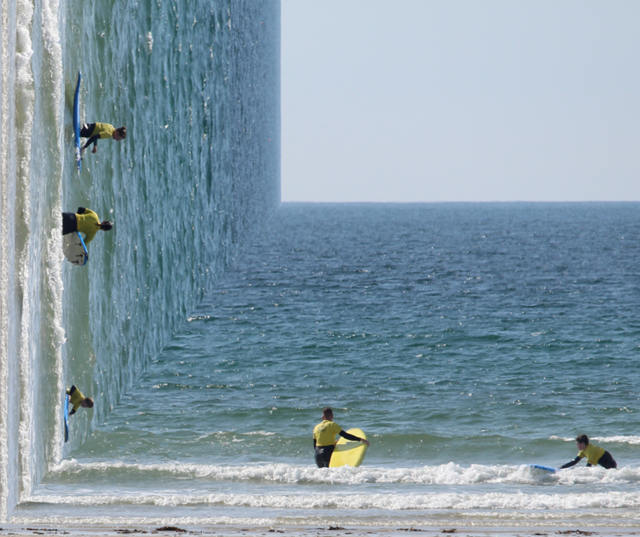
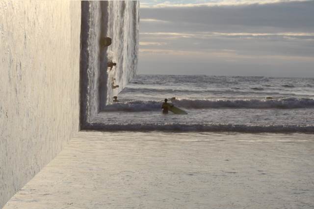
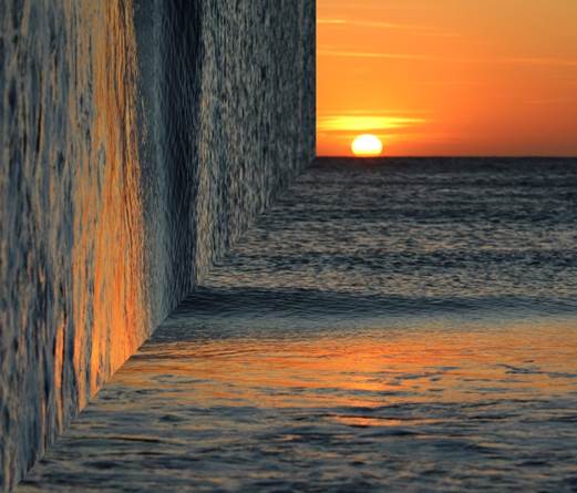
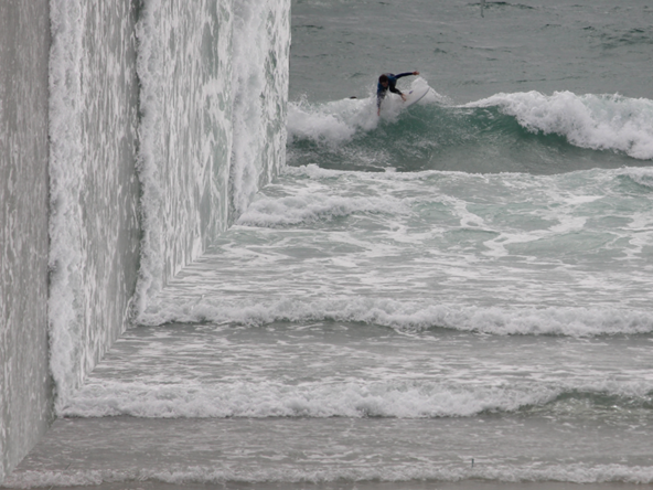
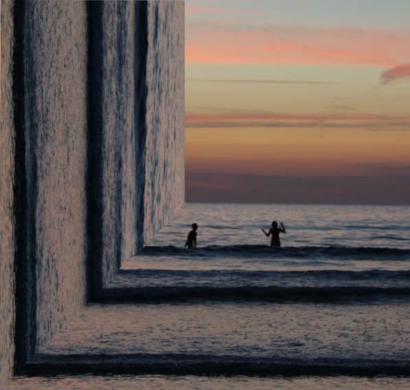
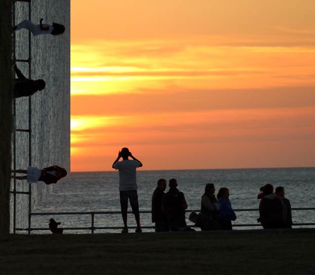
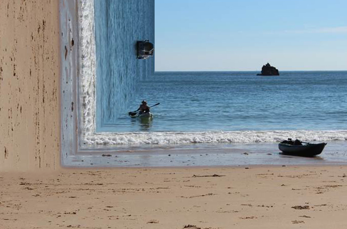
For this photo shoot I am going to focus on Witchoria’s photos which she creates a 90 degree angle of half the picture on the side to create an illusion.  Her photos are all at the beach for this style therefore this photo shoot will consist of mainly beach pictures.  For this photo shoot I will use a tripod due to the fact that the sea is constantly moving and I want to try to reduce as much motion blur as possible to create a realistic looking photo to help with the illusion which will be created when editing.


Homework 5- Altered Landscapes

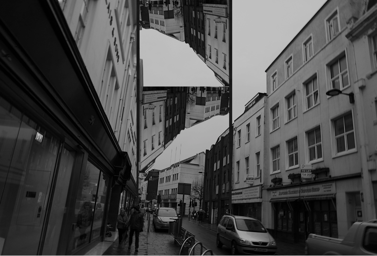
Out of Beomsik Won and Mona Caron i decided to take inspiration from Mona Caron. I decided to edit pictures of nature and plants onto buildings to present the concept of urban taking over nature. I planed to physically stick the images onto a printed out building to make a collage and to also digitally edit images onto buildings in photoshop, similar to how I edited my other altered landscape photos.

The images I planned to use to edit onto buildings were not my own photographs but secondary source of art as Mona Caron physically painted murals onto buildings I wanted to keep that aspect but using different artists work of natural landscapes and plants, still keeping my own images of the buildings.

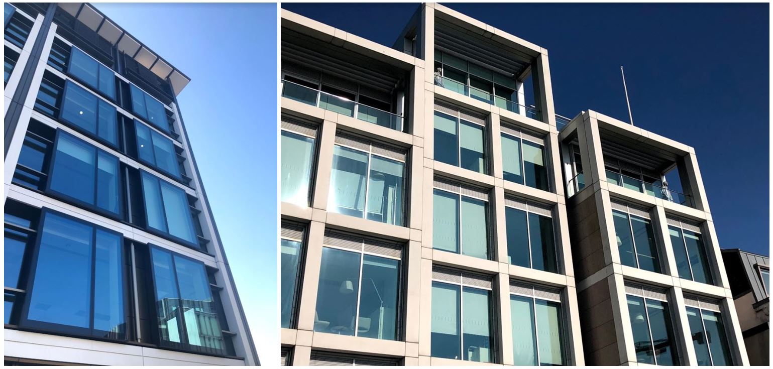
I first went out and took pictures of buildings so i could edit them in different ways.

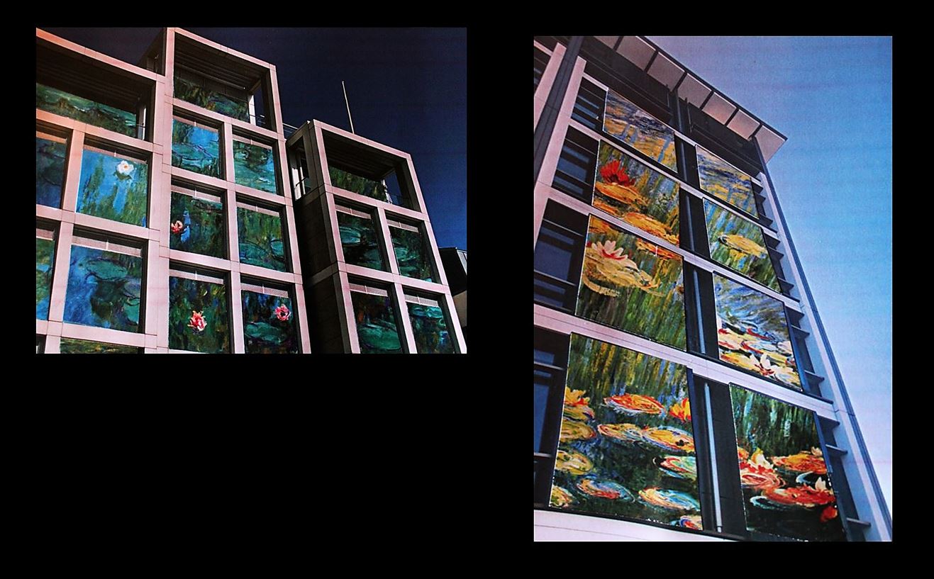
I then chose two of these images to be my final images to edit. The pictures I wanted to lay on the buildings are from the artist Claude Monet as his paintings are often of nature and plants so the urban and nature will both be included in my image. Also Mona Caron is an artists and physically paints murals onto the side of buildings so i wanted to carry that aspect on to my images.
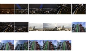
I cut the paintings specifically in the shape of the windows so it looks like the paintings are inside of the buildings. I think this was effective as the paintings are angles to make the image look 3D. These were the final outcomes when I photographed the images stuck on top of each other:

  • I chose to do this as i think the images link into my other blog posts with the theme of urban vs. nature. Claude Monet’s painting of lily pads represents the nature with the structural building representing urban.
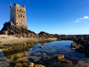
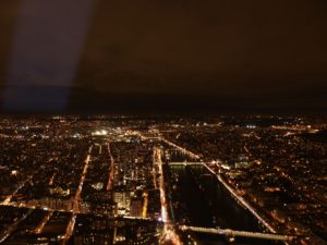
  •  I physically printed out the images and collaged and stuck them together to make the images seem less manipulated.
  • To re-take the photo I used artificial lighting to highlight the photo as best i could even though the print out of the building wasn’t the best quality (to improve these images i could get them printed professionally.)
  • I think the edits look effective as it looks as though they were edited digitally when they were physically stuck on.
  • The shadows created from the building (especially in the first photo) make edit look more real as the painting is cut in a certain shape to emphasise that shadow.
  • For my final image I put a black border around the images and combined the tow in the same photo to show the variety of images.

Approach Ideas

My approach to this unit of work ‘Landscape photography’ will consist of finding and presenting a balance between Natural, Urban and Altered landscapes, whilst limiting the alteration of the raw photography as I aim to present my raw camera skills along with minimal editing.

This approach to the unit will take influence and inspiration from Ansel Adams (Natural landscape side) and the New Topographics (Urban/Altered landscape side).

This approach I am taking is my way of creatively focussing on the issue of man made developments covering up beautiful natural landscapes. But whilst exploring this issue, also showing that there is however still beauty in our man made surroundings, and which can be enhanced when in harmony with nature.

Formalism and minimalism within landscape photography

Formalism

Formalism is the study of art by analyzing and comparing form and style the way objects are made and their purely visual aspects. In painting, formalism emphasizes elements such as color, line, shape, texture, and other perceptual aspects rather than iconography or the historical and social context.

Examples of formalism photography

Image result for formalism photography

Image result for formalism photography

Minimalism

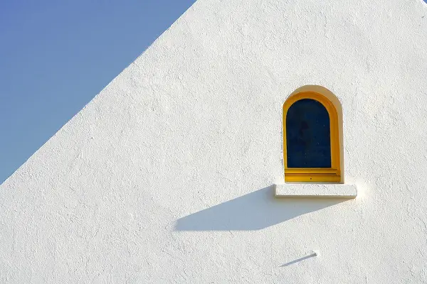
Minimalism is a style used by many 20th Century artists, using a very minimum amount of elements which consist of: color, shape, line and texture. Within the art world it is considered an extremely subjective concept, leaving interpretation and meaning up to the viewers perception of the work.

Examples of minimalism photography

Image result for minimalist photographyImage result for minimalist photography


typology analysis

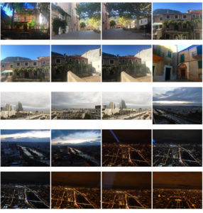
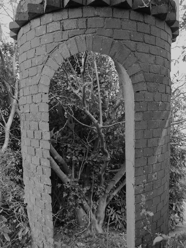
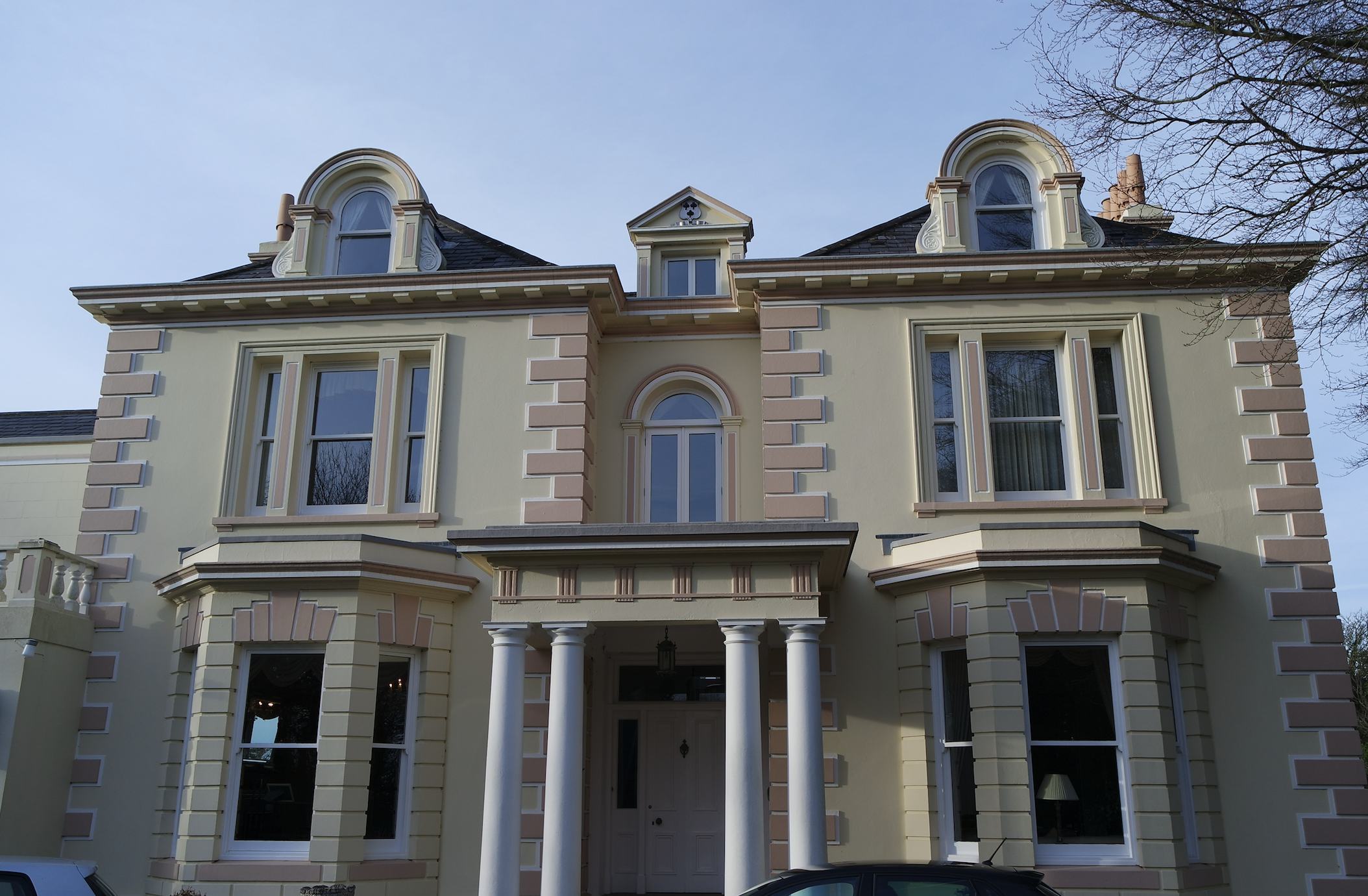
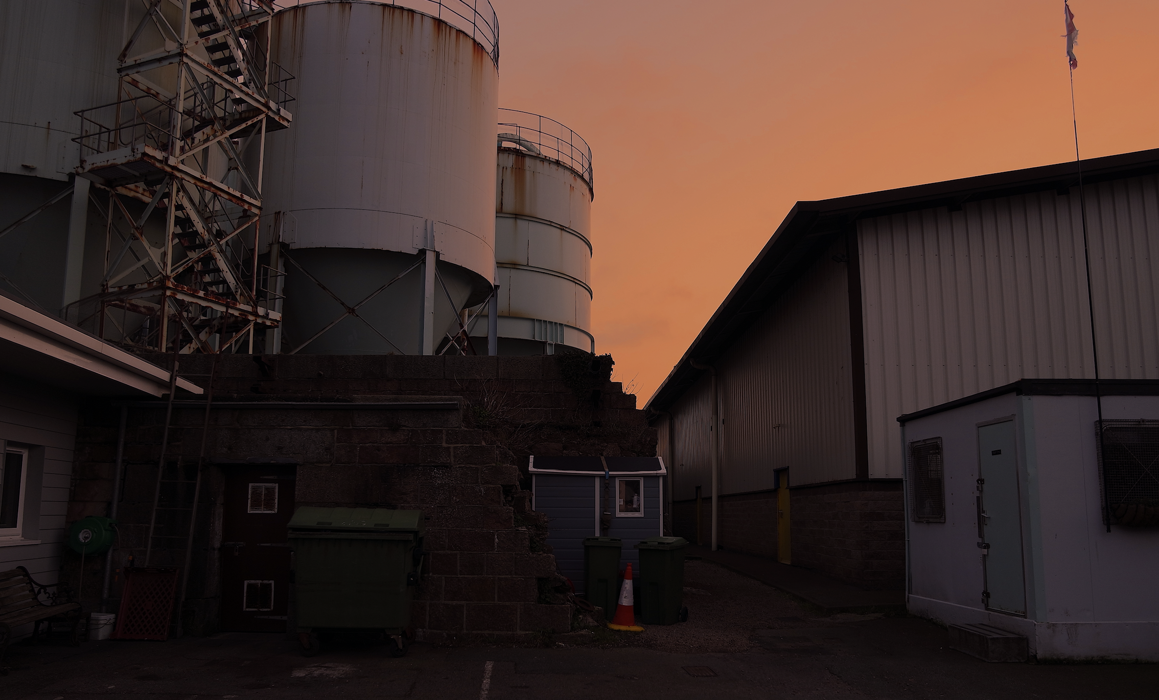
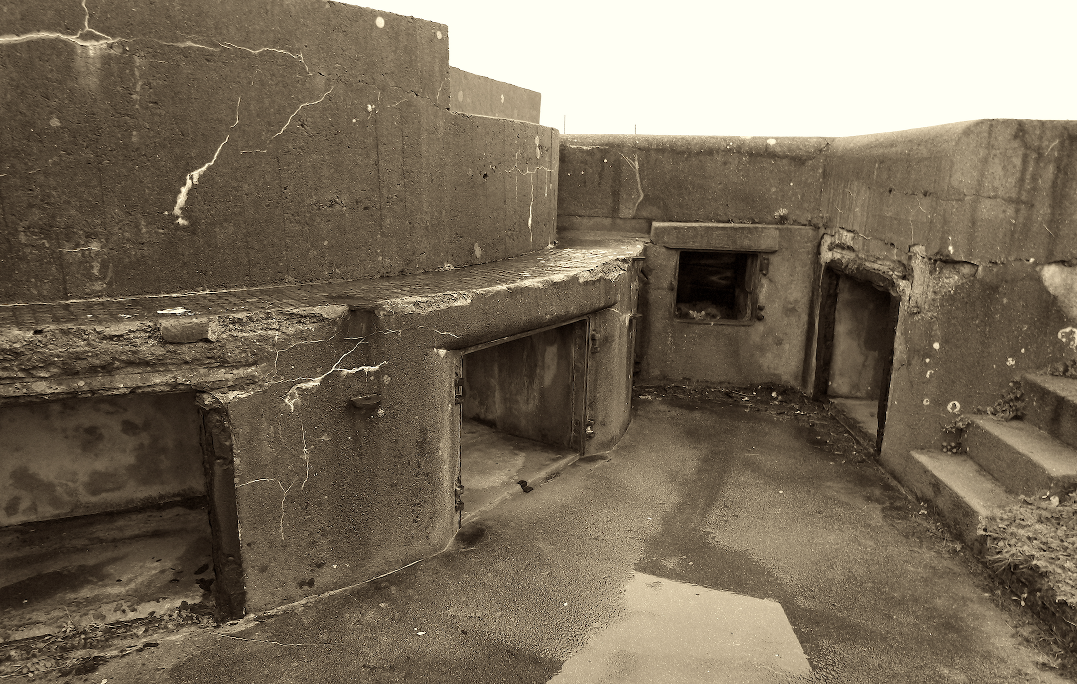
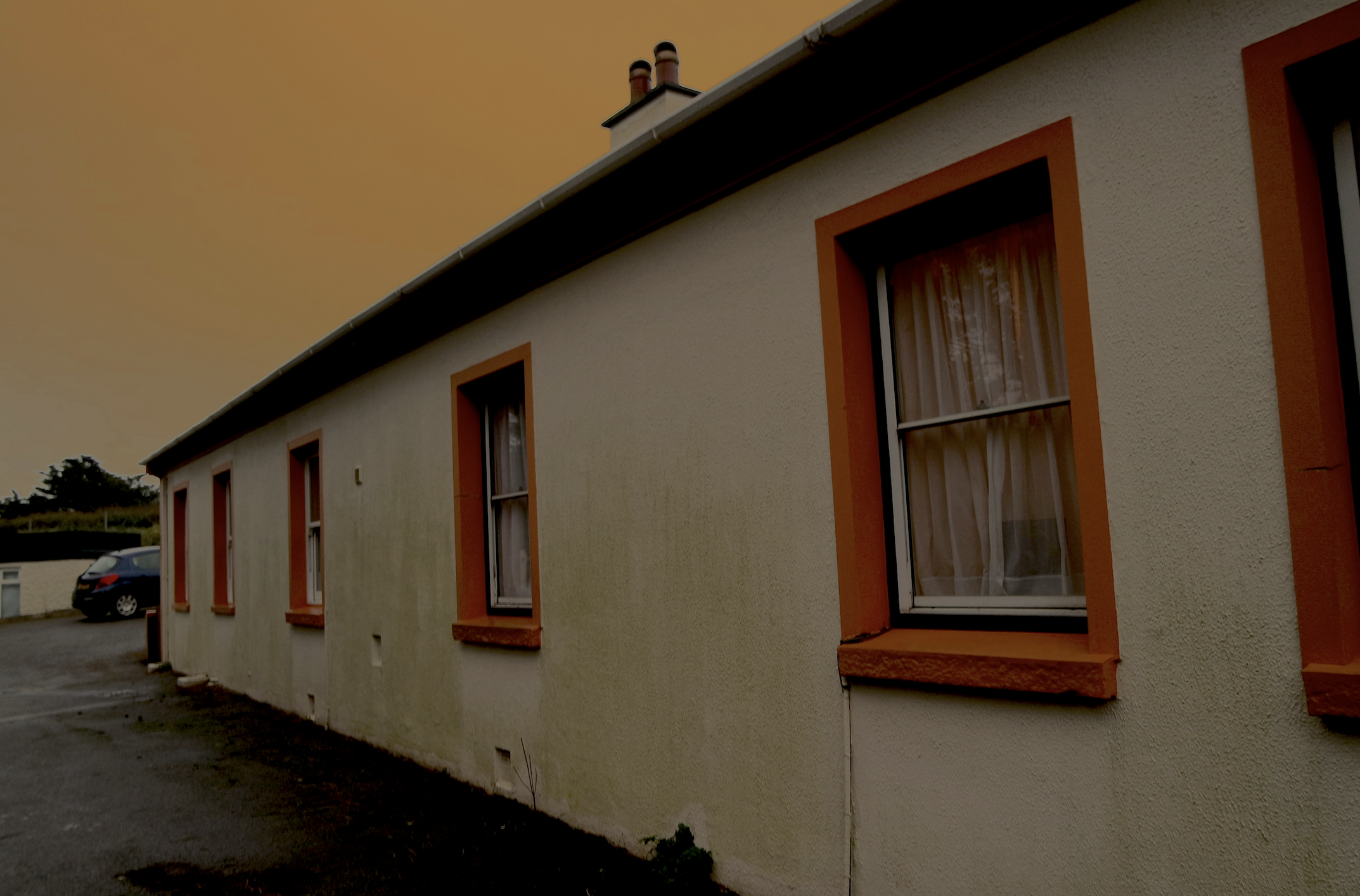
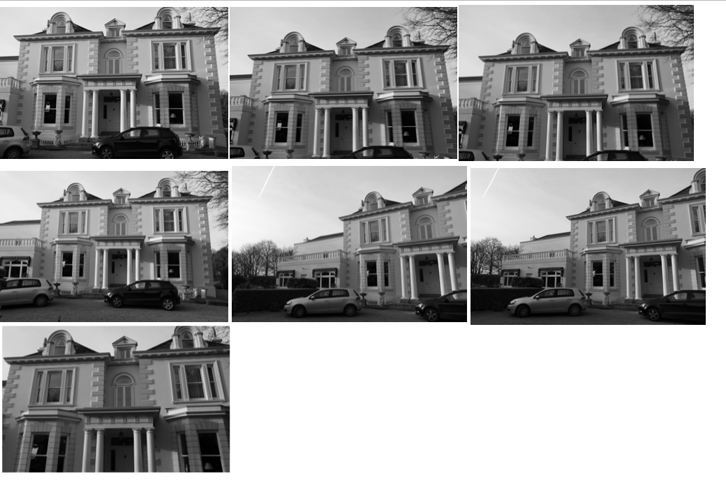
when I thought of typology I wanted to use a wider range of the terms wanted to find a range of buildings from all different spectrums of history and movements,I did this is order to have many possibilities to contribute to my final outcome,becasue of this I took many images and angles of the same building, I wanted to present each building in such close detail and also portray that the image could be seen as three or two dimensional depending not the angle and representation necessary.

As I said before all of these buildings have different occurring qualities weather it was me wanting to couture a texture,a historical aspect of society,an urbanised areas and or a more Morden buildingsI did this as all of these present a different shape and have different occurring  qualities and angles within them.

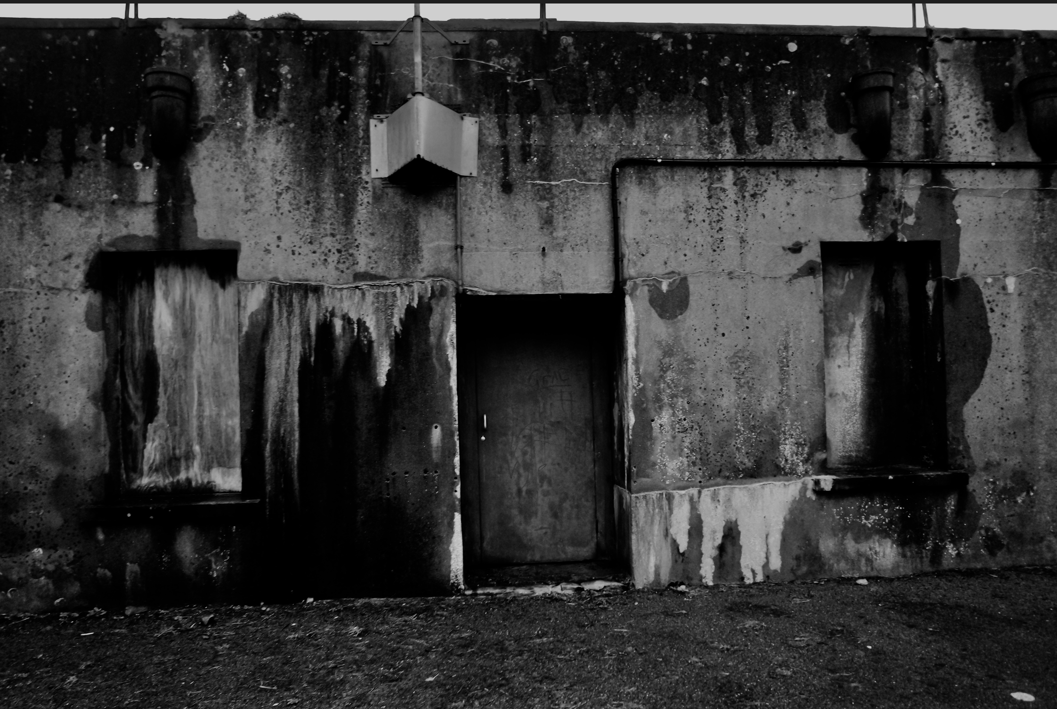
I have already adjusted these images as seen previously with colouring to a darker tonal back and white ,or enhancing the pigment within the saturation,this is all dependent on the scene and what I am trying to achieve within the piece itself. all of my images are taken from right angles when cycling round too mature every element and angle of the image itself, which can not necessarily be parented from above.

 Grid set development:

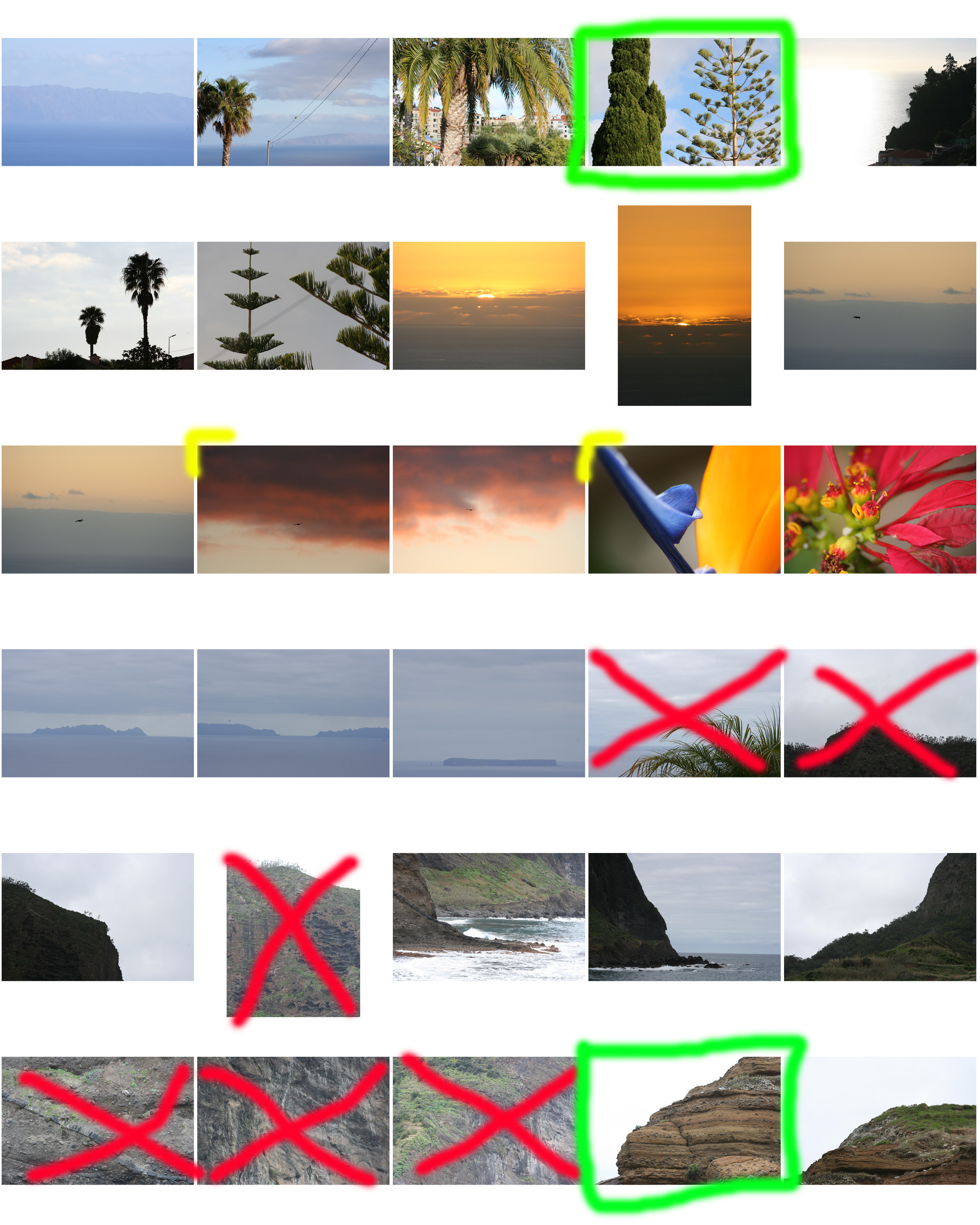
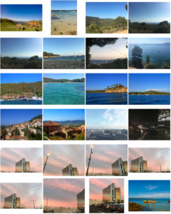
I have slightly cropped my images in order to display them clearly alongside some other angles that I have taken,I have done this for all  of the buildings and structures that I have worked within. although many  of these images are mirror images and so near and similar that they portray the same composition and lighting, although they could be edited and both enhanced or even presented  together.

overall I think I have capture enough images to show that I have considered typologies although I did focus more on individual buildings that will hep contribute to my theme of form man made  sutures to enhance nature.