This blog post shows some edits that I have done of my photographs of the diverse and incredible landscapes of Hong-Kong.
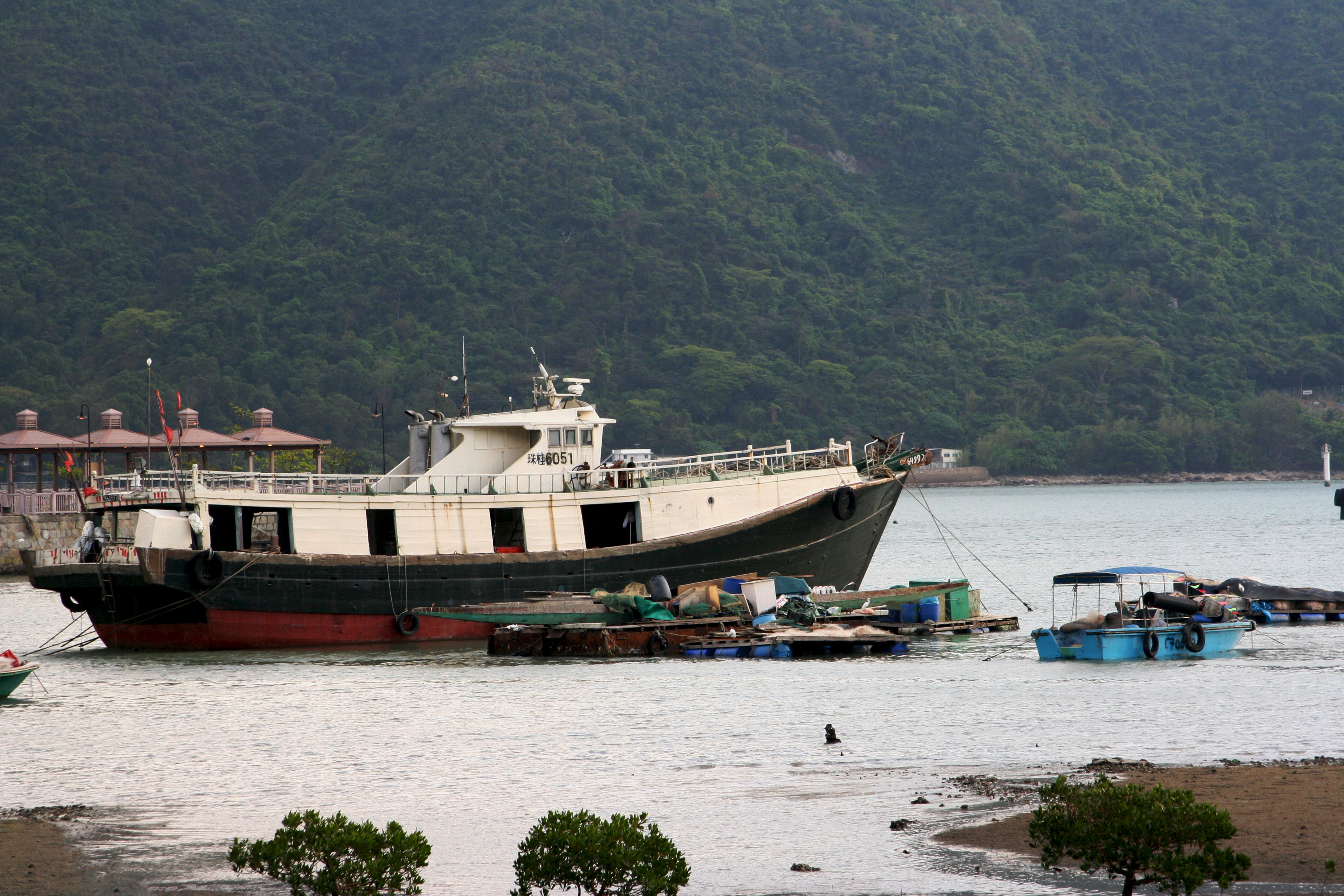
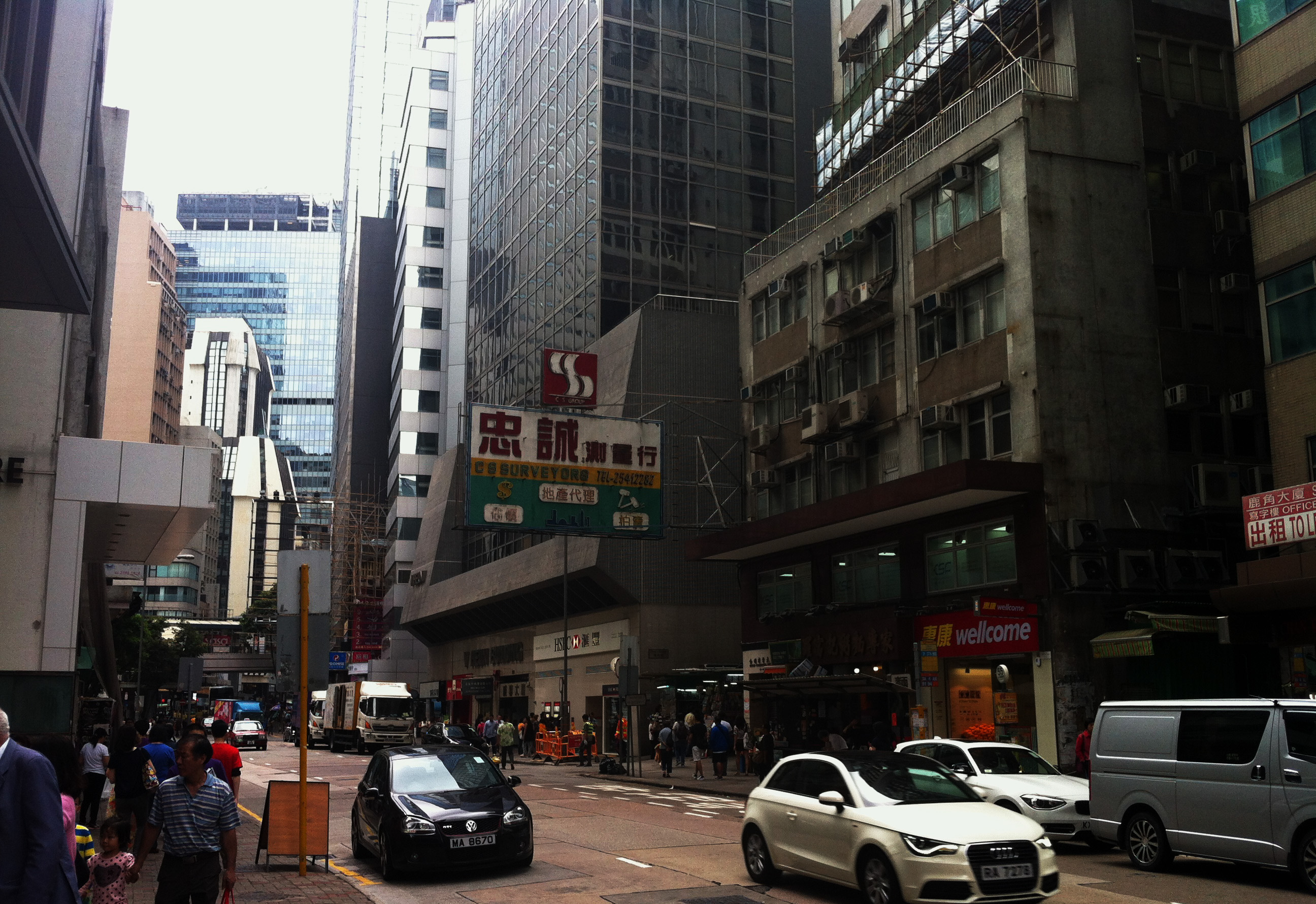
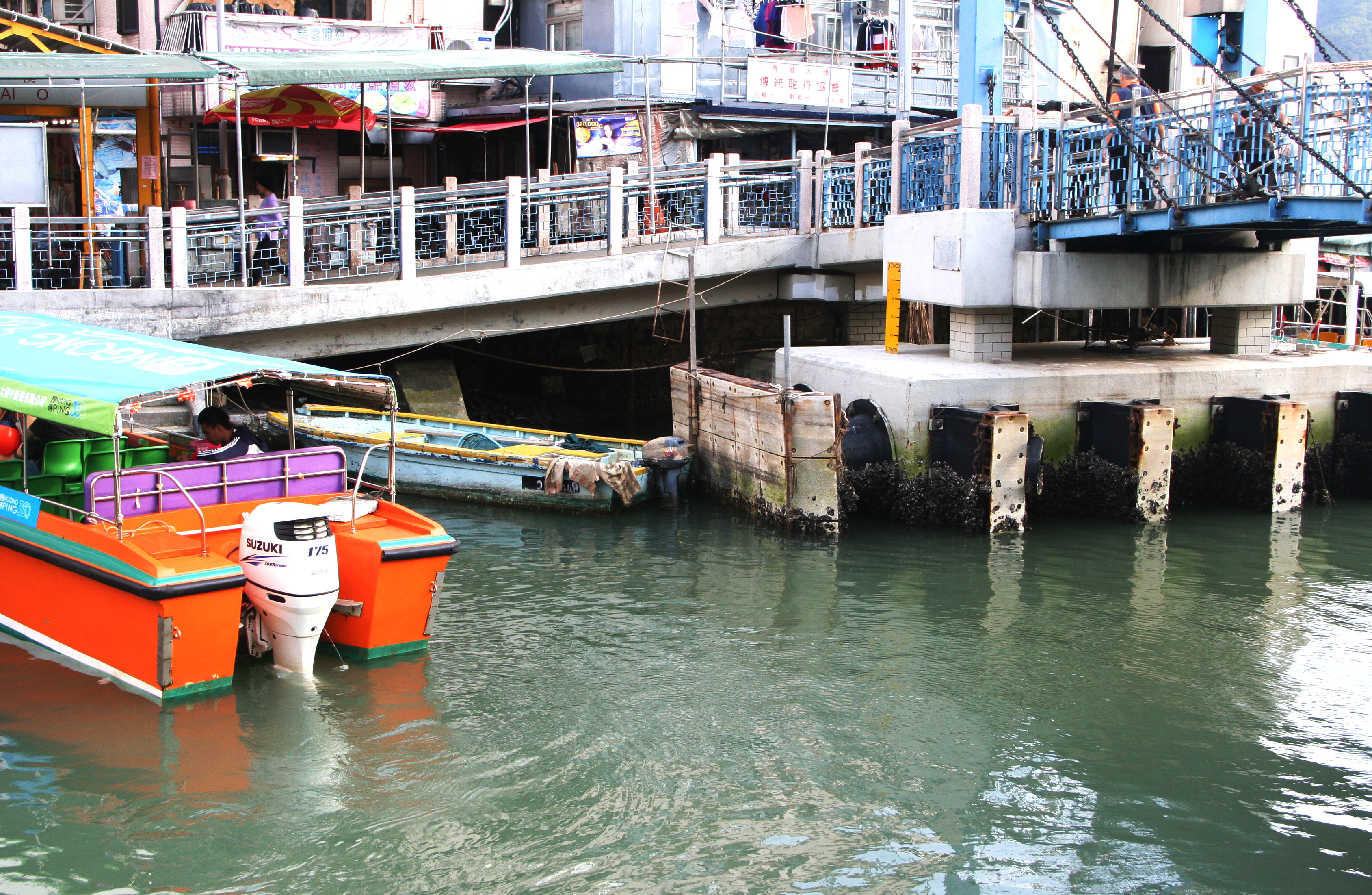
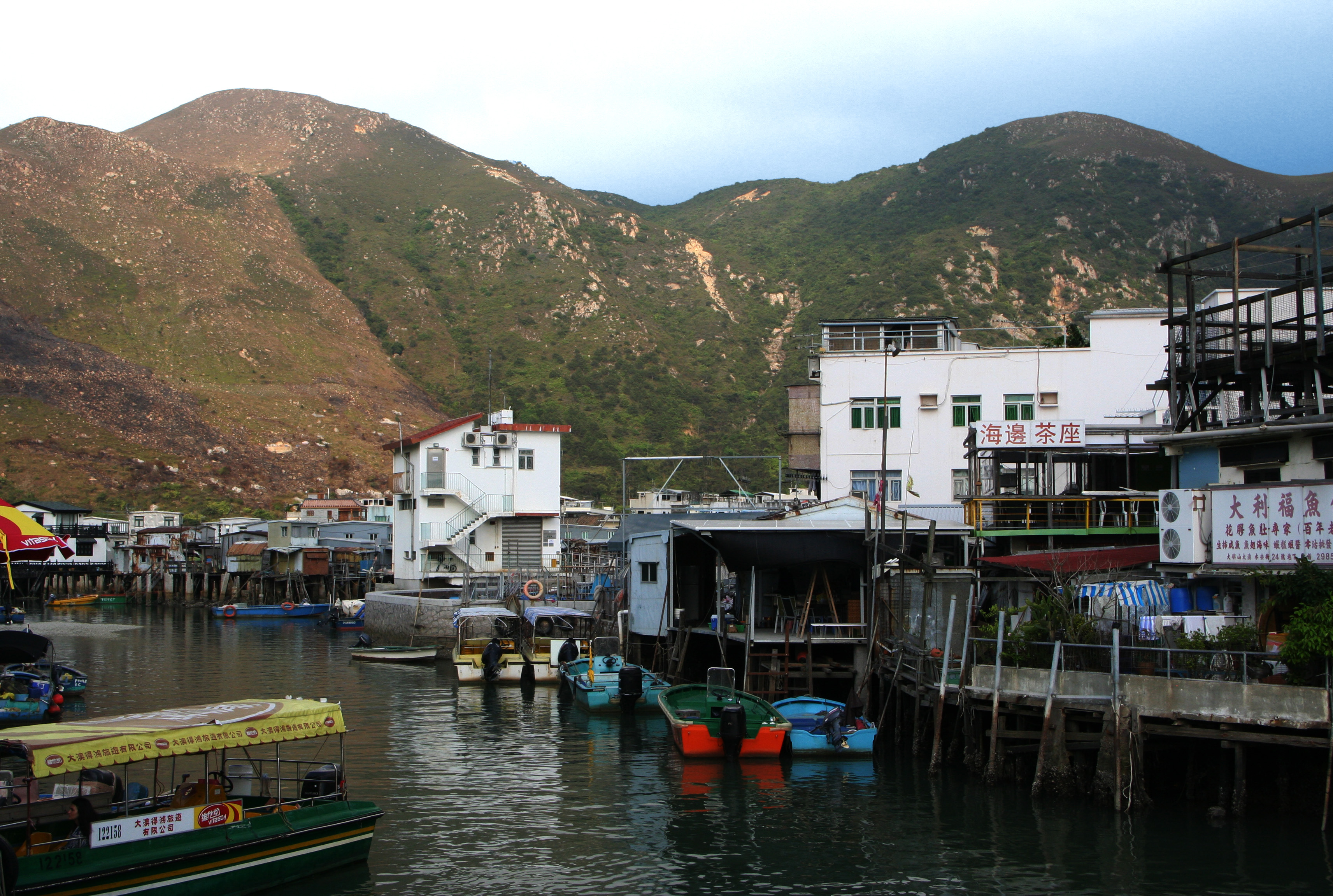
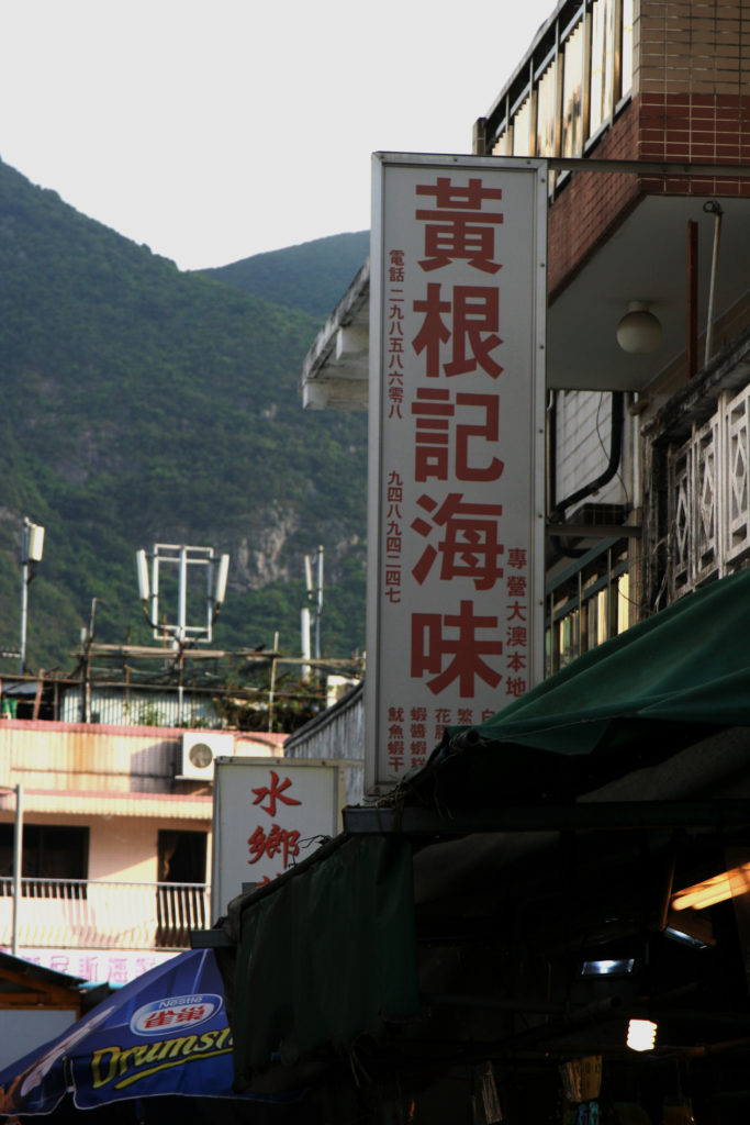
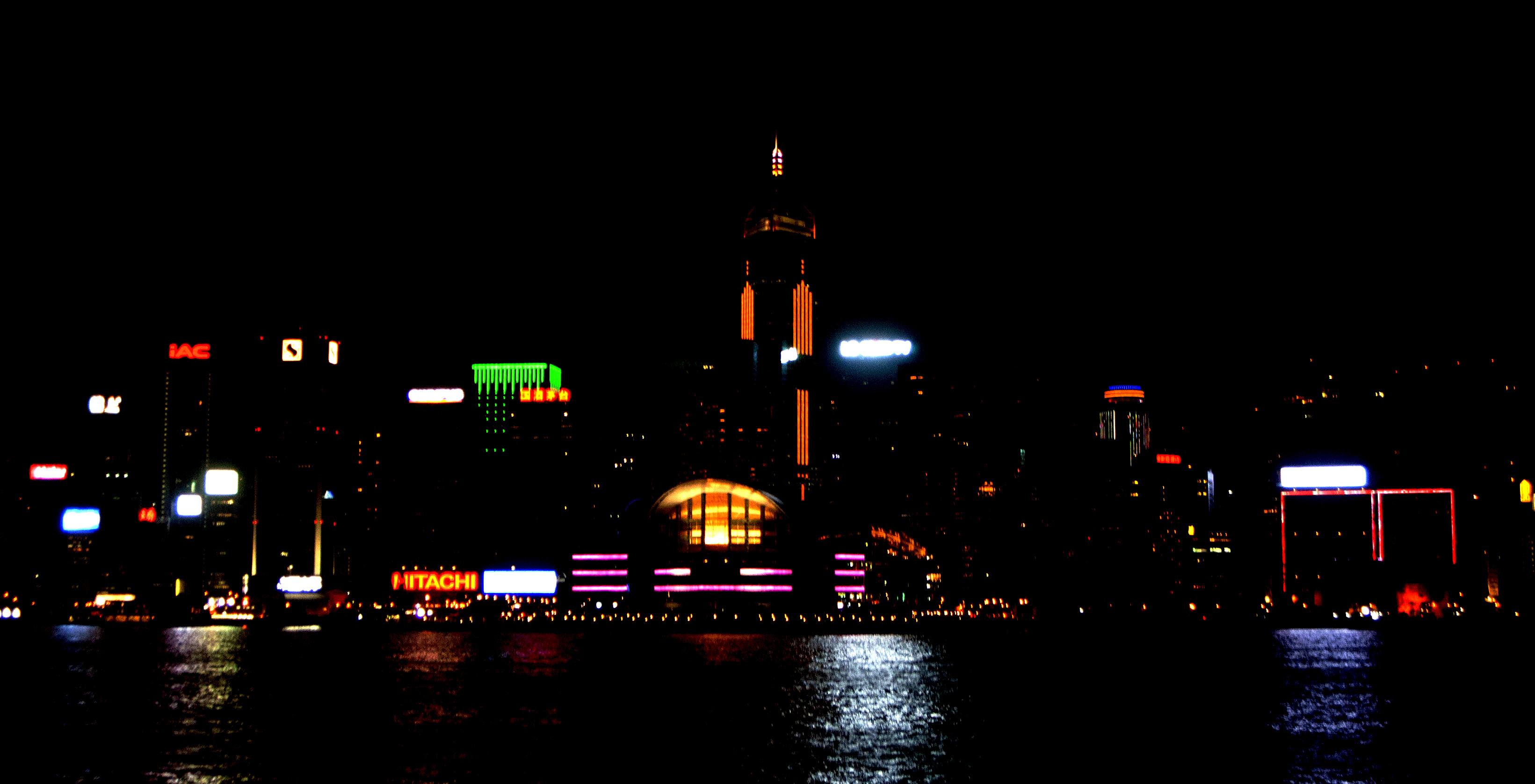
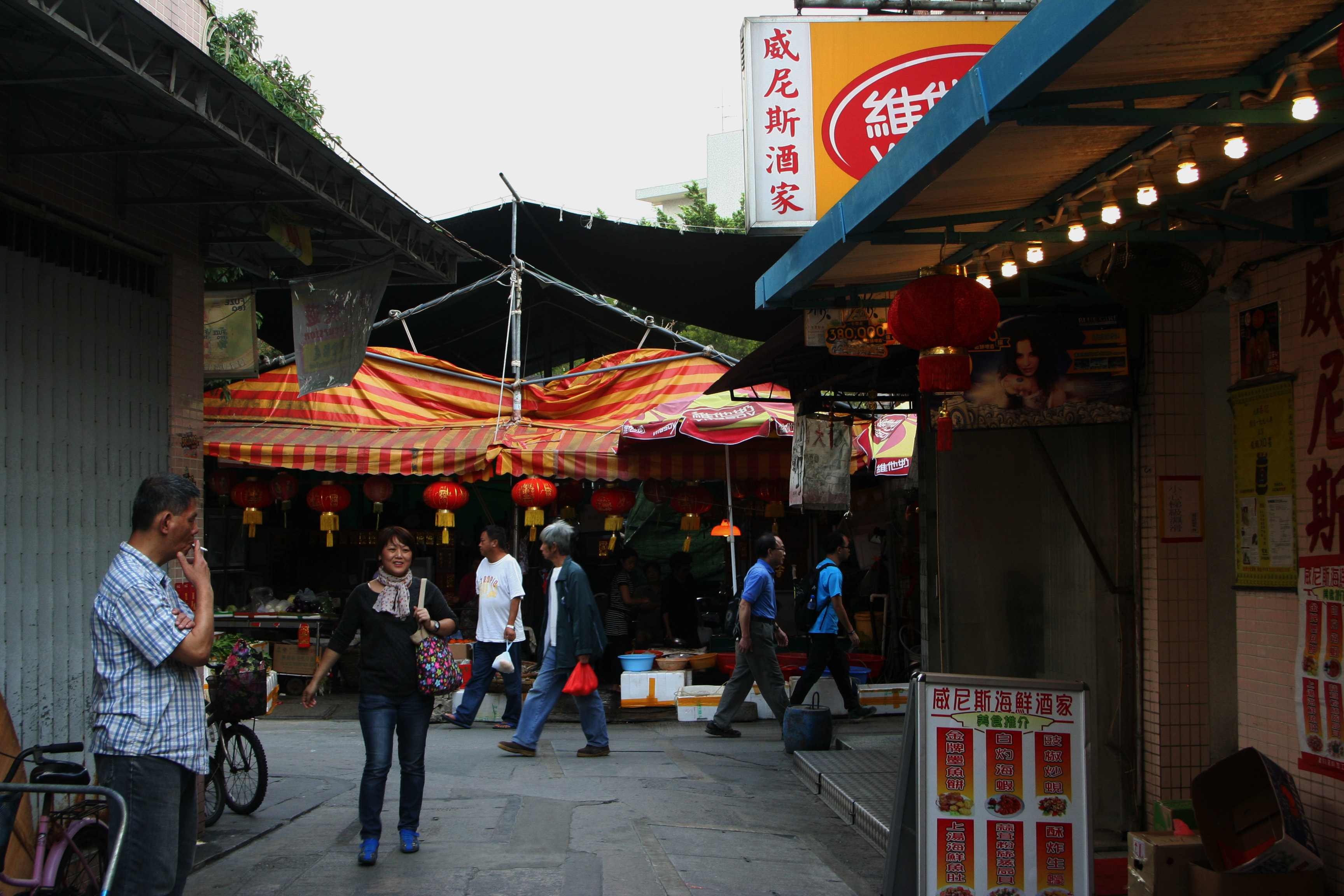
This blog post shows some edits that I have done of my photographs of the diverse and incredible landscapes of Hong-Kong.


I have taken a sea shoot developing on many different surfaces of water and line which I have further experimented and attached some previous images of buildings and created an altered aspect of surrealism and tonal editing.
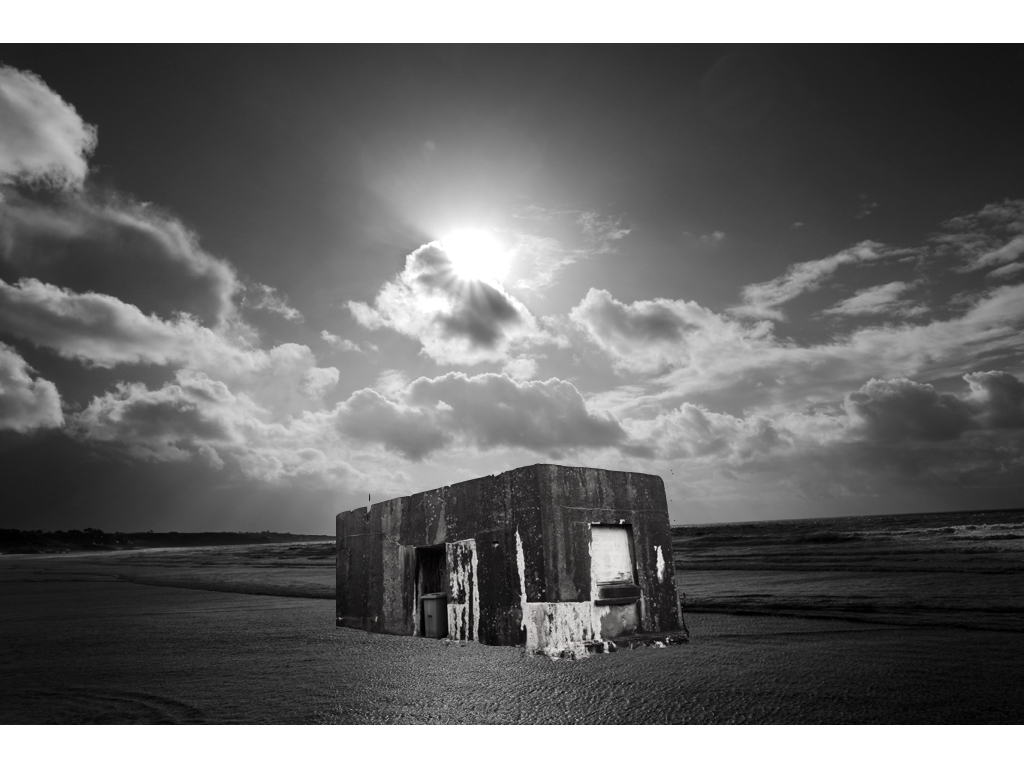
This is my favourite experimental piece so far,I wanted to capture the tones of the sea to be very calm and have a contrasting representation to what water should look like, furthermore the light allowed a direct centre view and also showed a diversity of tones throughout the piece.I then decided to add this building as the tonal range brings about a harmony to the piece and also the buildings angle itself shows a three dimensional angle creating an overall successful affect.
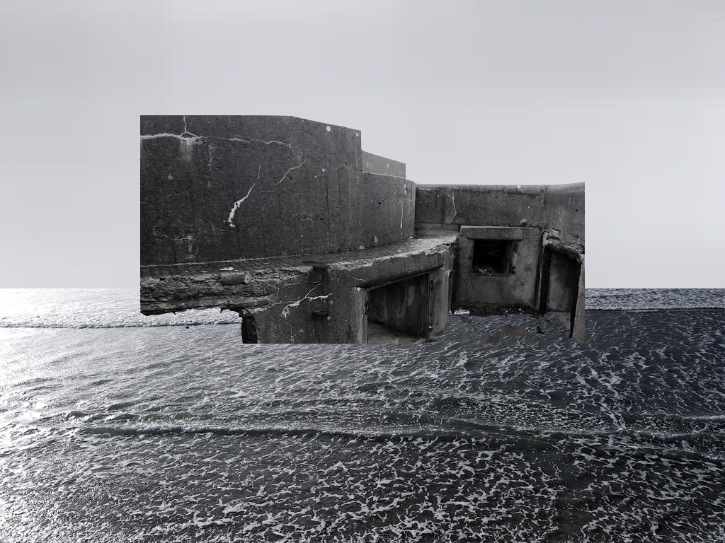
within this piece and one other I took a sample from the sea and sued this for the sky to have a same interconnecting tonal range but also a calmness to the scenario.
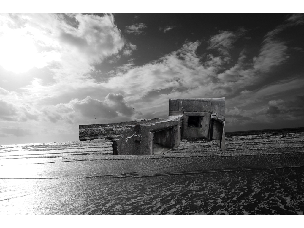
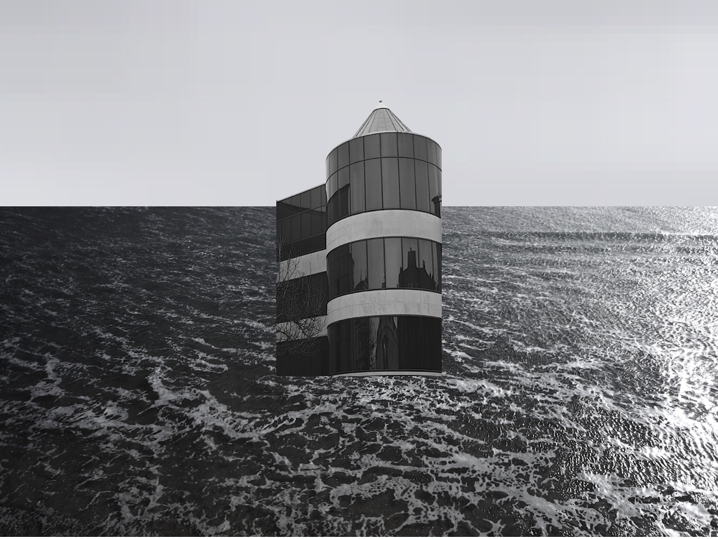
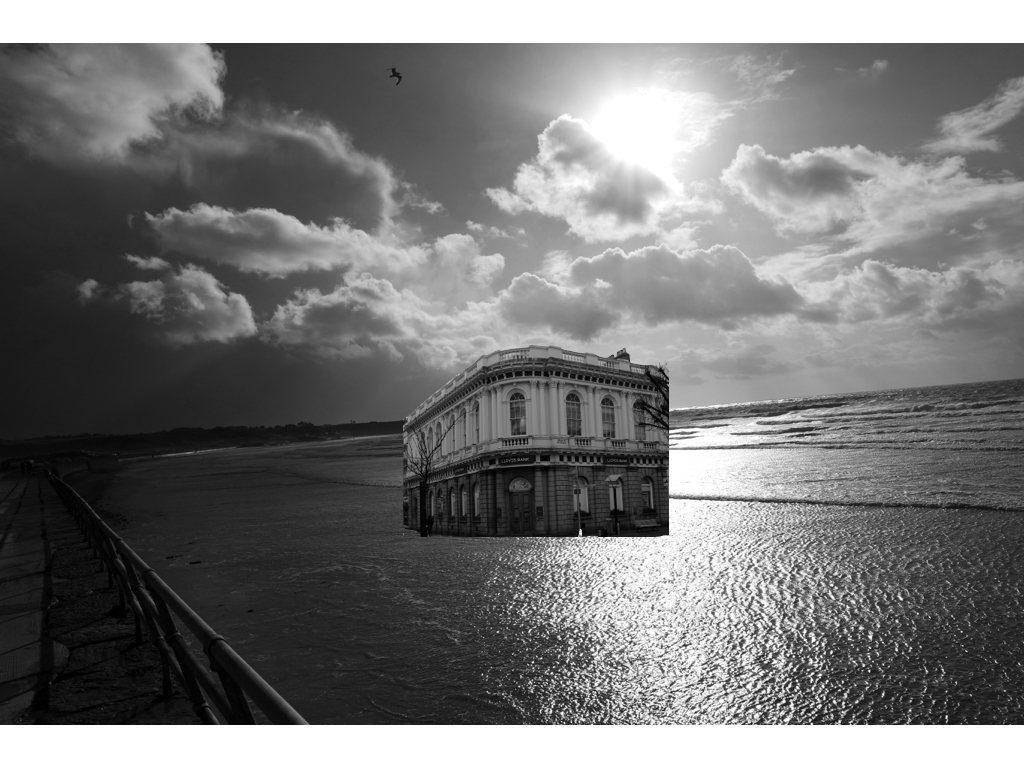
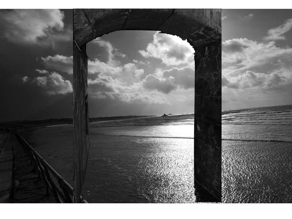
Within the rest of these images I again did the same technique of editing the original images to have the same tonal range inspired by my artist and also having an interesting strong juxtaposing industrial piece in the middle of the piece. 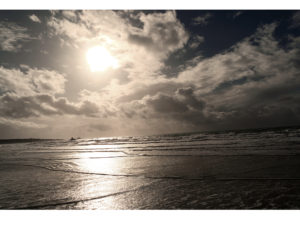

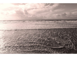
These images above are pulley romanticised sea images and originals from the shoot itself, this portrays the scene previously to how it was altered.
Here is a one-off landscape photo-shoot of a windsurfer that I wanted to present on the blog but I did not feel that it perfectly matched the project.
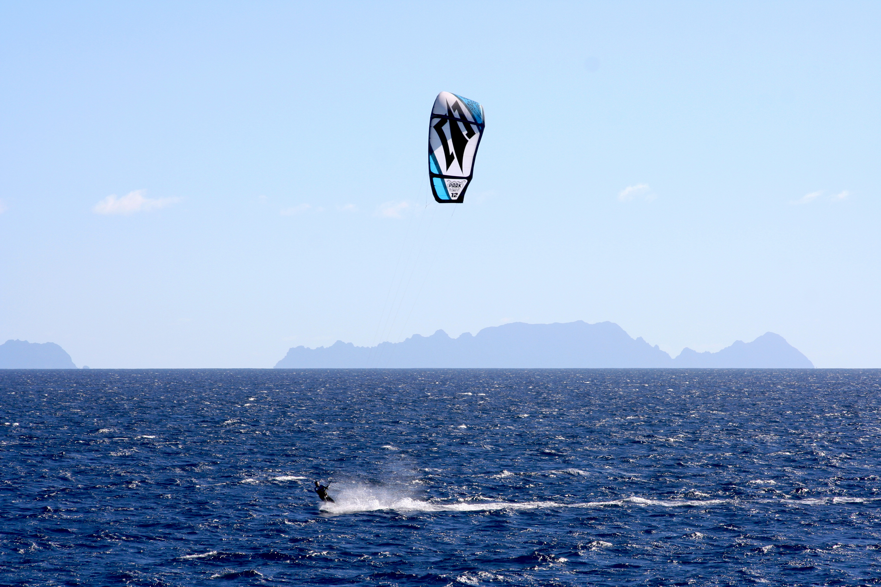
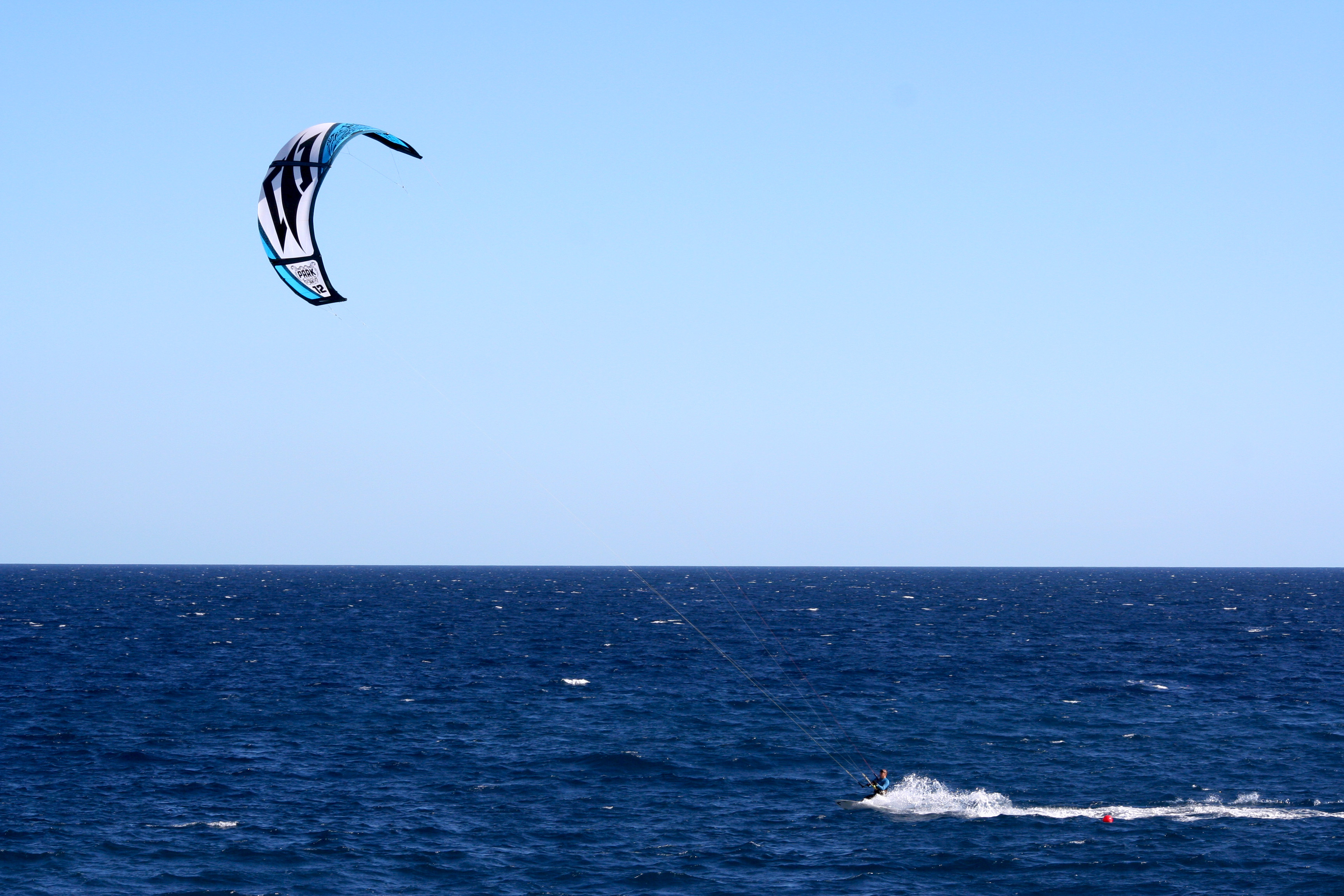
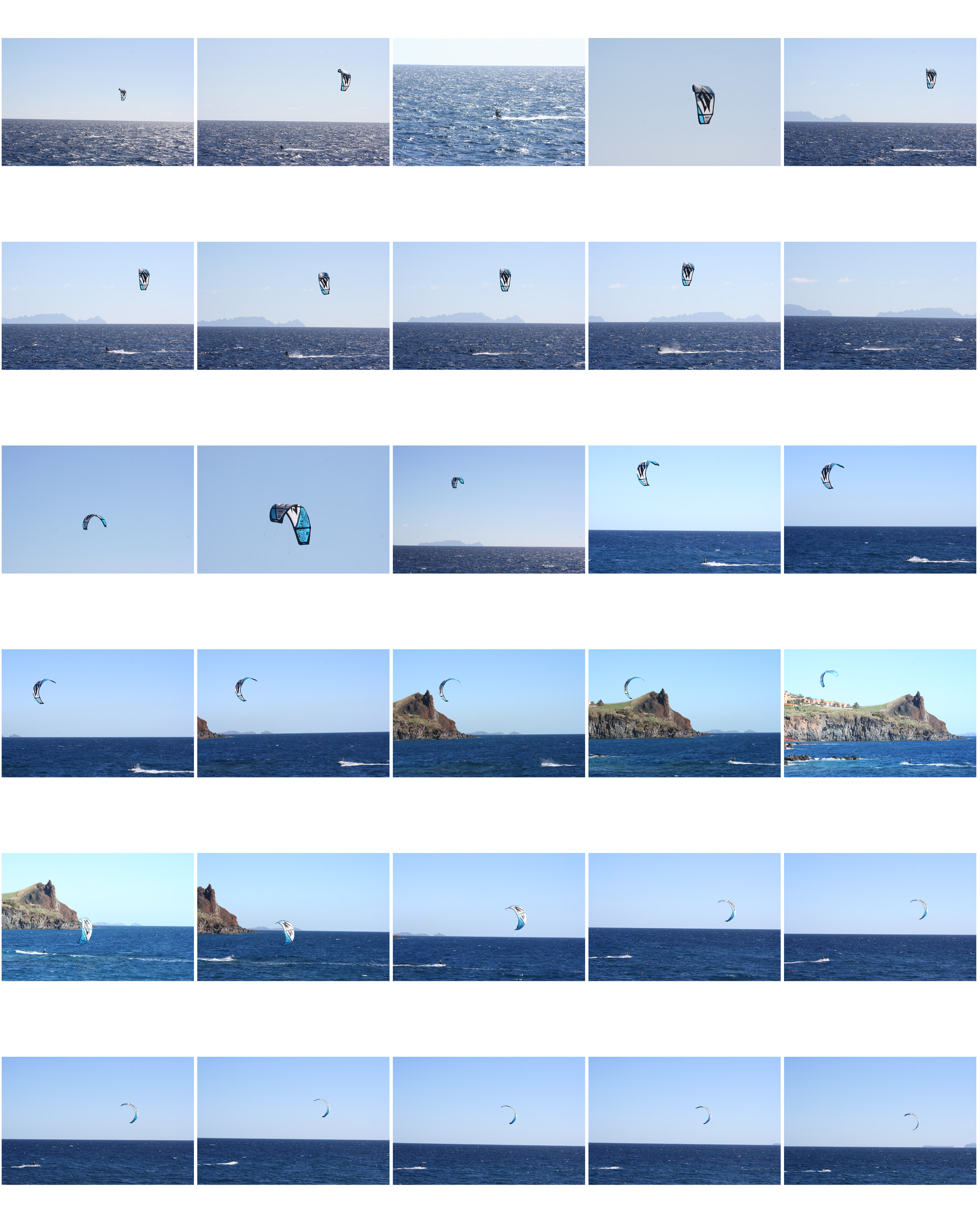 From this short photo-shoot here were my favourite outcomes…

Hannah Hoch was a german artist who focused on the style dada and focused on collage in her work. She was born in 1889 and died in 1978 meaning she lived through two world wars, this is the reason for the dada and political influence in her work. Dada was an artistic movement formed in 1919 in Switzerland which rejected the monarchy and the military, they felt art should have no restrictions. She was a pioneer of photomontage which focused on the issues of gender and the figure of women in in modern society which made her a pioneer of feminist art. She was also well known for her political collages where she reworked images and text fro the mass media as a critique of the failings of the weimar german government. Her inspiration came from the collage work of Pablo Picasso and Kurt Schwitters, both of their work incorporate a dynamic layered style.
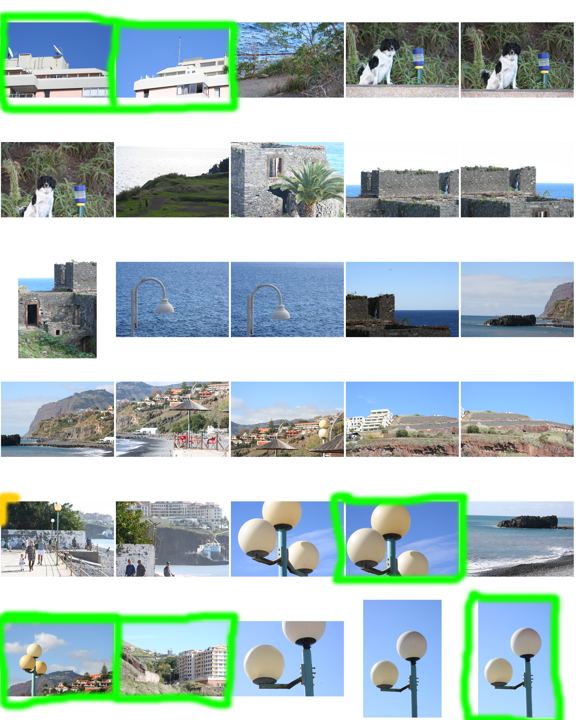
Here are my favourite outcomes from my urban and altered landscape photo-shoot, these pieces have been done with inspiration and influence from The New Topographics.
With these photographs I have aimed to present my raw camera skills and display the pure aesthetic pleasure of man made landscapes and how man made structures can impact natural landscapes.
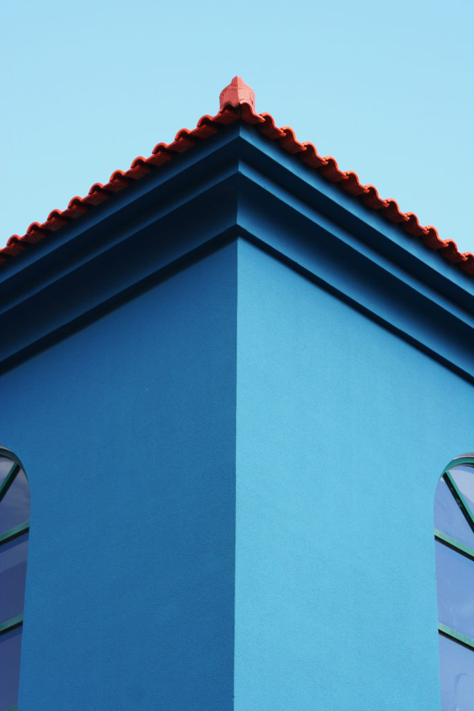
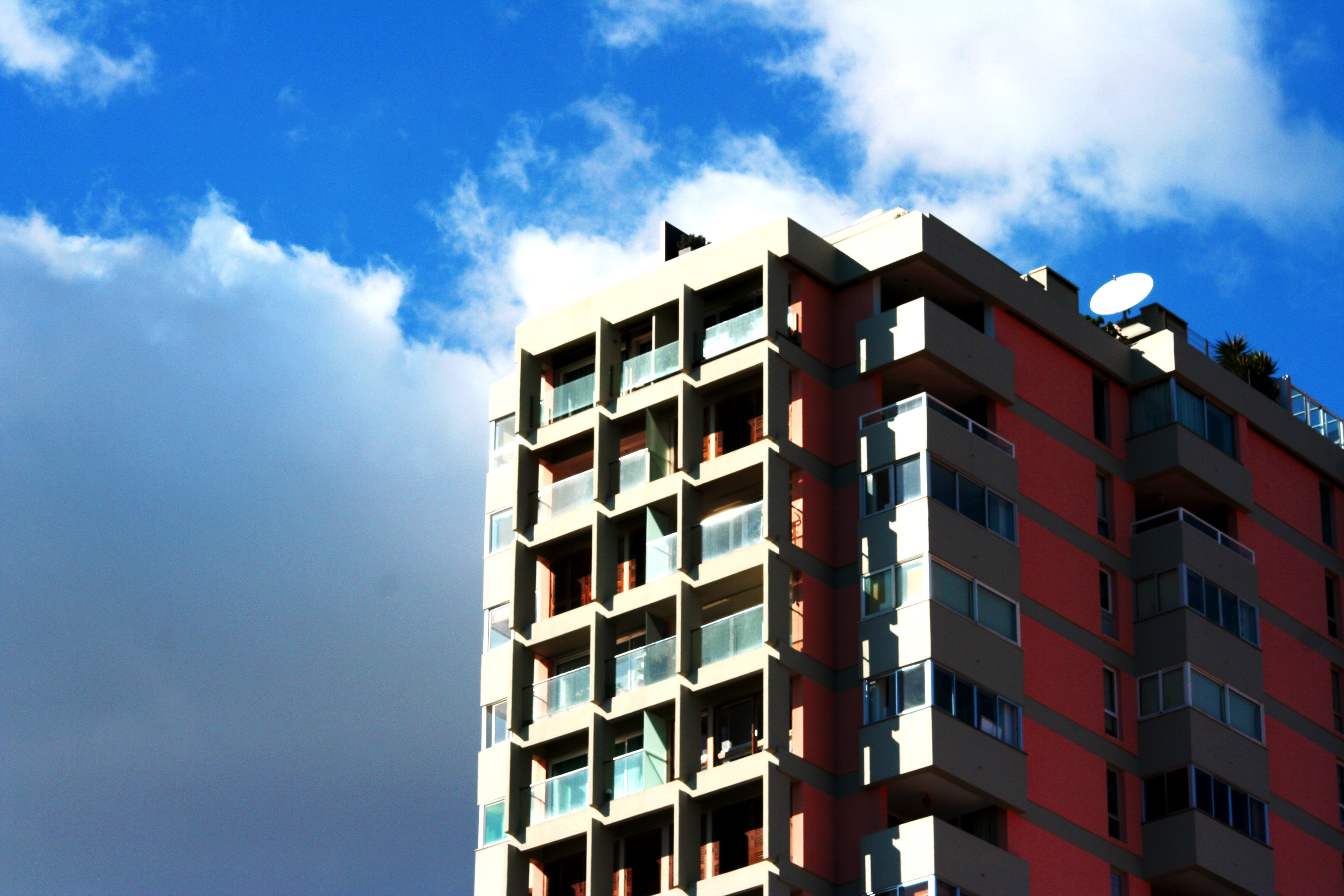
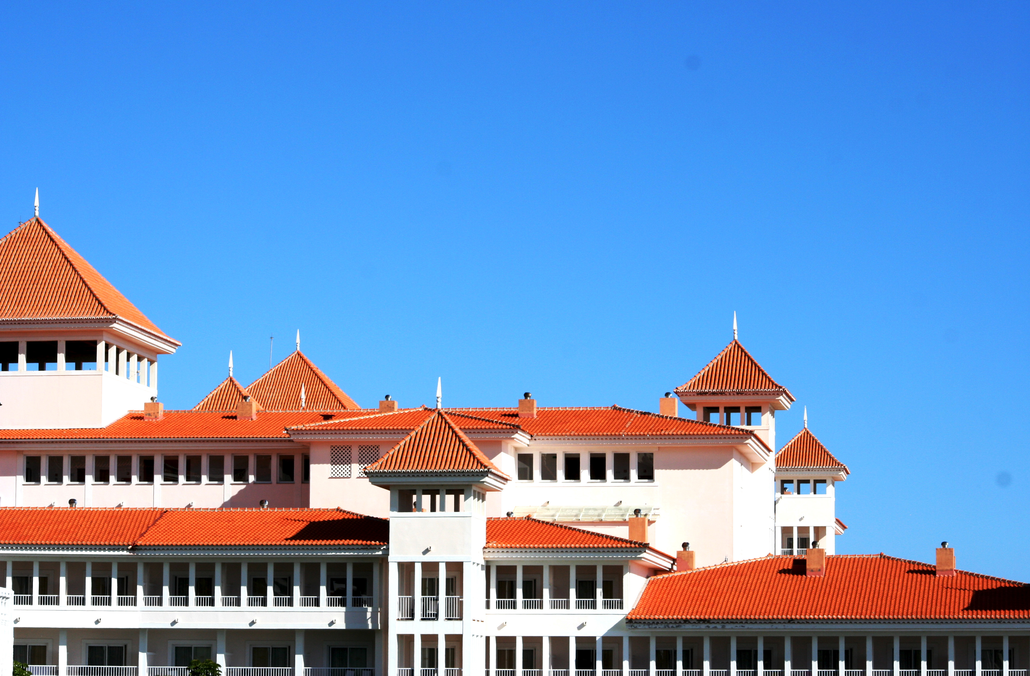
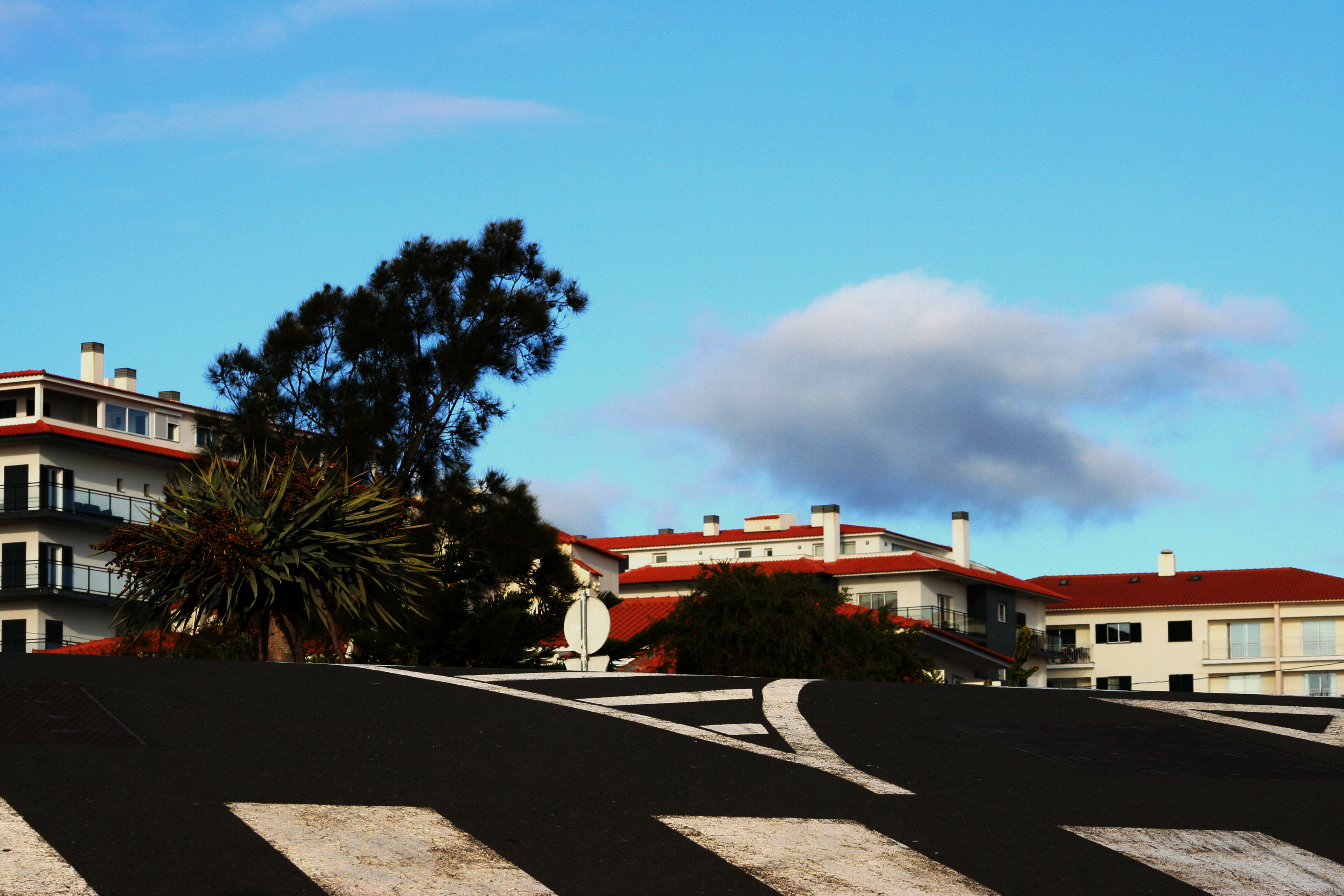






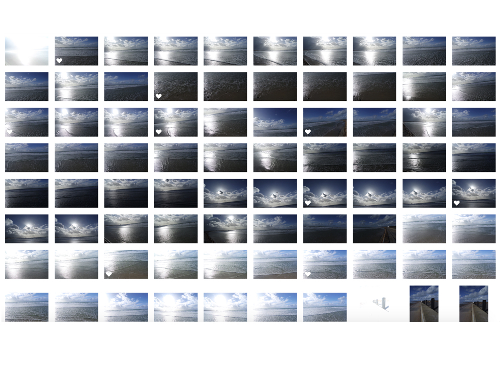
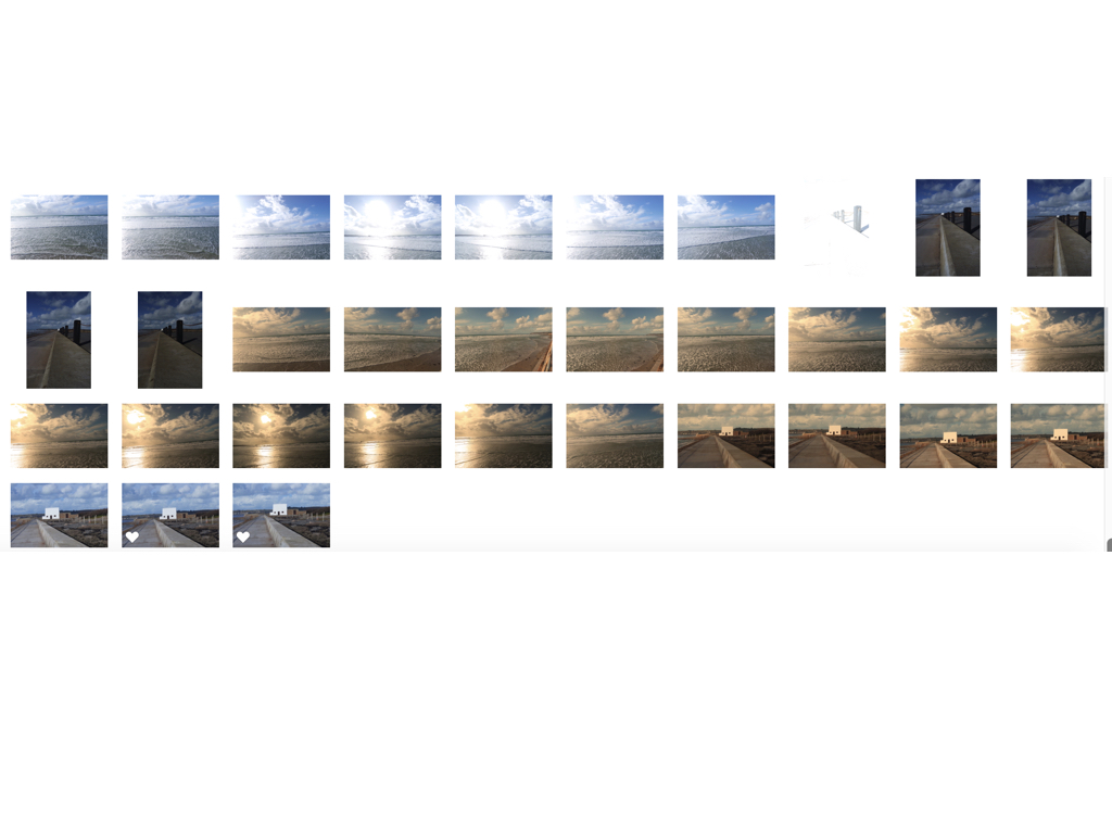
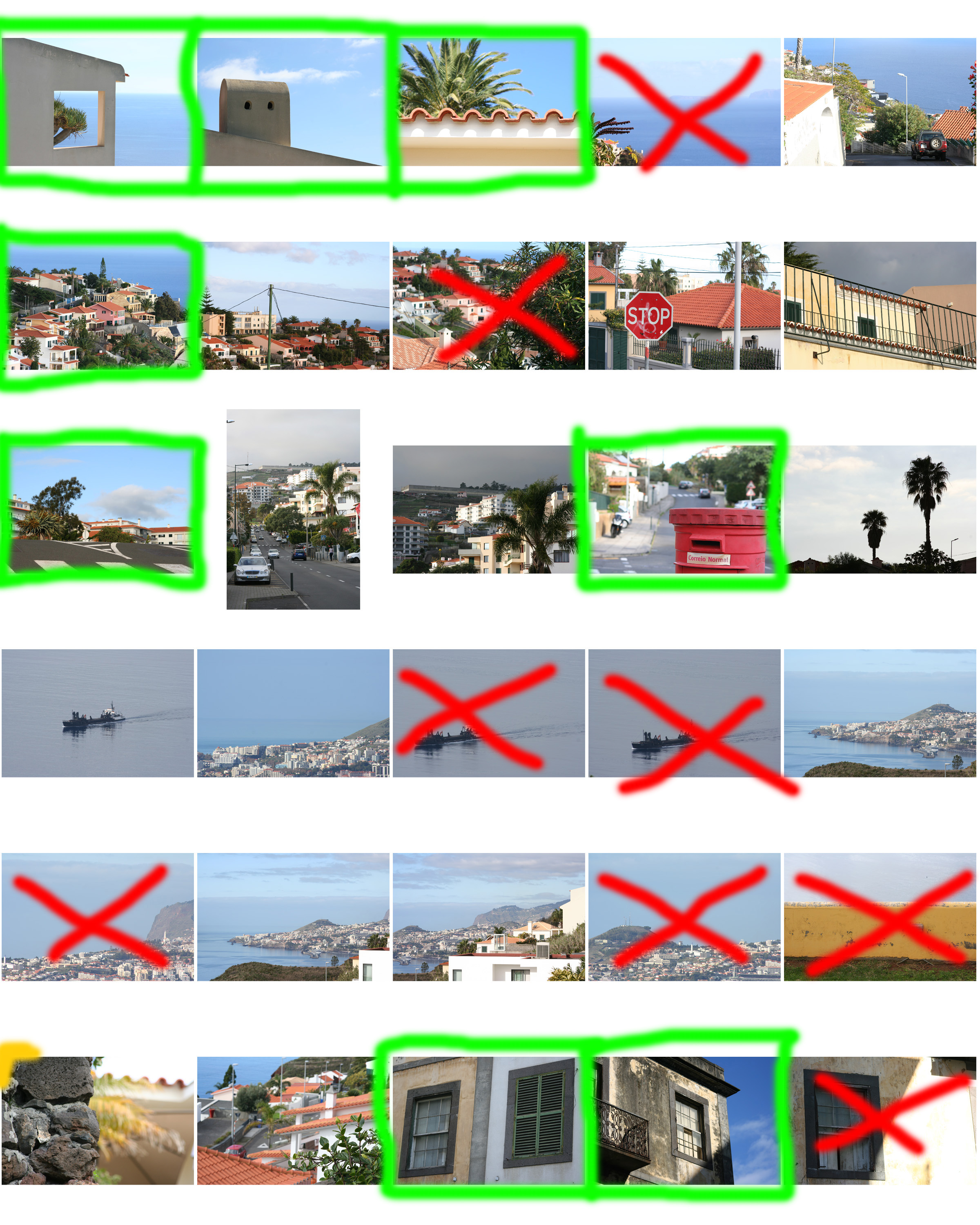
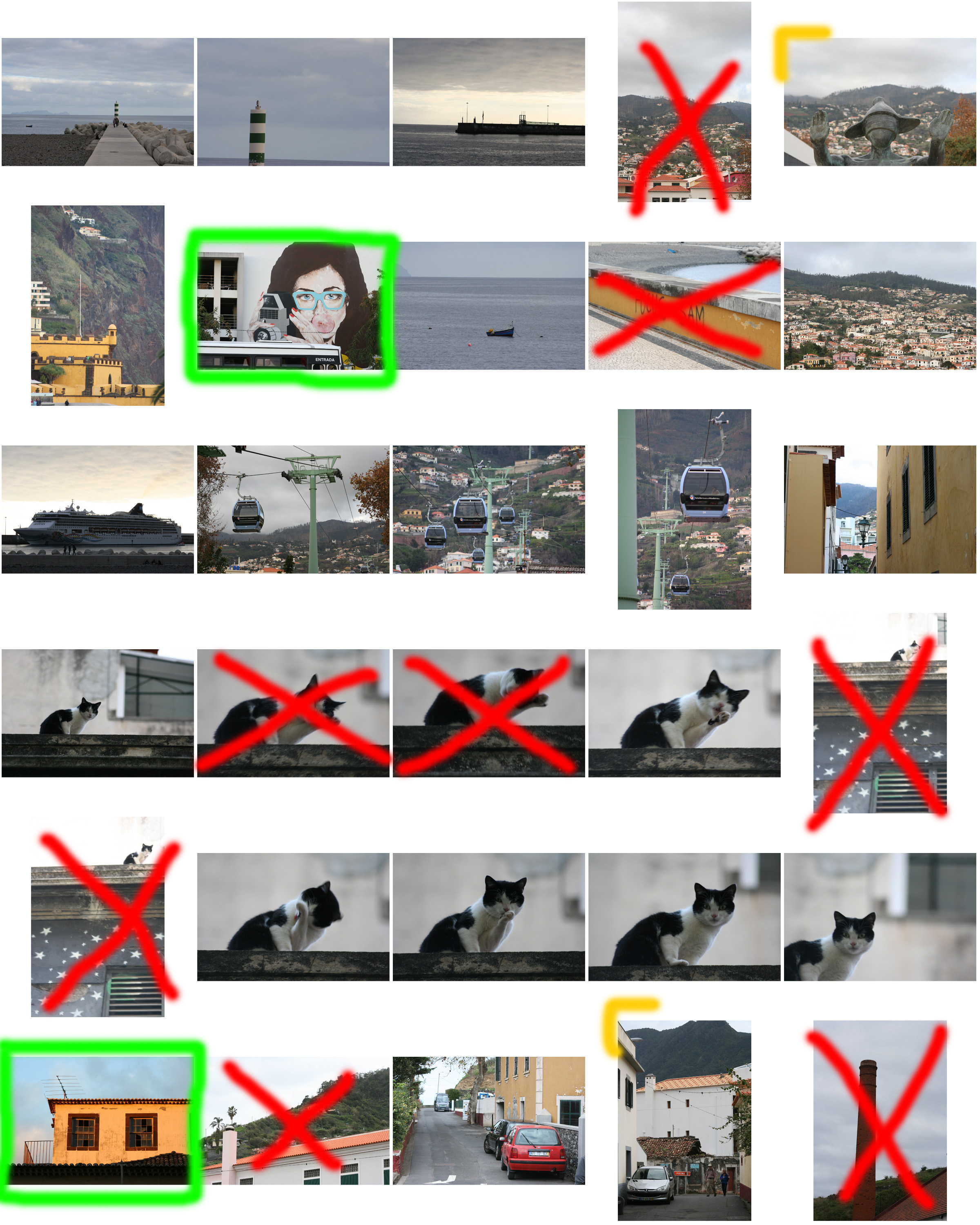
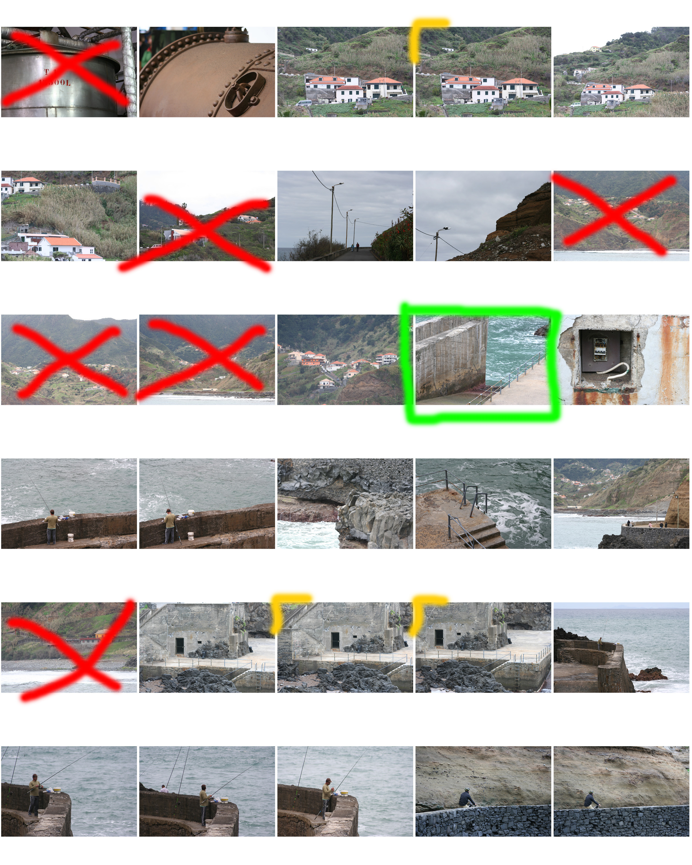
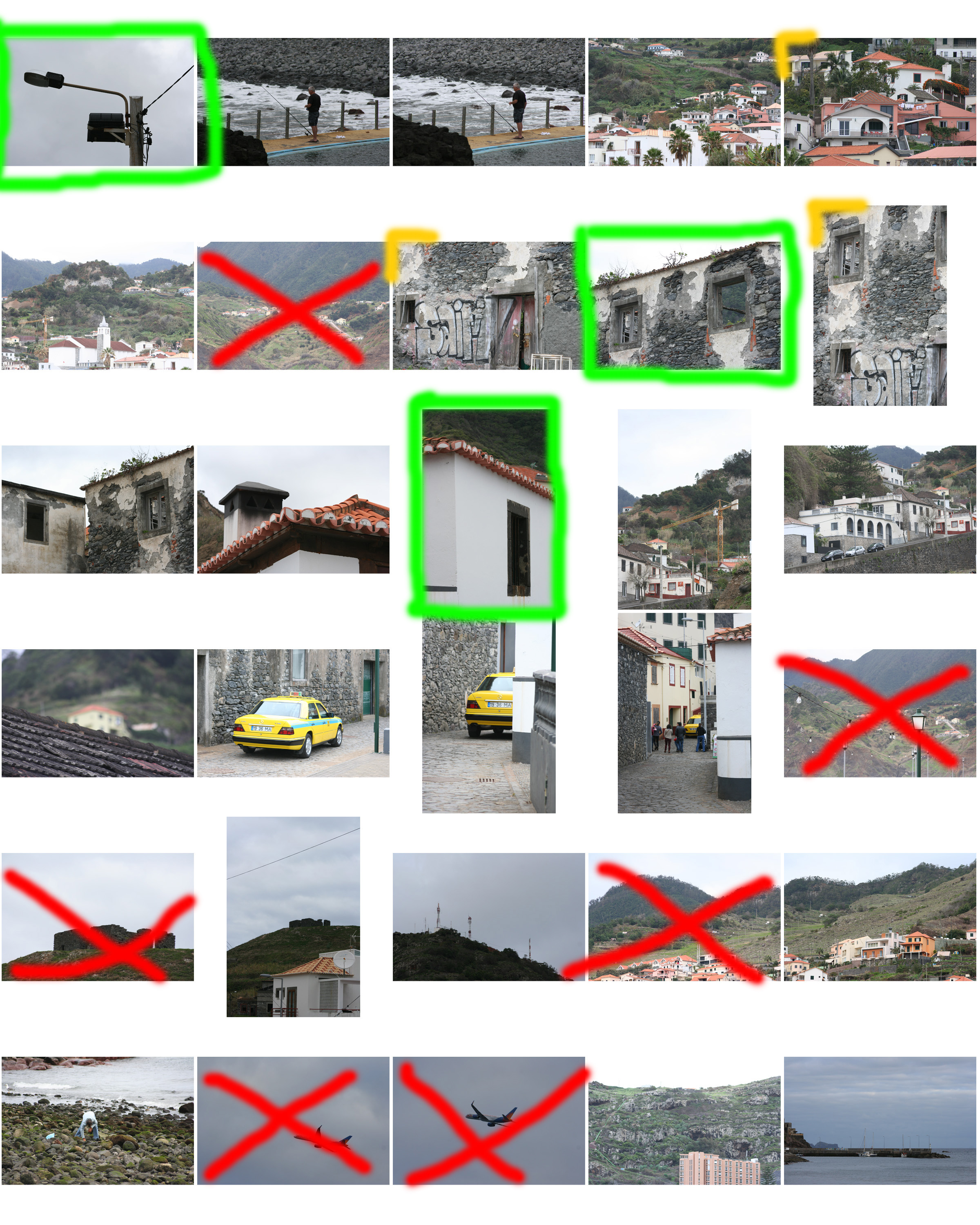
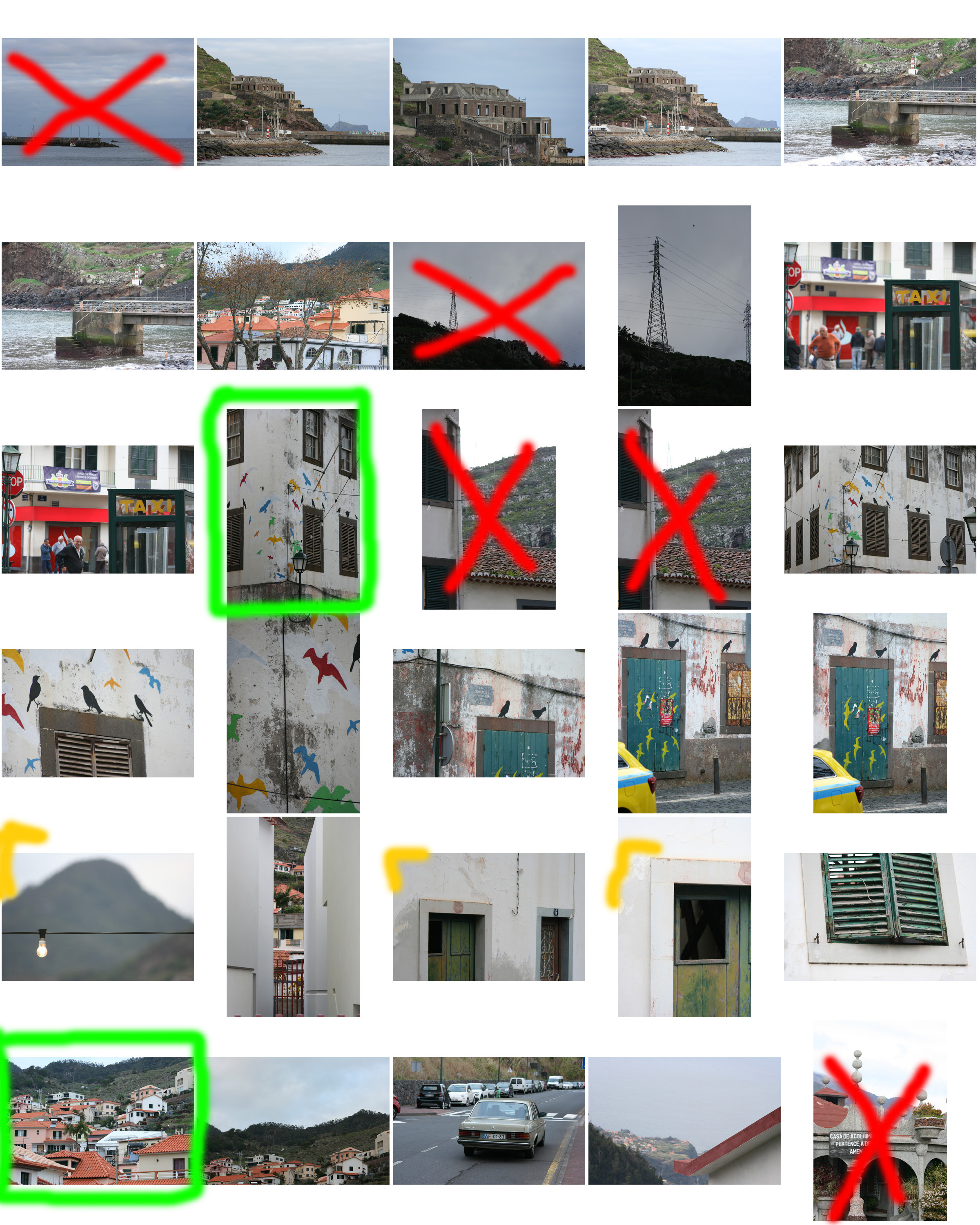
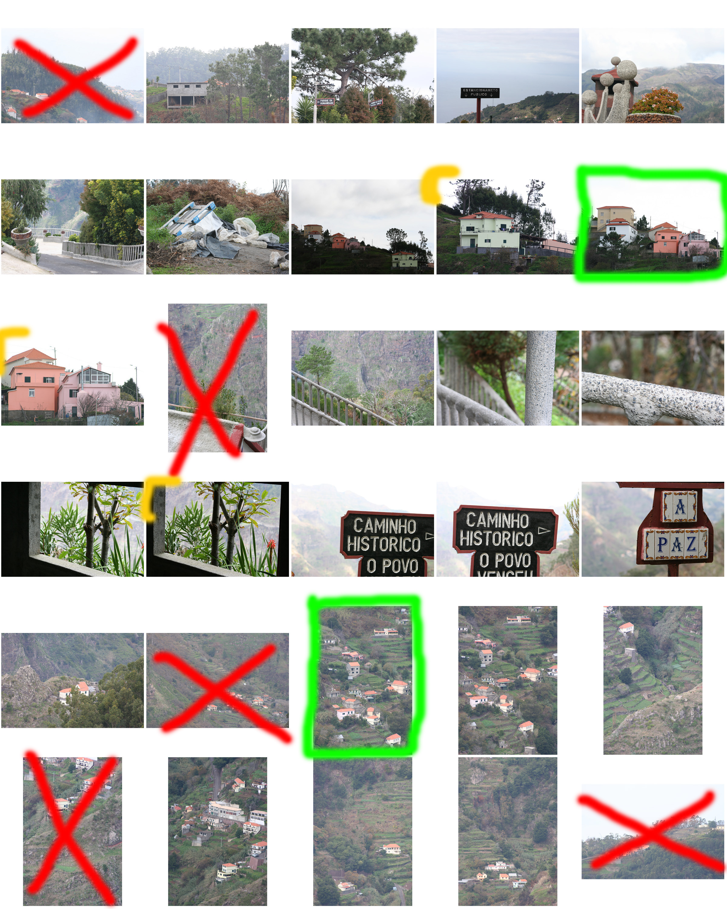
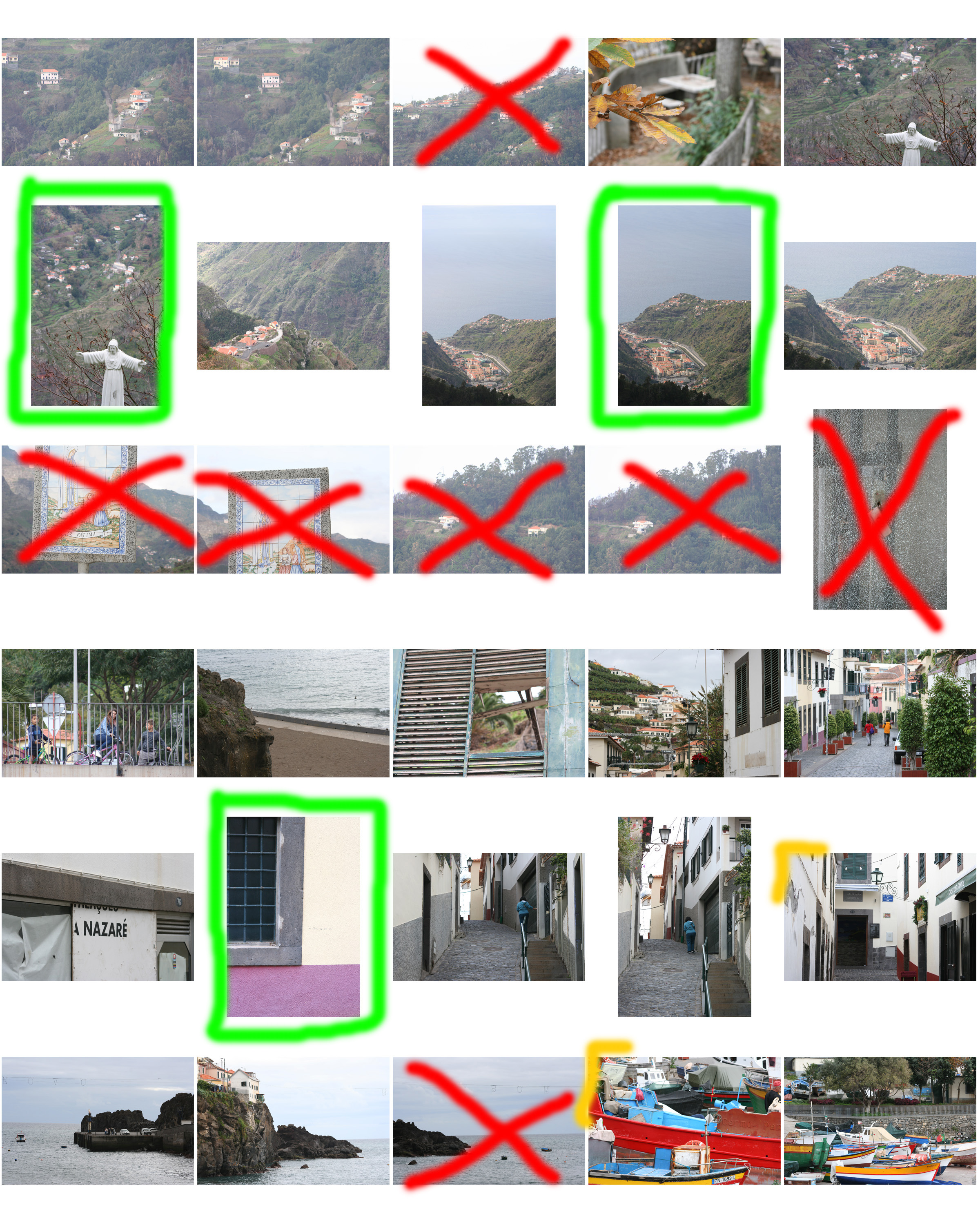
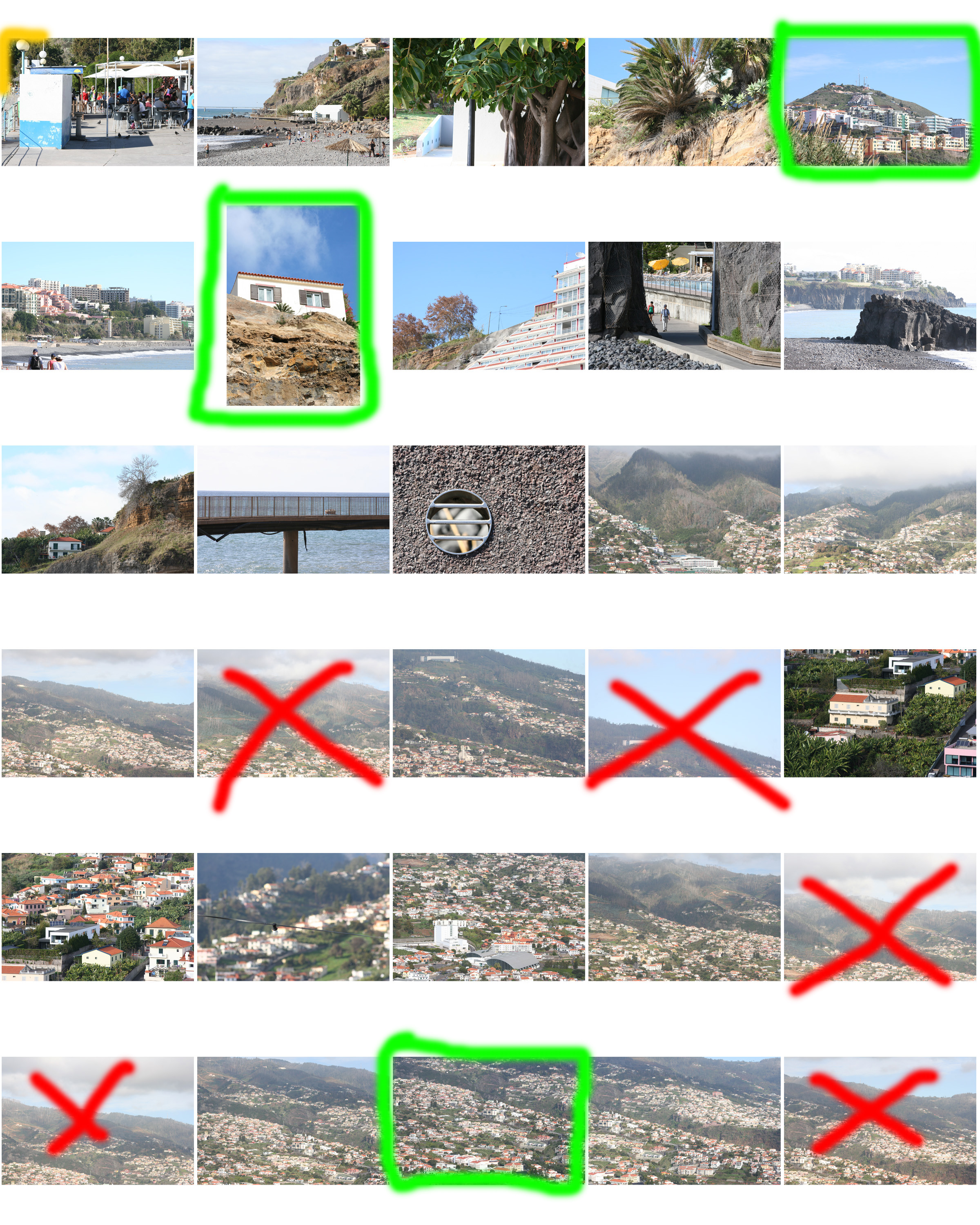
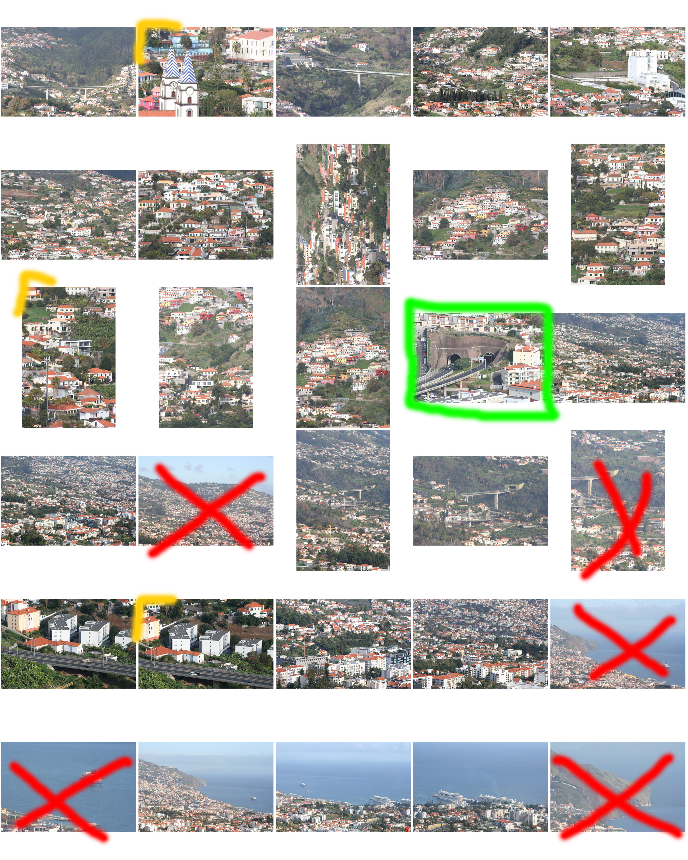
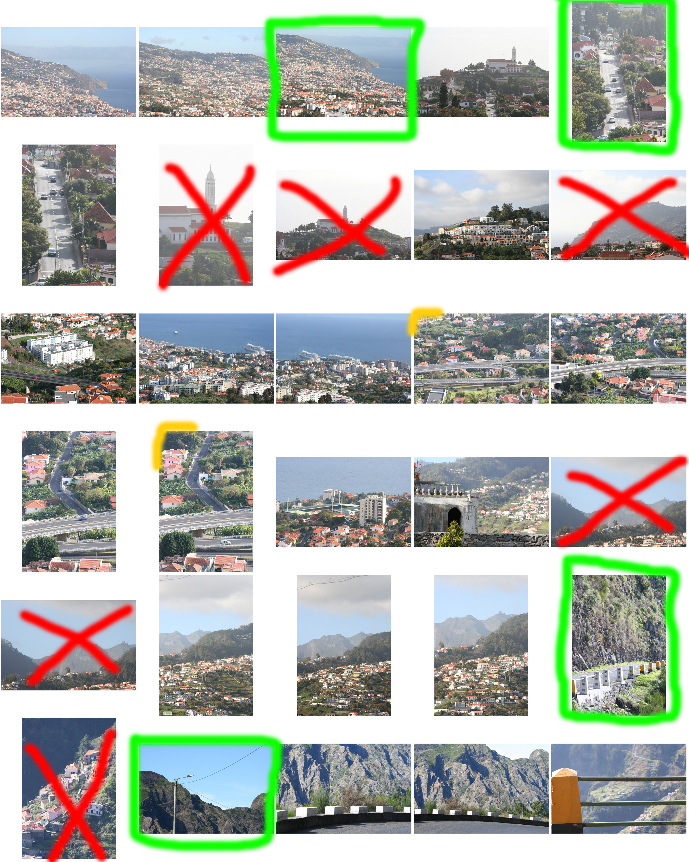
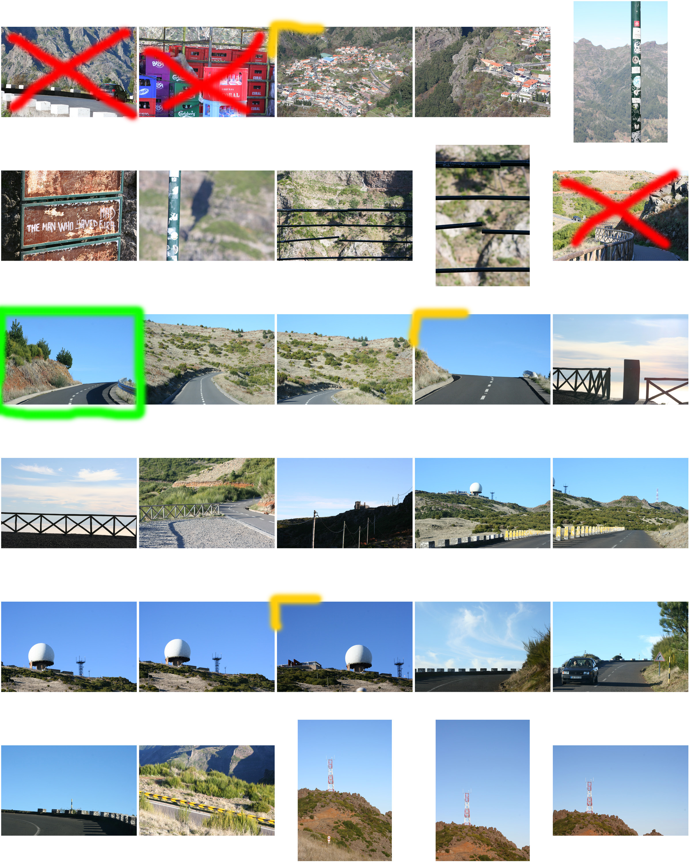
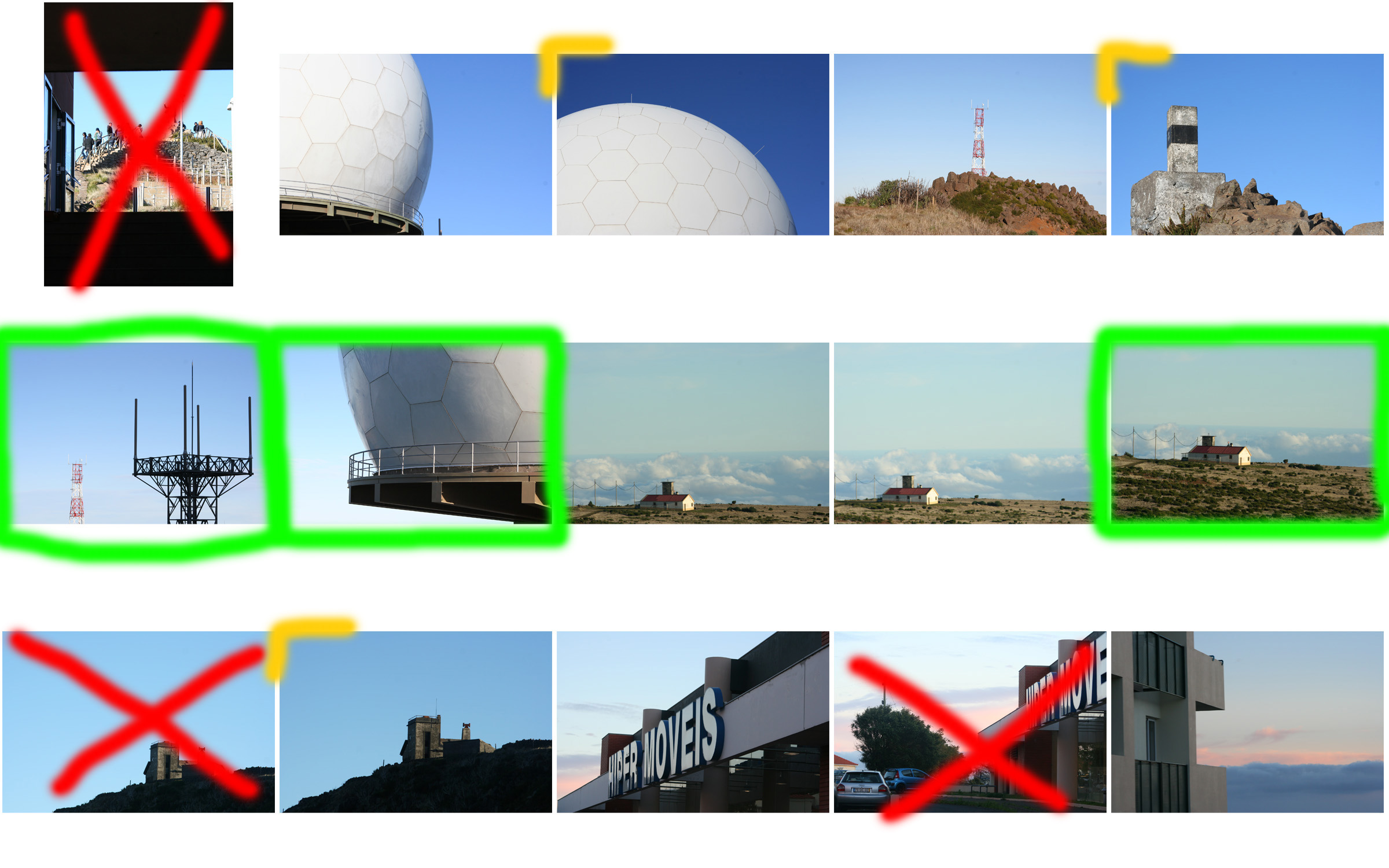
Here is my raw Urban & Altered landscape photo-shoot. I have visually annotated the contact sheets of the shoot in order to help myself when picking out my favourite images to edit or put aside. My favourite outcomes from this photo-shoot will be presented in my following blog post.


I decided to learn more about abstract and formalism as I want to produce Many of my own images that mainly focus upon a structure-being a building ,and a close up from of a whole image and scenario.I found a photographer who I thought captured beautiful images and a movement within a solid object and how he enhances these images within using light.


I believe that I am going to start focusing more upon surrealism within how nature and architecture within buildings works together,So I believe that if i do some experimentation within the lines and structure inside buildings and what surrounds me could too be efficient.I also think the color of tones will too work well within the work in which I am going to focus my attention purely within.I chose to do this small study because I do believe it will help me to access a more architectural and tonal sense of eye that will help when developing my typology study of building in order to produce my final image of forming nature landscapes and architectural urban landscapes.
Due to my plan of studying architectural and a structural sense this allows me to capture how lines and such can enhance my overall image and also how and what angles would show a more three dimensional pattern that would also benefit me as this is what my artists does too. This could also help when producing a mirrored effect within my images and finding a fine line to cross and or using a sea mirroring effect or wanting to capture the structure within a moving object.
I do think that studying this small experiment shoot has helped to develop an Idea of how I will capture the buildings and shows a sense of line using tone and light within the images. I could always possibly use some of these works in order to show how I could finish the other shots that I have done.
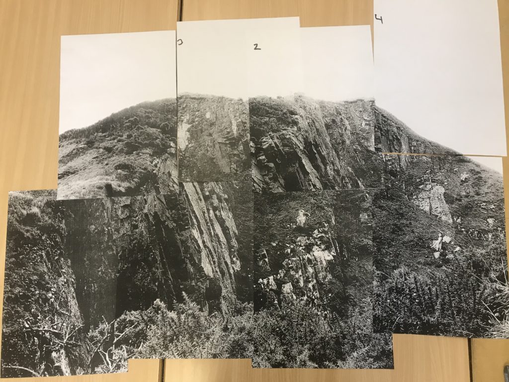
Below is one of my final images that I will be presenting for my final piece in the mock exam. In this post I look at how I could present the photograph in different ways to make it stand out more and be more creative.
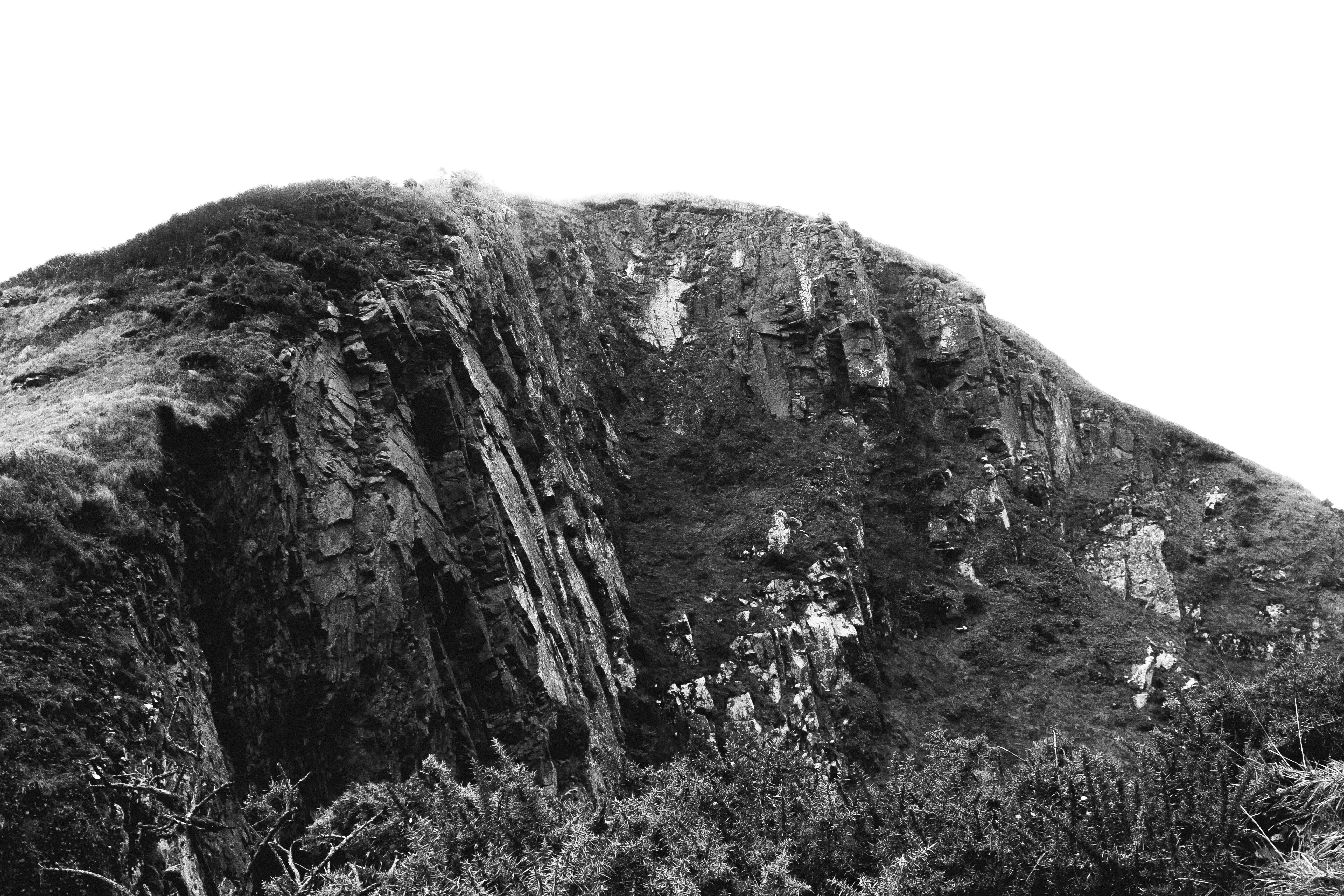
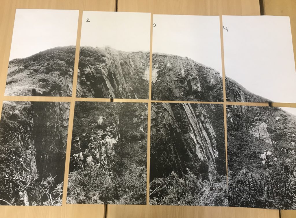
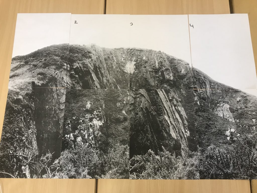
Due to the size of the subject in this photograph, I want to present the photograph on a large scale to emphasise the presence and size of it. This creates a more intimidating effect because of the largeness of the subject. I have looked at keeping window-like borders between each section of photograph but decided that I will not follow through with that because I feel that it takes away the fact that it is one large photograph. I have also looked at moving around the panels in order to create a mixed up image – I decided that this takes away from the nature of the photograph and isn’t in the direction that I want to be going. I came to the conclusion that my best option was to stick all the panels together in the correct order to create one large photograph.

THE CHAIR
Location: Abandoned Places
To explore natural landscapes more i decided that i wanted to go to abandoned places that have been neglected to create more interesting subjects for my images. I decided that I would visit derelict greenhouses with overgrown plants showing the natural aspect with the broken greenhouse creating a more thought-provoking image. Although these photos aren’t completely natural, they show how the natural aspects have taken over and grow around the urban spaces.
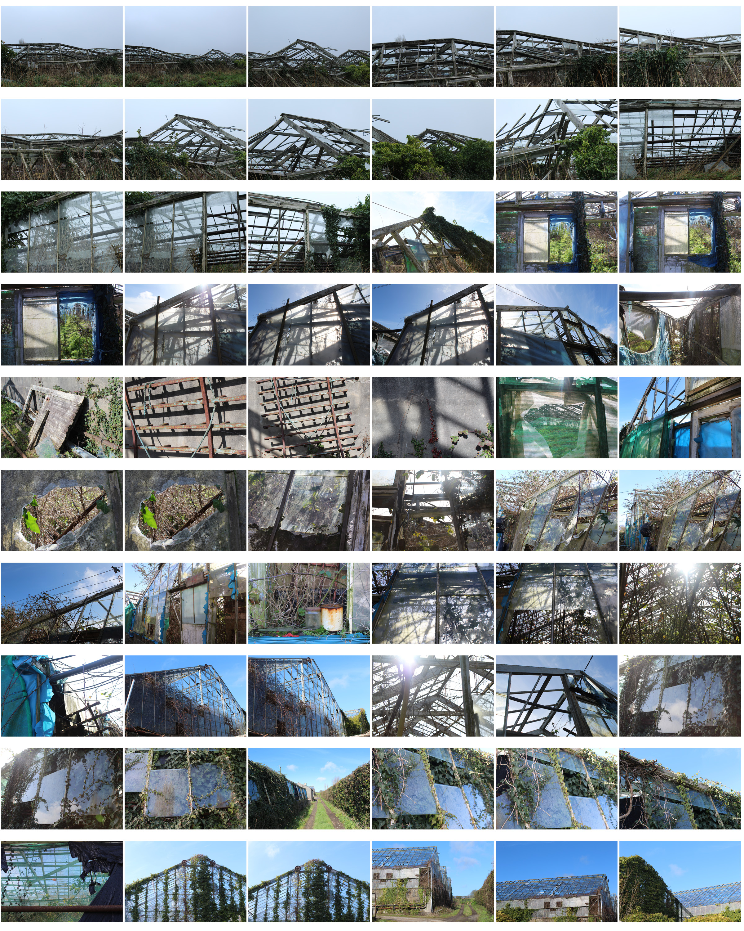


I went through my contact sheet and selected my favourite images and displayed them above unedited. I chose these photos as they are taken from different angles showing a different point of view in each image, some showing close up detail of areas that caught my attention and some that are from far away giving more of an overview of the scenery and structural shapes.


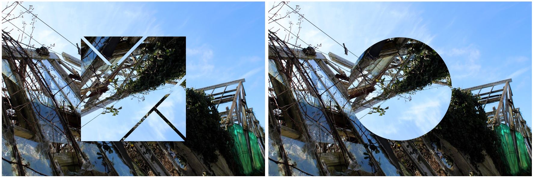
To experiment with my images I decided to edit different shapes with the image to make the photo more intriguing and to give the photo a different aspect, although I like the images by themselves.



I also tried to create some panoramic images by taking the same image and flipping it horizontally and attaching to the original image. I did this as i thought it would be harder to attach different images and line them up exactly to create one landscape so i use the same images flipped so the it was easy to connect which I thought would be more aesthetically pleasing. These panoramic images create structural shapes that would not be found in real life making for an interesting image. I did not chose these images to be in my final outcomes as I think the patterns created are too repetitive being the same images repeated again.