

EDITS


EDITS


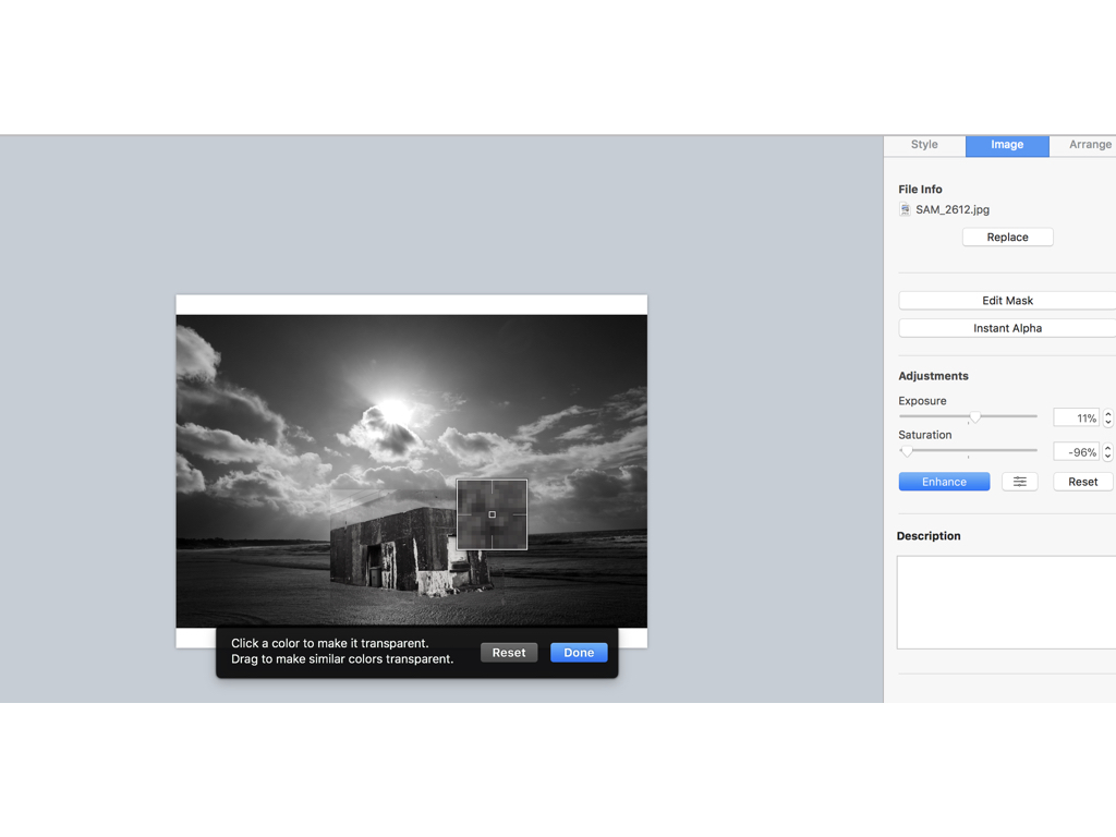
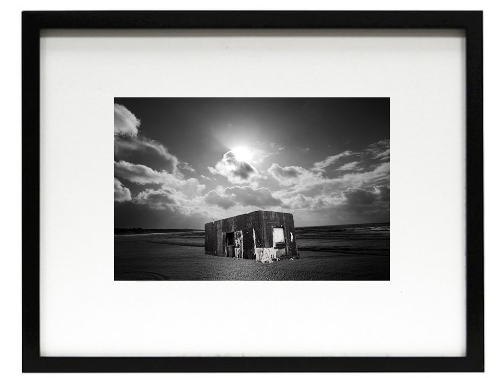
firstly when editing I went through all my shoots in order to find two images in which I think could make a successful overall composition,to do so I would line them up and think of a composition in which I could make.When I decided on the images I focused on the structural images and used an instant Alpha editing technique in order to remove the background and only use the part of the building that from a three dimensional shape and also has strong hold to its shape.I then layered the image in order to place the structure on top and arrange it in the composition middle so it looks effective on the light itself,Furthermore I edited the tonal qualities on both images lowering the saturation making the images both the same tones but creating a lighter exposure on the stature as it has a more realistic feel to the light shining on top of it.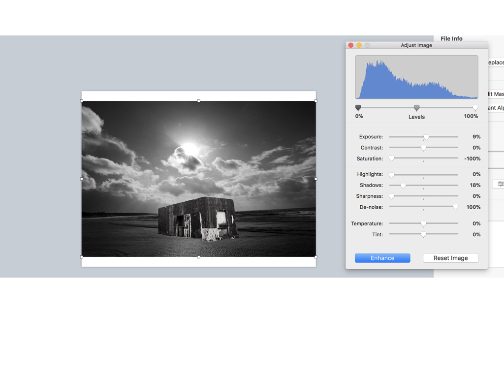
Here are the settings before I edited the images I found it important to find the same level of structure and the sea and lower half of the bulling so it looks realistic and also have surrealism within the image due to the believability.
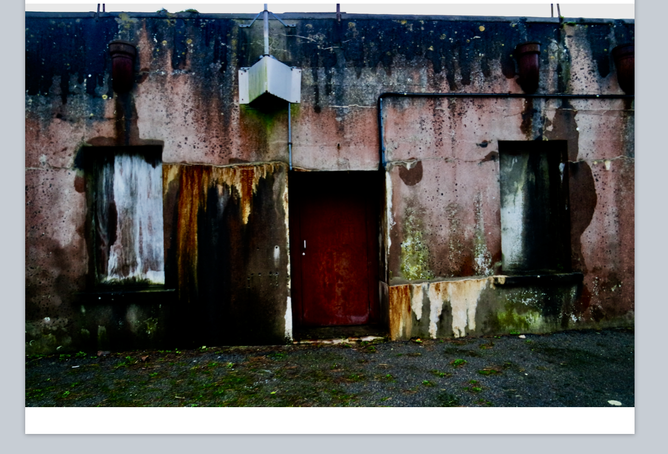
This was there original images of the houses I wanted to capture this due to all the lectures seen wihtin the building and an old sense of abandonment wihtin the image,furthermore I thought the shape and cut would work well when repeating the image due to the straight lines and form.
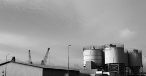
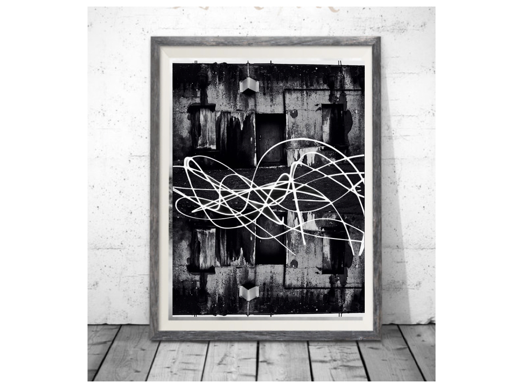
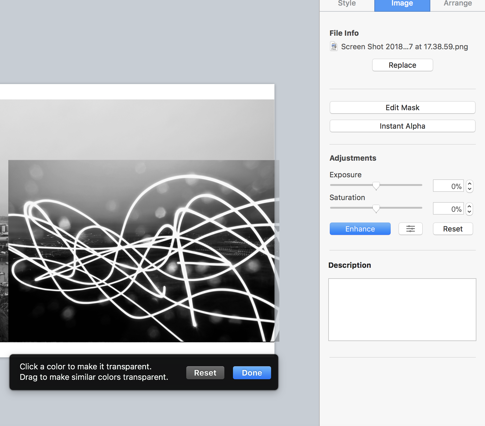 For this image I wasted to capture a slow shutter exposure on the light and show a movement over a city shaped thought it had strong abstract qualities but would look affective when layering an image.
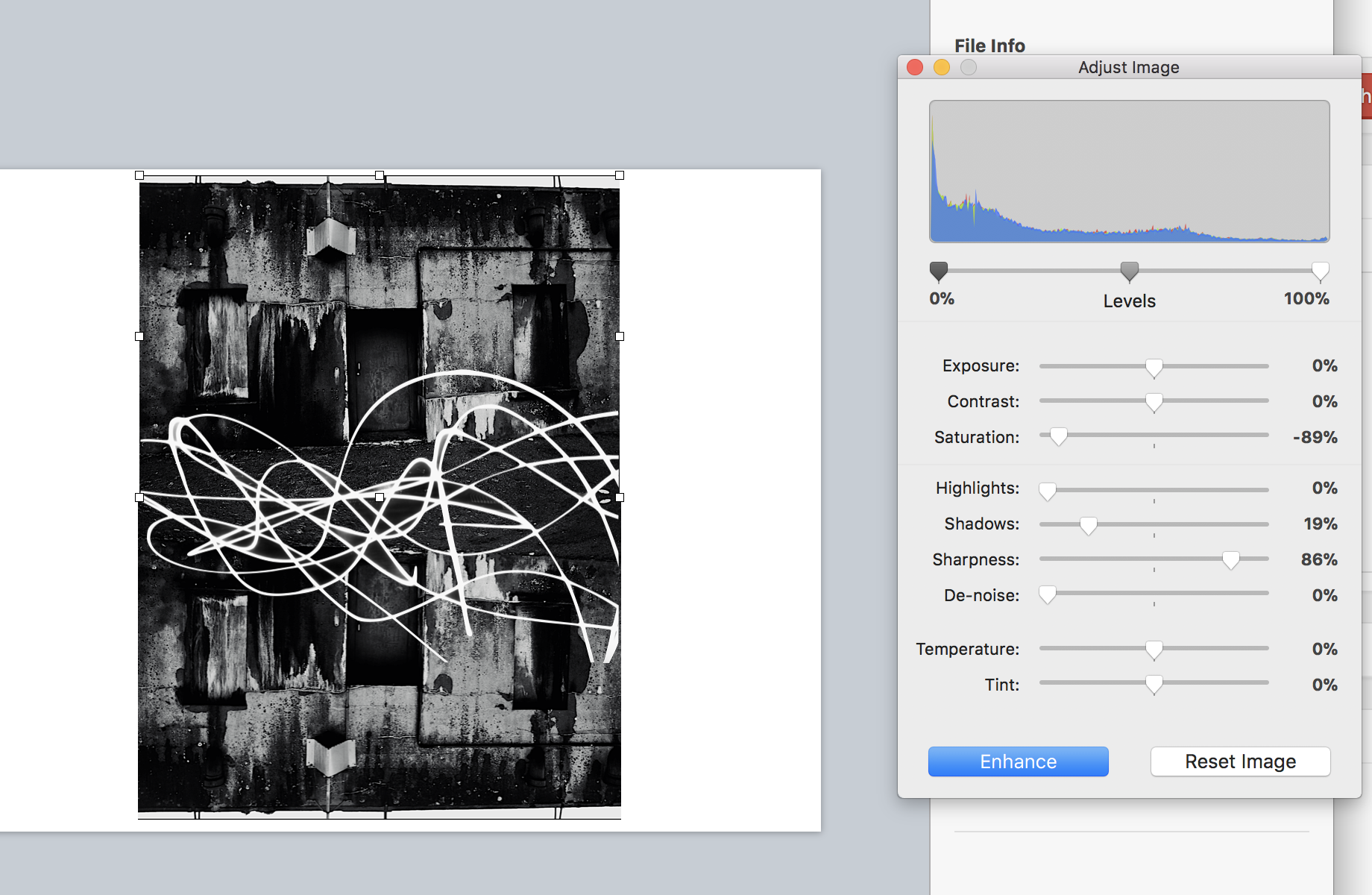
Finally I flipped and repeated the house images and adjusted the tones as above, I then used alpha once again to remove the black from surrounding the light exposure and then applied that to the image over the top structure in order to show an effective strand throughout the piece and an equal sizing.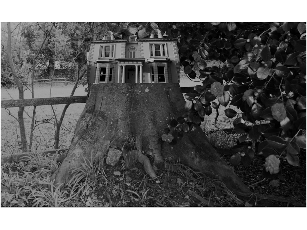
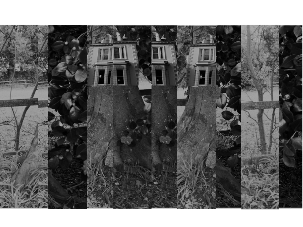
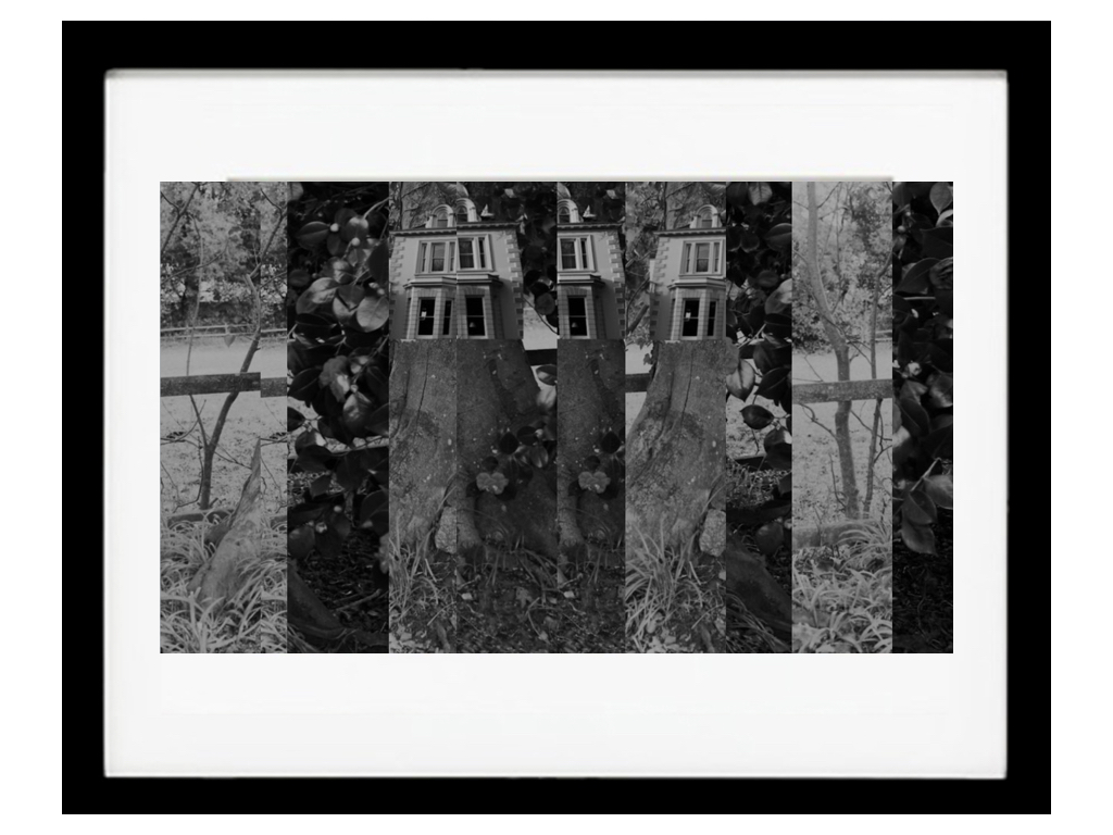
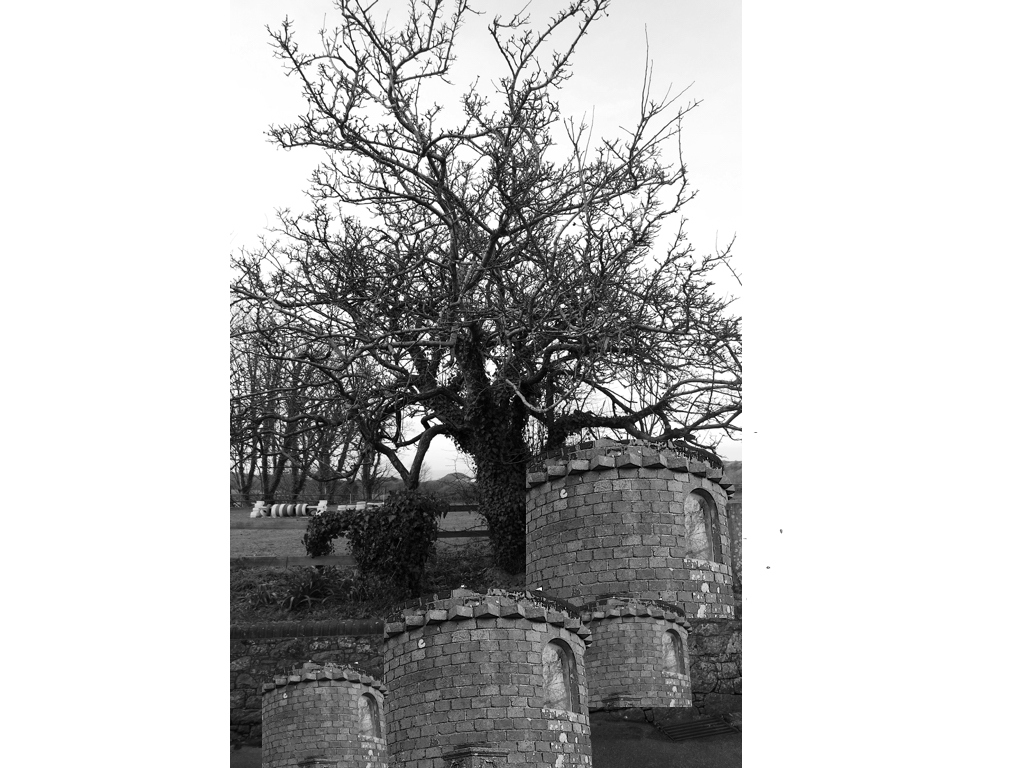
To edit this image once again I was separating the house for the surrounding background and using the dame tones to attach the images to each other,Although It was mostly important to capture the size and insure it was equal to the size of the tree itself.I wanted to additionally experiment within how I can change the lines and overall image by cutting and resizing with them into separate sections of the piece,this can be shown here:it shows different sections and different tones yet you are still Able to see the original piece itself.
For presentation I think I want separate ideas but for all of them to compliment the individuality of the image itself:for the first image due to its simplicity and power to speak for itself I think a black frame with a white boarder would be effective in a large print out ,when doing this I thought due to the dark tones to all the images they would all look best in black frames wihtin different cuts and sizes of frame and inside displays.
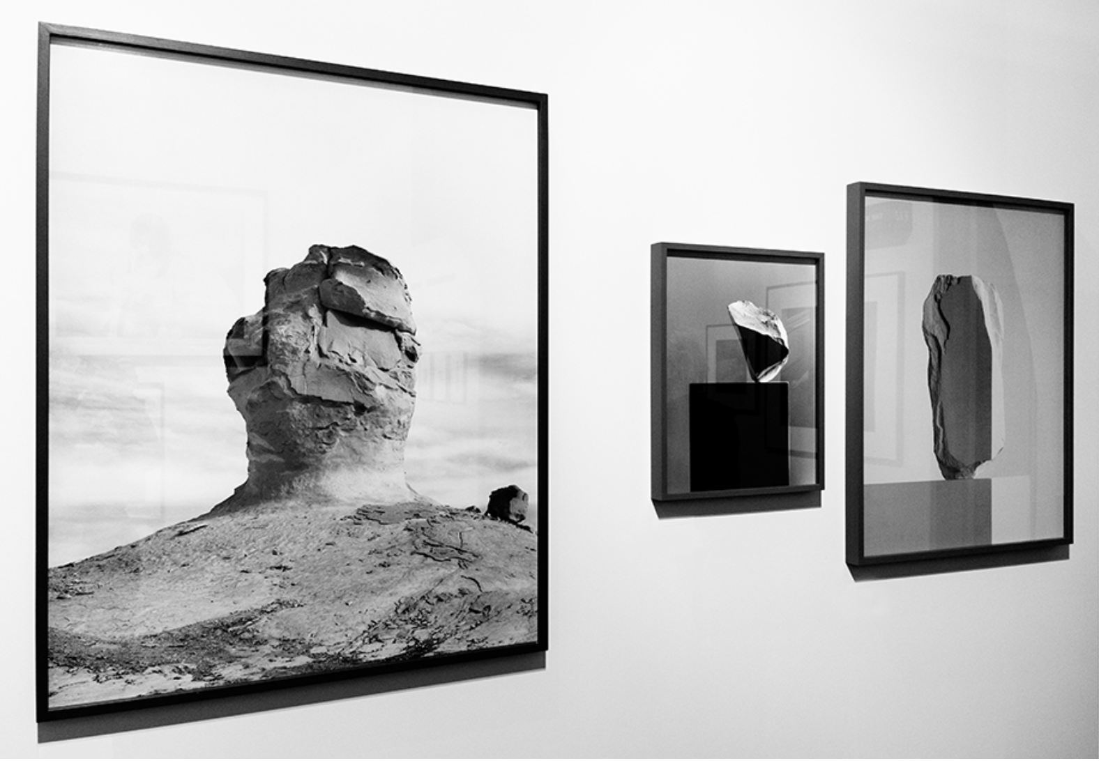
My idea was somewhat based off of this, using different sized and thickness of frames to enhance the I ages themselves but I would also include a white inner boarder to the images, as I think this looks effective.
Her work has a clear connection to my response of hers, showing structures being on water and showing themes of surrealism and mirroring techniques such as she does in water,I was too able to show a opposition of their natural equal, wether that be sea and a man made mould or a manner and a tree, and or be a city scape conflicting with an urban building,I used her sense of dimensions throughout my pieces and my final also using many different angles of interest.I think I have successful shown a sense of her ideas and format of nature though my work and through a comparison you will be able to see the same theme continuing through.
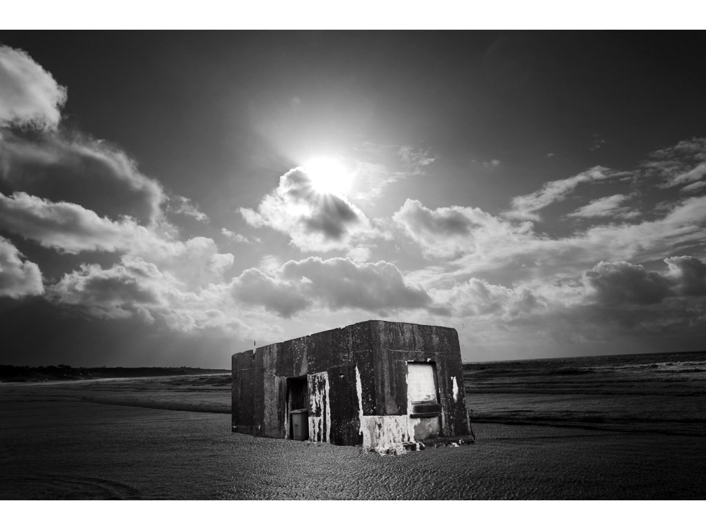
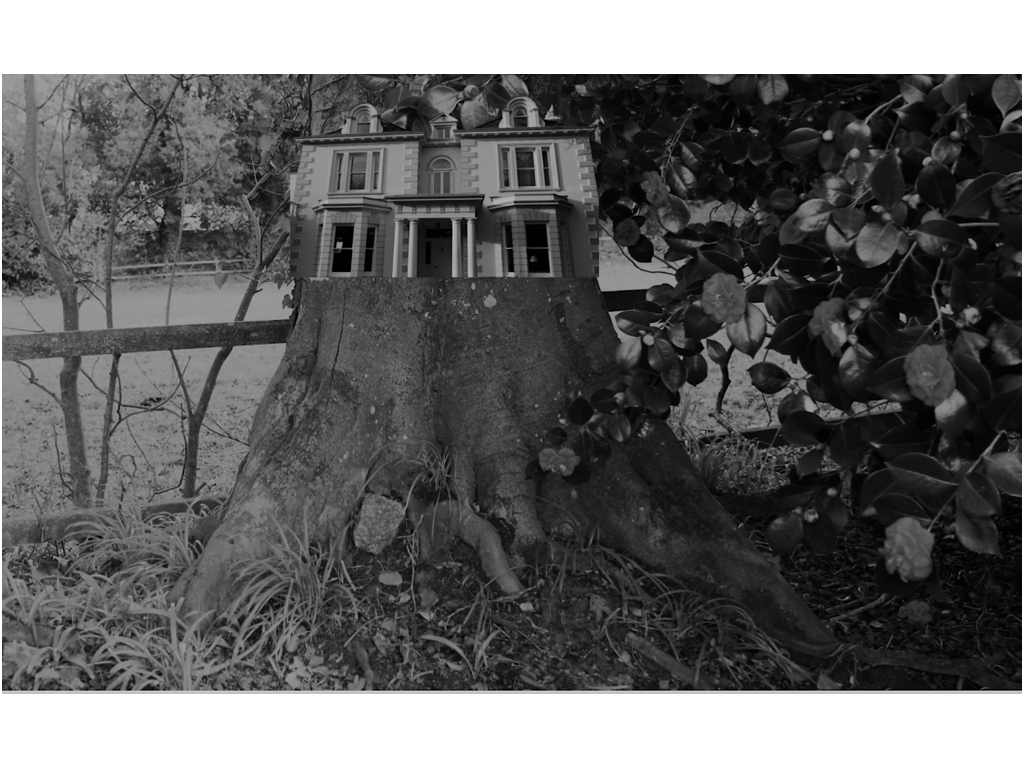
This photos come about on two separate shoots,one of which focusing on sea scapes and the other focusing on more urban industrial sculptors.I decided to edit both in a tonal black and white in order to capture a more in-sync image and an overall successful composition.The light is successful and enhances the composition of the building and overall has a surrealistic undertone and still relates to my artist and also my themed shoots.This is my favourite image and will definitely be used for a final piece.
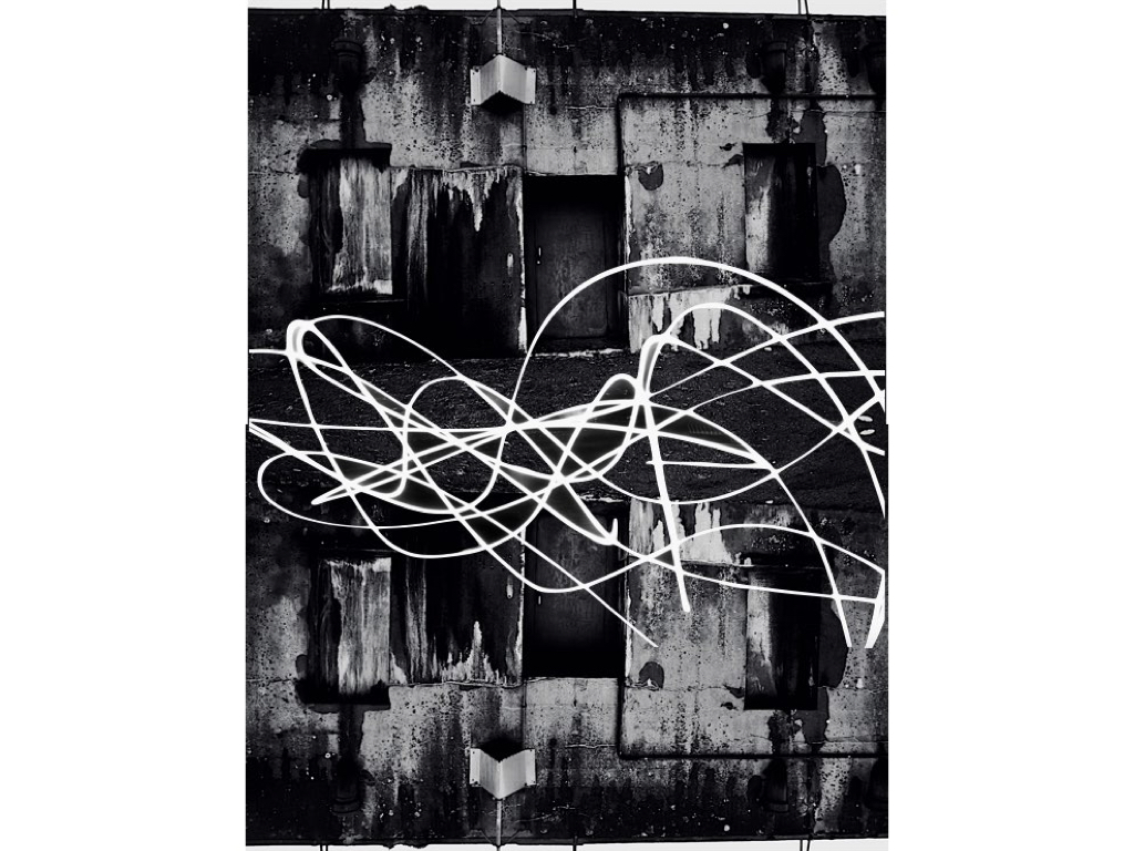
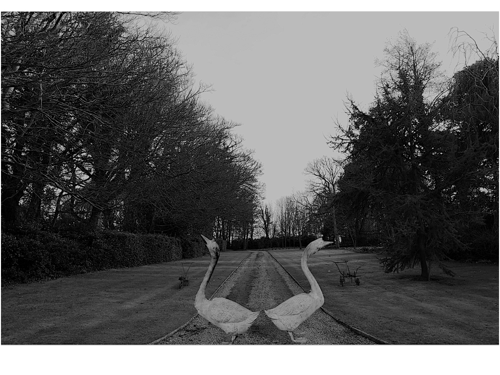
This piece is a lot more Inspired by urban landscapes and a mirroring effect enhanced by a slow light exposure seen within a city scape, it creates an abstract type of quality and overall has an interesting composition. Although there is not a surrealism aspect the tones and overall concentration on structure allows a cohesion to the rest of the chosen images.

This image was inspired by the surreal effect of joining the woods into an interesting large historical building, this is not complete with editing but still has an interesting presence and composition to the piece.

This image has a strong sense of abstract themes but the tones and editing of the original stature has a consistency of tones and compliments the environment in which it is surrounded. The editing was very much in a similar direction using the instant alpha technique to separate the building to form its original backdrop and then place and resize in order to be in line with the background of the sea. 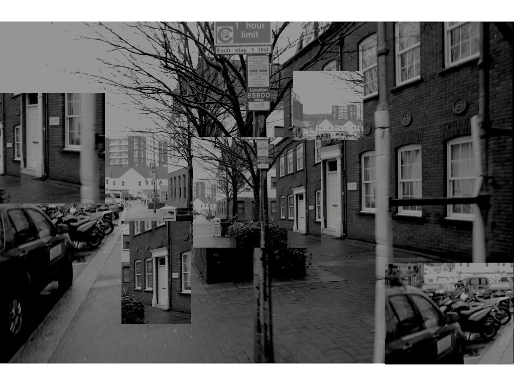
This image is again the more urban route, but still uses the same tonal editing technique and with the focus on buildings and an overall separated stature to the pieces,It is unusual in its varied segregation but allows interesting points of views throughout.
New editing ideas: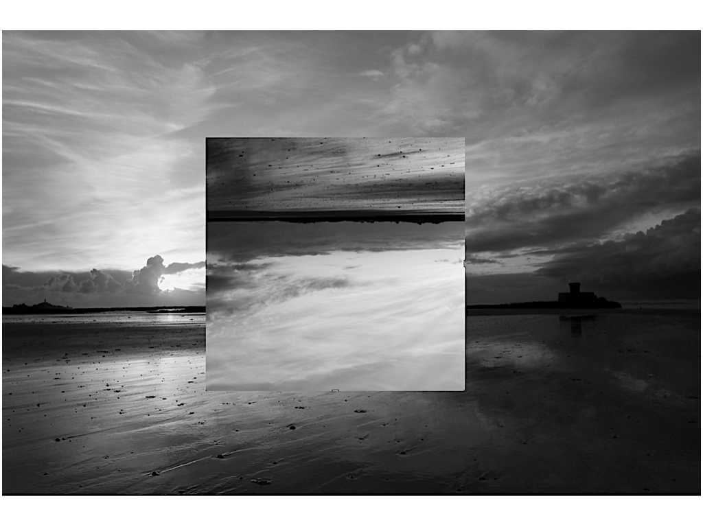 I wanted to do additional editing on this piece as I have already changed the romanticised backdrop to be an altered reality and the change of the tonal range in order to be more conjoined to the rest of the images,it presents an interesting aspect of light and still has the presence of a stature on the right hand side.
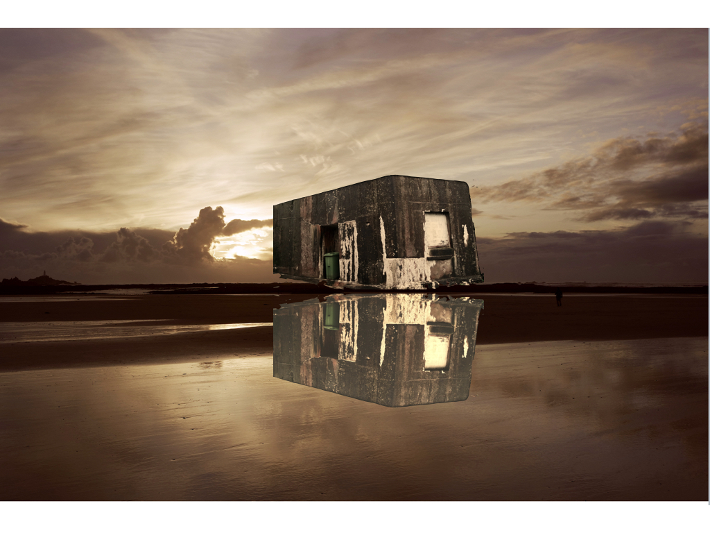
Here I wanted to try a basic mirroring technique in order to connote a reflection onto the sea again using a past romanticism landscapes did this by flipping and editing the tones of the piece,althought this is less successful as the previous as it is not edited well enough to show a watered technique.
The Altered Landscape Photography Collection is the largest focus collection of the Nevada Museum of Art permanent collection. Since its establishment in the early 1990s, the collection has included images that address and engage issues related to land use and the changing landscape.
Much inspiration for this theme was deprived from a group known as the New Topographic photographers; they made works that framed industrial structures, suburban developments, and other ordinary subjects with unprecedented matter-of-fact realism.
Now, the term ‘Altered Landscapes’ refers to a variety of different subjects and approaches, these range from surreal images where Photoshop and editing plays a large part to purposely visibly cut and pasted imagery. Due to this, altered landscapes is a very open theme to work with.

typology inspiration:
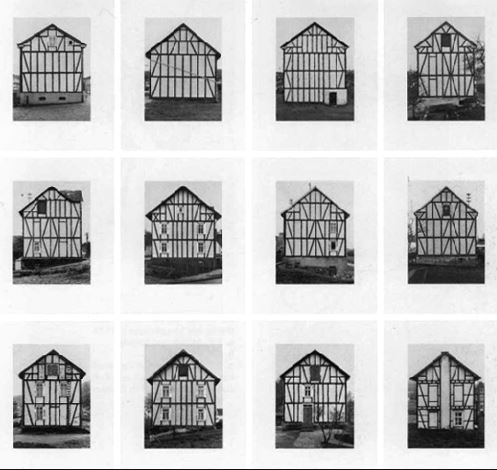
In my last project I have previously looked upon the old more historical buildings and recording them,however I want to find more interesting and landscape inspired images in which I can also develop.I was also going to develop within how I can use the natural landscape to express the way in which colour and the impact that they have but decided against it because it ill not have a specific relation to the ned of my project.
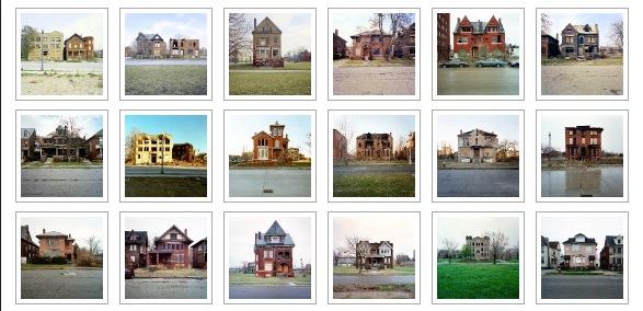
These ideas are much more modern photographers and also fit more into my interest of landscapes within natural and buildings that are purely structural. I think within these images they would allow me to explore more of what I want to develop within my final three weeks.I think this above is a good example of exterminations of the way in which stature and individuals in and areas can e interesting.
I decided to travel around and fine many houses in a similar area that all look very individual but have the same surrounding theme of environment,furthermore for the sunset images I want to capture a strong sense of color within the same beach but different areas and then also expand this to other areas within the island. I think i could show a gradual development of when the sun sets and perhaps even develop panoramic views.
This is my first shoot I discussed previously about my plane for the project,i want to go to many areas in which I can get a strong range of distinctive boiling I want to show no colours so I need to the stutter itself to speak fro all the effectiveness of the building itself.
I have already taken many images of old figures and statues so for this shoot I focused on the aspect of old historic and impressive buildings that have a great impact altogether.

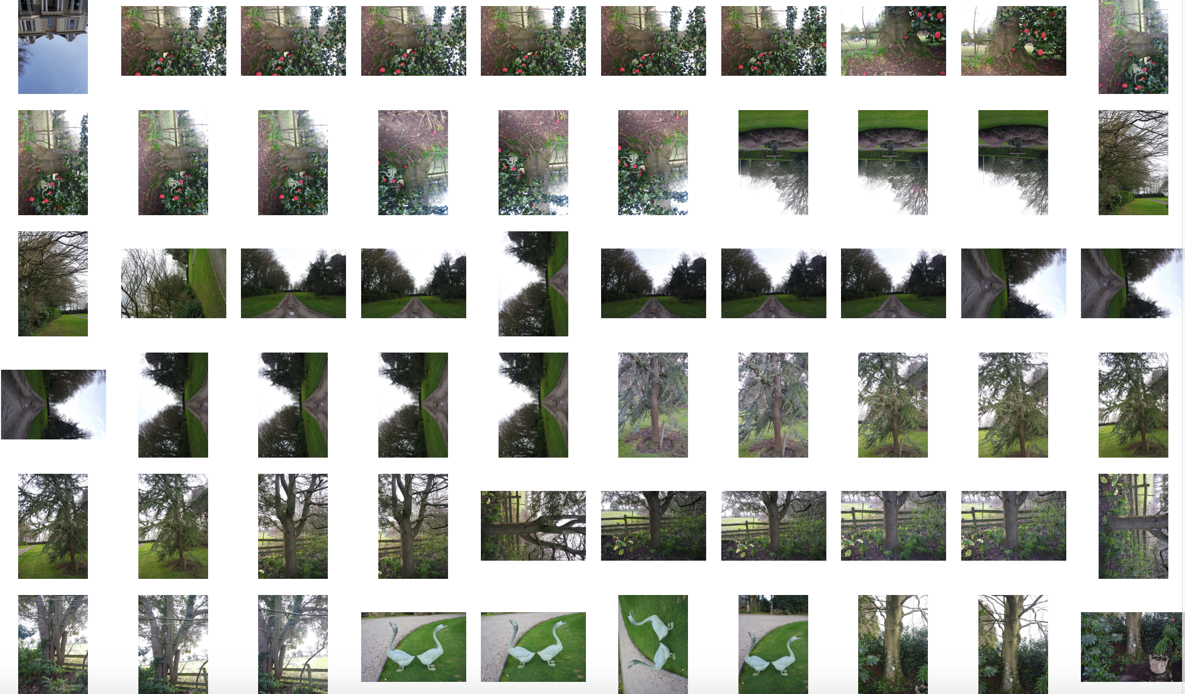
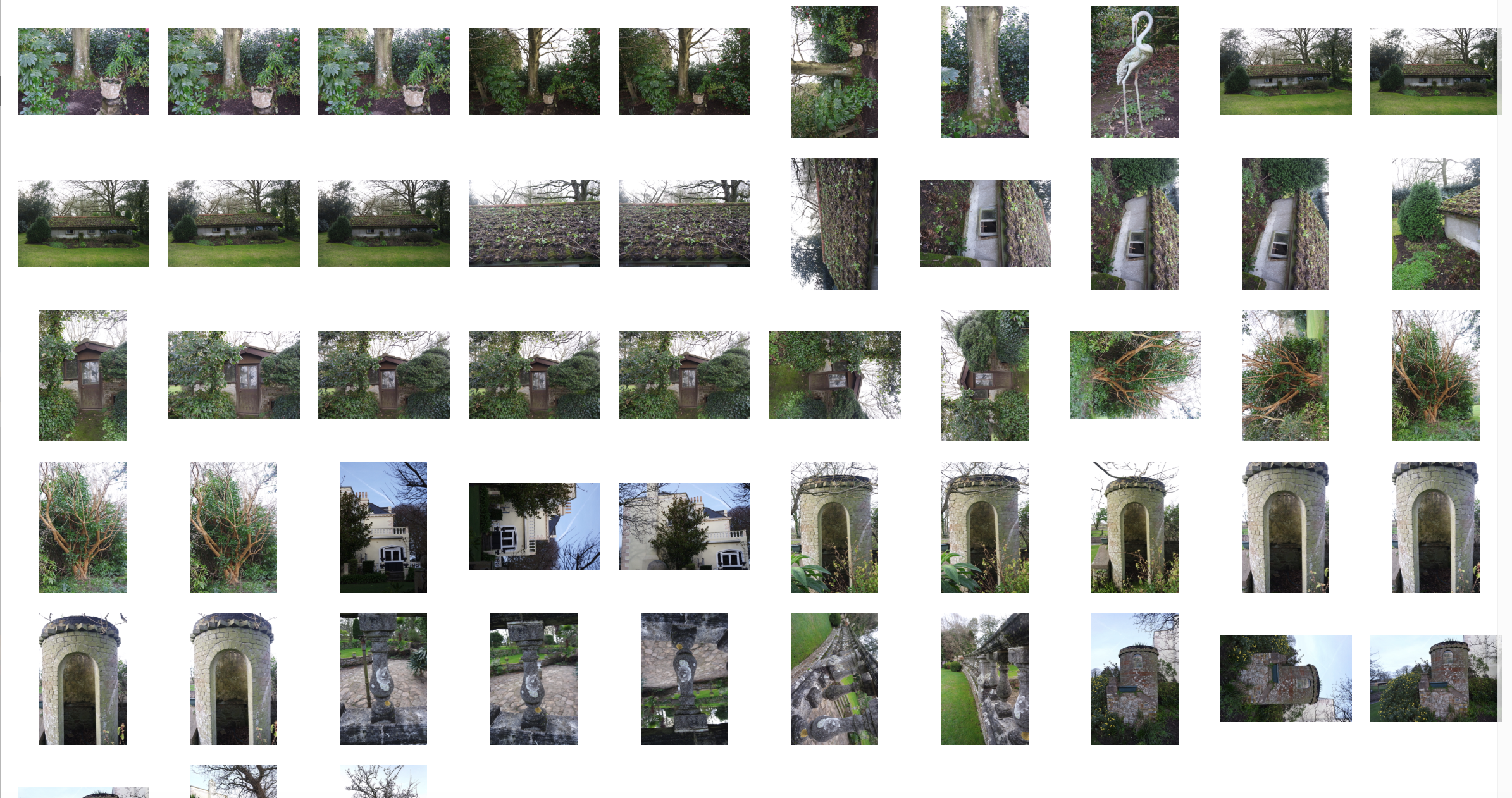

Once again for these images I was inspired by nature being formed with industrial structures and buildings,I wanted to also edit some additional themes of surrealism,althought these images are not edited to completion and will need some additional work.For the nature aspect I wanted to capture large and impactful structures and also the size of the nature itself and how it can compete with the man made structures.
Yener Torun is an absract minimalist photographer who was born in Turhal, Turkey in 1982. His portfolio mainly consists of colorful, bold and minimal photographs of architecture and other man made structures.
His photographs usually flatten space, they emphasise and exaggerate line and color instead of image depth. He alters the urban landscape, by re-framing structures as geometric abstractions and creates an alternative reality by abstracting architectural structures from their usual place into a brand new sense of space.
Below are some examples of his work…

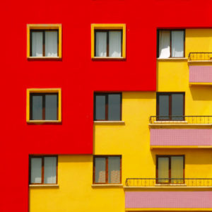

From his work I take the idea that you are able to use pattern, colour and geometric architecture in order to flatten dimensions and create an abstract, minimal landscape.
Here is my personal response to Yener Torun’s work…

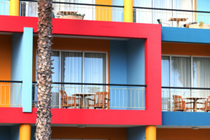


From some of my favourite images from throughout the projects I have decided to group those that are aesthetically or literally linked with others.
Here are the compiled image pieces…
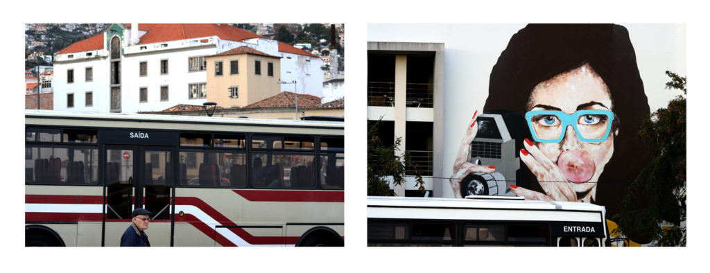
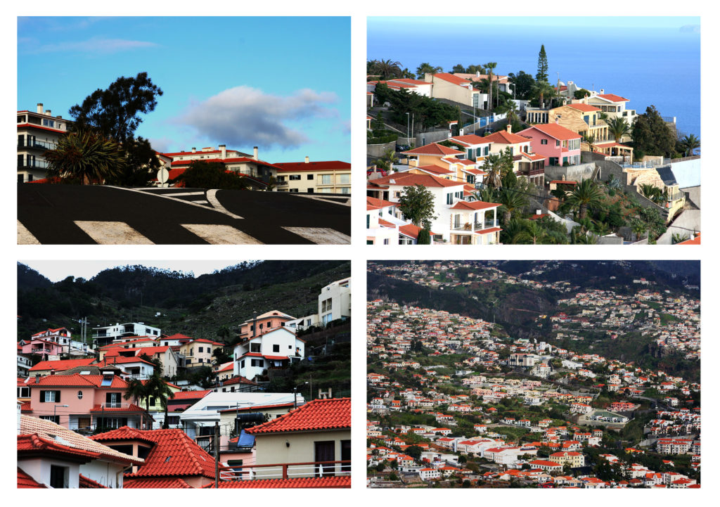


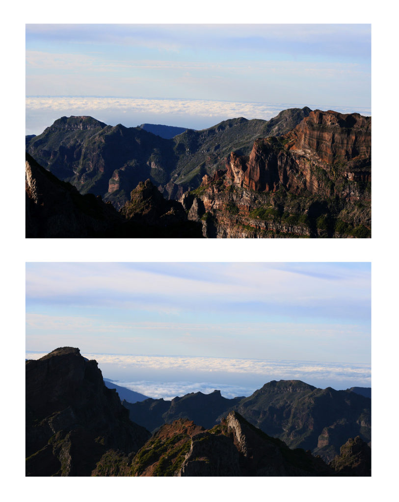


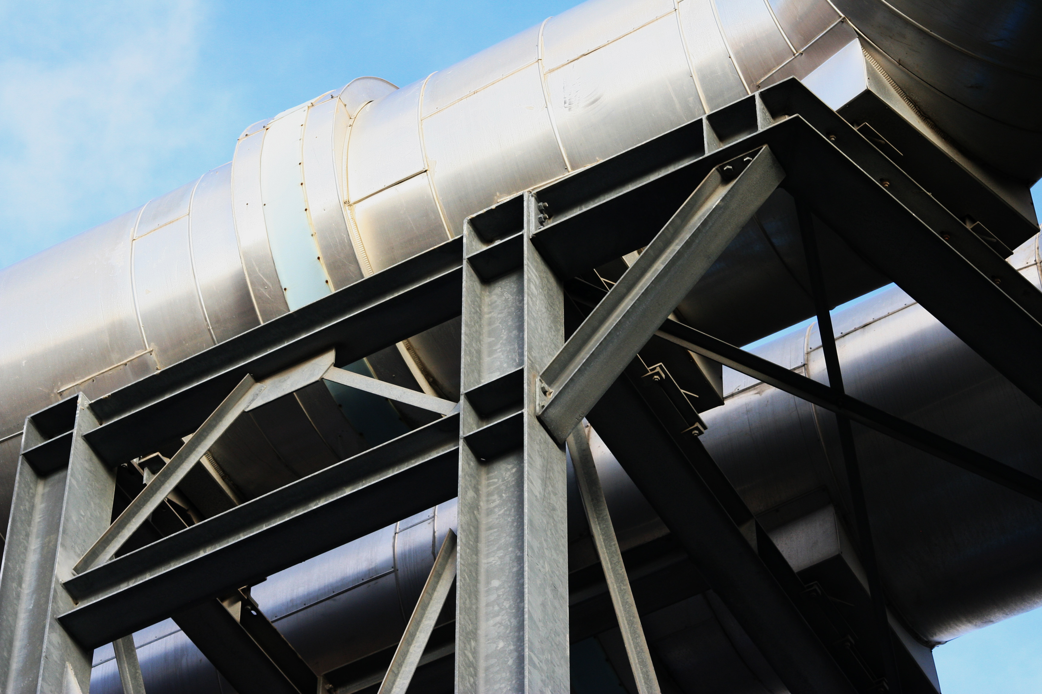
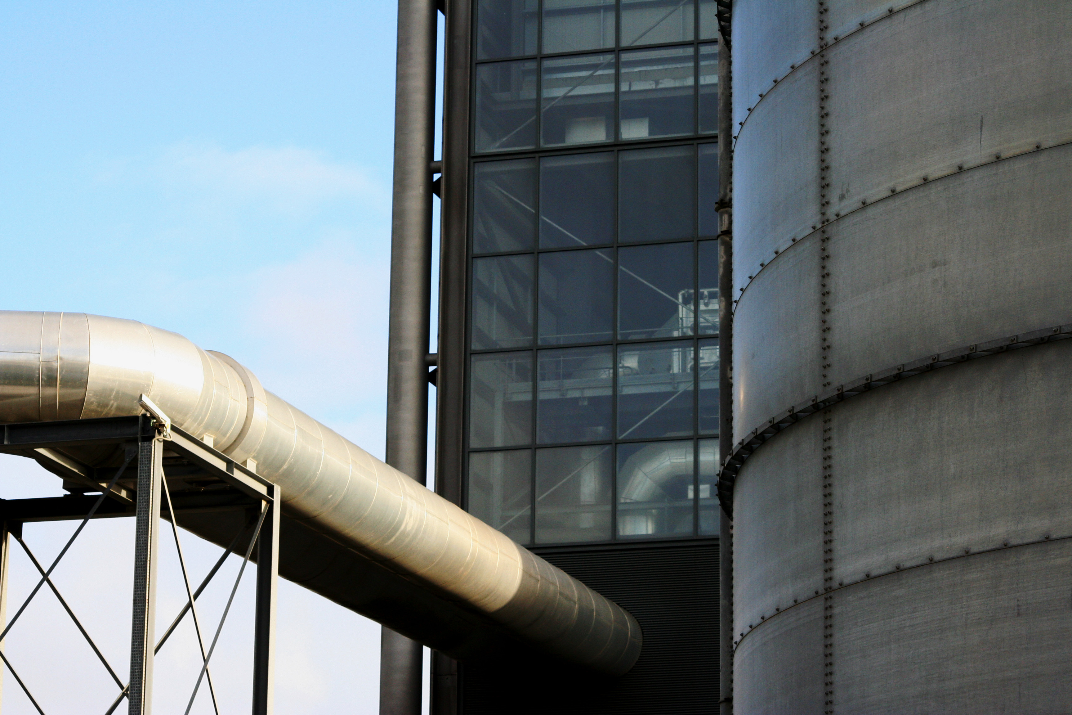
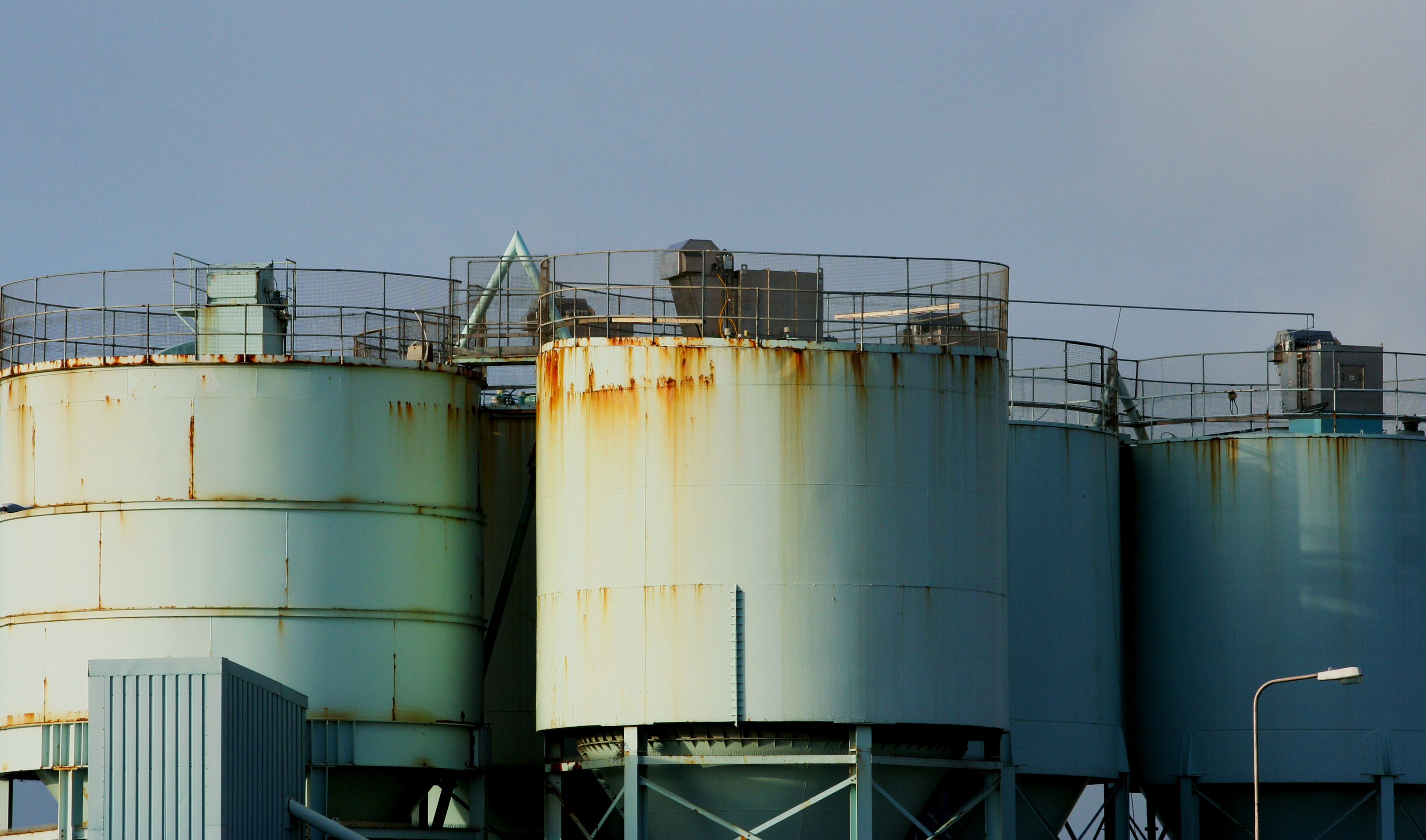
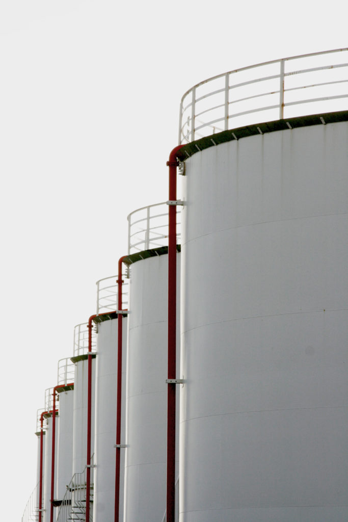
To create the edits for my final artist study I took photos of buildings around town which show of the urban landscapes and show the industrial side to the island. I tried to capture areas that are not always in the public eye, for example i took pictures down side roads rather than on main roads that are seen by everyone.
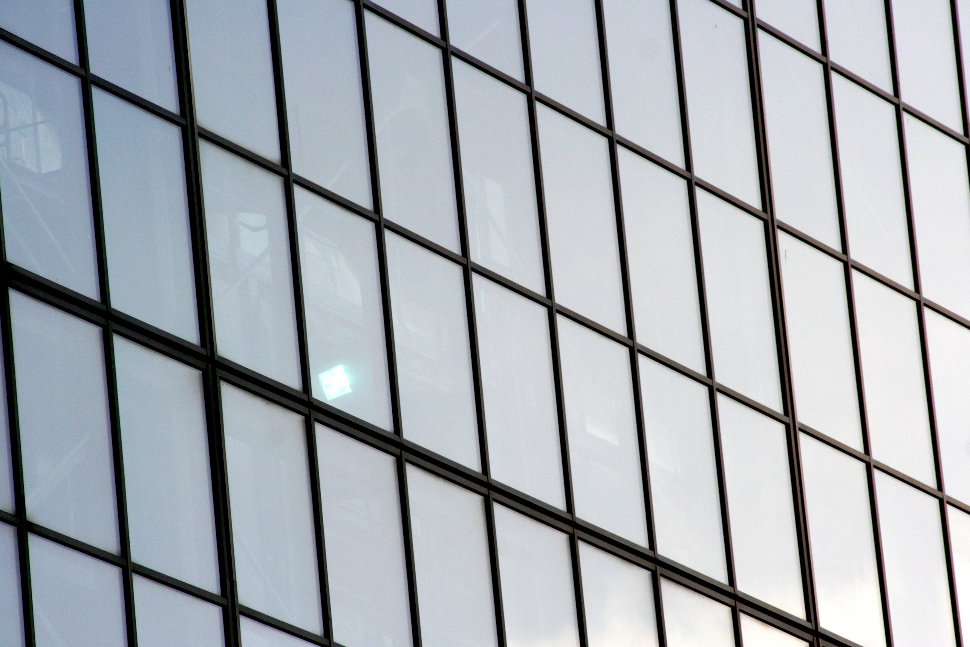
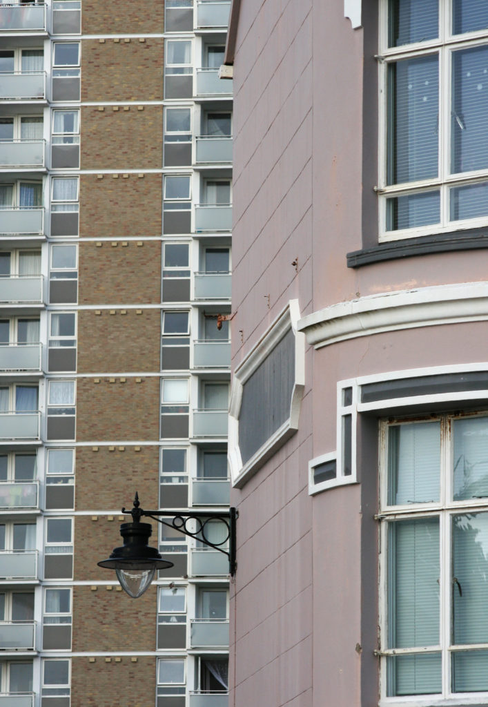
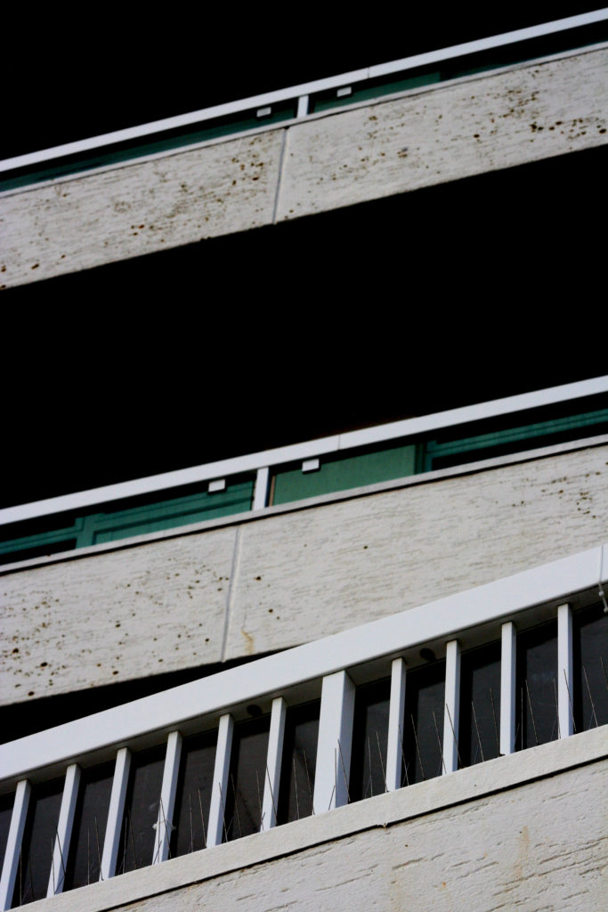
I also took some black and white minimal pictures of houses around the island, I made sure that the buildings looked like they stood out in their surroundings to reflect the work of my artist reference.
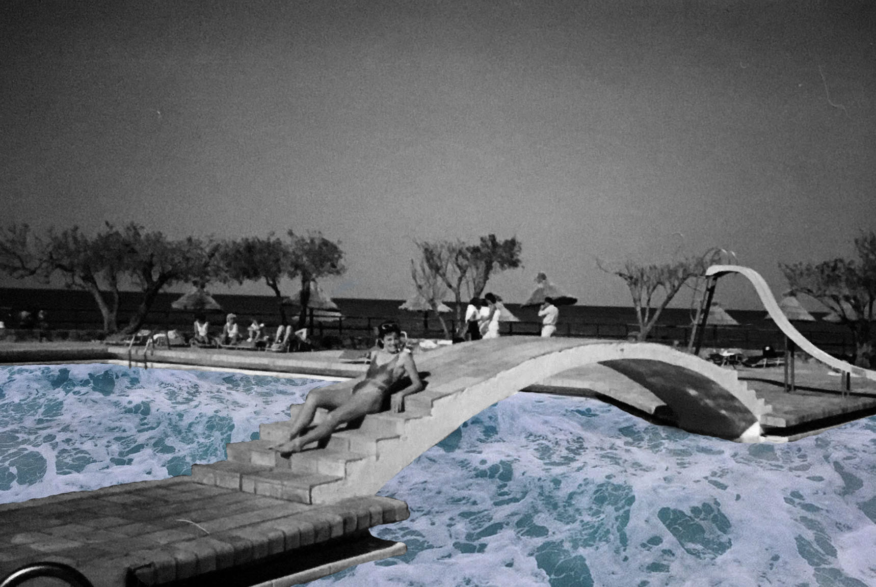
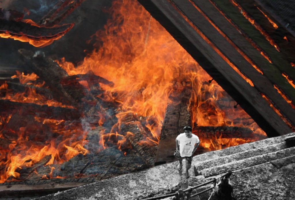
My artist reference uses old images and incorporates them with new images to create collages combining two worlds. I looked through my mum’s old pictures to find the perfect images which I could edit in the same style as Used

For an trip with the school photography department we visited the Havre Des Pas / La Collette area of St Helier in order to take some landscape photographs.
Here is the route that we took marked in red…

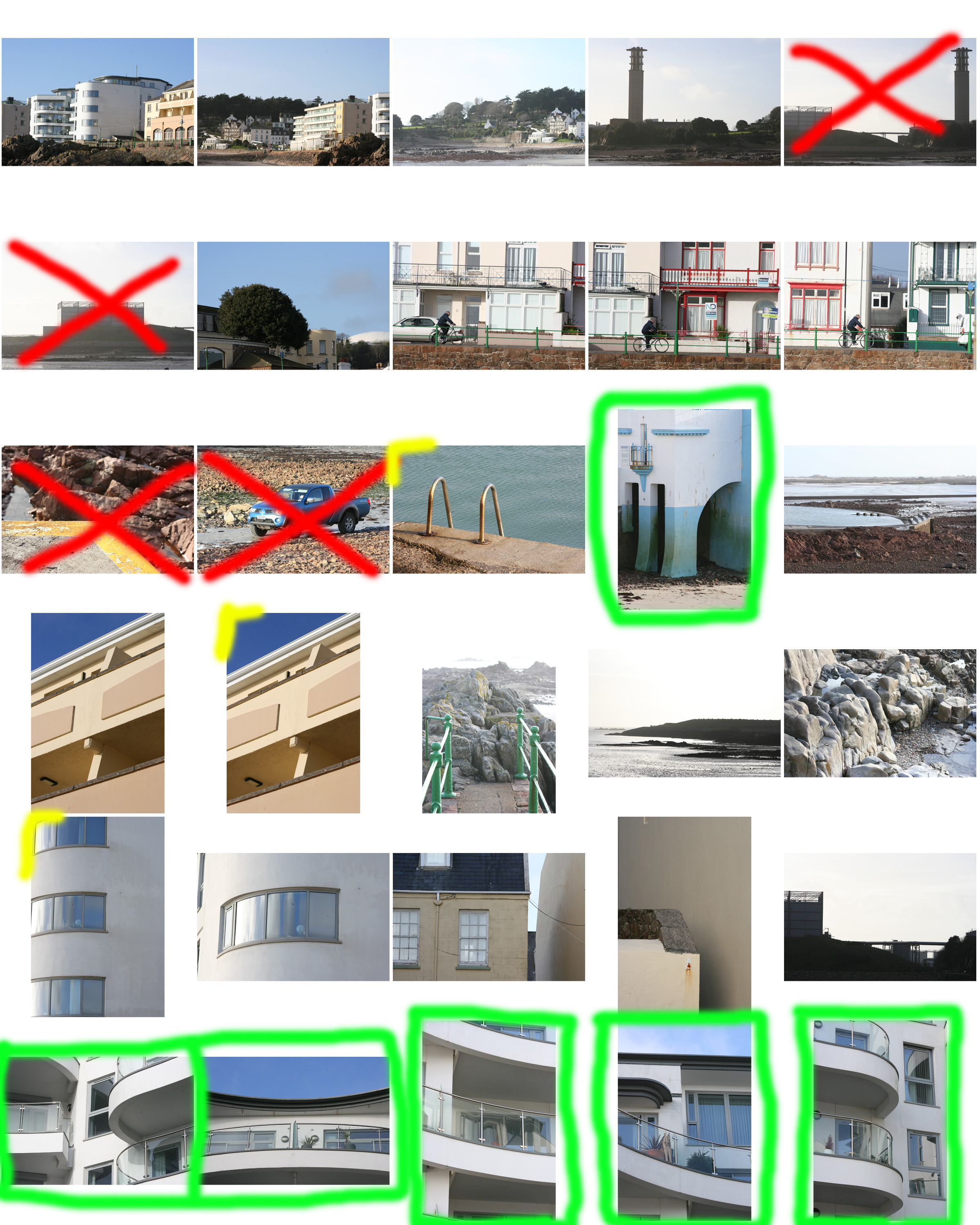
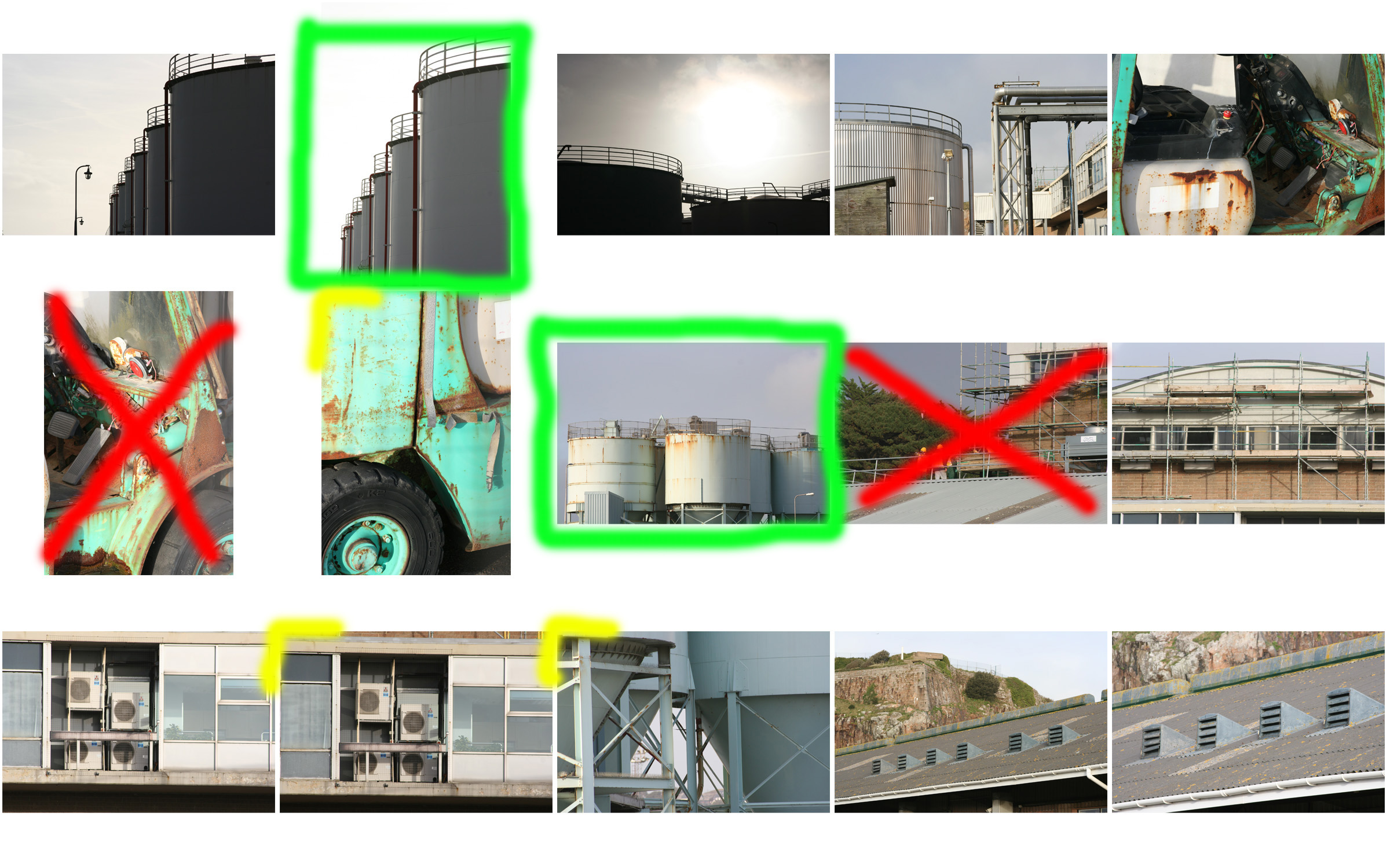
And here is the photo-shoot from the visit which I have visually annotated in order to assist me picking out my favourite images for editing and putting aside…
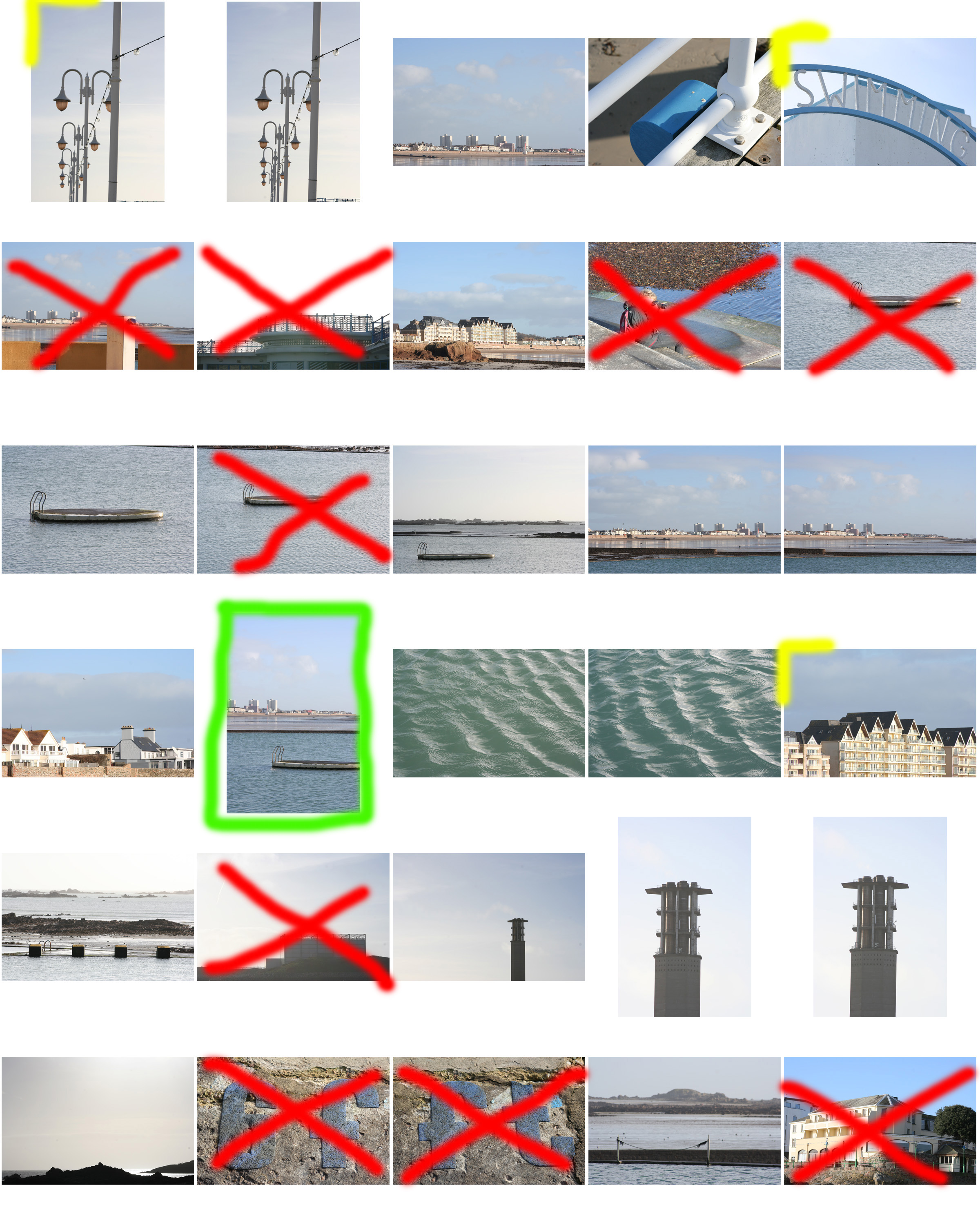


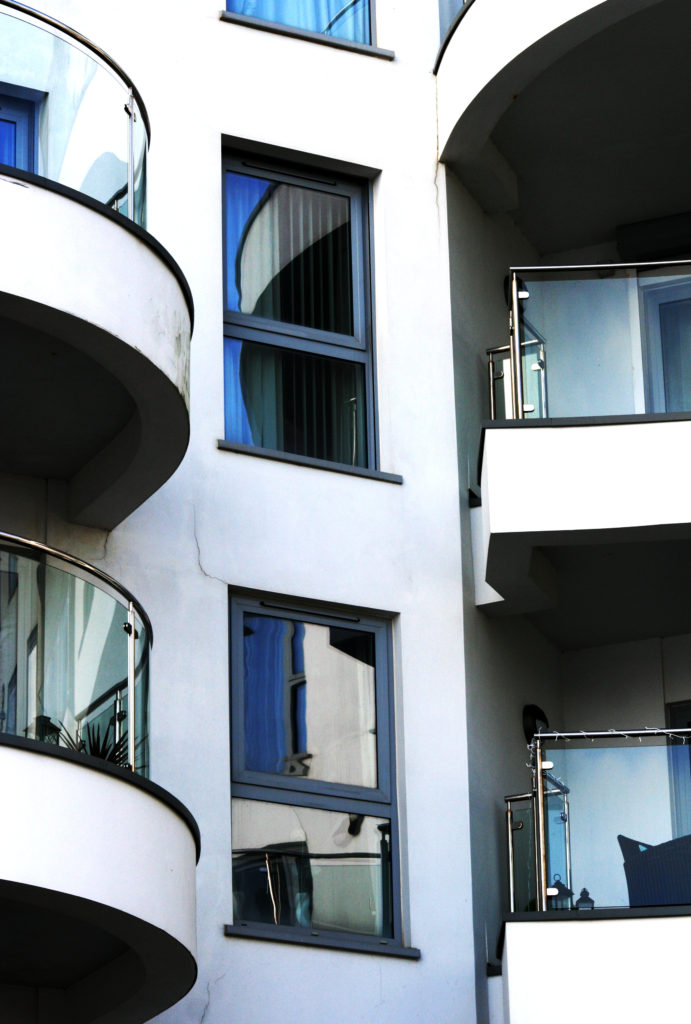
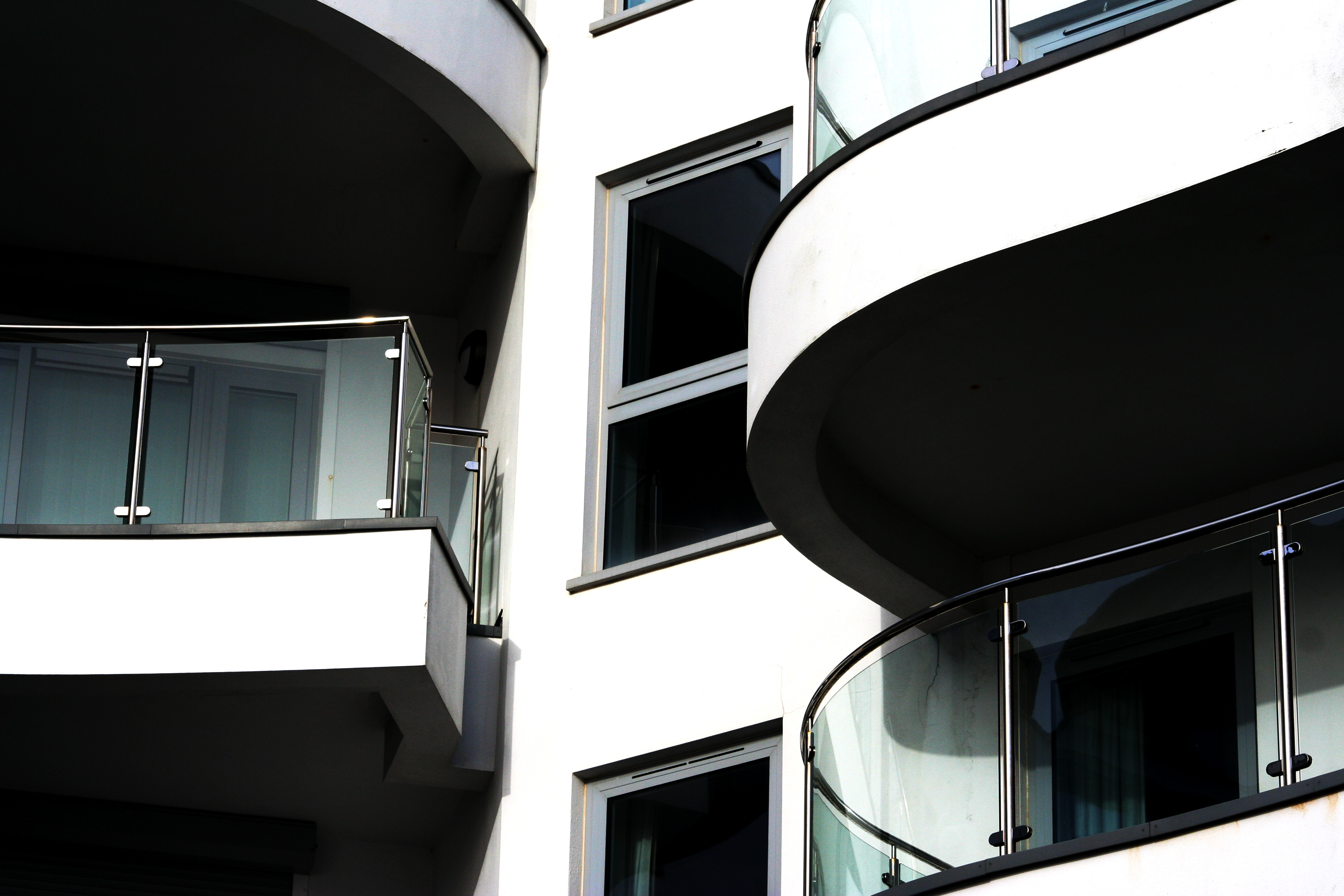
 From this photo-shoot I have edited my favourite images, I believe that the images from this photo-shoot have some very effective shapes and textures within them; and here are the outcomes…







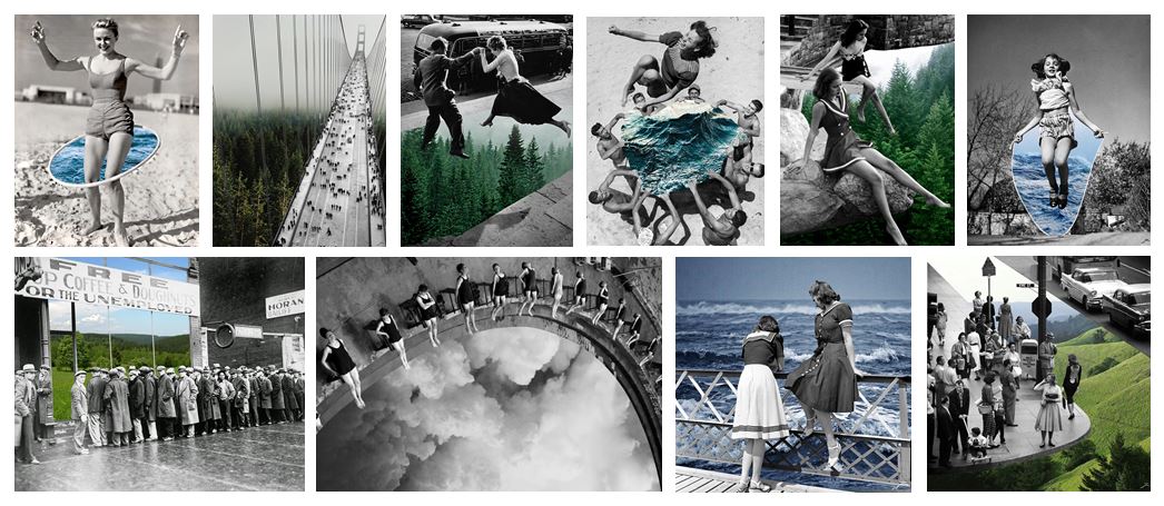
Merve Born in Istanbul, Turkey and graduated from Mimar Sinan Fine Arts University as an ceramic artist in 2010. She is a ceramics jewellery artist but is most popularly known for her series “natural act” which is a group of collages based on the questions of the relation between nature and the humanity. The main feature of this series is the unexpected use of selective colouring of black and white vintage photographs and new coloured photographs which creates a parallel meaning to the original storyline of the photograph. She spends a lot of time looking for the perfect vintage photo to manipulate, when she finds one she instantly starts thinking of how it could be manipulated in her head.
Technical: This image is made up from two photographs, one of a cliff edge with rough water at the bottom stretching out to sea. the second photo is of the edge of an old building. Both of the images were taken using natural lighting which was probably not with direct sun light due to the lack of harsh shadows. both of the photographs have a large depth of field because they are both landscapes. we know they were both taken with a fast shutter speed due to how sharp the images are, the waves would also be blurred if it was a longer shutter speed.
Visual: The main image of the building is in black and white and has a high contrast, the sky in the background is white washed which helps the texture of the building stand out. There is no other distraction in the background which helps the building stand out and take more of our focus. The photo of the sea has been edited with a filter which gives it a blue tint and enhances the shadows giving the image more texture. The image of the sea has been cut out and placed perfectly over the edge of the building to look as if the picture is on the wall in real life. the photo has also been taken from a low angle making us feel we are looking up at the wall. although we know that the image has been manipulated it creates a sense of fantasy by combining two polar opposites.
Conceptual: this image is made out of two completely separate photography, the black and white image is one the artist found and did not take herself. Like the rest of her work she combines old photos with knew ones, this old photo acts like a canvas for the new image. The coloured photo represents nature and contrasts with the urban black and white image to show a visual representation of how diverse landscapes and out surroundings can look.