
For my final Prints I have chosen the following images.


I have chosen these images to print out as I believe that all together they have a good balance of natural and urban landscape. This covers my idea from the start of the project of showing how industrialised development is taking over natural areas. And they also show influence and response to the photographers that i have researched during the landscape project (Ansel Adams, Michael Boniwell, The New Topographics and Yener Torun).
Here is how I plan to mount and compose my prints…

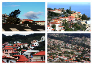
With the A3 print of 4 photographs of houses situated in/on natural landscapes, I plan to trim down the 4 images and place each on a slight frame of black mounting board. Then place all 4 pieces onto 1 piece of foam-board. This will hopefully give the images a slight elevation from the board putting them closer to the viewer. With the raw minimally edited approach to this landscape project, giving the image presentations a sense of depth will mean that there is an extra element added to the piece rather that just mounting the images straight onto mounting board.

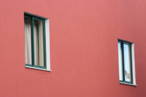
With this composition I am using my two A5 prints and one of my A4 prints. The idea of this composition is to present colour and shape within landscape which i think is effectively executed with the use of primary colours. I will put each image on its own piece of foam board with a 1cm boarder (grey in picture) and then mount all three in the order above onto one long thin piece of foam board. The idea of this is to give the piece a considerable amount of depth so that hopefully a shadow is cast on the white foam board as shadow is an element explored within the photographs.

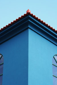
For this A4 photograph print I wanted to keep it simple as it subtly reflects various elements such as shape, line, shadow and pattern. Therefore I will give the image a thin black boarder and place this onto a larger piece of foam board to give the piece a sense of scale and draw your eye into the image without over complicating its presentation.
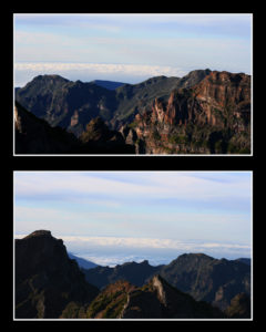
For this final print composition I plan to mount these images of mountains in black mounting board. I wanted to do this as the images are quite detailed in areas and there is a large sense of depth within the photographs, so i didn’t want the presentation of the image to have significant depth its self. I also feel that the black surrounding the photographs will help to bring out the light in the image and draw the viewer’s eye towards the photographs.