
Image 1:
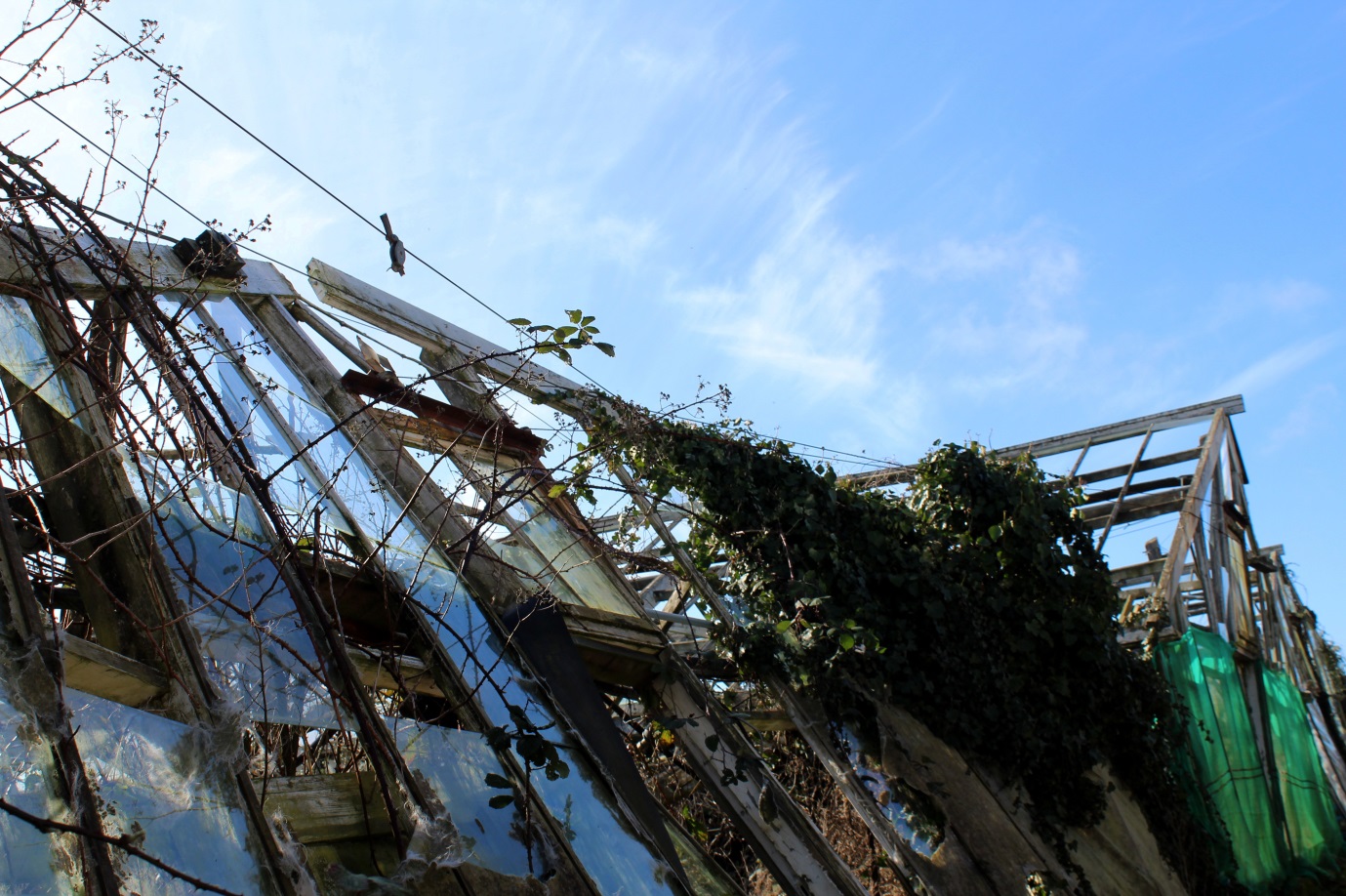
For this photoshoot I wanted to go explore natural places and landscapes but came across some abandoned greenhouses and decided to focus my photoshoot around them. I still consider this a photoshoot exploring natural landscapes as all the images contain some sort of natural aspect but combined with derelict greenhouses, either the plants that have grown around the broken glass and wooden frames or are surrounding the greenhouses by themselves. I chose this image from my photoshoot to be in my final 3 as I like the geometrical shapes and lines created from the broken wooden frames, giving a different effect than if they were not derelict.
Experimentation:
For experimentation I wanted to add another aspect to the image to make it more aesthetically pleasing and interesting. I decided to try and edit shapes into the photo so you could still see the background of the original photo but with a shape in the middle that was transparent so you can still see through it.
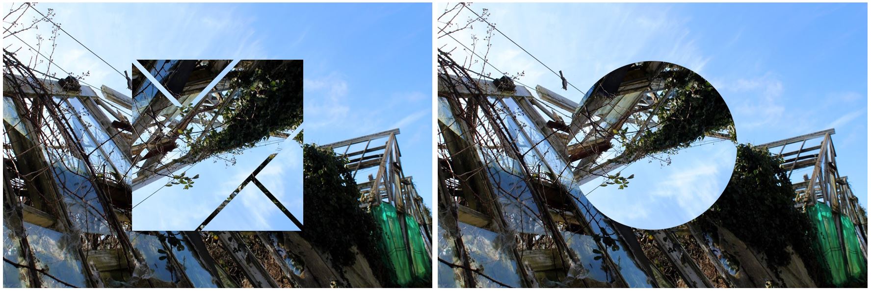
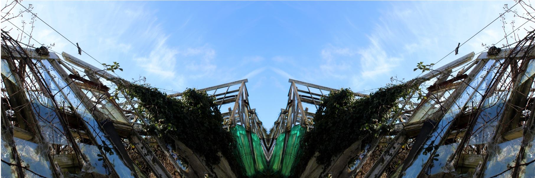
I also tried turning the image into a panoramic image by taking the photo and attaching it to the original image but flipped horizontally to create a symmetrical and aesthetically pleasing overall image. I decided to not use this image as i think its too repetitive and decided that when I added in a shape it gives the image a different aspect, rather than the same aspect repeated.
Conclusion:
- When taking this photoshoot i didn’t have one particular photographer in mind and wanted to do my own images, with a combinations of ideas from all the different photographers I’ve studied.
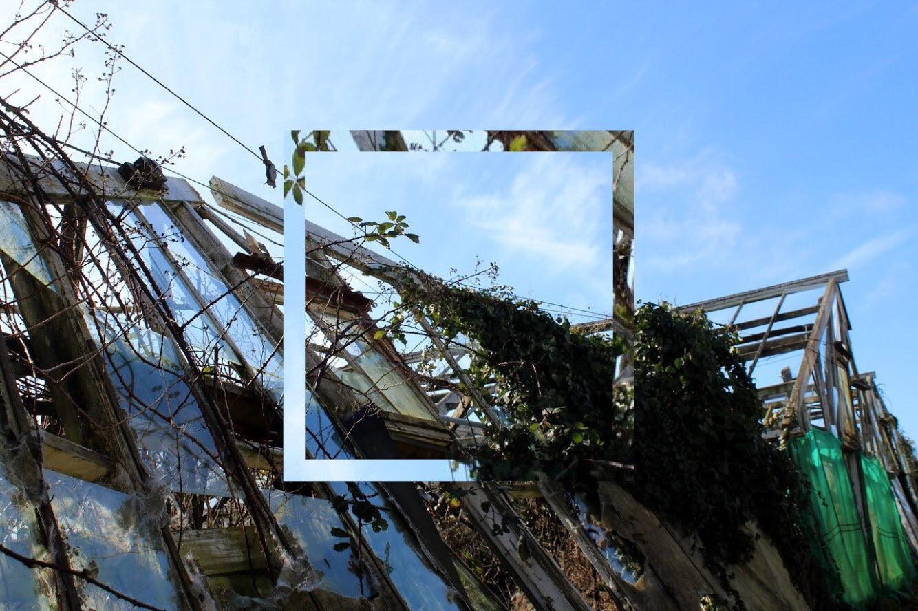
- Although i liked the image by itself, without much editing, I decided to add in different shapes to develop my work and to make it look like more of a final outcome.
- The square shape I have edited emphasises the geometrical lines and shapes within the image and adds a different aspect to the photo.
- The shape also brings the light blue from the sky into the bottom half of the image creating contrast between the two as it contains parts of the image within the square.
- The colours within the image as a whole are very neutral: the panes of broken glass on the left side of the photo also show the reflection from the sky making them appear blue in the image and show the reflection of the clouds aswell. This blue then contrasts with the green on the right side on the image on a different greenhouse,
Image 2:
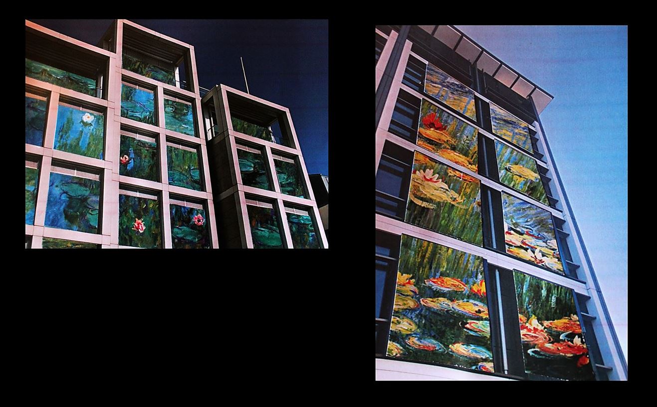
For these images I took inspiration from Mona Caron and the murals & street art she paints in the US, throughout South America and in Europe. For this image I put together two images as i liked them both together and decided to show the range and variation within my work. I added a black background as it frames the images and reflects how i want the images to be shown together rather than two separate images. I think they go together well as although they both have different paintings which i have edited in, the colours complement each other well as they are both from the same artist (Claude Monet). My favourite out of the two images is the one on the right as the painting is more visible and noticeable which makes it more similar to Mona Caron.
Experimentation:
At first I thought I would edit the images onto the side of the buildings as that’s what the artist did but I thought the paintings would look better framed by the window edges which would make my images similar but slightly different to Mona Caron’s.
 Compare and Contrast:
- The one main difference between Mona Caron’s work and mine is that she physically paints her images onto buildings (normally plants and flowers) to create murals for the public in the city, whereas I gathered images of paintings by Claude Monet (specifically his water lily paintings) and physically stuck them onto my own photos of buildings. Instead of sticking the printed out paintings onto the walls on the side of the buildings, I edited them in the shape of the windows, so there were different sections of the painting around the image instead of just a whole image on one wall.
- One similarity of Mona Caron’s and I’s work is that instead of using images of actual plants and flowers I used images of paintings that an artist has created to be more alike to Mona’s work.
- In Mona Caron’s photos she has surrounding buildings within the building to create a sense of the city she painted her mural in, showing urban activity like cars and people in the images. She also does this to show the size of her paintings as without the surroundings someone may mistake it for being smaller than it actually is. In my images I only included one building in each of the images as i wanted all the attention to be on one single building, focusing on the paintings edited on as if i included other buildings there would be too much going on in the images when i displayed them both together.
Image 3
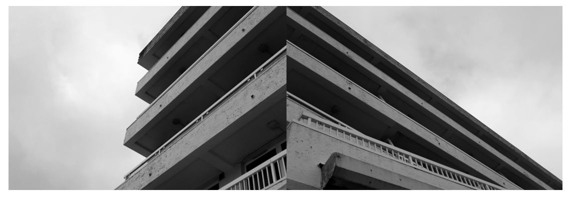
I chose this image from my Harve Des Pas photoshoot as i like the simplicity of it and the strong geometrical lines and shapes. I combined the two images together as i didn’t think the images would be as effective by themselves and be combining them together to create a completely new image and the illusion of a new building. I think this image represents the urban side of photography that I explored in this project, taking inspiration from the New Topographics through the contrasts of the harsh lines to the bright sky.
Experimentation:
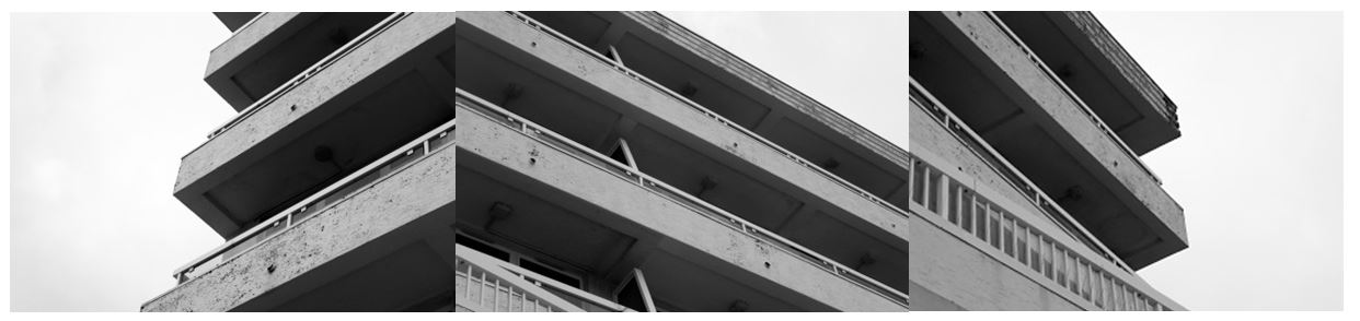
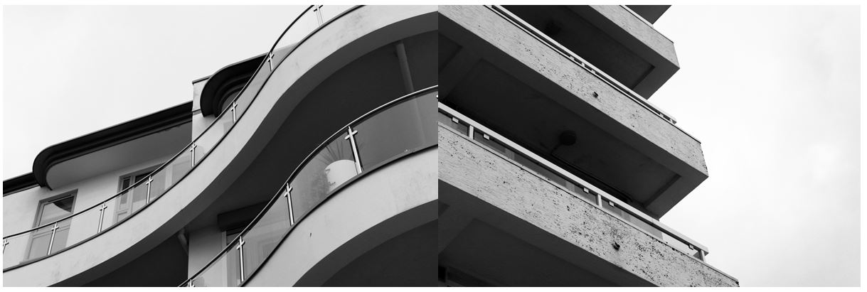
To experiment with my images I tried different arrangements of images I took on my Harve Des Pas homework. I used images that i had edited to all have bold lines and shapes and connected lines from each image to the next (especially in the first image) so the images had a connection between them. I like the second image as it shows contrast between the curved and straight lines on different buildings, but they’re edited in a way to make them look similar: in both images the underneath of the balcony is contrasted with the light colour of the balcony and the bright white sky.
Compare and Contrast:
When photographing this image I tried to interpret some on Thomas Struth’s building photographs and some of the concepts he incooporates in his photos. He photographed industrialised cities focusing his attention on such cities as New York, Tokyo, Berlin and Naples. Struth’s images of the urban environment concentrate on seemingly unspectacular streets and public spaces. This is similar to my photos as I focused in on one particular section of buildings, excluding any surroundings. He seeks to record the face of urban space, seeing the architectural environment as a site where a community expresses its history and identity.
Struth deliberately refers to the tradition of black and white documentary photography, adopting a seemingly objective position. I also edited my images to black and white to create a similar effect to Struth’s. I also took the photo with a ‘seemingly objective position’ by zooming in on the edges and certain parts of the buildings, and with the compositions being simple. One difference between mine and Struth’s work is that his photographs are neither staged nor digitally manipulated in post-production, whereas I edited my photo after, with emphasising the contrast between the light and dark sections.
Another similarity is that Struth had taken his photographs from the ground, adopting the viewpoint of a spectator looking up at the towering office blocks, which is what I did aswell. One difference between out work is that Struth seemed to focus his photos on a whole street or whole buildings, whereas I only focused on one section of a building, not incorporating any other buildings, giving a more objective viewpoint.
Overall I have enjoyed this landscape unit as i got to develop my knowledge in camera techniques and my understanding of concepts behind landscape photography that i wouldn’t have thought of before. I also now have a deeper knowledge of older and newer landscape photographers and the reasons they do what they do from researching romanticism, altered landscapes, as well as the urban and natural side of landscape photography and have explored each area doing my own interpretations.