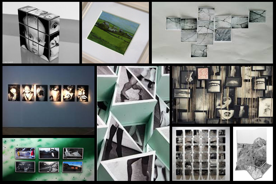
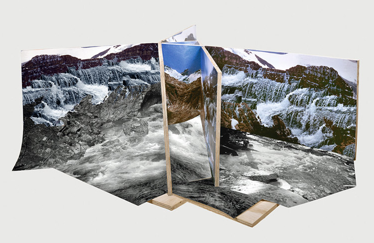
When presenting my imagery I wanted to experiment ways of which I could visually present my images differently to the standard style. A way in which I could do this was through Photoshop where I could manipulate images into the style of presentation I desired. Before I got to this stage however I thought it was necessary to come up with a mood board on my ideas regarding the presentation of the final pieces, this was my result: After looking over these images I decided I should trial run a few of them by manipulating the photos within Photoshop to get the effect needed. I Ideas I settled on were 3D presentation of the landscape and objects due to how through this method it allowed me to choose the focus of interest I wished the view to focus on, whilst creating a more realistic and abstract result. The second idea was the simple image between two black sheet with a white border, I chose this one because I loved the simplicity of the outcome as I thought it emphasized and complimented the entire piece.
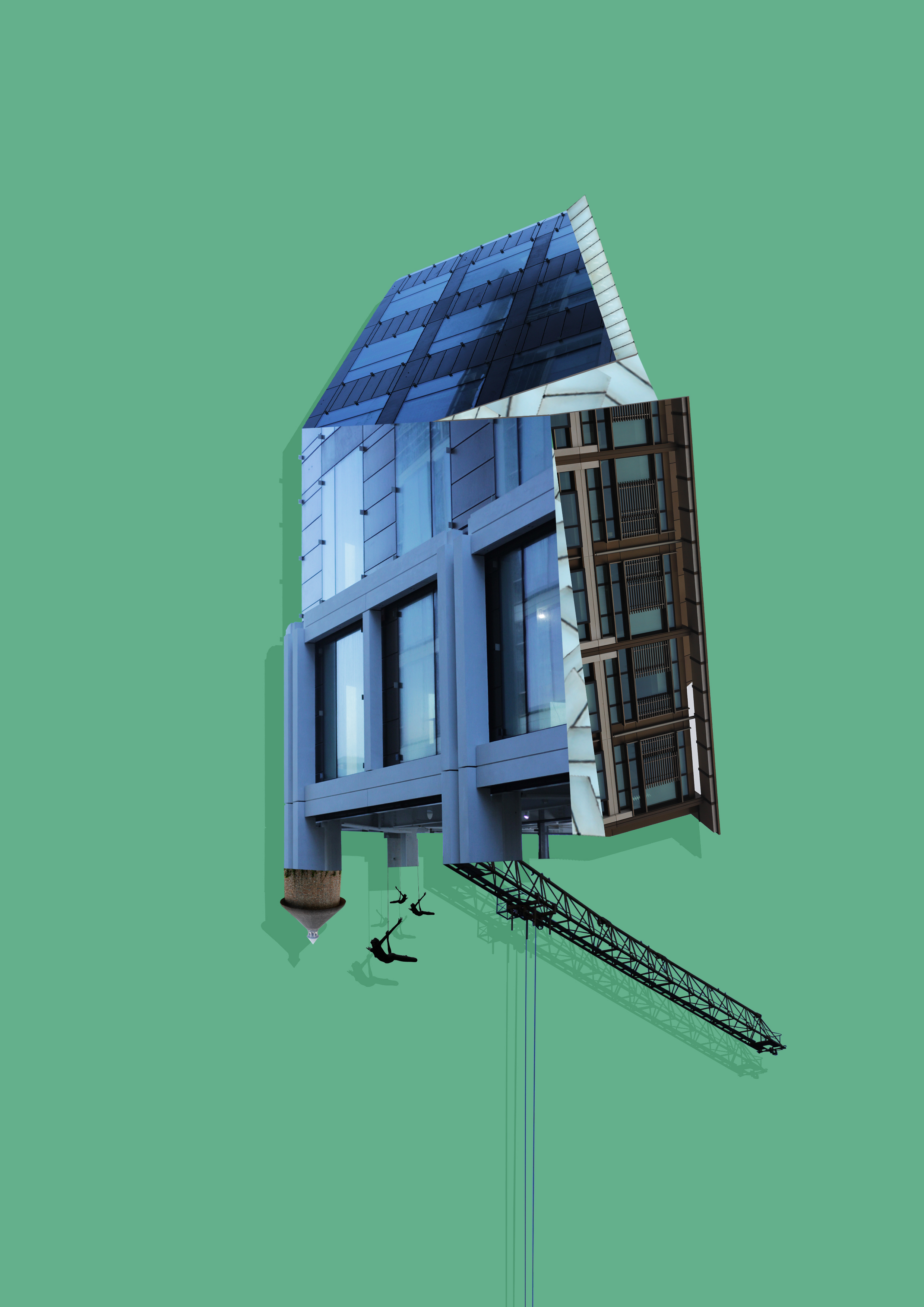
I firstly focused on the 3D design with this being my desired effect: To create this I stitched images of building I had taken together, with me adding edges digitally it made the 3D effect I wanted, this was my outcome:
 Whilst making this design I found that by adding a shadow to the piece created the effect as if it was mounted upon a wall, emphasizing the 3D aspects even more.
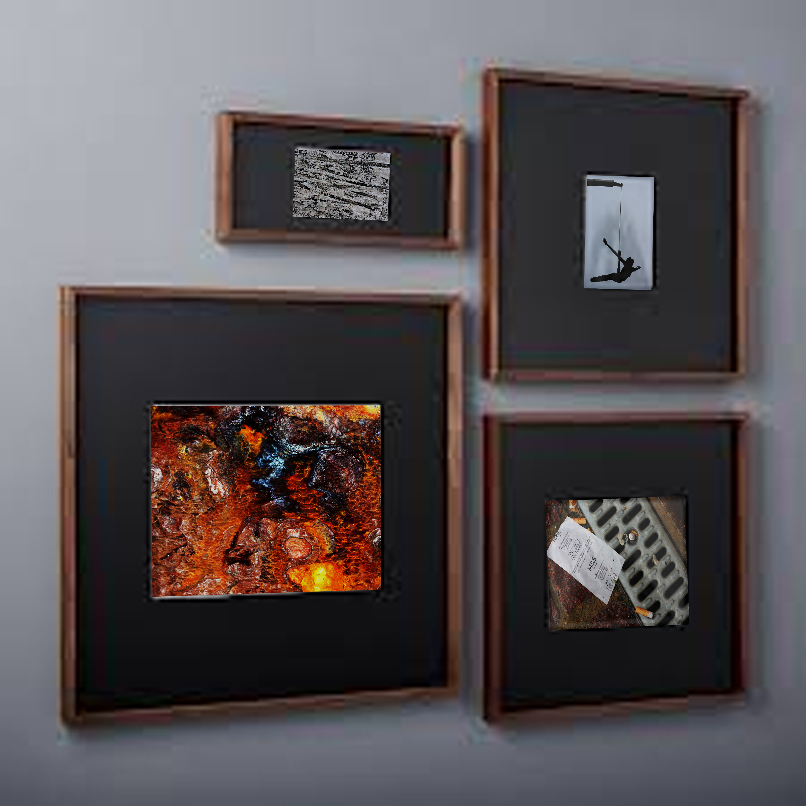
Once completed I moved onto the design of a plain black mounted image to present my images in. To do this I used simple shapes to create the imagery adding texture to them by using overlay, this was my result:

 When editing the images I found that when displayed together the pieces looked more aesthetically pleasing to the eye. This allowed me to come to the conclusion that I would display three of the images together to created this effect.
