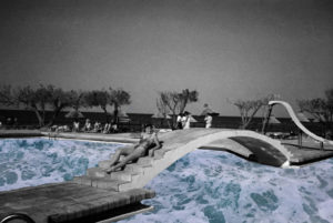
I am going to edit my final images on photoshop and print the out in various sizes, I will then frame them or mount them of foam board. this will help the photos stand out on their own and as the photos are already quite detailed a simple frame will help this stand out and not over complicate them.
I also want to experiment with my editing and try to display them in a more interesting way.
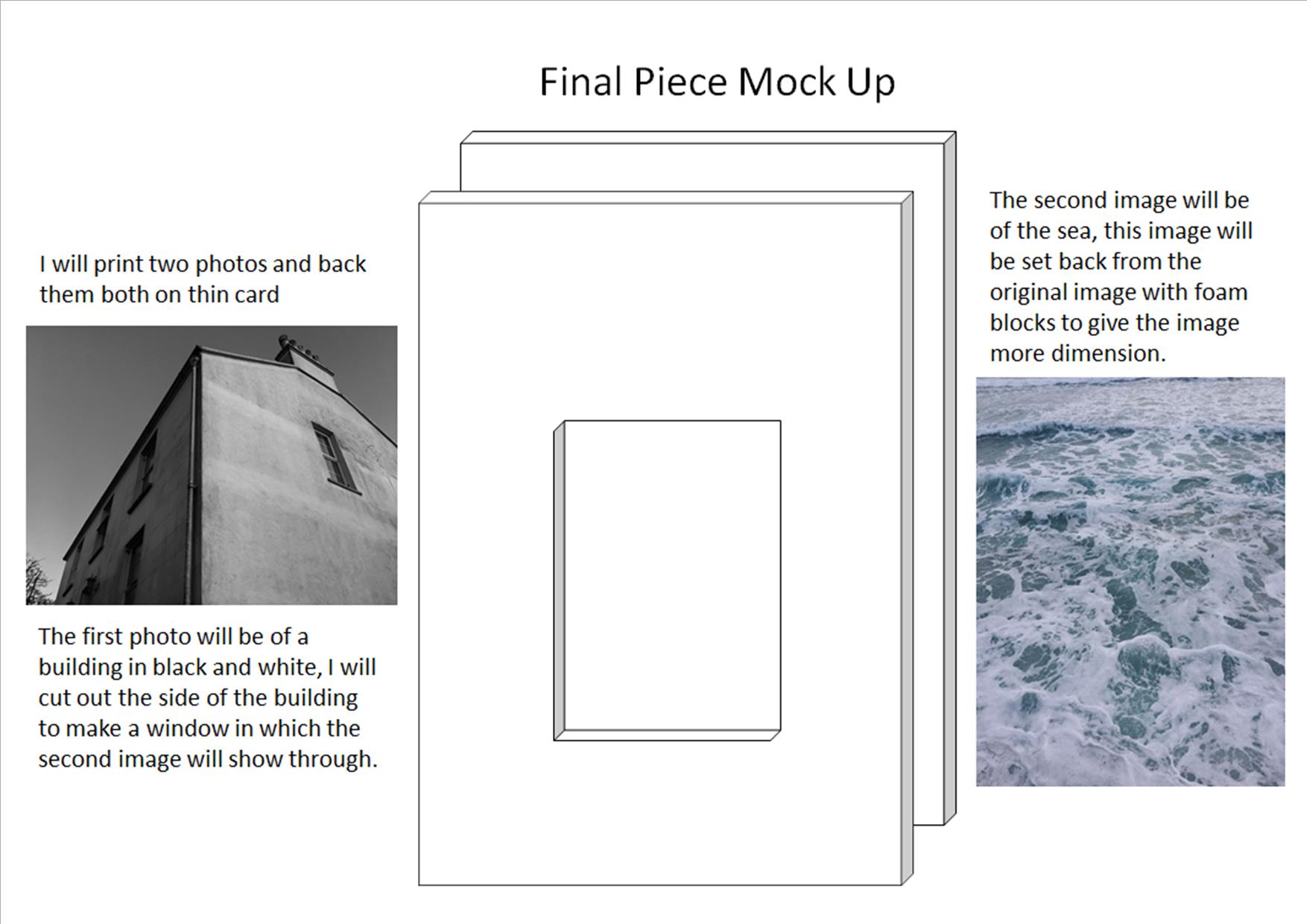
I will then frame both the image with a beveled edge on poster black poster board. I will print a variety of images and try different combinations of black and white urban images and coloured natural image to see what looks best.
with my other photos which are being printed i will display them by either backing them on foam board or creating a frame.
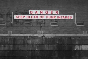
I will print this image out in A3 because I think it is a striking image and will stand out and show its details in the background better as a larger print. I want to to either mount this image on white foam board of frame it in white. the white boarder will help the writing pop and stand out oven more. This image does not fit in with my most recent artist study however I think it sums up some of the new skills and styles I have learned whilst doing this landscape project. For this reason I am choosing to present this image on its own.
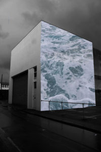
My A4 print will be my edit inspired by Merve Ozaslan’s work, I combined two photos that I took to create a collage which shows an urban and natural environment in one image. I will back this image on white foam board with a thin boarder to help the highlights on the image stand out.
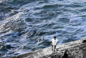
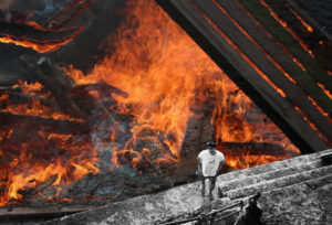
These two images will be printed on A5 and displayed as a pair. both of these images were edited from one old image which I then replaced the sea in the image with a new photo I had taken. The idea behind this collage is to show the balance and contrast between the natural elements.
