
All of these I will do a window mount on mount board and leave a large white boarder surrounding the piece itself this creates a strong juxtaposing contrasts of white and dark tones and also creates a sense of harmony and a pattern to all the separate pieces. I think that tones create a finished piece it would be most effective to frame the pieces in a black frame and then hang them all in order or largest to smallest and create an overall pattern through the hanging itself. The top final image is the most accurate as the sizing is the same as i would too develop it for a finished final affect.I think the simplicity of the images is also enhanced within the frame as it too just highlights the tones without subtracting the attention of the images.
Evaluation:
Overall I think these three pieces will be the most effective as they all have a clear linked theme of significance being;that of combining nature and then with architectural structures,they also have the same theme as my artist but i decided to use a wider range of setting combining woodland ans well as urban and sea scapes .They all have a continuing tonal range throughout being black and white continuing the same theme throughout. I also think that the display of them all will be effective as it is simple but also the second image will be cut into this style.
But also presents the ability of many different editing techniques and stretching the ability to use camera techniques as well as Photoshop abilities. The editing also allows a similar overall theme throughout and does still respond to the artists themes.
critical analysis:
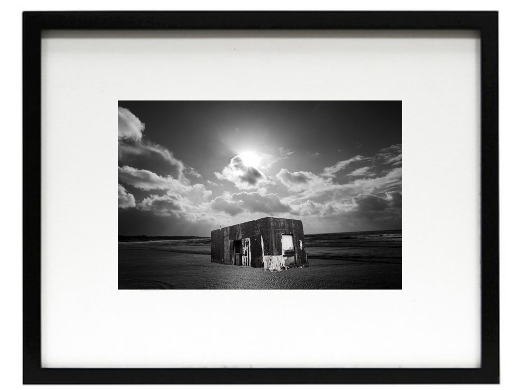
Critically I think the first image is the mostly successful,Due to the angle of the structure and also the way the light enhances the overall composition and the sea scape being effective and using the formalism lines too.Although i do think the lines surrounding the building could be edited better,as there are some issues are areas I did not intended to be there,furthermore the bottom could be possibly blended into the sea although i do not know if this would then take away the effect of the sea being present.
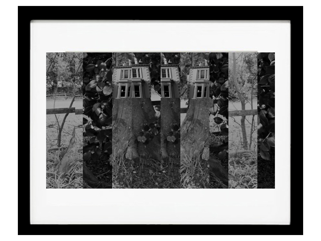
My second piece I decided I would not use the piece above but the original image where there are no lines present,this is because it has a better quality and you are able to see the buildings of the tree and not have to question what is happening and if it is effective. To make this piece more effective I should have blurred the house to the tree and make a stronger area of cohesion and perhaps also make the tones darker as this would be more suiting to the other images.I do not think the surrealism is as accurate to a real life scenario as the previous image but can still be seen without questioning.
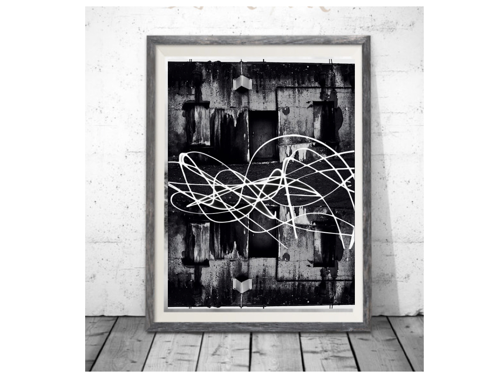
Thirdly this is a lot more abstract.This could be seen as effective or too much editing,but I do think again it present my themes in a different light overall.It could be slightly repetitive as just flipping the image is not the most in depth editing I could have done although i do think i was enhanced with the light I drew over the top with a slow shutter speed exposure,despite some sections with the previous background.
final response:
Overall I think that all my images work well together and still do show the themes of nature molding with industrial buildings. Although some could have been further edited but the simplicity of some of them still creates the same overall effect.