My favourite final images
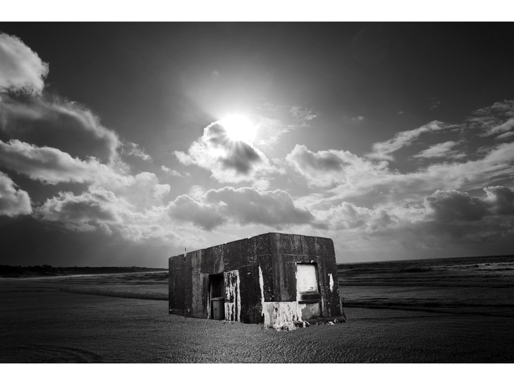
This photos come about on two separate shoots,one of which focusing on sea scapes and the other focusing on more urban industrial sculptors.I decided to edit both in a tonal black and white in order to capture a more in-sync image and an overall successful composition.The light is successful and enhances the composition of the building and overall has a surrealistic undertone and still relates to my artist and also my themed shoots.This is my favourite image and will definitely be used for a final piece.
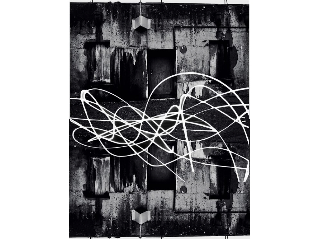
This piece is a lot more Inspired by urban landscapes and a mirroring effect enhanced by a slow light exposure seen within a city scape, it creates an abstract type of quality and overall has an interesting composition. Although there is not a surrealism aspect the tones and overall concentration on structure allows a cohesion to the rest of the chosen images.
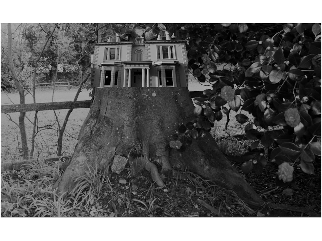
This image was inspired by the surreal effect of joining the woods into an interesting large historical building, this is not complete with editing but still has an interesting presence and composition to the piece.

This image has a strong sense of abstract themes but the tones and editing of the original stature has a consistency of tones and compliments the environment in which it is surrounded. The editing was very much in a similar direction using the instant alpha technique to separate the building to form its original backdrop and then place and resize in order to be in line with the background of the sea. 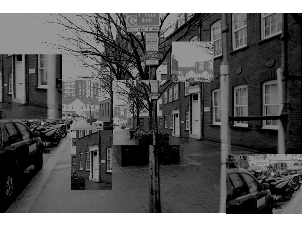
This image is again the more urban route, but still uses the same tonal editing technique and with the focus on buildings and an overall separated stature to the pieces,It is unusual in its varied segregation but allows interesting points of views throughout.
New editing ideas: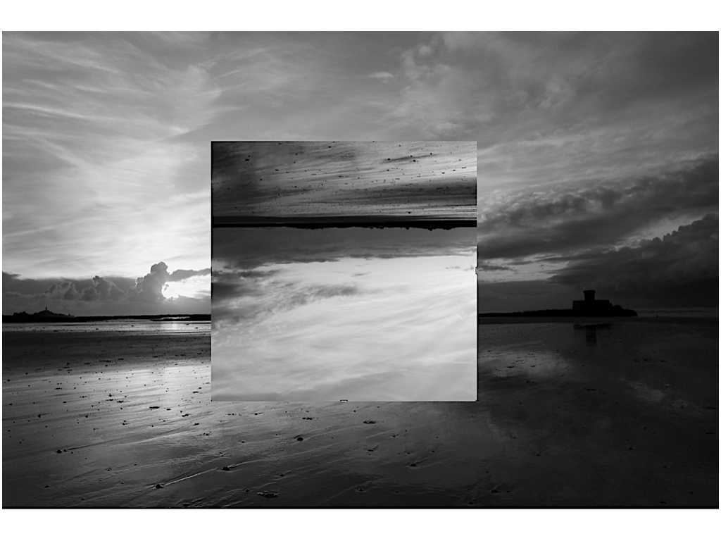 I wanted to do additional editing on this piece as I have already changed the romanticised backdrop to be an altered reality and the change of the tonal range in order to be more conjoined to the rest of the images,it presents an interesting aspect of light and still has the presence of a stature on the right hand side.
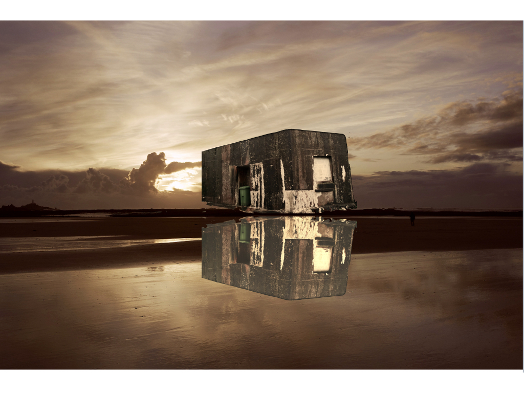
Here I wanted to try a basic mirroring technique in order to connote a reflection onto the sea again using a past romanticism landscapes did this by flipping and editing the tones of the piece,althought this is less successful as the previous as it is not edited well enough to show a watered technique.
