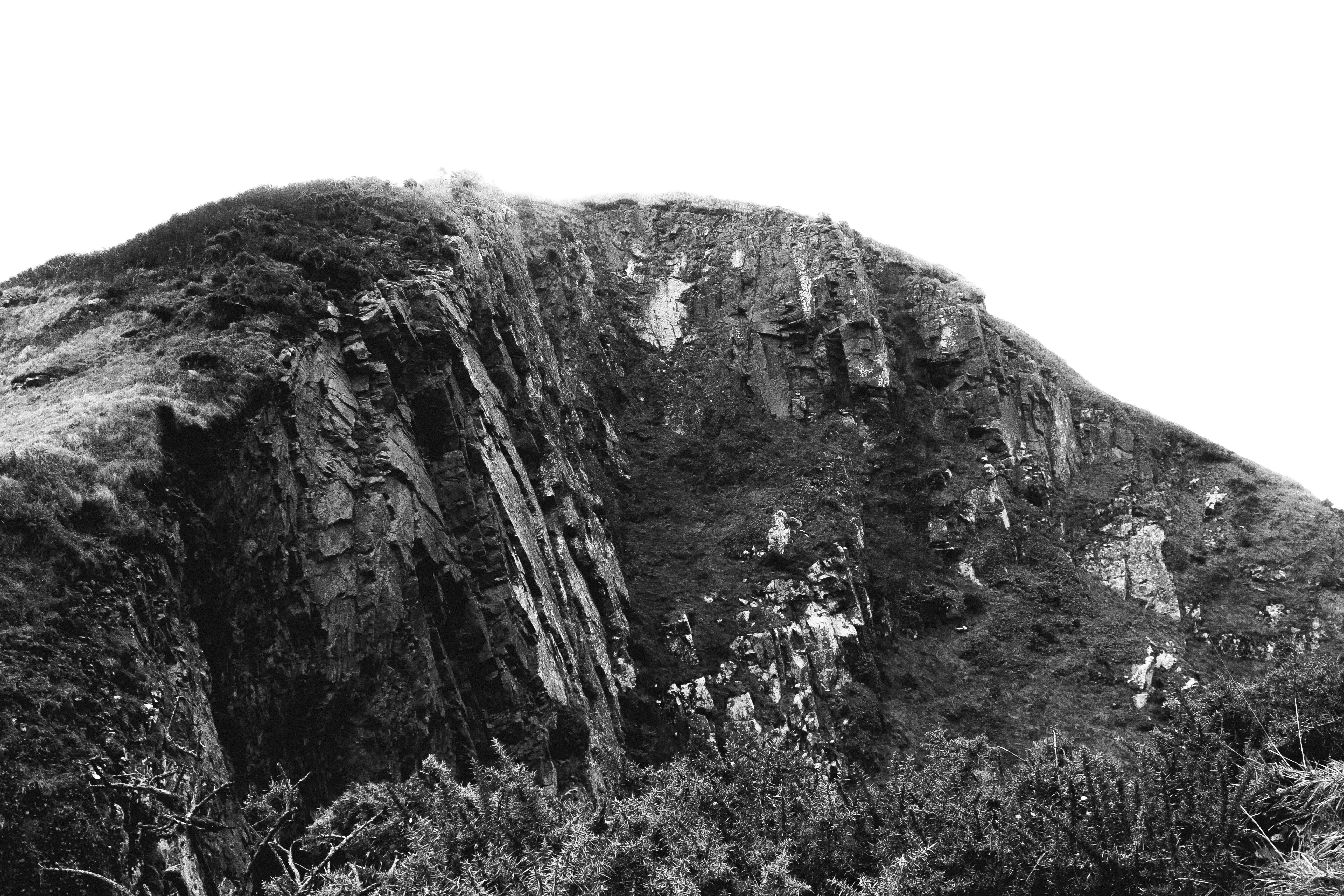
Below is one of my final images that I will be presenting for my final piece in the mock exam. In this post I look at how I could present the photograph in different ways to make it stand out more and be more creative.

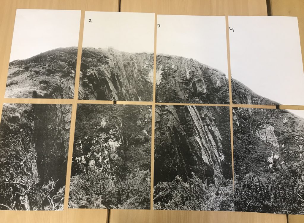
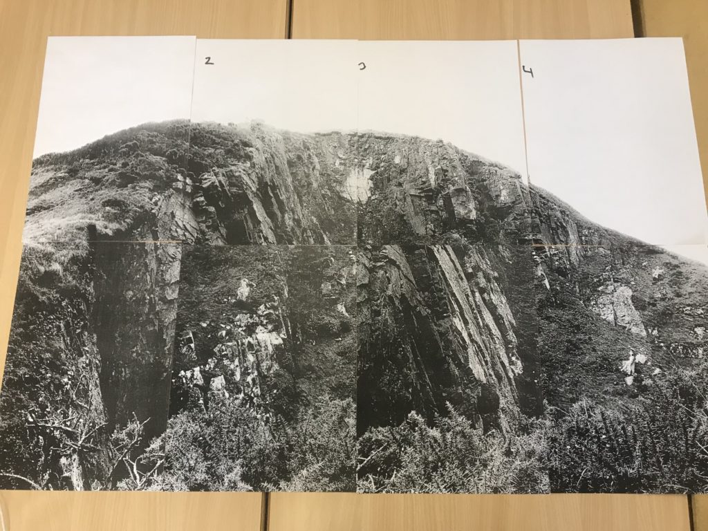
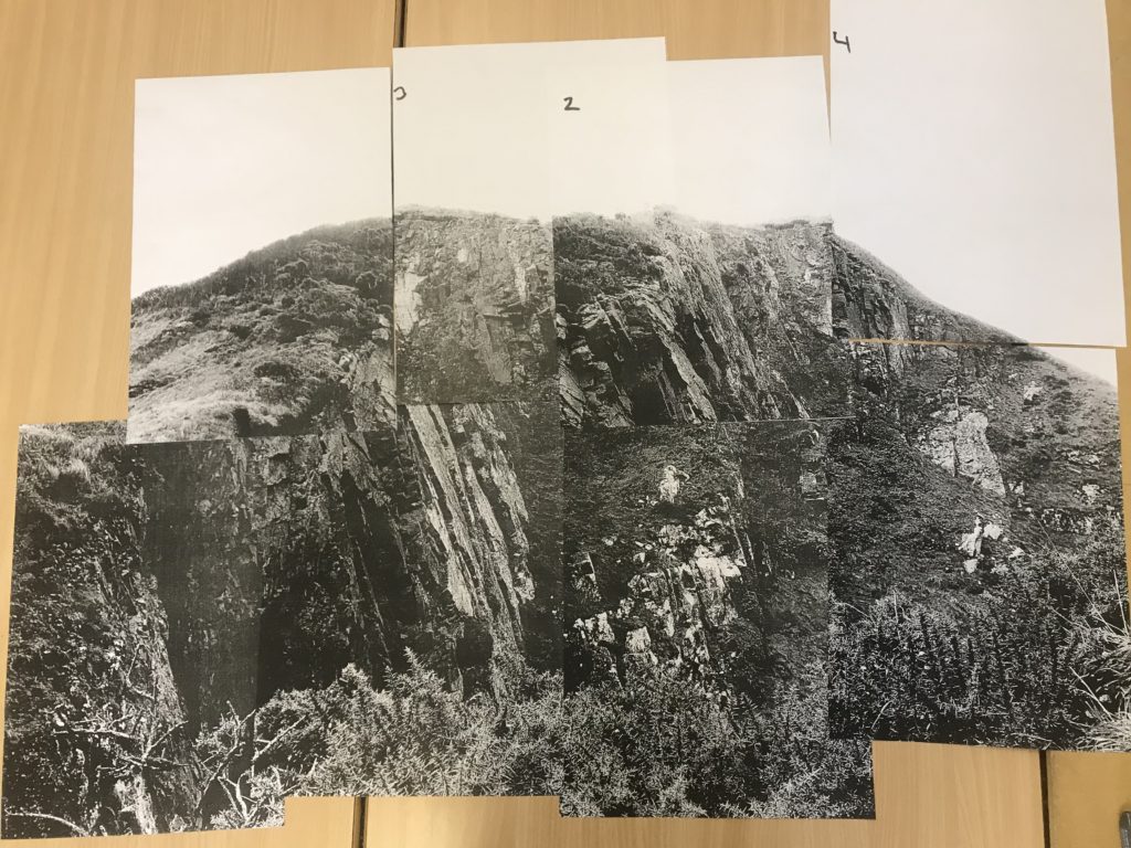
Due to the size of the subject in this photograph, I want to present the photograph on a large scale to emphasise the presence and size of it. This creates a more intimidating effect because of the largeness of the subject. I have looked at keeping window-like borders between each section of photograph but decided that I will not follow through with that because I feel that it takes away the fact that it is one large photograph. I have also looked at moving around the panels in order to create a mixed up image – I decided that this takes away from the nature of the photograph and isn’t in the direction that I want to be going. I came to the conclusion that my best option was to stick all the panels together in the correct order to create one large photograph.


