Homework 5- Altered Landscapes

Out of Beomsik Won and Mona Caron i decided to take inspiration from Mona Caron. I decided to edit pictures of nature and plants onto buildings to present the concept of urban taking over nature. I planed to physically stick the images onto a printed out building to make a collage and to also digitally edit images onto buildings in photoshop, similar to how I edited my other altered landscape photos.

The images I planned to use to edit onto buildings were not my own photographs but secondary source of art as Mona Caron physically painted murals onto buildings I wanted to keep that aspect but using different artists work of natural landscapes and plants, still keeping my own images of the buildings.

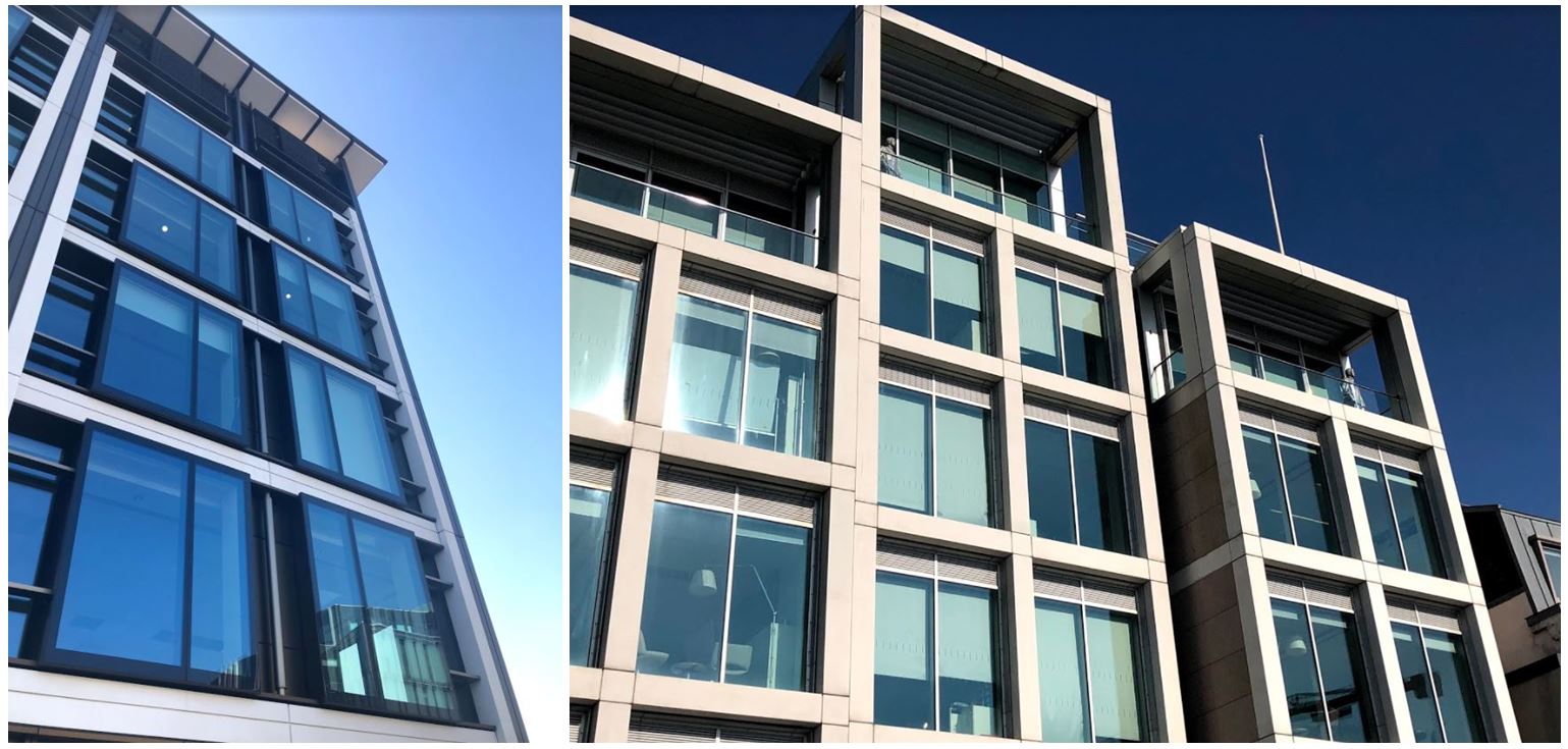
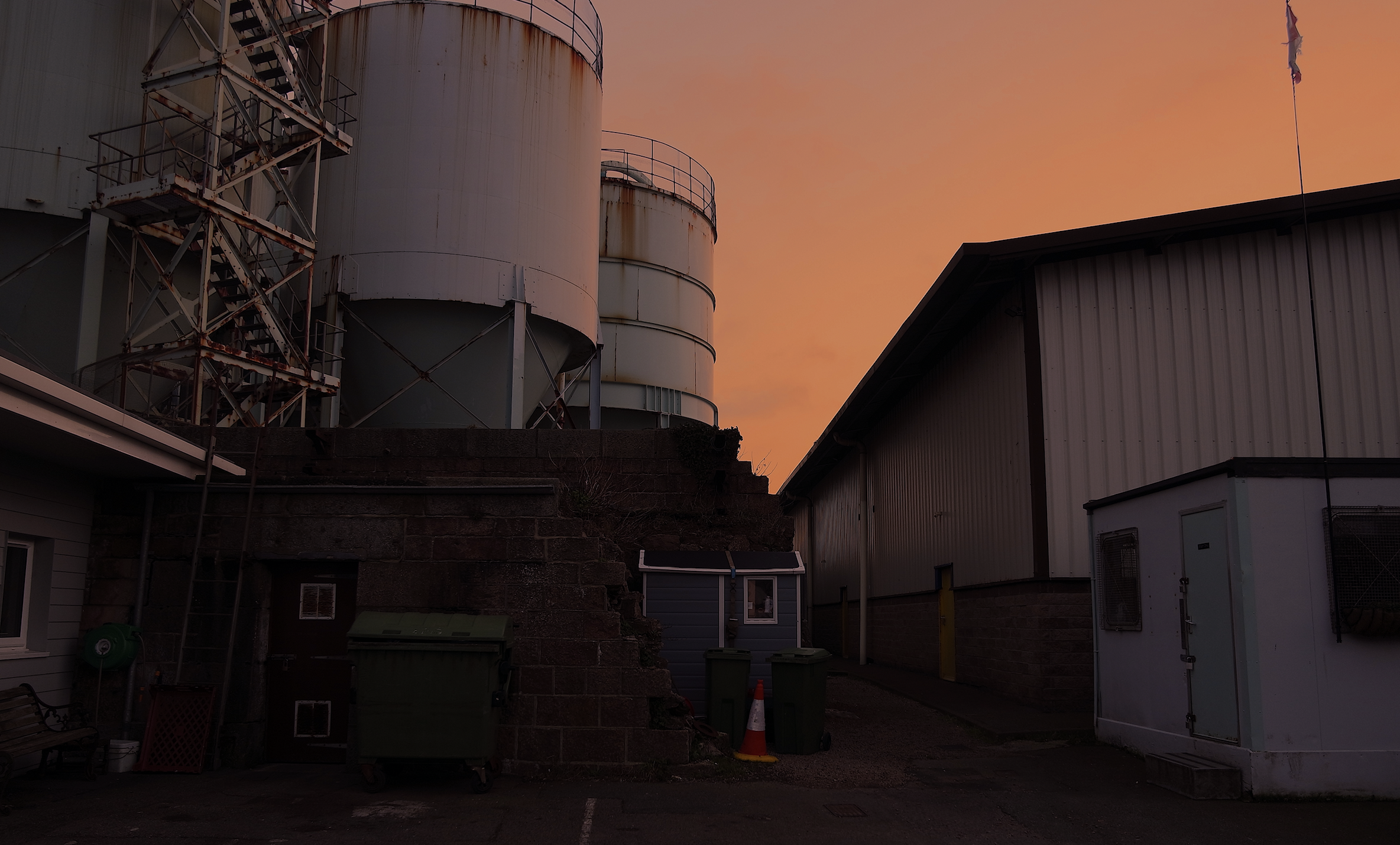
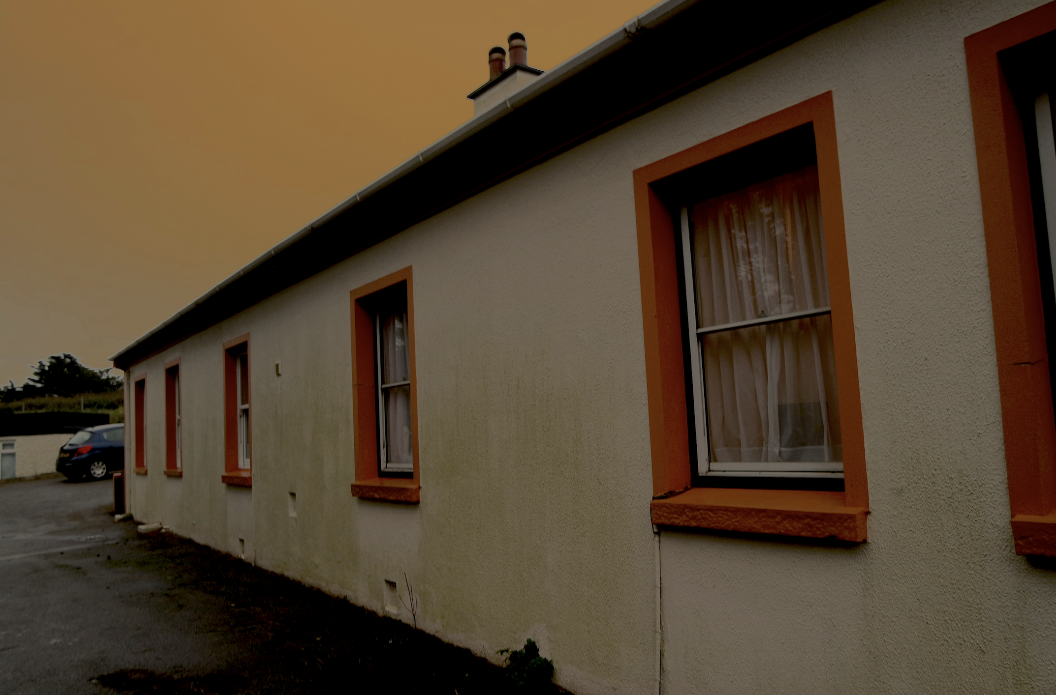
I first went out and took pictures of buildings so i could edit them in different ways.

I then chose two of these images to be my final images to edit. The pictures I wanted to lay on the buildings are from the artist Claude Monet as his paintings are often of nature and plants so the urban and nature will both be included in my image. Also Mona Caron is an artists and physically paints murals onto the side of buildings so i wanted to carry that aspect on to my images.

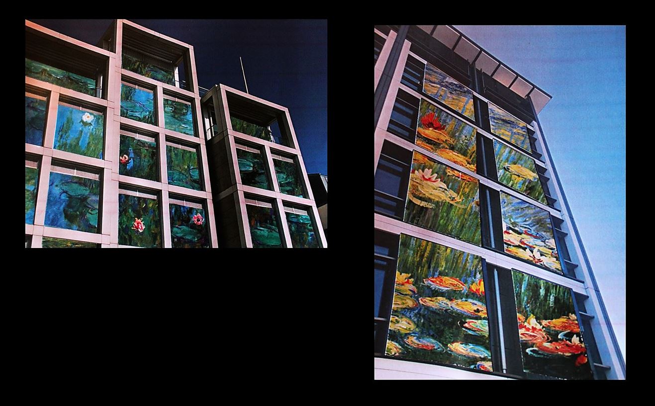
I cut the paintings specifically in the shape of the windows so it looks like the paintings are inside of the buildings. I think this was effective as the paintings are angles to make the image look 3D. These were the final outcomes when I photographed the images stuck on top of each other:

  • I chose to do this as i think the images link into my other blog posts with the theme of urban vs. nature. Claude Monet’s painting of lily pads represents the nature with the structural building representing urban.
  •  I physically printed out the images and collaged and stuck them together to make the images seem less manipulated.
  • To re-take the photo I used artificial lighting to highlight the photo as best i could even though the print out of the building wasn’t the best quality (to improve these images i could get them printed professionally.)
  • I think the edits look effective as it looks as though they were edited digitally when they were physically stuck on.
  • The shadows created from the building (especially in the first photo) make edit look more real as the painting is cut in a certain shape to emphasise that shadow.
  • For my final image I put a black border around the images and combined the tow in the same photo to show the variety of images.

Approach Ideas

My approach to this unit of work ‘Landscape photography’ will consist of finding and presenting a balance between Natural, Urban and Altered landscapes, whilst limiting the alteration of the raw photography as I aim to present my raw camera skills along with minimal editing.

This approach to the unit will take influence and inspiration from Ansel Adams (Natural landscape side) and the New Topographics (Urban/Altered landscape side).

This approach I am taking is my way of creatively focussing on the issue of man made developments covering up beautiful natural landscapes. But whilst exploring this issue, also showing that there is however still beauty in our man made surroundings, and which can be enhanced when in harmony with nature.

Formalism and minimalism within landscape photography

Formalism

Formalism is the study of art by analyzing and comparing form and style the way objects are made and their purely visual aspects. In painting, formalism emphasizes elements such as color, line, shape, texture, and other perceptual aspects rather than iconography or the historical and social context.

Examples of formalism photography

Image result for formalism photography

Image result for formalism photography

Minimalism

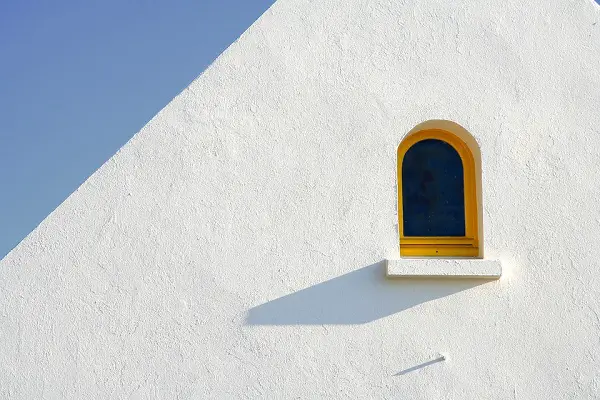
Minimalism is a style used by many 20th Century artists, using a very minimum amount of elements which consist of: color, shape, line and texture. Within the art world it is considered an extremely subjective concept, leaving interpretation and meaning up to the viewers perception of the work.

Examples of minimalism photography

Image result for minimalist photographyImage result for minimalist photography


typology analysis

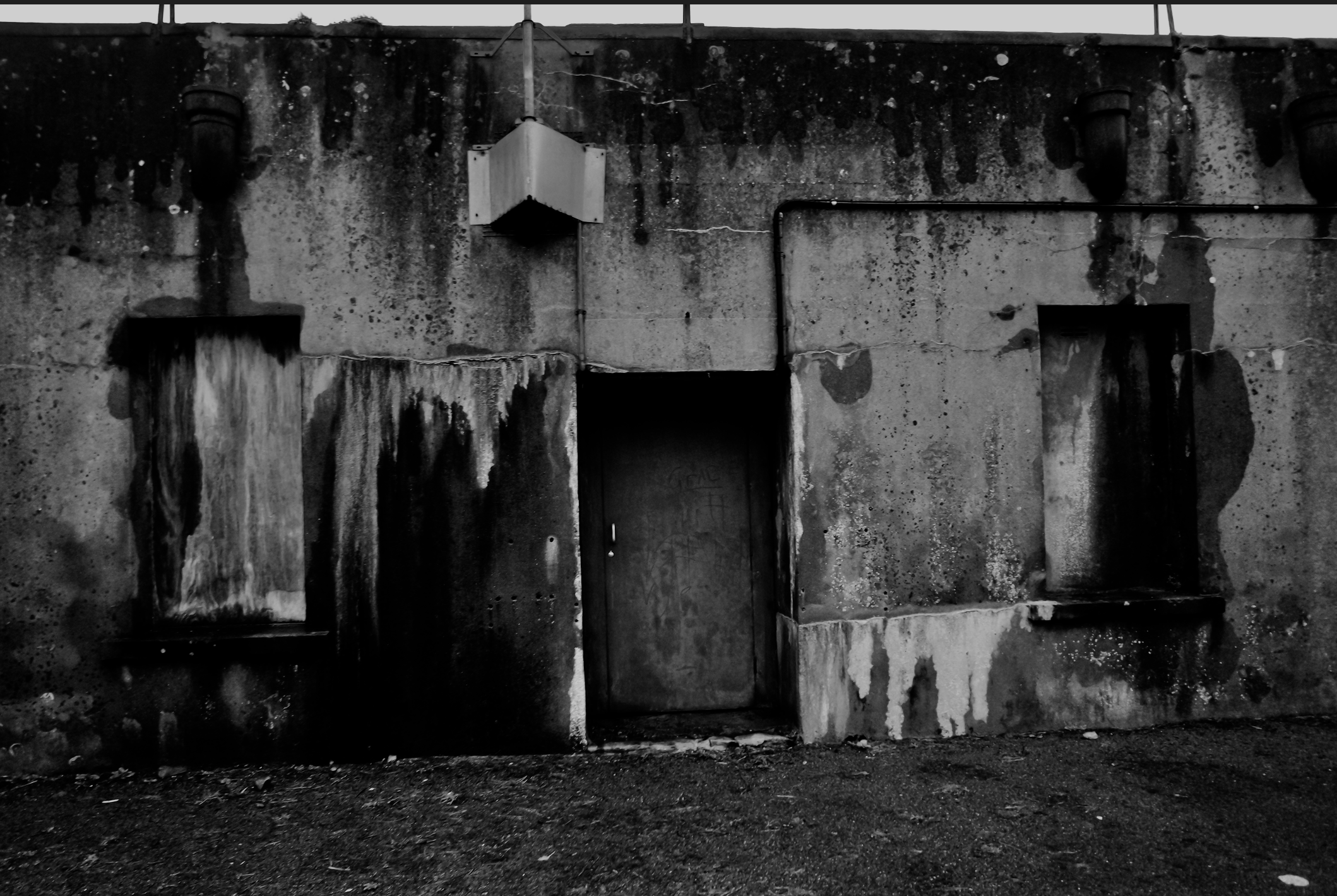
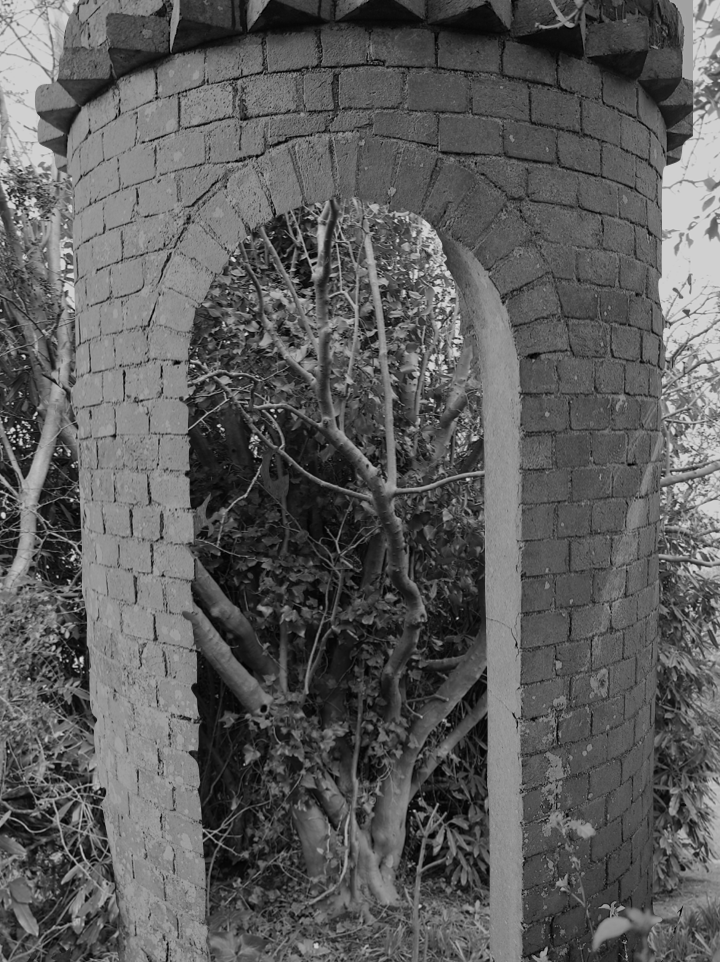
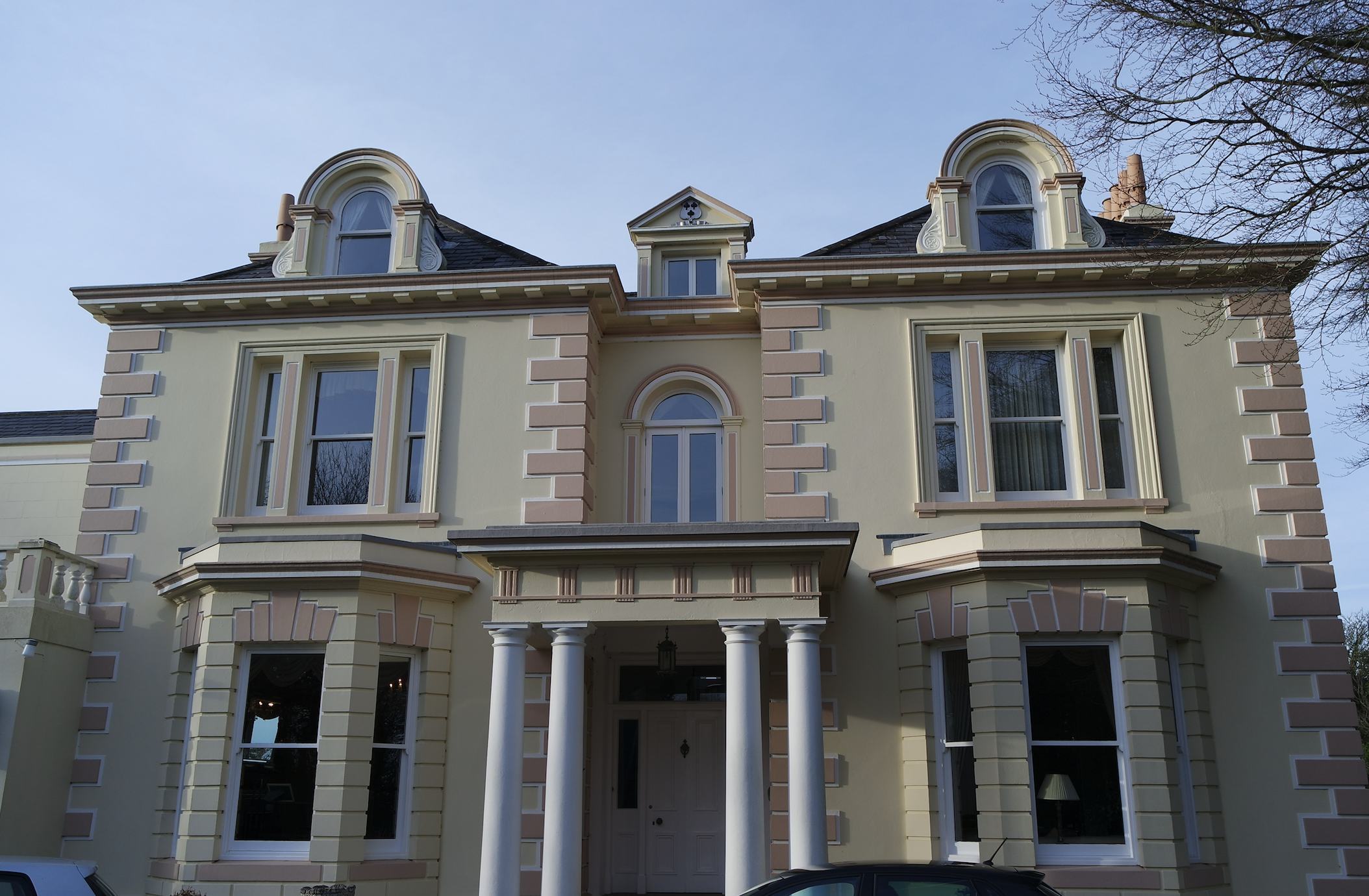
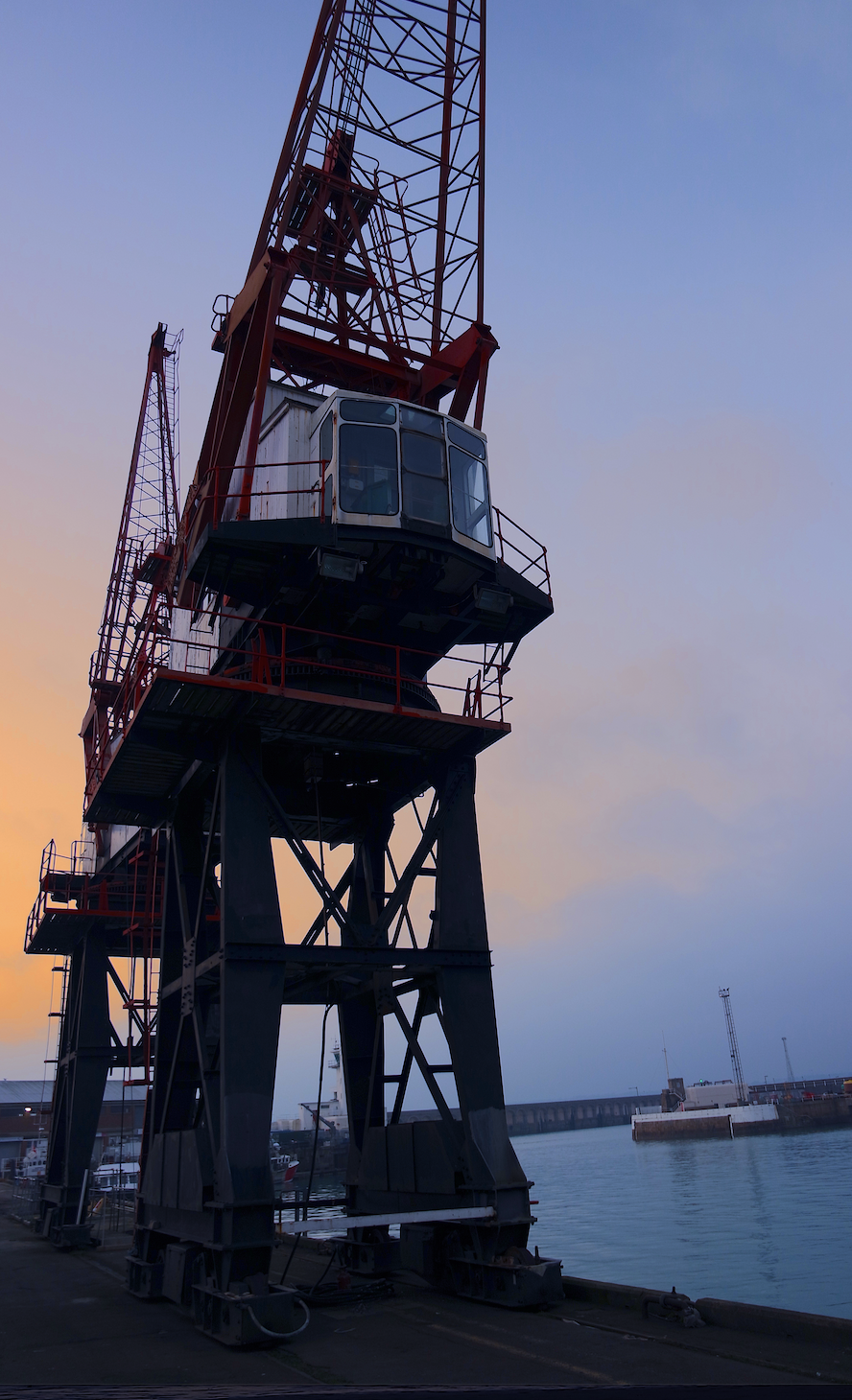
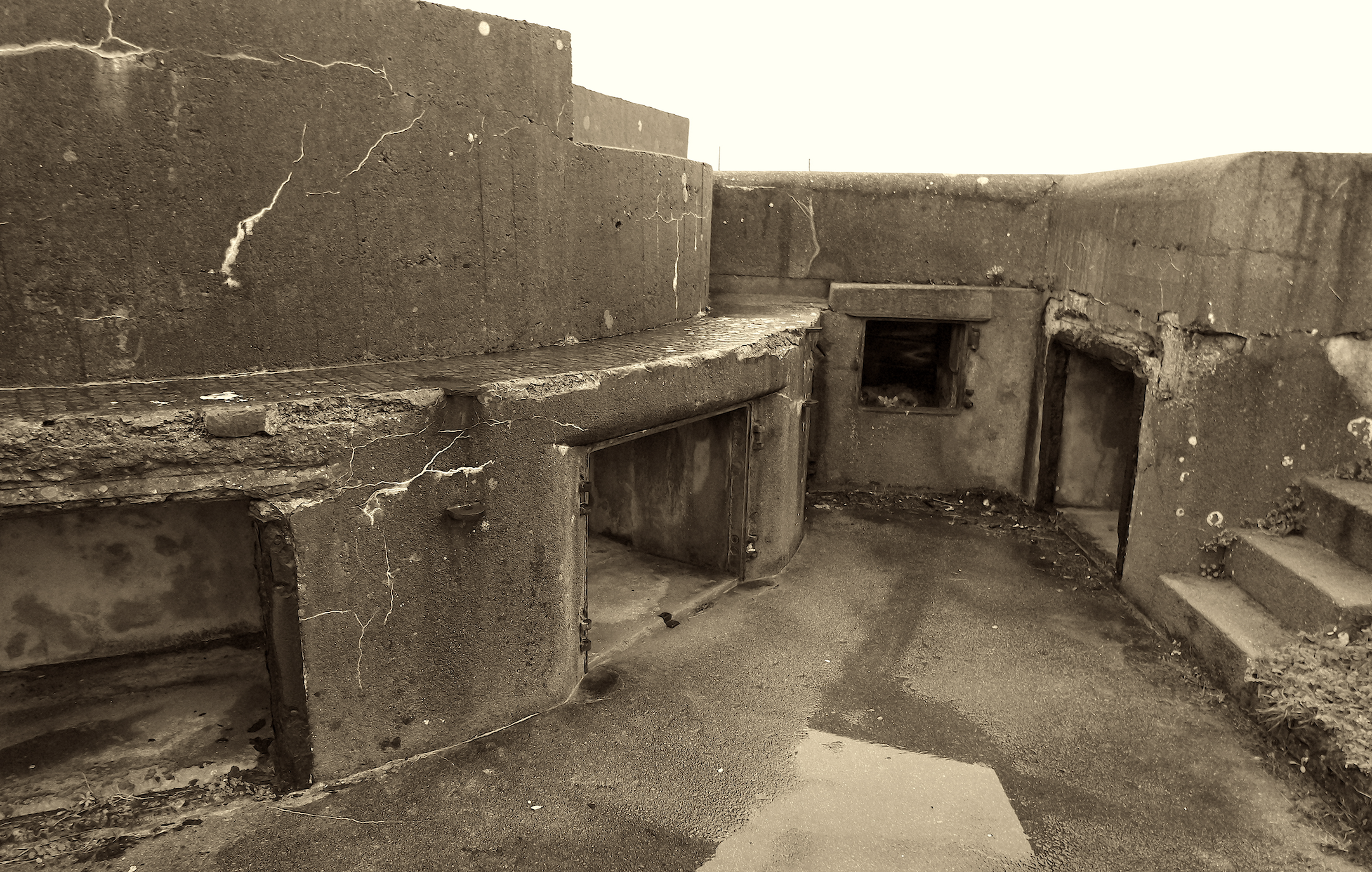
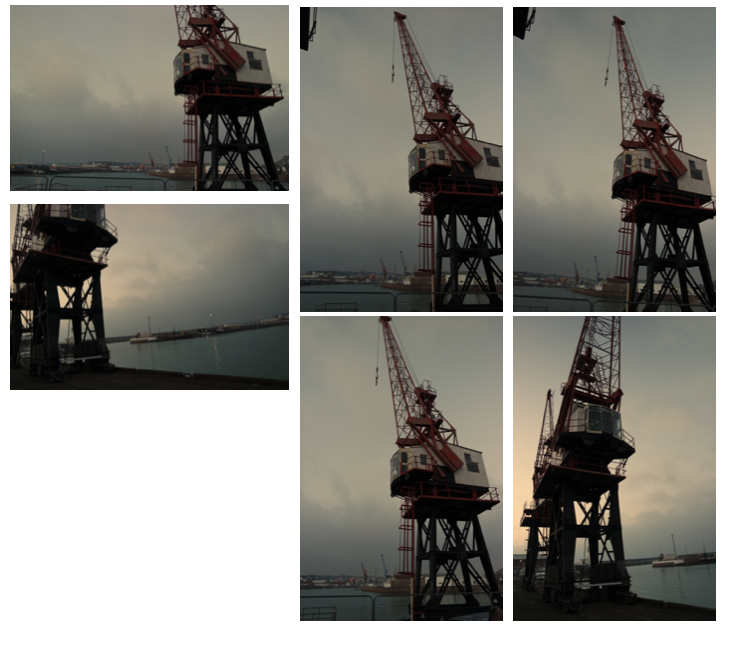
when I thought of typology I wanted to use a wider range of the terms wanted to find a range of buildings from all different spectrums of history and movements,I did this is order to have many possibilities to contribute to my final outcome,becasue of this I took many images and angles of the same building, I wanted to present each building in such close detail and also portray that the image could be seen as three or two dimensional depending not the angle and representation necessary.

As I said before all of these buildings have different occurring qualities weather it was me wanting to couture a texture,a historical aspect of society,an urbanised areas and or a more Morden buildingsI did this as all of these present a different shape and have different occurring  qualities and angles within them.

I have already adjusted these images as seen previously with colouring to a darker tonal back and white ,or enhancing the pigment within the saturation,this is all dependent on the scene and what I am trying to achieve within the piece itself. all of my images are taken from right angles when cycling round too mature every element and angle of the image itself, which can not necessarily be parented from above.

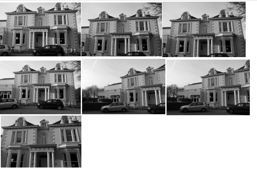
 Grid set development:

I have slightly cropped my images in order to display them clearly alongside some other angles that I have taken,I have done this for all  of the buildings and structures that I have worked within. although many  of these images are mirror images and so near and similar that they portray the same composition and lighting, although they could be edited and both enhanced or even presented  together.

overall I think I have capture enough images to show that I have considered typologies although I did focus more on individual buildings that will hep contribute to my theme of form man made  sutures to enhance nature.


The Editing Process

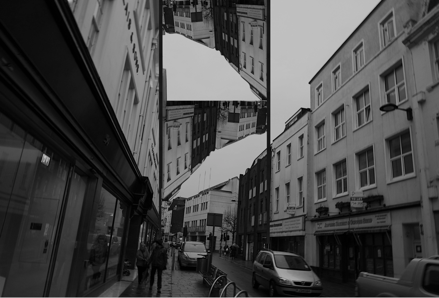
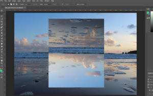
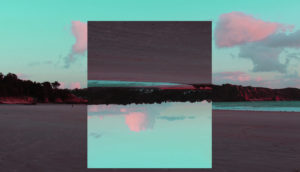
The first thing that I did when I began the editing process was selected the area of the image that Iwanted to flip upsdedown. To do this I first went a selected the rectangle Marquee Tool as this gave me the most freedom when deicing how big I wanted the area to be.

I then went into Edit – Transform – Roate 180 degrees. 

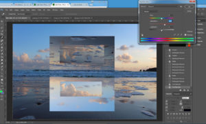
Then wanted to edit then image further to create another reflection within the image. To do this I repeated the process but with a smaller section of the image being selected.

The lastly Iwent and increased the vibrancy, saturation and contrast of the image only very slight as i felt that the image already was very strong colour and contrast wise. I felt as this step was necessary as I wanted this shoot to incorporate elements of the Romanticism genre  buy increasing the levels of all of factors, it has helped the imahge to fall into the category.

Compare and Contrast: Thye Reading

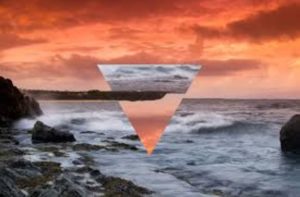
Tyhe Reading Geometric Landscape image which inspired my shoot
My response to Tyhe’s Image

Overall I think that mine and Cody’s image are very similar in looks and technical skill. When I first began to look at Cody’s images, I noticed that he would only edit his image with a triangle ontop  and no other shape which I didnt like. So I decided that I would stick to only a square/rectangle to edit my image,  The foreground of Cody’s image is very busy with crashing waves, which is one thing that I wanted to make sure I didn’t have in my images as i found it to be very distracting and I wanted the main focus of my image to be the section which has been rotated an]s otherwise the image would have been to busy. One thing that I made sure was the same when I began to edit this image was that when the image was rotated was the the land is the section that had been roasted was inline with the rest of the image.