
CORSEWORK CHANGE TO EXTERNALLY SET ASSIGNMENT
Monthly Archives: February 2018
Filters
mind map for secrets/codes and conventions
- Experiment wihtin mirroring or using glass to represent a restraint and innovate themes of a slow sense of dream lost within reality.I would emphasis the use of glass in order to present a self reflection and convey their personal thought and feelings,hower I could also experiment wihtin not showing a face, and emphasis of a mystery and secretive time behind the work.I would use dark tonal ranges and different camera perspectives to present a value or part of their life.Wether that be ripping open a part of them or using a pathetic fallacy feature and using what is surrounding them to that their feelings. additionally the split mirror and back symbolise a break and distortion within their self image or additionally within the secrets they hold.

- For my section idea I want to focus on areas in which have a lot of historical significance but attain many secrets and stories.I want to emphasis a more scary and or adventful area of locations. This could also be viewed as signs and symbols to illustrate a past experience and a journey through time of past peoples lives.
- This next piece is again more landscape inspired but showing the unpredictability and power that nature holds over people. the chosen image is which you are not able to see and cause interesting tonal and lighting effects as this is shot bring about the suspense to the images, it presents a possibly journey to be taken to as past journey, it shows a formation of a personal emotion to the scenario.

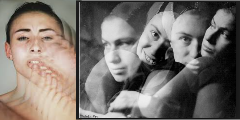
- This next ideas is similar to the first but to create multiple faces of different angles and shoe a repletion and continuation of a being, this is interesting nd slightly more surreal but inserts codes of insecurity and self reflection,it also could be used to symbolises different emotions and every face symbolises a different emotion of themselves. These images are seen to hold secrets and tell a story of past and possible journeys.This presents the codes and conventions of who and makes up who we are, it allows an interesting composition of forming many feelings
- . I could also focus upon the many underlining conventions of old family portraits and their shift of time and development of people within them both with and without spontaneity to the photos but a ritual family series.
Evaluation, critique and analysis of my final response

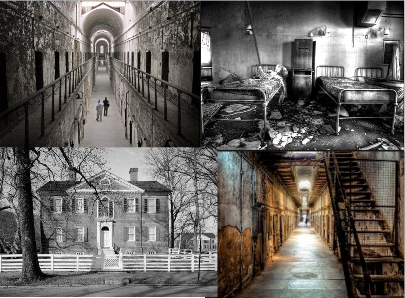
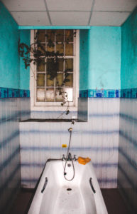
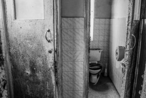
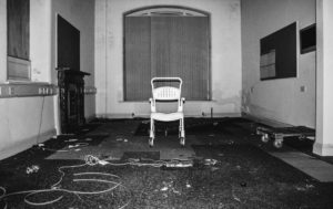
This piece of work is a true representation of the past. It represents a discovery of forgotten things which brings a realization that this place was someones past; the history of lives we never even knew. There is great use of leading lines and depth of field within these photograph which help to direct the viewer around the piece as a whole. The carefully positioned pictures create a strong contrast and juxtaposition to the photos themselves which are completely wrecked and derelict. This use of contrast may be a reference to the atmosphere which once was present to how it appears to be now. This links to the way the hospital used to be run, probably smooth and regulated well, compared to the myths associated with it and how it looks now. Personally, I believe that viewers should appreciate the subjects of this work but keep them in mind as examples of humanity’s wastefulness and the impact society has on nature. I think that to make this piece of work better, I could have explored a variety of derelict sites as appose to only one. I could have also thought about the presentation more to create something more visually pleasing such as a 3D sculpture, incorporating my photos within it.
Landscape Final Outcomes
FINAL OUTCOMES
This post covers my final outcomes from the whole landscape project. Some of these were photographs that i had printed and some are purposed for the blog.
The first of my final outcomes is this composition of 2 photographs of mountainous landscape in Madeira. I chose to put these two photographs together as one of my final pieces simply because i believe the photos show my raw camera skills and show the true beauty of the landscape as opposed to my previous projects in which my final outcomes were fairly edited and although the raw camera skills of those pieces were good the editing could be seen to ‘take over’ the raw skill. I believe that the exposure of all the photos that I have chosen for my final outcomes are well suited to the condition in which the photos were taken. These 2 photographs have taken inspiration from and are a response to the romanticism landscape photographer Ansel Adams.
Outcome 1

For my second final outcome I have chosen this 3 piece composition of black and white photographs of rocks and water. I believe that these photos represent the harmony of land and ocean as the water covered rocks show how the ocean adds to the aesthetics of the land. the monochrome of the images helps to focus on the detailed textures and shadows of the images by enhancing the light and dark within each.
Outcome 2

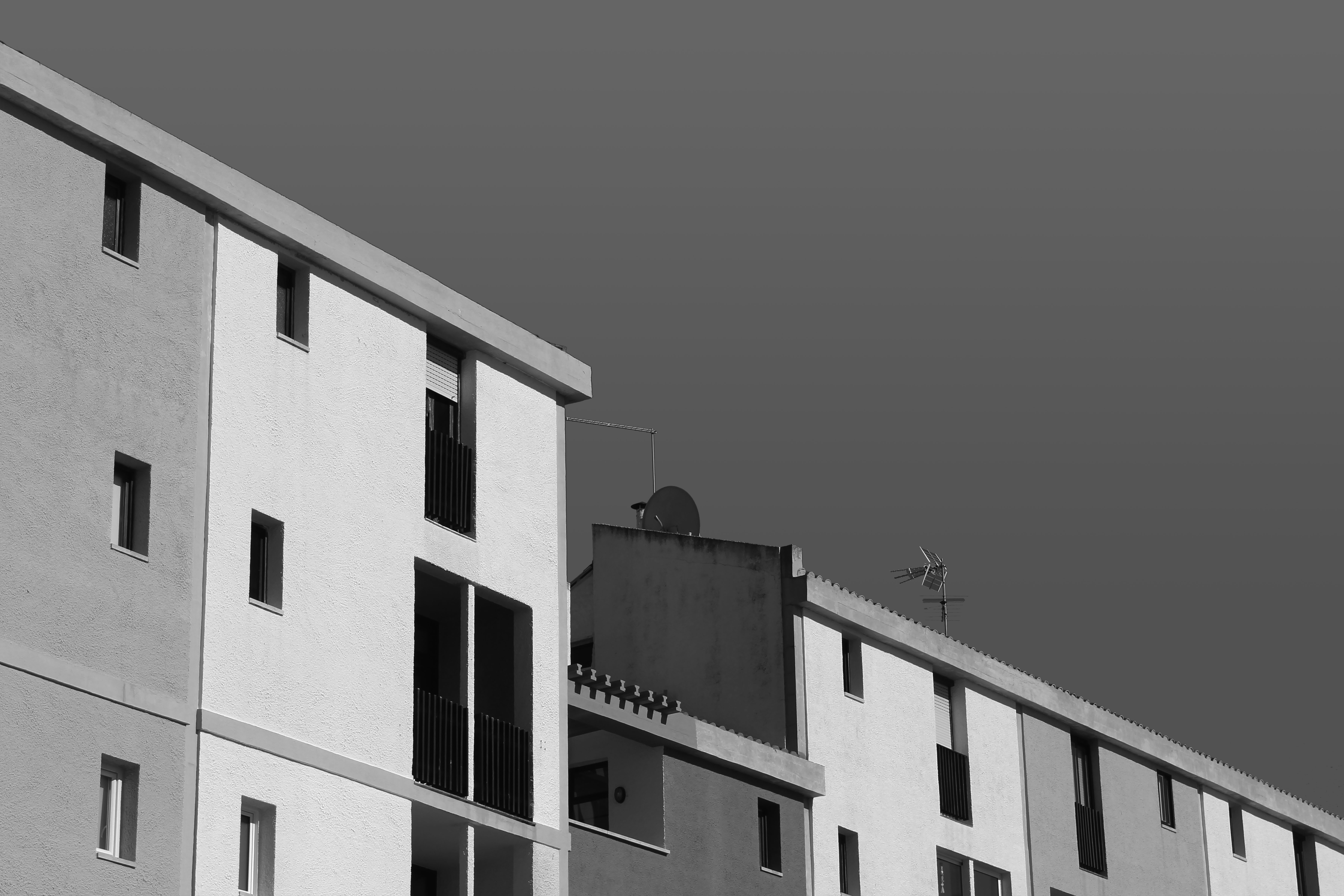
For my third final outcome I have chosen this 3 piece composition of photographs of minimal, colourful and bold architecture which show a really interesting combination of shape, pattern, shadow and colour. Also the combination of the 3 primary colours is something that I believe is rather aesthetically pleasing. These 3 images are a inspired by the abstract photographer Yener Torun.
Outcome 3

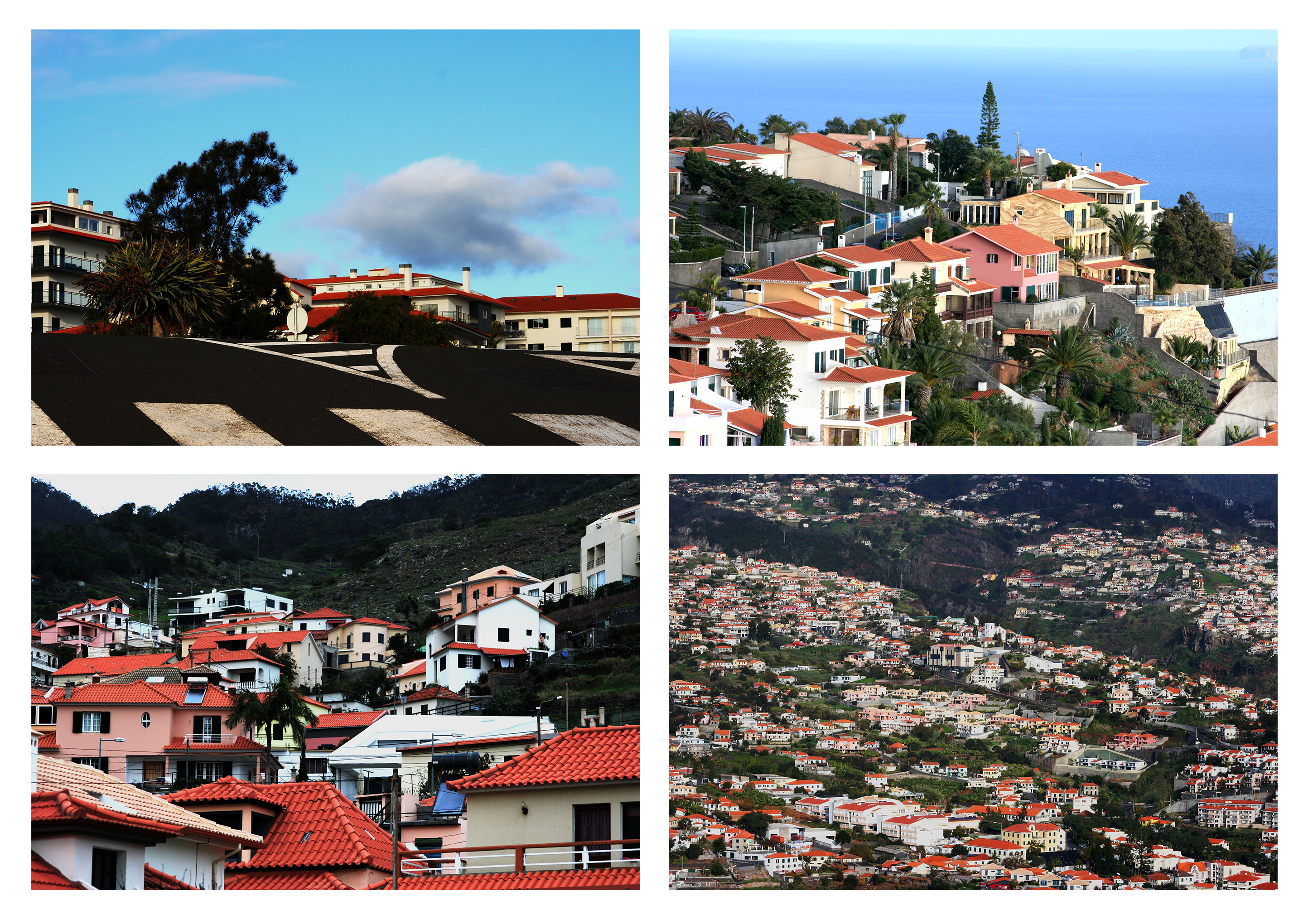
For my fourth final outcome I have chosen this 4 piece composition of photographs of houses positioned in and on top of natural landscapes to show how industrialization/property building effects the natural landscape (but not always in a bad way), which is the idea I was aiming to present from the start of the project. Also I believe that the 4 photographs are all very well matched as the colours and exposures are very balanced.
Outcome 4
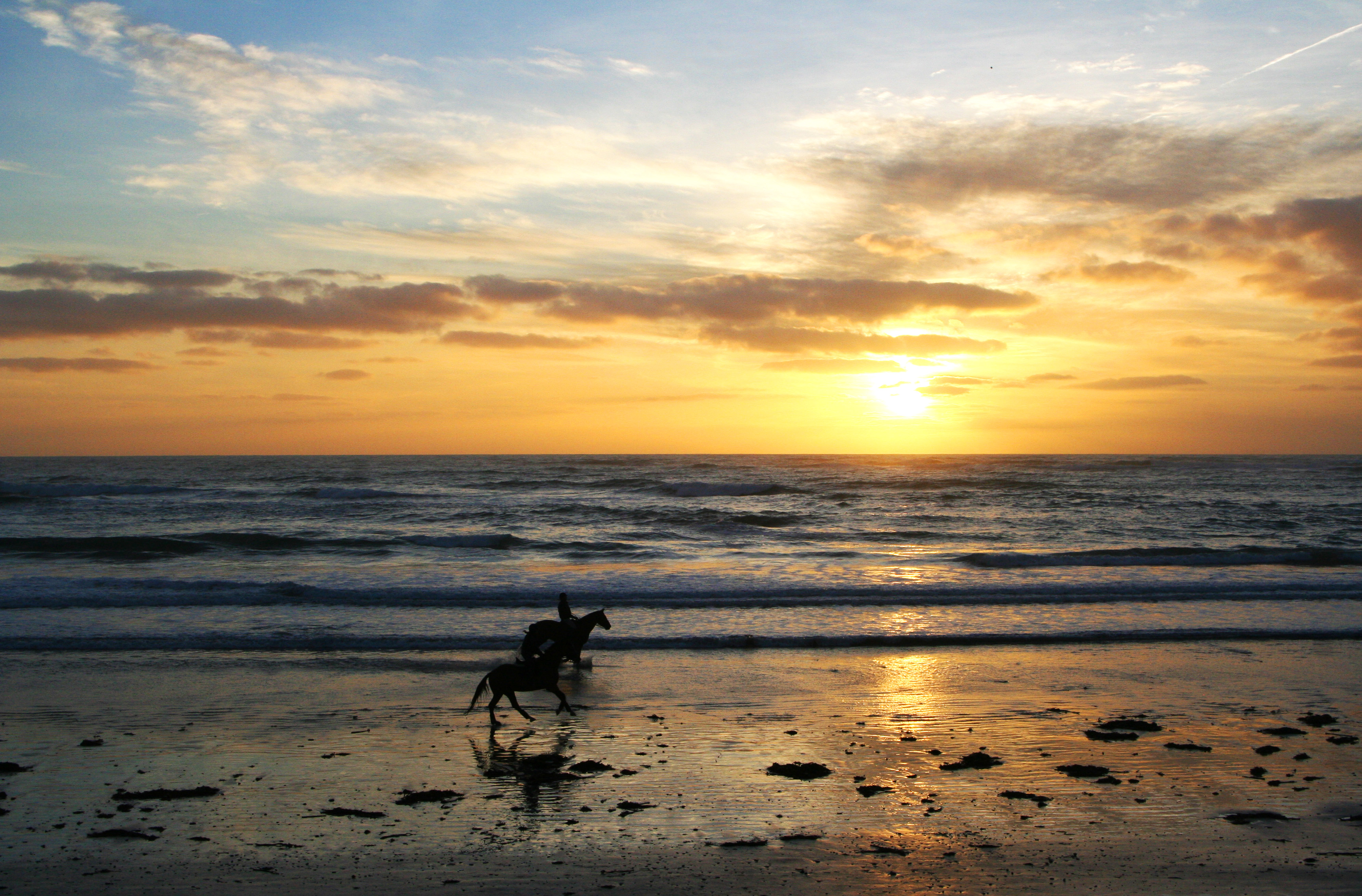
For my last final outcome I have chosen this photograph of a shoreline with the sunset and two horses. Similar to my first outcome I feel like this piece presents the pure beauty of the landscape and displays my raw camera skills so therefore deserves to be one of my final outcomes. I feel that the dusk exposure of the image is very effective as it enhances all the different textures within the image such as the smooth clouds and the rough, jagged sea. The silhouette-like dark figures of the horses are the main focus of the image as the sunlight draws the viewers eye right towards them.
Outcome 5
Overall I feel that my 5 outcomes achieve what I wanted to present by the end of the landscape project as they show the harmony between Urban and Natural landscapes. Whilst taking inspiration from the photographers that I have looked at over the project. Also with this project I have been able to produce aesthetically pleasing outcomes whilst purely showing my raw camera skills without any over-creativity which I have been more inclined to explore in my previous projects.
Presentation Ideas
For the presentation of my images I have printed my selected images out onto three different sizes based on how important each image was in telling the story and messages I intended.
A3

A4


A5


For presentation, I intend to create a story board that gives the audience an insight into the St Saviors Mental Asylum. This will consist of using two foam boards, taped together, and arranging the images into an order that will attract viewers and direct them around the board to the different pictures. The pictures which gives the biggest impact will be in the middle as the main focus of my final piece. I will experiment with different compositions and placing of my photos to ensure i get the best possible arrangement for effect.
The following images show the process I took to get to my final arrangement. In order, it shows how I experimented with the positioning of my photographs to get to my final piece.
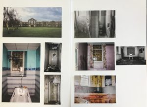


I think this composition works the best because it is visually pleasing, allowing the viewer to focus on the middle two pictures, the most important ones, and then be directed around them to get an insight of what the derelict building entails.
Selection Process For Final Images
Initial Images compared to Final Images
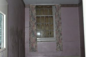
The overall effect of the initial images was completely incorrect for the story and messages I intended to portray. The photos did not ‘pop’ at all and the lighting created some very dull and faded images that were not eye catching. Through the editing process I manipulated all aspects of the photo, focusing on lighting and colors specifically. A main feature in creating these eerie feeling images, was the clarity. With a high clarity I was able to bring out very fine textures within the walls and other subject matter within the photo to give an overall feeling of destruction. I used the brush tool for almost every photo which allowed me to changed lighting and colors within small parts of my photos. Another editing technique i used in creating these images was changing specific colors through the hue, saturation and luminance. I believe the initial photos were not effective themselves and could have been improved by using a stronger light source within the building and possibly taking photos on a sunnier day which would have allowed for brighter photos inside the building and better lighting outside too.
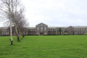


I believe for my final piece, these images are the effective and the best in portraying a sense of landscape, documentary photography of the derelict mental asylum. The variation of vibrant and black and white photographs will compliment each other when side by side in my final presentation. I believe this set of images creates a true representation of the mental institution at its current state and how it is wastefully sitting there, taking up space that could be used for nature. However it supports the untrue myths associated with how it was once full of psychopaths and was poorly run.
Through this set of images I want the audience to appreciate and acknowledge the wastefulness in which humanity evokes. Also i want them to serve as an eerie reminder that nothing lasts forever.
Nick Frank experimentation
Photo shoot Plan
Genre / Artist – Landscape, Formalism/ Minimalism
Concept – Man Made
Location – Towns, Cities
Props – Tripod
Shot type – Landscape
Lighting – Natural
Settings – Landscape
Contact sheets


My Favorite images


Edited Images


Further experimentation – Black and white


Evaluation – favorite final image

This was my favourite image out of the originals and also the edited images. I think this image is very aesthetically pleasing as the strong contrast between the multiple colours on the building and the dark blue sky really brings forth the building and allows the colours to stand out massively. Furthermore, I believe that this image is very strong in the way it imposes the conceptual ideas of man taking over and nature. This can be seen in the image as this building is almost looking over the tree thats tucked away in the bottom corner. This is a clear representation of the power of man and our mad made structures and how it can overcome nature is such a way that it has just been put to the side so humans can make their vast man made structures.
final outcome and display.

I decided it would be the most effective for the wide framed images to be in this order, this works due to the equal sizing and orderly shaping to the images themselves.The two landscapes and the portrait in the middle also allow the successful overall equal composition. I also think the most powerful image is the largest so again the most effective in this sizing order. This final presentation also works alongside with my inspired artist in the way in which it presents larger landscapes in a large size and the more abstract and delicate elements followed in suite but smaller to connote the simplicity to the images. This pattern of display also works because the lighter tones are surrounding the darkest image and the ones that is the most abstract.I could place all these cuts onto a larger white board in order to keep this as a clear set of work and additionally allow the long piece to be successful accomplished. overall all of these images display the forming of nature and architectural structures
Experimenting With Map-Rendering Software
What Is It?
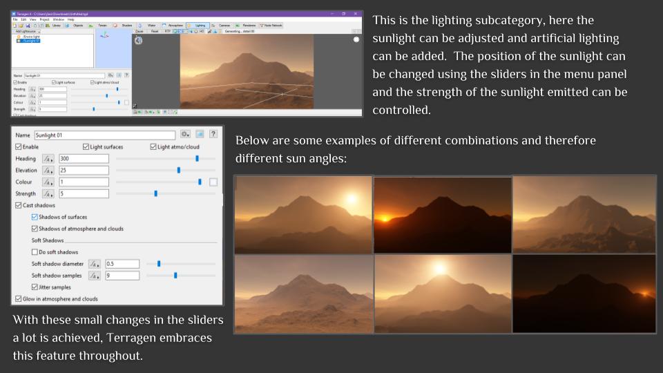
Terragen is the software that many artists turn to when they want to render beautifully realistic landscapes, skies or other natural environments. It’s used to create blockbuster movies such as Star Wars: The Force Awakens, TV shows, games, VR environments, museum exhibits, documentaries, and much more.
Generally speaking, it’s a landscape generator designed to render micropolygon displacements. It’s driven by a layer-based system, which allows you to drive fractal functions with various shaders. So, for instance, you can have a fractal node generating the landscape, with a displacement shader adding specific details. Then the colour can be derived from another node, and masked by a shader driven by slope or altitude – which in turn can be driven by another node – and so on.
Currently, the prices for Terragen 4 stand at $349 for Terragen Creative and $699 for Terragen Professional. However, Planetside (the company behind Terragen) offers an educational license that allows you to acquire Terragen Creative for free given that you can prove that you’re a student.
Source: Official Terragen Site
My experimentation with Terragen 4
The Terragen Education Licence doesn’t come with any sort of tutorial or guide on how to use the software, therefore, I was left to figure out the basics by myself. Below is a basic overview and my understanding of each of the functions.


Nick Frank
Who is Nick Frank?
Nick is a German urban landscape photography who has studios located in Munich and has also worked with some of the largest companies in the world such as; Apple, Adobe and Canon. Furthermore, Nick has also been awarded with numbers of awards throughout his carrier.
Nick was responsible for the visual presentation of advertising campaigns over many years in advertising agencies, he then he changed to express his ideas in his own pictures.
His photographs can be found in numerous announcements today. For example; news magazines like Spiegel, Wired or New York Times and highly regarded newspapers like SZ. His requests from global cities like Vienna, Paris and so on are showing his strength in his images.
Examples of Nick’s work

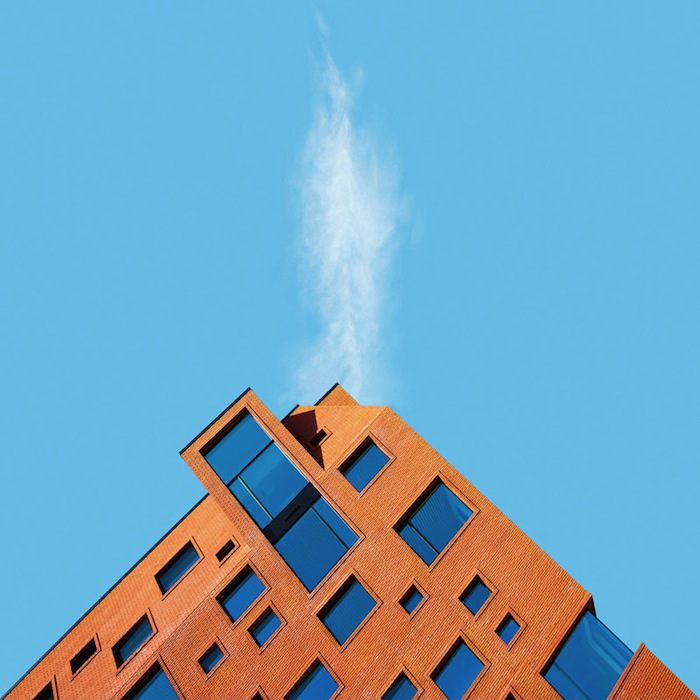

Photo analysis

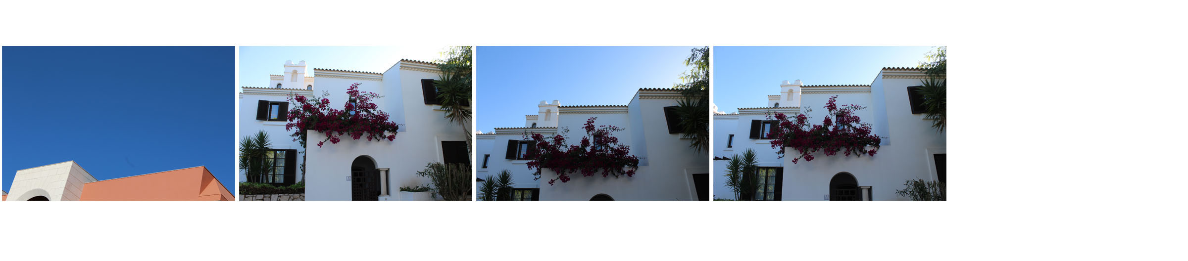
This coloured landscape photograph is of a pink building called the La Muralla Roja. This photography has clearly only been taken with natural lighting as you can see the multiple shadows that have been created from the abstract building. There is a strong contrast in this image between the pink building and the pale blue sky. The use of this strong contrast really allows the building to project its abstract shapes. Furthermore, the green tree creates a sense of juxtaposition as it also creates a strong contrast between the man made structure and the natural structure within this image. This is because there is very little natural structures compared to the large amount of man made structures. The multiple shapes within this building creates a sense of depth as it create an almost maze feeling to the image as you could imagine getting lost among all the sharp and abstract shapes. Overall, the way Nick has captured this abstract image allows the viewers to visualise it in such a way which results in this image being very aesthetically pleasing to look at.