Stephen Shore – The New Topographics

Stephen Shore

Stephen Shore (born October 8th 1947) is an American photographer known for his work as a New Topographic and his pioneering use of colour in photography. In 2010, Shore received an Honorary Fellowship from the Royal Photographic Society. Shore took photographs of the introduction of civilisation and industry to nature and showed how man-made structures were taking over from nature.

Image result for stephen shoreImage result for stephen shoreMy Favourite Photograph

Image result for stephen shore

It appears that in this photograph, natural lighting from the American deserts were used to capture it. This helped to create a very saturated photograph that is very eye-catching. A deep field of depth appears to have been used as the corners have not been slightly blurred. A shutter speed of around 1/50 – 1/80 appears to have been used as the majority of the photograph is in focus but there is a moving car in the bottom left corner that is blurred so the shutter speed is not quick enough. An ISO of 200 or 400 was most likely used along with this shutter speed to create a light enough and high quality photograph.

There is lots of colour in this photograph which is partly what Stephen Shore was known for. The saturated colours help the viewer to tell what country the photograph is set in. There is not a massively wide tonal range in this photograph – it is quite a light photograph which matches the colours that it consists of. There is no texture in the photograph but from the setting of it, it is very clear that it is in a warm place.

This photograph by Stephen Shore was taken during the start of the industrialisation of America – the signage and colours are unique to the United State and it is a perfect example of a New Topographic’s work. It shows the should-be ugly man-made structure but portrays it as something aesthetically pleasing.

This photograph is showing the man-made structures over-powering the natural land in America and are symbolic for the New Topographic movement taking over from the Romanticists. The bright colours of the man-made structures are contrasting with the nature in the background and show that change is inevitable.

The New Topographic

New Topographics was a group of American photographers made by William Jenkins in 1975  (such as Robert Adams and Lewis Baltz) whose pictures had a similar banal aesthetic, in that they were formal, mostly black and white prints of the urban landscape.

Many of the photographers associated with The New Topographics were inspired by the man-made subjects such as parking lots, suburban housing and warehouses were all depicted with a beautiful stark austerity, almost in the way early photographers documented the natural landscape. An exhibition at the International Museum of Photography in Rochester, New York featuring these photographers also revealed the growing unease about how the natural landscape was being eroded by industrial development.

The new topographics were to have a decisive influence on later photographers including those artists who became known as the Düsseldorf School of Photography.

Case Study – Romanticism

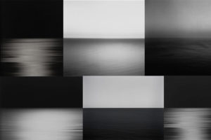
Photographer Research – Hiroshi Sugimoto

Sugimoto Hiroshi, born on February 23, 1948, is a Japanese photographer and architect. He leads the Tokyo-based architectural firm New Material Research Laboratory.

He came to be known for his strictly black-and-white, highly stylized photography series. These series show views of the sea, extremely long exposed theatres, photos of scientific display cabinets, wax figures or Buddhist sculptures. Hiroshi Sugimoto sometimes works for several years on these work series. In recent years he has occupied himself increasingly with architecture, furniture design, objects and fashion.

“It was my goal to visualize the ancient layer of human memory with the means of photography”

“It is about returning to the past and remembering where we come from and how we came into existence.”

source

Photo Analysis

Technical

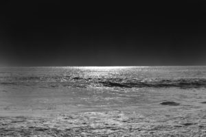
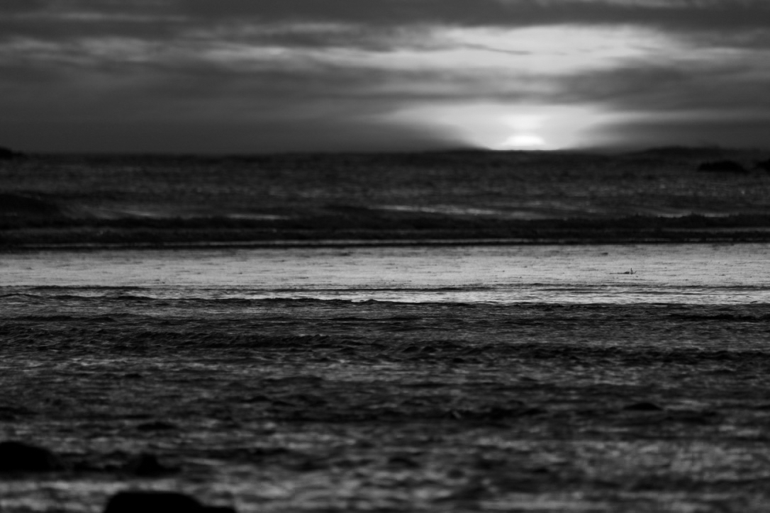
Although this photo may look plain and simple at first glance; there are many technical elements embedded in the image. Firstly, the smooth ripples in the water mean long exposure was used, Hiroshi Sugimoto most likely paired that with a slower shutter speed and bigger exposure to achieve this smooth and serene effect. Since the sky is rather dark, it’s natural to assume that the photo was taken at night – due to this, Sugimoto didn’t have to worry about overexposing the image as it would have been too dark to begin with. If the photo was taken in the dark, there would be no natural light for Sugimoto to work with meaning he had to rely on his camera and settings. Referring to Ansel Adam’s tonal range; the image seems to be missing the darkest black and brightest white but captures most of the tones in between.

Visual

Visually, I find this photo very pleasing and soothing. The lack of colour doesn’t feel like a disadvantage in this image; in fact, the lack of colour contributes to the simplicity and straightforward nature of Hiroshi Sugimoto’s photographs. By looking at the other photos in this set, it is safe to assume that Sugimoto used a black and white effect on this photo like all others. The photo has two parts to it: the sky and the sea, divided only by the line of the horizon that creates a soft contrast between the dark grey sky and lighter waves. Sugimoto purposely arranged the position of the sea like this in countless photographs to play and experiment with the concept of minimalism.

Contextual

The photograph was taken in 1997, during a time where most people had access to coloured photographs- Sugimoto purposely chose to not include colour in this image. Hiroshi Sugimoto studied art in Los Angeles in 1971, at the time of Minimalism and Conceptual Art – this is clearly evident in his work.

Conceptual

To me, the concept behind the image is to challenge the audience’s perspective and views on what makes a successful photograph. The image, at first glance, lacks the most conventional aspects of a successful photograph.  The image is incredibly plain due to the lack of subjects but still able to capture the attention of the viewer and provoke an emotional response. The whole set has a similar calm and harmonious atmosphere it radiates, allowing the viewer to feel safe and at peace – which may not be a feeling we expierence much in our chaotic everyday life.

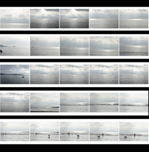
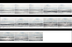
Contact Sheets

Final Edited Image In The Style Of Hiroshi Sugimoto


For this image, I first used the lasso tool to separate the sky and the ocean into two different layers and then I simply used the ‘burn’ tool to darken both the sky and the ocean until I was satisfied with the results.  It was an easy process but it allowed me to quickly obtain the results I wanted.

New Topographics Homework Assignment

Planning

Task: Take 100-150 urban landscape/night photos

Props: I will be using a tripod in order to capture some long exposure shots at night.

Camera settings: For my long exposure shots I will be using a shutter speed of 30 seconds to make them more effective, along with a 100 ISO. For other landscape photographs I will be using an ISO of 200 with a shutter speed of 1/20 to allow enough light to enter the lens.

Lighting: I will be using lights from passing cars, buildings and lamp posts to capture my photographs

Location: Town

Context: I will be capturing photographs with the style of the New Topographics in mind.

Concept: To capture photos whilst taking influence from the style of Robert Adams and Stephen Shore.

My Photographs

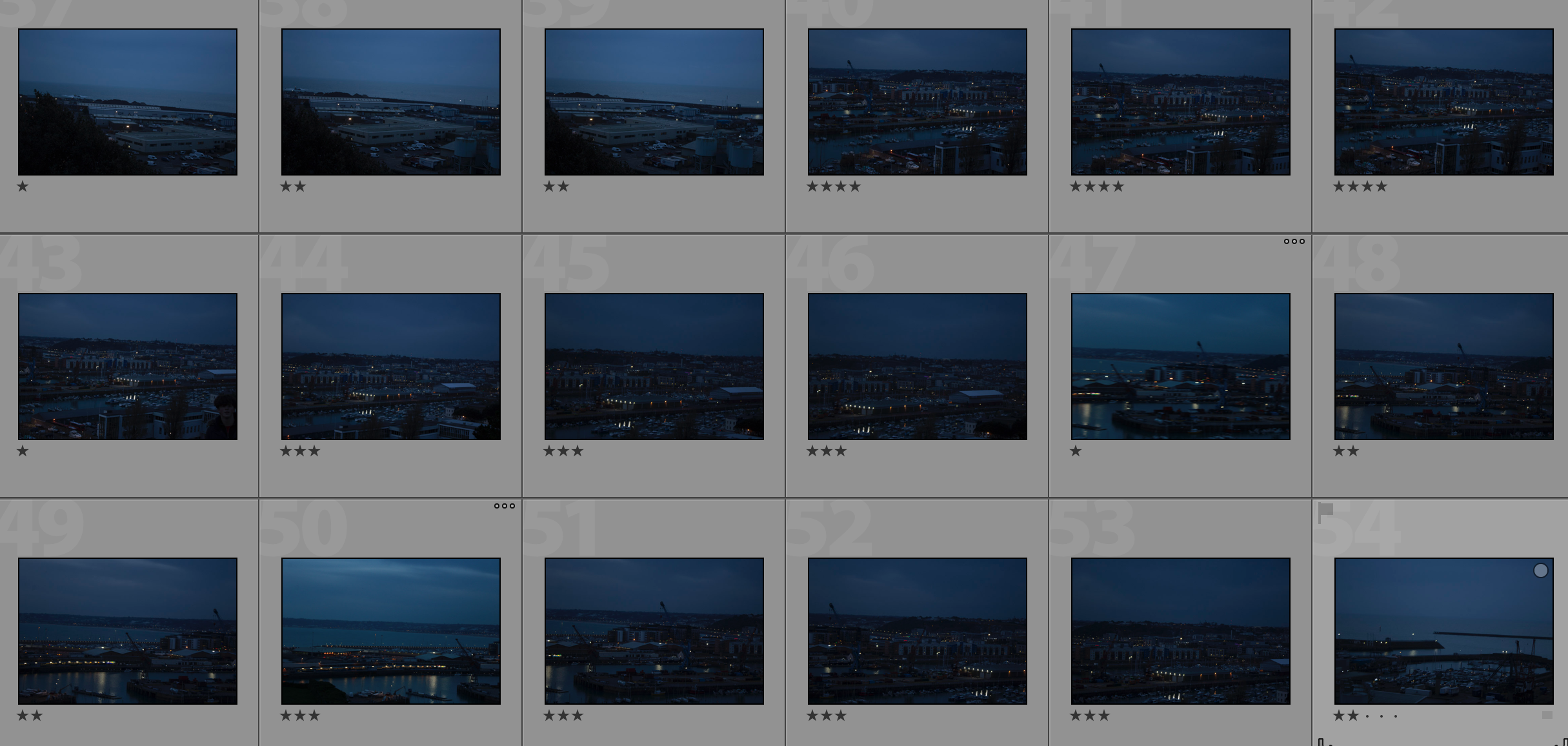
Contact Sheet

My Edits

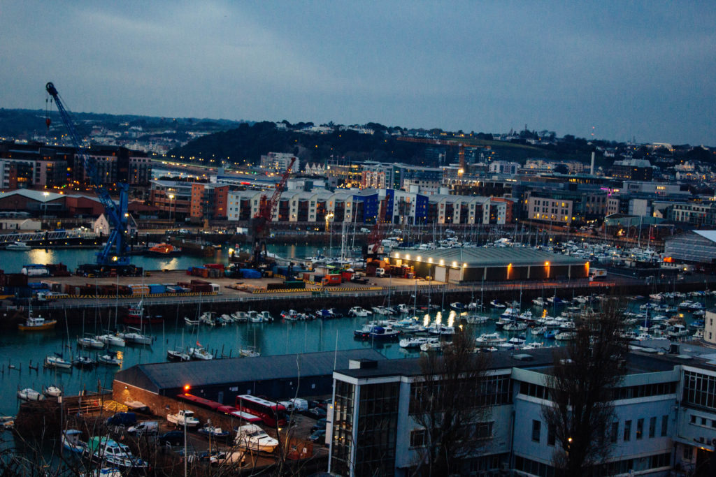
My Favourite Photo

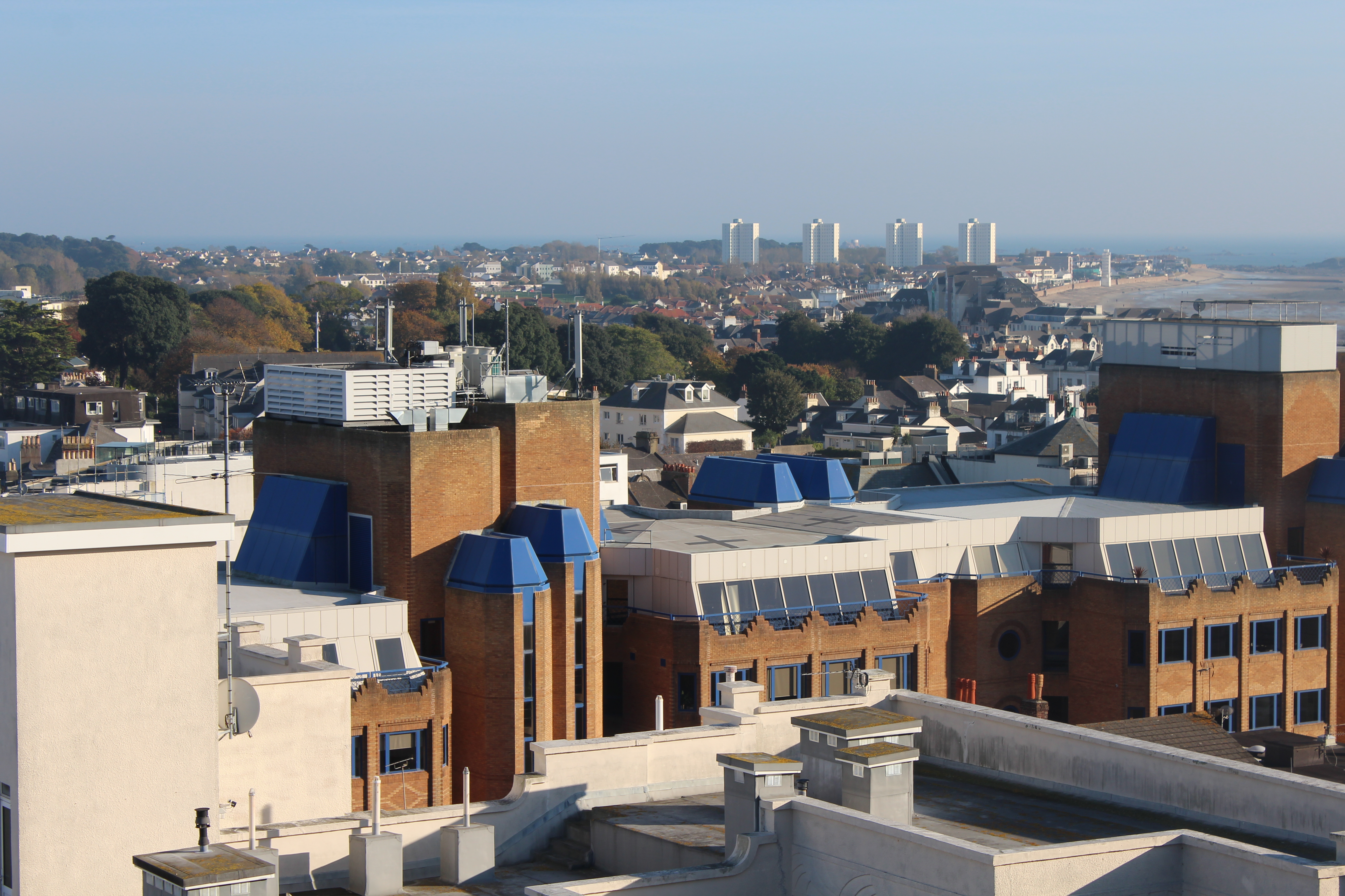
In this photograph I used natural lighting. I took advantage of the lights in the down as dusk approached in order to cast contrasting orange colours against the blue-tinted town. I used a deep depth of field of  20 to capture this photograph to ensure that the whole of the image was clear and in focus. I used a shutter speed of 1/20 in order to allow enough light to enter the lens from the dark environment, paired with the low ISO of 100 that I used, it allowed me to create a high quality image with a wide tonal range.

There are lots of intense colours in this photograph such as the orange lights and the blue sea and sky which cast a blue tint on the photograph. It is generally quite a dark image with the lightest tone being the bright lights. It has a slight 3D effect due to the harbour in the middle separating the foreground and background.

This photograph has been taken with the work of the New Topographic movement in mind. It shows the industrial side of the environment and all the man-made structures along with nature being pushed to the background or covered up by man-made structures.

The photograph shows how the nature shown in the photograph has been taken over completely by man-made structures and has lost the attention it once had. This is symbolic for the New Topographic movement taking over from the Romanticism movement. It shows how quickly things can change for better or for worse.


Nicholas Nixon

Who is Nicholas Nixon?

Nicholas Nixon is known for the simplicity and intimacy of his black and white large format photographs. Nixon has photographed porch life in the rural south, schools in and around Boston, cityscapes, sick and dying people, the closeness of couples, and the ongoing annual portrait of his wife, Bebe, and her three sisters. Recording his subjects close and with meticulous detail, he facilitates an emotional connection between the viewer and the subject.

The body of work explores the self in physical and psychological proximity to the urban landscape. In 2017, Fundación MAPFRE in Madrid opened a comprehensive survey of the artist’s work to date, accompanied by a catalogue illustrating over 200 images.

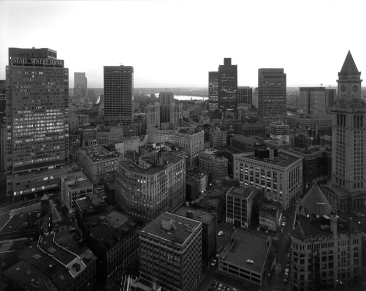
Image result for nicholas nixon new topographicsImage result for nicholas nixon new topographicsImage result for nicholas nixon new topographics

Photo analysis


Image result for nicholas nixon new topographics

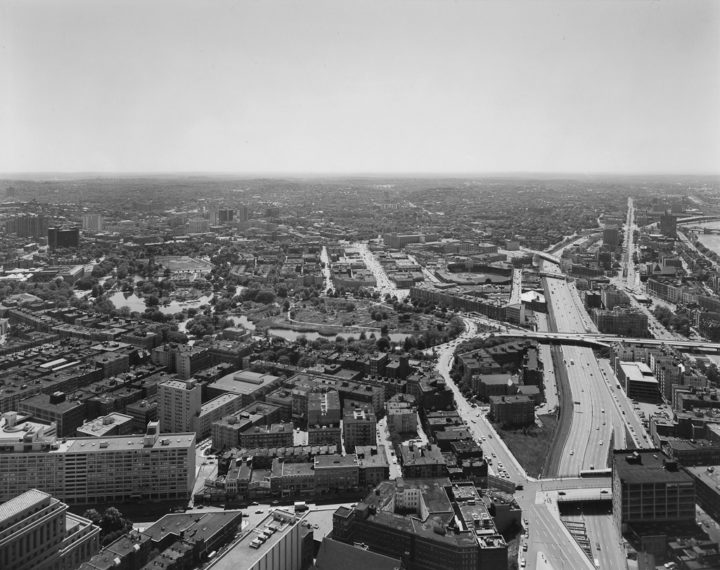
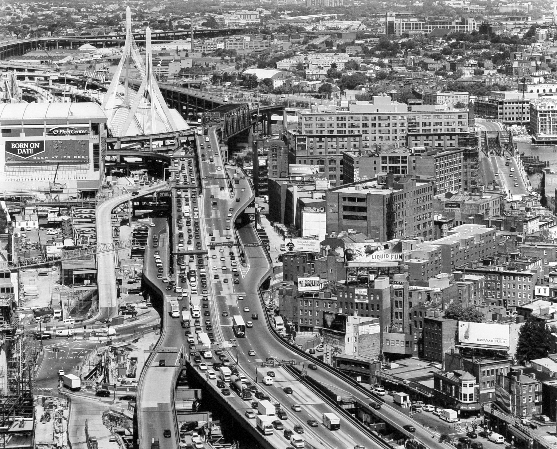
Natural lighting was clearly used to capture this photograph due to the natural tones and contrast in the photograph. The use of natural lighting allows the photo to project a sense of realism which helps allow the audience to feel as if they can connect with the photo. This is shown within this photograph as it has been displayed in black and white which makes the photo seem  more surreal and creates a sense of mystery and creates a more dramatic image. The use of black and white helps bring out the levels in this image from the masses of cars on the highway and the heights of the buildings. This photo shows the advancement of civilization and man made structures which is conveyed by how hectic and lively this image looks due to the mass numbers of buildings and how full the roads are. This shows how the New Topographic movement was a reaction to Romanticism  just from the use of the juxtaposition within this image such as; the man made features throughout the whole image and the natural aspects within the image such as the trees among the buildings . This photograph is a clear message to reflect how man made structures are taking over society and dominating these natural areas. This is clearly supported by the fact that the natural features are hidden away in the image and are not the main features of the image like they would be within romanticism photography.

My own Images


Edited Images


edward weston

Contextual - https://www.ai-ap.com/publications/article/18753/archive-fever-edward-weston.html
Weston was a 20th century American photographer. He captured images of landscapes, still life, nudes, genre scenes and whimsical parodies. Technical - In the foreground of the image the contrast is high between the dirt and the crops - black and white accentuates this - yet the tonal range is small until the focus is brought to the sky and further hills in the background where lighter and softer tones. The photograph has sharp details - fast shutter speed.
The deep depth of field gives the field a greater distance - the lines of the crops also exaggerate this as some of them fade into the distance.

Visual - Weston has captured what people would have seen as a seemingly mundane scene and has composed a photograph that incorporates pattern, contrast and depth. His approach to taking photographs as he says is 'To make the common place unusual'. The aesthetics of the austere landscape has been brought to a focus through Weston's photographs.

Conceptual - The purpose of Weston's photograph could be to reinforce the beauty in nature and to perhaps conserve the natural landscape through photographs. The subject of a tomato field is also an insight to the natural order man creates in society and life. 
Continue reading

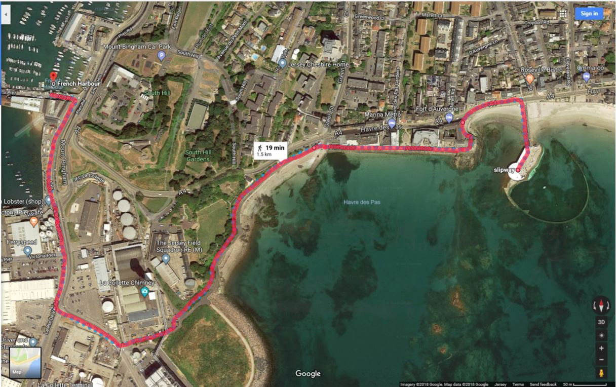
Harve Des Pas Walk

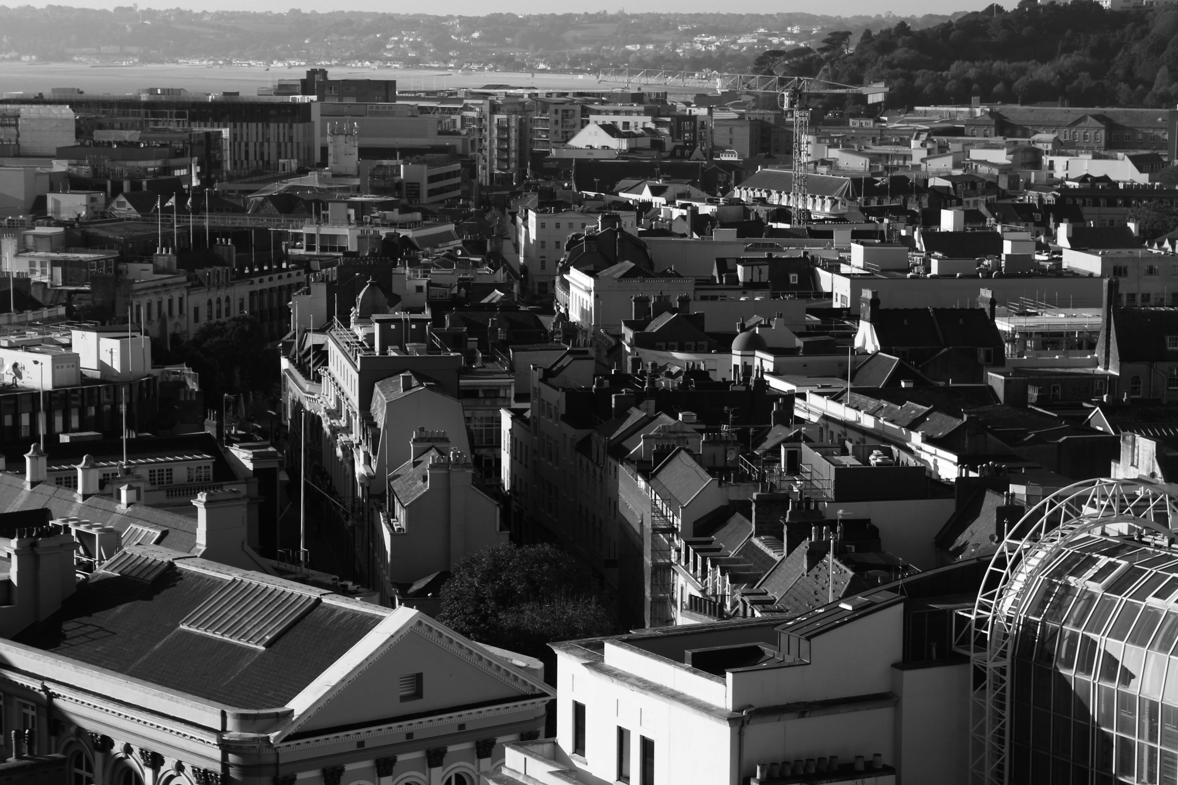
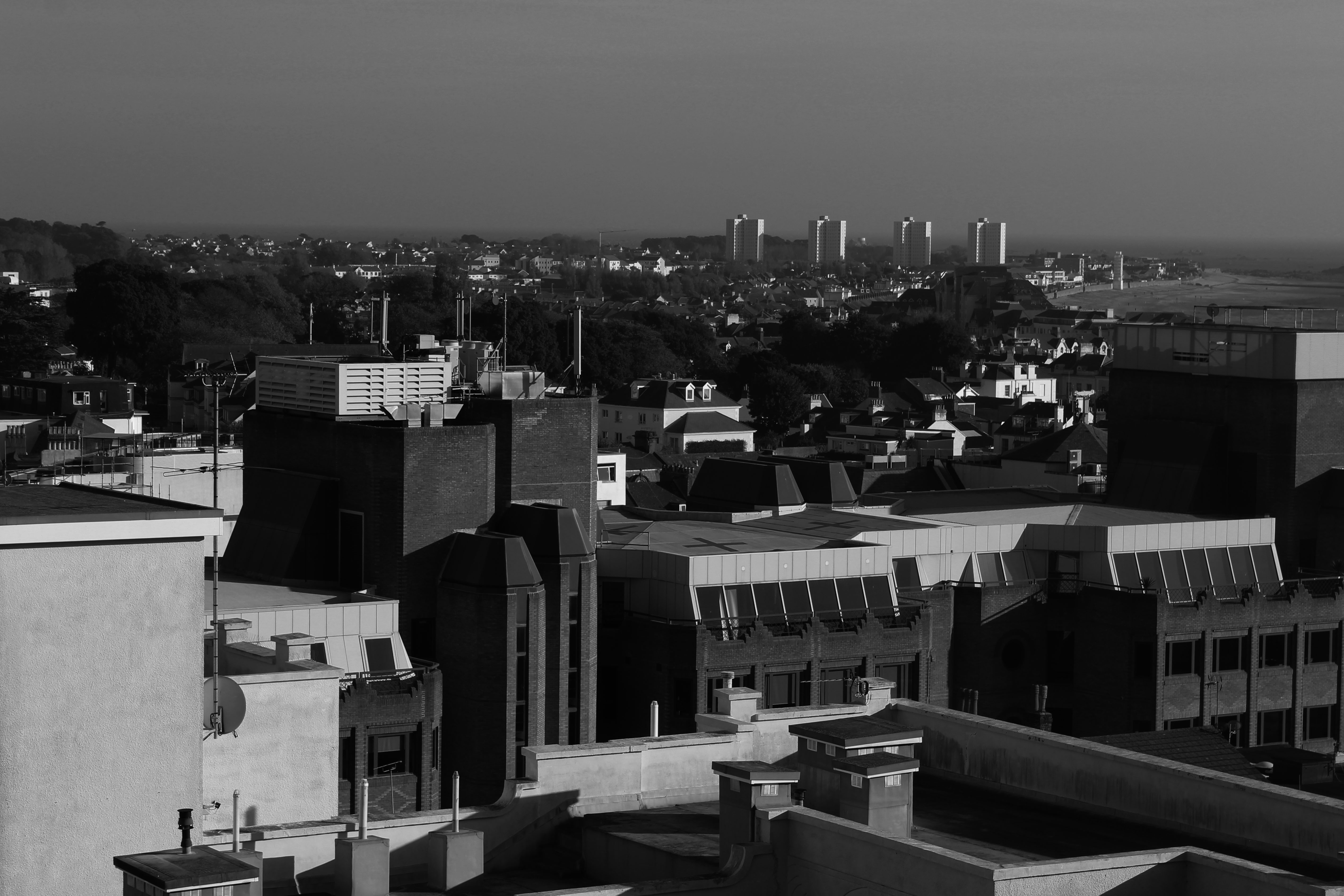
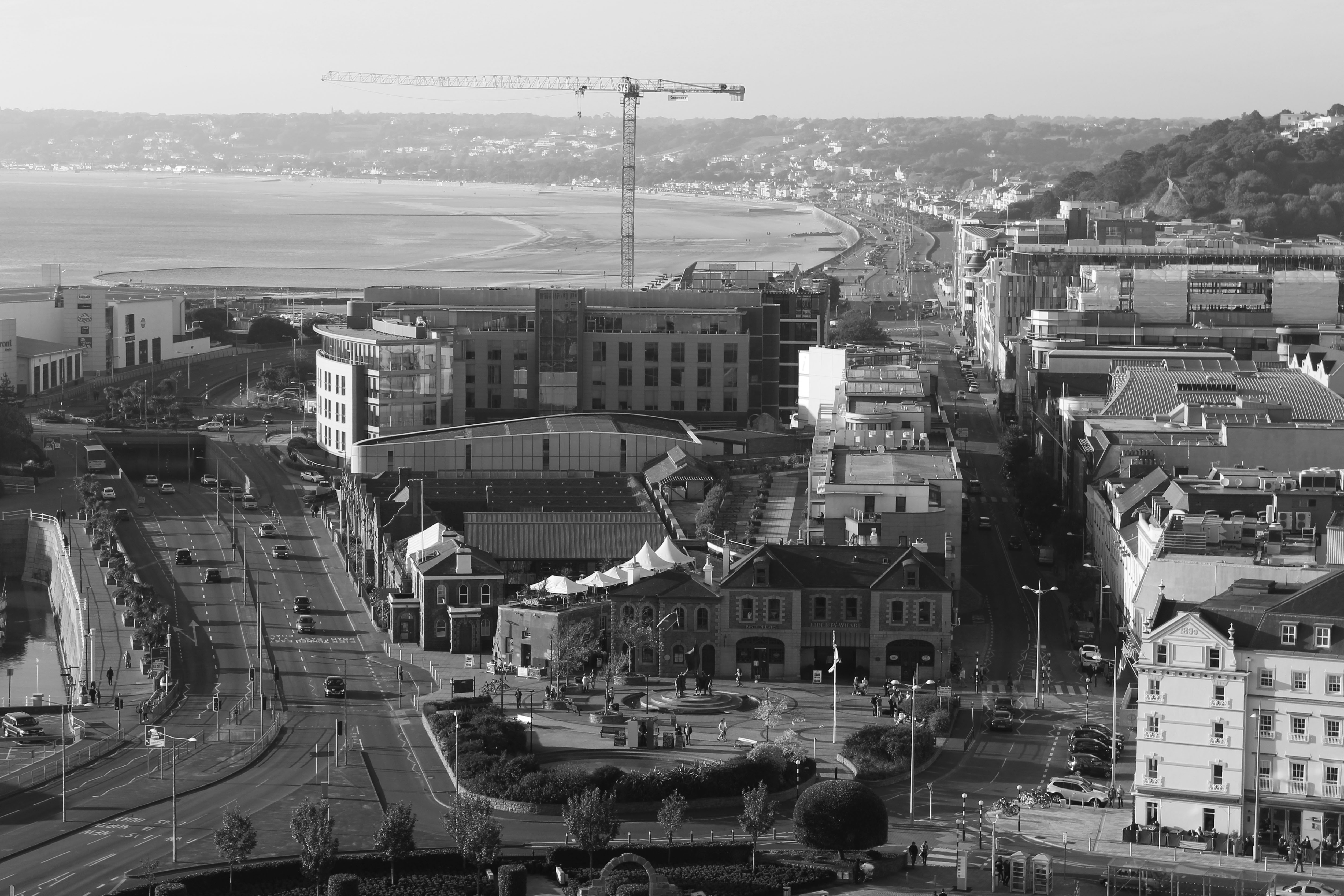
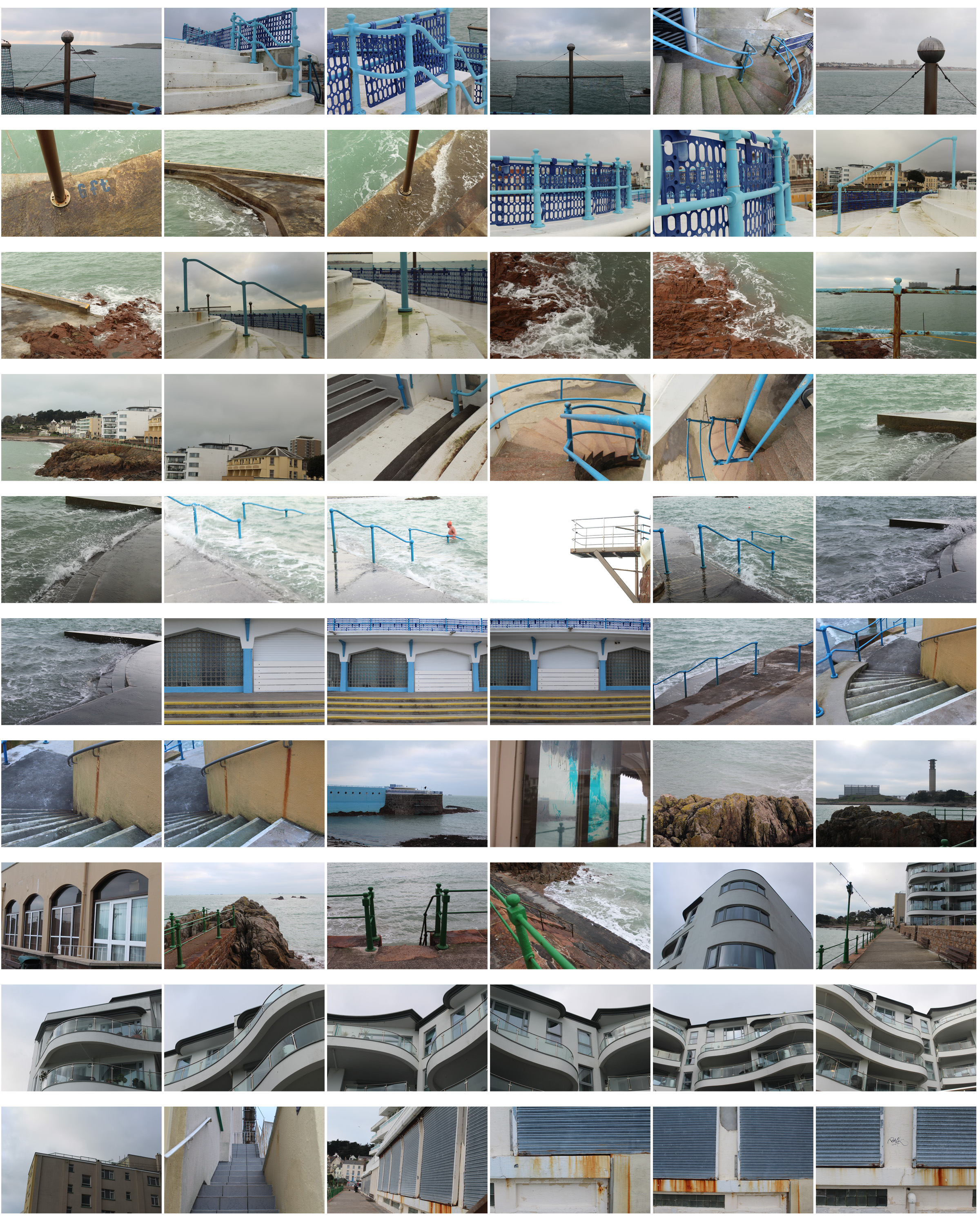
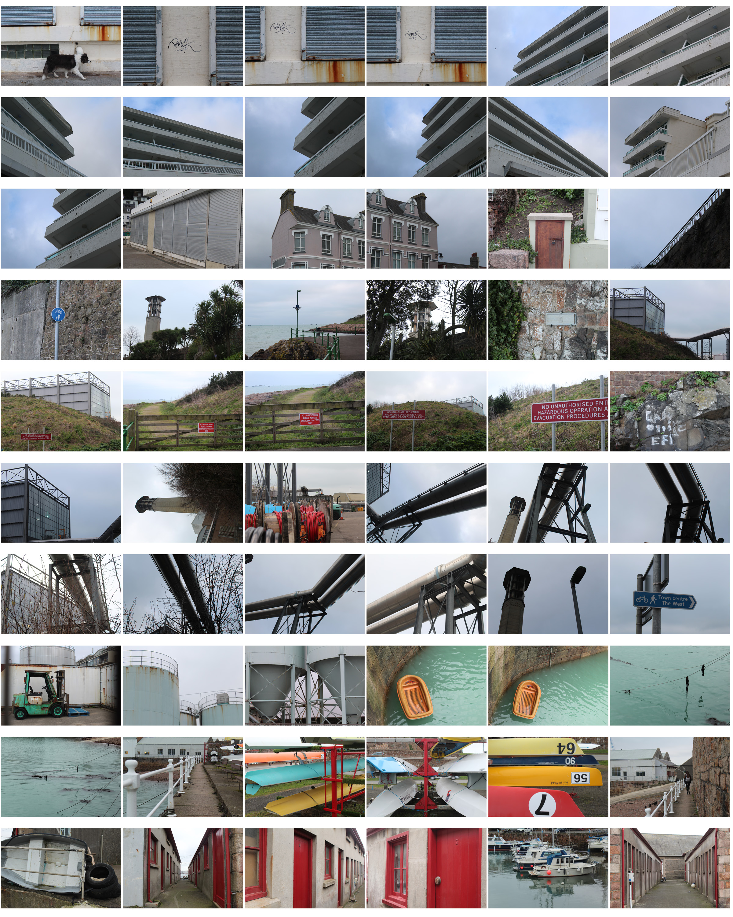
I planned to walk from Harve Des Pas to the Incinerator following the path back to town. This gave me different views and landscapes to photographs showing  my route and journey. I presented my images in a contact sheet and throughout you can see how the route and scenery change from natural to urban.

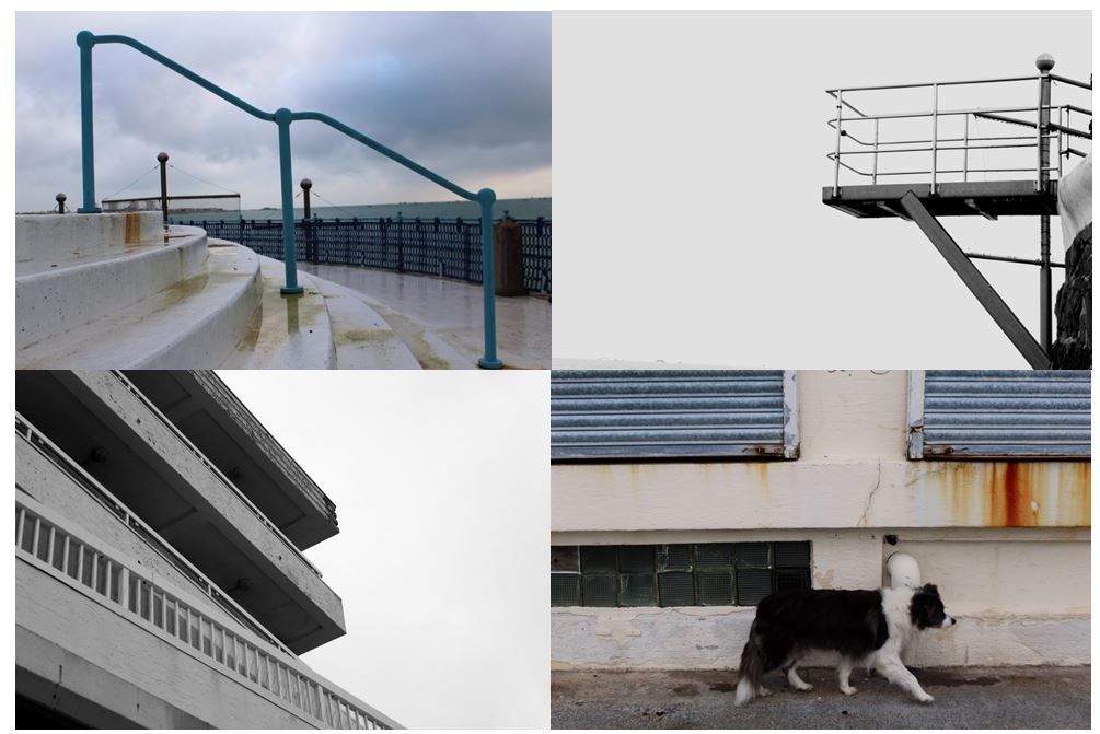
I then chose my favourite photos out of all the images, edited them and displayed them in the contact sheet below so the images can be seen more clearly. I chose these images as each one is completely different and shows the different landscapes I passed and the journey I went on- focusing on structured , man-made objects as well as nature.
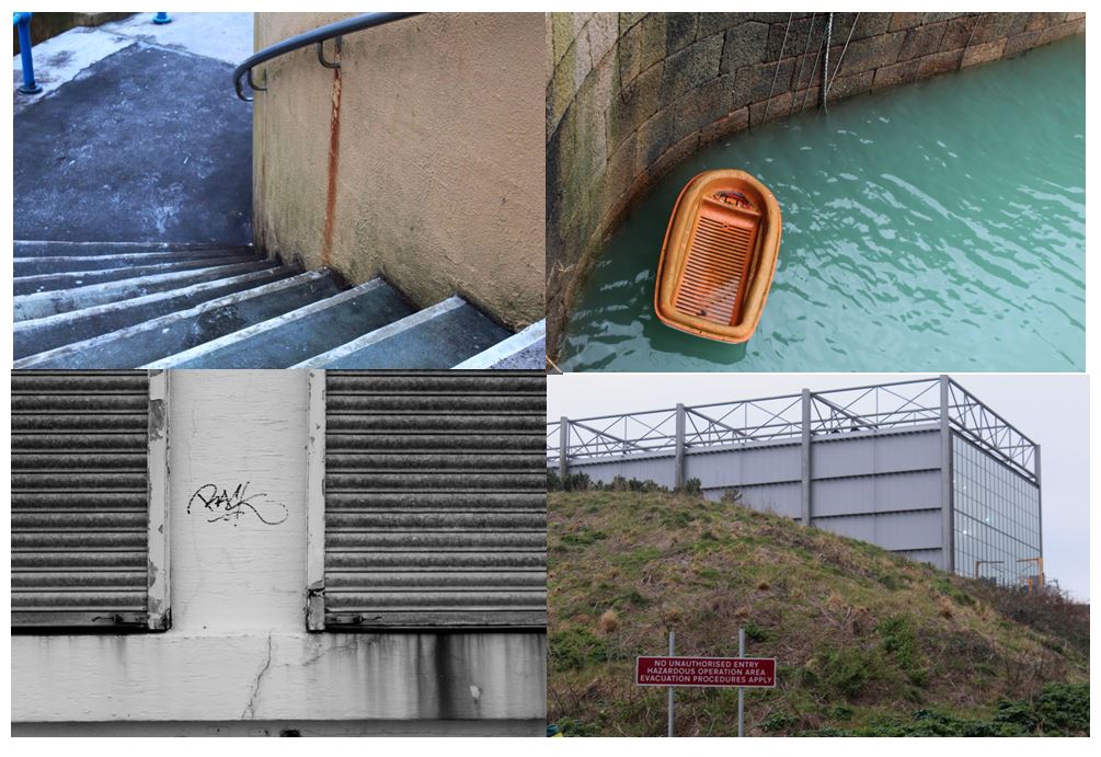
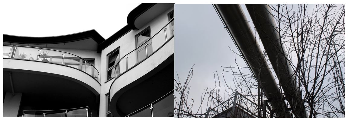
I chose this photo as one of my final images as it clearly shows how urban is taking over nature, similar to concepts The New Topographics focused on. The image shows a very structural industrial building in the background, and a natural hill in the foreground. The contrast between both parts of the image makes it seem like they wouldn’t be in the same place and so close together. It also shows a bright red sign post on the hill which also presents  the new topographics unease about how the natural landscape were being eroded by industrial development. I decided to leave the image in colour with not much editing as I think it emphasises the differences between the two sections of the image.

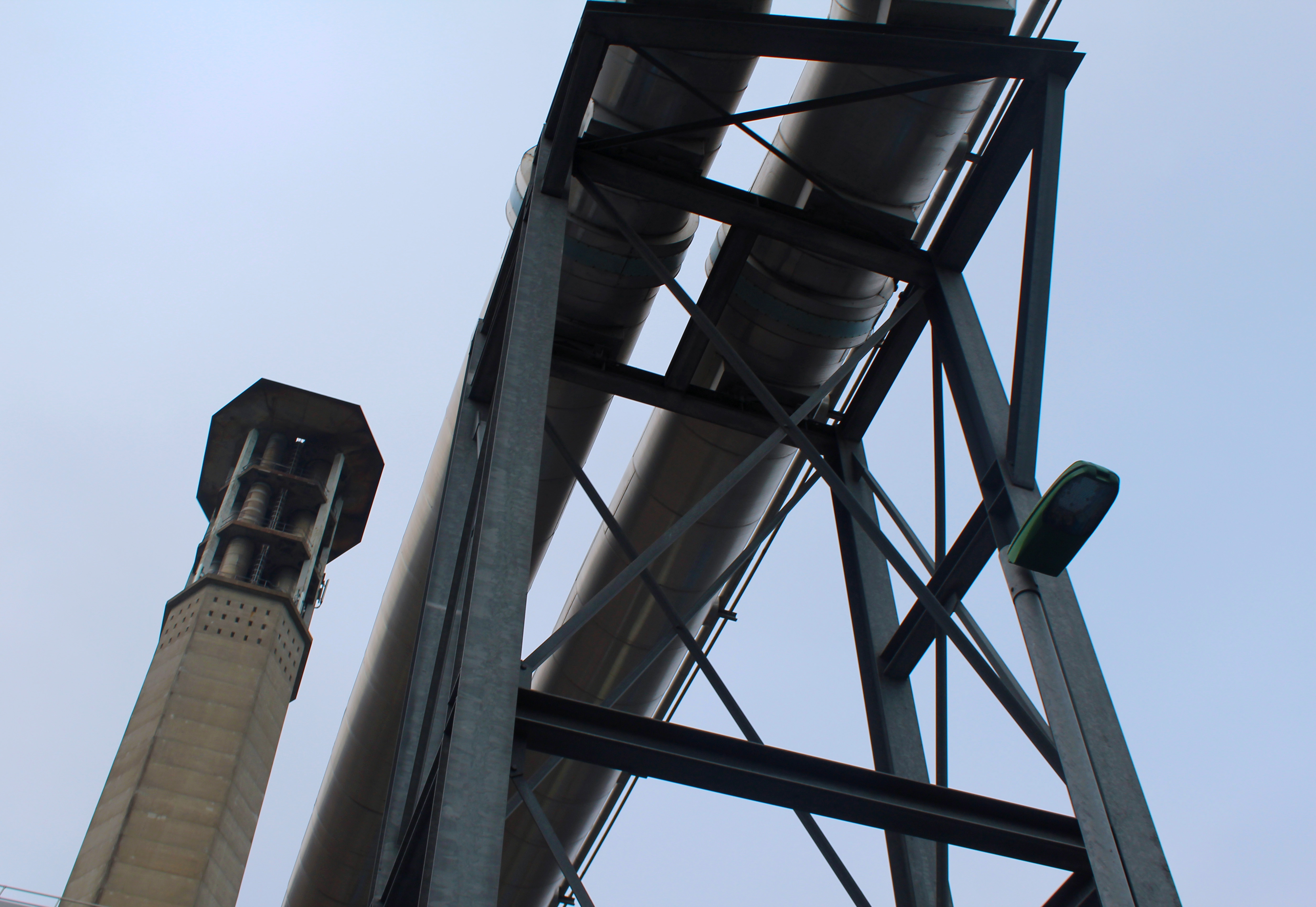
I also chose this photo as one of final images as I focused on industrial buildings and the structures they make. This image takes inspiration from The New Topographics as it focuses on geometrical shapes and symmetry. The image doesn’t contain any natural elements and only shows man-made structures which contrasts with some of the other images I have taken. I left the image in colour as the it only contains browns, greys and blacks that contrast with each other which would not happen as much if the image was in black and white. It also shows the structures and the sky being completely different (natural vs urban).

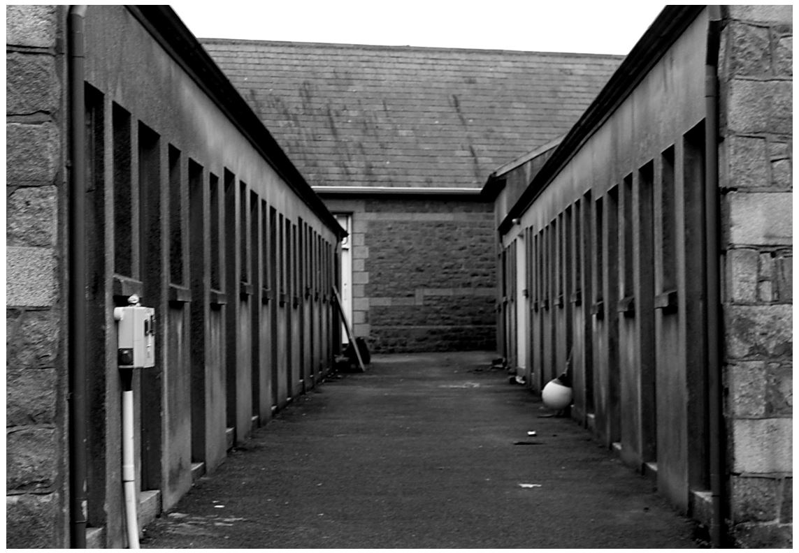
I also chose this image as it shows an alley that I tried to make  symmetrical to show lines and repetition on both sides. I turned the photo to black and white taking inspiration from the new topographic photographers, trying to get the same effect. The industrial photographs I’ve taken have similarities to Albert Renger-Patzsch style in The New Objectivity with clear, black and white pictures of industrial archetypes.
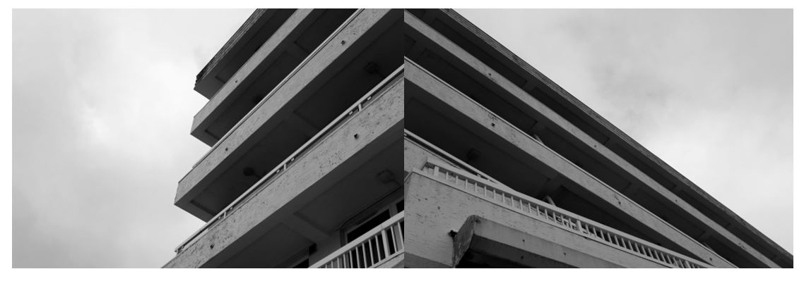
I also tried focusing on industrial buildings, zooming in on specific sections of the same building so I could present them together to show different perspectives. I edited them to black and white as I think it makes the images have more of a contrast between the tones of grey and emphasises the shadows underneath of the balconies and where the light hits the outside of the balcony walls, making the images more powerful. I arranged the images so some of the lines join up between the photos connecting them together to make a new image.

Romanticism Homework

Photo shoot Plan

Genre /  Artist – Landscape, Romanticism

Concept –  Natural beauty 

Location – Coastlines, sand dunes, fields, forests

Props – Tripod,

Shot type – Landscape, low angle

Lighting – Natural

Settings – Landscape, shutter priority

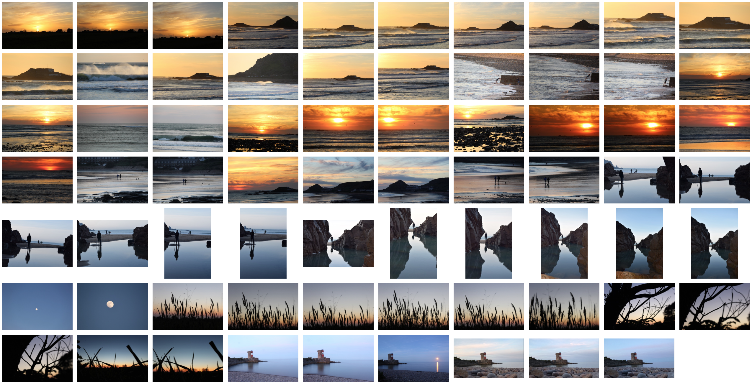
Contact Sheet

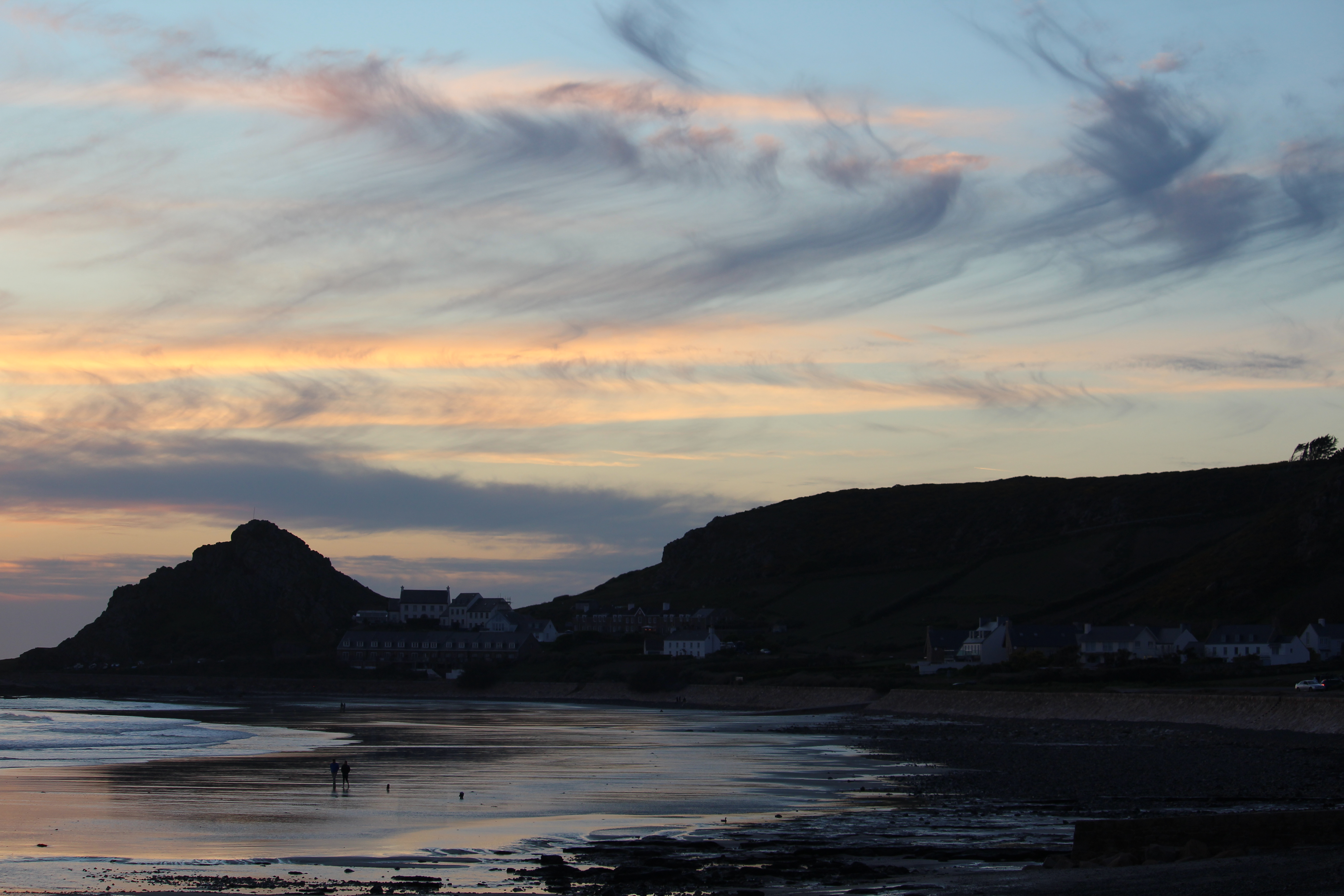
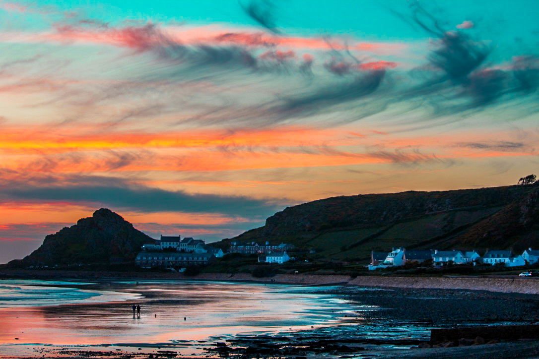
Editing Color into my photographs

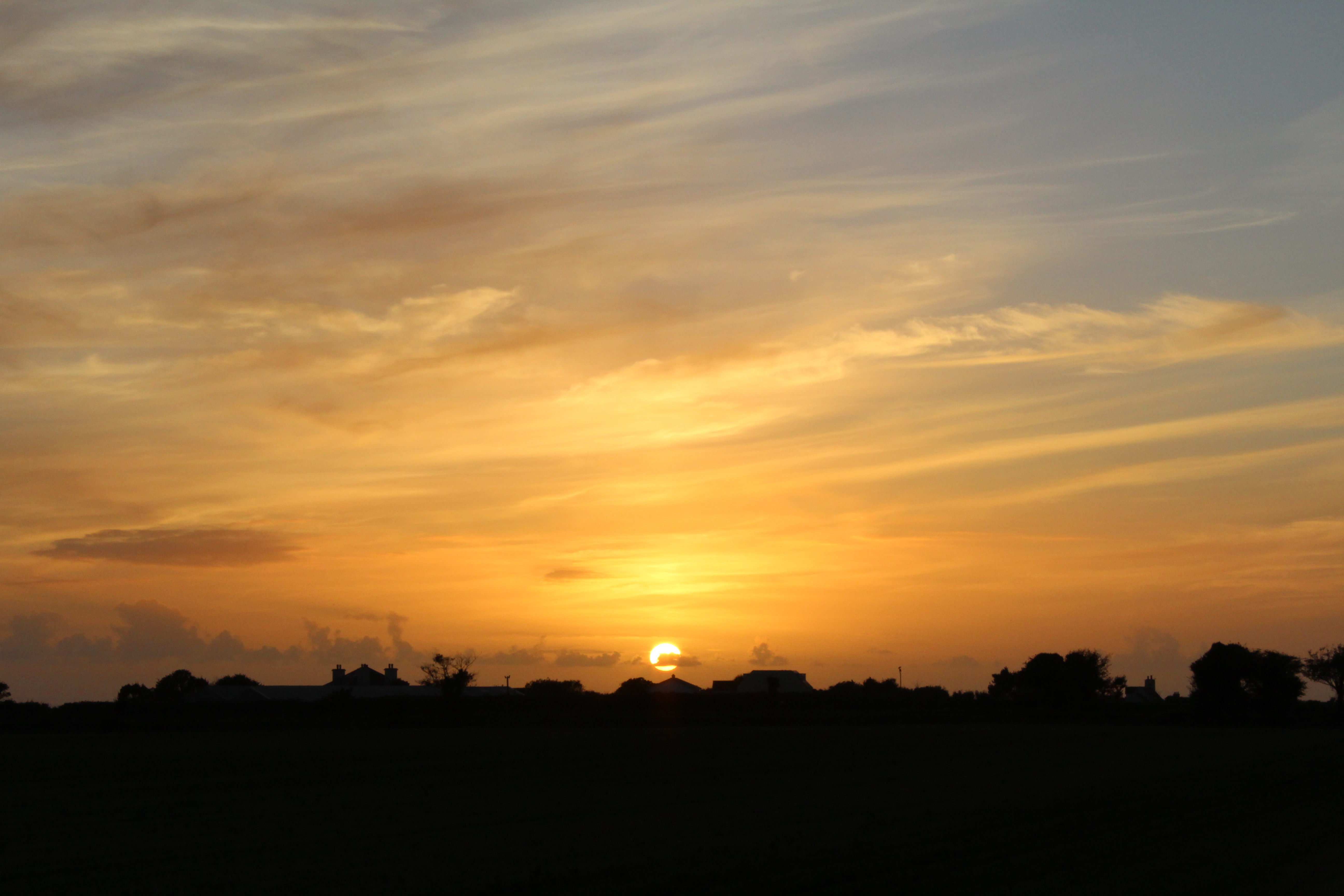
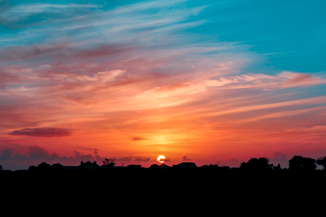
This is the original photograph without any editing having been done to it. I felt as if this photo was effective in portraying the typical colours involved with a sunset which to me, created a boring and uninteresting photo as it can be seen in real life which is much more aesthetically pleasing. To ensure I could entice the viewer with this photograph, i decided to take it to Lightroom and add a variety of vibrant and saturated colours which would influence the audience to appreciate the picture. I believe these colours really bring the sunset to life which has a strong contrasted connotations of how the life (the sun) is dissappearing for the night.


Editing photos into B+W

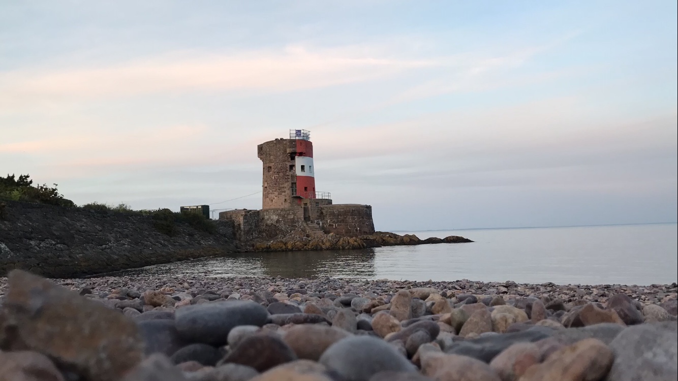
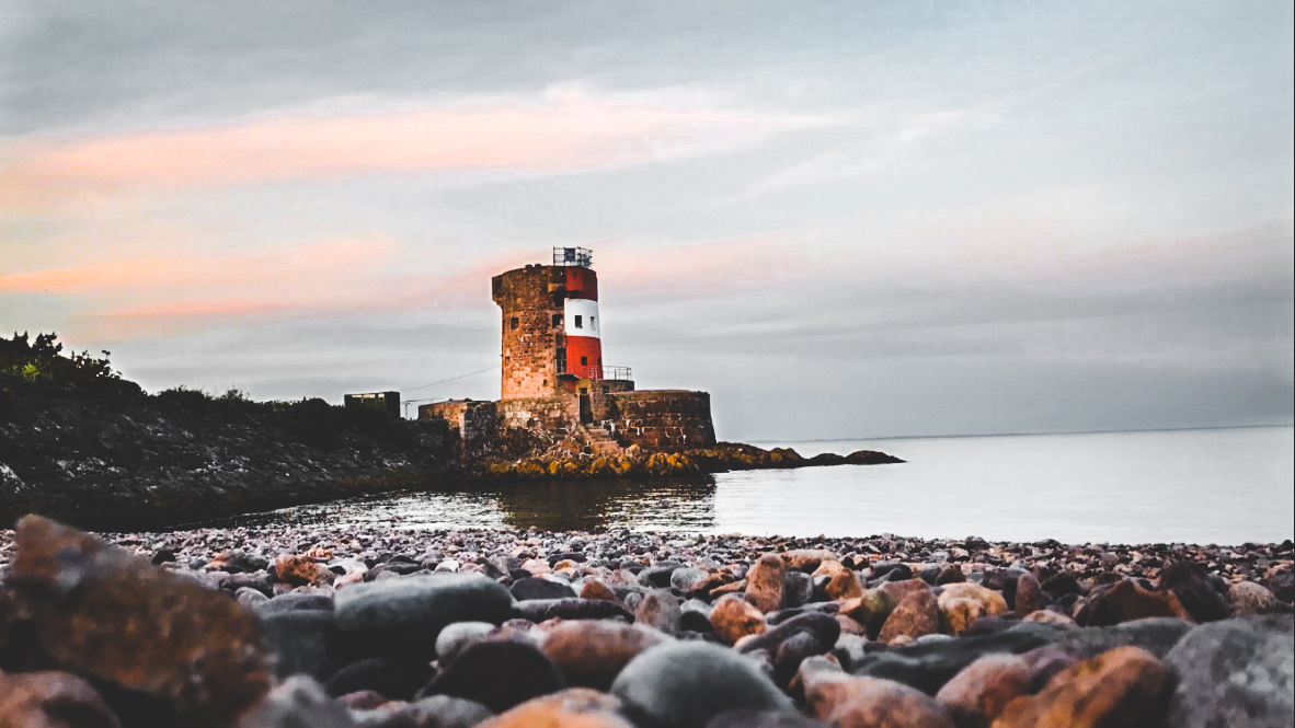
I think that the main success with these black and white photos are the texture which are visible within both. The sand and skies give a great texture with a variety of patterns leading the viewer around the photo. I think that these images could relate to the death of the sun each day as the black and white effect has connotations with death and symbolises this.

Lewis Baltz

Lewis Baltz a visual artist and photographer who was born in 1945 in California. After studying at San Francisco Art Institute he worked as freelance photographer and taught photography to students.His work has been included in major exhibitions, including New Topographic at the George Eastman House in 1975 and Mirrors and Windows at the Museum of Modern Art in 1978. Since the mid 1980’s he has been based in Europe and traveling a lot taking photos everywhere he goes.

Lewis Baltz produces photographs in series focused on a particular theme or geographic area and usually publishes them in the form of a book. His work, like that of others associated with the New Topographic, challenges the nineteenth century tradition of western landscape photography represented by people like Ansel Adams  by presenting a less innocent view of the landscape.

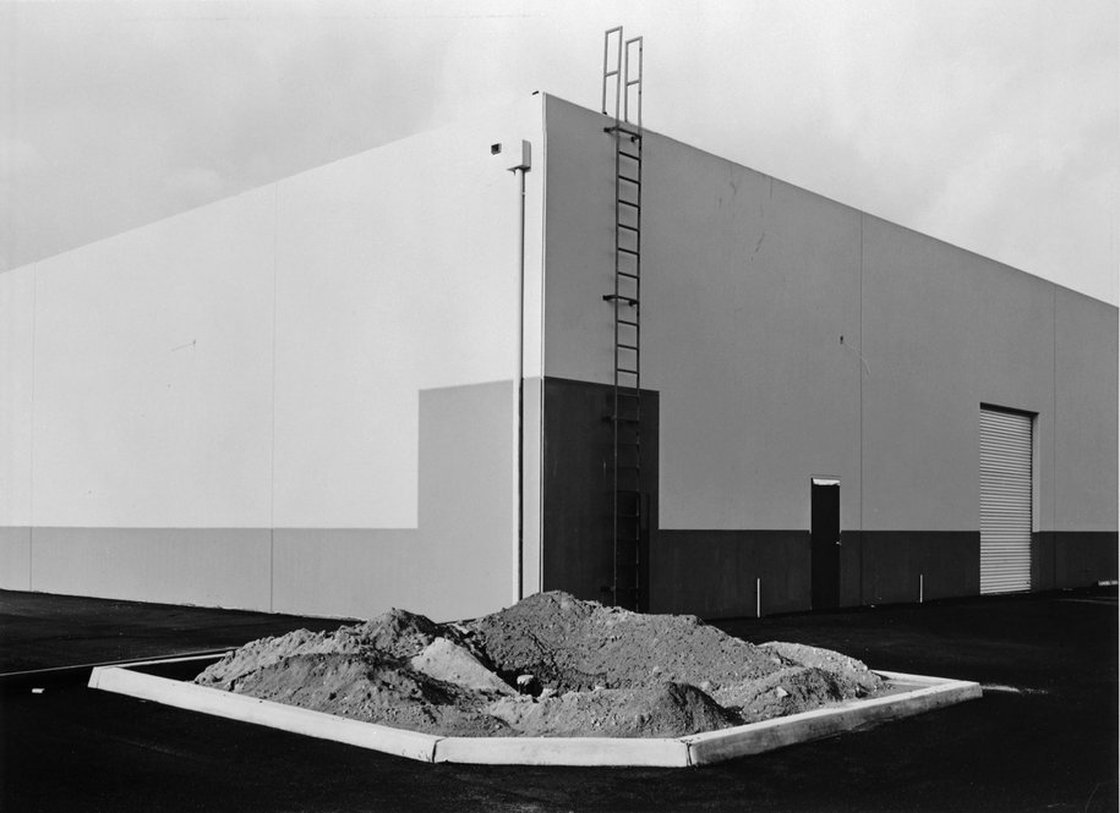
South Corner, Riccar America, 3184 Pullman, Costa Mesa”, 1974, silver print, printed ca. 1974, 5 15/16” x 8 15/16

Technical: from the photography I can tell that natural lighting was used and it was probably a cloudy day, i can tell this from the bright but soft light and the absence of sharp shadows. A wide angle or regular lens would have been used to take this photo and to help get this much of the building in the frame. The image has a large depth of field which makes everything at a distance from the lens sharply in focus. I think a short exposure would have been used to get such a sharp image and to capture the dark tones.

Visual: It is a black and white Photograph which has a high contrast with an equal amount of light and dark areas. The image is separated by different shades of grey in geometric shapes, these are split up using texture from the empty flower bed in the centre of the image. the bottom of the image has more dark shades whilst the top half contrasts with this with bright almost white shades. the corner of the building is centred to the middle of the image with lines going out towards the outer edges of the image

Contextual: towards the end of the 1960s the rapid development of the American postwar decades began to take a toll on the environment. In November 1971, the newly created Environmental Protection Agency announced a massive photo documentary project, called DOCUMERICA, which recorded the adverse effects of modern life on the environment. More than 100 photographers were hired not only to document specific issues, but to capture images showing how we interacted with the environment. By 1974, more than 80,000 photographs had been produced.

Conceptual: his work focused on searching for beauty in desolation and destruction, his images show the architecture of the human landscape, officers, factories, and car parks. the idea of his photos are  is to show the control, power and influence which human have on nature and nature consequently has on us. In this image we can see a large building with simple characteristics. the flower bed in the image was made by human in intention for life to live in amongst urban areas however as we can see this image there is no sign of life which could lead us to believe that humans power over nature is weak and that we can not control it.

Read more http://www.leegallery.com/lewis-baltz/photography/

Night Photography shoot

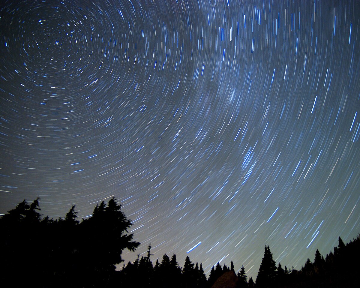
Night photography is photographs that have been taken outdoors when the sun has gone down. Photographers that shoot at night usually use artificial light and using a long exposure, exposing the scene for seconds, minutes, and even hours in order to give the film or digital sensor enough time to capture a usable image.

Image result for night photographyImage result for night photographyImage result for long shutter speed photography

The following techniques and equipment are generally used in night photography.

  • A tripod is usually necessary due to the long exposure times. Alternatively, the camera may be placed on a steady, flat object e.g. a table or chair, low wall, window sill, etc.
  • A shutter release cable or self-timer is almost always used to prevent camera shake when the shutter is released.
  • A camera lens with a wide aperture, preferably one with aspherical elements that can minimize coma