Homework 3

Kings Street

King Street forms part of Saint Helier’s main shopping area in Jersey. It is a pedestrianised street which runs from Charing Cross at its west end to Queen Street at its east end.

This map of King Street is believed to date from 1913. It shows clearly how relatively small the properties were on the south side of the street, compared with those on the north, which stretched back over what had previously been wet meadowland.

I first planned out where i was going to go to explore psycho geography on google maps and decided to walk along King Street. I printed out old photographs that were taken of buildings from the past, which also capture the environment of that time.  I planned to compare the old images to present day and take a photo of the comparison.I researched what  King Street looked like in the past and displayed a few to show the comparison between the two time periods.
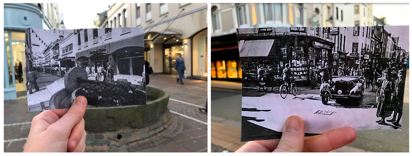
  • I took a few photos of me comparing the present day to old photographs and found that these two worked to best as the buildings line up in both real life and the printed off image.
  • The images also looked better in black and white as it makes them seem more historic.
  • I especially like the one on the right as it shows how different the street was in the past with the car coming from the street which is no longer a road.
  • The one on the left is from King Street in the 1970s. In 1978 the apple crusher was installed at the junction of Rue de Derrière and Ruette Haguais, and La Croix de la Reine at the junction of King Street and Broad Street as part of the pedestrianisation landscaping, a traditional. The left image is from the 1940s showing A German staff car in King Street during the Occupation.

These images also show the change over time on King Street. The first image shows buildings and people in the past and the second image shows what the same buildings look like in the present day. The first image contains quite a few people walking on the pavement dressed in old fashioned clothes, second image contains less people walking in the street and has construction work in the middle of the road.

I also took pictures of the urban landscape when comparing the old images and photographed the surrounding environments. When doing this I tried to take the photos taking inspiration from the New Topographic photographers.
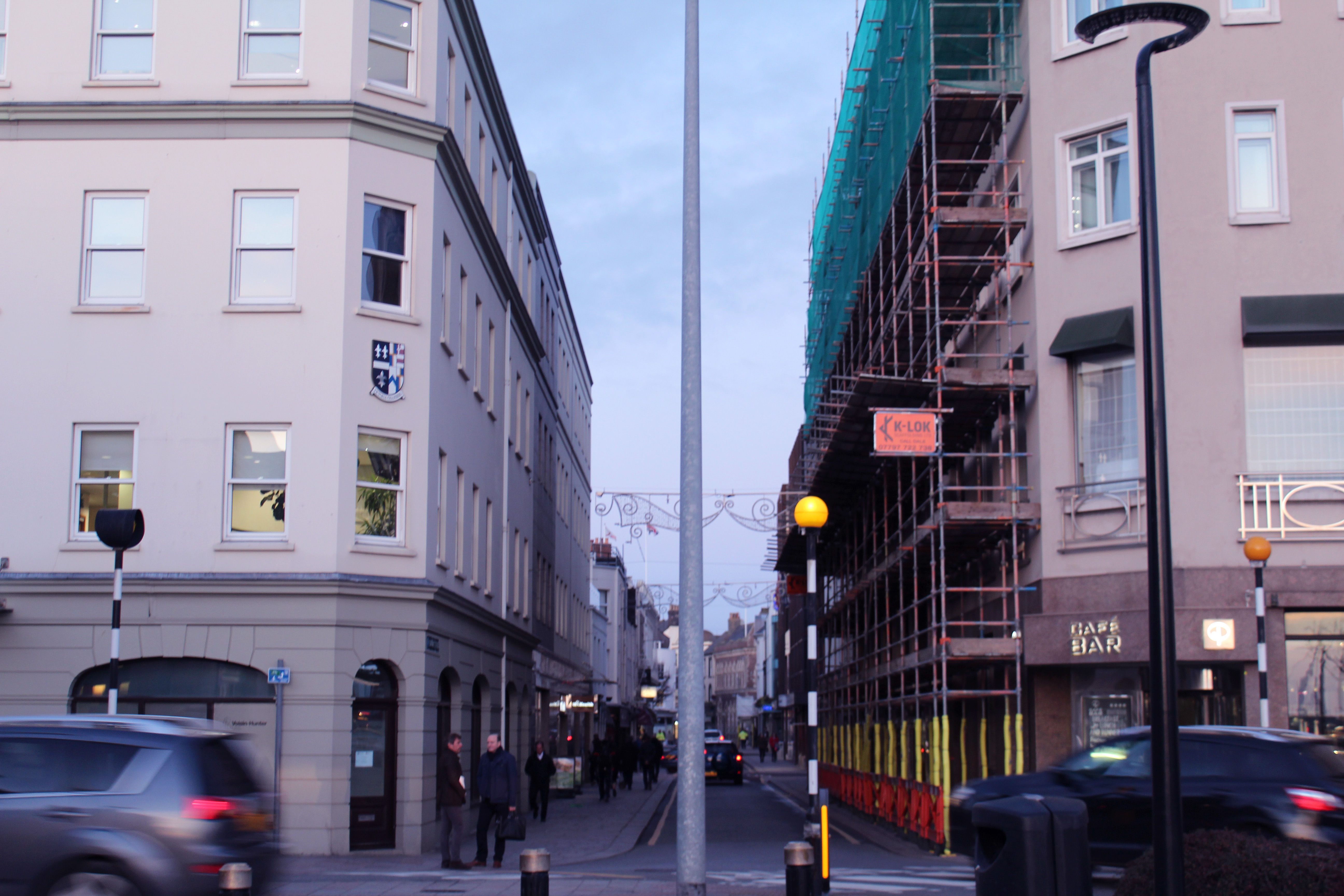
  • When taking this photo I tried to capture the movement of the cars and the symmetrical alignment of the buildings to produce an overall aesthetically pleasing image.
  • The lamp post in the middle divides the image in half, either side having similar layouts with the buildings and cars in similar place.
  • I thought the image was powerful enough by itself and didn’t think it needed too much editing so i only gave the photo a pinkish tint and decreased the exposure slightly to create a softer appearance.
  • I chose to take this photo at this angle to show urban activity continuing down the road with the rushing cars, people and construction along it. The blue sky contrasts with the pinkish buildings
Visual:
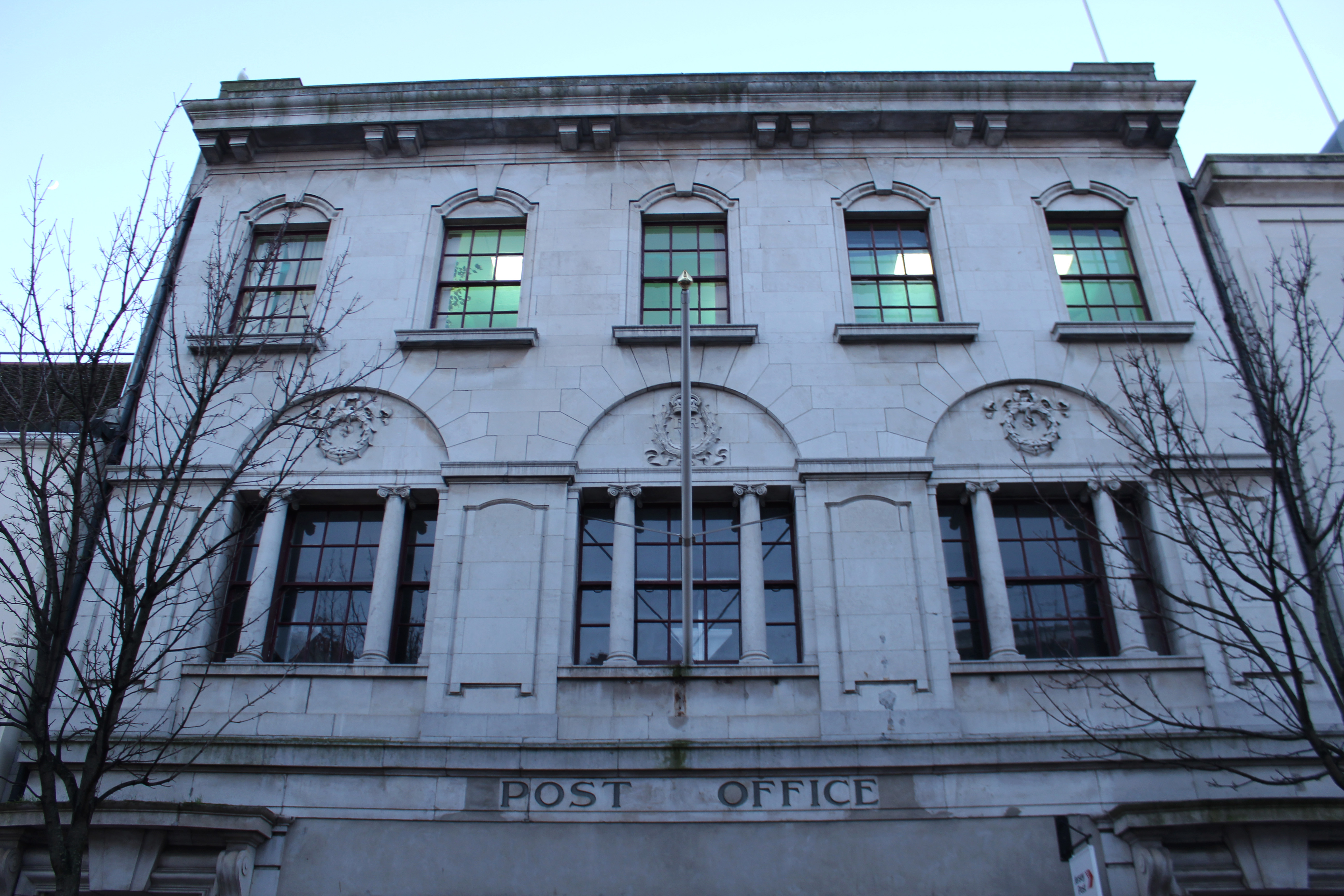
  • The angle at which this photo is taken makes the surrounding buildings look like they’re taller and towering over the camera, creating a tunnel like street.
  • The buildings have a shadow cast over them but the bright sky creates a contrast between the two, emphasising the pathway.
  • The layout of the image is nearly symmetrical as the photo was taken standing closer to the left side than the right. This makes the buildings on the left seem taller. I took the photo like this as it emphasises the pathway of the street.
  • The photo is taken from a street view like a person would see when looking down the street as the other image showing the history of Kings Street is from the same angle.
Conceptual:
  • The concept of this image was to compare history to present day thought the buildings on Kings Street.
  • And to capture the atmosphere on King Street now compared to then.
Technical:
  • The lighting in this image was natural and had a natural shadow over the buildings which i emphasised when editing.
  • I used a wide angle lens so i was able to show the whole street
  • I used a fast shutter speed to eliminate motion i the image and low exposure which was why the shadows were emphasised
Contextual:
  • I placed both images beside each other to show the comparison from the historic image and the present day image.
  • It shows how buildings and shops have developed and been re-designed over time

New Topographics Research

What Was It?

“What I remember most clearly was that nobody liked it”Frank Gohlke, one of the participating photographers told the LA Times when the exhibition was re staged last year.

‘New Topographics: Photographs of a Man-Altered Landscape’ was an exhibition that showcased a key moment in American Landscape photography. Parking lots, suburban housing and warehouses were all depicted in the same way that early photographers would document the natural landscape- this caused many people to turn their heads on this exhibition. The show consisted of 168 rigorously formal, black-and-white prints and when taken collectively, they seemed to posit an aesthetic of the banal.

source

Robert Adams – Artist Research

Born on the 8th May 1937, Robert Adams is a photographer from America specializing in the landscapes of West America. Adams’s documentation of contemporary western landscapes reveals the environmental damage caused by the suburbanization of such cities as Denver, Portland, Seattle, and Salt Lake City, as well as by the proliferation of nuclear weapons technology in those areas. 

Contact Sheets

j

Analysis Of Photograph

Technical

This is my favourite photograph by Robert Adams, the image portrays a fairground ride illuminated by bright lights. The photo was taken during the evening as the sky was getting darker. Since all of the image is in focus I can assume that Robert Adams used a high aperture of F/22+,  he most likely increased the  exposure to achieve the soft glow from the lights. Due to the black & white feature of the photograph I cannot comment on the white balance or colour composition of the image but due to the vast range of grays it can be implied that the colours created chaos and in that sense, the black and white aspect was able to create a calm and serene atmosphere.

Visual

Referring to Ansel Adam’s tonal system, the image has the brightest white (#ffffff) but lacks the darkest black, despite this, it still  contains a wide range of grays. The composition of the photograph is very successful, the ferris wheel isn’t in the direct center of the image, in fact, the top half of the image is incredibly plain and predominately one colour. This, however, doesn’t in any way serve as a disadvantage to the photograph. Naturally, the eye is drawn to the center of the ferris wheel; then to the bright lights and finally to the looming clouds.

Contexual

The name of the image is ‘Longmont, Colorado’ taken from the series ‘Summer Nights’. The image was taken roughly around 1982 (but printed in 1989).

For about five years, beginning in 1974, Adams embarked on an experiment, he made a series of photographs at night, the opposite of the high-altitude daylight used in most of his previous photographs. The project brought an element of risk he had not experienced before. In this photograph, Adams isolates the ferris wheel lights against a threatening sky to create a scene both delightful and ominous.


Marcus DeSieno Image Analyse

Who is Marcus DeSieno?

DeSieno us a lens-based artist interested in how the advancement of visual technology is changing continually and enhances our view of the world. DeSieno received his first MFA in Studio Art from the University of South Florida and is currently the Assistant Professor of Photography at Central Washington University.

His work has been displayed nationally and internationally at various places such as the Center for Fine Art Photography, Candela Gallery, Aperture Foundation etc. the work has also been used in a variety of publications such as National Geographic, Slate etc. Marcus DeSieno focuses on the idea of surveillance and  macro lens photography as seen below:One image that I particularly liked and decided to analyse was ‘Archival Pigment Print From a Surveillance Camera Feed’ which won the Lens Culture Emerging Talent Award 2016.

62.009730, -6.7716400. Archival Pigment Print of a Still from a Surveillance Camera Feed. © Marcus DeSieno, Winner, LensCulture Emerging Talent Awards 2016.Technical:  Marcus DeSieno’s piece consists of hacking into surveillance feeds to capture interesting imagery, the image itself seems to be taken on a gloomy day, capturing the silhouette of the mountain range in the distance whilst incorporating the Ansel Adams system throughout capturing a range of shades. The picture seems to have been deteriorated creating an old feeling to it whilst maintaining much of the crisp qualities of the original photo. A depth of field can be seen partially used through the use of the graininess and how the road snakes off into the distance removing detail from the image, but at the same time keeping out focus on the road.
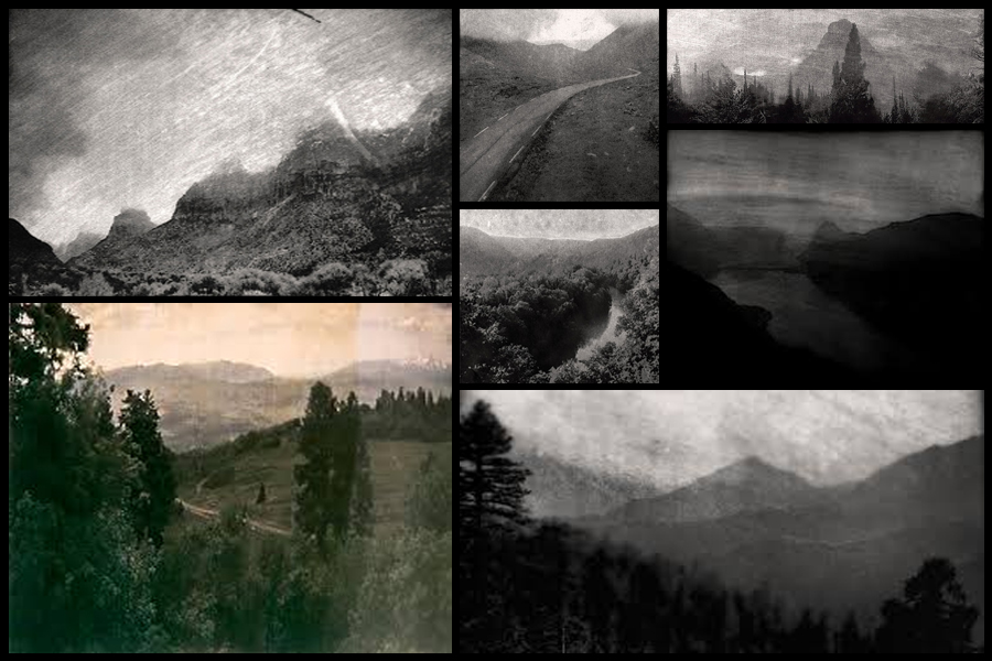
Visual: The image consists of a huge range in tone, with a big difference in the contrast between black and white allowing for the photographer to make certain parts of it pop out and draw the viewer in. The snaking road positioned in the center of the image is the focal point of the picture as the light shades of it balances the rest the darkness, seen throughout the rest of the photograph.

Conceptual: His photography consists of the exploration of how surveillance is used in our everyday lives, with the idea that we are constantly watched. Marcus takes advantage of this and uses camera feeds that look upon landscapes to capture the beauty of nature using Archival Pigment Prints to capture the image.


Psycho-geography

What is psycho-geography?

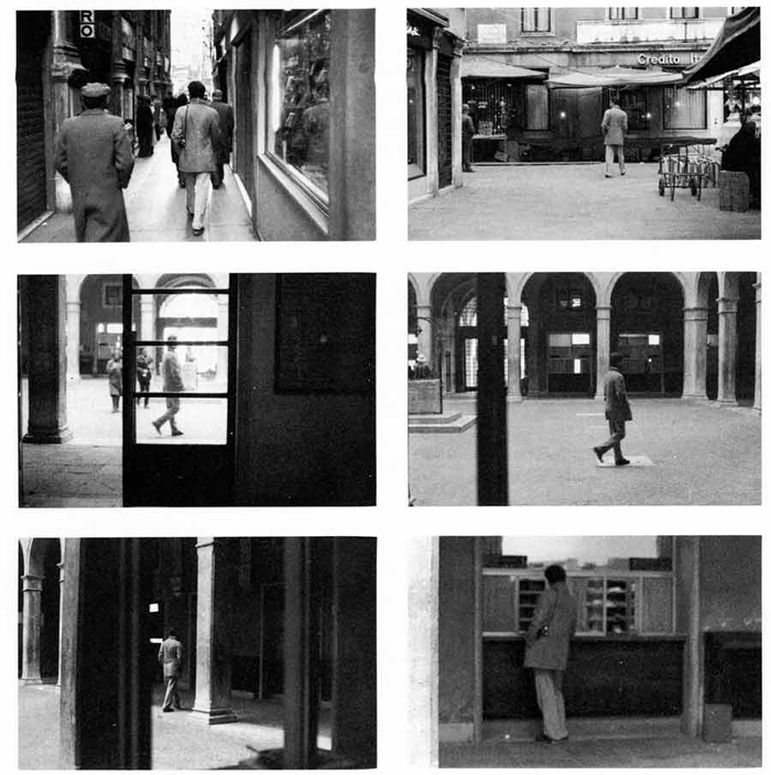
The term psycho geography was made by the Marxist theorist Guy Debord in 1955. It was inspired by the French nineteenth century poet and writer names Charles Baudelaire’s concept of the flâneur, an urban wanderer. Through this new term it suggested a creative and playful way of exploring the urban environment in order to examine its architecture and space. He wanted to create a term that was new to the approach of architecture that was less functional and more exploratory. Some example of psycho-geography in photography consist of:

 As seen above psycho-geography very much focuses around the aspect of architecture, through the recording and creation of visually pleasing imagery of what in most circumstances would look like ruins of debris. Most of the photos are very much based around the exploration of a urban inhabited area, to which what they tend to focus on makes the photos taken look almost desolate and uninhabitable for civilization.

The process of psycho-geography can be simple or complex depending on what you choose to focus on, but the main focus is how we are affected by being in certain places around us due to architecture, weather and who you’re with. Many are taken within a small area to focus on how much you know about the specific area you are in, this is known as practicing dérive, and is a fundamental principle in psycho-geography.

A leading photographic artist in the area consist of Marcus Desieno. Desieno creates almost de-humanised landscapes from hacking into surveillance camera networks, whilst at the same time avoiding privacy problems associated with urban and residential areas. Here are some example of his work:

This form of photography can also be focused around the idea of the constantly being watch as everywhere we go there are cameras, and so can explore this idea by incorporating maybe satellite imagery into the form of photography using creative angles to make the most of the landscape.

Image result for satellite camera imagery of cities

Psycho-Geography

Psycho geography

Psycho geography is an exploration of urban environments that emphasizes the playfulness. Psycho geography was defined in 1955 by Guy Debord as the study of the precise laws and specific effects of the geographical environment, consciously organized or not, on the emotions and behavior of individuals. Another definition is a whole toy box full of playful, inventive strategies for exploring cities… just about anything that takes pedestrians off their predictable paths and jolts them into a new awareness of the urban landscape. The idea of urban wandering relates to the older concept of the flaneur, theorized by Charles Baudelaire and is similar to street photography.

I am interested in this style of photography as it allows for a wide range of possibilities as well as an enjoyable experience whilst capturing interesting images. Some go alone, others in organized groups or societies, some walk randomly and aimlessly, others have goals and approximated destinations and some even use algorithmic and logical patterns. I personally am interested in the style of walking randomly and aimlessly to in hope come across some interesting subject matter.

Related image


Response To Richard Misrach

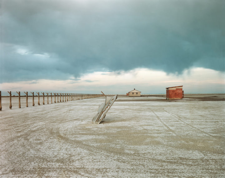
The generic conventions within Richard Misrach’s work is the environmental issues inflicted by humans. The photographer clearly has a negative view on how society is treating the environment and has a variety of work displaying the pure destruction of the environment to  try and insure people are aware of these issues. He  uses strong juxtapositions within his work to show how we are unnecessarily building structures in scenic, natural areas.

Image result for Richard Misrach

This is a typical photograph taken by Misrach in which influenced me to try and capture a similar message within my photographs. On a photo shoot I decided to focus in on the things in which ruined the environment and really are showing a sign of humans presence. Thus was to create a sense of destruction that we are doing to our world.

My Images


Richard Misrach

Richard Misrach is an American photographer firmly identified with the introduction of color to fine art photography in the 1970s, and with the use of large-format traditional cameras.

Richard Misrach appears to have been inspired by The New Topographic in the way he chooses to capture man-made subject matter in the style of landscape photography. For Richard This included coastal areas, lakes, rural areas and urban areas which were all depicted with a beautiful element however his images inflict this idea of destruction that us as humans has created to this beauty.

Image result for Richard Misrach

Image result for Richard Misrach

Image result for Richard Misrach

Image Analysis

Related image

The generic conventions within Richard Misrach’s work is the environmental issues inflicted by humans. The photographer clearly has a negative view on how society is treating the environment and has a variety of work displaying the pure destruction of the environment to  try and insure people are aware of these issues. This photograph is a clear response to the environmental issues within a lake or the ocean. I believe the photographers main influence is an indication of the rapid urbanization around the world and this is leading to humans destroying nature, plants and vegetation. As well as this photograph indicating how we are building unnecessary things which are destroying the natural beauty, it is also a clear reference to the Marine pollution and tells us how serious it is. The use of the juxtaposition between the wooden structures and the natural scenes of the lake and distant mountains helps to convey these ideas that we are unnecessarily building structures which are dominant in creating a distraction and almost disturbing scenes. I also am influenced by the use of isolation involved with Misrach’s images as they release a sense of calmness and a tranquil atmosphere.

Urban Landscapes – Homework

Photo shoot Plan

Genre /  Artist – Landscape, Urban

Concept –  Capture images in the style of The New Topographics

Location – Town, Outskirts of town

Props – Tripod

Shot type – Landscape, varied angle dependent on subject matter

Lighting – Natural, possible use of flash or spot light

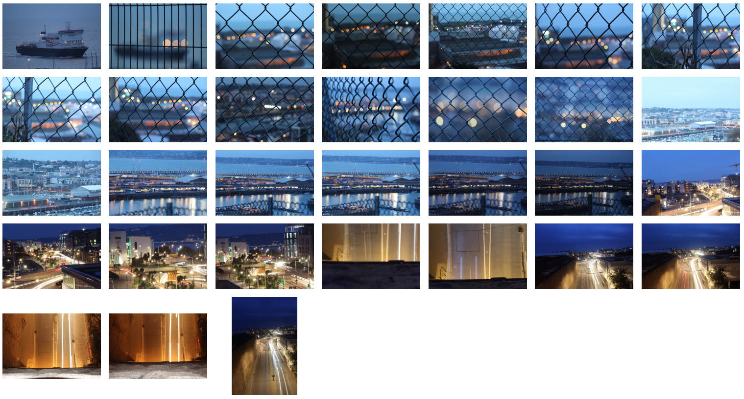
Settings – 30 Second exposures with ISO of 200 for light trails

Contact Sheet


Edited Images


Favorite Edit

I believe this image best reflects the movement of the new topographic in the way it displays an overcrowded array of lights from the urbanised area behind the fence. I have purposely used the fence to convey a sense of imprisonment that us humans have created by the building of these colossal structures that look down upon us. This image best relates to how our natural beauty has been ruined by all the man made features such as the lights which are a key element to this photograph. Where as this place would have once been a peaceful and tranquil environment with little buildings, it now is an energetic and stress prone environment. This links to the New Topographic movement taking over from the Romanticism movement. It shows how quickly things can change for better or for worse.


Robert Adams – The New Topographics

Robert Adams was born in May 1937 and is an American photographer who has focused on the changing landscape of the American West. His first work to become prominence in the mid – 1970s through his book ‘The New West’. His participation in the exhibition The New Topographics was also a dominant feature in helping his career.  He twice recieved a Guggenheim fellowship, a MacArthur Fellowship and he won the Deutsche Borse photography prize as well as the Hasselbald Award.

Image result for robert adams

Image result for robert adams

Image Analysis

Image result for robert adams

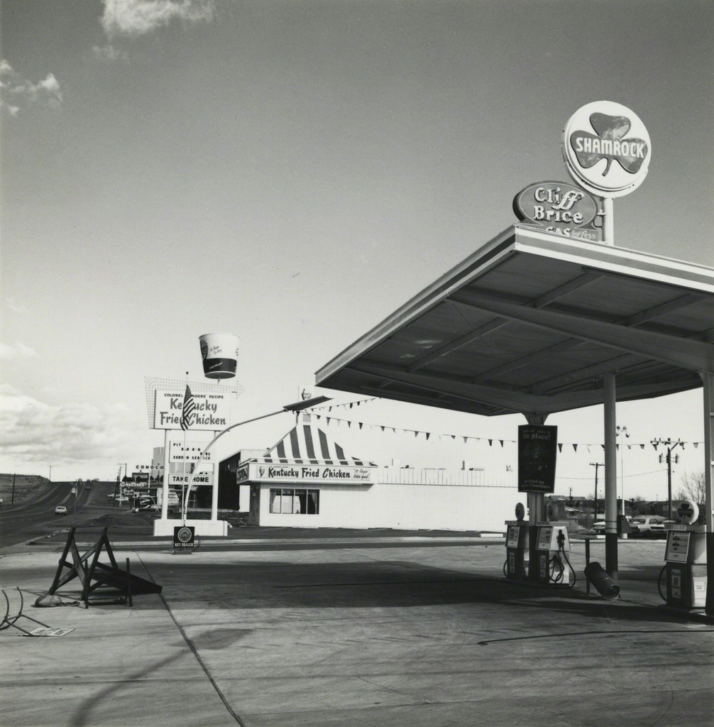
It appears that natural lighting was used to capture this photograph due to the natural tones and contrast in the photograph. This allows the photo to convey a sense of realism and make the audience feel as if they can connect with the photo more. This is contrasted with the way there is no color involved within the photo which makes the photo surreal and creates a sense of mystery and a more dramatic image. The use of black and white helps to focus on the main subjects, thus being the caravans, to allow Adams messages to be portrayed. This photo shows the start of civilization and man-made structures with natural objects appearing towards the back of the photograph. It shows how the New Topographic movement was a reaction to the Romantics by the use of the juxtaposition with the man made features in the foreground and the natural features in the background. In my opinion, this photograph is a message to reflect how man made structures are taking over our society and dominating these natural areas. This is clearly reflected by the way in which the natural features are pushed towards the back of the photo and are not the main feature like they would be in romanticism photography.


new topographics Photo shoot

Photoshoot Plan 

Concept:  After researching the New Topographic, urban landscapes and the photographer Lewis Baltz  I am going to take inspiration from the style of their work and apply it to my own photos.

Location: I am going to take photos at the industriel estate at La Collette, we will walk from Harve des Pas along the coast line and through the industrial estate and along the harbor taking pictures relating to our topic of New Topographic. The area has a wide range of urban scenes which i can take pictures of.

Lighting: I will use natural lighting to take these photos and I will take them in the afternoon to avoid over exposed images with light flares.

Camera settings: I will take the photos using the manual  expose setting and experiment with long shutter speed and the waves.

Contact Sheets:

I also edited some other photos that I took in a different location. They were in the style  of  Nicholas Nixon’s landscapes so i edited them in black and white and enhanced the highlights to give them a higher contrast whilst still making them look faded.