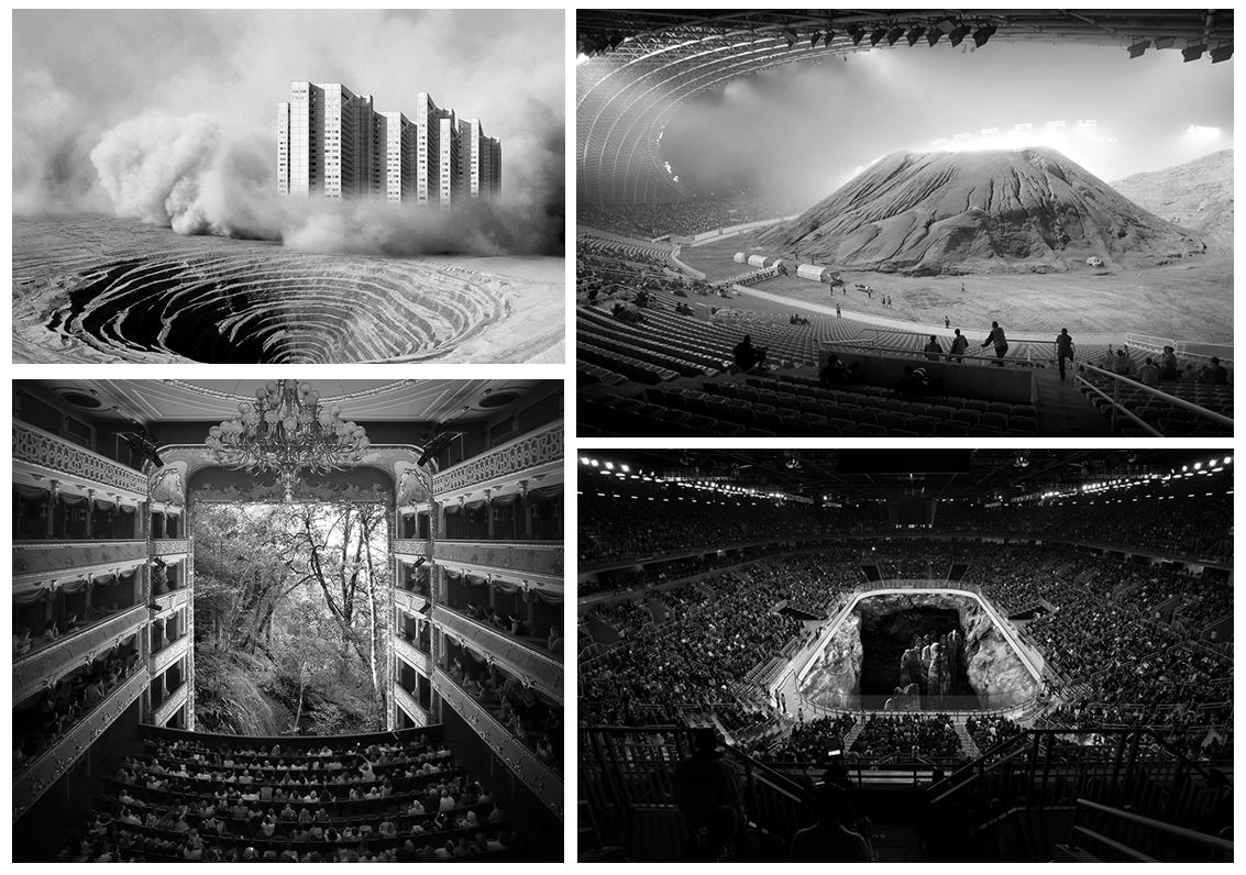
Altered Landscapes

Tanja Deman

Tanja Deman’s art is inspired by her interest in the perception of space and her relationship to nature.
Tanja’s works, incorporating photography, collage, video and public art, are evocative meditations on urban space and landscape. Observing recently built legacy or natural sites her work investigates the sociology of space and reflects dynamics hidden under the surface of both the built and natural environment.

Her investigation of collective psychology and space focuses on recently built legacy, specifically in spaces for collectives and how they relate to nature. Her images are visual metaphors that step into puzzling sites and situations layered with history. She captures the awkward socio-political dynamics under the surface of both the built and natural environment.
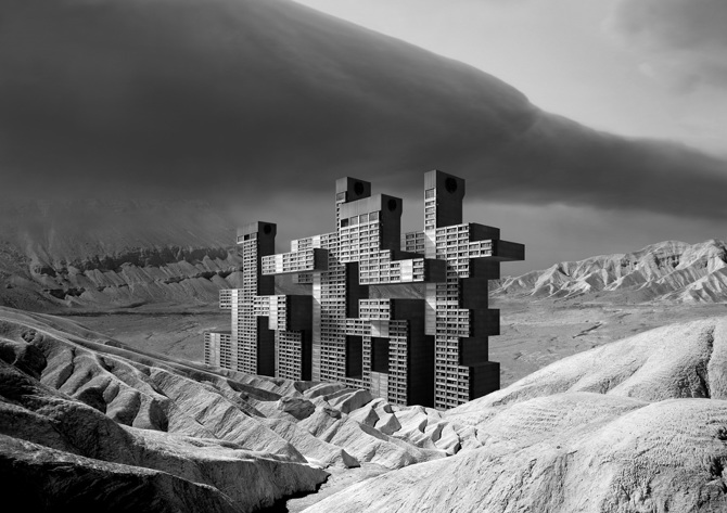
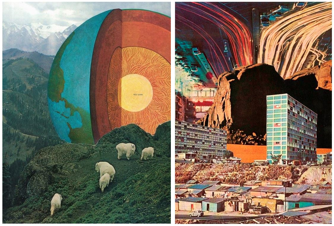
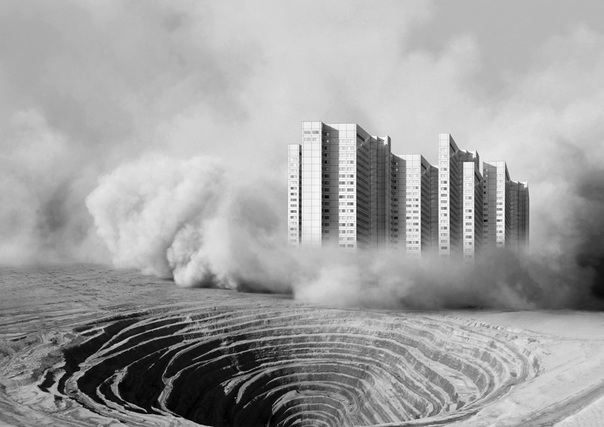
This image is part of her series called ‘Fernweh’ which explores the concept of a modernist city through its extreme relations to the landscape. The images are placed on a blurred line between a past which reminds us of a future and a future which looks like a past. Scenes are referring to the modernist ideas and aspiration of a man conquering the natural wild land and subordinating it to the rational order, and the consequences of those aspirations, which switched into the longing for an escape from urban environments.

Another one of her series called ‘Sight Densification’ is a photo collage series, based on conflict atmospheres of rapid territorial densification of contemporary megalopolis. While creating these images she was interested in the aura of coexistent city infrastructure, skyscrapers, building sights, bridges, dams and other mega structures in urban environments, as well as their dramatic relation to the nature.

She also won the Archisle International Photographer in Residence Award in Jersey 2017. In 2015 she began ‘Salt Water’ a new series exploring the underwater landscapes of the Adriatic Sea and in her Jersey project she develops this body of work further for the exhibition Sunken Gardens.

“In Jersey I have made a photographic exploration of inter-tidal zones, capturing morphological formations of the seabed, reefs and cliffs that penetrate the sea depths; the transmission and refraction of light through the sea water; and above all the lush underwater gardens of seaweeds.”

Jesse Treece
  • His idea is to create artwork that excites and surprises no matter what the current trends or moods are.
  • He’s mainly into old newspaper comic strips, dystopian sci-fi novels, crazy architectural drawings, designs from the 60’s and 70’s and works of artists like Salvador Dalí and Hayao Miyazaki.
  • By this and his preference for the process and the look of handmade collages, he turns his inspiration into something unique and original.
  • Being basically self-taught except for some not very serious art classes, Jesse Treece became a central figure in the underground collage art movement and was even recently included in AnOther Magazine’s list of the top ten collage artists in the world.
  • He somehow manages to mix regular and absurd, beautiful and disturbing, science and nature, large and small and puts together these familiar imageries to create a whole new picture.
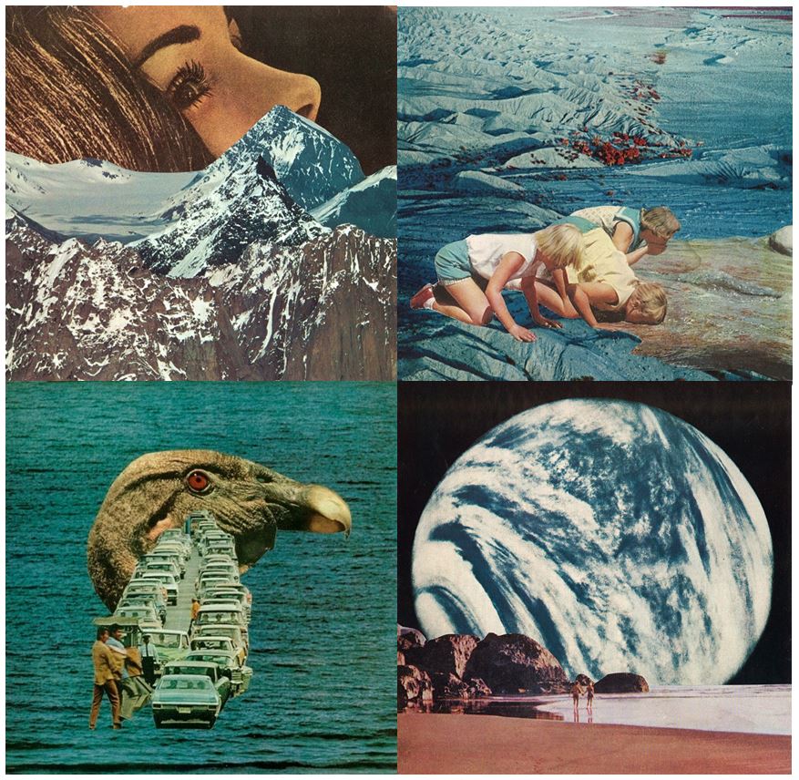
Every image tells a different story that you can get lost in for hours. Jesse Treece himself even calls his work slightly disturbing. His imageries somehow made me think of science fiction and horror movies from the 70s.

“I came across a box of old magazine clippings one night and found myself wanting to make a visual story out of them. That turned into my first collage and it was the most satisfied I ever felt with something I had created. I guess it kind of snowballed into an obsession from there”

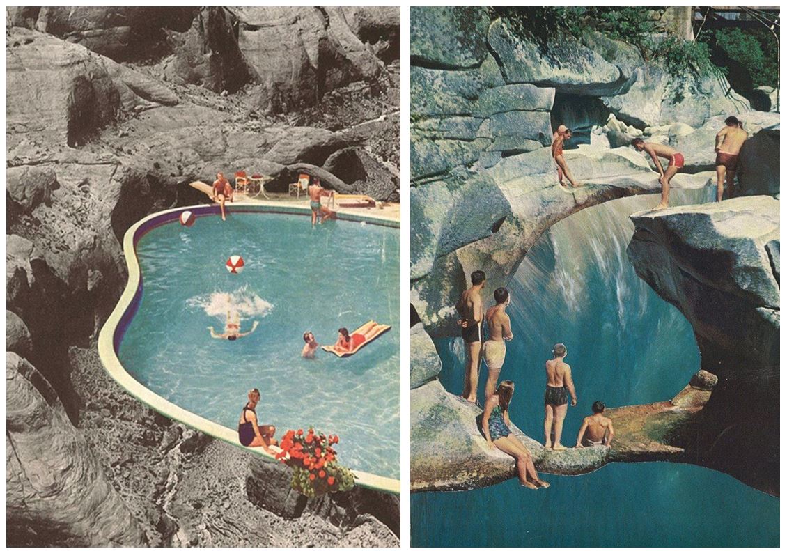
Sammy Slabbinck
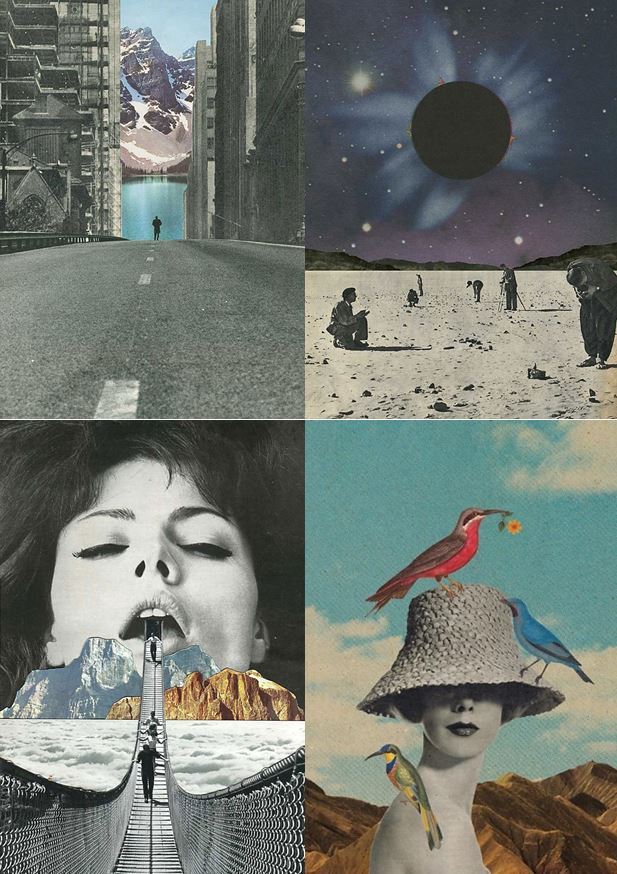
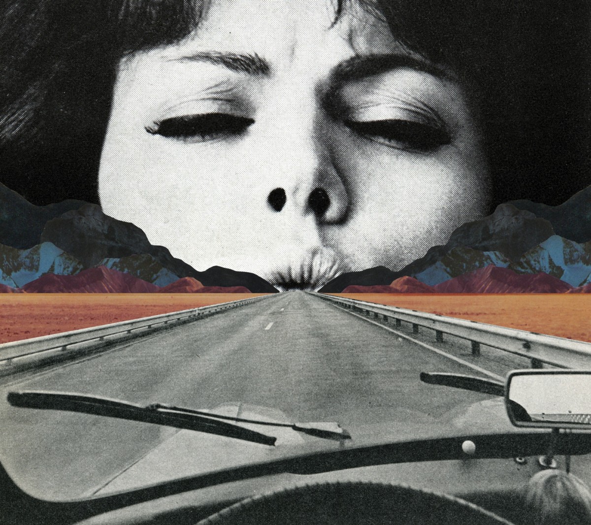
  • Belgian artist Sammy Slabbinck’s work comprises surreal collages and illustrations that somewhat unexpectedly combine vintage with contemporary images.
  • Slabbinck likes to play around with different styles and proportions with the aim of creating powerful yet simple visual works that are permeated by a subtle sense of humour.
  • His carefully composed images create startling juxtapositions and present new meanings through a masterful combination of completely heterogenous elements and a clever use of scale and form.
  • He is an avid collector of magazines and books from the 50’s, 60’s and 70’s and takes full advantage of the muted tones and rich textures that he finds in his source material, namely vintage advertisements, photography and print.

He uses photography from vintage magazines, advertisements and prints as he says “they have a certain look and feel, with very strong lines. You can see it in the architecture, the cars, the furniture. But the photography is also completely different: it has a quality which he finds very innocent. The colours are faded and warm, the images have a soul. It’s nothing like the photographs you can take now with a super digital camera and millions of pixels. I tried making collages with recent magazines but they just don’t  have the same spirit.”
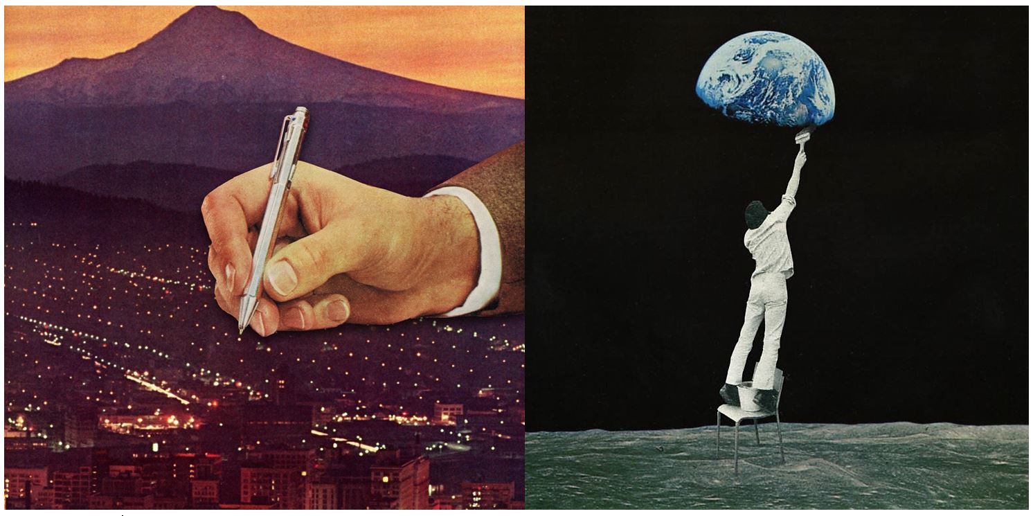
”Mid-century advertisements have a certain look that appeals even up to this day. There is a sense of innocence in them that’s very inviting to work with. Putting these images out of their normal frame and juxtaposing them with modern elements can give an exciting and surprising effect. The characters in these ads can function as actors in the collage, and I, as the director, can give them a second life by putting them in a new surreal landscape.”

He doesn’t consider him self to be a political artist but  he does like to put extra layers in his work.  Sometimes it can go as far as a political satire. He does like to play around with the absurd and put some humor in his work.

Planning the Psycho-Geography Shoot

The aim of psycho-geography is to be familiar with a certain area, and to essentially explore it. To do this I will be focusing on a small urban area within town, to which I will try to become more familial with its surroundings in order to take the photos needed. This is the area I have chosen:To add to my research of the area to be explored, I decided that it would be appropriate to take street view shots in order to have a bit of an insight before hand of the area.Part of the main area I am exploring is the car park, however now has been transformed into the International Finance Centers, with much of it still under construction. Other areas include Liberty Wharf, which was once known as a former abattoir that was restored and converted for the use of a shopping centre.

Some artists that have inspired me in the shoot consist of  Mishka Henner and The Boyle Family. Henner tended to focus on more satellite/birds eye view techniques of the landscape around the world to create vivid and mind-boggling imagery, to which in some cases he would distort them to create more abstract pictures. Some examples of their work can be seen below:As seen above Henner very much focuses on satellite imagery as his main source of art. One technique commonly seen in his work is shaped pixels, this can be done through selecting an area and finding the main color present in that space, to then convert it to just that singular color.

The Boyle Family however take a very different stance on psycho-geography, as seen below:They tend to focus on how the different textures of the floors can create the pattern to make aesthetically pleasing imagery. The images taken are of everyday generic objects that we take for granted and don’t see the patterns within them.

Case Study: David Hockney

David Hockney is a British born photographer, painter, draughtsman, print maker,stage designer. Related imageHe is a vital part of the pop art movement which took place in the 60’s

He attend the Royal College of Art in 1959-1962 when there he said that he took the most pride in his work.  Whilst at the college he was featured in the  Young Contemporaries exhibition which also featured Peter Blake this exhibit began the arrival of British Pop art. He was associated with the movement, but his early works display expressionist element. Image result for david hockneyWhen the Royal College of Art said it would not let him graduate in 1962, Hockney drew the sketch The Diploma in protest. He had refused to write an essay required for the final examination, saying he should be assessed solely on his artworks.
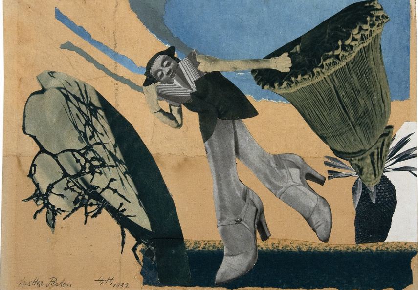
Image analysis 

Image result for david hockney photography

The images that make up this image have been taken in natural daylight, by the colour and angle of the sun it looks as if the image was taken at midday.The angles in which David took the images it makes the image very 2D is a feature of Davids work. The colours in the very saturated which is to highlight the different areas of light and shade in the image. The lightest part of the image which draws the onlookers attention to the centre of the image. This is one of Hockney’s most famous called ‘Joiners of an American Highway’. This image is made out of thousands of smaller photographs and in real life is almost 2 meters high by 3 meters wide. The full image took 8 full days for David to complete.In this image there many different textures in the image, for example, the texture of the road is very rough in contrast to the texture of the sky which is smooth.

Hannah Hoch

Hannah Hoch was a German Dada artist born in 1889, she was one of the first photographers who was artist to use photomontage. Related imagePhotomontage is a collage of images which have been cut/taken from their orignal context and place into different photographs to give the image a different meaning.

She is best known for her work of the Weimar period. Höch’s work was intended to dismantle the fable and dichotomy that existed in the concept of the “New Woman”: an energetic, professional, and androgynous woman, who is ready to take her place as man’s equal. Hoch also focused on other topics such as androgyny, political discourse and shifting gender roles, these themes creates a feminist idea surrounding Hochs work. Image result for Hannah Hoch

The Dada Movement

Dada was an artistic movement formed in 1919 in Zurich, Switzerland. The movement rejected monarchy, militarism, and conservatism and was enmeshed in an “anti-art” sentiment. Dadaists felt that art should have no boundaries or restrictions and that it can be whimsical and playful. The Dada movement had a tone of fundamental negativity in regards to bourgeois society. The term “dada” has no actual meaning the word used to describe the lack of reason or logic in much of the artwork.


Mishka Henner, Edward Burtynsky, The Boyle Family and Psycho-Geographies

Mishka Henner

Mishka Henner (born 1976) is a Belgian artist working and living in Manchester. His work has featured in several surveys of contemporary artists working with photographers in the internet age. Henner uses technologies such as Google Earth, Google Street View, and YouTube in his work.

Image result for mishka henner

Image result for mishka henner

Edward Burtynsky

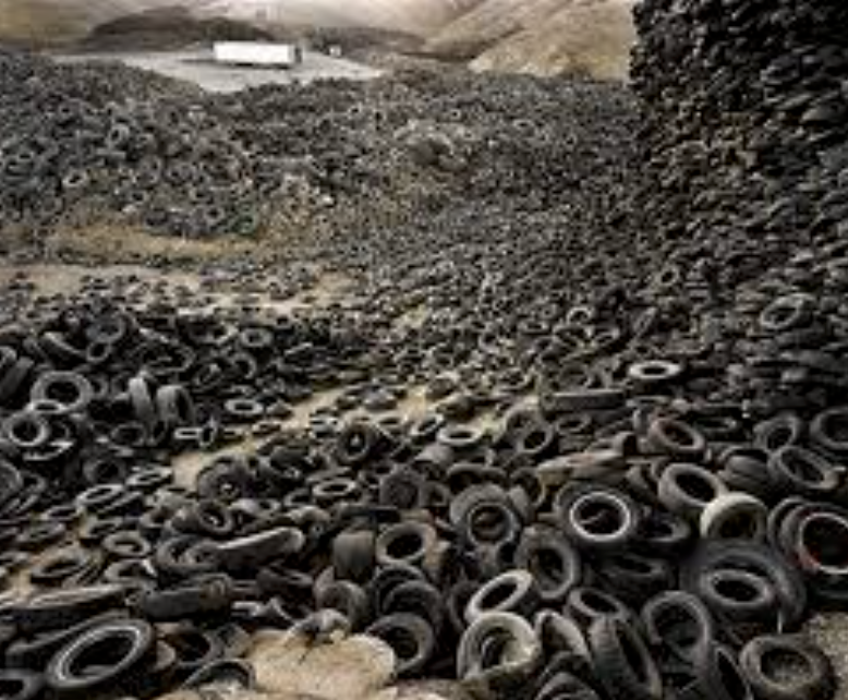
Edward Burtynsky (born 1955) is a Canadian photographer and artist known for his large format photographs of industrial landscapes. His work is kept in more than 50 museums including the Guggenheim Museum. Nature transformed through industry is a constant theme in his work.  He uses subjects that are rich in detail and scale but they are open in their meaning. The images produced are meant as metaphors to the dilemma of our existence; they search for a dialogue between attraction and repulsion, seduction and fear.

The Boyle Family

The Boyle family is a group of collaborative artists based in London. It consists of the couple Joan Hills and their children. The Boyle family work across a wide range of media (painting, photography, sculpture, film and more) but they are most known for their Earth studies. They recreate randomly chosen areas of the Earth’s surface using resin and fibreglass.

Typology Homework Assignment

Planning

Task: Take 100+ photos that explore the concept of typologies

Camera settings: I will be using an ISO of 100 with a shutter speed of 1/20 mainly in order to allow the image to be as high quality as possible but this may have to be adapted slightly for darker environments.

Lighting: I will be using daylight for the majority of my photographs but photographs taken inside the car park may be captured with flash or with the car park lights.

Location: Waterfront underground car park and Jacksons car centre.

Context: I will be taking photographs with the work of Typologists in mind.

My Photographs

My Edits

My Favourite Photograph

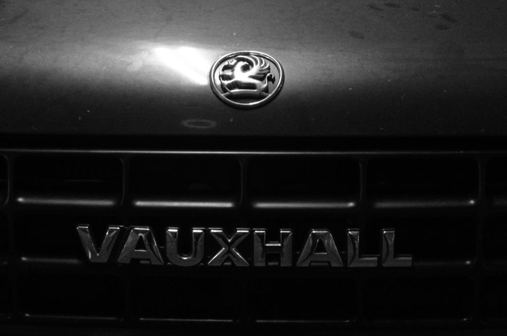
In this photograph I used the artificial lighting the waterfront underground car park. This lighting allowed the photograph to be contrasted with the correct amount of exposure. An aperture of f18 was used for this photograph to ensure that the whole of the photograph was in focus with a deep depth of field. I used a shutter speed of 1/20 along with an ISO of 200 to allow enough light to enter the lens whilst keeping the quality of the photograph as best as possible.

There is no colour in this photograph – only black and white. This creates a rustic/old-fashioned styled photograph. There is not a massively wide tonal range in the photograph but the contrasting tones are right next to eachother so it gives a more dramatic effect. It is quite a 2D photograph as it only has one close-up subject with no foreground or background.

This photograph is part of a collection of typology photographs that I took which include the fronts of cars up close in order to show the differences between similar structures on the Earth. I took inspiration for the style of photograph (rustic) from the Bechers’ but instead of photographing the same subjects as them I decided to choose my own typology whilst taking inspiration from their style.

Psycho-Geography

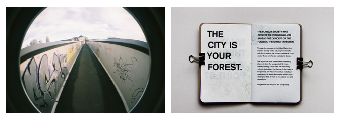
Psycho-geography describes the effect of a geographical location on the emotions and behaviour of individuals, it is often recorded through photography which shows a journey or exploration and a location. it is a mixture of photography and geography in which the photographers drifts or wonders around an urban environment documenting it in various ways. photos, time lapses, scrapbooks or even drone footage can be used to show the location and urban environment being explored. Guy Debord a theorist in the 20th century described psycho-geography as “the study of the precise laws and specific effects of the geographical environment, consciously organised or not, on the emotions and behaviour of individuals.”

the idea is that photographer explore and go off the path they take everyday, by doing this you may discover new thing which have always been in a familiar area but have never been photographed or looked at in detail. In our everyday lives we are constantly on the go  and not paying attention to where we are. By putting your mind on your location and focusing on everything around you we can find new things or see familiar ones in a new light raising awareness of urban areas in our everyday life

Lewis Baltz – Typologies

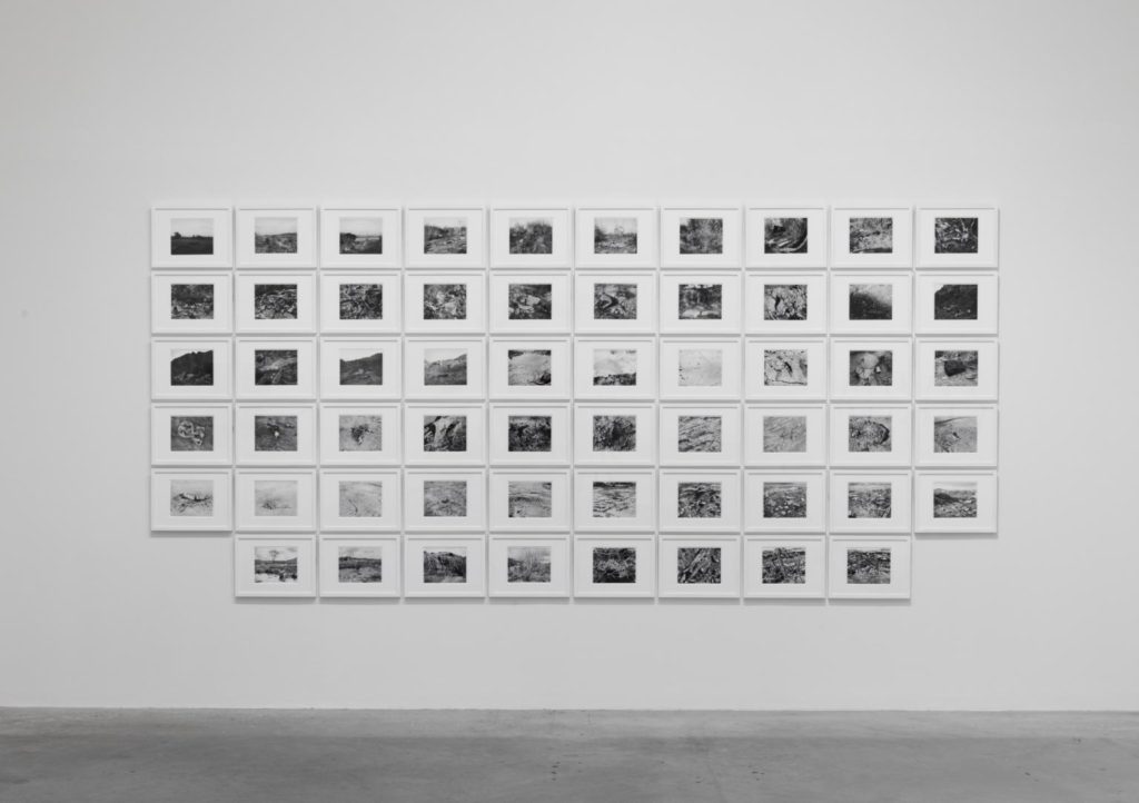
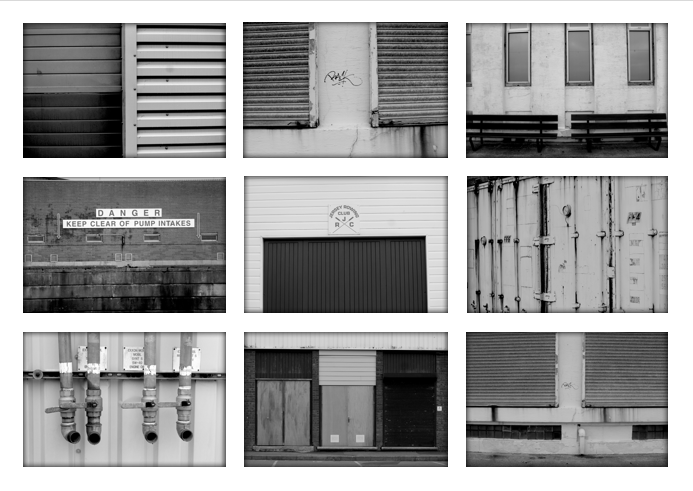
I am going to use the idea of typologies to present my photos from my last shoot inspired by Lewis Baltz.  I have already studied his photography of urban landscapes linking to new topographic so i will use these photos and select and display them in the form of typologies.

San Quentin Point 1982 Lewis Baltz born 1945 Purchased with funds provided by the Photography Acquisitions Committee 2011 http://www.tate.org.uk/art/work/P79978

I like the way these photos by Lewis Baltz have been displayed his photos in frames with wide white boarders, and hung them in a group on the wall.

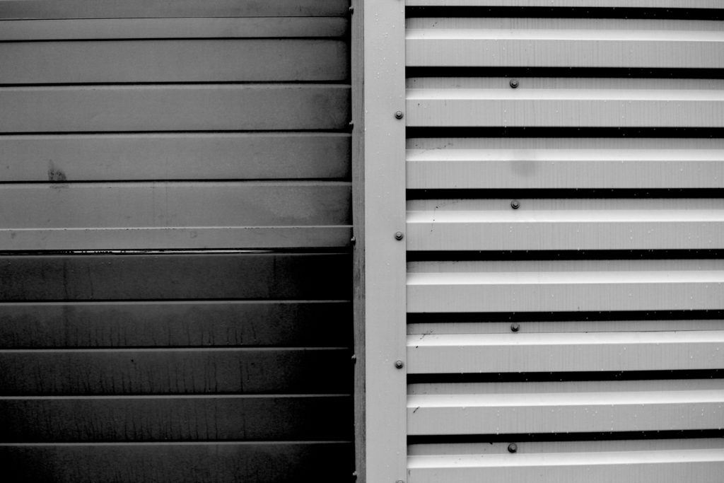
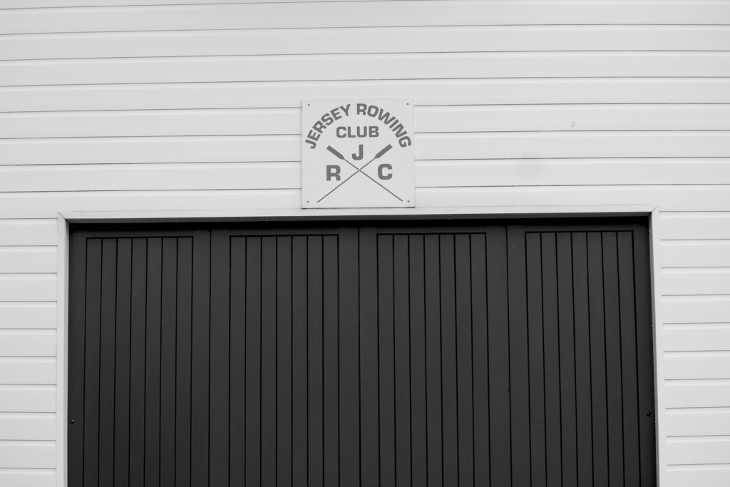
using my photos from this shoot I selected the photos of walls and edited them into black and white. I then arranged them into a grid format which helped to show the pattern in the geometric shapes in each wall.

Week 4 | Altered Landscapes | Cut-N-Paste | Composite Images

This week we will be looking more closely at the concept of altered landscapes.

You may choose to employ a range of creative techniques (digital and traditional) to create your environments…

  • Photographing changed, changing or altered landscapes
  • Creating altered landscapes by combining a range of images in Adobe Photoshop
  • Using cut-n-paste techniques and printed matter (from photos, magazines, print-outs, newspapers etc)

You may already have a range of suitable images to start your designs…but will need to conduct a range of photo-shoots to ensure that you have enough high quality images to work from:

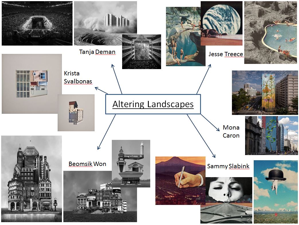
Here are some examples to help inspire your ideas…

Tanja Deman

Beomsik Won

Jesse Treece
Sammy Slabink

Krista Svalbonas


CLICK HERE to research Vassilis Konstantinou’s “unintentional sculptures”

CLICK HERE to research “new landscape” photography

CLICK HERE to find more examples of cut-n-paste ideas…

Essential Blog Posts This Week…

  • Research Altered realities,
  • Hannah Hoch and the early pioneers of photo collage  / montage
  • A Case Study on your chosen photographer (plus analysis of a key image)…show how this has inspired your ideas and process
  • Your images, process, editing, selection, final outcomes and evaluation

HANNAH HOCH INTRO CLICK HERE

EXTENSION TASK

Research the work of Joan Fontcuberta…

One of Spain’s most prominent artists, Joan Fontcuberta is best-known for his exploration of the intersection between art, science, and illusion. In Landscapes without Memory, an exhibition of forty large-scale works made between 2002 and 2005, Fontcuberta harnesses a piece of landscape-rendering computer software designed for the military, which creates photo-realistic three-dimensional models based on two-dimensional sources. For his Landscapes of Landscapes series, the focus of the Aperture exhibition, Fontcuberta feeds the software images of famous paintings and photographs by Turner, Cézanne, Rothko, and Carleton E. Watkins, among others, forcing the program to interpret the landscape masterworks as “real.” The contours and tones of the pictures are transformed into three-dimensional mountains, rivers, valleys, and clouds—baroque, fantastical landscapes void of human existence that tap into our desire for unattainable paradise. Thumbnails of the original images are shown next to Fontcuberta’s work.

Through his artistic process, Fontcuberta creates new landscapes that, despite their “postcard perfect” resonance, are purely fictional­ and can never be experienced in nature. The result is “landscapes without memory.”

  • Why do you think Fontcuberta creates “photography” in this way…?
  • How does Fontcuberta’s work compare to the work of James Casabere ??? (below)
  • “The photographs that put artist James Casebere on the map are chilling. Like an architect, he builds a highly detailed model. But instead of turning the model into a life-size construction, Casebere zeroes in on the nano-details of the space and then photographs it to create his “constructed photography.” In the past, he has built and then photographed empty spaces, from miniature prison cells to flooded rooms to suburban homes that recall the housing crisis. To call these sparse, meditative images haunting, with their careful placement of light and shadow, is an understatement.”

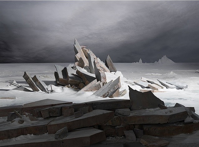
    James Casabere (after Friedrich)


Mishka Henner And Edward Burtynsky


About Henner

Mishka Henner is a Belgian artists who is currently living and working in Manchester,his work is featured within the contemporary arts and working within photography in the internet age,he has been featured in many surveys over time.He studied at Lough borough university and also at goldsmiths college,after he attended school in London he stayed there for a number of years until 2003,he vised Tate modern frequently surveying many documentary photography which to him was described as ‘life changing’.Later on in life he featured on many broadsheet magazines and soon after in 2008 joined panos pictures.He has also been described as a modern day Duchamp,his appropriation of image-rich technologies including ,google earth,street view and also you tube.This is the means of all of his inspiration and where he is seen adopting his print-on-demand bypass to traditional models.This creates a unique sense of works which is inspired by many social medias but also the way in which we love as a group in society through  industrial urban-ism.

Many of his key works are between 2010 and 2015,Henners work is brought to life by the strong engagement of character and nature within his photography. many of his works resulted in print on demand books,films and installations that featured in large scale museum  within France,Canada,and then in the us.He works in the following manner,his new approach of photography is seeing light,photographer without cameras,the need to press the shutter is replaced by a direct interest in images,not necessarily in making images.

Image analysis

title of the pice:OIL FIELDS – Levelland Oil – Gas Field- Texas, Courtesy of Carroll/Fletcher

I chose this image due to the clear though out and interesting composition of the piece itself,all the lines create a strong presence of structure coming from throughout the image,He conceptually wanted to capture the way in which people are continuously walking in a straight created format for themselves and  rarely veering off the path,He took this from a birds eye view angle possibly from google maps and used a strong technological purpose.

ideas I would want to use within my work:

I too would want to take high elevated shots in order too mature lines and a structure within what looks like nature but man made lines’ think it is a clear representation of the path that everyone constantly walks, and how they are in such straight lines and create a parasol form. I think I will use his work more as reference and inspiration and will not do the same technique due to this being very  unrealistic to accomplish without a drone.

Edward Burtynsky

Burtynsky is a Canadian photographer and artists known for his large format photographs of industrial landscapes. His work is now housed in more than 50 museums word wide.He was born in Ontario and his parents then immigrated to Canada in 1951,his childhood is filled of watching ships pass through locks so a very outside oriented childhoood, he also had an interest within many industrial areas and the slow developing urbanism of his life. when he was just 11 his farther purchased a dark room inclusive cameras and manuals from which he practised and become an ammeter photography .he learned how to male black and white prints together with his older sister established small business

I chose this artists because he had a consistent view though all his work and only demonstrated different angles and heI did not change theme throughout. Much like the previous artists he focused very much upon how he can sues suture within all of his work,I again think this is interesting and when possibly will try to find similar scenarios.

Burtynskys most famous work are sweeping views of landscapes altered by industry,mine tailings,quarries,scrap piles, the grand, awe inspiring beauty of his images and is often tension within the compromised environments they depict. He has made several excursions to china and the country toys industrial emergence and the construction of one of the worlds largest engineering project.

To be able to take images like this I will have to get to very high places and then use a wide lens in order to capture accurately the whole ascent of the area itself.I could also do more night time slow shutter speeds and try  to capture  the light traces with all the given road paths because it shows even a more detrimental human inference of technology and building in order for human convenience.

Within this image you can see an architectural  side to the image and also the the structure to the image and the interesting sense of atmosphere that it brings.The green shows the small amount of nature left In the world and how it is now overpowered by the cities and insurable towns that we all live among.

This is my favourite image due to the way in which he uses the interesting and somewhat dystopian feel in order to show a theme of ruins and slow destruction that the human are forming on the earth, his works is done in order to show awareness of global warming and all the negative aspects that we as a society are distilling upon our world.

Ideas for the shoot

I would want to go to many areas such as the dump were there is a large change and a slow deterioration of the green and healthy nature within the environment and how that society and its gradual new buildings evolve so do the effect on the environment and also the people and living and trying to prevent this form occurring.I will only be able to use aspects of this work as I am not able to take images from as high of an angle.