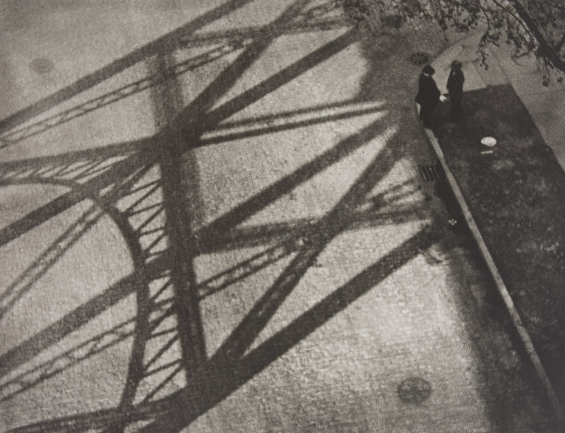
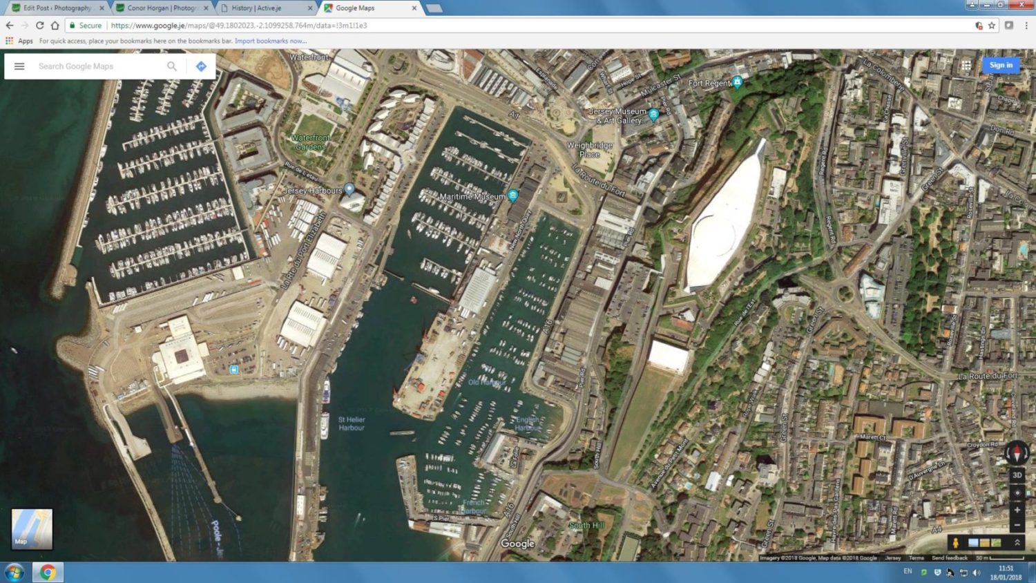
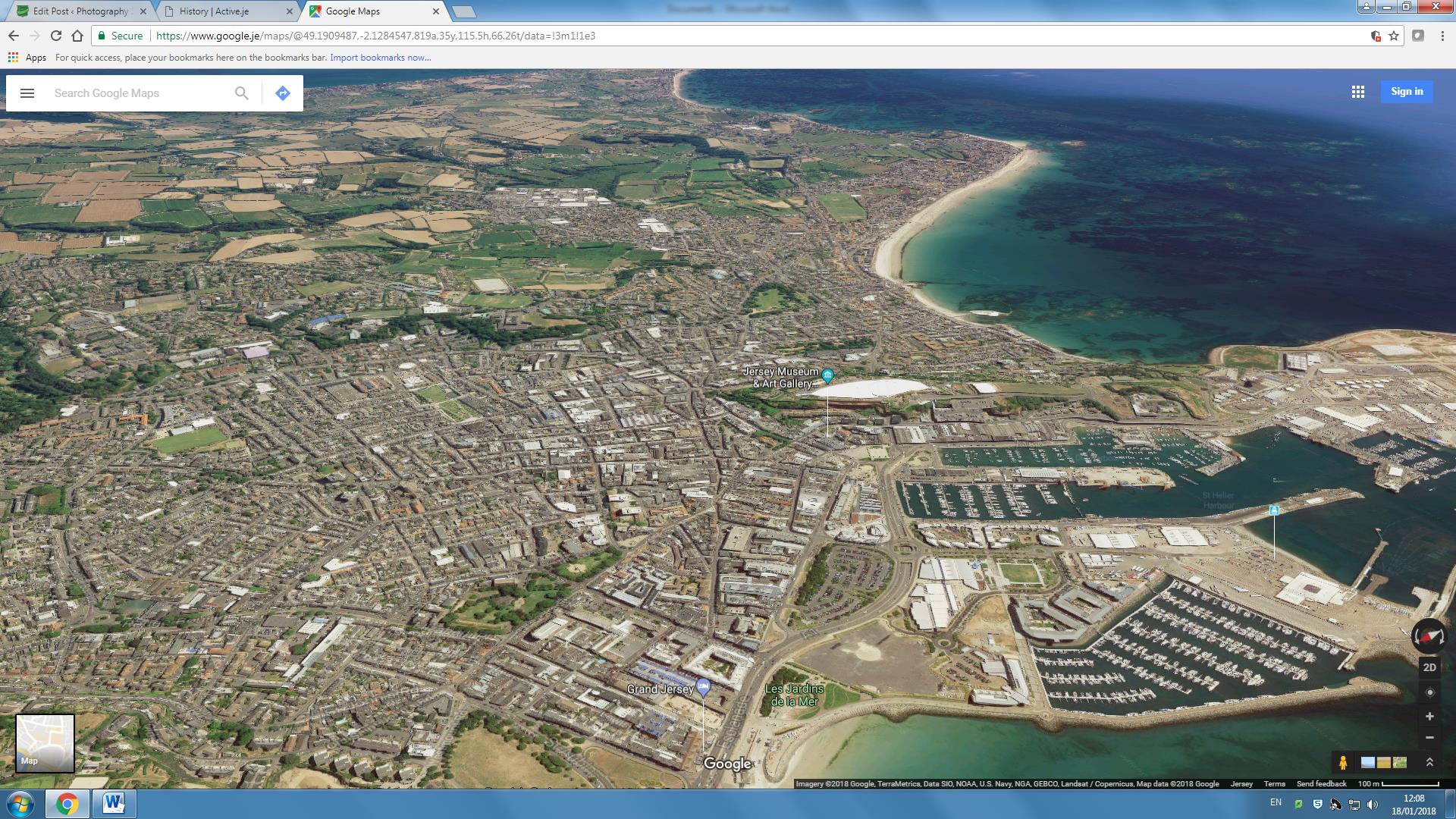
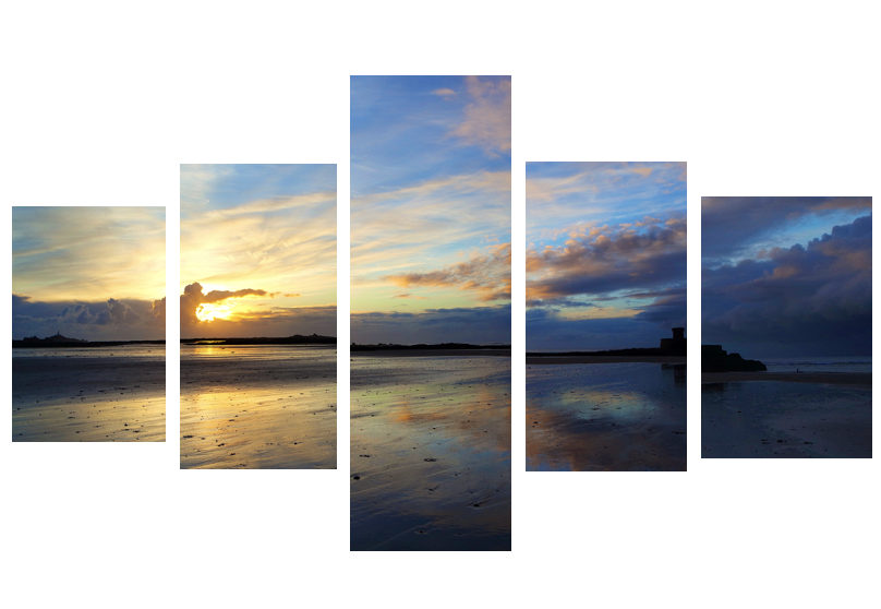
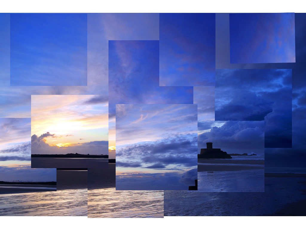
For this shoot I will be focusing on the topic of psycho geography. For this shoot I think I will be mainly working around the areas of town such as Liberty Station and the International Finance Centers, to which through my photography I will need to explore how the place makes you feel and behave whilst exploring and navigating the urban environment around me to examine its architecture and spaces. Some of the photographers that I will be using to help guide me along to adapt to the style of psycho geography are the Boyle Family and Mishka Henner, the style of their work can be seen below:
 From here I thought it would be appropriate to come up with a few ideas in order to help me along the shoot and guide me in what I should be doing. Here are my ideas:

Once I had gathered my ideas I decided it was time to move onto the shoot. Using this mind map to produce the imagery desired I covered the area of town that I had concluded that I would explore in the previous post. These are my results made into contact sheets:


 Once all the pictures of the given area had been taken I decided that I should whittle the selection down to the top ten overall images. This would allow me to come to an easier conclusion on what I thought was the best image taken in the shoot. These were my selected images I thought had the best outcome from the shoot:
Once I had selected my favourite images from the shoot I decided to make it easier to select the final image by cutting the ten images into five. By doing this I could closely analyse the images in further detail and decide from there which is the best. These were my choices:
 I selected this image because I loved the texture created by the shades of rust on a pole. I found that this allowed heavy but effective contrast between the overall piece as all the colors complemented each other making an almost molten scene.
 In this image I found that I particularly liked the contrast between the silhouette of the statue and the dim-lit sky, with the composition of the pole and string balancing out the image as a whole creating a visually pleasing overall piece.
 Once again I loved the use of the colors created by the rust to make an almost volcanic landscape with shades of red overlapping each other. I found the composition of the piece eye-capturing as the more rusted black areas looked like a mountain range captured from a bird’s eye view.
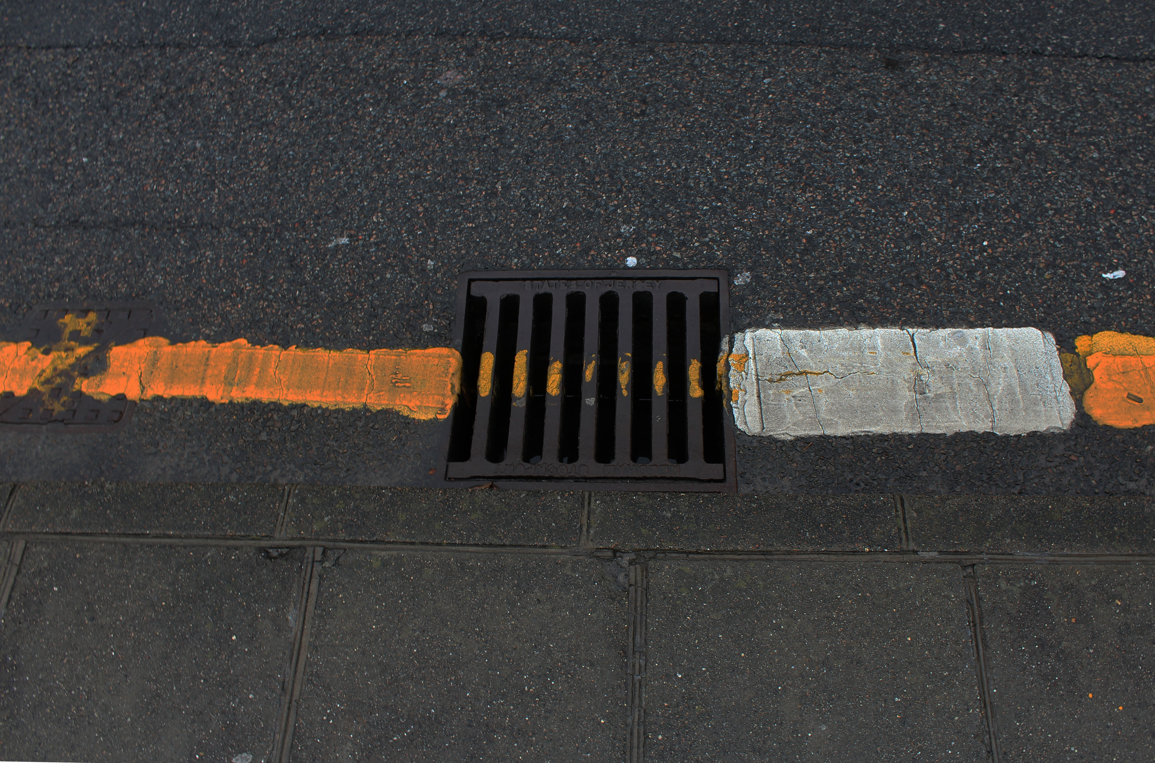
 In this image I tried to capture the way certain streets were looked after within my given area. What I liked about this one was how it incorporated everyday objects as almost ruining and breaking up the pattern made by the pavement through the composition of the paper and cigarettes.
 Finally I chose this picture because I loved the symmetry created by the textures of the floor surrounding the lights making an aesthetically pleasing image. This use of composition I found was most effective from how it drew the eye to the areas wanted through a clear contrast.
Once analysing the images I had decided which image I thought was the most effective out of the batch. This was my outcome for the final image:
I chose this particular image because of how I adored the pattern created by the overlapping colors of the rust. This clear contrast of the blacks against the reds allowed for an almost landscape look effect upon the photo, making it look almost as though it was taken from a plane. The composition I really liked through how the black snaked its way across the image as if it was molten whilst the reds and yellows covered the areas around it.


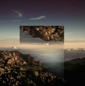


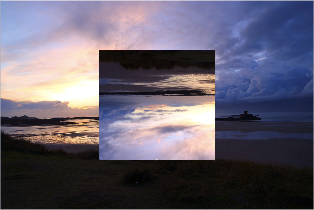
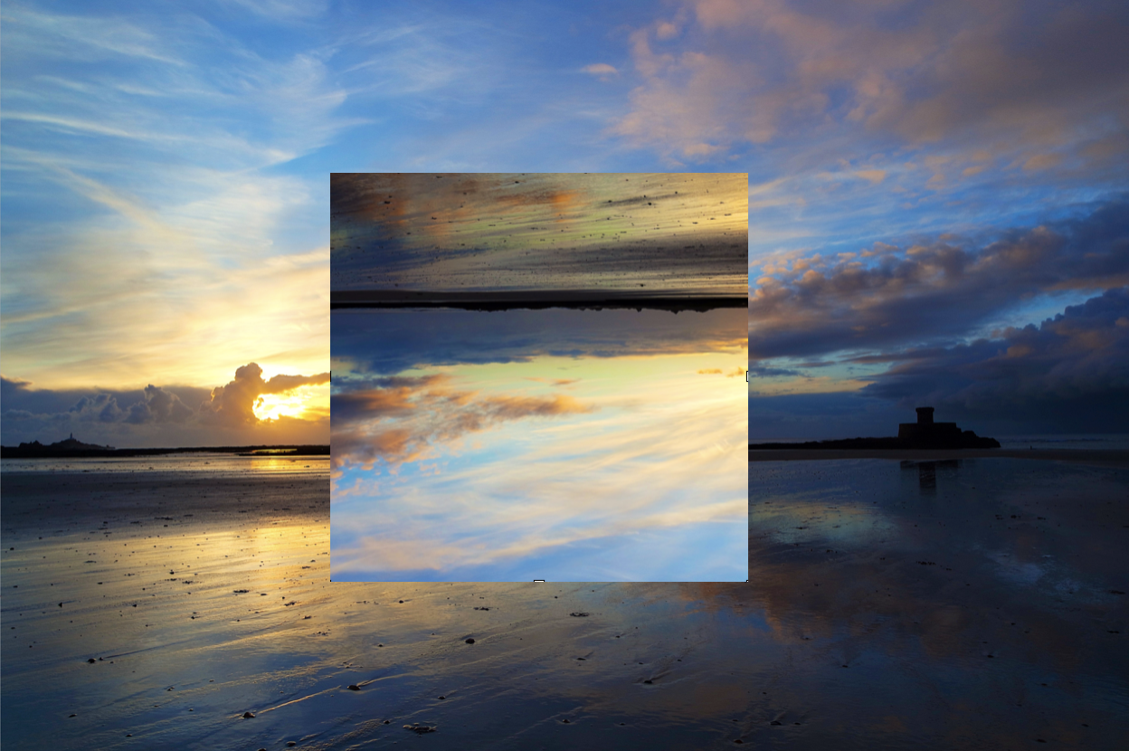
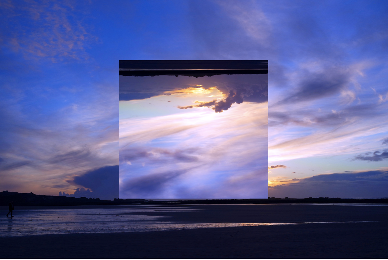
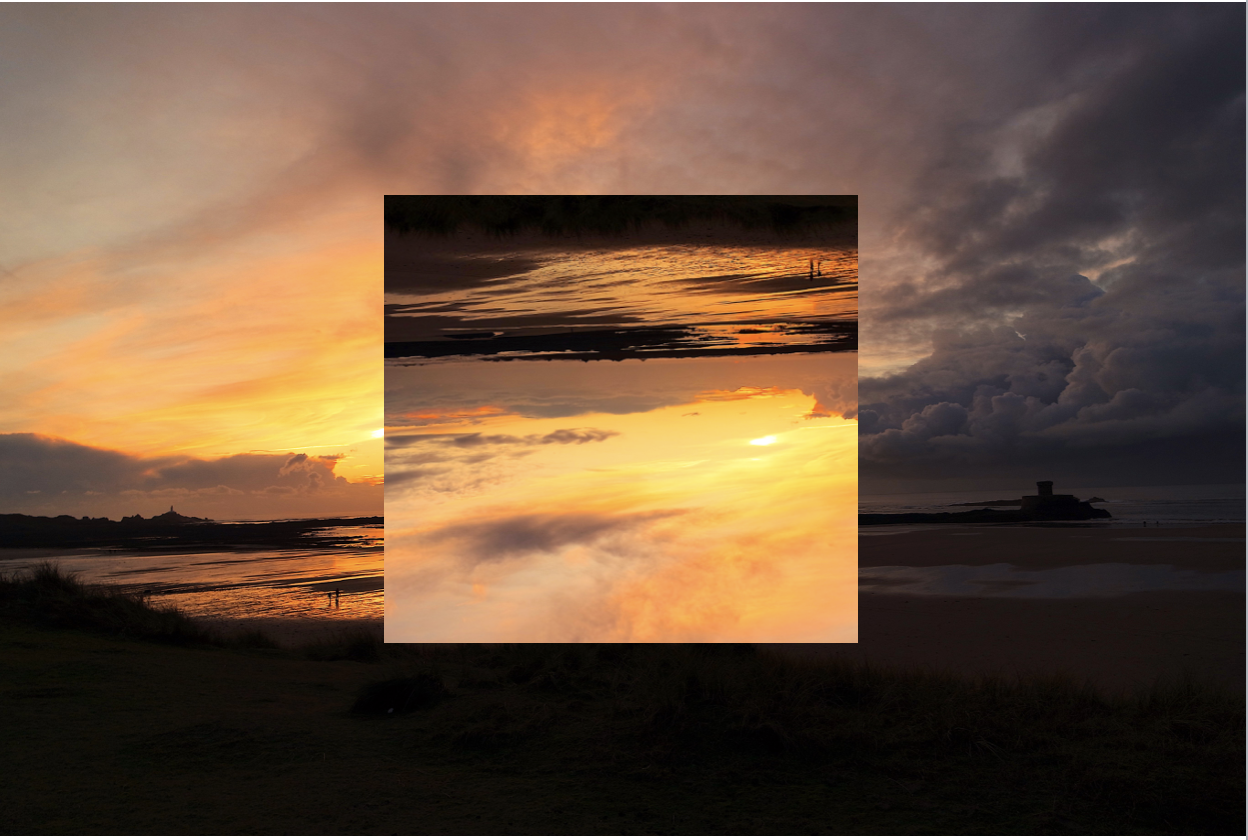
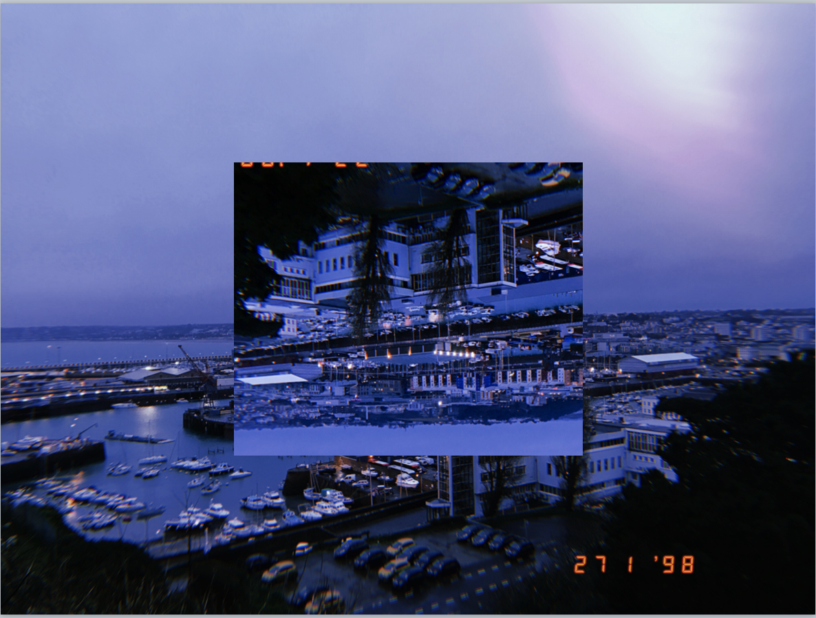

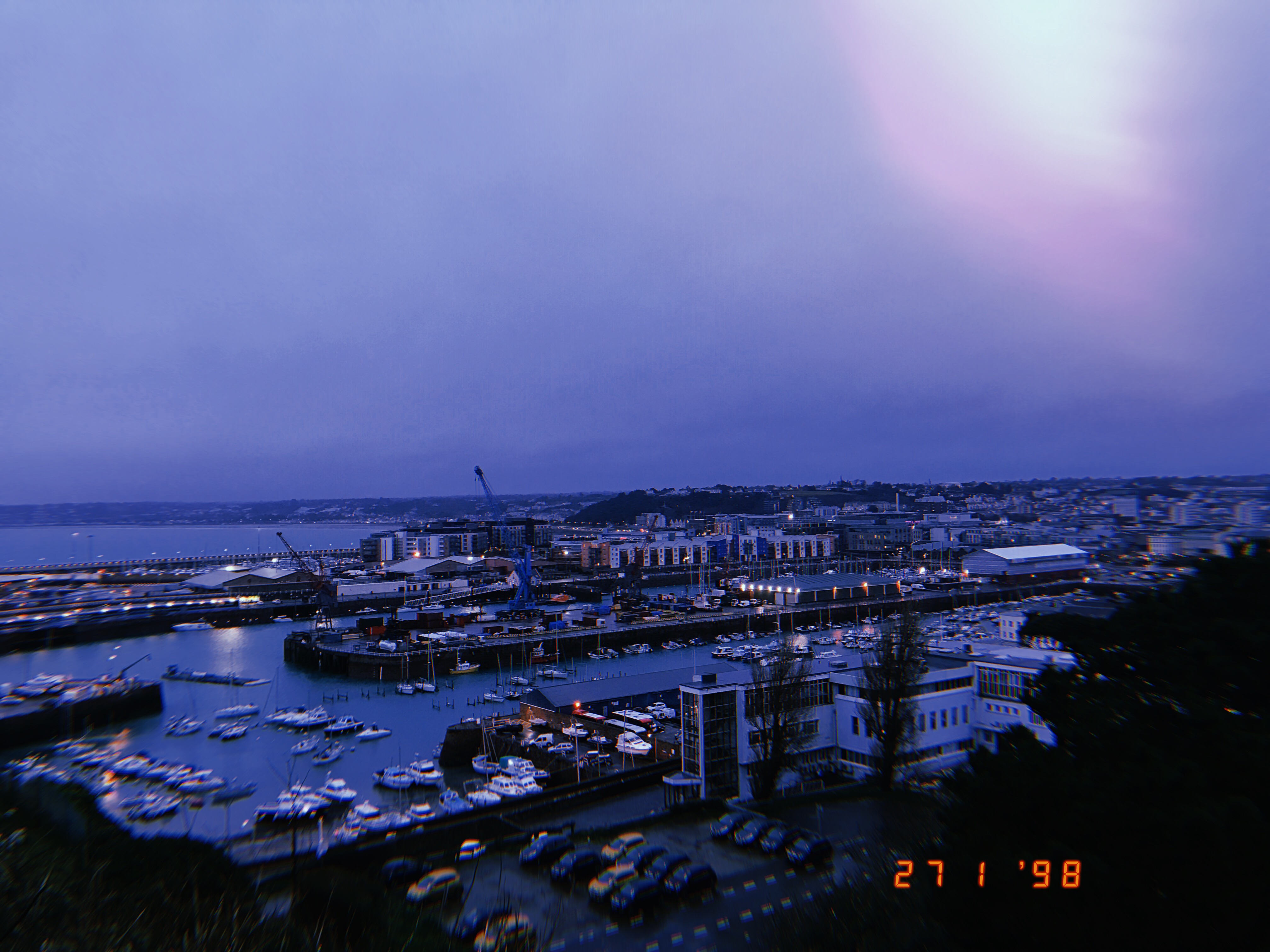





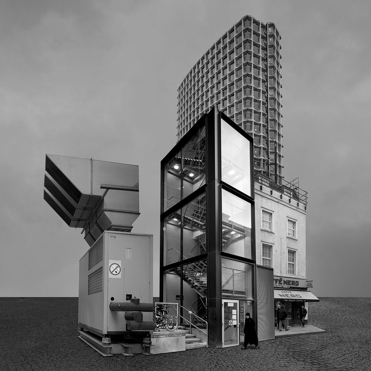
 His images are digitally manipulated photographs of non-existent, fantastical buildings that appear to be real.
 At first, he only made images in black and white, but then he realised that the real world is not b&w but coloured. So since then he has been making two version at the same time. He believes the black and white version is more surrealistic than colour one.




 I want to explore Kensington place and lewis street because most of the buildings on the streets are run down but still functional.
Photoshoot - I planned one afternoon to go out into town and photograph as much as I could. In my chosen area i didn't find as many interesting places to photograph so I carried my photo shoot out even further around town. However, from my chosen place I did find a few interesting places to photograph.
  my three best images -


 These images were based on The New Topographics while I didn't document everything in the area, only what i found interesting and ultimately, avoiding the point of psychogeography.


