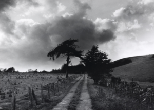
The New Topographics

What is the new topographic?

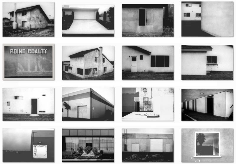
Influential movement of many artists, many of their works documented the handling and evolving of the natural landscape to be perceived as more mediated urban landscapes. New topographic  was a term colonized by William Jenkins in 1975,it was created in order to describe a group of American photographers such as Robert Adams and Lewis Baltz, these are people whose images all had a sniper-like banal aesthetic in that they were formal,mostly black and white print of urban landscape. All the photographers within this movement were inspired by man made  subject matter; this included parking lots, suburban housing and warehouses and were all depicted with beautiful austerity.they were trying to find the beauty within man made landscape and urban areas which were not commonly at the time published.

What is the meaning of this movement?

The eroding of natural landscapes and demonstrating an unease of industrial development within the world. The movement started with an exhibition o this urban work to have a large ripple effect on the whole medium and genre of landscape photography,the wanted to emulate a spirit and atheistic throughout their world, three of the artists within this moment had such a significant impact beyond just within America they  were later  commissioned by the French government. Their work was said to capture “stopped of any artistic frills and reduce to an essentially  topographic state, conveying substantial amount is visual information but eschewing entirely the aspects of beauty,emotion and opinion.”

What is the movement a reaction to?

They wanted to present a critical eye on what American society had become and depicted urban and suburban realities under changes in a detached approach.

How has photography  responded to this moment?

There was a mass movement that evolved from natural landscapes to  capture urban cities and the underlining meaning of the people and aesthetic within this area.It shows how society was continuously changing from beautiful to man made  objects. It presents a literal movement and due to this continuation of movement and cityscape it enables the movement to continually inspire documentation.

What is the sense of beauty in the banal ugliness functional land use?

The functional land use presents an angle of pure unedited sense of beauty and a piece of art which is consciously existing within a community of people and nature.It captures a reflection of people and where they live and a sense of belonging of this importance. Every image conveys information about the area and why it is important to the people present.


The New Topographics

Many of the photographers associated with new topographics  were inspired by the man-made. Parking lots, suburban housing and warehouses were all depicted with a beautiful stark harshness, almost in the way early photographers documented the natural landscape. These photographers included Robert Adams, Lewis Baltz, Bernd and Hilla Becher, Frank Gohlke, Nicholas Nixon, Joe Deal, Henry Wessel and Stephen Short and have influenced photographic practices regarding landscape around the world

Robert Adamas pointed his camera at eerily empty streets, pristine trailer parks and the steady creep of suburban development in all its regulated uniformity.

All the pictures had a similar banal aesthetic, in that they were formal, mostly black and white prints of the urban landscape

-Lewis Baltz made stark photographs of the walls of office buildings and warehouses on industrial sites in Orange County.

“New Topographics: Photographs of a Man-Altered Landscape” was an exhibition that epitomized a key moment in American landscape photography. The exhibition was at the International Museum of Photography at the George Eastman House, New York, and remained open to the public from October 1975 until February 1976 featuring photographers showing the growing unease about how the natural landscape was being eroded by industrial development.  In one way, they were photographing against the tradition of nature photography that the likes of Ansel Adams and Edward Weston had created.

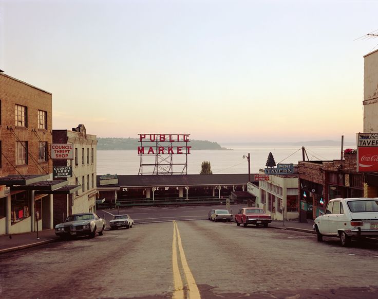
Each photographer in the New Topographics exhibition was represented by 10 prints. All but Stephen Shore worked in black and white. It seemed to heighten the sense of detachment in Shore’s photographs of anonymous intersections and streets.

-Nixon concentrated on innercity development: skyscrapers that dwarfed period buildings, freeways and gridded streets 

LANDSCAPE PHOTOGRAPHY | WEEK 2 | THE NEW TOPOGRAPHICS


New Topographics was a term coined by William Jenkins in 1975 to describe a group of American photographers (such as Robert Adams and Lewis Baltz) whose pictures had a similar banal aesthetic, in that they were formal, mostly black and white prints of the urban landscape…
LEWIS BALTZ
Many of the photographers associated with The New Topographics including Robert Adams, Lewis Baltz, Nicholas Nixon and Bernd and Hiller Becher, were inspired by the man-made…selecting subject matter that was matter-of-fact. Parking lots, suburban housing and warehouses were all depicted with a beautiful stark austerity, almost in the way early photographers documented the natural landscape. An exhibition at the International Museum of Photography in Rochester, New York featuring these photographers also revealed the growing unease about how the natural landscape was being eroded by industrial development.
STEPHEN SHORE

The new topographics were to have a decisive influence on later photographers including those artists who became known as the Düsseldorf School of Photography.

WATCH THIS …New Topographics

Photographing Urban Landscapes

  1. Research and explore The New Topographics and how photographers have responded to man’s impact on the land, and how they found a sense of beauty in the banal ugliness of functional land use… 
  2. Create a blog post that defines and explains The New Topographics and the key features and artists of the movement.
  3. ANSWER : what was the new topographics a reaction to?
  4. Choose from…ROBERT ADAMS, STEPHEN SHORE, JOE DEAL, FRANK GOLKHE, NICHOLAS NIXON, LEWIS BALTZ, THE BECHERS, HENRY WESSEL JR, JOHN SCHOTT ETC to write up a case study that will inspire your own photography.
  5. Analyse some key imagery carefully and show your understanding of the  TECHNICAL / VISUAL / CONCEPTUAL AND CONTEXTUAL ATTRIBUTES OF THE IMAGES YOU HAVE CHOSEN TO DISCUSS
  6. Here are some other suggestions that may stimulate your imagination  / Starting points for YOUR OWN photo-assignments THIS WEEK…

    • Scrapyards, building sites, cranes, restoration yards, derelict ruins
    • Stadiums, floodlight arenas, staircases
    • Motorways, railways, runways, dockyards
    • Circuit boards, pipework, telephone poles, towers, pylons, skyscrapers
    • Shop displays, escalators, bars, libraries, theatres and cinemas
    • Gardens, parks, playgrounds, swimming pools, man-made beaches

    Possible titles to inspire you and choose from…

    Dereliction / Isolation / Lonely Places / Open Spaces / Close ups / Freedom / Juxtaposition / Old and new / Erosion / Altered Landscapes / Utopia / Dystopia / Wastelands / Barren / Skyscapes / Urban Decay / Former Glories / Habitats / Social Hierarchies / Entrances and Exits / Storage / Car Parks / Looking out and Looking in / Territory / Domain / The Realm / Concealed and Revealed

EXTENSION TASK

Look at how the New Topographics approach has inspired landscape photography and we document our surroundings / the way we are using and transforming the land.

You should look at photographers such as…

Research a selection of these photographers and respond with…

  • similar imagery from your own photo-shoots / image library
  • analytical comparisons and contrasts
  • a presentation of final images

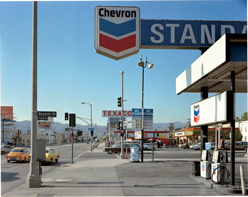
Stephen Shore, Beverly Boulevard and La Brea Avenue, Los Angeles, California, June 21, 1975, 1975, chromogenic color print

Analysis starters

  • Foreground vs background | Dominant features
  • Composition | low horizon line | Square format
  • Perspective and detail / cluttering
  • Wide depth of field | Large Format Camera
  • Colour | impact and relevance
  • Nationalism vs mobility vs isolation
  • Social commentary | The American Dream ?

Edward Weston

Born on the 24th of march 1886, in Highland Park, Illinois Edward Weston spent most his time in Chicago. At the age of sixteen be begun to take photos after his father got him a bulls eye 2 camera he took photos of the parks of Chicago. His first photo was published in 1906 and after this he moved to California and worked as a surveyor. After this he spent time as an itinerant photographer traveling door to door photographing anything of interest. The combination of Weston’s stark objectivity and his love of nature and form gave his still files, portraits and  landscapes, qualities that seemed particularly suited for expressing the new American lifestyle and aesthetic that emerged from California and the West between the two world wars. in 1932 he joined a group along with Ansel Adems, Imogen Cunningham and other photographers called f/64, the group worked together to create an exhibition. 

Dunes, Oceano, 1936 (47SO)

Textual: This photo has been taken with natural lighting due to it being a natural landscape, there are some very dark shadows which suggest the sun was bright and high in the sky. The image has a very high contrast however most of the photo is a light grey colour. which helps the texture stand out.

Visual: It is a black and white photo which is relatively bright however does have some highlighted and shadowed areas. the texture in the sand in the foreground is detailed and shows a pattern, however as you go up  and towards the mid ground the imaged the patterns become more fine and hard to see. Each layer of the dune looks different which helps them stand out and look different. The image is full of lines, for example at the top of each dune there is a shadow which helps define it and creates depth in the image.

First Landscape Photographs

Planning

Camera Settings – I will use a fairly low shutter speed of 1/20 to 1/30 to allow more light to enter the lens from the darkening environment of the sunset. Along with a low ISO of 100 or 200 to keep the image high quality and to have a dark tone in the photograph. I will use a deep depth of field to ensure the whole photograph in in focus.

Lighting – I will use natural lighting from the golden hour before sunset for the photographs.

Location – I will do my shoot at Greve de Lecq.

Context – I will be using black and white, contrasting photographs in order to capture photographs in the style of the romantics.

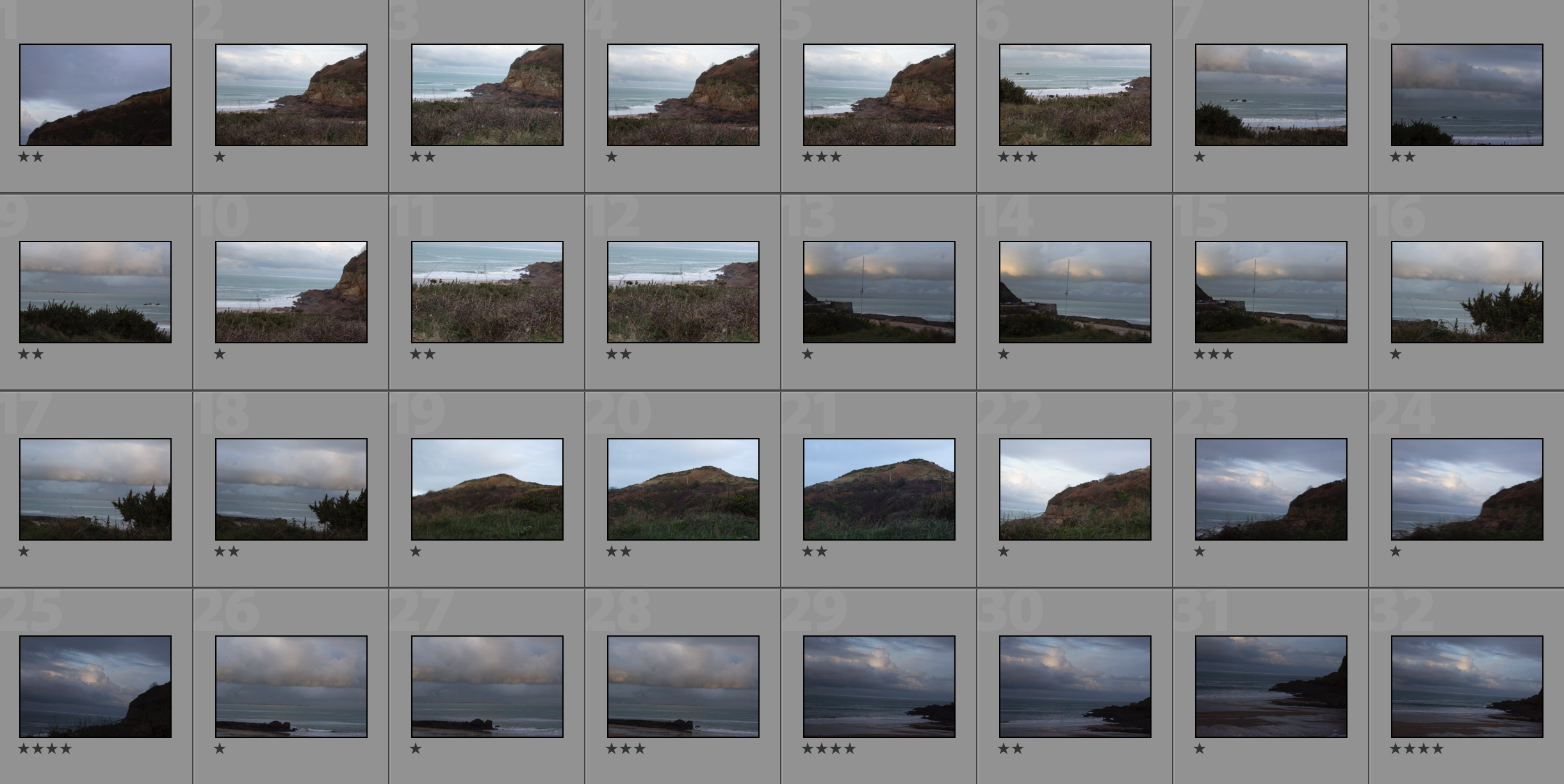
Raw Photos

My Edits/Top 5

The Editing Process

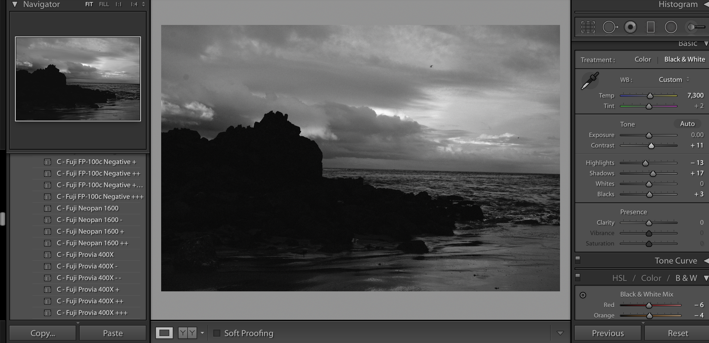
I started off my editing process by using the custom white balance tool to find the correct white balance for the photograph (tool is the eyedropper tool on the right).I then applied the filter Fuji Neopan 1600 to create a strong, contrasting photograph that emphasises the shapes. I then adjusted the shadows, highlights, contrast, brightness and whites and blacks in order the fine tune the photograph.
My Top 5
My Favourite Photograph

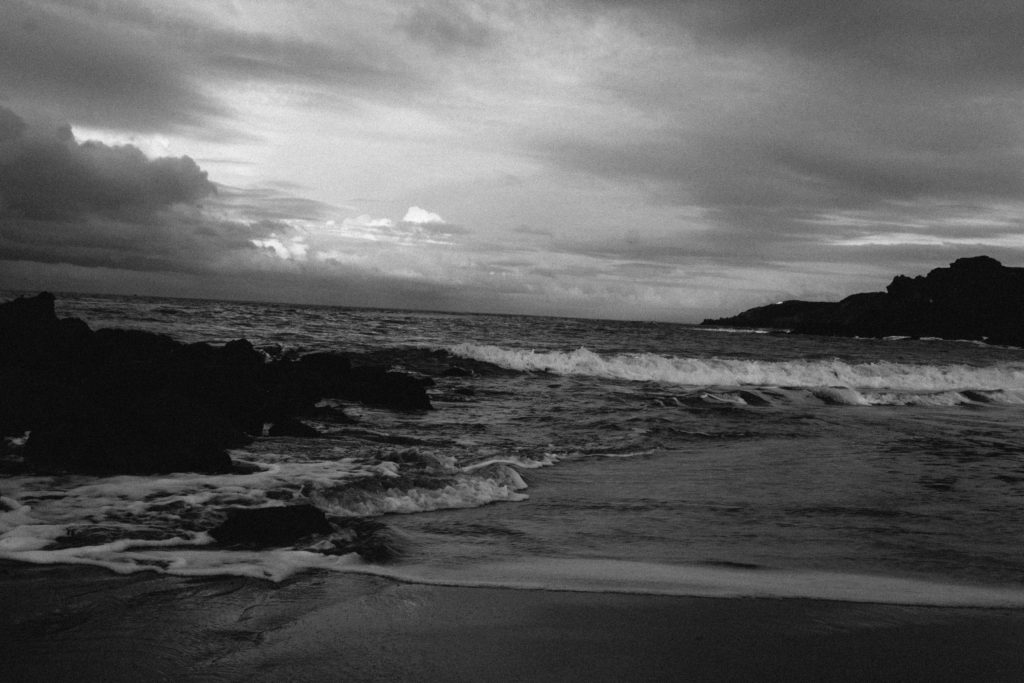
For this photograph, I used natural daylight from the golden hour before sunset. This helped to create a darker image with more contrast, drama and a wider tonal range. I used a deep depth of field in the photograph to ensure that the whole of the photograph was in focus. I used a slow shutter speed of 1/20 to capture the photograph to ensure that enough light entered the lens from the dark environment. I used this along with a low ISO of 200 to make the photograph high quality but dark to create a dramatic photograph in the style of the romantics.

There is no colour in this photograph, only black and white. This is because of the style of the Romantics, their photographs would be contrasting black and white photographs with lots of drama within them. There is a wide tonal range in this photograph ranging from the darkness of the rocks to the whiteness of the crashing waves, this adds even more contrast and mystery to the photograph. The texture of the clouds and sea shows quite clearly in this photograph, this creates a more realistic image. There is also a 3D effect in this image; the layers of clouds can be seen over the sea, this is further done by the texture in the photograph. There are three horizontal lines in the clouds and sea in the centre of this image, this pattern leads the eye to it due to the aesthetic of it.

This photograph was taken in the style of the Romantics. It involves a strong black and white with high contrast as this is typically what was in their photographs. The setting is also Romanticism inspired; the Romantics would picture raw landscapes without any signs of civilization around.

The concept behind this photograph and Romantic photographs is that it helps to show the scale of us. It shows how big and mysterious the world is and how we are just one mark on it at one small point in time. It shows that there is a meaning behind everything and aesthetic behind everything, even if it doesn’t appear so.

romanticised landscapes final images

Final ideas for my shoot:I was inspired by Ansel Adams and Fay godwits work, this is due to the way they both dramatically emphasised the amount of beauty but also movement and sense of attention within their piece,They continually did this by their high or mid perspective.Also the use of their dark contrasting tones wihtin the pieced how they continually evolve and move throughout the piece in order to show a sense of unity to the piece as a whole. Furthermore I was also inspired by the way in which they all used lines in order to draw a sense of direct view to a specific part of the images altogether.

when taking my images I focused  more upon the dramatic Skys and a contrast of softer Skys and an idealised beauty compared to a power possessive sky.I also had an aim to to take images of the landscape and direct lines continually going through although these were not my strongest outcomes.I edited the images with some in colourful saturation and others in more tonal ranges to show a large to relation to that of the artists.I did look for many leading lines and I was able to find some but they did not correctly show a continuation in the way I would expect so were not as successful as the coastline images.

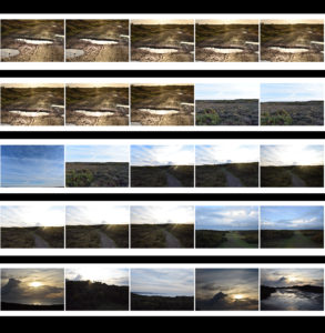
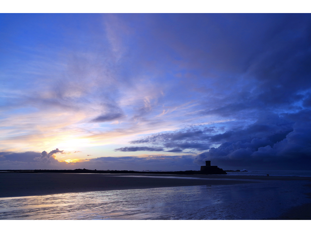
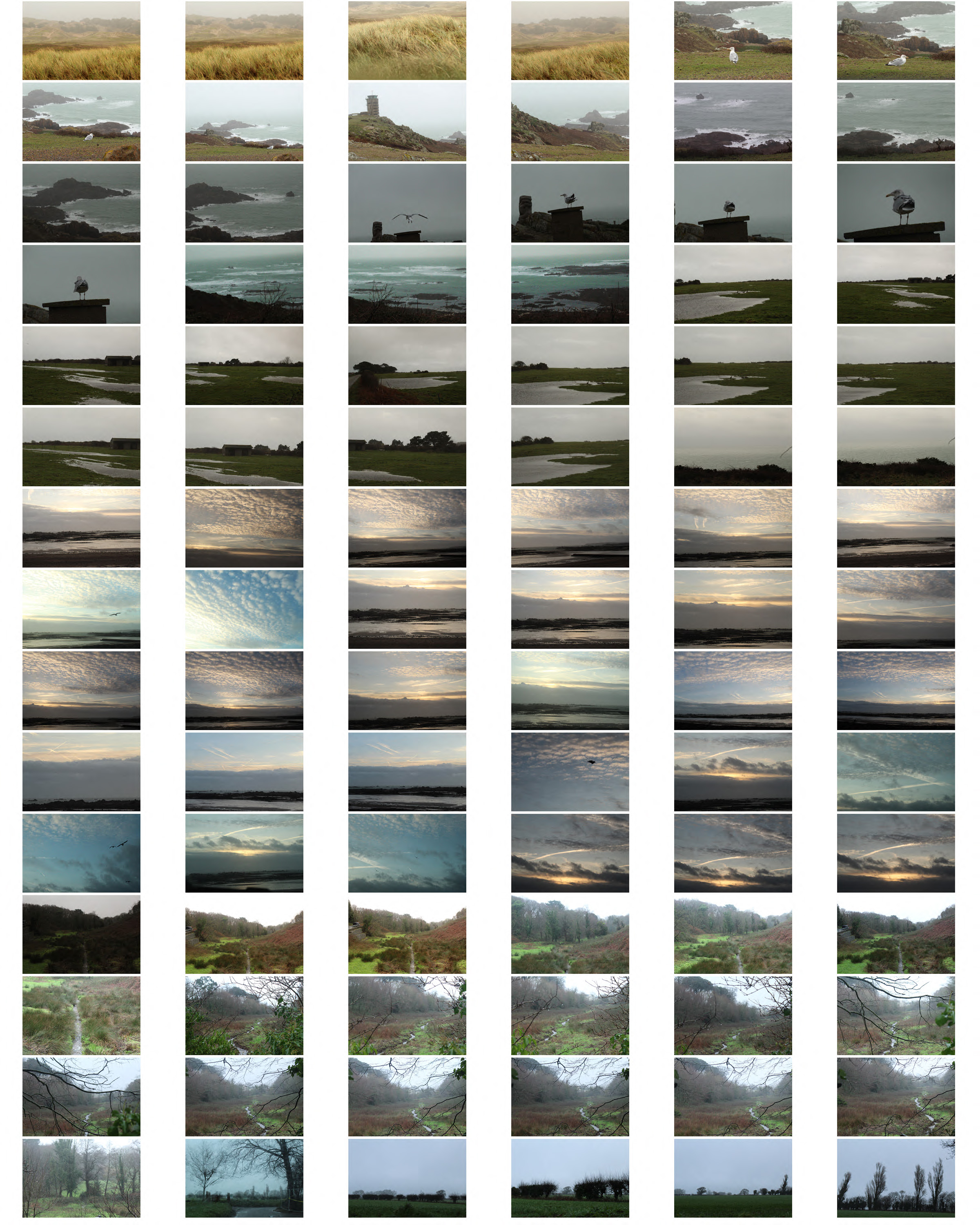
Above you can see the contact sheet of green landscapes and also the different angles of sunsets.I chose to take the photos at golden hour in order to see the changing and dramatic colours but also the darkness approaching from the right side within my images.It brings a warmth to many of the images and a great depth of colour.

you are able to see the before and after previous to editing the images and how I was able to enhance the colour to show a better detail of clouds and how to allow the reflection to be more vivid in its tone.

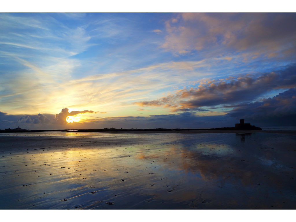
Here you are able to see I edited my images by enhancing the saturation and the colour of the piece,I chose to enhance the colour due to being able to see more drama and a stronger contrast between sides of the image, the juxtaposition of the lighter left side and the dramatic clouds and castle on the right.Additionally I edited the image this way due to the mirroring effect in the water surface and it looks as if a continuation of the sky.

I wanted to use the weather to evoke a sense of atmosphere snd emotion,I wanted their to be a relationship fo love within the coloured image and a sense of movement of light and attention,this is due to the stereotypically romantic choice of lighter colours and also how the sun is used to enhance from a stutter and the reflection of the sea shows a sense of peace altogether throughout the image itself. My aim was to capture the coastline and the sand dunes and how they are continuously evolving to capture different compositions and effects of light. 

overall I think this is my strongest image due to the lens of illusion and gradually forming power throughout the image.I wanted to show an understanding of reflections rising  the composition of the piece and how light can be used to suggest from and also movement to the piece itself.I took this image knowing I wanted both the light sense of warmth and other the authority of the castle and harsh clouds I used the technique of getting very high but lowering my camera so everything in the image looks level but additionally only capturing the reflection and the sky itself. I enhanced the exposure so the light so was able to progress throughout the image and used a wide angle lens in order to capture the whole angle of the image and see the size and power .These images are successfully romatisized landscapes although not edited within similar style due to the colours further down I edited my images tonally with a warmth in order to emphasis the artists styles too.  within the images above I wanted to capture a romanticised landscape in a much more vivid and and poetical extreme of colour caught within the golden hour, although I also wanted to capture a sense of clam that will soon be abounded due to the oncoming stormy strength of the high side and cloud formation.

These last images I edited in order to show the light and dark within the image and show a stinger relationship to the artists themselves. It connotes a much more stormy atmosphere all together but still effectively shoes the beauty within the landscape,the cloud in the last piece has such. strong depth and overwhelming power throughout the piece itself ,this was important because contextually it commands attention and shows how one beach can have such beauty and also dominate representing the power that nature has over people.

Homework 1- Romanticism in Landscape photography

To explore romanticism i planned to visit 3 different places on different days so each image was varied with a different setting and weather. I planned to show an interest in the natural world, taking inspiration from Fay Godwin creating careful compositions and control over tonal values, light and atmosphere.

For this photograph I tried to find a path or stream to be in my image with a natural setting. I focused on the branches in the foreground of the image and left the background more out of focus emphasising the misty environment which creates more atmosphere in the picture. Fay Godwin photos mainly consist of natural environments with trees, fields and beaches which is where I went to take my images.
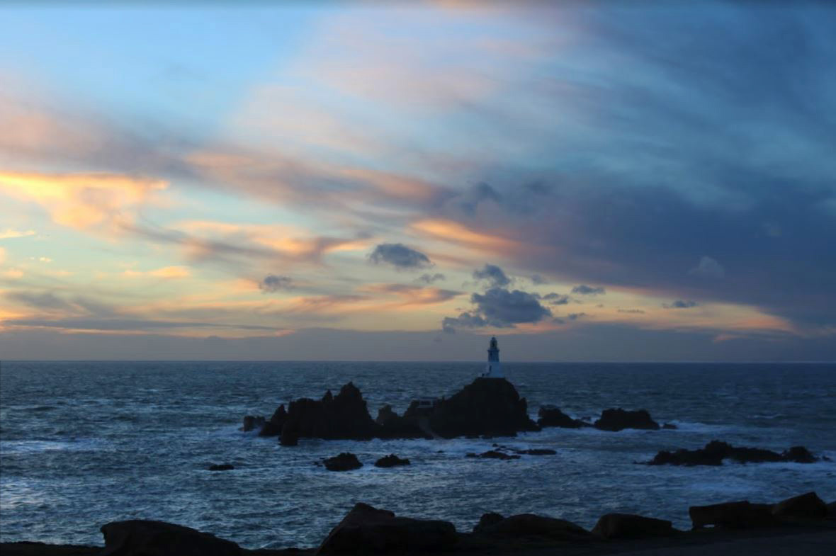
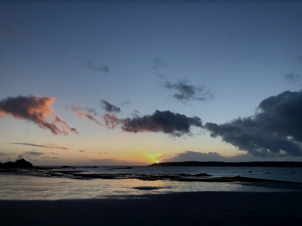
For my second photo shoot I decided to take my images around sunset creating a more romantic setting. Both images have clouds making them more atmospheric and interesting.  In the first photo I decreased the exposure to make the sea darker which emphasises the white and the rocks in the bottom half of the image. In the top half of the image i did not decrease the exposure, but did increase the contrast slightly and adjusted the levels to make the image more effective.

I also tried, when on one of my photoshoots, to take a panoramic on my phone to get a elongated field of view an dot get  wider view of the environment

Panoramic Photography:

Panoramic photography is a technique that stitches multiple images from the same camera together to form a single, wide photograph (vertical or horizontal). The term “panorama” literally means “all sight” in Greek and it first originated from painters that wanted to capture a wide view of a landscape, not just a certain part of it. The first panoramic photographs were made by simply aligning printed versions of film, which did not turn out very well, because it was close to impossible to perfectly align photographs. With the invention of personal computing, advancements in computer software and digital photography, it is now much easier to stitch digital images together using specialized software.

Fay Godwin

Goodwin was born in Berlin,and was the daughter of a British diplomat who was married to an american artist.In her later work of photographing writers she too married one called Tony Goodwin,and then later had two sons.later on in her life she become very ill in which she blamed drugs making her weaker every day. Goodwin then died on 27th May in 2005 at the age of 74

Fay Goodwin is the artist in which I am going to focus my attention of methods onto .Goodwin moved to London in order to become a portrait artist and even more significantly in order to capture famous artists and writers.Typically she captured the people in her own home and even soon herself became a published author.Her book was based upon the oldest road and ridge-way and so making her also a prolific landscape and the nations best known landscape photographer and was critically acclaimed for her early and mature work by the sens of ecological crisis present and how it made a Adriatic difference in the 1970’s. Later in her career she also started taking many images of natural forms and had many major exhibitions that toured nay areas around the world.

I chose Goodwin due to her stunning black and white landscapes of the coast and countryside and how this would be achievable to re-create and expand on in jersey.she was continually inspired when walking around and her pursuit of landscapes have taken her to highly remote areas of the British landscape but no doubt producing many beautiful pastoral scenes and contrasting urban landscapes.To me the way in which captures color and light within her images.Many of her work are captured within woods or well known british landscapes.

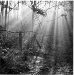
This is my favourite piece that Godwin has produced.I chose this piece due to the way in which the light captures the presence of nature and highlights the detailed aspect of the image,  furthermore the way in which the light also has a sense of structure in the image itself.You are able to see the contradictions line wihtin the tress that form a delicacy to the piece and how this is juxtaposing to the more rugged and textured floor but how this then continues to operate into the light, it purposes almost a path to the image that is highly successful.

contextually,the artists within this image had a scenic is to capture the light within what is stereotypically perceived as a dark and fluently feared section of a wood, she wanted to demonstrate the natural beauty in hick we live and the landscape that had a man made gate but how this has a removal from the relationship within nature and society.It emphasis how we should be placed together and how this would create a world with much light and jovial living.Techniqually:the piece was taken very accurately in order to capture the light to cover and produce lines over the whole of the image.The purpose, it was taken to show the natural beauty within landscapes and how people have to look to find the beauty in which they are continuously surrounded by

mind map:I chose the following images because I thought they successfully reprinted the way in which the photgoher capture the beauty and essence of landscapes but also the drama of Romanism wihtin the sky.She continually has an interesting main fetaure of the image weather that be lines or circles or a large dark juxtaposing tone.

Ideas I want to use in my work:

throughout my work I too want to capture the way in which she uses light to create a from and also enhance the image throughout its detail and overall finish the composition as a piece.Secondly I want to so many of her works the have a long lead of extension and a road but show a tree or an obstacle in the way, this is due to the way in which it draws attention to a specific aspect the piece but also shows a dynamic sense of dynamic composition  of lines and thirds within the piece. Much like my previous  artist Ansel Adams I will to edit the images to have the same contrasting tones of darker and lighter throughout.


Romanticism Photoshoot Response

In this shoot I will be focusing on photography surrounding Romanticism. To help me with my shoot I will use Fay Godwin as my influence from a photographer, I chose her because of how her photography uses much of the scenery seen in Jersey and so could use her techniques to provide guidance on what to take as seen below:Image result for Fay GodwinBefore taking the shoot I wanted to pull some ideas together on what to take, allowing for a guideline to my photos, this was my outcome:

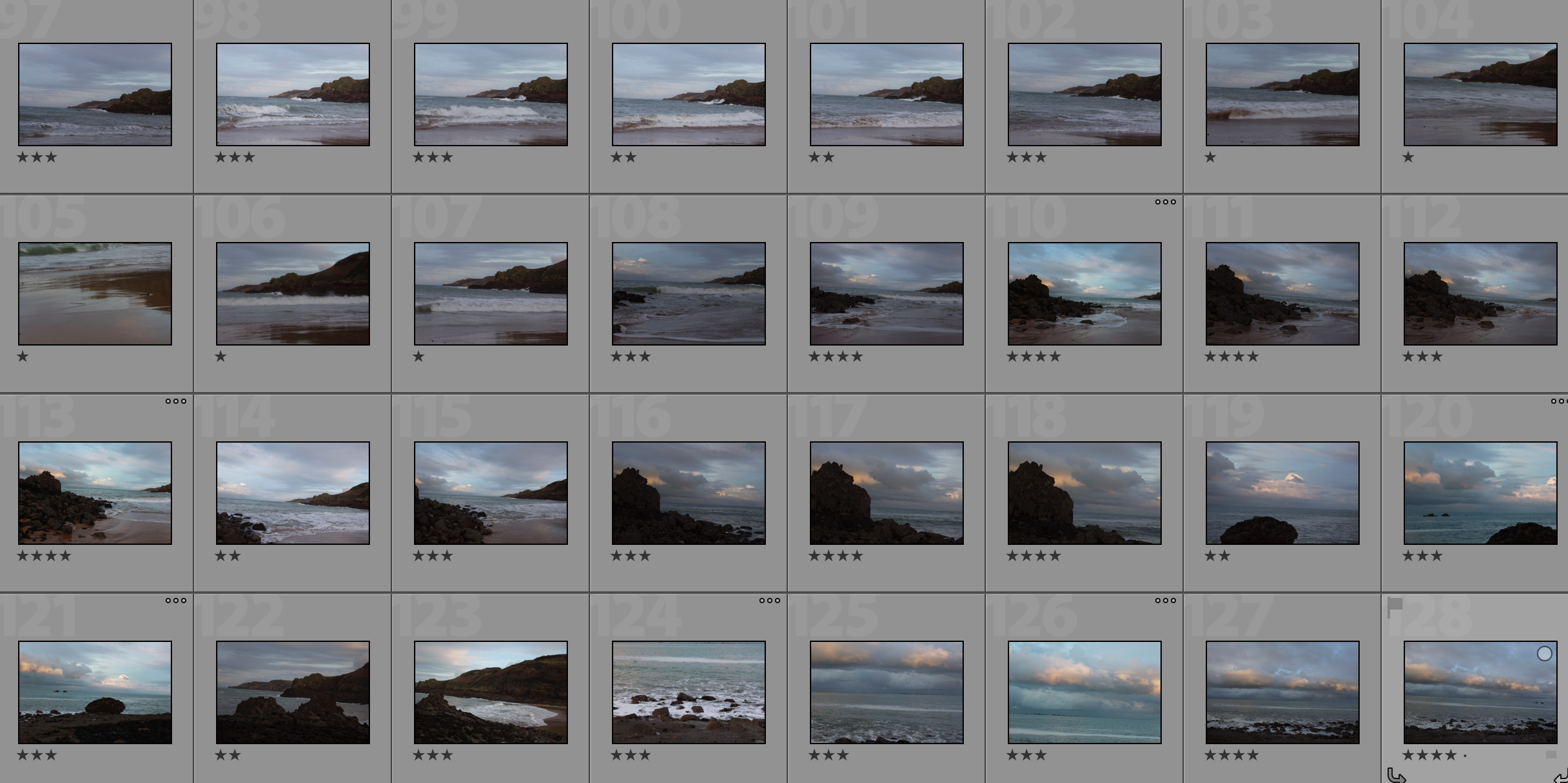
Once I had a general idea on what I could do for the shoot I finally moved onto the images themselves with these being the outcome:
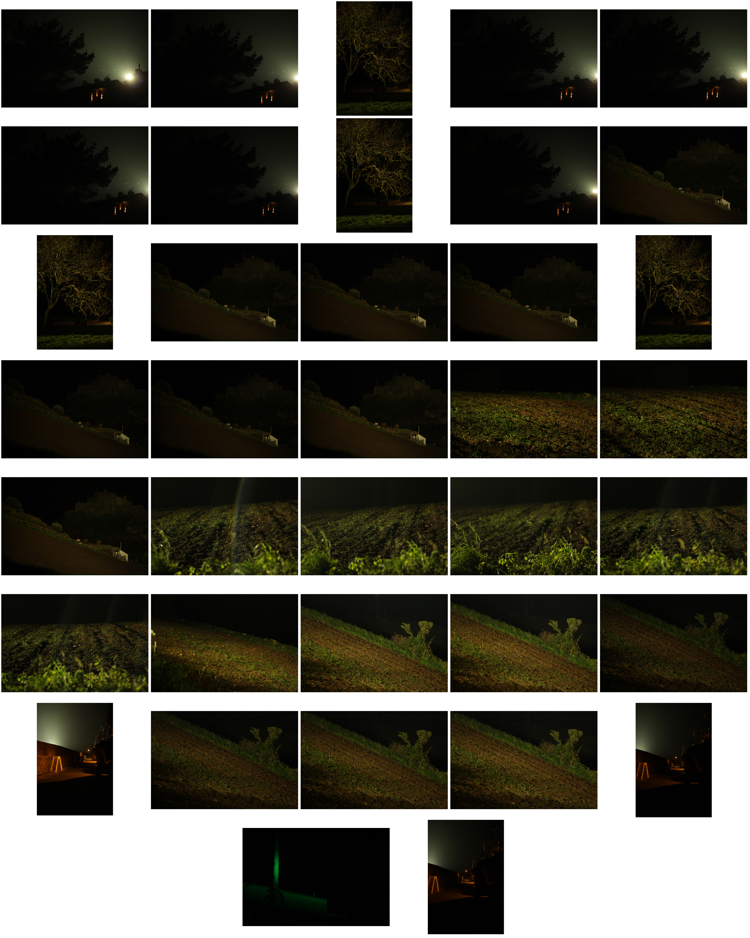
From the photographs I decided on, I made a selection of ten images that I thought presented my best imagery from the overall shoot on the topic of romanticism. These were my choices:

I chose these images because I thought they popped out from the rest of the shoot, and had a greater understanding of what romanticism in photography was about. I found that their vivid colours and use of depth of field made them particularly effective. From here I wanted to whittle my selection down to just five images to really provide a clearer insight into my final image for the shoot. This is my selection:

I chose this image due to how I loved the effect created from the back light that was meant to illuminate Gorey Castle at night, that instead silhouetted the housing and trees around it, creating an aesthetically pleasing result as an outcome. And with the slight use of red and oranges from the housing I though it really balanced it out.
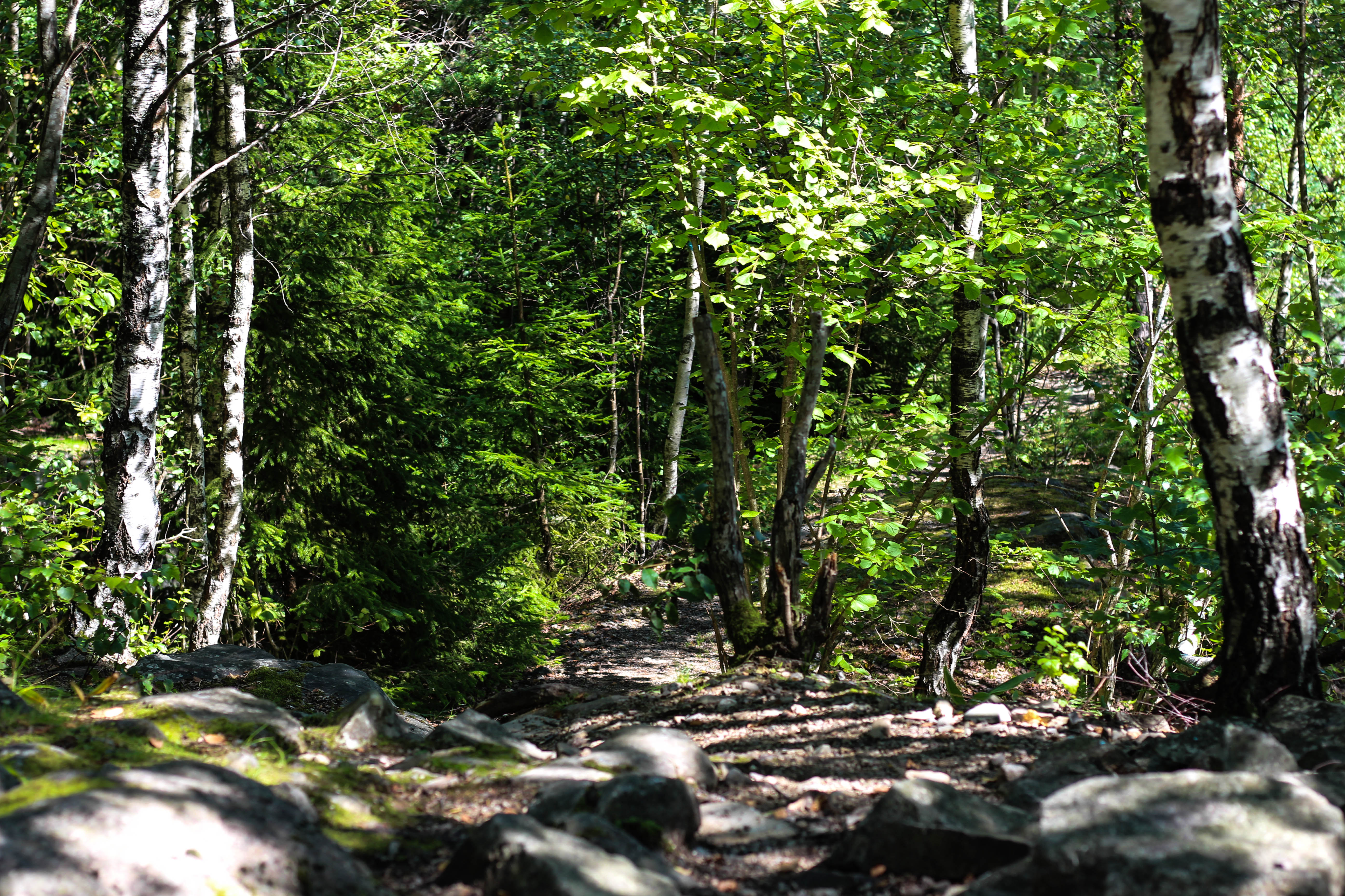
What I loved in this image was the use of the depth of field, this created a focus on a certain section of the woods which instantly drew the eye through the use of its vivid greens. Within the image I used Photoshop to enhance the greens within the image to make it more suited to the theme of Romanticism with the expected outcome as desired.

I found that this images use of contrast between the light provided by the lamps created an aesthetically pleasing photo. This was because of how by making the oranges within the picture more vivid, it emphasised the shadows created by the surrounding boats, thus drawing the eye instantly to the soft glow of the lamp centred in the middle of the picture.

The gradient created by the sky I thought particularly allowed for a romanticism theme. This was because of how the majority of the image was made up of the slow but constant changing of shades of blues into yellows, with only a small percentage made up by the landscape. I found that by darkening the ground it created a greater effect onto the sky due to an emphasis to the colours.

What I loved about this image was the composition and the dark and grim colours. This is because of how the skeletons of the trees create a sinister but beautiful effect on the pathway through the middle of them, with unclear imagery of people in the far distance. I also liked the use of depth of field as well due to how the trees slowly faded and merged into one collective backdrop, whilst maintaining the desired look.

After analysing each of the five images, I decided to come to an overall decision on the final piece from the selection. This is my final choice for the best image out of the shoot:

I chose this as my final image because of how I loved the contrast created by the floodlights to Gorey Castle. I found that through this it completely emphasised the silhouettes of both the tree and the house in a sinister but fascinating way. I also liked how the floodlight captured by the camera is seen as a circular gradient in which slowly fades into darkness, with the three red lights being there to balance out the image as a whole and not let the black overpower the piece.