JOHNNY JOO – Altered Landscapes

Johnny Joo gives the world a glimpse of places long forgotten through the lens of his camera. He is a photographer by trade but an urban explorer at heart. The scenes he shares are covered in weeds, moss and cobwebs. They serve as an eerie reminder that nothing lasts forever.Related image

Joo cautions that viewers should appreciate the subjects of his incredible photos but keep them in mind also as examples of humanity’s wastefulness and the impact society has on nature.”It’s really important to think about just how much we leave behind,” the 25-year-old Mentor native said. “I want to try and make a change in the way people think.”

He’s photographed abandoned malls, stadiums, schools, hospitals and houses. His pictures from inside Mike Tyson’s deserted Ohio mansion and the decaying Geuga Lake Amusement have gone viral on the Internet.

Image result for johnny jooImage result for johnny jooImage result for johnny joo

Photo Analysis

Image result for johnny joo

This photograph is a true representation of the past. It represents a discovery of forgotten things which brings a realization that this place was someones past; the history of lives we never even knew. There is great use of leading lines and depth of field within this photograph. The layered chairs, which represent a sense of structure which once used to stand, helps to draw the audience to the daylight in the distant windows. I believe this small amount of natural light represents a feeling of hope that is left about the building. The carefully positioned chairs create a strong contrast and juxtaposition to the rest of the building which is completely wrecked and derelict. This use of contrast may be a reference to the atmosphere which once was present to how it appears to be now. Personally I see these this photo as a missed opportunity to help those who don’t have a place to call home such as the homeless.

Beomsik Won

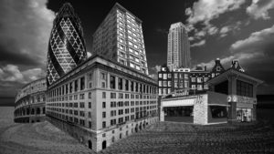
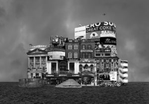
Beomsik Won takes photographs of urban buildings from different times and spaces, breaks them down into segments using digital techniques, and constructs collages to create familiar-looking, yet imaginary buildings. To make these “Archisculptures” as it is called, he carefully combines the segments taking into consideration the architectural size, space, and formative elements; he then places them against simple backgrounds, and lastly adds people or birds for the viewers to guess the size of the building. Although these strange buildings are products of the artist’s imagination, they show various styles of architectures throughout history.

My response to Beomsik Won.

Case Study: Tyhe Reading

http://www.tyhereading.com/

Tyhe Reading is a professional photographer and graphic designer located in Melbourne, Victoria. With a focus on sustainability, Tyhe captures his subjects in a way that is truly representative of the experience.  He first started taking images at aged 14 but really found his passion for the subject and deiced to peruse it as a full-time career when he was 17. His photography works stems from his childhood of growing up on the Coast, admiring the natural environment in ways that had to be captured with a camera. This crosses over into his design work as he tries to incorporate his love for the natural environment and geometric structures into his designs.
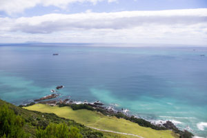
 

Image analysis


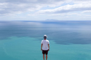
This image was taken during golden hour using natural lighting to capture the image. You can tell this because the light that is being reflected of the sea and the mist in the background of the image had a golden tint to it which would only happen during golden hour which is ethier sunset or sunrise. The shutter speed would have been around 1/40 1/100 to make sure that the waves are in focus and sharp The main focus of the image is the triangle in the centre which has then been split up into furthering different parts of the image to create a geometric effect. There isn’t much texture in this image as the waves in the foreground ae very smooth and sleek, however a bit of texture can bee seen in the background of the image with the rocks but mainly only the silhouette can be seen. Overall the image is very light the only dark tones in the the high raise of the wave and the outline of the rocks in the background

David Hockney’s Landscape Joiner Photography

David Hockney

David Hockney (born 1937) is an English painter, print maker and photographer. He was an important contributor to the pop art movement of the 1960’s and is considered one of the most influential British artists of the 20th century.  Hockney has made prints, portraits of friends, and stage designs for the Royal Court Theatre and the Metropolitan Opera in New York City. Hockney was born with synaesthesia, he sees synesthetic colours in response to musical stimuli. In the early 1980’s, Hockney began to produce photo collages that he called ‘joiners’, in these Hockney took multiple photographs and arrange a patchwork to create a composition.

Image result for david hockney landscape joiners

Image result for david hockney landscape joiners

My Favourite Photograph

Image result for david hockney landscape joiners

In this joiner photograph it appears that Hockney used natural daylight to capture it. This is because the colours are very vibrant and there is a natural level of contrast within the photograph. In the photographs that make up this collage, I think that a deep depth of field will have been used to ensure that the whole of the photograph is in focus. A shutter speed of 1/40 – 1/100 will have been used along with an ISO of 100 or 200 for this as the photographs making up the collage are sharp and have the correct amount of exposure.

There are lots of vibrant colours in this collage which catches the viewers eye, this creates a wider tonal range and more contrast between colours in the photograph. The majority of the collage is light, the only dark tones are in the trees and shadows. There is a texture in the ground in the collage which allows the viewer to see the photograph as more realistic and relate to it more. It is quite a 3D image as there are obviously subjects in the foreground and subjects in the background which get darker as they get further back.

This photograph is one of Hockey’s joiner photographs in which he would use polaroid prints and 35 mm commercially processed colour prints of a single subject to create a collage. The result of this joiner work has an affinity with Cubism, which is one of Hockney’s major aims – discussing the way human vision works.

Weeks 5 – 8 | Preparing for your Mock Exam Landscape Photography

Over the coming weeks you must now produce your final mini-unit that clearly demonstrates your knowledge, understanding and practical application of landscape photography…

You must provide blog posts that illustrate :

  1. Mood-board of images relevant to your plan
  2. Mindmaps / brainstorms of ideas
  3. Artist case study + image analysis
  4. Action plan for final photo shoot
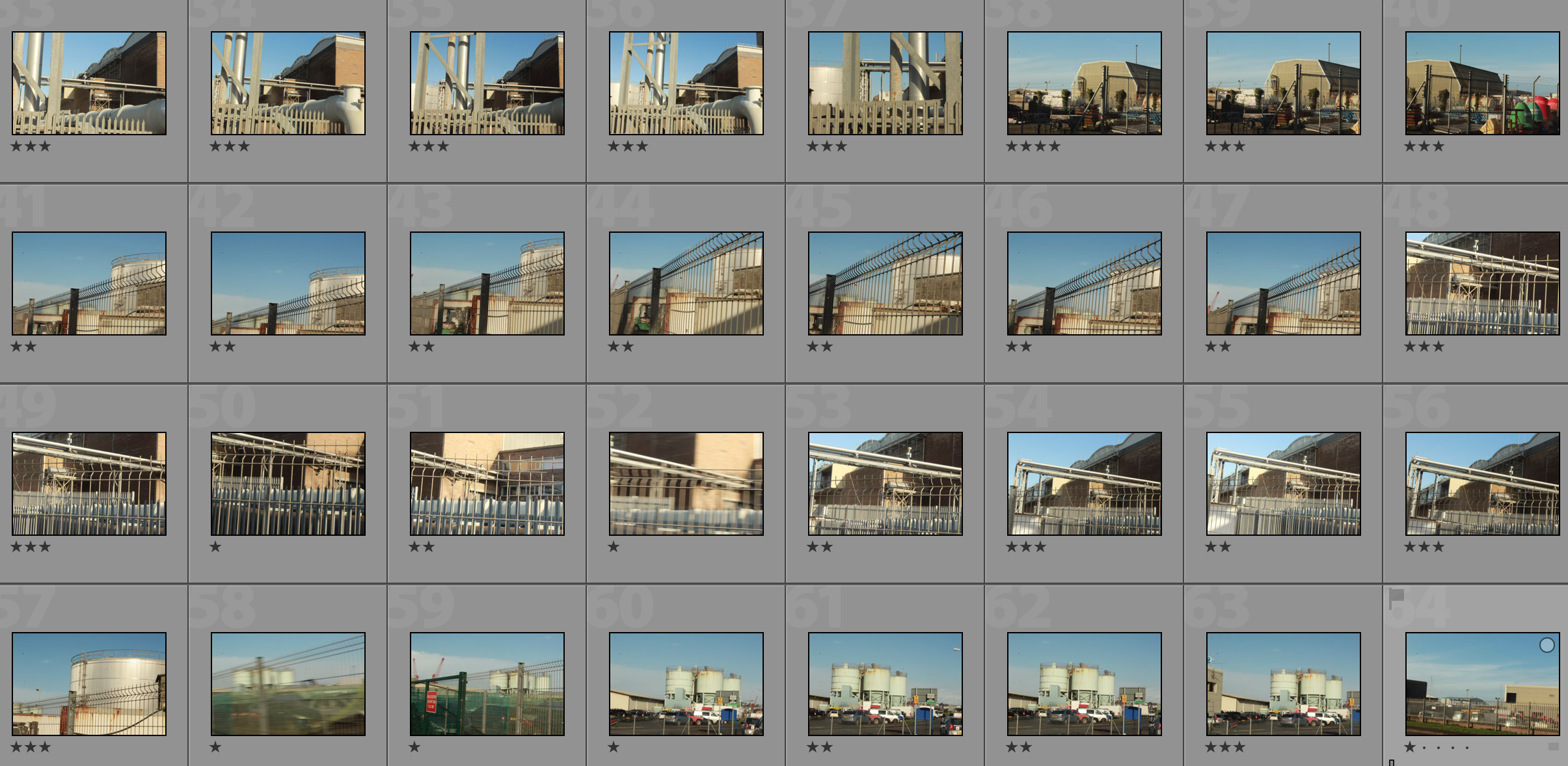
  5. Original images ( contact sheet)
  6. Your selection process
  7. Your editing process
  8. Presentation ideas / printing solutions
  9. Compare and contrast to your chosen photographer
  10. Evaluation, critique and analysis of your final response(s)

YOUR FINAL BLOG POST SHOULD CLEARLY SHOW 3-5 POSSIBLE FINAL OUTCOMES, INCLUDING YOUR PRESENTATION METHOD

FROM THIS YOU CAN CHOOSE YOUR IMAGES FOR PRINTING

Contemporary approaches to presentation :

Research and explore alternative approaches to presenting your final images. This should be an integral part of your concept…not a gimmick…ultimately, the quality of your photography will be the primary focus and your mark will reflect this…

Dafnor Talmor

Letha Wilson
Noemie Goudal
Alternative shapes…


Darren Harvey Regan


Print Deadline : Tuesday 20th February

Find the folder : M:\Departments\Photography\Students\Image Transfer\PRINTING

Essentials

  • Remember to label each JPEG  in the print folder with your name
  • 1 x file per A3. A4, A5
  • Ensure that your final images are a direct response to your chosen photographer (s) and show a clear visual link

Marking Criteria

The four assessment objectives clearly outline expectations, so you must provide high quality evidence for each AO…

AO1 : Develop ideas through sustained and focused investigations, informed by contextual sources, demonstrating analytical and critical understanding

AO2 : Explore and select appropriate resources, media, techniques and processes, reviewing and refining ideas as work develops

AO3 : Recording ideas (taking photos) that are relevant to intentions, reflecting critically on work as it progresses

AO4 : Present a personal and meaningful response(s) that realises intentions, and makes connections with other artists


Further Reading CLICK HERE


Abstraction and Formalism Landscape Homework

Planning

Task: Take 150-250 photographs that explore Abstraction and Formalism

Camera Settings: I will be used an ISO of 200 along with a shutter speed of 1/40 to allow the image to be as high quality as possible.

Lighting: I will be using natural daylight for my photographs.

Location: La Collette

Context: I will be taking photographs with the work of photographers such as Albert Renger-Patzch in mind.

My Response

My Top 5/Edits

My Favourite Photograph

In this photograph I used natural daylight in order to create a good amount of contrast between the structure and the sky. I used a deep depth of field in order to ensure that all of the photograph was in focus and sharp. I used a shutter speed of 1/40 to allow the image to be sharp, with an ISO of 200 it allowed the image to be slightly dark which increases the contrast and drama in the photograph.

There is no colour in the photograph as I used black and white. I took inspiration for this from Renger-Patzch who did his work in black and white. This creates more drama and shadows within the photograph. There is a wide tonal range in the photograph and the wires and metal structure is very dark whereas the podium they sit on is highlighted with white. There is a 3D effect in this photograph due to the shadows and edges with the photograph.

This photograph is of a crane-type structure used for moving large items, down at la collette. The industrial part of the island that I took photographs of is a great example of altered landscapes because there is almost no nature left there due to the amount of business that goes on there.


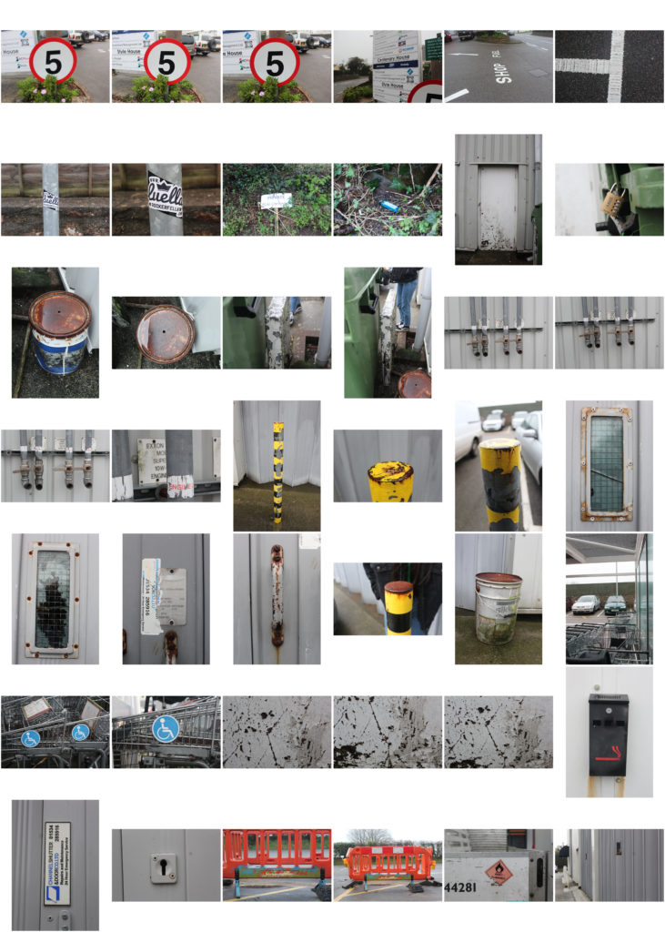
psycho geography photoshoot

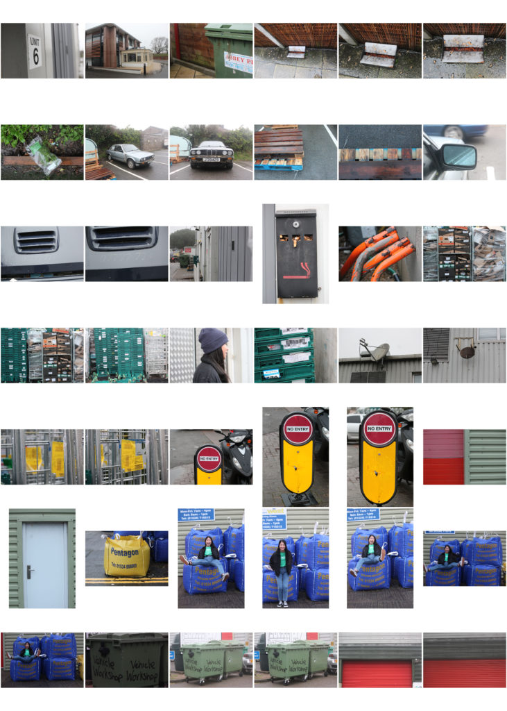
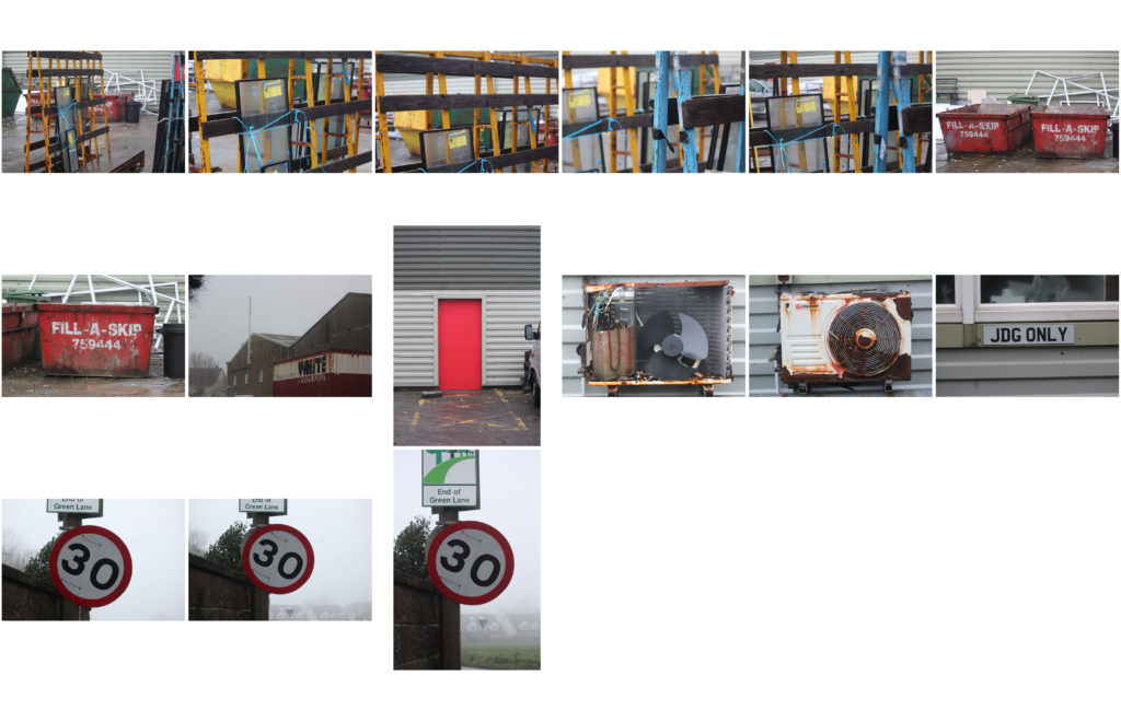
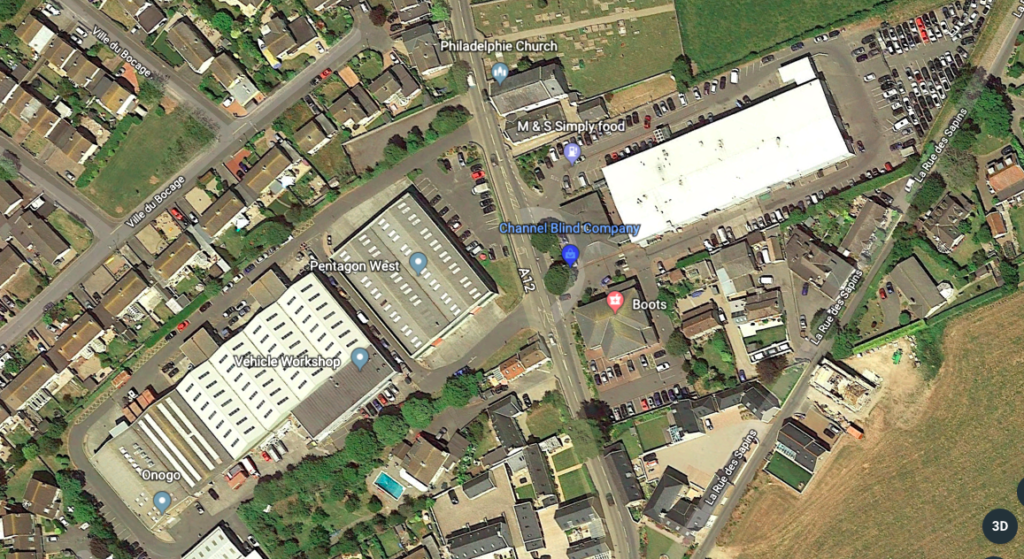
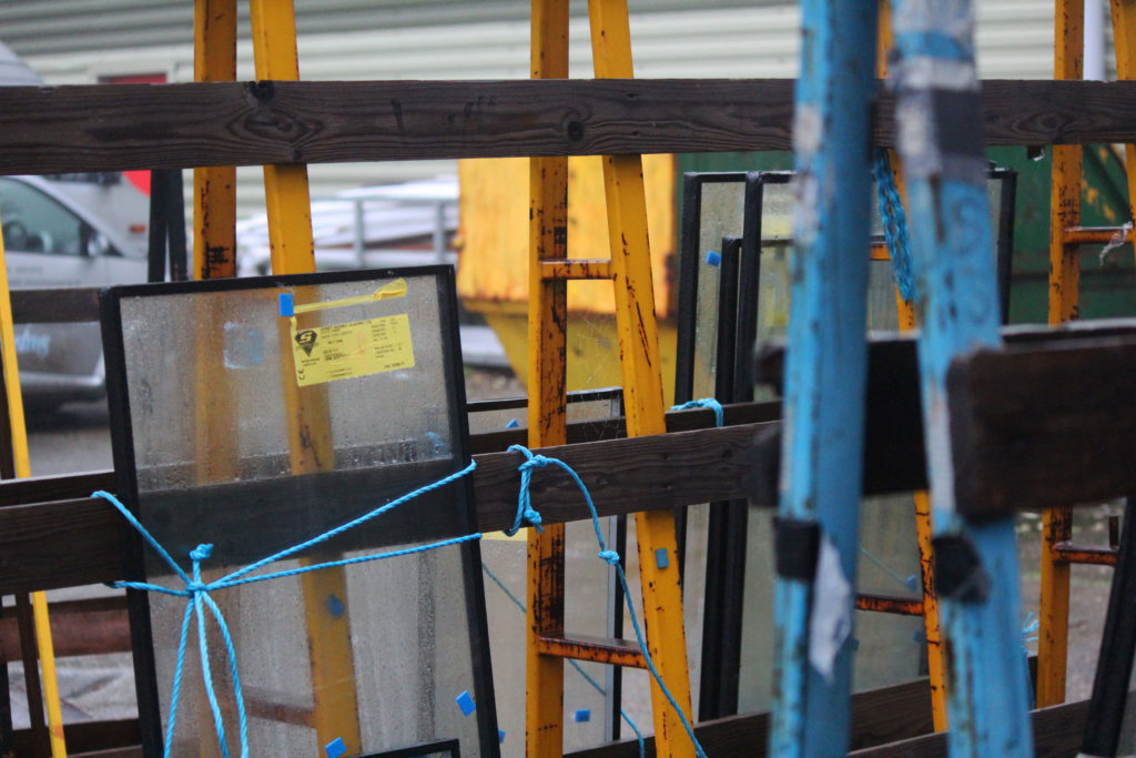
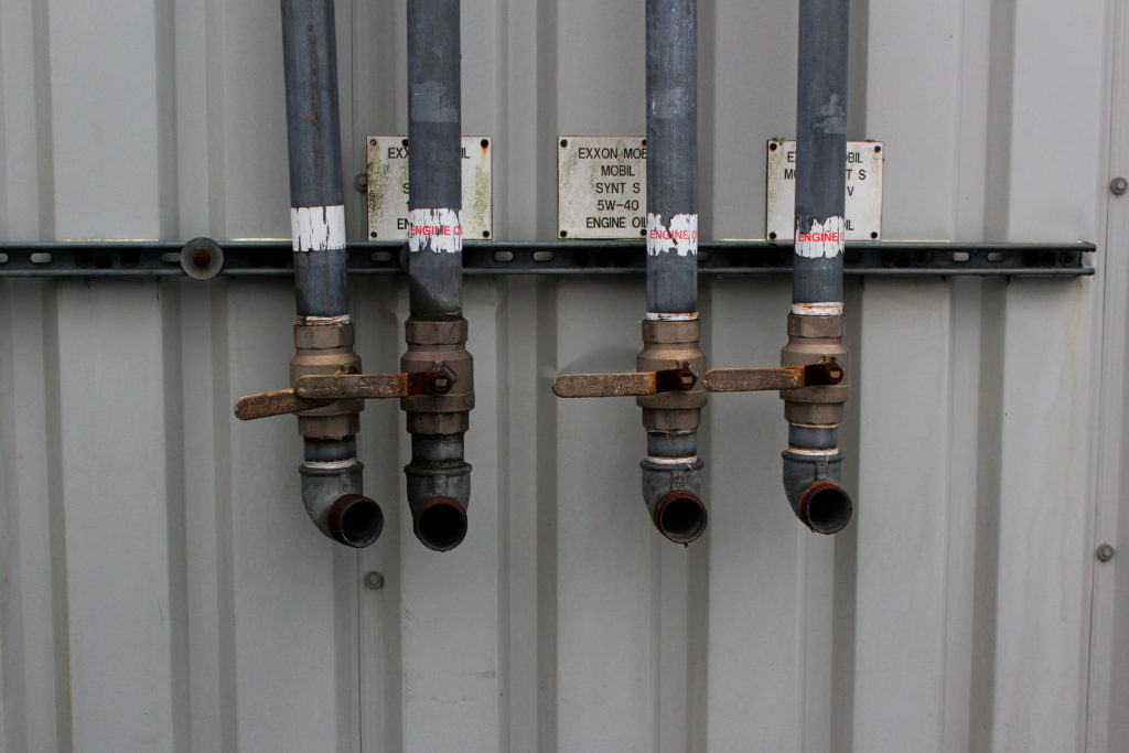
The photos I took on this shoot are interesting because they show the deterioration of the urban area. A lot of the photos are more close up and abstract but I think these help to paint a picture of the urban landscape as a whole through detailed photos. I found when I was walking around and exploring an area i though I was familiar with I found interesting things which I would not have noticed if I hadn’t come there to specifically takes photos.

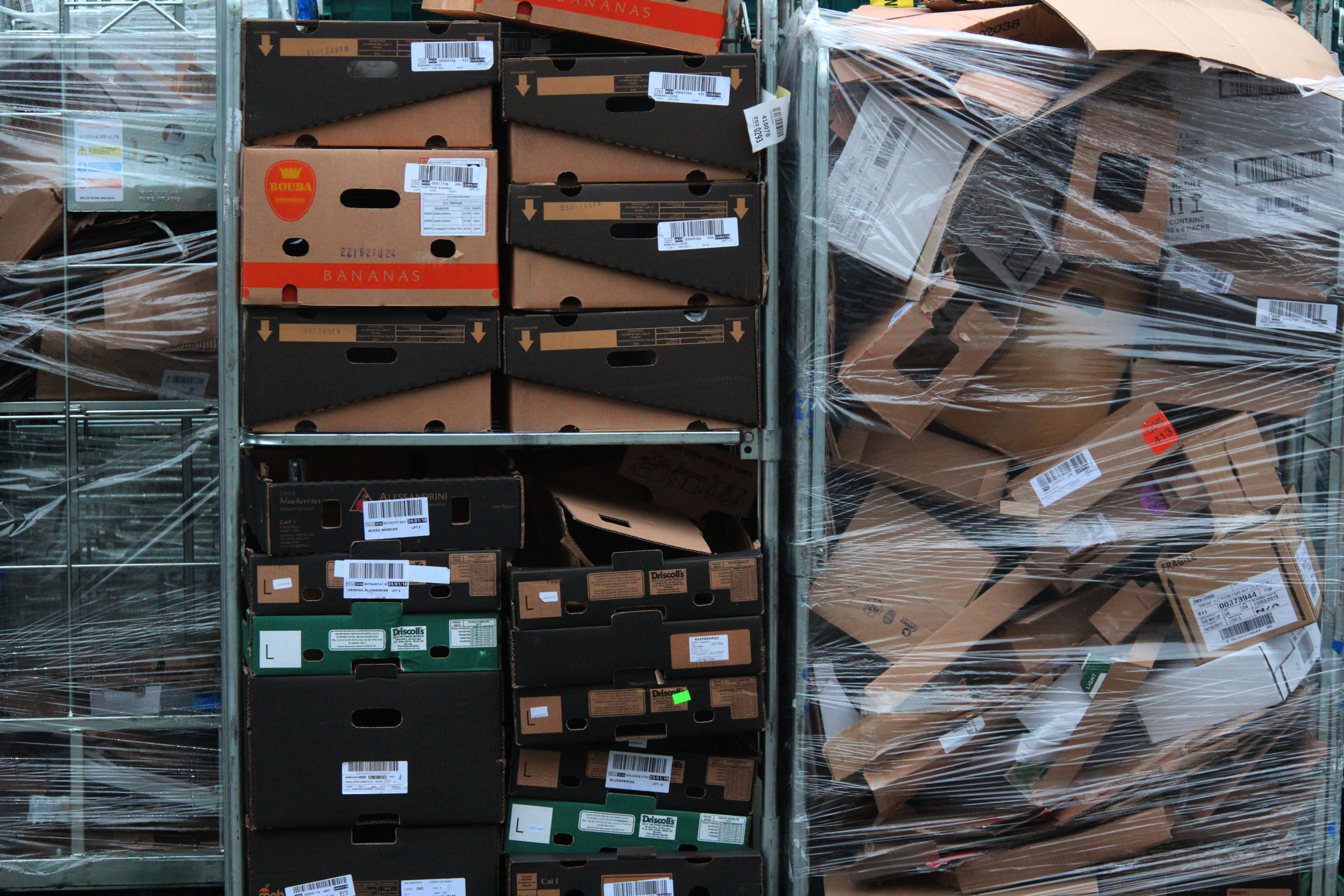
I selected and edited my favorite images from this shoot which I thought showed the area I walked around the best. They display the idea of disposable goods and and how the weather and environment has effected urban areas.
 

my initial ideas

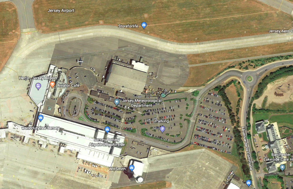
I am interested at exploring the and taking photos at the airport. I think there would be a lot of opportunities to take interesting urban landscapes  and areas which you would not notice at a glance, for example the old aircraft hanger and rows of cars in the car park.

I will also walk around urban areas areas near where I live which I have never looked at in detail before and take photos of what I come across. This will be interesting to discover new things in an area that I though I was familiar with.

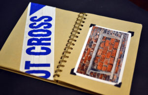
I am interested in presenting my journey practically for example as a collage or  scrapbook. I have looked into other photographers who do a similar thing and I found work by Nicola Hilditch. it was called ‘Scrapbooking The City…Psychogeography Experiment!’ She walked around her city with no particular destination in mind, collecting interesting objects and taking photographs to create a representation of the city in the form of a scrap book.

Photo shoot plan:

Concept:  After researching the area i want to explore and looking at work from other photographers, I am going to take inspiration from the style of their work and apply it to my own photos but also adapt it to my own journey in the shoot.

Location: I am going to take photos around a warehouse and behind shops in my local area. The area has a main roar running through it which means people see it on a daily basis but never look at it in detail.

Lighting: I will use natural lighting to take these photos and I will take them in the afternoon to avoid over exposed images with light flares.

Camera settings: I will take the photos using the manual  expose setting and experiment with long shutter speed and the waves.