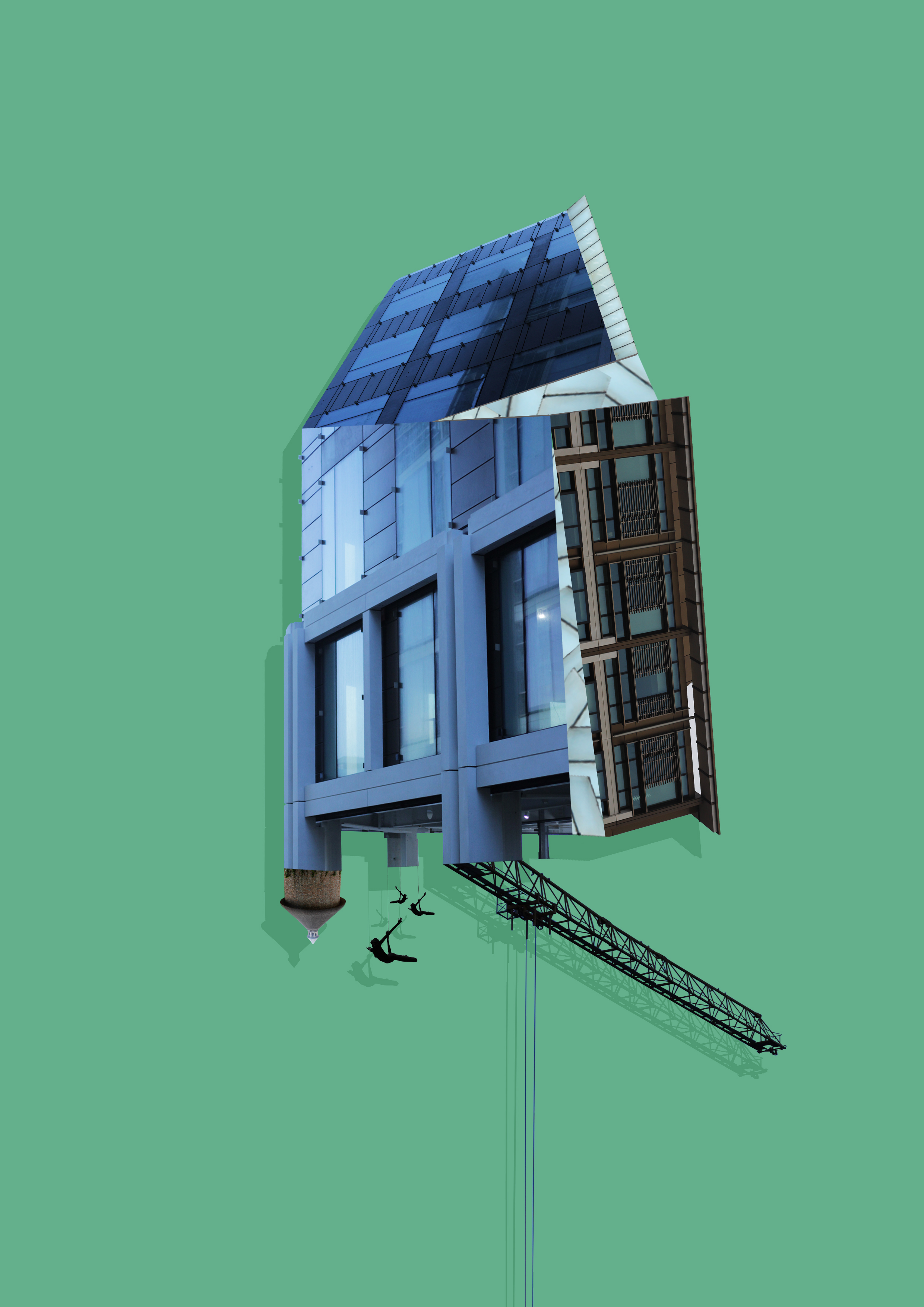
For this post I wanted to explore the use of altered landscapes. To do this I would need to research specific photographers that use this technique to produce the artificial designs and attempt to copy the idea using my own imagery and Photoshop. A photographer I found particularly interesting is Krista Svalbonas, Svalbonas uses images she has taken of buildings to then create part of a structure by stitching together parts of the buildings wanted. Here are some examples of her work: I found that Svalbonas used a calm colored backdrop to her creations to balance the entire piece and really make the design pop out. In response to this I looked through previous photo-shoots picking out images of buildings that I had taken recently. Once found I proceeded onto Photoshop to cut out and stick the parts of these buildings together creating a structure similar to that of Svalbonas, to which I would continue to add a colored matt backdrop that in my opinion balanced the image out. This was my process:
Firstly I created a mood board of the images I wanted to stick together that I thought worked well composition and color wise. From here I cut out the buildings individually and proceeded to join them together experimenting with what fitted well.
 To do this I used the lasso tool to accurately outline the object wanted so that I could then paste onto the design and move it around until satisfied with its placement.
 Once the design had been finished I experimented with a series of colors that I thought were neutral and would not overpower the overall piece. To do this I used the shape tool to cover the backdrop with a large square where I could then change the colors of it.
Once I had put together the images I thought best suited each other I added a backdrop using a singular shape put beneath the layers, this allowed for the effect wanted whilst neatly finishing the piece. These were my results:

 To create these images I mainly incorporated photos that I had based around the International Finance Center for my psycho-geography shoot and a few images from various other shoots. Whilst doing so I found that by duplicating the image and coloring it black while at the same time reducing the opacity, created a shadow like effect to the piece, this allowed for a 3d like effect that I wanted to put across on the piece and at the same time giving it a more graphic feel. Once done I added a green and a pink backdrop to each piece as I found that these colors drew the gaze to the piece rather than be sore from all the negative space surrounding it.
