For my ideas I want to cpature three main aspects within my urban landscape and psycho-geogrohy shoot.
Firstly I want to capture the slow development of urbanism and the contrast of black and white historical photos compared to that of the society now, this will done by visiting areas in which had a strong historical significance and taking the photos it the same place and creating a comparison of works.
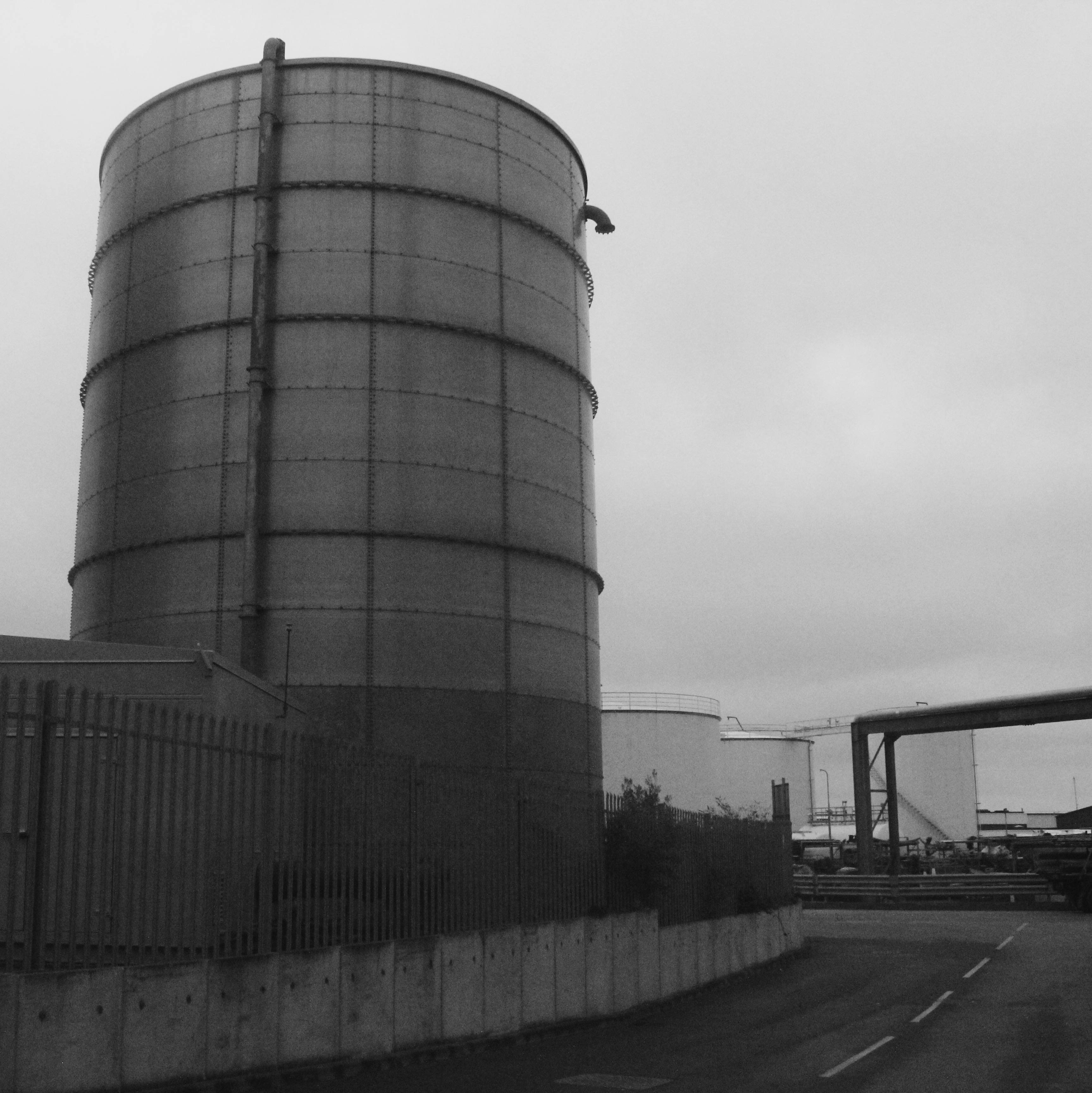
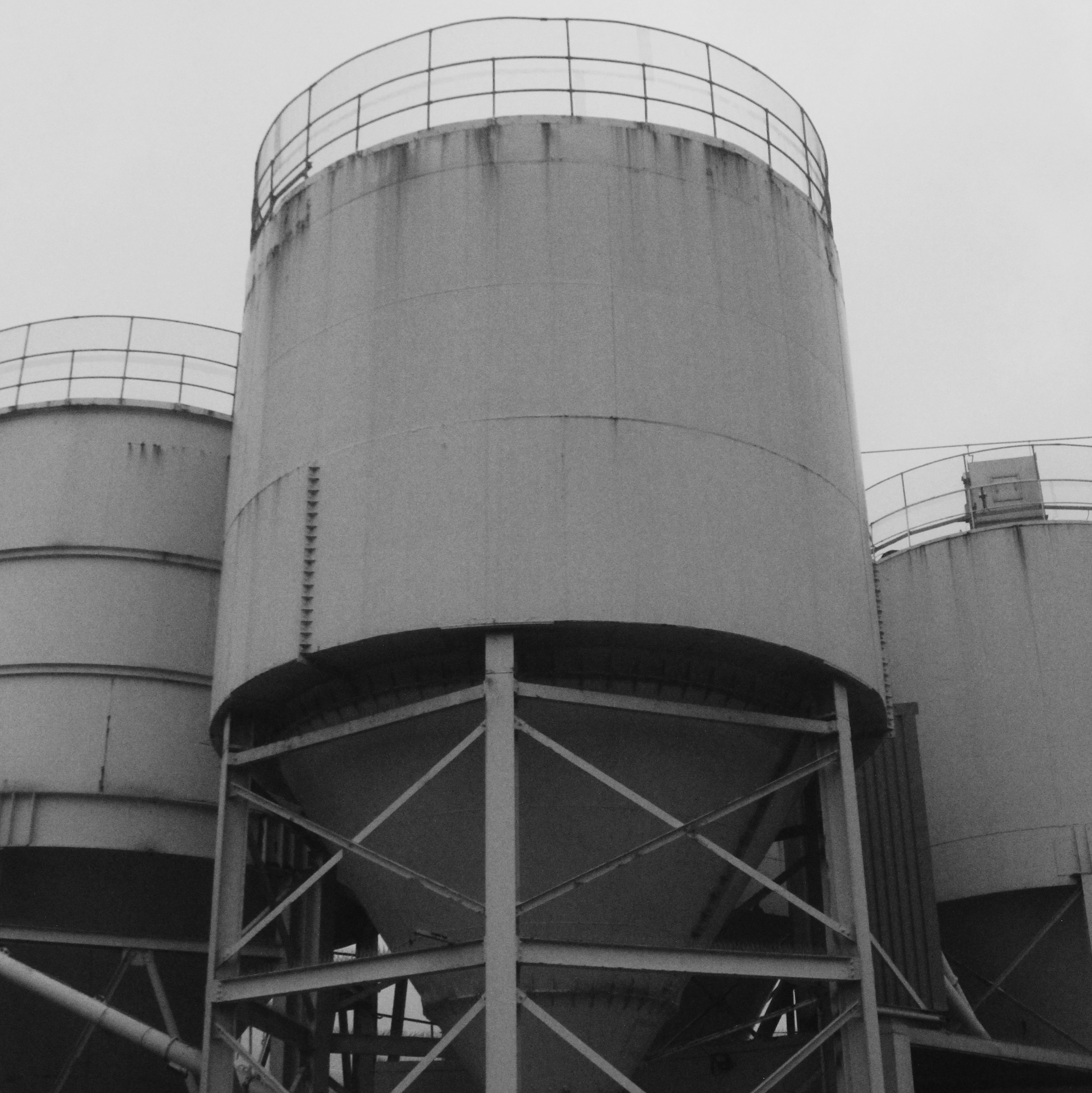
Secondly I also want to show the Morden aspects of lines ands stature wihtin the world and how it has slowly changed. this is inspired by Edward burtnasky,this could be done by going to the dump or even just going to area sin which shows such large industrial sites that it shows a strong connotations to the impact on the society.
lastly I want to capture more generalising urban landscpses form around towns want to show interposing dynamic shots and be able to edit them in an array of methods.And perhaps even take more romanticised landscape shots in order to use later on during the project.
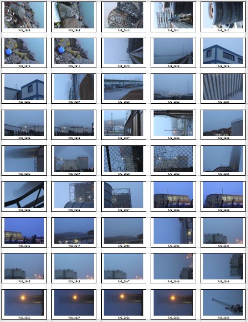
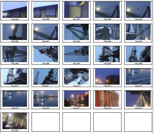
Contact sheet


Original images


I ended up capturing many images to show architectural ideas o urban photography and then also large landscapes in which I had a wide view and so all to dit in an interesting manner. From these few images I wanted to show a diverse range from colour to atmosphere and the way in which the images were taken themselves.
My photos edited
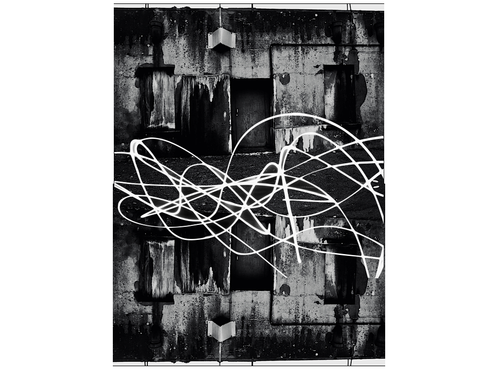
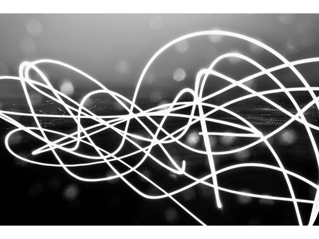
I decided this image was very suiting in black as it enhanced the overall atmosphere of the images and also allowed an indebted tonal sense of different textures and creates an interesting rundown sense off environment in which I was in.I then added on a slow light exposure image in order to show a larger sense of freedom and abstract sense within urban photography. The mirror repetition with the light exposure creates an interesting divide and perhaps is meant to signifier the divide between the land in which we live from light Morden buildings to run down ones such as this. 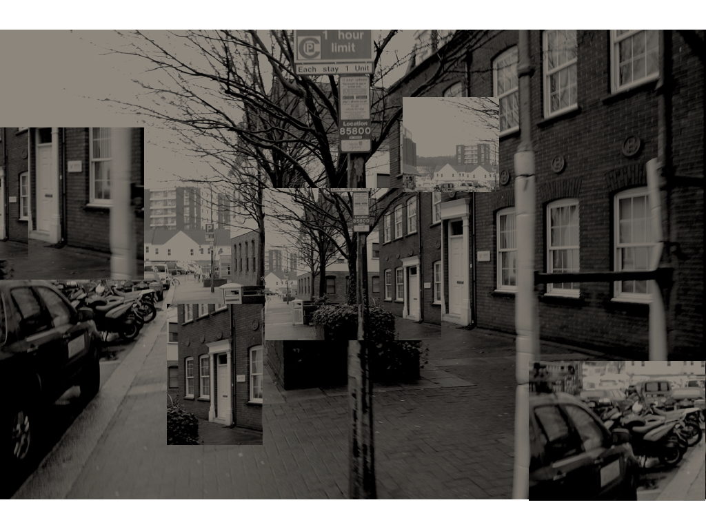
Within this image it is was much more psycho-geography street based, as I was walking down the street in town I wanted to capture a normal photo of a realistic atmosphere in which many people travel through,I then further wanted to experiment within how each area of the image was so different and contrasted with a different aspect of architecture and also a different theme as to what urban photography is. Because of this I tried to re-create the image moving the area but still in such a way the lines work together and create an interesting sense of structure and also light. 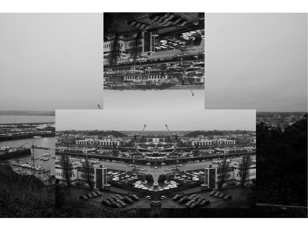
Within This image I wanted to capture a strong overall night time sense of a city,I then was inspired by my altered realities feel to the piece so wanted to flip and separate the image but in such a way you are still able to see what the landscape looks like. 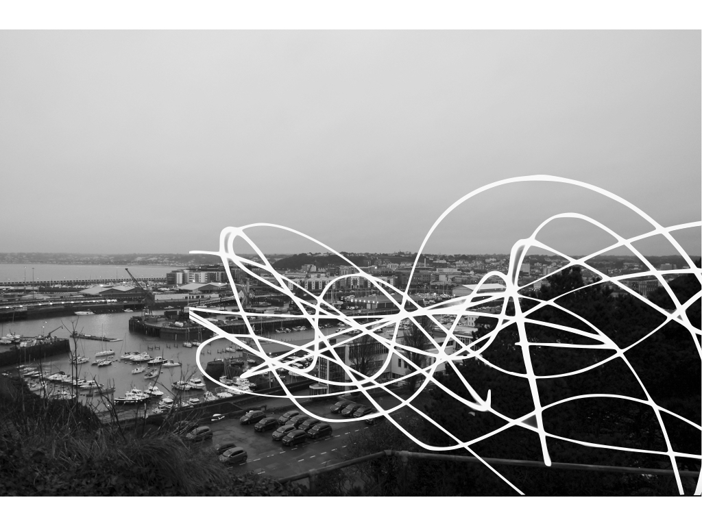
Here is a similar image to the one above, I wanted to use a wide lens in order to capture the whole atmosphere of the piece,I then again additionally added on the slow shutter speed light and did this in such a way in separates the images and creates a new abstract feel overall. 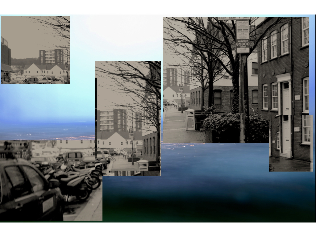
This image is Alot more experimental,for the background I have a slow shutter speed image capturing the lines of red light from the light and also the blue of the sea,I moved my camera left and right in order to have the lines segmented movement throughout, furthermore I then did the same as previous and edited on an image but this time in the place of position if was originally, this creates a random image overall but effective for experimentation. 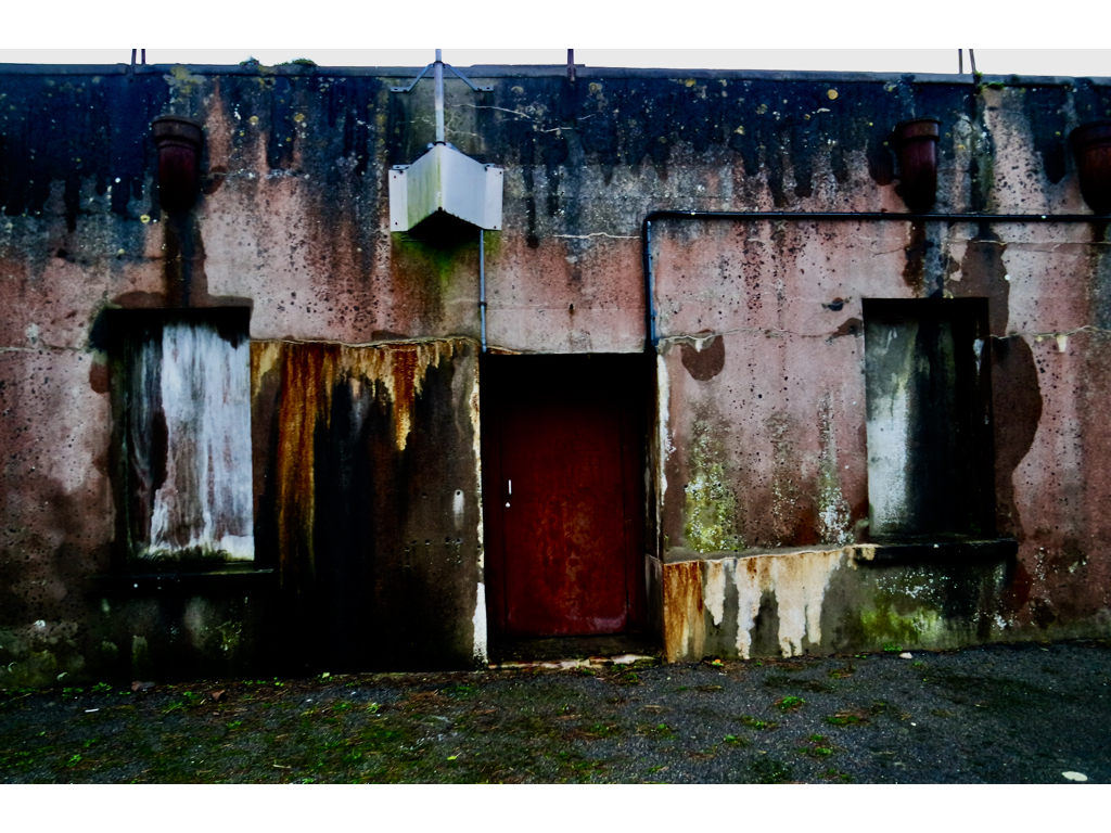
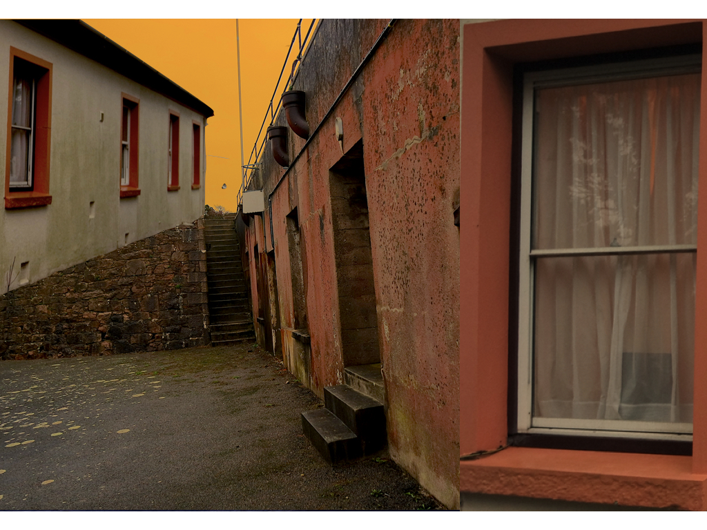
This is the image of the decaying house,wihtin this image I wanted to exaggerate the colours and shows an over exaggerated feel of colour to the piece,I did not do any further editing due to me having already done this before.
Lastly this piece was a lot more collage based,I wanted to show how lines can be used structurally to add additional buildings and create dimensions that are not possible but do structurally work in the image,Also this is the same building in different angles and lightings which creates an interesting contrasting dynamic to the image. Also the large window to the right is from a 3rd separate image but again shows a different structure to the image.
 I decided however to plan the shoot before I went ahead and did it. This would allow me to have a general idea before hand of what I wanted, and needed to achieve to produce an effective overall image regarding the topic of New Topographics. These are my ideas:
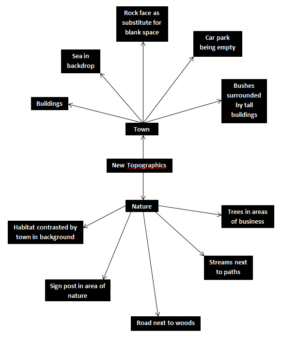 Once this was complete I decided it was time to move on to the shoot itself, and so decided to use the areas regarding the idea sheet of town, Grouville and St Brelades. These were my outcomes:
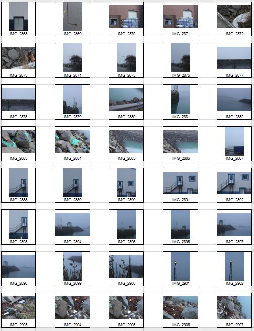

 Once the shoot was complete I narrowed the images down to only ten of my favourite pictures. By doing so it would make it easier for me to select the final image that I believe to be the most relevent and successful overall. These were my choices on the ten best images:


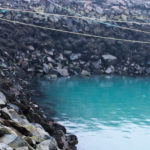


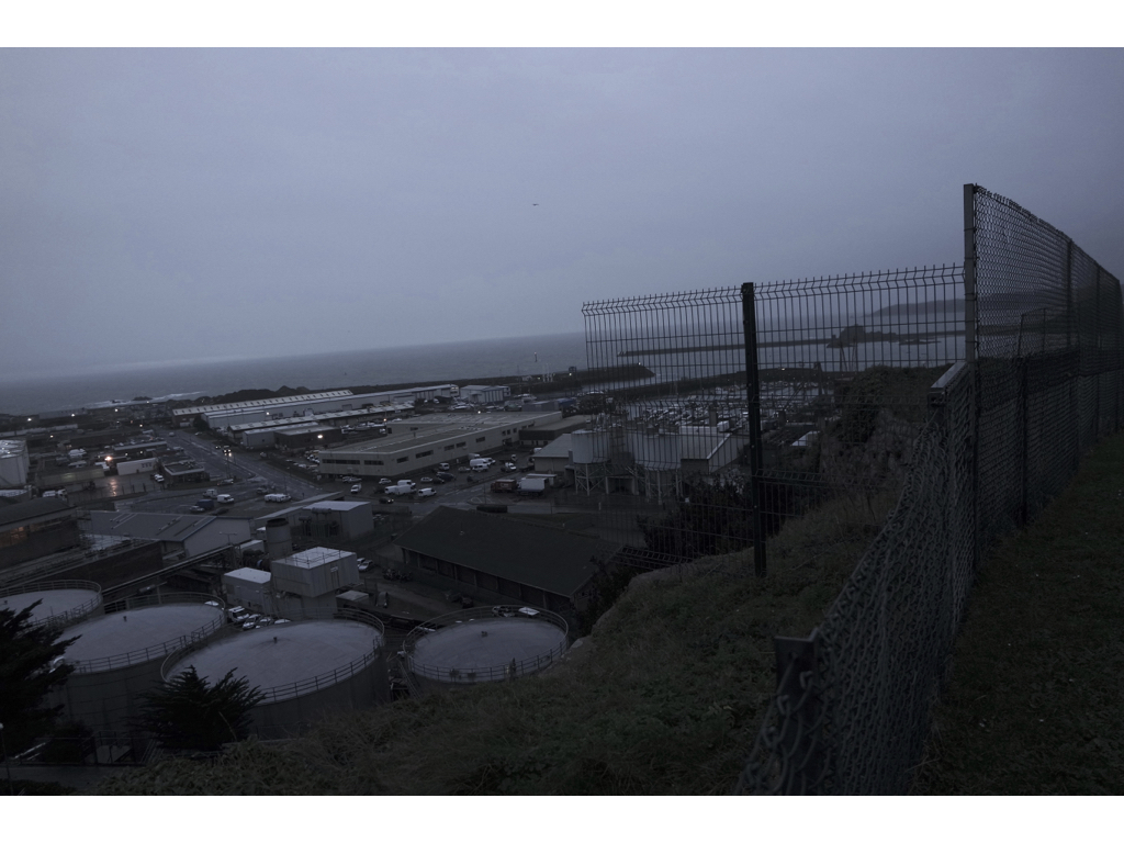
 I chose this image because of how I loved the clear contrast between nature and the taking over of it by man, seen by the run down sign surrounded by overgrown grass. I found this to be aesthetically pleasing created by the use of a depth of field, by doing so it blurs our the foreground and the background allowing only really the sign to be noticed properly which is where the eye is drawn. I found the slanted composition to be especially interesting by how it gives the impression of an overgrown and ruined world.
 I selected this image due to once again the use of the depth of field that blurs the backdrop, this along with the use of the composition allowed for maximum effect, giving the impression of a world that eventually succumbs to nature. I found that the way that the fence was composition allowed for a sense of distance to the photo, with the use of neutral space on the right being filled with industrial buildings bringing the viewer into perspective of the area it was taken in.
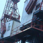
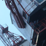
 What I loved about this image was the clear contrast and clear colors used to create an aesthetically pleasing outcome. This is done through contrasting colours blue and white which highlight features of the building, allow for such things as the door and bolts top pop out and draw the viewer’s attention. The composition I found also was aesthetically pleasing due to how the entire image is symmetrical which in consequence created a much cleaner and pleasing look.
 Within this image I found that there was obvious difference between nature and man-made structures. This is once again done through the use of a depth of field to which allows for the appearance of us peering through nature to find the man-made structures that surround everything, whilst showing how where ever nature is human activity is not far behind. I found that the gloomy colours within the image emphasised the destruction caused to the landscape by these structures and how nature and civilisation lives side by side.
  Finally I chose this image as I loved the reflection of cranes created by the aftermath of rain fall. This was partially down to how I thought it highlighted a clear contrast between nature and society, with the looming structures left behind, whilst at the same time creating a deserted and desolate feel to the overall piece. I found that the composition of the piece complimented the photo as it filled most of the negative space made by bricks, with various beams fading out of the image.
 What made me choose this photo as my final image was because how to me it summed up the clear contrast between human activity and nature. This was done by the composition of the grass creating the impression of it growing around the sign as if taking back the land seized by man, to which there is a clear difference in surrounding of the backdrop consisting of machinery and metallic structures that create contrast in not only surroundings but color. The use of depth of field creates a clear definition around the sign allowing for the eye to be drawn to it immediately with both the foreground and background complimenting it due to the drastic difference in colors and blur. To me this was the image that related the most to the topic of ‘New topographic’, which not only created a feel of the contrast between man and nature, but also of the deserted spaces that surround us in our everyday lives.
 I found that Svalbonas used a calm colored backdrop to her creations to balance the entire piece and really make the design pop out. In response to this I looked through previous photo-shoots picking out images of buildings that I had taken recently. Once found I proceeded onto Photoshop to cut out and stick the parts of these buildings together creating a structure similar to that of Svalbonas, to which I would continue to add a colored matt backdrop that in my opinion balanced the image out. This was my process:
 From here I cut out the buildings individually and proceeded to join them together experimenting with what fitted well.
 To do this I used the lasso tool to accurately outline the object wanted so that I could then paste onto the design and move it around until satisfied with its placement.
 Once the design had been finished I experimented with a series of colors that I thought were neutral and would not overpower the overall piece. To do this I used the shape tool to cover the backdrop with a large square where I could then change the colors of it.
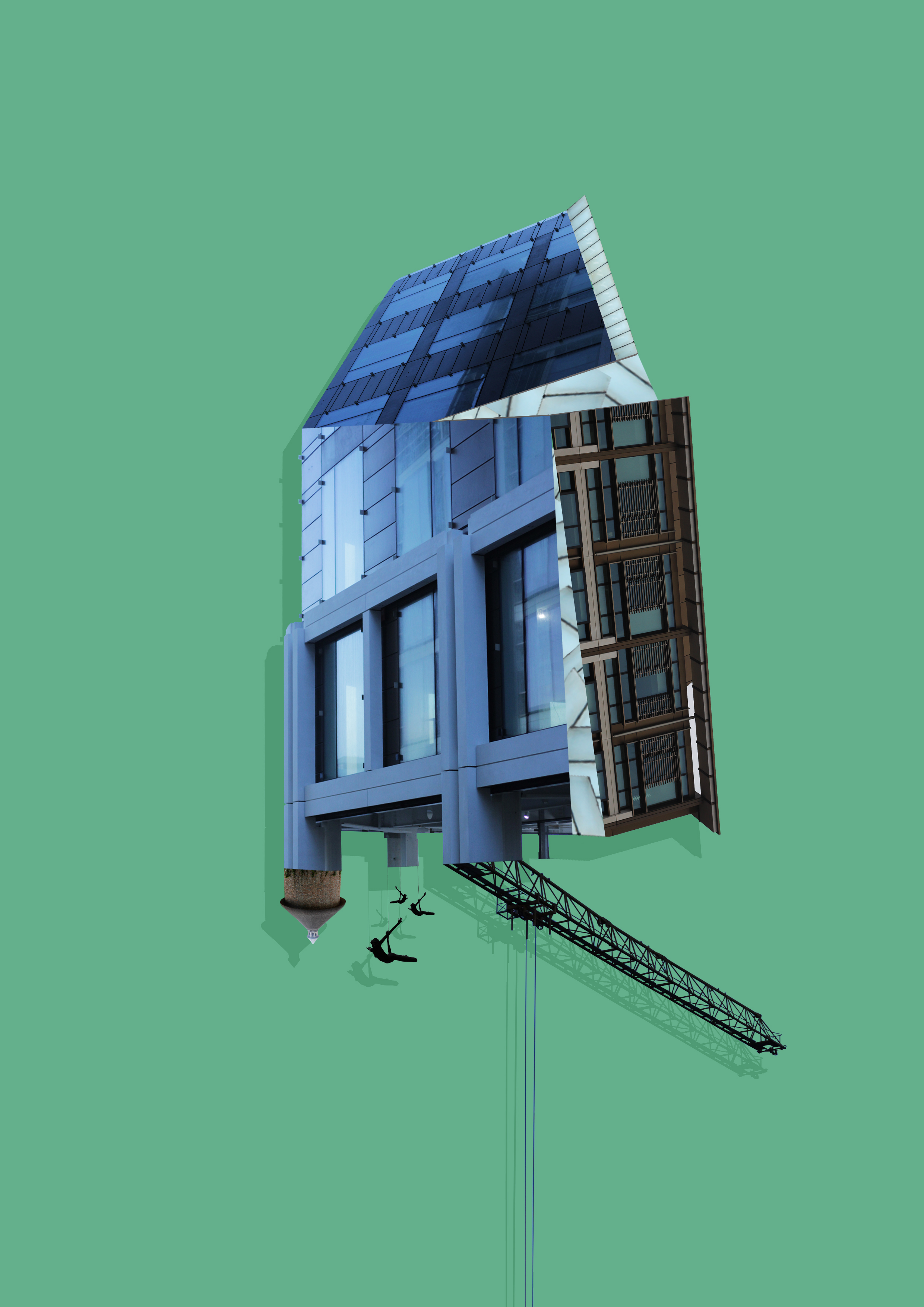
 To create these images I mainly incorporated photos that I had based around the International Finance Center for my psycho-geography shoot and a few images from various other shoots. Whilst doing so I found that by duplicating the image and coloring it black while at the same time reducing the opacity, created a shadow like effect to the piece, this allowed for a 3d like effect that I wanted to put across on the piece and at the same time giving it a more graphic feel. Once done I added a green and a pink backdrop to each piece as I found that these colors drew the gaze to the piece rather than be sore from all the negative space surrounding it.