Week 4 | Altered Landscapes | Cut-N-Paste | Composite Images

This week we will be looking more closely at the concept of altered landscapes.

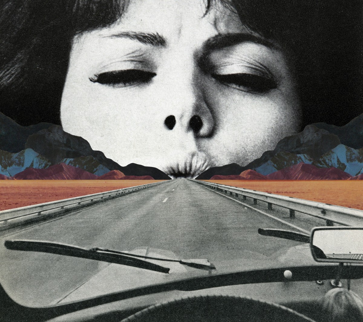
You may choose to employ a range of creative techniques (digital and traditional) to create your environments…

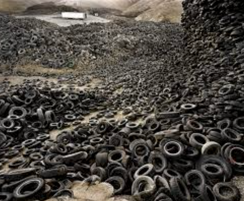
  • Photographing changed, changing or altered landscapes
  • Creating altered landscapes by combining a range of images in Adobe Photoshop
  • Using cut-n-paste techniques and printed matter (from photos, magazines, print-outs, newspapers etc)

You may already have a range of suitable images to start your designs…but will need to conduct a range of photo-shoots to ensure that you have enough high quality images to work from:

Here are some examples to help inspire your ideas…
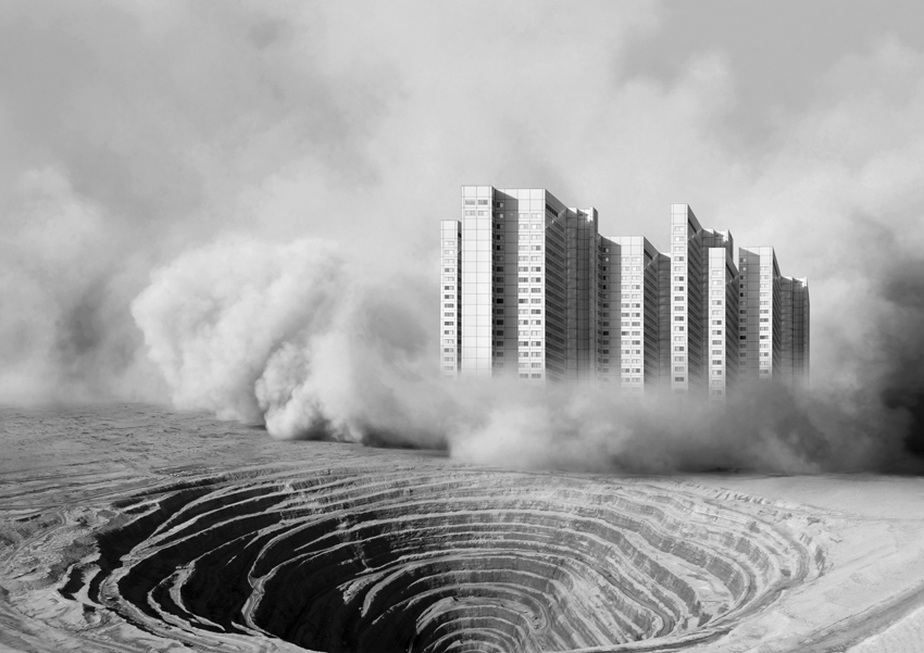
Tanja Deman

Beomsik Won

Jesse Treece
Sammy Slabink

Krista Svalbonas


CLICK HERE to research Vassilis Konstantinou’s “unintentional sculptures”

CLICK HERE to research “new landscape” photography

CLICK HERE to find more examples of cut-n-paste ideas…

Essential Blog Posts This Week…

  • Research Altered realities,
  • Hannah Hoch and the early pioneers of photo collage  / montage
  • A Case Study on your chosen photographer (plus analysis of a key image)…show how this has inspired your ideas and process
  • Your images, process, editing, selection, final outcomes and evaluation

HANNAH HOCH INTRO CLICK HERE

EXTENSION TASK

Research the work of Joan Fontcuberta…

One of Spain’s most prominent artists, Joan Fontcuberta is best-known for his exploration of the intersection between art, science, and illusion. In Landscapes without Memory, an exhibition of forty large-scale works made between 2002 and 2005, Fontcuberta harnesses a piece of landscape-rendering computer software designed for the military, which creates photo-realistic three-dimensional models based on two-dimensional sources. For his Landscapes of Landscapes series, the focus of the Aperture exhibition, Fontcuberta feeds the software images of famous paintings and photographs by Turner, Cézanne, Rothko, and Carleton E. Watkins, among others, forcing the program to interpret the landscape masterworks as “real.” The contours and tones of the pictures are transformed into three-dimensional mountains, rivers, valleys, and clouds—baroque, fantastical landscapes void of human existence that tap into our desire for unattainable paradise. Thumbnails of the original images are shown next to Fontcuberta’s work.

Through his artistic process, Fontcuberta creates new landscapes that, despite their “postcard perfect” resonance, are purely fictional­ and can never be experienced in nature. The result is “landscapes without memory.”

  • Why do you think Fontcuberta creates “photography” in this way…?
  • How does Fontcuberta’s work compare to the work of James Casabere ??? (below)
  • “The photographs that put artist James Casebere on the map are chilling. Like an architect, he builds a highly detailed model. But instead of turning the model into a life-size construction, Casebere zeroes in on the nano-details of the space and then photographs it to create his “constructed photography.” In the past, he has built and then photographed empty spaces, from miniature prison cells to flooded rooms to suburban homes that recall the housing crisis. To call these sparse, meditative images haunting, with their careful placement of light and shadow, is an understatement.”
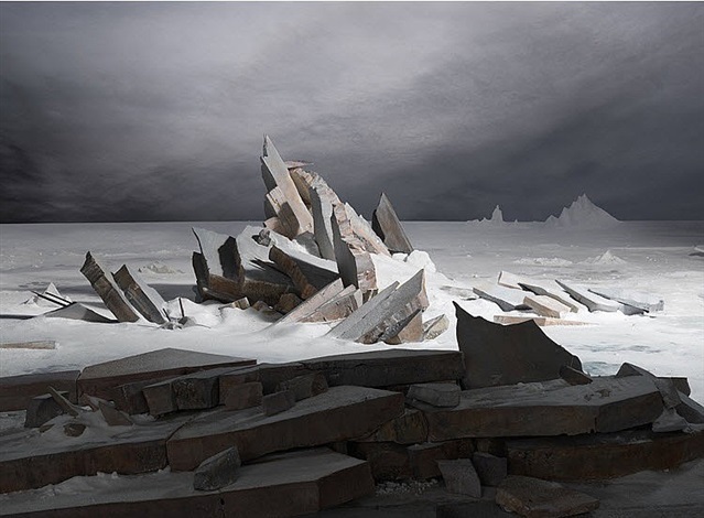
    James Casabere (after Friedrich)


Mishka Henner And Edward Burtynsky


About Henner

Mishka Henner is a Belgian artists who is currently living and working in Manchester,his work is featured within the contemporary arts and working within photography in the internet age,he has been featured in many surveys over time.He studied at Lough borough university and also at goldsmiths college,after he attended school in London he stayed there for a number of years until 2003,he vised Tate modern frequently surveying many documentary photography which to him was described as ‘life changing’.Later on in life he featured on many broadsheet magazines and soon after in 2008 joined panos pictures.He has also been described as a modern day Duchamp,his appropriation of image-rich technologies including ,google earth,street view and also you tube.This is the means of all of his inspiration and where he is seen adopting his print-on-demand bypass to traditional models.This creates a unique sense of works which is inspired by many social medias but also the way in which we love as a group in society through  industrial urban-ism.

Many of his key works are between 2010 and 2015,Henners work is brought to life by the strong engagement of character and nature within his photography. many of his works resulted in print on demand books,films and installations that featured in large scale museum  within France,Canada,and then in the us.He works in the following manner,his new approach of photography is seeing light,photographer without cameras,the need to press the shutter is replaced by a direct interest in images,not necessarily in making images.

Image analysis

title of the pice:OIL FIELDS – Levelland Oil – Gas Field- Texas, Courtesy of Carroll/Fletcher

I chose this image due to the clear though out and interesting composition of the piece itself,all the lines create a strong presence of structure coming from throughout the image,He conceptually wanted to capture the way in which people are continuously walking in a straight created format for themselves and  rarely veering off the path,He took this from a birds eye view angle possibly from google maps and used a strong technological purpose.

ideas I would want to use within my work:

I too would want to take high elevated shots in order too mature lines and a structure within what looks like nature but man made lines’ think it is a clear representation of the path that everyone constantly walks, and how they are in such straight lines and create a parasol form. I think I will use his work more as reference and inspiration and will not do the same technique due to this being very  unrealistic to accomplish without a drone.

Edward Burtynsky

Burtynsky is a Canadian photographer and artists known for his large format photographs of industrial landscapes. His work is now housed in more than 50 museums word wide.He was born in Ontario and his parents then immigrated to Canada in 1951,his childhood is filled of watching ships pass through locks so a very outside oriented childhoood, he also had an interest within many industrial areas and the slow developing urbanism of his life. when he was just 11 his farther purchased a dark room inclusive cameras and manuals from which he practised and become an ammeter photography .he learned how to male black and white prints together with his older sister established small business

I chose this artists because he had a consistent view though all his work and only demonstrated different angles and heI did not change theme throughout. Much like the previous artists he focused very much upon how he can sues suture within all of his work,I again think this is interesting and when possibly will try to find similar scenarios.

Burtynskys most famous work are sweeping views of landscapes altered by industry,mine tailings,quarries,scrap piles, the grand, awe inspiring beauty of his images and is often tension within the compromised environments they depict. He has made several excursions to china and the country toys industrial emergence and the construction of one of the worlds largest engineering project.

To be able to take images like this I will have to get to very high places and then use a wide lens in order to capture accurately the whole ascent of the area itself.I could also do more night time slow shutter speeds and try  to capture  the light traces with all the given road paths because it shows even a more detrimental human inference of technology and building in order for human convenience.

Within this image you can see an architectural  side to the image and also the the structure to the image and the interesting sense of atmosphere that it brings.The green shows the small amount of nature left In the world and how it is now overpowered by the cities and insurable towns that we all live among.

This is my favourite image due to the way in which he uses the interesting and somewhat dystopian feel in order to show a theme of ruins and slow destruction that the human are forming on the earth, his works is done in order to show awareness of global warming and all the negative aspects that we as a society are distilling upon our world.

Ideas for the shoot

I would want to go to many areas such as the dump were there is a large change and a slow deterioration of the green and healthy nature within the environment and how that society and its gradual new buildings evolve so do the effect on the environment and also the people and living and trying to prevent this form occurring.I will only be able to use aspects of this work as I am not able to take images from as high of an angle.


Homework 3

Kings Street

King Street forms part of Saint Helier’s main shopping area in Jersey. It is a pedestrianised street which runs from Charing Cross at its west end to Queen Street at its east end.

This map of King Street is believed to date from 1913. It shows clearly how relatively small the properties were on the south side of the street, compared with those on the north, which stretched back over what had previously been wet meadowland.

I first planned out where i was going to go to explore psycho geography on google maps and decided to walk along King Street. I printed out old photographs that were taken of buildings from the past, which also capture the environment of that time.  I planned to compare the old images to present day and take a photo of the comparison.I researched what  King Street looked like in the past and displayed a few to show the comparison between the two time periods.
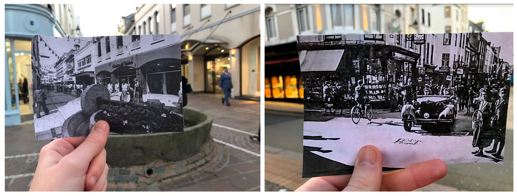
  • I took a few photos of me comparing the present day to old photographs and found that these two worked to best as the buildings line up in both real life and the printed off image.
  • The images also looked better in black and white as it makes them seem more historic.
  • I especially like the one on the right as it shows how different the street was in the past with the car coming from the street which is no longer a road.
  • The one on the left is from King Street in the 1970s. In 1978 the apple crusher was installed at the junction of Rue de Derrière and Ruette Haguais, and La Croix de la Reine at the junction of King Street and Broad Street as part of the pedestrianisation landscaping, a traditional. The left image is from the 1940s showing A German staff car in King Street during the Occupation.

These images also show the change over time on King Street. The first image shows buildings and people in the past and the second image shows what the same buildings look like in the present day. The first image contains quite a few people walking on the pavement dressed in old fashioned clothes, second image contains less people walking in the street and has construction work in the middle of the road.

I also took pictures of the urban landscape when comparing the old images and photographed the surrounding environments. When doing this I tried to take the photos taking inspiration from the New Topographic photographers.
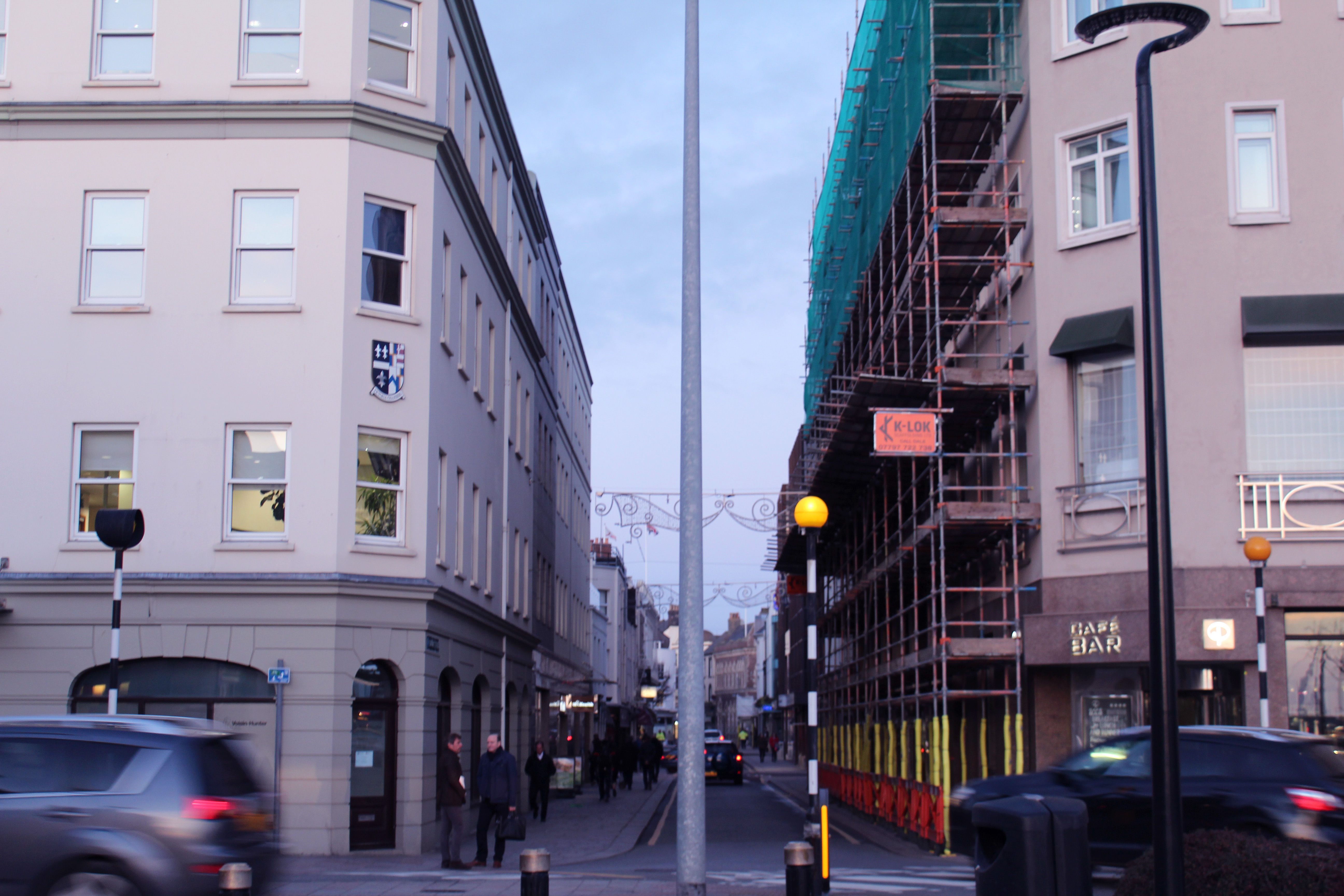
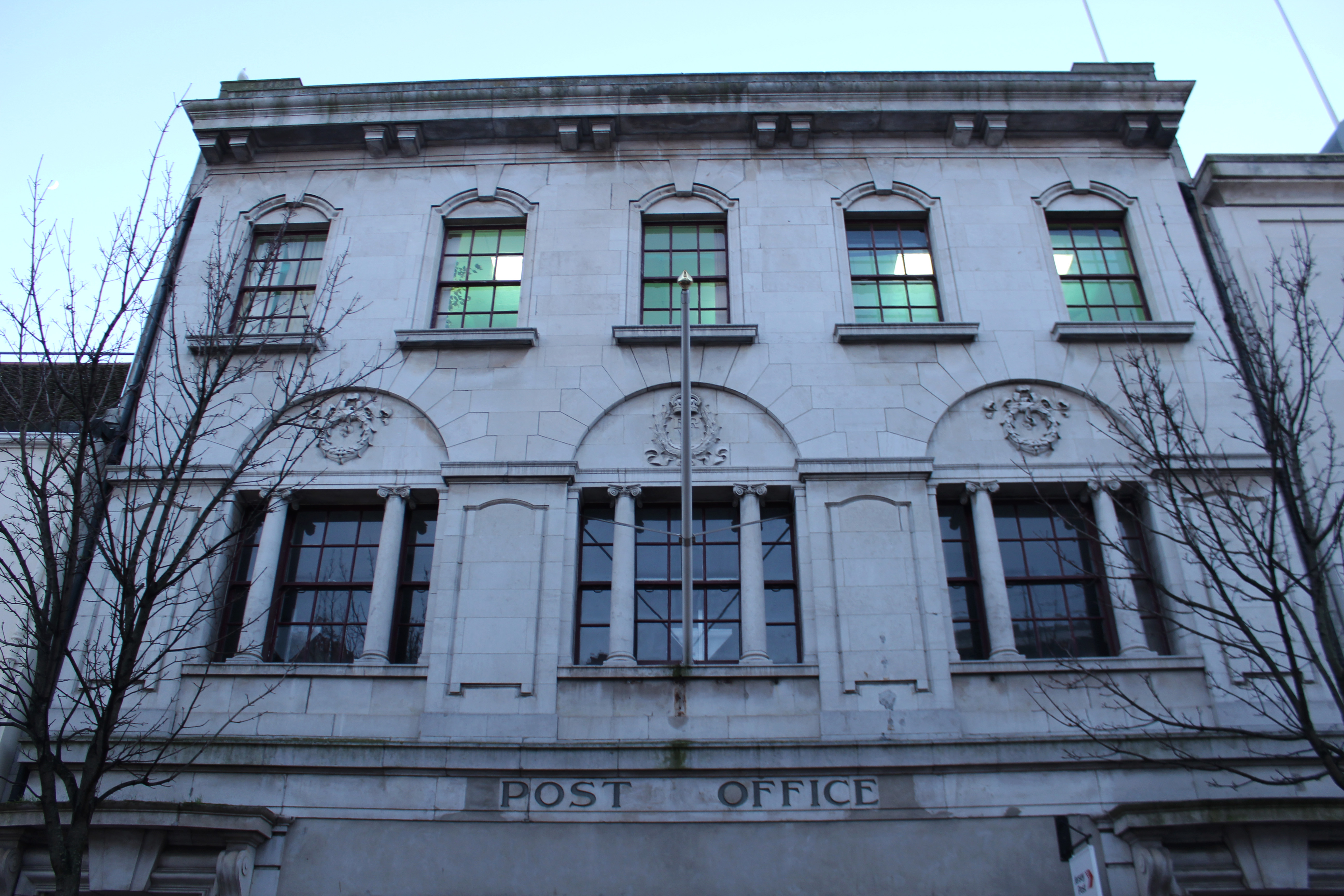
  • When taking this photo I tried to capture the movement of the cars and the symmetrical alignment of the buildings to produce an overall aesthetically pleasing image.
  • The lamp post in the middle divides the image in half, either side having similar layouts with the buildings and cars in similar place.
  • I thought the image was powerful enough by itself and didn’t think it needed too much editing so i only gave the photo a pinkish tint and decreased the exposure slightly to create a softer appearance.
  • I chose to take this photo at this angle to show urban activity continuing down the road with the rushing cars, people and construction along it. The blue sky contrasts with the pinkish buildings

Visual:
  • The angle at which this photo is taken makes the surrounding buildings look like they’re taller and towering over the camera, creating a tunnel like street.
  • The buildings have a shadow cast over them but the bright sky creates a contrast between the two, emphasising the pathway.
  • The layout of the image is nearly symmetrical as the photo was taken standing closer to the left side than the right. This makes the buildings on the left seem taller. I took the photo like this as it emphasises the pathway of the street.
  • The photo is taken from a street view like a person would see when looking down the street as the other image showing the history of Kings Street is from the same angle.
Conceptual:
  • The concept of this image was to compare history to present day thought the buildings on Kings Street.
  • And to capture the atmosphere on King Street now compared to then.
Technical:
  • The lighting in this image was natural and had a natural shadow over the buildings which i emphasised when editing.
  • I used a wide angle lens so i was able to show the whole street
  • I used a fast shutter speed to eliminate motion i the image and low exposure which was why the shadows were emphasised
Contextual:
  • I placed both images beside each other to show the comparison from the historic image and the present day image.
  • It shows how buildings and shops have developed and been re-designed over time