extension:Joel Sternfeld

Joel Sternfeld

As cities gradually formed newer building and more industrial sites are formed in order to produce and cope with the necessities that are essential for the growing population,The new trphogrohics tarted to raise  attention Joel Sternfeld (born  June 30th 1994,)Started his fine art color photographer ,he usually works within large formats of documentary picture from within the united states.He became a highly respected artists throughout his medium for  color and his many works in the permanent collection off MOMA within New York City.  Sternfeld  started teaching at Dartmouth college and teaches photography  after he himself learning all about color theory. Sternfeld’s most successful book was American Prospects and explored the irony of human altered landscapes. Sternfeld has many different aspects of exhibitions in order to try and capture and represent people in different manners, furthermore  his work was very much influenced by the new trophgorhics,his exhibition was called the American prospects and had many different aspects o human life within nature.

I chose Joel  Sternfeld due to his edge of nature but how he looks at the image as if it is a a whole set prepared image.I also liked his color within the image and how it compliments the setting.He has such a wide shot it enables a connection with the whole area of the image and a successful composition.

Mind map
All these images above all successfully convey the theme of presence of people the evolution of society and how nature has a mass significance.He has a clear color variation due to the type of surrounding scenario that the  photographer is in.

Best image analysis

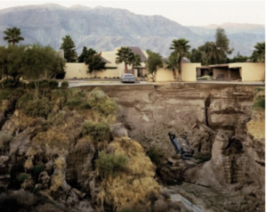
This is my favorite image, this is due to the way in which you can see the effect that humans have and a certain type of deterioration to nature you can see the slow development of man made houses falling down and the gradual spread of rubbish mixed within the nature.the composition  is interesting in the way of how the tree is closest to the  foreground and has a large area of significance. Then you have the petrol station that too is falling down.conceptually he wanted to connote how people use land and then leave and what they leave behind is a constant effect and to the defect of how people abuse nature.

My idea for the shoot

His images have a very strong aspect of planned or at least  a strong com-positional aspect,So with my small experimentation of his work i too would want to show these aspects to create a successfully image.I also like his use of color and the way in which it is somewhat removed but also very much  present within the large tonal range of colors.Areas In which I could take this work ,All these photos have a strong resemblance to isolation and a removal of presences themselves,due to this I will go to remote areas in which there is a high presence of nature and a lack of city scape of fast moving action.

architectual,night and panoramic Shoot development

My shoot development

For my shoot I wanted to continue using my artists inspiration of the new topographic’s and of rich urban landscapes but a clear view or traditionalism and nature aspect contrasting within the background of the image.For my photo shoot I will try and visit Scrapyards, building sites, cranes, restoration yards, derelict ruins,additionally to this I will also look for any area that has pipework or a clear decoration of man made activity.

For my second artist who has more of a humane feel to the area and the way in which nature and buildings has a strong relevance to peoples lives I will photograph shops and long distance views of roads and such,this could also be seen within theaters and large populated areas.For the title and main inspiration for my shoot I have chosen the themes of juxtaposing urban and isolated compared to sky and habitats. This means that my images will have a strong sense of new upcoming society and how it can be isolated from other areas and a clear vision of separation of lack of nature within that area.

How I will edit my images

Once again I used HDR in order to get a  crisp image with lots of light and vibrancy of color and or tone.I also want to use some of my own development ideas  such as slow shutter speed to capture an urban effect during nighttime,this can be done from being high up above traffic and brightly lighted town and also within the areas and also develop the  focused nature aspects,these would look like:

I chose this image as an example due to its high over towering view so allowing a clear focus on light but also how nature is wrapped around all human light and presents clear lines and paths within the image itself. 

Secondly I thought this was an accurate perception of my idea due to the large presents of nature within the center of the urban landscape,it shows a subtle formation of the two elements.

panoramic development

Additionally  I also want to capture panoramic shoots,i will achieve this by developing my images into one after taking a course of many over an area with small movements in between. I would want to displays this in a straight forward lines and then secondly with separations of lines and cuts to show repetition of a scene and lastly a divided area in which i can present the image in many different levels such as:

I will still be  focusing on my theme of urban isolation contrasting with nature and sky,this allows me to use all my techniques and capture all these themes in different mannerisms. Overall I  still want to use the same elements and angles that the new topographic achieved but in a more  modernized and inventive mannerism.

Edits:

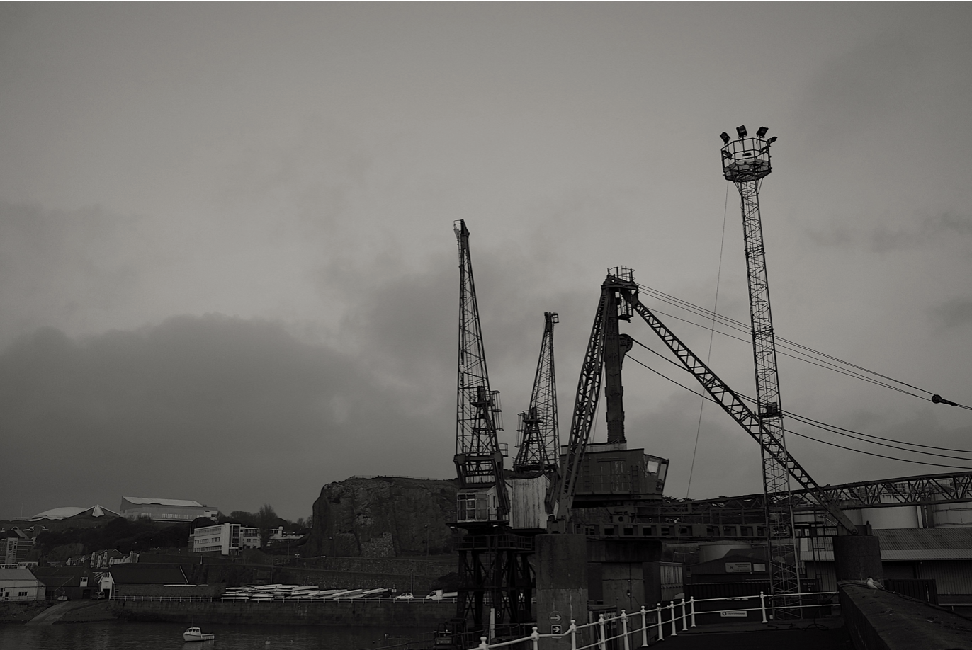
I decided to divided my edits into color and black and white dependent on what is the most appropriate and effective.I really swatted to nature the contrast between he deep architectural lines and with colour on the background.

first shoot:day time shoot


SAMSUNG CAMERA PICTURES

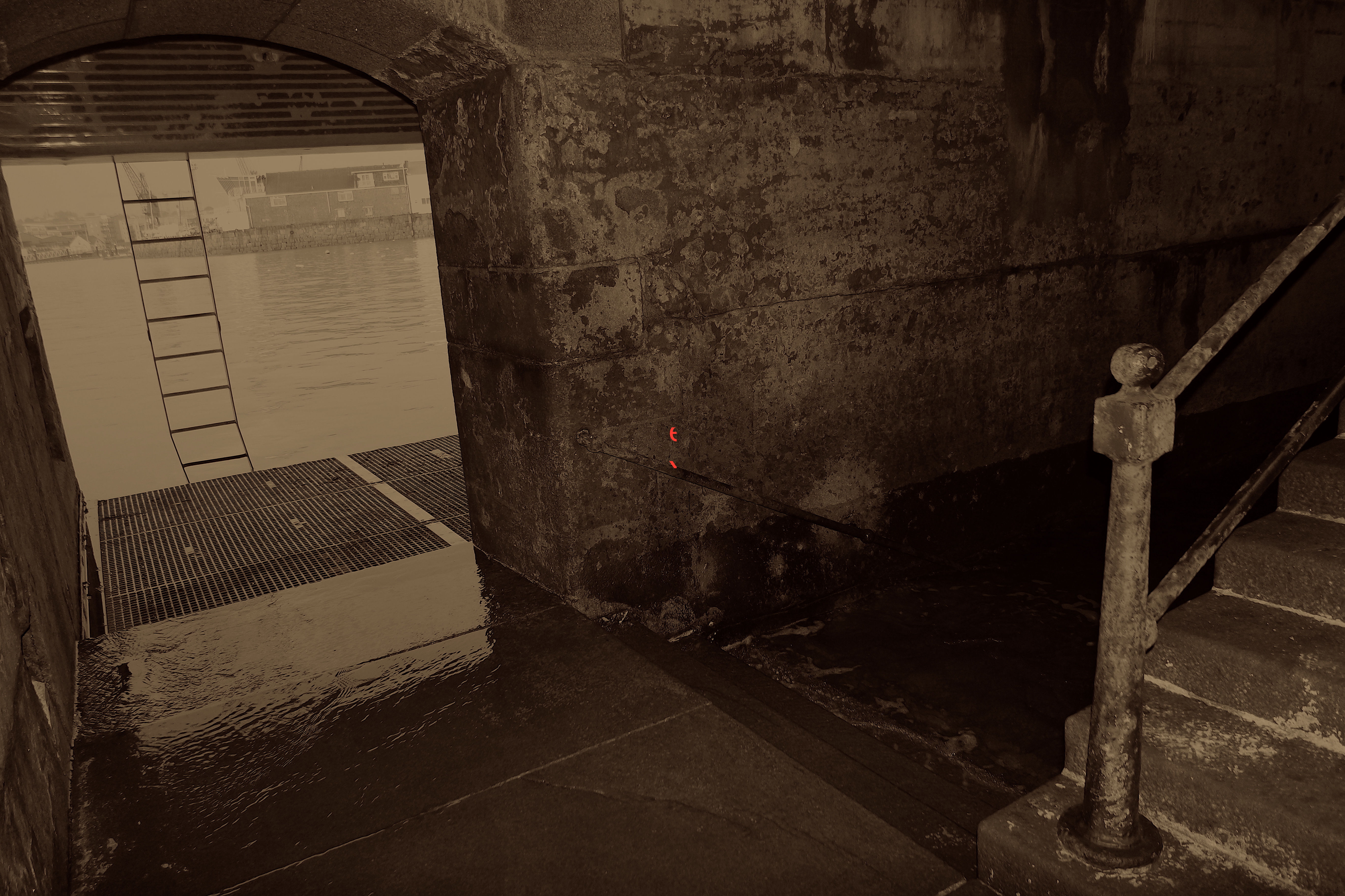
I think this piece is really effective as its composition is centred and then further enhanced by the light  background of the image. it also has a structure  due to the ladder , but has  a delicacy to the line lines reflected within the water and the rhyme and form that bring to the piece itself. 

all of this images above I clearly wanted to focus on stature and how it can be enchanted by a natural background,it creates an effect of nature formed within a harsh man made structure.

further editing: 

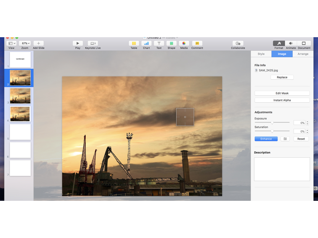
with this image I wanted  to form a romanticised background and then form this with the architectural structure from this shoot.i do think though it is not as effective as the small detailed liens when edited do not achieve the same realism and are not as effective.

here I wants to from an interesting architectural piece using a repletion and building using lines to from a large building going through he centre,i think this makes an interesting composition yet still forms a line and stature overall. 

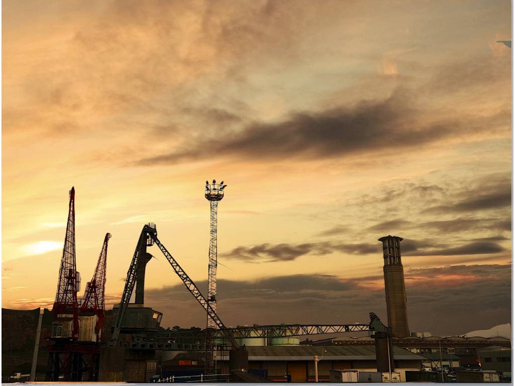
wihtin this edited I wanted to try and from both interesting  clouds to show the strong presence of nature and then also from and lit in the industrial aspects of human development that I wanted to capture.

night shoot:slow shutter speed light capture


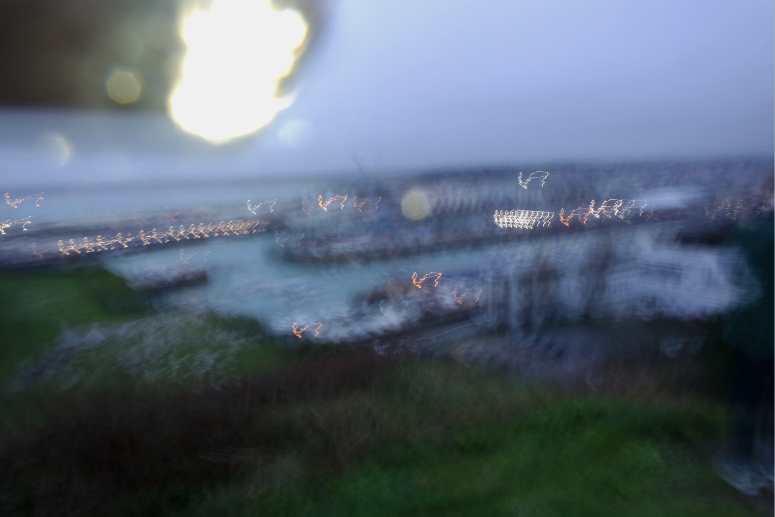
I wanted to experiment within night shoot in this method as it is more abstract and would be effective in an overlay within other images too.it also allowed more to capture the night city scape whilst also forming a slow light pattern.This method also means I am able to from the shape and not dependent on wirer the light is already.

panoramic development:

I did not take many sets of image such as this is I knew I did not want to develop within this method, although for my final I think the overall prevention would look successful hung in size order alongside each other.

Overall analysis

overall I think I have developed within many methods and shoots and now I am able to see and decided what will be the most successful and effective within the future  of my work.

Stephen Shore – The New Topographics

Stephen Shore

Stephen Shore (born October 8th 1947) is an American photographer known for his work as a New Topographic and his pioneering use of colour in photography. In 2010, Shore received an Honorary Fellowship from the Royal Photographic Society. Shore took photographs of the introduction of civilisation and industry to nature and showed how man-made structures were taking over from nature.

Image result for stephen shoreImage result for stephen shoreMy Favourite Photograph

Image result for stephen shore

It appears that in this photograph, natural lighting from the American deserts were used to capture it. This helped to create a very saturated photograph that is very eye-catching. A deep field of depth appears to have been used as the corners have not been slightly blurred. A shutter speed of around 1/50 – 1/80 appears to have been used as the majority of the photograph is in focus but there is a moving car in the bottom left corner that is blurred so the shutter speed is not quick enough. An ISO of 200 or 400 was most likely used along with this shutter speed to create a light enough and high quality photograph.

There is lots of colour in this photograph which is partly what Stephen Shore was known for. The saturated colours help the viewer to tell what country the photograph is set in. There is not a massively wide tonal range in this photograph – it is quite a light photograph which matches the colours that it consists of. There is no texture in the photograph but from the setting of it, it is very clear that it is in a warm place.

This photograph by Stephen Shore was taken during the start of the industrialisation of America – the signage and colours are unique to the United State and it is a perfect example of a New Topographic’s work. It shows the should-be ugly man-made structure but portrays it as something aesthetically pleasing.

This photograph is showing the man-made structures over-powering the natural land in America and are symbolic for the New Topographic movement taking over from the Romanticists. The bright colours of the man-made structures are contrasting with the nature in the background and show that change is inevitable.

The New Topographic

New Topographics was a group of American photographers made by William Jenkins in 1975  (such as Robert Adams and Lewis Baltz) whose pictures had a similar banal aesthetic, in that they were formal, mostly black and white prints of the urban landscape.

Many of the photographers associated with The New Topographics were inspired by the man-made subjects such as parking lots, suburban housing and warehouses were all depicted with a beautiful stark austerity, almost in the way early photographers documented the natural landscape. An exhibition at the International Museum of Photography in Rochester, New York featuring these photographers also revealed the growing unease about how the natural landscape was being eroded by industrial development.

The new topographics were to have a decisive influence on later photographers including those artists who became known as the Düsseldorf School of Photography.

Case Study – Romanticism

Photographer Research – Hiroshi Sugimoto

Sugimoto Hiroshi, born on February 23, 1948, is a Japanese photographer and architect. He leads the Tokyo-based architectural firm New Material Research Laboratory.

He came to be known for his strictly black-and-white, highly stylized photography series. These series show views of the sea, extremely long exposed theatres, photos of scientific display cabinets, wax figures or Buddhist sculptures. Hiroshi Sugimoto sometimes works for several years on these work series. In recent years he has occupied himself increasingly with architecture, furniture design, objects and fashion.

“It was my goal to visualize the ancient layer of human memory with the means of photography”

“It is about returning to the past and remembering where we come from and how we came into existence.”

source

Photo Analysis

Technical

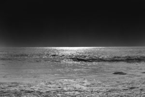
Although this photo may look plain and simple at first glance; there are many technical elements embedded in the image. Firstly, the smooth ripples in the water mean long exposure was used, Hiroshi Sugimoto most likely paired that with a slower shutter speed and bigger exposure to achieve this smooth and serene effect. Since the sky is rather dark, it’s natural to assume that the photo was taken at night – due to this, Sugimoto didn’t have to worry about overexposing the image as it would have been too dark to begin with. If the photo was taken in the dark, there would be no natural light for Sugimoto to work with meaning he had to rely on his camera and settings. Referring to Ansel Adam’s tonal range; the image seems to be missing the darkest black and brightest white but captures most of the tones in between.

Visual

Visually, I find this photo very pleasing and soothing. The lack of colour doesn’t feel like a disadvantage in this image; in fact, the lack of colour contributes to the simplicity and straightforward nature of Hiroshi Sugimoto’s photographs. By looking at the other photos in this set, it is safe to assume that Sugimoto used a black and white effect on this photo like all others. The photo has two parts to it: the sky and the sea, divided only by the line of the horizon that creates a soft contrast between the dark grey sky and lighter waves. Sugimoto purposely arranged the position of the sea like this in countless photographs to play and experiment with the concept of minimalism.

Contextual

The photograph was taken in 1997, during a time where most people had access to coloured photographs- Sugimoto purposely chose to not include colour in this image. Hiroshi Sugimoto studied art in Los Angeles in 1971, at the time of Minimalism and Conceptual Art – this is clearly evident in his work.

Conceptual

To me, the concept behind the image is to challenge the audience’s perspective and views on what makes a successful photograph. The image, at first glance, lacks the most conventional aspects of a successful photograph.  The image is incredibly plain due to the lack of subjects but still able to capture the attention of the viewer and provoke an emotional response. The whole set has a similar calm and harmonious atmosphere it radiates, allowing the viewer to feel safe and at peace – which may not be a feeling we expierence much in our chaotic everyday life.

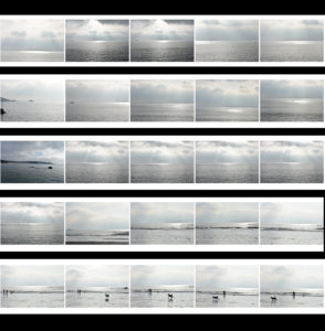
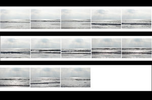
Contact Sheets

Final Edited Image In The Style Of Hiroshi Sugimoto


For this image, I first used the lasso tool to separate the sky and the ocean into two different layers and then I simply used the ‘burn’ tool to darken both the sky and the ocean until I was satisfied with the results.  It was an easy process but it allowed me to quickly obtain the results I wanted.

New Topographics Homework Assignment

Planning

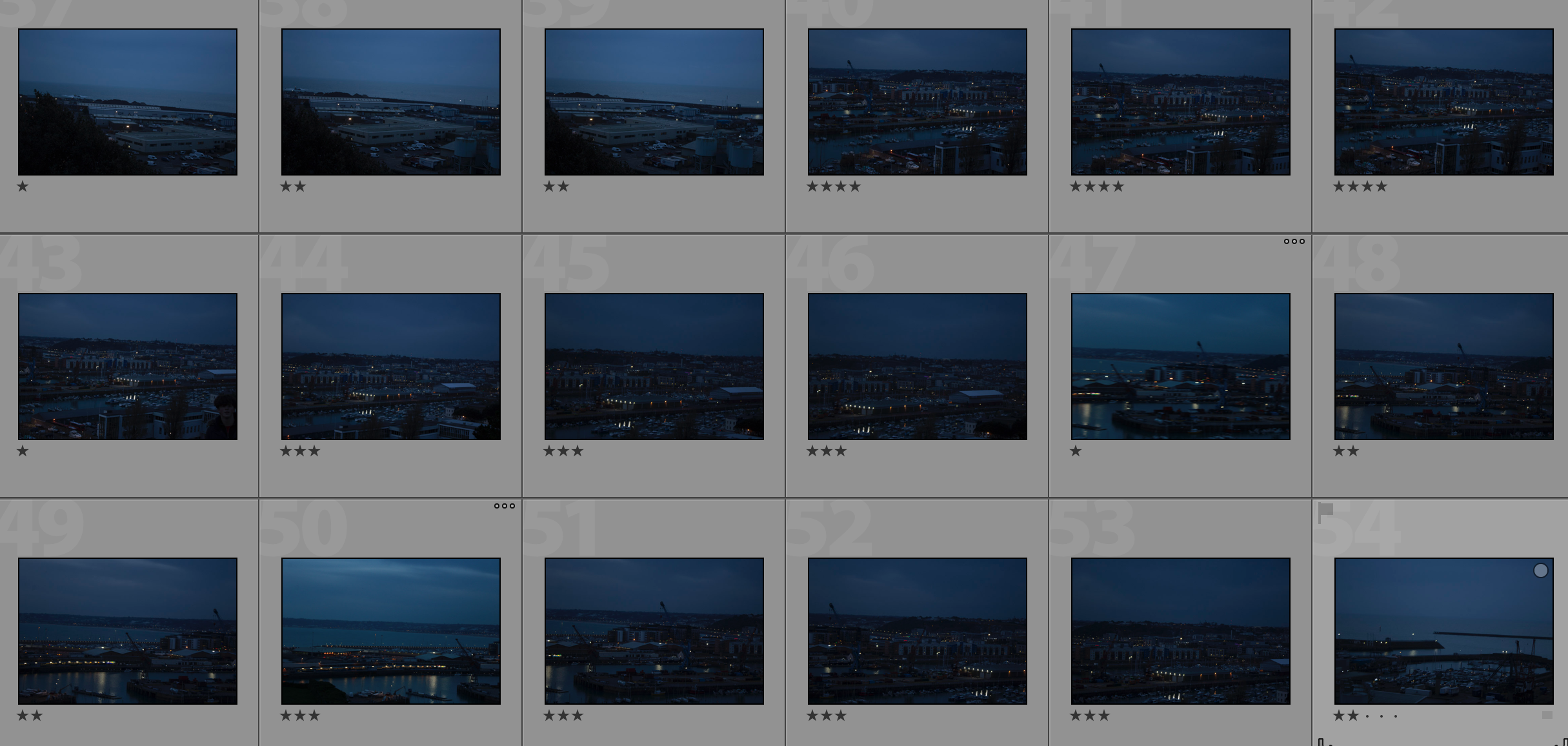
Task: Take 100-150 urban landscape/night photos

Props: I will be using a tripod in order to capture some long exposure shots at night.

Camera settings: For my long exposure shots I will be using a shutter speed of 30 seconds to make them more effective, along with a 100 ISO. For other landscape photographs I will be using an ISO of 200 with a shutter speed of 1/20 to allow enough light to enter the lens.

Lighting: I will be using lights from passing cars, buildings and lamp posts to capture my photographs

Location: Town

Context: I will be capturing photographs with the style of the New Topographics in mind.

Concept: To capture photos whilst taking influence from the style of Robert Adams and Stephen Shore.

My Photographs

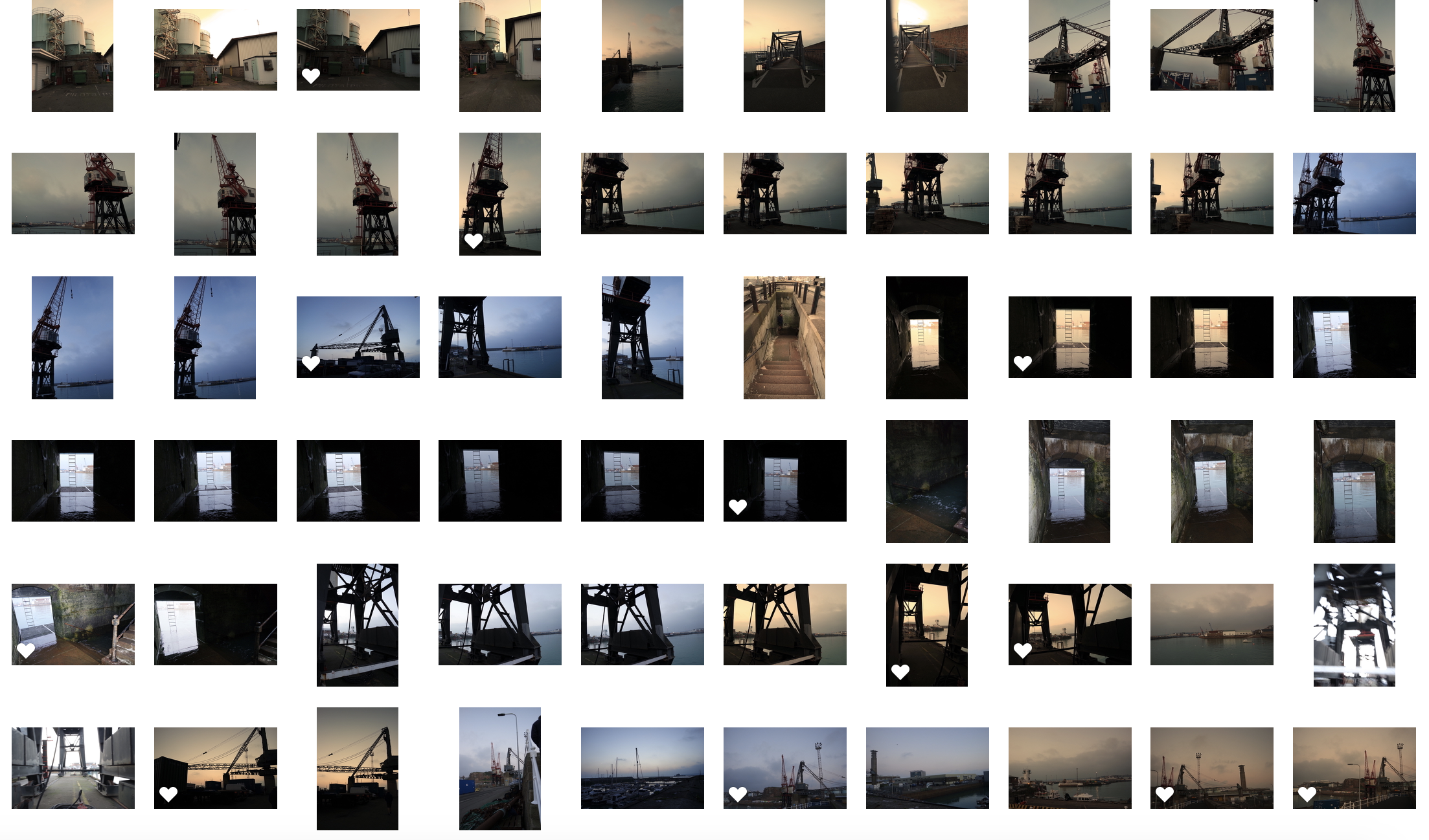
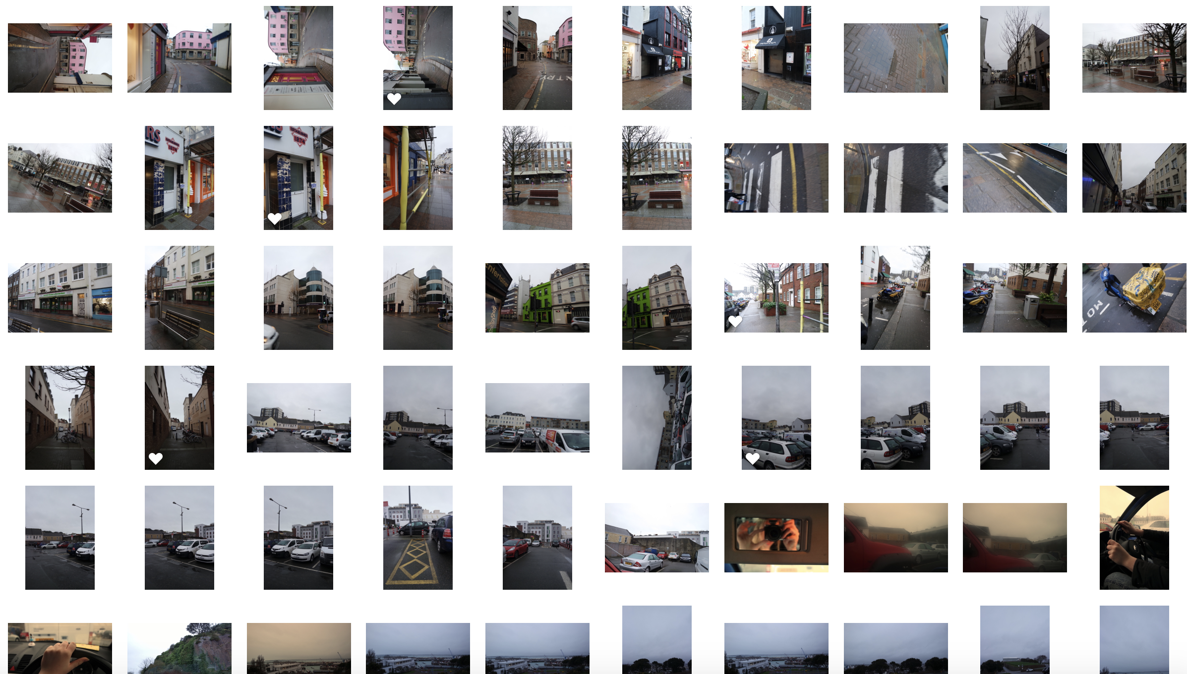
Contact Sheet

My Edits

My Favourite Photo

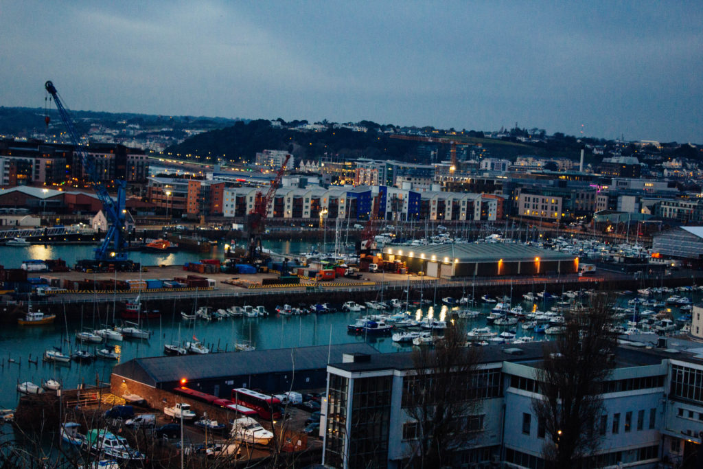
In this photograph I used natural lighting. I took advantage of the lights in the down as dusk approached in order to cast contrasting orange colours against the blue-tinted town. I used a deep depth of field of  20 to capture this photograph to ensure that the whole of the image was clear and in focus. I used a shutter speed of 1/20 in order to allow enough light to enter the lens from the dark environment, paired with the low ISO of 100 that I used, it allowed me to create a high quality image with a wide tonal range.

There are lots of intense colours in this photograph such as the orange lights and the blue sea and sky which cast a blue tint on the photograph. It is generally quite a dark image with the lightest tone being the bright lights. It has a slight 3D effect due to the harbour in the middle separating the foreground and background.

This photograph has been taken with the work of the New Topographic movement in mind. It shows the industrial side of the environment and all the man-made structures along with nature being pushed to the background or covered up by man-made structures.

The photograph shows how the nature shown in the photograph has been taken over completely by man-made structures and has lost the attention it once had. This is symbolic for the New Topographic movement taking over from the Romanticism movement. It shows how quickly things can change for better or for worse.