Who is Nicholas Nixon?
Nicholas Nixon is known for the simplicity and intimacy of his black and white large format photographs. Nixon has photographed porch life in the rural south, schools in and around Boston, cityscapes, sick and dying people, the closeness of couples, and the ongoing annual portrait of his wife, Bebe, and her three sisters. Recording his subjects close and with meticulous detail, he facilitates an emotional connection between the viewer and the subject.
The body of work explores the self in physical and psychological proximity to the urban landscape. In 2017, Fundación MAPFRE in Madrid opened a comprehensive survey of the artist’s work to date, accompanied by a catalogue illustrating over 200 images.

Photo analysis
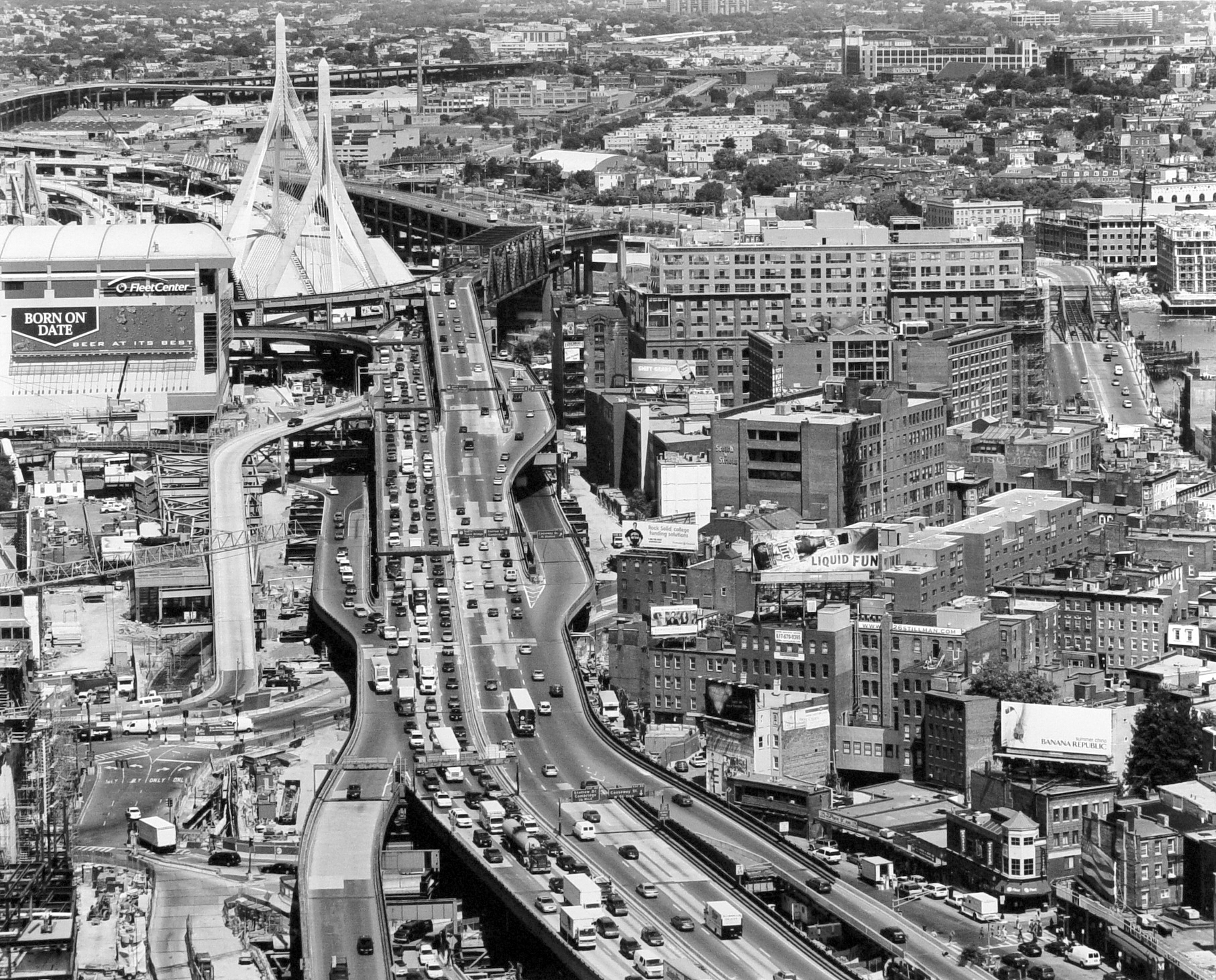
Natural lighting was clearly used to capture this photograph due to the natural tones and contrast in the photograph. The use of natural lighting allows the photo to project a sense of realism which helps allow the audience to feel as if they can connect with the photo. This is shown within this photograph as it has been displayed in black and white which makes the photo seem more surreal and creates a sense of mystery and creates a more dramatic image. The use of black and white helps bring out the levels in this image from the masses of cars on the highway and the heights of the buildings. This photo shows the advancement of civilization and man made structures which is conveyed by how hectic and lively this image looks due to the mass numbers of buildings and how full the roads are. This shows how the New Topographic movement was a reaction to Romanticism just from the use of the juxtaposition within this image such as; the man made features throughout the whole image and the natural aspects within the image such as the trees among the buildings . This photograph is a clear message to reflect how man made structures are taking over society and dominating these natural areas. This is clearly supported by the fact that the natural features are hidden away in the image and are not the main features of the image like they would be within romanticism photography.
My own Images
Edited Images


 Technical - In the foreground of the image the contrast is high between the dirt and the crops - black and white accentuates this - yet the tonal range is small until the focus is brought to the sky and further hills in the background where lighter and softer tones. The photograph has sharp details - fast shutter speed.
The deep depth of field gives the field a greater distance - the lines of the crops also exaggerate this as some of them fade into the distance.
Visual - Weston has captured what people would have seen as a seemingly mundane scene and has composed a photograph that incorporates pattern, contrast and depth. His approach to taking photographs as he says is 'To make the common place unusual'. The aesthetics of the austere landscape has been brought to a focus through Weston's photographs.
Conceptual - The purpose of Weston's photograph could be to reinforce the beauty in nature and to perhaps conserve the natural landscape through photographs. The subject of a tomato field is also an insight to the natural order man creates in society and life.
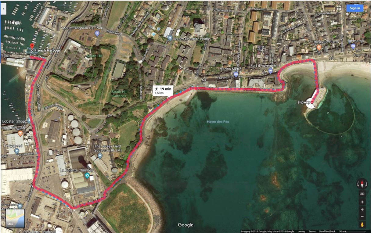
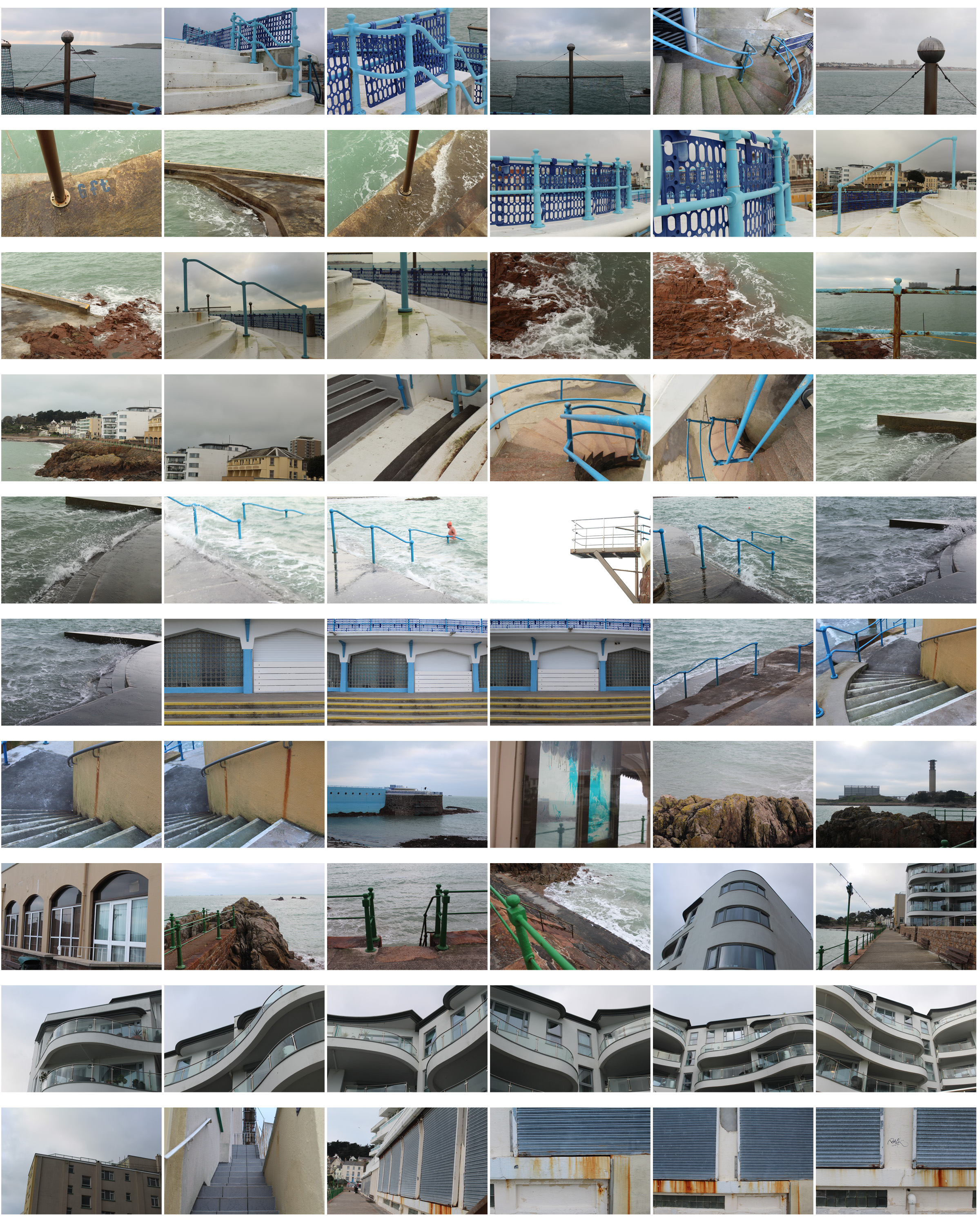
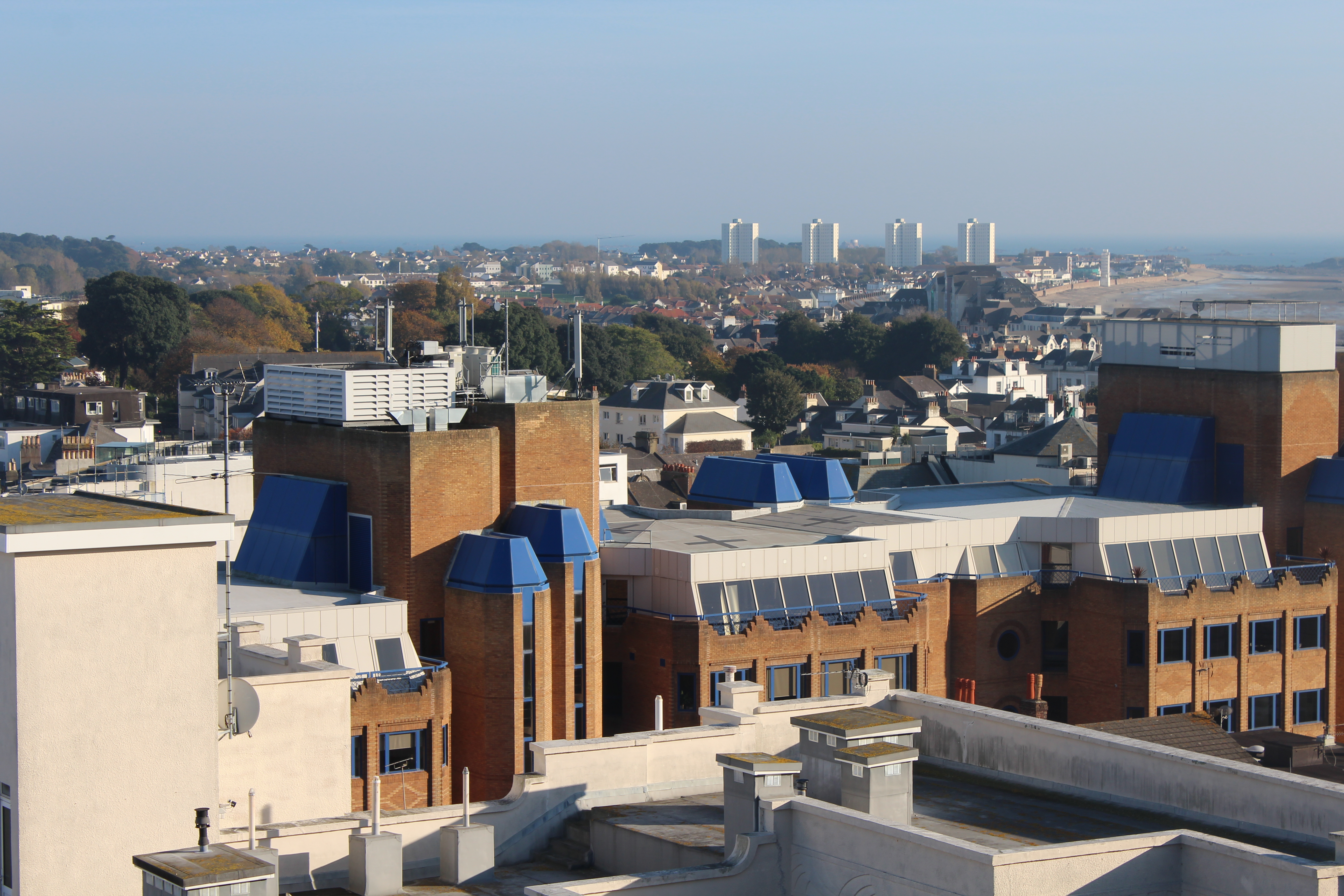
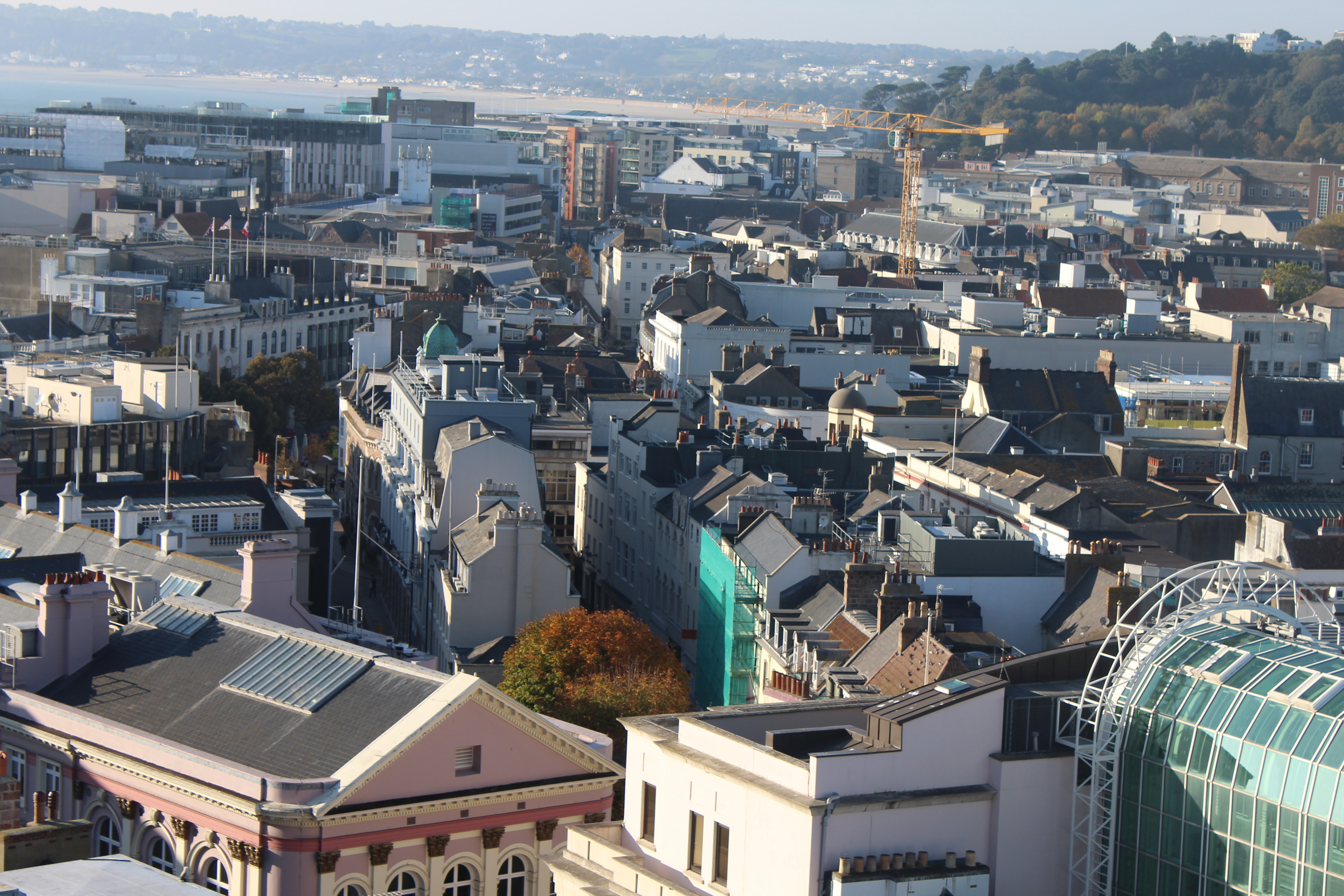
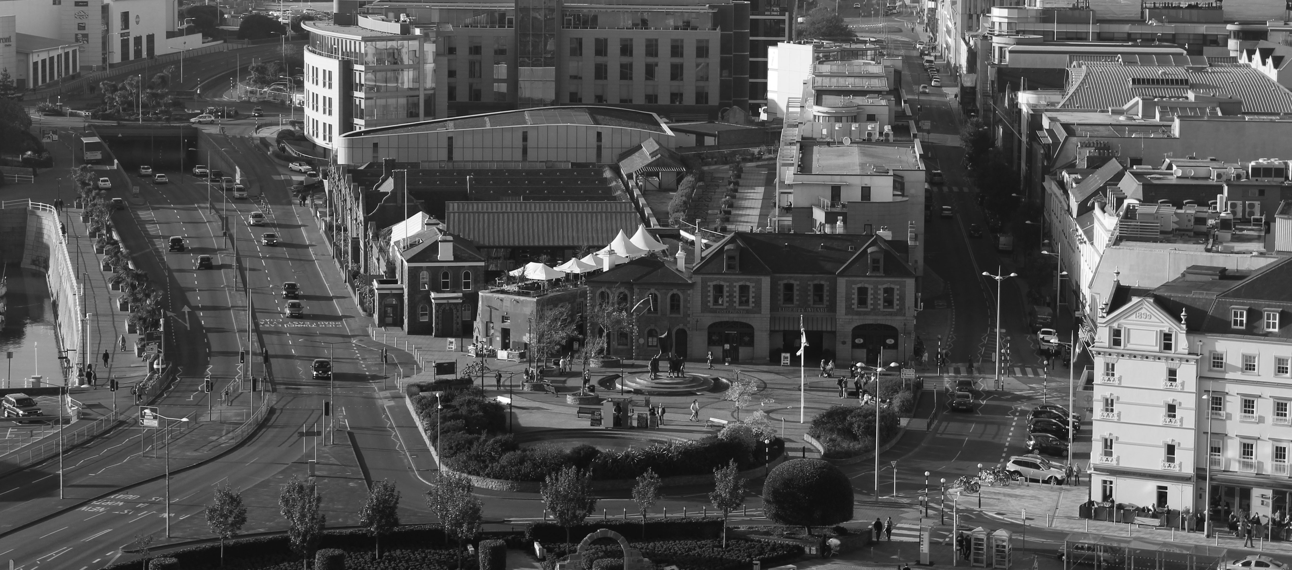
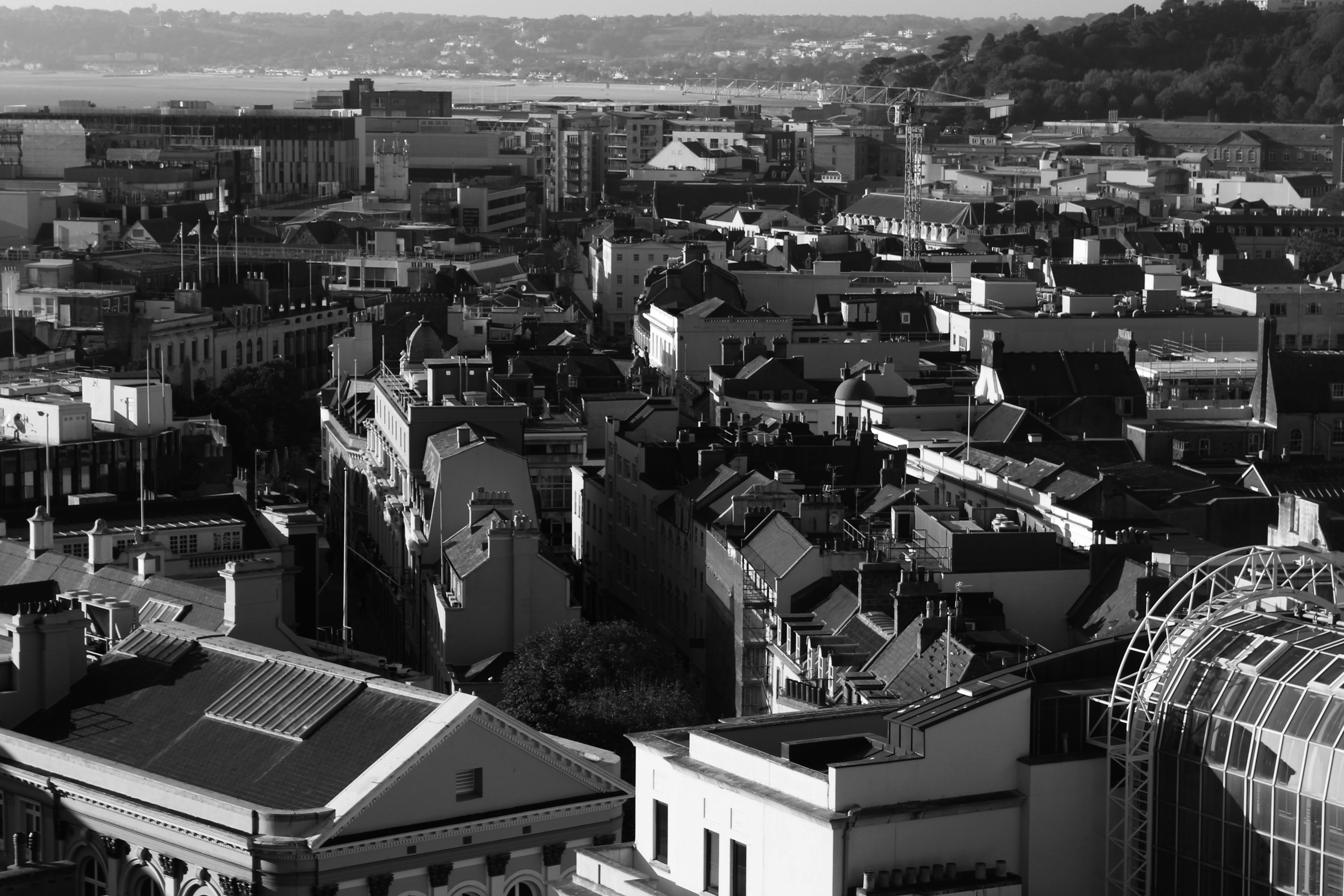
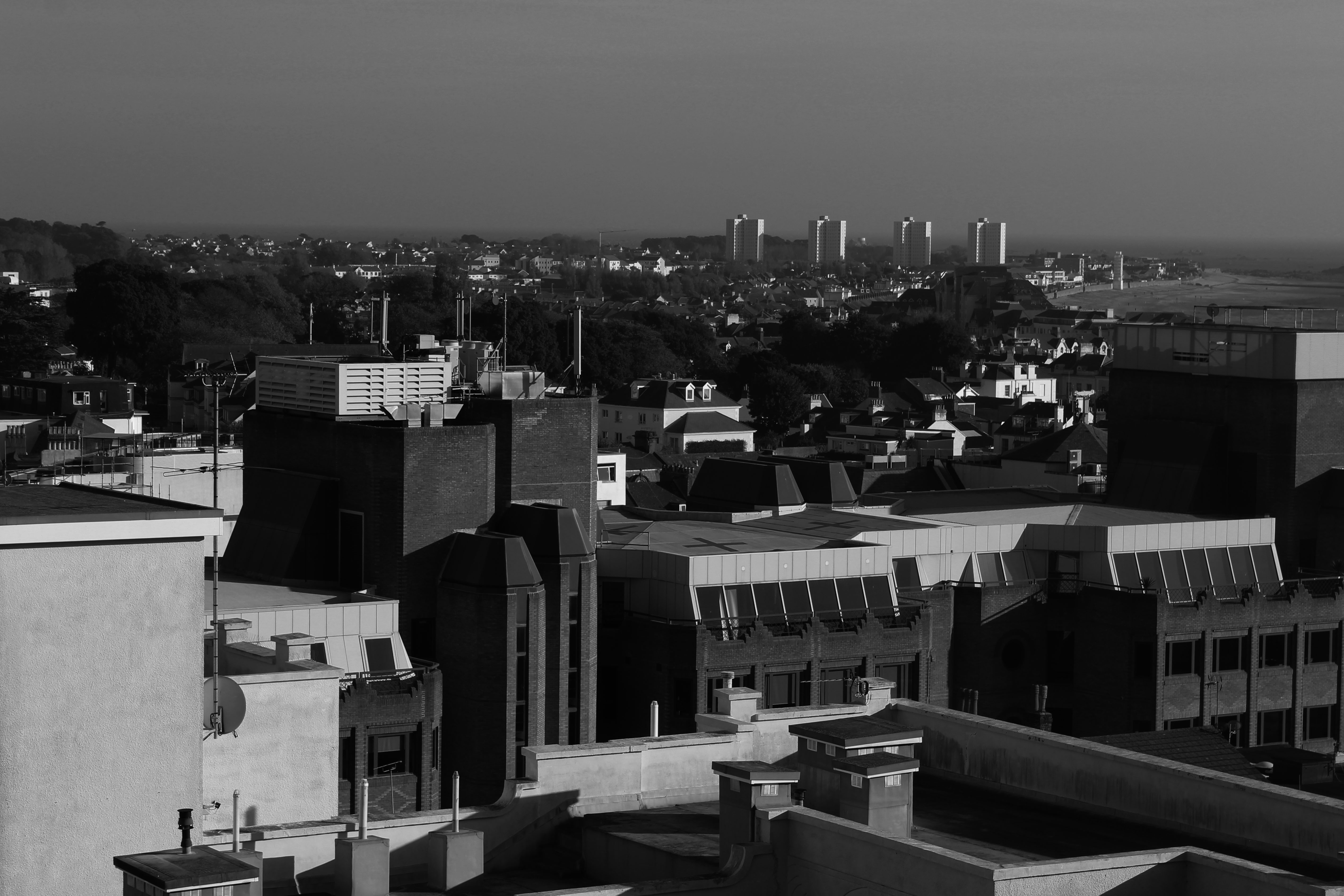
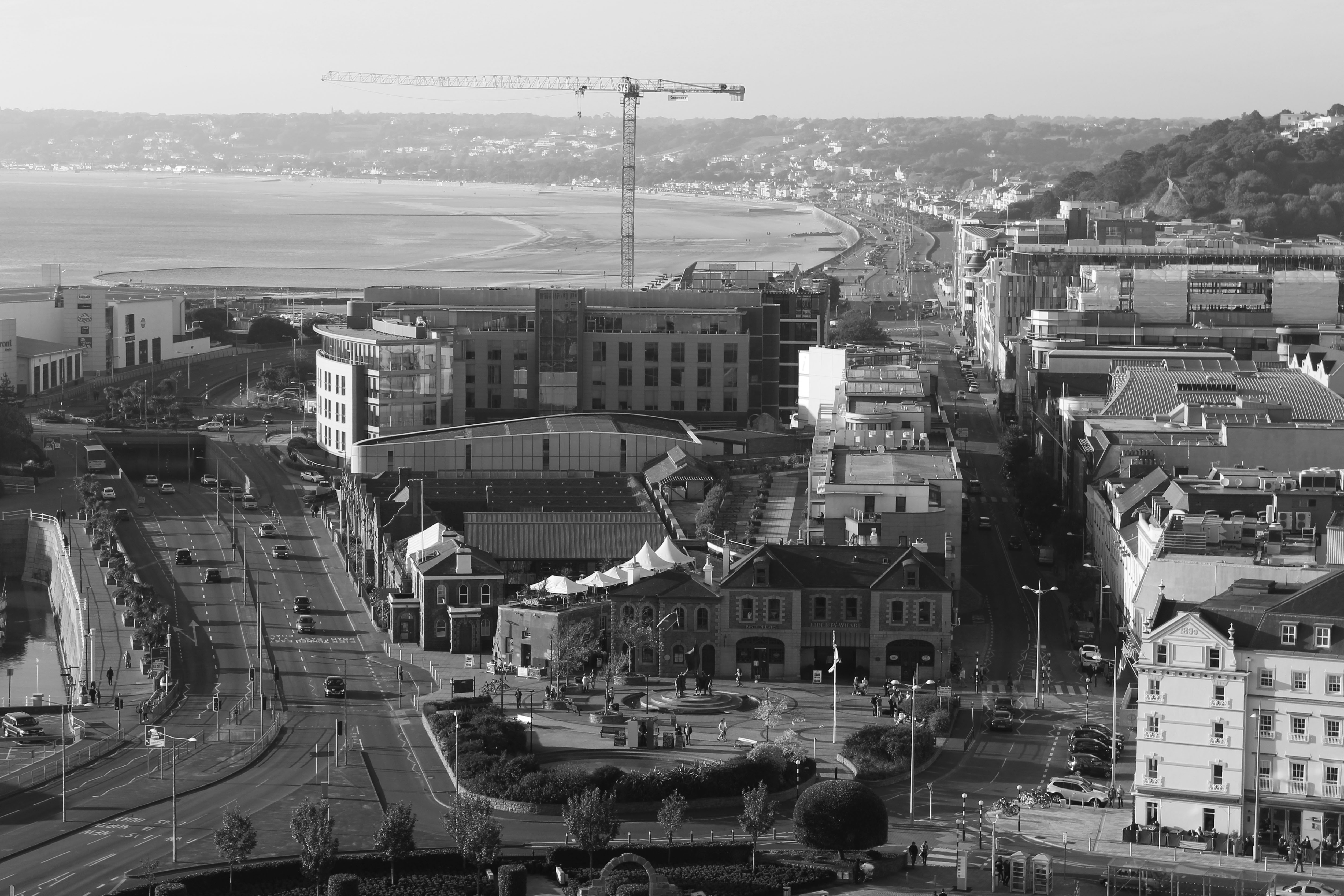
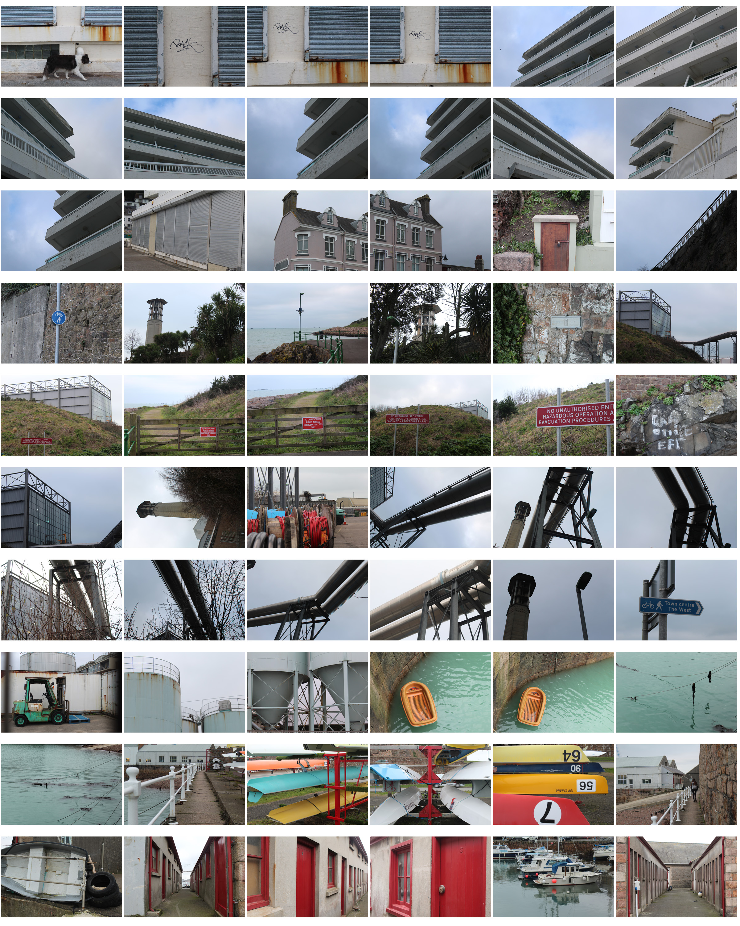 I then chose my favourite photos out of all the images, edited them and displayed them in the contact sheet below so the images can be seen more clearly. I chose these images as each one is completely different and shows the different landscapes I passed and the journey I went on- focusing on structured , man-made objects as well as nature.
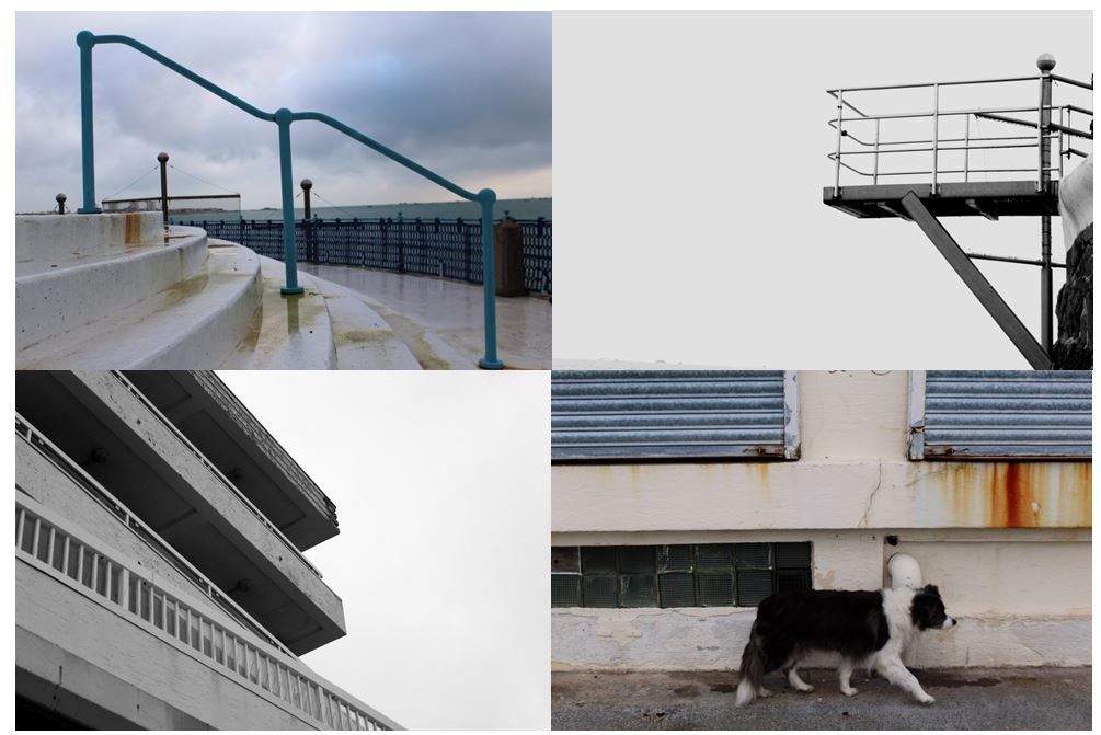
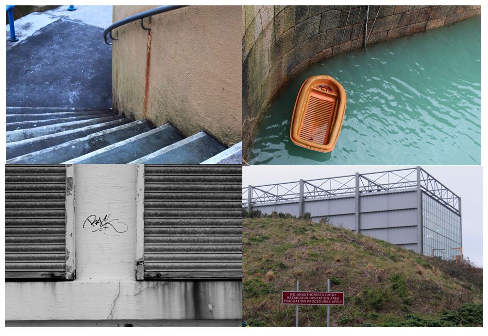
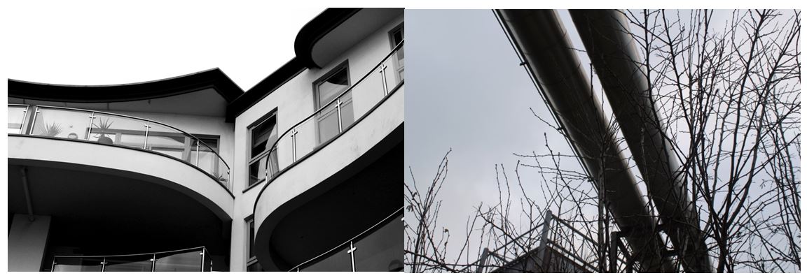

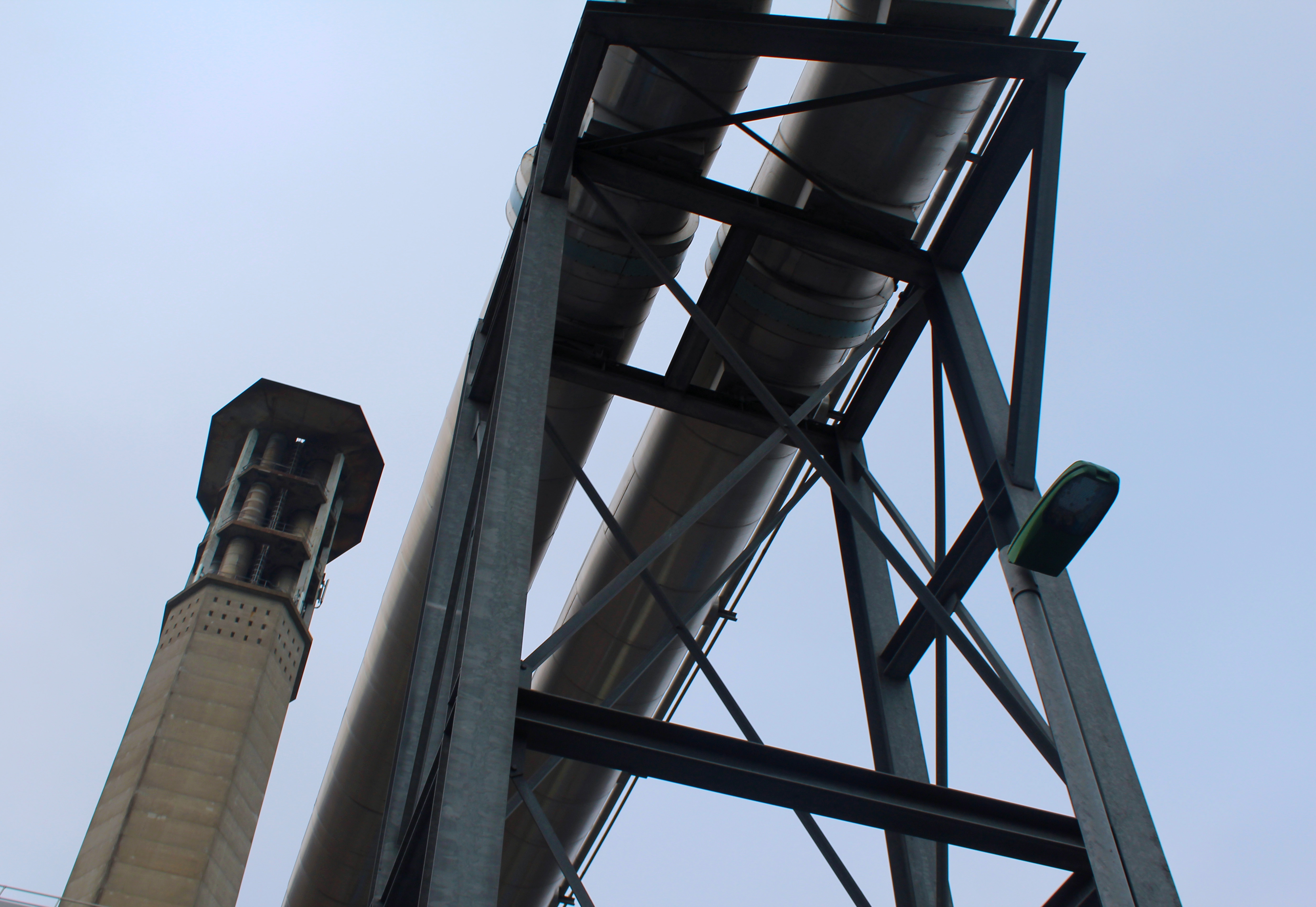


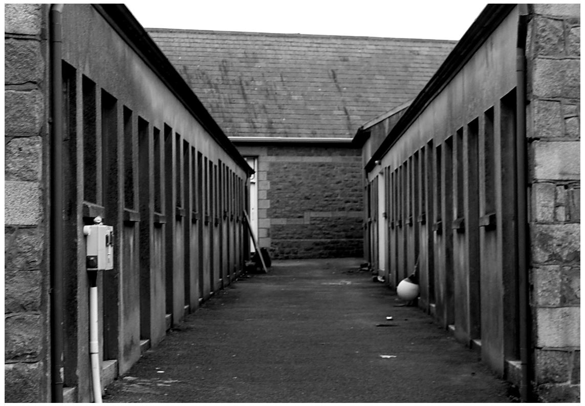 I also chose this image as it shows an alley that I tried to make symmetrical to show lines and repetition on both sides. I turned the photo to black and white taking inspiration from the new topographic photographers, trying to get the same effect. The industrial photographs I’ve taken have similarities to Albert Renger-Patzsch style in The New Objectivity with clear, black and white pictures of industrial archetypes.
